Does your home feel lifeless and dull? Adding vibrant colors to your living space can transform it from boring to breathtaking – but many homeowners freeze when it comes to using bold hues. They worry about making expensive mistakes or creating rooms that feel overwhelming rather than energizing.

I get it. After helping many homeowners refresh their spaces, I’ve seen that same hesitation again and again. But here’s the truth: bringing vibrant colors into your home doesn’t have to be scary or complicated.
In this complete room-by-room guide, you’ll discover:
- Simple ways to add bold colors without repainting entire rooms
- Designer tricks for balancing bright shades with your existing decor
- Proven color combinations that work in any space
- Budget-friendly ideas that can transform a room in just one afternoon
Whether you’re looking to energize your home office, create a calming bedroom retreat, or design an inviting living room, you’ll find practical tips you can use right away. Just follow these tested techniques to bring your rooms to life with color.
Let’s turn your color dreams into reality, one room at a time.
I. The Psychology of Color: Why Vibrant Hues Matter

Think of your favorite childhood memory. Chances are, it’s filled with color – maybe the bright blue of a summer sky or the warm red of your grandmother’s kitchen. Color isn’t just something we see – it’s something we feel deep in our bones.
As an interior design who’s worked on many home projects, I’ve seen firsthand how vibrant colors can completely change how people feel in their spaces. The science backs this up: studies show that colors directly affect our mood, energy levels, and even our appetite.
Here’s what happens in your brain when you walk into a colorful room:
- Your heart rate might increase slightly when you see warm colors like red or orange
- Cool colors like blue and green can lower your blood pressure and help you feel calm
- Yellow stimulates the production of serotonin – that’s why sunny rooms often make us happier
But there’s a catch. While some design blogs push you to paint every wall a bold shade, that’s not always the right answer. The key is understanding how to use vibrant colors strategically.
Think of color like seasoning in cooking. A pinch of spice enhances the whole dish, but too much can overwhelm it. The same goes for your home’s color palette.
Pro Tip: Create a color journal for a week. Note which colors you encounter that make you feel energized, calm, or productive. Use these observations to guide your home color choices.
Don’t Miss: How To Create Mood Board In Canva: Step By Step Guide
II. Practical Tips for Using Vibrant Colors

After years of helping homeowners overcome their fear of color, I’ve developed a foolproof system for success. Let me share the exact process I use with my design clients.
Start Smart: Testing Colors
Before you commit to any vibrant colors:
- Paint large poster boards instead of tiny swatches
- View them during different times of day
- Move them around the room
- Take photos – they often reveal things your eye misses
The 48-Hour Rule: Live with your color samples for at least two days. I’ve saved countless clients from expensive mistakes with this simple step.
Common Mistakes to Avoid
I see these issues all the time, but they’re easy to fix:
- Choosing a color without testing it in your lighting
- Adding too many different vibrant colors at once
- Forgetting to consider adjacent rooms
- Not accounting for existing elements like flooring
Budget-Friendly Color Ideas
You don’t need a huge budget to make an impact:
- Paint is your best friend – one accent wall can transform a room
- Shop your home first – gather colorful items from other rooms
- Update lamp shades for an instant color boost
- Add vibrant plants or flowers for natural color
Special Tips for Renters
Can’t paint? No problem! Try these landlord-friendly options:
- Use removable wallpaper for accent walls
- Hang large colorful art pieces
- Layer colorful rugs over neutral carpets
- Install temporary window films in vibrant hues
Seasonal Color Updates
Keep your space fresh by:
- Switching throw pillows with the seasons
- Rotating artwork in different color schemes
- Changing curtain panels for a new look
- Updating small accessories monthly
Also: Color Drenching 101: A Beginner’s Guide to a Cohesive Space
III. Most Popular Vibrant Colors for Home Design

Having helped many clients find their perfect color palette, I’ve noticed clear favorites that consistently create stunning spaces. Here are the most versatile and beloved vibrant colors in home design:
Jewel Tones
- Emerald Green: The breakout star of modern interiors. It adds luxury to any room and pairs beautifully with brass fixtures and natural woods.
- Perfect for: accent walls, velvet furniture, or kitchen cabinets.
- Benjamin Moore “Emerald Isle” (2039-20)
- Sherwin Williams “Eden” (SW 6467)
- Behr “Vine Leaf” (S-H-470)
- Farrow & Ball “Calke Green” (34), Pro Tip: Sample these greens in both morning and evening light. Some emerald greens can look dramatically different depending on your lighting.
- Perfect for: accent walls, velvet furniture, or kitchen cabinets.
- Sapphire Blue: This rich, vibrant blue creates instant sophistication. It’s especially popular in home offices and bedrooms where it promotes focus and tranquility.
- Best used for: built-in bookshelves, upholstered headboards, or dining room walls.
- Benjamin Moore “Stunning” (826)
- Sherwin Williams “Hyper Blue” (SW 6965)
- Behr “Deep Azure” (570B-7)
- Valspar “Blue Eclipse” (4008-10C), Pro Tip: Most sapphire blues look best in rooms with plenty of natural light to show off their depth.
- Best used for: built-in bookshelves, upholstered headboards, or dining room walls.
- Ruby Red: A powerful accent color that adds drama without feeling aggressive. The key is using it in small doses.
- Ideal for: dining room chairs, throw pillows, or kitchen accessories.
- Benjamin Moore “Caliente” (AF-290)
- Sherwin Williams “Show Stopper” (SW 7588)
- Behr “100 MPH” (P150-7)
- Farrow & Ball “Incarnadine” (248), Pro Tip: Always use a primer when painting with red – it helps achieve true color coverage.
- Ideal for: dining room chairs, throw pillows, or kitchen accessories.
Modern Brights
- Coral: The perfect balance between pink and orange, coral adds warmth without being overwhelming. It’s especially popular in spaces that need a cheerful boost.
- Works well in: bathrooms, reading nooks, or as accent pieces.
- Benjamin Moore “Coral Gables” (2010-40)
- Sherwin Williams “Coral Reef” (SW 6606)
- Behr “Tropical Coral” (P180-3)
- Valspar “Orange Delight” (2010-2), Pro Tip: Coral can read very differently on your walls versus the paint chip. Paint a large sample board and view it vertically.
- Works well in: bathrooms, reading nooks, or as accent pieces.
- Mustard Yellow: This sophisticated take on yellow has become a designer favorite. It adds warmth and energy while feeling more mature than primary yellow.
- Great for: accent chairs, throw blankets, or kitchen backsplashes.
- Benjamin Moore “Yellow Marigold” (2155-30)
- Sherwin Williams “Cut the Mustard” (SW 6384)
- Behr “Golden Cricket” (360D-7)
- Farrow & Ball “India Yellow” (66), Pro Tip: Mustard yellows often need two or three coats for even coverage.
- Great for: accent chairs, throw blankets, or kitchen backsplashes.
Nature-Inspired
- Peacock Teal: This vibrant blue-green hybrid is versatile enough to act as a neutral while still making a statement.
- Popular in: living rooms, front doors, or accent furniture.
- Benjamin Moore “Aegean Teal” (2136-40)
- Sherwin Williams “Oceanside” (SW 6496)
- Behr “Dresden Blue” (510D-7)
- Valspar “La Fonda Deep Pool” (5011-7), Pro Tip: This color family tends to look darker on walls than on chips – consider going one shade lighter than you think you need.
- Popular in: living rooms, front doors, or accent furniture.
- Aubergine Purple: A rich, sophisticated purple that adds depth without feeling too bold.
- Perfect for: powder rooms, dining chairs, or bedroom accents.
- Benjamin Moore “Shadow” (2117-30)
- Sherwin Williams “Plum” (SW 6542)
- Behr “Black Raspberry” (S-G-670)
- Farrow & Ball “Brinjal” (222), Pro Tip: Aubergine looks most sophisticated in matte or eggshell finish rather than semi-gloss.
- Perfect for: powder rooms, dining chairs, or bedroom accents.
Pro Tip: The most successful vibrant color schemes often combine one of these popular colors with a softer version of itself and a complementary neutral. For example, peacock teal + soft aqua + warm gray creates a foolproof combination.
Color Popularity by Room
- Living Rooms: Emerald green and sapphire blue lead the way
- Kitchens: Coral and mustard yellow are current favorites
- Bedrooms: Peacock teal and soft aubergine create calming yet interesting spaces
- Bathrooms: Jewel tones of any variety make small spaces feel luxurious
- Home Offices: Deep blues and energetic greens promote productivity
Remember: While these colors are popular for good reason, the best color for your space is one that makes you feel happy every time you see it. Use these as inspiration, but don’t be afraid to follow your own color instincts!
Also: 30 Interior Decorating Rules You Can (and Should!) Break
IV. Vibrant Color Application Ideas

Let’s get practical! After helping countless homeowners add color to their spaces, I’ve developed what I call the “Impact Scale” – ways to add vibrant colors from subtle to bold.
Level 1: Dip Your Toes In
Start small with:
- Colorful throw pillows (easiest to swap out)
- Bold artwork (instant focal point)
- Vibrant vases or decorative objects
- Bright picture frames
Level 2: Medium Impact
Ready for more? Try:
- Area rugs with vibrant patterns
- Colorful window treatments
- Painted furniture pieces
- Statement light fixtures
Pro tip: Take photos of potential color combinations in the store – what looks good in person might need adjusting when viewed in photos.
Level 3: Bold Moves
For the color confident:
- Accent walls in rich, vibrant hues
- Colorful sofas or chairs
- Painted ceilings
- Bold wallpaper patterns
Designer secret: When choosing an accent wall, pick the one with the most natural light or architectural interest. It’s like choosing where to put a spotlight in a theater.

Don’t miss: How to Add Pops of Color to Your Home
V. Creating Balance with Vibrant Colors
The biggest mistake I see? Going too bold too fast. Here’s how to create perfect balance every time.
The 60-30-10 Rule: Your Color Recipe
Think of it like cooking:
- 60% is your main ingredient (neutral base)
- 30% is your supporting flavor (secondary color)
- 10% is your spice (vibrant accents)
Pro tip: Use the “five feet rule” – step five feet back from your room entrance. The first three things you see should include your vibrant color in descending amounts.
Real-Life Example: In a living room, this might look like:
- 60% warm gray walls and sofa
- 30% deep blue accent wall and chairs
- 10% coral pillows, art, and accessories
Balancing Bright Colors Like a Pro
- Use darker shades of vibrant colors in larger areas
- Add brighter pops in smaller doses
- Include plenty of white space to let colors breathe
- Layer in textures to add depth without more color
“Layer bold colors with midtones and neutrals to balance color in a room,” says Khristian A. Howell, textile designer and color expert. Consider the 60-30-10 rule where you have 60% of one color, 30% of another and 10% of the last.
Designer secret: I always tell clients to step back and squint at their room. If one area jumps out too much, it needs more balance.
The Neutral Secret
Here’s something most designers won’t tell you: Neutrals are your vibrant colors’ best friends. They:
- Ground bold colors
- Prevent visual overwhelm
- Create resting places for the eye
- Make vibrant colors look more expensive
Remember: Every vibrant color needs a neutral partner. Think of it like a dance – one leads while the other supports.
Also: Most Popular Paint Colors To Transform Your Space
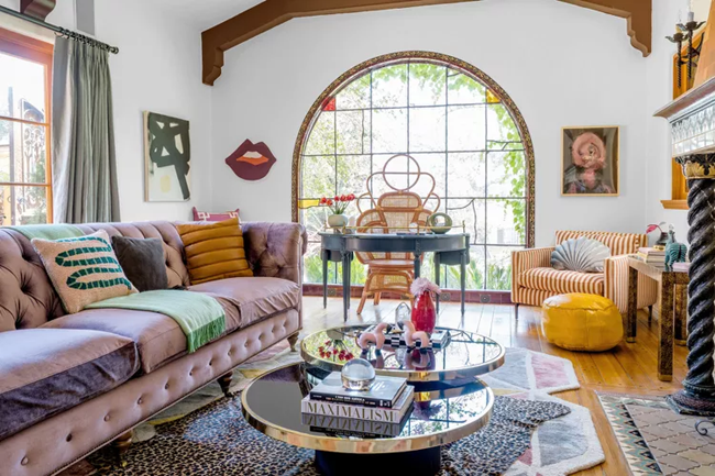
VI. Living Room: Creating an Energetic Social Hub

Your living room is like the heart of your home – it needs to pump energy through the whole house while still feeling welcoming. This is where vibrant colors can really shine, but you need to use them wisely.
I recently helped a client transform their dull beige living room into a vibrant gathering space. The secret? We didn’t paint all four walls bright blue (though she initially wanted to). Instead, we created what I call “color moments” throughout the room.
Here’s how to add vibrant colors to your living room without going overboard:
Strategic Color Placement
- Choose one wall for a bold accent color (think jewel tones like emerald or sapphire)
- Add 2-3 pieces of colorful furniture that complement your accent wall
- Spread smaller pops of color around the room through accessories
“Give yourself permission to use a bold color. You don’t have to love it everywhere—one throw or pillow might be just enough,” says designer Nate Berkus.
The Right Balance
Your room should follow this ratio:
- 60% neutral base color (walls, large furniture)
- 30% secondary color (accent wall, large decor pieces)
- 10% vibrant accent colors (pillows, art, small accessories)
My clients often worry about committing to vibrant colors in their main living space. Here’s a trick I always share: start with colorful throw pillows and wall art. These are low-risk ways to experiment with bold hues. Once you see how different colors make you feel, you can commit to bigger changes.
Pro tip: Natural light changes how colors look throughout the day. Before painting an accent wall, tape up large color samples and watch them for 48 hours. You might love that bright coral in the morning but find it too intense in evening light.
Remember that successful living room design isn’t about following trends – it’s about creating a space that energizes and welcomes both your family and guests. When used thoughtfully, vibrant colors can help you achieve exactly that.
Want to test the waters? Try this simple weekend project: Add three new items in the same bright color to different parts of your living room. Maybe it’s a blue vase, throw pillow, and book cover. Notice how your eye travels around the room, creating a sense of flow and intention.
Designer secret: Take a photo of your living room in black and white. Areas that look flat or boring are perfect spots to add vibrant color.
Don’t Miss: Best Home Color Scheme Secrets For a Stylish Home
VII. Kitchen: Appetizing Color Combinations

Ever notice how your favorite restaurants use color to make their food look more appealing? The same principle works in your home kitchen. After redesigning several kitchen spaces, I’ve learned that vibrant colors can make this hardworking room feel both energetic and welcoming.
Recently, I helped a family transform their all-white kitchen into a joyful cooking space. The change was so dramatic that their teenage kids actually started hanging out there to do homework. The secret wasn’t a complete overhaul – it was strategic color placement.
Smart Ways to Add Color in Your Kitchen
- Paint lower cabinets a rich color while keeping upper cabinets light (this prevents the room from feeling heavy)
- Choose colorful appliances as statement pieces
- Install a vibrant backsplash as your kitchen’s “jewelry”
Pro tip: If you’re nervous about permanent changes, start with colorful kitchen accessories like:
- Stand mixer (the most popular first step for my clients)
- Cooking utensils and holders
- Tea towels and oven mitts
- Storage canisters
Remember: The best kitchen colors often connect to food. Think warm spice tones, fresh herb greens, or bright citrus shades.
Designer secret: Choose vibrant colors that complement your food – warm oranges and reds stimulate appetite, while cool blues might suppress it.
Don’t Miss: How To Decorate An Inviting Dining Room
VIII. Bedroom: Balancing Energy and Rest

Your bedroom needs to be both energizing in the morning and calming at night. It’s a tricky balance, but vibrant colors can help when used thoughtfully. This isn’t just design theory – sleep studies show that color affects our rest patterns.
I recently worked with an insomniac client who transformed her sleep quality by adjusting her bedroom’s color scheme. We kept the walls serene but added vibrant accents that made her smile every morning.
Creating the Perfect Color Balance
- Choose a soothing base color for walls and large furniture
- Add vibrant colors through easily changeable elements
- Create a color progression that gets calmer as you move toward the bed
Best Places for Vibrant Colors in Your Bedroom:
- The wall opposite your bed (what you see when you wake up)
- Window treatments (which can be closed at night)
- Artwork and accessories (easy to adjust seasonally)
- Throw pillows and blankets (simple to switch out)
“In the same way a bright shoe adds surprise and fun to a black outfit, an unexpected touch of trim along a curtain panel or in piping can add color in a way that’s easy to live with,” says designer Anna Lobell
Designer secret: Layer different shades of your chosen vibrant color to create depth without overwhelming the space. Think ombre effect with your accessories.
Also: 10 Easy Ways For a Bedroom Refresh on a Budget
IX. Bathroom: Creating a Refreshing Oasis

Think of your bathroom as a personal spa. In my 15 years of design work, I’ve found that bathrooms are actually one of the safest places to experiment with vibrant colors. Why? Because we spend less time here, bold choices feel less overwhelming.
After designing several bathroom spaces, here’s what I’ve learned: small bathrooms can handle big colors. In fact, vibrant colors often make tight spaces feel more intentional and luxurious.
Pro tip: Test your vibrant color choices under both natural and artificial light – bathroom lighting can dramatically change how colors appear.
Bathroom Color Strategies
For maximum impact with minimum risk:
- Use vibrant colors in shower tile or floor patterns
- Paint a bold accent wall behind the vanity
- Add color through towels and bath accessories
- Install colorful light fixtures or mirror frames
Designer Secret: Want to make your bathroom feel bigger? Use the same vibrant color on one wall and the ceiling. It blurs the boundaries of the space and draws the eye up.

Trending: How To Decorate Dark Feminine Bedroom
X. Home Office: Boosting Productivity with Color

Working from home? Your home office color choices might be affecting your productivity more than you realize. Research shows that vibrant colors can increase focus and creativity – when used correctly.
I’ve designed many home offices, and here’s what works consistently: using color to create distinct zones for different types of work.
Pro tip: Position vibrant colors at eye level or above to energize your workspace without creating screen glare.
Color Zoning for Productivity
Create these areas with different color intensities:
- Focus Zone: Deeper, richer colors for concentrated work
- Creative Zone: Vibrant, energetic colors for brainstorming
- Meeting Zone: Professional but welcoming colors for video calls
Best Colors for Work-From-Home Success:
- Blue tones for focused computer work
- Yellow accents for creative tasks
- Green elements for reduced eye strain
- Purple touches for artistic inspiration
Designer secret: If you’re on video calls, create a vibrant but professional background wall. I help clients choose colors that look good on camera while energizing their workspace.
Quick Office Color Fixes
- Paint one wall in a bold shade that makes you feel energized
- Add colorful organizing tools and desk accessories
- Use vibrant art pieces as focal points
- Position plants with colorful pots or flowers in your webcam view
Remember: Your home office should make you feel both professional and inspired. Don’t be afraid to use colors that corporate offices typically avoid – this is your space to customize for peak performance.
Also: Aesthetic Work Desk Setup Ideas
Most Popular Post:
10 Affordable Home Decor Finds Under $50 to Elevate Your Space
Studio Apartment Decorating Expert Tips: Maximize Your Space and Style
Most Affordable Amazon Home Decor Finds
Best Home Decor Ideas On a Budget
How To Decorate a Desk at Home
Conclusion: Your Color Journey Starts Now
Remember that dull, lifeless space we talked about at the beginning? Now you have all the tools you need to transform it into a vibrant, energizing home that reflects your personality.
Let’s recap the key takeaways:
- Start small with easily changeable items
- Use the 60-30-10 rule as your guide
- Test colors before making major changes
- Balance vibrant hues with neutrals
- Trust your instincts – you’ll know when it feels right
The best part about using vibrant colors? There’s no single “right” way to do it. Your home should be as unique as you are. Whether you’re ready to paint an entire room emerald green or just want to add a few bright pillows, take that first step today.
Your Next Steps
- Choose one room to start with
- Pick your favorite vibrant color
- Add it in three small ways this week
- Notice how the color makes you feel
- Build from there
Remember, some of the most beautiful rooms I’ve designed started with a single colorful pillow that caught my client’s eye. Your perfect vibrant space is waiting to unfold, one color choice at a time.
Don’t Miss: A Pro Guide To Best Interior Paint Finishes For Walls
Using Vibrant Colors-Frequently Asked Questions
Q: Won’t vibrant colors make my small room feel even smaller?
A: Actually, bold colors can make a space feel larger when used strategically. The key is to choose one vibrant accent wall while keeping other walls lighter. This creates depth and visual interest.
Q: How do I know which vibrant colors will work in my space?
A: Start by noting which colors appear in your favorite clothes or accessories – these often reflect the colors you naturally gravitate toward. Test samples in your space and observe them for 48 hours in different lighting conditions.
Q: What if I make a mistake with a bold color choice?
A: That’s why we always start with easily changeable elements like pillows or artwork. If you’re painting, remember: it’s just paint! You can always repaint if you’re not happy with the result.
Q: How can I use vibrant colors without my space looking like a kindergarten classroom?
A: The secret is balance. Use the 60-30-10 rule and pair vibrant colors with sophisticated neutrals. Think jewel tones rather than primary colors for a more mature look.
Q: Will vibrant colors go out of style?
A: While color trends come and go, choosing colors you personally love never goes out of style. Focus on colors that make you feel good rather than following trends.
Subscribe To the Newsletter!
Subscribe now for an endless feed of inspirational women’s cave decor ideas, pampering rituals, and more tips for curating your ultimate escape. Let’s start making your cozy refuge a reality – you so deserve this!
CATCH THE LATEST IN HOME DECOR TRENDS:
Steal These 16 Expert-Approved Decorating Secrets

How To Accessorize Your Living Room
How to Make a Small Room Appear Bigger

How to Make Your Home Look Expensive
GET CAUGHT UP ON ALL THE INSPIRING DECOR TIPS:

18 Fresh Decorating Ideas To Update Your Fireplace

How to Make a Gallery Wall: The Complete Step-by-Step Guide (Even If You’ve Never Hung a Picture)
