The fastest way to make your home look expensive is to fix three things designers always get right: oversized, layered lighting instead of one flat ceiling light; correctly-sized rugs and curtains (not “close enough”); and a tightly edited color and material palette instead of a mismatched mix. None of it requires a renovation — just the right order of operations.
How to make your home look expensive comes down to a handful of decisions most people never think to question — the height of a curtain rod, the wattage of a lamp, whether a rug is six inches too small. You bought the pretty pillows. You hung the art. And somehow the room still reads “big box store” instead of “boutique hotel.” That gap between Pinterest and your actual living room isn’t a taste problem — it’s a sequencing problem. Most people decorate in the wrong order, spending money on decor before fixing the bones (scale, light, and proportion) that decor sits on top of.

Here’s the good news: designers don’t rely on bigger budgets nearly as much as you’d think. They rely on a formula — a specific order in which lighting, scale, texture, and color get addressed before a single throw pillow gets bought. In this guide, I’m handing you the exact formula for how to make your home look expensive: the designer rules, the room-by-room breakdowns nobody else covers, the lighting math, and the real product picks (budget and splurge) to pull it off in a weekend.
- The 5 Designer Rules That Make a Home Look Expensive
- Paint, Trim & Architectural Details
- How to Make Your Home Look Expensive, Room by Room
- Lighting Strategy: The Layering Formula
- Textiles & Soft Furnishings
- Hardware & Refined Finishes
- Curation & Negative Space
- What NOT to Do
- Budget-Tier Quick Wins
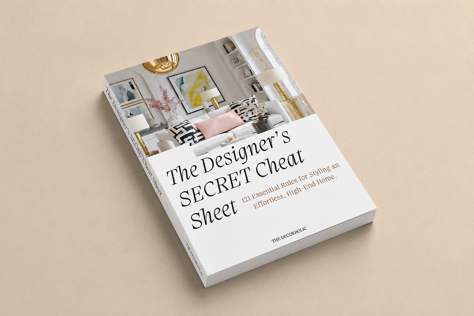
- The Designer’s Cheat Sheet
- FAQs
The 5 Designer Rules That Make Your Home Look Expensive
The Direct Answer: A home looks expensive when its lighting is warm and layered, its textiles are correctly scaled, its color palette is edited to 2-3 tones, its surfaces are decluttered, and its finishing details (hardware, frames, trim) are intentional rather than default. These five levers matter more than any single purchase.
1. Light Warm, Light Layered
Builder-grade overhead lighting is the single biggest “cheap” signal in a home, because a lone ceiling fixture throws flat, shadowless light that flattens every surface in the room. Designers use three light sources per room minimum — ambient, task, and accent — set to a 2700K-3000K warm color temperature. That warmth alone reads as “curated” instead of “office.”
2. Get the Scale Right, Every Time
Undersized furniture and decor is the second-biggest tell. A rug that floats in the middle of the room, art that’s too small for the wall, curtains that stop at the window frame — all of it reads as an afterthought. The fix is almost always: go one size bigger than feels comfortable.
3. Edit Your Palette to 2-3 Tones
Expensive-looking rooms repeat a tight palette — usually one neutral, one deep anchor tone, and one metal finish — across furniture, textiles, and hardware. A room with five unrelated colors and three different metal finishes will always look busier and cheaper than the same room edited down.
4. Declutter Every Horizontal Surface
Countertops, nightstands, and consoles read as expensive when each surface holds 3-5 intentional objects with breathing room between them, not a pile of mail and chargers. This costs nothing and takes an afternoon.
5. Make the Small Details Intentional
Cabinet hardware, door hinges, outlet covers, lamp shades — designers treat these as design decisions, not afterthoughts. Swapping ten dollars’ worth of hardware on a dresser changes how expensive the whole piece reads.
If you can only fix one thing this weekend, fix lighting. It affects how every other design choice in the room reads, and it’s the cheapest lever to pull.
Paint, Trim & Architectural Details That Read Expensive

Photo: Brent Darby
The Direct Answer: One of the fastest ways to make your home look expensive is to treat trim, ceilings, and walls as one connected design decision instead of three separate ones — matching sheens and tones on purpose, and adding a little architectural detail (like picture-frame molding) rather than leaving walls flat and builder-white.
Stop Treating Trim as an Afterthought
Most builder-grade homes paint every wall one flat color and every piece of trim stock white, with no relationship between the two. Designers use sheen and tone on purpose: satin or eggshell on walls, semi-gloss on trim and doors, so the trim reads crisp without looking plastic. For a more custom, monochromatic look, try painting the walls, trim, and ceiling in the same color family — a technique called color drenching — which removes the visual “seams” between surfaces and makes a small room feel intentional rather than unfinished.
Add One Piece of Architectural Detail
A single accent wall of picture-frame molding, beadboard, or wainscoting is one of the highest-ROI weekend projects for making a home look expensive, because it adds dimension that paint alone can’t fake. Paintable, peel-and-stick molding kits run $100-150 and install in a weekend with no carpentry experience. Stick to one wall or one room to start — molding in every room of the house can tip from “custom builder home” into “overdone” fast.
Ditch the Stark White Ceiling
A pure white “builder white” ceiling next to a colored wall creates a hard, cheap-looking line. Painting the ceiling a shade or two lighter than the walls (rather than stark white) softens that transition and makes the whole room feel more custom and cohesive.
Don’t mix more than two trim colors in a single sightline. One wall color family, one trim sheen, one ceiling treatment — consistency reads as intentional; variety reads as unfinished.
How to Make Your Home Look Expensive, Room by Room
General tips only get you so far — every room has its own scale rules for how to make your home look expensive. Here’s how the formula changes by space.
Living Room

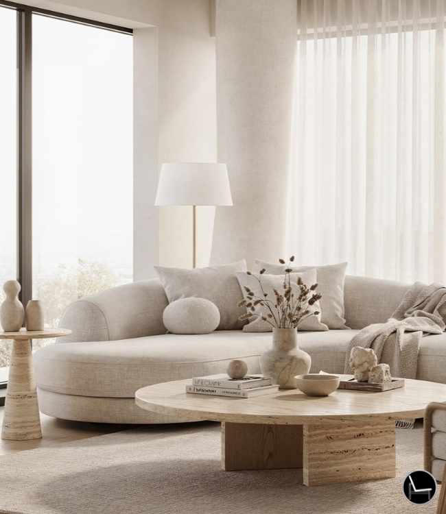
The living room lives or dies on rug size and sofa scale. Your rug should be large enough that at least the front two legs of every major seating piece sit on top of it — a rug that only the coffee table touches will always look undersized. For an average 12×15 room, that means a 9×12 rug, not the 5×7 that feels “safe.” Anchor the room with one large-scale piece (an oversized mirror, a substantial coffee table) rather than several small, matchy accessories.
Bedroom

Photo: Samantha Stathis-Lynch
Hotels look expensive because of two things: white or tonal bedding, and a headboard that visually anchors the wall. Layer a duvet, a top sheet fold, and two to three pillow sizes (standard shams, a lumbar, one accent) instead of a single flat comforter. Nightstand lamps should sit at roughly chest height when seated in bed — too short and the light glares, too tall and the proportions feel off.
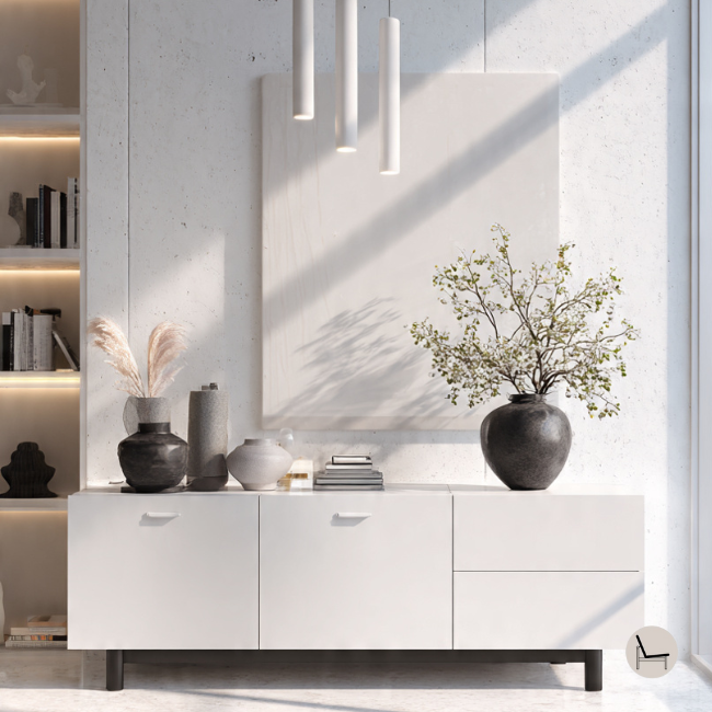
The Console (What Actually Goes On It)

Photo: Grey and Scout
This is the detail almost nobody covers, and it’s one of the fastest wins in the house. A console — entryway, behind-sofa, or media — should carry an odd number of objects (usually 3 or 5) at varying heights: one tall anchor (a lamp or large vase), one mid-height layered element (a stack of books topped with a small object), and one low, wide piece (a bowl or low sculptural object). Leave at least a third of the surface empty. A console packed edge-to-edge reads cluttered no matter how nice each individual piece is.
- Even number of same-height objects
- Surface filled edge to edge
- No height variation
- Mail, keys, and remotes left visible
- Odd number, staggered heights
- 1/3 of the surface left empty
- One tall anchor object
- Everyday clutter hidden in a tray or drawer
Lighting Strategy: The Layering Formula

Photo: James Merrell / Future
The Direct Answer: Lighting is one of the fastest, cheapest ways to make your home look expensive. Expensive-looking rooms use three layers of light — ambient, task, and accent — all set to a warm 2700K-3000K bulb temperature, with at least one source on a dimmer. A single overhead fixture, no matter how nice, can’t do this job alone.
Ambient
Overhead or ceiling-mounted fixture that lights the whole room evenly. Should be dimmable.
Task
Table lamps, desk lamps, or under-cabinet lighting placed where you actually read, work, or cook.
Accent
Sconces, picture lights, or candles that create depth and shadow instead of flat, even light.
When sizing a lamp shade or overhead fixture, oversized reads intentional and undersized reads like an afterthought — a fixture that looks “almost too big” for the space is usually correct.
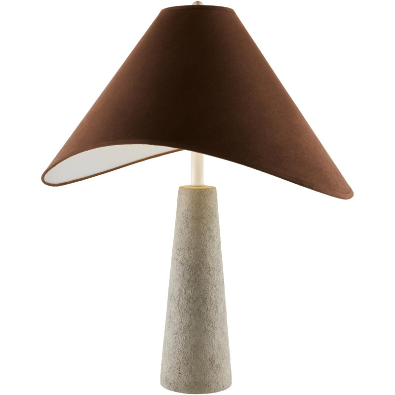
Brayden Studio Alsop Table Lamp
Solves the “one flat overhead light” problem instantly. A clean, warm-toned base and shade that layers in as a task or accent light on a nightstand or console.
My take: this is the easiest single swap in the whole guide — it does more work per dollar than almost anything else on this list.
Check Current Price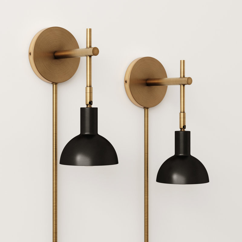
17 Stories Plug-In Armed Wall Sconce (Set of 2)
No electrician required. Adds the accent layer designers rely on for shadow and depth, especially flanking a console, bed, or media wall.
My take: this is the fixture I reach for when a room has good ambient light but still feels flat — the pair adds instant symmetry.
Check Current PriceBuy warm 2700K-3000K bulbs for every fixture in your main living spaces. Cool white (4000K+) bulbs are the fastest way to make a beautifully decorated room feel clinical and cheap.
Textiles & Soft Furnishings: The “Plump” Factor

Photo: Cullifords
The Direct Answer: Soft furnishings are an easy, affordable way to make your home look expensive without buying new furniture. Expensive-looking rooms feel dense and plush, not flat and thin. Overstuffed pillow inserts, substantial rugs, and heavy drapery fabric all signal quality the moment you look at — or sit on — them.
The Design Psychology: Volume reads as abundance. A flat, sagging pillow or a thin, floaty curtain panel signals “the cheapest option available,” even if the fabric itself is decent, because our eyes read density as quality before we ever touch anything.
Pillows: Always Size Up the Insert
A 20-inch pillow cover needs a 22-inch (or even 24-inch) insert stuffed inside it, not a matching 20-inch insert. That extra two inches is what creates the plump, slightly overstuffed corner-to-corner look designers use — a flat insert always looks deflated within a few weeks.
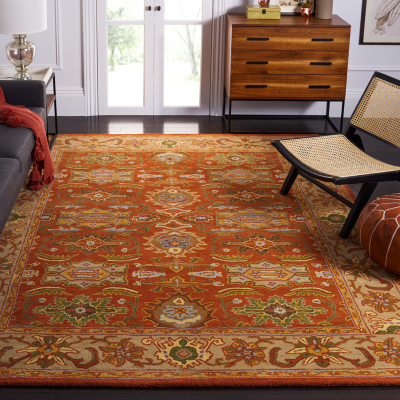
Rugs: Choose Pile and Weight Over Flat-Weave
A wool or wool-blend rug with real pile height adds visual and physical weight to a room that a thin, flat synthetic rug can’t fake, no matter how similar the pattern looks in photos. This is the one area worth spending slightly more, since it’s the largest textile surface in the room and touches everything else visually.
Drapery: Weight Matters More Than Pattern
A heavier linen or linen-blend curtain panel that breaks slightly at the floor (rather than clearing it by a few inches) reads as substantial and intentional. Thin, sheer polyester panels — even in a nice color — tend to float and read cheap no matter how well they’re hung.
Hardware & Refined Finishes: The Micro-Upgrades
The Direct Answer: Hardware is the highest-impact, lowest-cost upgrade in a home because it repeats dozens of times across cabinets, drawers, and doors — one consistent finish compounds into a completely different impression of the whole space.
The Design Psychology: A single mismatched knob is invisible. Twenty of them, all slightly different, register subconsciously as “unfinished,” even if a visitor couldn’t tell you why. Consistency is what your eye is actually responding to.
Pick One Finish and Commit
Choose a single metal finish — brushed brass, matte black, or aged bronze — and use it everywhere: cabinet pulls, door hinges, light switch plates, and faucet fixtures in the same sightline. Mixing two finishes on purpose (say, black hardware with brass lighting) can look intentional; mixing four by accident never does.
Size the Pull to the Piece
A bar pull should span roughly a third of the drawer or door’s width for the proportions to feel balanced — a pull that’s too short on a wide drawer front is one of the most common mismatched-scale mistakes in kitchens and dressers alike.
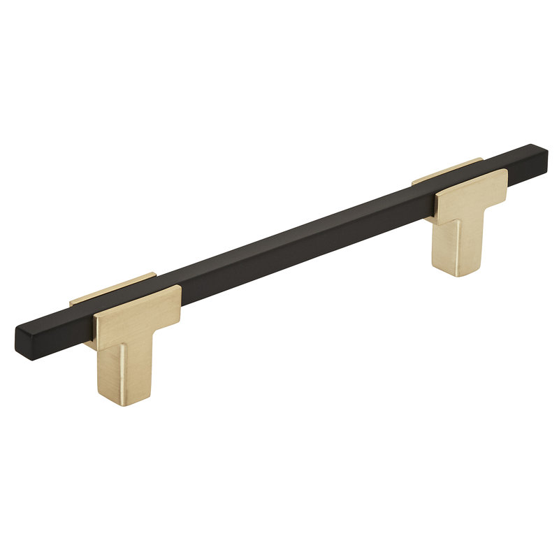
Amerock Urbanite Bar Pull
A clean, versatile bar pull that works across kitchens, dressers, and vanities without reading trendy or dated in a few years.
My take: this is the pull I reach for on builder-grade cabinets — it instantly makes flat-panel doors look custom.
Check Current Price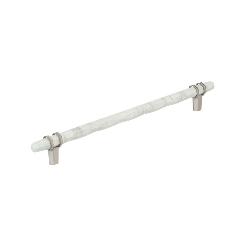
Amerock Carrione Bar Pull
A slightly more sculptural profile with a warmer finish option — the pull I’d choose when the room already leans traditional or transitional.
My take: the subtle curve catches light differently than a flat bar, which is exactly the kind of detail that reads “considered” up close.
Check Current PriceRenters: most cabinet hardware is a two-screw swap. Keep the original hardware in a labeled bag and put it back before move-out — it’s fully reversible.
Curation & The Power of Negative Space (The Edit)
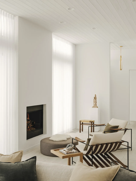
Photo: Lance Gerber
The Direct Answer: If you want to know how to make your home look expensive without buying anything else, start here: leave empty space on purpose. Restraint — not more decor — is usually the final step between a “nice” room and one that looks designed.
The Design Psychology: A room packed with objects reads as though nothing could be edited out, which subconsciously signals uncertainty or budget constraint. Deliberate empty space signals the opposite: that every remaining object earned its place.
Run the One-In, One-Out Edit
Before adding a new decor item to a shelf, console, or bookcase, remove one existing item first. This single habit stops the slow “collection creep” that turns a well-styled shelf into a cluttered one over a year of well-intentioned purchases.
Leave 20% of Every Surface Empty
Bookshelves, consoles, and coffee tables should all have roughly a fifth of their surface left visibly empty. If you’re not sure whether a surface is over-styled, take a photo — clutter is far more obvious in a photo than in person.
Edit Before You Buy, Not After
Walk through a room and identify what you’d remove before you shop for anything new. Most rooms don’t have a “not enough decor” problem — they have an editing problem, and removing three mismatched items usually does more than adding three new ones.
What NOT to Do
Avoiding these common mistakes is just as important as any tip above if you want your home to look expensive.
Do This
- Hang curtain rods 4-6 inches above the window frame
- Mix matte and warm metal finishes deliberately
- Leave a third of every surface empty
- Choose one large piece of art over a wall
Not This
- Hang curtains at the exact top of the window frame
- Mix four unrelated metal finishes in one room
- Cover every inch of a console or counter
- Hang several small, unrelated frames with no plan
Budget-Tier Quick Wins
If you want the short list instead of the full formula, here’s how to make your home look expensive sorted by what it costs.
- ◆Declutter every horizontal surface to 3-5 objects
- ◆Group console items in odd numbers, staggered heights
- ◆Raise curtain rods 4-6″ above the frame
- ◆Swap in any warm-toned bulbs you already own
- ◆Warm 2700K bulbs for every main fixture
- ◆One large, low-maintenance plant per main room
- ◆A single quality candle or reed diffuser for scent
- ◆Swap cabinet or dresser hardware to one finish
- ◆A properly sized rug (front legs of furniture on it)
- ◆A paintable picture-frame molding accent wall
- ◆One oversized mirror or piece of art at 57″ center height
- ◆Swap one plastic or laminate piece for solid wood or stone
The Designer’s Cheat Sheet
Curtain Height
Mount 4-6″ above the window frame, wide enough that panels clear the glass when open
Rug Sizing
Front legs of all seating on the rug minimum; 9×12 for most living rooms
Art Height
Center of art 57″ from the floor, or 6-8″ above furniture below it
Lighting Temp
2700K-3000K bulbs throughout main living spaces
Pillow Insert
Size insert 2″ larger than the cover for a plump, overstuffed look
Console Styling
Odd-numbered objects, 1/3 of surface left empty
Trim Sheen
Satin/eggshell walls, semi-gloss trim and doors
Hardware Pull Size
Pull length ≈ 1/3 the width of the drawer or door face
Negative Space
Leave ~20% of every shelf, console, or surface visibly empty
FAQs
Making Your Home Look Expensive Is a Formula, Not a Budget
None of this requires a renovation, and it definitely doesn’t require a designer’s budget. It requires doing things in the right order: fix the lighting first, get your scale right on rugs and curtains, edit your palette down, clear your surfaces, and then — only then — start adding the finishing details. Pick one room and one rule from this guide and start there this weekend. You’ll be surprised how far a warm bulb and a bigger rug can carry a space.
Ready to Style Like a Designer?
Grab The Designer’s SECRET Cheat Sheet for room-by-room formulas you can use today.
Get the Cheat SheetCATCH THE LATEST IN HOME DECOR TRENDS:

Steal These 16 Expert-Approved Decorating Secrets

How To Accessorize Your Living Room
How to Make a Small Room Appear Bigger

How to Make Your Home Look Expensive
GET CAUGHT UP ON ALL THE INSPIRING DECOR TIPS:

18 Fresh Decorating Ideas To Update Your Fireplace

How to Make a Gallery Wall: The Complete Step-by-Step Guide (Even If You’ve Never Hung a Picture)
