Kids Bedroom Decor: The Room-by-Room Transformation Guide
Kids bedroom decor fails when parents buy by theme rather than design by principle. This guide delivers the exact framework professional designers use: zone-based layouts, biophilic texture layering, circadian-aware lighting (2700K–4000K), and correct furniture scale — all sequenced so the room functions beautifully, looks genuinely designed, and grows with your child without a full redesign every two years.
Kids bedroom decor is one of the most emotionally loaded design challenges in the home — and one of the most commonly mishandled. You’ve bought the matching bedding set. You’ve painted the accent wall. You’ve hung their initial above the headboard. You step back, cross your arms, and think: why does it still look off?

The problem is structural, not aesthetic. Most parents approach a child’s room the way furniture retailers want them to — theme first, design never. They buy a jungle safari set, a matching curtain, a coordinating rug, and call it decorated. What they’ve created is a sensory collision: competing scales, clashing undertones, no focal point, and zero hierarchy. The room doesn’t feel like a space. It feels like a store aisle.
The emotional cost of a poorly designed bedroom is real and documented. Environmental psychology research shows that cluttered, poorly lit, or visually overwhelming rooms elevate cortisol levels in children, delay sleep onset, and reduce independent play. Your child’s bedroom is their first experience of personal space — how it’s designed shapes how they relate to their own environment, potentially for years.
This guide to kids bedroom decor is The Playbook. Not a mood board. Not a vague tips list. The same framework professionals use — specific measurements, psychological principles, and sequenced decisions that produce a room that looks designed, functions developmentally, and evolves gracefully.
Read Next 15 Best Interior Design Rules For Decorating Your HomeStep One: Zone Before You Decorate

Before choosing a single color or purchasing a single piece of furniture, divide the room into three functional zones: sleep, study, and play/creative. Every decision — furniture placement, lighting, color — must serve one of these zones. Theme is a finishing layer applied last, never the structural foundation.
The single biggest error most parents skip: skipping the spatial brief. Zone-based design is grounded in environmental behavior research showing that distinct spatial cues help children self-regulate. A child with a clearly defined study corner is measurably more likely to use it without prompting. A sleep zone with low-lux, warm-toned lighting signals the brain the day is ending. These aren’t opinions — they’re physiological facts applied to room design.
“Children’s rooms fail when every corner looks identical. Distinct zones create cognitive clarity — the brain shifts modes when it recognizes a different spatial context within the same room.” — Environmental Behavior Research, Zone-Based Design Principles
Designer Strategy — Scale & Placement
- Sleep zone: Position the bed on the longest wall with at least 24 inches of clearance on each accessible side. A twin bed floating in the center of a room loses all visual anchor.
- Study zone: Place the desk perpendicular to or directly beneath a natural light source. Natural sidelighting reduces glare more effectively than any screen filter.
- Play zone: Define it with a correctly sized area rug. In a standard 10×10 room, a 5×7 rug is the minimum to anchor a play zone — a 4×6 reads as a bath mat.
Designer Strategy — Color, Mood & Texture
- 60-30-10 per zone: 60% calm base (muted sage, warm white, soft clay), 30% supporting neutral, 10% bold accent. This prevents the “too many colors fighting for attention” syndrome.
- Avoid pure white walls. White amplifies every shadow and reads colder at night. Warm whites with a yellow or red undertone (LRV 75–85) appear bright while feeling nurturing.
- Layer textures in threes: one smooth surface (painted wall), one soft surface (rug or bedding), one tactile surface (woven basket, wood shelf). This is biophilic design at micro-scale — varied textures reduce sensory monotony and increase perceived comfort.
How to Zone a Kids’ Bedroom — Step by Step
Kids Bedroom Decor and Furniture That Grows Up

Invest in neutral, convertible, or multi-function furniture and reserve personality for soft goods and décor. A loft bed with desk integration, a tall bookcase that doubles as a room divider, and an ergonomic chair that adjusts through adolescence will outlast five rounds of character-licensed bedroom sets — and cost less in total.
The furniture trap in children’s rooms is buying for right now. A toddler bed themed around a popular franchise will feel embarrassing to a 7-year-old — and the parent who bought it will have spent three times what neutral furniture would have cost across the same period. The design-smart move: neutralize large furniture pieces and load personality into textiles, wall art, and accessories that you can swap for under $100.
Designer Rules — Scale & Placement
- The 2/3 rug-to-bed rule: The area rug should extend at least 18 inches beyond each side of the bed. For a standard twin (38″×75″), the minimum rug size is 5×8. Anything smaller creates the visual effect of furniture floating on islands.
- Art at 57 inches on center: Even in a child’s room, art hung at standard adult eye height (57″ from floor to the art’s center) looks intentional. Hanging it at a child’s eye level creates a basement effect — everything feels sunken.
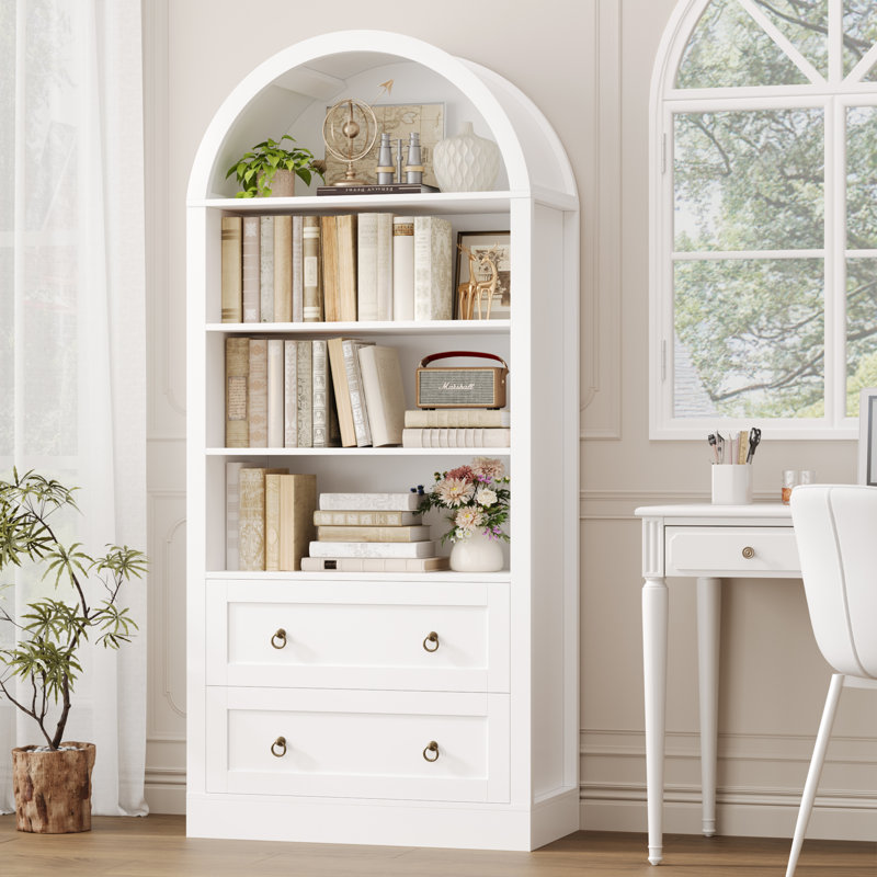
- Bookcase as architecture: A tall or arched bookcase at the room’s entry creates a visual gateway before you’ve spent anything else. Architectural weight, not just storage.
| Item | Budget Option | Designer Pick | Why It Matters |
|---|---|---|---|
| Bed Frame | Loft bed with desk, $300–500 | Solid wood daybed, $800–1,400 | Multi-function saves floor space in rooms under 120 sq ft |
| Area Rug | Low-pile patterned, $80–150 | Wool flatweave, $350–600 | Natural fiber adds warmth; low pile is easier to clean |
| Desk | Adjustable height, $120–200 | Built-in with hutch, $600–1,200 | Adjustable desks grow with the child; built-ins maximize vertical storage |
| Lighting | LED strip + clip lamp, $40–80 | Dimmable pendant + sconce, $200–450 | Layered lighting is the single highest-impact upgrade per dollar |
| Wall Decor | Peel-and-stick + prints, $60–120 | Custom mural, $500–2,000 | Peel-and-stick is renter-friendly; murals create irreplaceable atmosphere |
Lighting: The Invisible Designer

A child’s bedroom needs minimum three light sources at different Kelvin temperatures: a warm ambient overhead (2700K–3000K) for wind-down, a neutral task light (4000K) for homework, and a soft nightlight (1800–2200K) for overnight. Single-overhead-fixture rooms are the most common lighting failure in children’s spaces.
Lighting is where 90% of kids’ bedrooms fail silently. A single 5000K flush-mount washes the room in flat, blue-white light that designers call “hospital lighting.” It’s not just aesthetically wrong — it’s physiologically harmful. High-Kelvin overhead lighting in the hour before bed suppresses melatonin production in children, delaying sleep onset by up to 40 minutes according to pediatric sleep research.
For every bright task light in the room, provide three surrounding ambient sources at lower intensity. This 3:1 ratio creates visual focus without sensory overload — and prevents the “interrogation room” effect of a single bright light in darkness.
Color Psychology: Design the Mood First

Choose your room’s dominant mood before choosing a color. Energizing creativity, calm restfulness, and focused study each require a different color temperature, saturation level, and distribution. Trying to achieve all three with a “colorful” approach produces a space that serves none of them.
Applying Color Like a Designer
- Paint one accent wall, not all four. Full-room color in a child’s bedroom amplifies energy and makes wind-down physiologically harder. A single bold wall behind the bed provides drama without the sensory overload.
- Use peel-and-stick for renters or commitment-phobes. Modern peel-and-stick quality rivals traditional wallpaper at a fraction of the cost, zero wall damage — ideal when tastes change annually.
- Match soft goods to your accent wall, not your base wall. Bedding and curtains that draw from the accent color create visual cohesion that makes the room feel designed even without a designer.
- Full-room themed wallpaper in primary colors
- Matching themed bedding, curtains, and rug
- Single 5000K overhead light fixture
- 4×6 rug under a twin bed
- Art hung at child’s eye level
- No defined zones
- One accent wall (peel-and-stick or paint)
- Neutral furniture; bold personality in bedding
- Three-source layered lighting, 2700K–4000K
- 5×8 rug extending 18″ beyond the bed
- Gallery wall at 57″ on center
- Sleep, study, and play zones clearly defined
The 5 Invisible Killers of Kids bedroom Decor

These are the problems nobody names but every parent feels. You’ve done “everything right” and the room still looks wrong. Here’s the designer diagnostic — and the fix for each.
-
01
Floating Furniture Syndrome Furniture with no visual conversation between pieces — looks like a showroom floor. Fix: Group by function. Bed, nightstand, and wall sconce within 18″ of each other. Clusters should feel intentional.
-
02
The Rug That’s Too Small A 4×6 in a room with a twin bed and full-size desk reads as a bath mat. Fix: Minimum 5×8 for a twin in a 10×10 room. When in doubt, go one size larger than feels necessary.
-
03
Hospital Overhead Lighting A single 5000K flush-mount as the only light source — clinically flat and sleep-disruptive. Fix: Replace with a 2700K dimmable bulb and add one warm lamp. Layered light produces depth that no single fixture achieves.
-
04
The Theme-Over-Design Trap Every item in one motif — visually exhausting and obsolete within 12 months. Fix: Limit themed items to two or three soft goods. Keep all structural pieces neutral. The theme can evolve; the furniture doesn’t need to.
-
05
Clutter Without Containment No storage built into the design — the room is messy by design, not by the child. Fix: Build storage into every zone. Loft bed drawers, labeled bins, poufs with internal storage. Frictionless systems get used.
Furniture Clearance: The Numbers No One Gives You
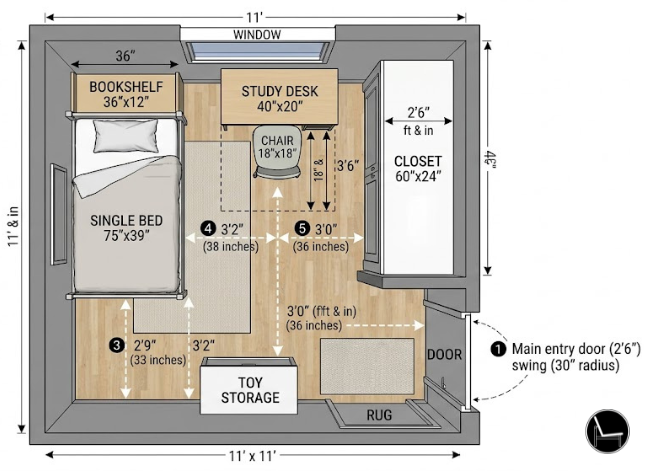
The most important element when decorating a kids bedroom is: the actual measurements. Here are the clearances every children’s room designer works from — non-negotiable regardless of style or budget.
| Measurement | Minimum | Recommended | Designer Note |
|---|---|---|---|
| Bed walkway (accessible sides) | 24″ | 30″ | Allows bedmaking without contortion |
| Desk chair pull-out | 36″ | 42″ | Clearance behind fully extended chair |
| Closet door swing (bifold) | 24″ | 24″ | Never block with foot-of-bed furniture |
| Closet door swing (hinged) | 30″ | 36″ | Allow full arc clearance |
| Rug extension beyond bed | 18″ | 24–30″ | Feet must land on rug when waking |
| Art center height | 57″ from floor | 57–60″ | Adult eye-level — even in kids’ rooms |
| Play zone rug (10×10 room) | 4×6 | 5×7 or 6×9 | Defines zone without crowding circulation |
| Desk height (child) | 22″ (ages 4–6) | Adjustable 22″–30″ | Elbows at 90° when seated |
Free Patio Style Quiz
Not sure where to start with your outdoor spaces? Take our free 2-minute quiz and get a personalized design direction — product picks included.
Take the Free Quiz →The Designer’s Shopping List
Every product below was chosen for function, correct scale, and design neutrality — the criteria a professional uses, not the criteria of a sponsored post. These are affiliate links that support this site at no extra cost to you.


Age-by-Age Design Guide: Decorate Once, Adapt Forever

The biggest waste of money in kids’ bedroom design is re-decorating every three years. The solution: buy for the next stage, not the current one. A 4-year-old in a room designed for a 4-year-old will need a full redesign by 7. A room designed around neutral structure with flexible personality layers adapts without touching the furniture.
| Age Stage | Design Priority | Key Furniture | What to Avoid |
|---|---|---|---|
| Toddler (2–4) | Safety + sensory stimulation | Low floor bed, open bins, soft rug | Tall furniture without anchoring, sharp corners, themed sets |
| Early Childhood (5–7) | Play zone definition + reading nook | Loft or bunk bed, bookcase, small desk | Character-licensed furniture, fixed-height desks |
| Middle Childhood (8–11) | Study zone dominance + privacy beginning | Ergonomic chair, adjustable desk, task lighting | Childish motifs, low-lux study lighting, open toy storage |
| Tween (12–14) | Identity expression + study performance | Full-size bed, desk with monitor riser, dimmable lighting | Overly “designed” rooms — involve them in every decision |
| Teen (15+) | Privacy, focus, and self-regulation | Full bed, blackout curtains, layered lighting, sound absorption | Treating it as a “kids’ room” — design it like a young adult’s space |
At every stage, keep the same rule: neutral walls, neutral furniture, flexible storage. Swap out bedding, art, and accessories to track the child’s evolving identity. This approach costs about 20% of a full room redesign — and delivers 100% of the emotional satisfaction.
Small Kids’ Bedroom Layouts: Designer Strategies for Tight Spaces

In rooms under 100 square feet, the design rules don’t change — the sequence of decisions does. Vertical thinking, multi-function furniture, and mirror placement are not stylistic choices in small rooms. They are structural requirements. A room that feels small is almost always a room where floor space is over-consumed and vertical space is ignored.
The most common small-room mistake: choosing furniture for the room size instead of the room’s function. A tiny desk in a tiny room still needs 42 inches of clearance behind the chair. A small rug in a small room still looks like a bath mat. The dimensions don’t shrink — only the floor plan requires more creative sequencing.
Small Room Strategies — The Designer Toolkit
- Go vertical with storage. Wall-mounted shelves, a tall arched bookcase, and over-door organizers recover storage space without consuming any floor area. The goal: zero freestanding storage units below 48 inches in a room under 100 sq ft.
- Use a loft bed. A loft bed with a desk beneath turns one footprint into two functional zones. In a 10×10 room, this single decision can free 25–35 square feet of usable floor space.
- Place a mirror on the wall opposite the window. A full-length or oversized mirror on the wall directly opposite the primary window doubles perceived natural light and makes the room read as visually larger. This is not a trick — it’s optics.
- Use one large rug, not several small ones. A single 5×7 rug in a small room creates visual continuity that makes the space feel larger. Two or three small rugs fragment the floor plan and make the room feel cluttered even when it isn’t.
- Keep the ceiling light. A dark or saturated ceiling lowers the perceived height of any room. A ceiling in the same color as the walls, or slightly lighter, reads as taller — especially important in rooms under 8 feet.
- Choose furniture with legs. Furniture that sits directly on the floor blocks sightlines and makes the room feel heavier. Furniture with visible legs allows the eye to travel under the piece, creating depth and perceived spaciousness.
“In a small room, every piece of furniture is making a decision about the floor. Make sure each decision is the right one — multi-function first, single-purpose only when essential.” — Small Space Design PrincipleRelated Reading Modular Sofas for Small Spaces: Brilliant Solutions for Compact Living
Shared Kids Bedroom Decor Two Children, One Room, Zero Compromise

A shared children’s bedroom works when each child has a clearly defined personal territory within the shared space. The design goal is not to split the room in half visually — it’s to create two distinct micro-environments that coexist without competing. Color, furniture placement, and personal storage are the three tools that make this possible.
Shared rooms fail when parents try to make everything match. Two children with different ages, genders, or temperaments do not want the same room — they want their own corner of the same room. The designer’s job is to honor both without creating visual chaos.
The Zoning Approach for Shared Rooms
- Use a bookcase or curtain as a room divider. A tall bookcase placed perpendicular to the wall — accessible from both sides — creates physical territory while providing storage for both children. A ceiling-mounted curtain track achieves the same separation with more flexibility.
- Give each child one accent wall. In a room with two beds on opposite walls, each child’s accent wall (behind their bed) can differ in color or wallpaper — creating distinct zones without needing two different rooms.
- Assign independent storage by zone. Each child should have their own labeled bins, drawers, and shelf sections within the shared storage system. Shared storage with no assigned territory is the number-one source of shared-room conflict.
- Use bunk beds only when floor space demands it. Bunk beds solve a floor space problem but create a privacy problem. If the room is large enough for two twin beds on opposite walls, the privacy and developmental benefits of separate sleeping surfaces almost always outweigh the floor space savings.
- Maintain a shared neutral base. The room’s base color, rug, and overhead lighting should be shared and neutral. Personal territory is expressed through bedding, art, and accessories — not through competing wall colors that turn the room into two visual arguments.
- Everything matching — no personal territory
- Competing wall colors on all four walls
- Shared storage with no assignment system
- Bunk beds as default, not as deliberate choice
- No visual divider between sleep zones
- Neutral shared base; personal accent per child
- One accent wall per bed, independently chosen
- Labeled, assigned storage within a shared system
- Bookcase or curtain divider creating territory
- Unified rug and lighting; individual bedding
Renter-Friendly Kids’ Bedroom Decor: Full Designer Impact, Zero Wall Damage

Renters have access to 90% of the same design tools as homeowners. The 10% they can’t use — paint and permanent fixtures — can be replicated with peel-and-stick wallpaper, removable wall strips, freestanding furniture, and clip-on or plug-in lighting. The constraint is not the lease — it’s knowing which tools to use.
The Renter’s Design Toolkit — Room by Room
- Peel-and-stick wallpaper on one accent wall behind the bed. Modern versions are fully removable, damage-free, and available in every pattern from botanical to geometric. Apply to one wall only — full-room application creates visual noise and risks adhesive residue.
- Removable wall art strips (Command Strips or equivalent) for all wall-hung items. Apply strips to the back of frames, not directly to the wall, and always test on a hidden surface first. Never exceed the weight rating — a 5lb picture on a 3lb strip will eventually leave a mark.
- Plug-in wall sconces in place of hardwired bedside lighting. Cord covers in matching wall color hide the cable. This single swap adds the bedside lighting layer that transforms a room from functional to designed.
- Freestanding room dividers in place of built-ins or ceiling tracks. A tall bookcase, a tri-fold screen, or a curtain rod with floor-to-ceiling tension mounts creates zone separation without touching the ceiling.
- Removable mirror adhesive for full-length or oversized mirrors. Placed opposite a window, a large mirror adds light and depth — two of the most impactful interventions in any room — with zero permanent installation.
Invest in this sequence: rug → bedding → removable wallpaper → plug-in lighting → art. These five categories produce 80% of a room’s visual transformation and require zero permission from a landlord. Everything else is refinement.
The High-Performance Study Corner: Designing for Focus, Not Just Function
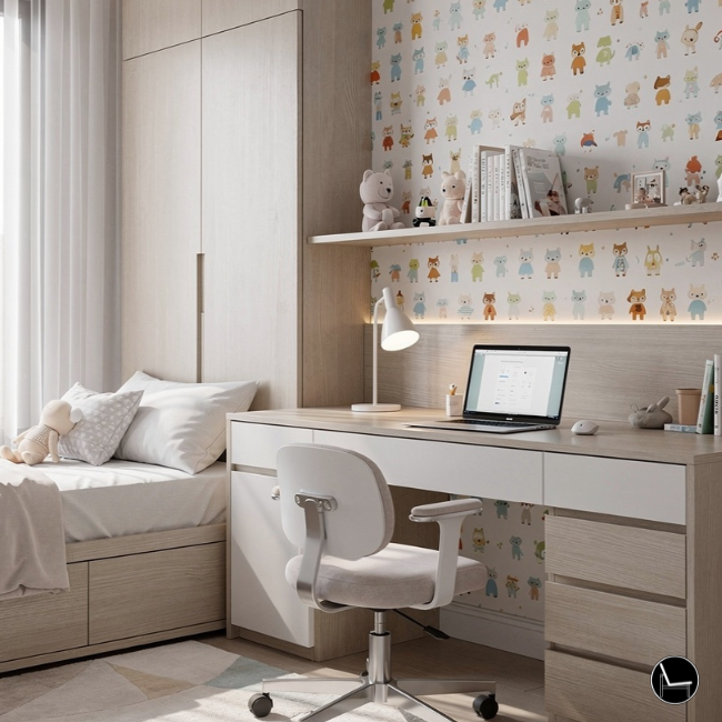
A study corner that actually gets used has three non-negotiables: correct ergonomic sizing (desk height, chair height, monitor distance), appropriate task lighting (4000K, positioned to the non-dominant side), and a clear visual signal that this is a work zone — not a general surface. The design of the space is what creates the habit of using it.
Most study corners in children’s bedrooms fail not because of poor furniture choices, but because of poor environmental design. A desk pushed into a corner with no task lighting, a chair at the wrong height, and a surface that doubles as a craft table and toy dump will never function as a study zone — regardless of how much was spent on it.
Study Corner Checklist — Designer Standard
- Desk height: Child’s elbows at 90° when seated, forearms parallel to the desk surface. For most children aged 5–8, this is 22–24 inches. Ages 9–12: 24–27 inches. An adjustable desk eliminates the guesswork entirely.
- Chair height: Feet flat on the floor, knees at 90°, back supported by the lumbar rest. A chair that’s even 2 inches too high causes shoulder tension within 20 minutes of seated work — a significant contributor to homework avoidance.
- Task lighting position: Lamp on the non-dominant side (left side for right-handed children) aimed at the work surface, not the face. This eliminates hand-cast shadows and reduces eye strain by up to 60% compared to overhead-only lighting.
- Monitor or screen distance: Screen at arm’s length (approximately 20–24 inches) at or slightly below eye level. A monitor riser or adjustable arm prevents the forward head posture that leads to neck pain during extended study sessions.
- Visual containment: A small corkboard, magnetic board, or wall-mounted organizer directly above the desk contains the “study zone” visually and gives the child a designated place for reminders, schedules, and current work — keeping the desk surface clear.
- Zone isolation: The study corner should face away from the play zone where possible. Visual access to toys during study time is a documented distractor. A simple bookcase positioned between the zones creates the necessary visual break.
“The best homework setup is one the child walks toward willingly. Ergonomics builds the physical comfort; design builds the psychological permission to sit down and begin.” — Ergonomic Design Principle, Children’s Study EnvironmentsRelated Reading Create Your Perfect Ergonomic Home Office: A Complete Guide
Not Sure What Style Fits Your Child’s Room?
Take our free Interior Design Style Quiz — two minutes, personalized direction, and curated product ideas for the style that actually fits your home.
Take the Style Quiz →The Designer Sequence in Five Principles
Zone first, theme last. Anchor with neutral furniture, then load personality into soft goods. Measure before you buy — rug sizes and clearances are load-bearing design decisions, not suggestions. Layer your light with intent, not afterthought. And remember: a room designed around your child’s developmental needs will outlast any trend, any theme, and any retailer’s seasonal collection.
The difference between a room that “looks nice” and one that feels designed is sequencing — not budget. Get the sequence right: zones → furniture scale → color → lighting → accessories → personality. Every product and principle in this guide serves that sequence. Start with one zone. Build deliberately from there.
Read Next Modern Organic Interior Design: The Ultimate 2026 Guide Take the Quiz Interior Design Style Quiz — Find Your Signature Style Read Next Interior Design Photography Hack: Make Your Home Look Better in PhotosKids Bedroom Decor Ideas – Frequently Asked Questions
CATCH THE LATEST IN HOME DECOR TRENDS:

Steal These 16 Expert-Approved Decorating Secrets

How To Accessorize Your Living Room

Small Space? 10 Ways To Make A Room Appear Bigger

Make Your space Look Expensive
GET CAUGHT UP ON ALL THE INSPIRING DECOR TIPS:

18 Fresh Decorating Ideas To Update Your Fireplace

How to Make a Gallery Wall: The Complete Step-by-Step Guide (Even If You’ve Never Hung a Picture)
