Gallery Wall Layout Guide: The Designer Blueprint That Actually Works
A successful gallery wall layout starts with a clear anchor point (center at 57 inches from the floor), a cohesive set of frames laid out on the floor first, and 2–3 inch spacing between pieces. Choose a layout style—grid, salon, or asymmetric cluster—that matches your wall size and personality, then hang the largest piece first and build outward. This gallery wall layout guide covers every step, mistake, and fix.
Gallery wall layout guide — you searched for it because something went wrong. Or because you’re terrified something will. Maybe you’ve been staring at a bare wall for six months because every time you think about committing, you freeze. Maybe you actually tried, and it looked… off. Not Pinterest-off. Just wrong in a way you couldn’t name.

Here’s what most guides won’t tell you: that queasy feeling is completely normal, and it has a fixable cause. Gallery walls fail for three specific reasons — wrong scale, ignored sightlines, and frames chosen in isolation rather than as a system. Fix those three things and your wall goes from “I tried” to “Did you hire someone?”
This isn’t a list of pretty pictures. It’s a working blueprint — the same process designers use before a single nail goes in. By the end, you’ll know exactly what to hang, where to hang it, and why it will look intentional instead of accidental.
What Is a Gallery Wall Layout (and Why Most Fail)?
A gallery wall layout is a curated arrangement of framed art, photography, objects, or prints grouped on a single wall to create a unified visual statement. Done right, it’s the most personal and impactful thing you can do to a room. Done wrong, it looks like a yard sale exploded.
The reason most gallery walls fail isn’t taste — it’s process. People start from the wrong end: they pick frames they love, buy them in random sizes, and then try to make them fit a wall. Designers do the opposite. They start with the wall, define a shape, then select pieces that fill it.
“The secret to a gallery wall layout that looks ‘effortless’ is that nothing about it is effortless. Every piece is auditioned. Every gap is measured. The spontaneity is staged.” — Nate Berkus, Interior Designer
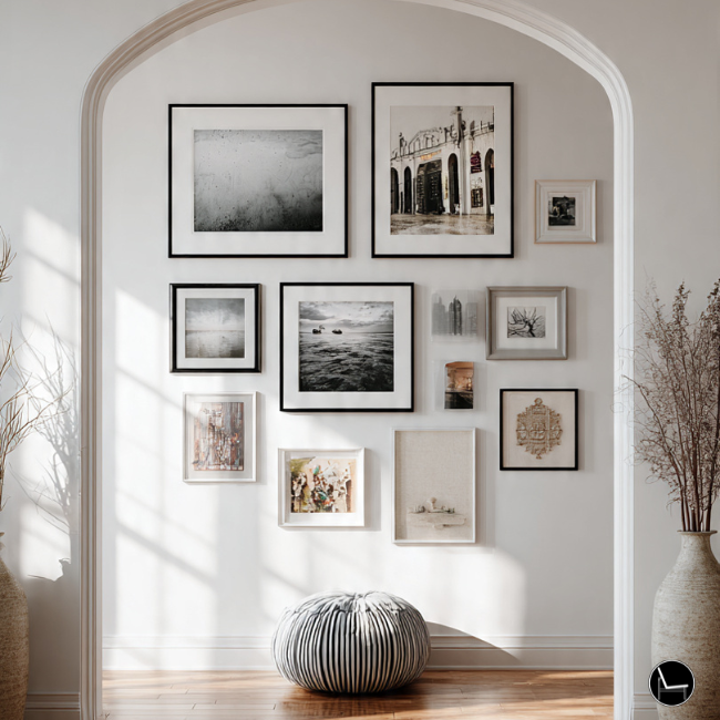
The Three Root Causes of a Bad Gallery Wall Layout
- No anchor frame. Without one dominant piece to organize the gallery wall layout, the eye doesn’t know where to start. Everything competes. Nothing wins.
- Inconsistent spacing. Gaps that vary between 1 and 6 inches make a wall look unfinished. Pick a spacing (2–3 inches) and commit to it everywhere.
- Wrong height hang. If the center of your arrangement isn’t near 57–60 inches from the floor, it will feel either floating or crowded depending on your ceiling height.
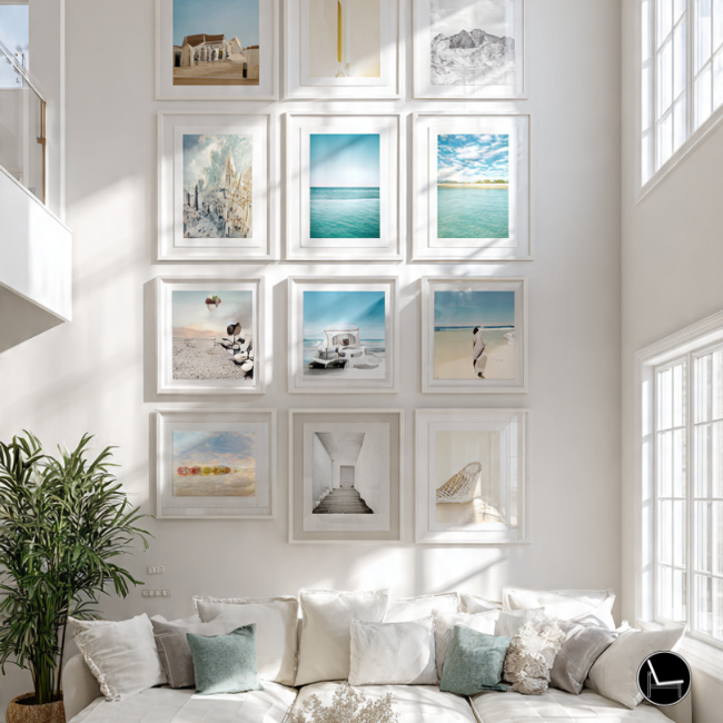
| Layout Style | Best For | Frame Count | Skill Level | Risk Level |
|---|---|---|---|---|
| Symmetric Grid | Clean, modern interiors Same-size frames in rows |
4–12 | Beginner | Low |
| Salon / Eclectic | High ceilings, bold personalities Mixed sizes, floor to ceiling |
10–25+ | Intermediate | Medium |
| Asymmetric Cluster | Most homes, most walls Mixed sizes, anchored cluster |
5–15 | Intermediate | Medium |
| Linear / Row | Hallways, above furniture Single horizontal or vertical row |
3–7 | Beginner | Low |
| Staircase Diagonal | Stairwells, tall narrow walls Follows the stair angle |
5–10 | Advanced | High |
 Dive deeper with this step-by-step guide on:
Renter-Friendly Wall Decor: The $500 Mistake 87% of Renters Make (And How to Avoid It)
Dive deeper with this step-by-step guide on:
Renter-Friendly Wall Decor: The $500 Mistake 87% of Renters Make (And How to Avoid It)
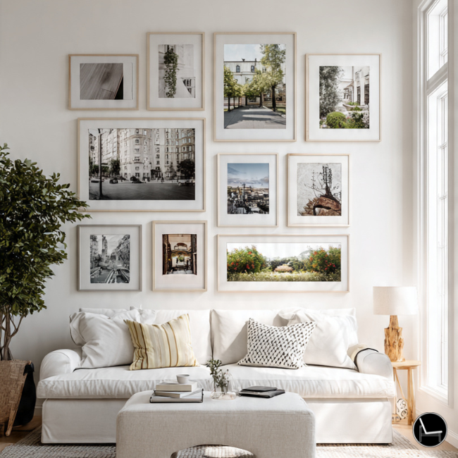
How to Plan a Gallery Wall Layout: Step-by-Step
Planning your gallery wall layout on paper (or floor) before touching your walls is the single biggest thing that separates a designer-level gallery wall from a regret wall. Here’s the exact sequence.
If your floor layout doesn’t look good, your wall won’t either. The floor is free real estate for decision-making. Spend 30 minutes there and save yourself three rounds of spackle.
Designer Strategy: Scale, Spacing & Placement Rules

This is where most tutorials skip straight to the aesthetics and leave you with nothing actionable. Spacing and scale are math problems — and once you know the formulas, the guesswork disappears.
The 57-Inch Rule
Museum curators hang art so its center sits at 57–60 inches from the floor — roughly average eye level. For gallery walls, this applies to the optical center of the entire arrangement, not individual pieces. For low-slung furniture (sofas under 32 inches), hang slightly lower. For dramatic high-ceiling rooms, 60 inches works better.
The 2/3 Rule for Furniture
Art above furniture should span 2/3 the width of the piece beneath it. A 90-inch sofa needs an arrangement roughly 60 inches wide. Narrower looks lonely. Wider looks chaotic. This rule applies whether you’re hanging one large print or an entire cluster.
Spacing Formulas That Actually Work
- Frame to frame: 2–3 inches for cohesion, 4–6 inches for a more relaxed feel. Never less than 1.5 inches or greater than 8 inches in the same arrangement.
- Top of arrangement to ceiling: At least 12–14 inches for standard 8-foot ceilings. More breathing room = more intentional.
- Bottom of arrangement to furniture: 6–8 inches minimum. Less than this and the art looks like it’s sitting on the sofa.
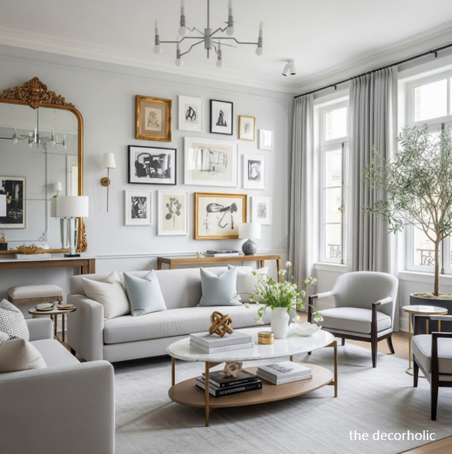
Color, Mood & Texture: The Invisible Architecture of a Great Gallery Wall Layout
The pieces you choose matter less than how they relate to each other. Two technically “beautiful” prints can clash horribly. Three average photographs can look stunning if they share a tonal language. This is what most people miss, and it’s exactly what makes the difference between a gallery wall layout that looks curated and one that looks collected.
Building a Tonal System
Before buying anything new, identify the dominant colors in your existing pieces and your room. A successful gallery wall layout usually works within 2–3 tonal families: warm neutrals (cream, sand, terracotta), cool neutrals (slate, sage, dusty blue), or a single saturated accent repeated across multiple pieces. The frames themselves are part of this color story — mixing black, gold, natural wood, and white frames only works if it’s intentional, and even then, use no more than two finish families.
- Warm rooms (hardwood floors, linen, terracotta): lean into natural wood frames, cream mattes, and art with amber or earth tones.
- Cool rooms (concrete, marble, white walls): black frames, white mattes, photography, and graphic prints hold the mood without competing.
- Mixed rooms: use matte consistency (all white mattes or all image-flush) as the unifying thread, even when frames vary.
Texture as a Design Layer
Texture is often the difference between a gallery wall that feels flat and one that feels alive. Mixing a canvas print (matte, soft) with a framed photograph (glossy, crisp) and a small shelf holding a sculptural object introduces tactile variety that photographs can’t replicate. In 2026, leading designers are actively mixing flat art with dimensional objects — woven textile art, small ceramic wall pieces, dried botanical stems in thin frames — creating gallery walls that have depth, not just breadth.
Keep reading for a designer-approved guide to: The Best Performance Fabric Sofas for Real Life (Kids, Pets & Spills Welcome)Real-Life Fixes: Awkward Walls, TVs, Renters & “Why Does It Still Look Off?”
The scenarios no design blog addresses because they’re messy. Let’s fix them.
The Gallery Wall Around (or Near) a TV
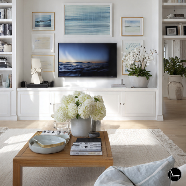
The TV problem is real. Your options: treat the TV as a functional black rectangle and build the gallery wall beside it (not around it), or commit to centering the TV in the arrangement and treating it like an oversized dark print. If you go the second route, the surrounding frames need to be minimal — black or dark wood, subjects with dark backgrounds — so the TV doesn’t read as a glaring intruder. Never hang art directly above a TV at the standard height; the heat damages prints and forces awkward viewing angles.
Renter-Friendly Gallery Walls
Command strips have graduated from “will it hold?” to genuinely reliable — with caveats. 3M Command Large Picture Hanging Strips hold 16 lbs per pair when applied correctly to clean, dry, properly primed walls. The application process matters: 60-second press, one-hour wait, overnight cure. For heavier pieces, use two pairs in a cross configuration. On textured walls (orange peel, knockdown), adhesive performance drops significantly — use Monkey Hooks or Brick Clips instead.
- Leaning arrangements: A shallow console or dresser with frames leaned at varying heights works as a gallery wall alternative with zero holes.
- Picture ledges (RIBBA-style): Two or three staggered ledges let you rearrange constantly without rehooking. One anchor screw per 30 inches of ledge — that’s what holds.
- Removable wallpaper panels: A single peel-and-stick textured panel as a backdrop elevates the whole arrangement and hides existing nail holes.
The “It Still Looks Off” Diagnosis
You followed the rules and it’s still not working. Here’s the checklist:
- Is there one obvious anchor piece, or are all the frames roughly the same size? (No anchor = no hierarchy = chaos.)
- Do any two adjacent frames share a horizontal or vertical edge? (Aligning at least one edge between neighbors creates structure.)
- Are you viewing from too close? Step back to at least 12 feet. Gallery walls read from a distance, not from 3 feet away.
- Is the arrangement hugging the ceiling, floating in the middle, or too close to an adjacent wall? (Isolation on all sides reads as unfinished.)
- Are the mattes mismatched? An off-white matte next to a stark white matte is louder than you think. Unify or go matless.
-
✕
Hanging everything at the same height Fix: Vary frame heights by at least 4–6 inches. The visual movement between high and low creates energy.
-
✕
All frames the same size Fix: Introduce at least one piece that is 2× the area of the others. Variety in scale creates hierarchy.
-
✕
Centering on the wall instead of centering the arrangement Fix: The optical center of your cluster should be at 57–60 inches. The edges don’t need to be equidistant from the wall’s corners.
-
✕
Four or more different frame finishes Fix: Choose a maximum of two frame finish families. Mix them deliberately — not by default.
-
✕
Tight, crowded spacing everywhere Fix: Keep spacing consistent at 2–3 inches. Tight groupings read as intentional; inconsistent spacing reads as amateur.
-
✕
Starting from a corner and working inward Fix: Always hang the anchor piece first, then build outward in all directions. Corners are the last things hung, not the first.
The Vibe Check: Match Your Layout to Your Personality
No layout style is objectively better than another. But the wrong layout for your personality will always feel like work to maintain. Here’s a fast self-assessment.
2026 Gallery Wall Trends Worth Knowing
Trend forecasting in interior design is genuinely useful — not because you need to follow trends, but because understanding them helps you understand why your current wall might feel slightly dated.
Identity Decor
The biggest shift in gallery walls right now is personalization over performance. In 2022–2024, people curated walls to impress guests. In 2026, the dominant impulse is to impress yourself. Personal photographs are back — not as snapshots, but printed at significant scale, framed properly, and given genuine visual weight alongside purchased art. A wall of 8×10 family prints in matching simple frames is having a real moment.
Organic Modern Framing
Chunky natural wood frames in oak, walnut, and cerused finishes are replacing the all-black-frame dominance of 2020–2023. The aesthetic is warm but architectural — think frames with visible grain and some visual weight, not thin metal or plastic. Paired with abstract, organic shapes in the art itself, the result feels grounded and handmade in a way that clicks with where interiors are heading.
Tactile Layering
Flat gallery walls are giving way to arrangements with dimension. Woven wall hangings, bas-relief ceramic pieces, small sculptural shelves holding single objects — these break up the predictability of framed-print-only walls and add sensory interest that reads very differently in person than in photographs. If your wall looks great in photos but feels flat in person, this is your solution.
Dive deeper with this step-by-step guide on: Swivel Chairs Ultimate Guide: How to Choose & Style the Perfect One for Your HomeBefore & After: What Changes When You Apply the Blueprint
- Frames bought individually over time
- Hung one at a time without a plan
- Variable spacing, 1–7 inches
- Hung at eye level of the art, not the arrangement
- Four different frame finishes
- All frames roughly the same size
- Started hanging from the left corner
- Frames selected as a system
- Full floor layout before a single nail
- Consistent 2.5-inch gaps throughout
- Optical center at 58 inches from floor
- Two frame finishes max
- One anchor at 2× the scale of others
- Hung anchor first, built outward
What You Actually Need to Buy (And What You Don’t)
Gallery wall budgets spiral because people buy reactively. Here’s the short list of things that genuinely matter versus things you can skip.


Spend money on the anchor piece and the hardware. Save money on the supporting frames. One $200 print surrounded by $20 frames looks more intentional than six $80 frames with filler prints. Invest in the hero; support it with basics.
The Honest Truth About Gallery Walls
The difference between the walls that stop you mid-conversation and the ones that disappear into the background is not money, taste, or talent. It’s sequencing. Plan before you hang. Anchor before you spread. Commit to a system before you buy a single frame.
The blueprint you’ve read here is the same process that takes designers 20 years to develop by trial, error, and a lot of expensive mistakes. It boils down to: define your zone, choose your layout, lay it on the floor, find your anchor, mark your center, template before nailing, and hang from the inside out.
You have everything you need. The wall has been waiting long enough.
Ready To Discover Your Decor Color Palette?
Your perfect room starts with the right color story. In 60 seconds, discover the palette that matches your mood, your light, and your life — then shop a curated edit built around it.
Take Free Color Palette Quiz!Frequently Asked Questions
Most well-balanced gallery walls have 5–12 pieces. Fewer than 5 reads more as a vignette than a gallery wall; more than 15 becomes hard to manage cohesively for most walls. Odd numbers (5, 7, 9) tend to look more dynamic and organic than even groupings. Start smaller than you think — you can always add.
An asymmetric cluster or horizontal linear arrangement works best above a sofa. The arrangement should span about 2/3 the sofa’s width, hang 6–8 inches above the top cushions, and center optically at 57–60 inches from the floor. A single large-anchor piece flanked by 2–4 smaller pieces is the most reliable approach for this space.
3M Command Large Picture Strips are the most reliable no-hole option for frames under 16 lbs. For lighter pieces on textured walls, Monkey Hooks thread into drywall with no damage. Picture ledges (one anchor screw each) offer the most flexibility — you can build an entire gallery wall look with minimal wall contact and swap pieces whenever you want.
They don’t need to match, but they should relate. The safest approach is matching frames with varied art. The more interesting approach is a maximum of two frame finish families (e.g., black and natural wood) used deliberately. What never works: four or more different finishes selected randomly. The frames form the visual grid of your arrangement — when they’re chaotic, the whole wall feels chaotic.
CATCH THE LATEST IN HOME DECOR TRENDS:

Steal These 16 Expert-Approved Decorating Secrets

How To Accessorize Your Living Room
How to Make a Small Room Appear Bigger

How to Make Your Home Look Expensive
GET CAUGHT UP ON ALL THE INSPIRING DECOR TIPS:

18 Fresh Decorating Ideas To Update Your Fireplace

How to Make a Gallery Wall: The Complete Step-by-Step Guide (Even If You’ve Never Hung a Picture)
