Choosing a timeless paint color shouldn’t feel like gambling with your home’s future. Picture this: you spend weeks agonizing over the perfect shade, drop hundreds on premium paint, and recruit friends for a weekend painting marathon. Fast forward eighteen months, and that “must-have” color from Instagram already looks tired and dated.
Sound familiar? You’re not the only one in this decorating dilemma.

Here’s the thing about paint trends—they’re designed to come and go quickly. That sage green taking over Pinterest? The warm terracotta everyone’s obsessing over? They’ll be tomorrow’s decorating regrets faster than you can say “accent wall.” Meanwhile, you’re left staring at walls that scream “2024” instead of “timeless elegance.”
But what if you could skip the trend cycle entirely? What if you could choose colors so beautifully enduring that they’ll look as fresh and sophisticated in twenty years as they do today? Colors that work with any decor style, in any lighting, and never make you cringe when you flip through old photos.
That’s exactly what we’re diving into today. This isn’t about boring beige or playing it safe. This is about discovering the sophisticated science behind colors that stand the test of time. You’ll learn which specific shades interior designers reach for again and again, why certain colors never go out of style, and how to create a cohesive palette that grows more beautiful with age.
Ready to make paint choices you’ll still love decades from now? Let’s unlock the secrets of the forever home palette.
I. What are timeless paint colors?

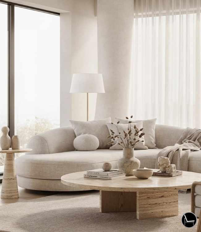
“Timeless” paint colors aren’t just safe or boring. They’re like that classic trench coat in your wardrobe – always chic, always in style. Unlike fleeting trends, timeless hues have special qualities that keep them looking fresh and sophisticated for decades.
Here’s what makes a color truly timeless:
- Super Versatile: These colors are chameleons! They effortlessly blend with any decorating style, from modern to farmhouse, letting your furniture and art truly shine.
- Adapts to Light: A timeless color looks beautiful all day, every day. Its subtle depth keeps it from looking flat or “off” as the light changes.
- Naturally Appealing: Inspired by nature – think soft greens, sky blues, and earthy browns – these colors evoke a sense of calm and stability that everyone loves.
- Quietly Elegant: They offer peace and warmth without screaming for attention. They’re a sophisticated backdrop that lets your home’s personality come through.
- Subtle Depth: Timeless colors are nuanced and complex, not loud. They have a sophisticated subtlety that keeps them interesting without overwhelming your senses.
Pro Tip: Timeless colors set the stage for everything else in the room to look good. They empower you to change your decor and accessories without ever needing to repaint the walls.
Don’t Miss: Modular Sofas for Small Spaces: Brilliant Solutions for Compact Living
II. Why Timeless Paint Colors Are Your Best Investment

Here’s what nobody tells you about paint trends: they’re expensive traps designed to keep you redecorating every few years.
The average homeowner repaints every 3-5 years. That’s not because paint wears out—it’s because color choices feel outdated. Meanwhile, homes with timeless paint colors maintain their fresh appeal for decades.
Pro Tip: Interior designer Sarah Richardson says her clients who choose classic colors call for updates 60% less often than those who follow trends.
Smart color choices deliver multiple benefits:
- Financial savings: Skip costly repaints every few years
- Broader appeal: Classic colors increase resale value by 5-10%
- Decorating flexibility: Timeless backdrops work with any style evolution
- Stress reduction: No more second-guessing your color decisions
Picture This: Your neighbor spent $2,000 on that viral “Millennial Pink” makeover in 2019. You chose warm white. Guess whose home still looks magazine-ready?
The best part? Timeless doesn’t mean boring. It means brilliant.
Don’t Miss: Color Drenching 101: A Beginner’s Guide to a Cohesive Space
III. The Science Behind What Makes Paint Colors Timeless

Ever wonder why certain timeless paint colors feel right in every decade? There’s actual science behind colors that endure.
Color psychology reveals that humans are naturally drawn to hues found in nature. Think soft sky blues, warm earth tones, and gentle greens. These colors trigger positive emotional responses that transcend trends.
The magic formula includes:
- Low saturation: Muted colors feel calming, not overwhelming
- Balanced undertones: Neither too warm nor too cool
- Versatile depth: Colors that shift beautifully in different lighting
- Natural inspiration: Shades that echo the outdoors
Pro Tip: Only use colors with LRV (Light Reflectance Value) between 50-85 for maximum versatility.
Here’s the insider secret: timeless colors have complex undertones that prevent them from looking flat or one-dimensional. They’re sophisticated enough to intrigue but subtle enough to live with daily.
Don’t Miss: Most Popular Paint Colors To Transform Your Space
The Essential Timeless Paint Color Categories

Forget scrolling through thousands of paint chips. Timeless paint colors fall into four foolproof categories that never disappoint.
These aren’t random picks—they’re colors that interior designers have relied on for decades. Each category offers multiple options while guaranteeing lasting appeal.
Your four color families:
- Warm Neutrals: Creams, beiges, and soft taupes
- Cool Neutrals: Grays, greiges, and mushroom tones
- Classic Whites: Pure whites and sophisticated off-whites
- Timeless Accent Colors: Navy blues and sage greens
Pro Tip: A survey from Benjamin Moore reports that 73% of their “Color of the Year” winners from the past decade fall into these four categories.
The beauty of sticking to these families? You can’t go wrong. Each category offers enough variety to express your personal style while maintaining that timeless elegance.
If you were to walk through any high-end hotel or designer showroom. Here’s what you would notice! They’re painted in these exact color families.
Ready to dive deeper? Let’s explore each category.
Warm Neutrals That Never Fail

Warm neutrals are the ultimate comfort colors. They create spaces that feel instantly welcoming and effortlessly sophisticated.
These timeless paint colors work magic in any room because they mimic the gentle warmth of natural light. They’re never cold, never harsh, always inviting.
Top warm neutral picks:
- Benjamin Moore White Dove (OC-17): Soft, creamy white with subtle warmth
- Sherwin Williams Accessible Beige (SW 7036): Perfect greige with golden undertones
- Farrow & Ball Elephant’s Breath (No. 229): Sophisticated pink-beige hybrid
- Benjamin Moore Revere Pewter (HC-172): The perfect warm gray
Pro Tip: Using warm neutrals will make any space in your home feel larger and more expensive.
These colors shine in living rooms, bedrooms, and dining areas. They’re particularly stunning in homes with wood floors or natural stone.
Picture This: Imagine your morning coffee in a kitchen painted Accessible Beige. The color shifts from creamy latte at dawn to warm honey at sunset.
Cool Neutrals for Modern Elegance

Cool neutrals bring instant sophistication to any space. These timeless paint colors create that coveted “expensive” look without the designer price tag.
The secret? Cool neutrals have just enough gray undertone to feel contemporary while maintaining the warmth needed for daily living. They’re never stark or cold.
Modern cool neutral champions:
- Sherwin Williams Agreeable Gray (SW 7029): America’s most popular greige
- Benjamin Moore Classic Gray (OC-23): Perfect balance of warm and cool
- Farrow & Ball Pavilion Gray (No. 242): Sophisticated blue-gray hybrid
- Sherwin Williams Repose Gray (SW 7015): Soft gray with subtle beige warmth
Pro Tip: Cool neutrals photograph beautifully, making them perfect for homes heading to market.
These shades excel in kitchens, bathrooms, and open-concept spaces. They pair flawlessly with both warm wood tones and cool metals.
Picture This: Your home office painted in Classic Gray. It feels calm during morning calls and sophisticated during evening video chats.
Cool neutrals are your gateway to effortless modern style.
Classic Whites That Always Work

White paint isn’t just white. The right white can transform your entire home, while the wrong one creates a cold, unwelcoming space.
Timeless paint colors in the white family have subtle undertones that add depth and warmth. They’re crisp without being clinical, bright without being harsh.
Foolproof white selections:
- Benjamin Moore Simply White (OC-117): Clean white with slight warm undertone
- Sherwin Williams Pure White (SW 7005): Crisp, modern white without yellow
- Benjamin Moore Cloud White (OC-130): Soft white with gray undertones
- Farrow & Ball All White (No. 2005): Complex white with subtle pink hints
Pro Tip: Tests every white in north and south-facing rooms before deciding—undertones shift dramatically with light direction.
Pure whites work beautifully in modern spaces with lots of natural light. Off-whites shine in traditional homes and rooms with limited windows.
Picture This: Your master bedroom in Simply White. It feels like a luxury hotel suite—serene, spacious, and timelessly elegant.
The right white never goes out of style.
Timeless Blues and Greens

Ready for color that’s not neutral? Timeless paint colors in blue and green families add personality while maintaining sophisticated appeal.
These aren’t trend colors—they’re nature-inspired hues that humans instinctively love. Think ocean depths and forest canopies rather than electric brights.
Forever beautiful color options:
- Benjamin Moore Hale Navy (HC-154): Rich, sophisticated navy blue
- Farrow & Ball Green Smoke (No. 47): Muted sage with gray undertones
- Sherwin Williams Naval (SW 6244): Deep blue with timeless appeal
- Benjamin Moore Saybrook Sage (HC-114): Soft green with lasting charm
Pro Tip: Navy blue is as neutral as brown—it works with every other color and never feels outdated.
Use these colors strategically: navy in dining rooms for drama, sage in bedrooms for tranquility. They’re perfect accent wall colors or bold bathroom choices.
Picture This: Your guest bedroom painted in Hale Navy with white trim. Guests always ask about “that gorgeous blue.”
These colors prove timeless doesn’t mean colorless.
Also: How To Choose The Perfect Entryway Paint Color
How to Test Timeless Paint Colors in Your Home

Here’s the truth: even timeless paint colors can look completely different in your specific space. Lighting changes everything.
Smart testing prevents expensive mistakes. The goal isn’t just finding a color you like—it’s finding one that works beautifully in your actual lighting conditions.
Your foolproof testing process:
- Buy sample sizes: Test 3-4 colors from your chosen category
- Paint large swatches: 2×2 foot squares minimum on different walls
- Observe throughout the day: Morning, noon, and evening light
- Test with your furnishings: Hold fabric samples against the color
- Live with it for a week: Notice how the color makes you feel daily
Pro Tip: Always tests colors on both north and south-facing walls—the difference can be dramatic.
Don’t rush this step. The extra week of testing saves months of regret.
Trending Post: How To Layer A Room: Step-by-Step Guide
Creating a Cohesive Color Flow Throughout Your Home

Random room-by-room color choices create a choppy, disjointed feeling. Timeless paint colors work best when they flow together harmoniously.
Professional designers think about the whole home experience. Colors should feel connected, even when they’re different shades.
Your cohesive color strategy:
- Choose one neutral family: Stick to all warm or all cool undertones
- Use the 60-30-10 rule: 60% main neutral, 30% secondary, 10% accent
- Consider sightlines: Colors visible from each other should harmonize
- Vary depth, not hue: Use lighter and darker versions of the same color
- Unify with trim color: Consistent white trim connects different room colors
Pro Tip: Don’t use more than three paint colors in a room—this will create sophisticated unity.
Think of your home as one beautiful, flowing story rather than separate chapters.
Picture This: Walking from your warm white kitchen to greige living room to soft taupe bedroom feels like a seamless, elegant journey.
Also: Best 10 Paint Color Combos for a Stunning Home
Timeless Color Mistakes That Age Your Home

Even when choosing from timeless paint color families, certain mistakes can make your home feel instantly dated.
These aren’t obvious blunders—they’re subtle choices that seem right initially but create problems over time.
Common timeless color traps:
- Too-cool grays: Grays without warm undertones feel sterile and cold
- Yellow-based beiges: These read as outdated 1990s builder colors
- Stark white everywhere: Pure white in every room lacks sophistication
- Mismatched undertones: Mixing warm and cool neutrals in connected spaces
- Ignoring natural light: Choosing colors without considering room orientation
Pro Tip: Don’t choose colors in isolation—every color must work with your lighting and furnishings.
The difference between timeless and tired often comes down to these subtle details.
Don’t Miss: Pastel Wall Colors – Your Guide to Serene, Stylish Spaces
Making Timeless Colors Feel Fresh and Personal

Worried that timeless paint colors equal boring spaces? Think again. The most stylish homes use classic colors as sophisticated backdrops.
Timeless colors aren’t the star—they’re the perfect supporting cast that makes everything else shine brighter.
Your personality-packed strategies:
- Add bold accessories: Vibrant pillows and art pop against neutral walls
- Play with texture: Interesting finishes like limewash add visual depth
- Use dramatic lighting: Statement fixtures create personality and mood
- Mix metals and materials: Brass, wood, and stone add warmth and interest
- Create accent moments: One bold wall or ceiling for unexpected drama
Pro Tip: Using timeless wall colors in your home allow you to change your style with accessories rather than expensive repaints.
Your personality shines through styling choices, not paint color bravery.
Picture This: Your neutral dining room transforms from cozy fall retreat to fresh spring gathering just by swapping textiles and flowers. That’s the power of timeless backdrops.
Most Popular Post:
31 Most Important Popular Interior Design Styles You Should Know About
How to Unite Multiple Rooms with a Cohesive Look: A Comprehensive Guide
10 Best Tips to Choose the Perfect Sofa: The Ultimate Guide
15 First Steps to Creating a Decorating Plan
21 Tips To Make Your Bedroom Elegant and Extra Cozy
Conclusion
You now have the insider knowledge that separates smart decorators from trend-chasers. Timeless paint colors aren’t about playing it safe—they’re about making brilliantly strategic choices.
Remember the key principles: choose colors for your home inspired by nature, test thoroughly in your specific lighting, and create cohesive flow throughout your home. Avoid undertone mistakes and use classic colors as sophisticated backdrops for your personal style.
The most beautiful homes aren’t painted in the latest trending color. They’re painted in shades that feel fresh and elegant year after year, decade after decade.
Your next step? Choose one room and start testing colors from our recommended categories. Experience firsthand how the right timeless color transforms not just your space, but how you feel in it.
Stop gambling with paint choices that might embarrass you in two years. Invest in colors that will make you proud for twenty years.
Your forever home palette is waiting.
Ready to transform your space with colors that stand the test of time? Start with our recommended paint samples and begin your journey to a home that never goes out of style.
Frequently Asked Questions About Timeless Paint Colors
Q: What makes a paint color truly timeless?
Timeless paint colors have balanced undertones, natural inspiration, and low saturation levels. They’re sophisticated enough to intrigue but subtle enough for daily living. Think colors found in nature rather than electric brights.
Q: Are timeless colors boring or too safe?
Not at all! Timeless colors create sophisticated backdrops that make your furnishings and personal style shine. They’re strategic choices that allow flexibility in decorating without costly repaints.
Q: How do I know if a neutral has warm or cool undertones?
Compare your color to pure white. Warm undertones lean toward yellow, pink, or beige. Cool undertones shift toward blue, green, or gray. Test colors in your actual lighting—undertones change dramatically throughout the day.
Q: Can I use timeless colors in modern homes?
Absolutely! Modern design relies heavily on sophisticated neutrals. Colors like Agreeable Gray and Simply White are staples in contemporary spaces. The key is choosing colors with the right undertones for your style.
Q: Should every room be painted the same timeless color?
Not necessarily. Choose 2-3 colors from the same family (all warm or all cool) for cohesive flow. Vary the depth rather than completely changing color families for professional-looking results.
Q: How do timeless paint colors affect home resale value?
Classic, neutral colors can increase home value by 5-10% by appealing to more buyers. They create a blank canvas that potential buyers can envision their own style within.
Q: What’s the difference between beige and greige?
Beige has warm, yellow-based undertones while greige combines gray and beige for a more contemporary feel. Greige offers the warmth of beige with the sophistication of gray—perfect for modern traditional styles.
Q: How long should I test paint colors before deciding?
Live with large paint swatches for at least one week. Observe the colors in morning, afternoon, and evening light. Notice how they make you feel and how they work with your existing furnishings.
Subscribe To the Newsletter!
Subscribe now for an endless feed of inspirational women’s cave decor ideas, pampering rituals, and more tips for curating your ultimate escape. Let’s start making your cozy refuge a reality – you so deserve this!
CATCH THE LATEST IN HOME DECOR TRENDS:

Steal These 16 Expert-Approved Decorating Secrets

How To Accessorize Your Living Room
How to Make a Small Room Appear Bigger

How to Make Your Home Look Expensive
GET CAUGHT UP ON ALL THE INSPIRING DECOR TIPS:

18 Fresh Decorating Ideas To Update Your Fireplace

How to Make a Gallery Wall: The Complete Step-by-Step Guide (Even If You’ve Never Hung a Picture)
