Staring at blank walls and feeling overwhelmed by endless paint swatches? You’re not alone. Popular paint colors come and go, but choosing the perfect shade can transform your space from ordinary to extraordinary. Whether you’re refreshing your living room or tackling a whole-home makeover, understanding today’s most sought-after paint colors will help you create a space that feels both timeless and trendy.

Interior paint colors has evolved far beyond basic beige. Today’s popular paint colors range from sophisticated neutrals to bold jewel tones, each capable of setting a distinct mood and making a unique statement in your home. From the calming embrace of Sherwin-Williams’ “Agreeable Gray” to the dramatic depth of Benjamin Moore’s “Hale Navy,” we’ll explore the colors that designers, homeowners, and color experts are choosing most often.
In this comprehensive guide, you’ll discover:
- Expert-recommended paint colors that stand the test of time
- How to choose the right shade for any room in your home
- The psychology behind today’s most popular color choices
- Practical tips for testing and applying your chosen colors
Whether you’re drawn to serene neutrals or bold statement hues, let’s explore the paint colors that are defining modern home design and learn how to use them effectively in your space. Let’s get started!
How to Choose the Perfect Paint Color for Your Home

When choosing a paint color for your home, consider that your perfect shade is more than just a visually appealing choice. Each space in your home has unique characteristics that influence how paint colors appear and perform.
Natural light dramatically affects color perception – that gorgeous gray that looked perfect on the swatch might read completely different in your space at various times of day. Additionally, your room’s size, function, and existing elements all play crucial roles in determining the most suitable paint color for your space.
- Assess Natural Light: South-facing rooms can handle both cool and warm tones, while north-facing rooms benefit from warmer shades to counteract bluish light
- Consider Room Function: Active spaces like kitchens work well with energizing colors, while bedrooms benefit from calming tones
- Evaluate Room Size: Lighter popular paint colors can make small spaces feel larger, while darker shades can add coziness to oversized rooms
- Test Colors Properly: Paint large swatches (at least 2×2 feet) on multiple walls and observe them during different times of day
- Factor in Fixed Elements: Consider existing flooring, countertops, and architectural features when selecting your paint color
Don’t Mis: Here’s Why You Shouldn’t Use Dark Paint Colors
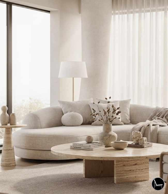
Most Popular Neutral Paint Colors
Neutral paint colors continue to dominate interior design trends, offering versatility and timeless appeal that works in any space. These popular paint colors provide the perfect backdrop for both bold accents and subtle decorative elements.
Understanding the undertones in neutrals is crucial – while they might appear simple at first glance, most neutral paint colors have subtle warm or cool undertones that significantly impact how they work in your space and interact with your décor. Let’s discover the most popular neutral paint colors!

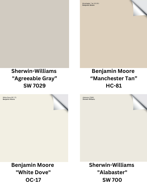
- Sherwin-Williams “Agreeable Gray”
- Perfect for open-concept spaces
- Warm undertones create a welcoming atmosphere
- Pairs beautifully with both cool and warm accent colors
- Ideal for living rooms and hallways
- Benjamin Moore “Manchester Tan”
- Sophisticated greige that bridges warm and cool tones
- Excellent for creating flow between rooms
- Changes subtly throughout the day
- A popular choice for main living areas
- Benjamin Moore “White Dove”
- Soft, warm white that never feels stark
- Creates bright, fresh spaces without feeling clinical
- Perfect for trim, cabinets, and whole-room applications
- Excellent in both modern and traditional settings
- Sherwin-Williams “Alabaster”
- Versatile white with balanced warm undertones
- Brightens spaces without appearing harsh
- Ideal for rooms with limited natural light
- Popular choice for kitchen cabinets and trim work
Tips for Use:
- Layer different neutral shades for depth
- Use varying textures to prevent monotony
- Consider lighting direction and intensity
- Test colors against existing furniture and flooring
- Best in open-concept spaces for flow
Best Rooms To Use It In:
- Living rooms (creates versatile backdrop)
- Open-plan kitchens (promotes flow)
- Hallways (ensures cohesive transitions)
- Home offices (enhances focus)
- Primary bedrooms (promotes relaxation)
Best Decor Styles To Use It:
- Modern Farmhouse
- Contemporary
- Scandinavian
- Traditional
- Transitional
- Minimalist
PRO TIP for Neutrals: Test neutral paint colors on multiple walls, as they’re highly susceptible to lighting changes. According to paint professionals, neutrals can display up to 5 different undertones throughout the day. Always test your neutral paint color against your flooring and trim, as 35% of customer dissatisfaction comes from undertone mismatches.
Trending: How to Decorate a Cozy Maximalism Living Room
Most Popular Deep Jewel Tones

The resurgence of jewel tones marks a significant shift in popular paint colors, moving away from safe neutrals toward more expressive, sophisticated choices. These rich, saturated hues add instant drama and luxury to any space, while maintaining a timeless quality that prevents them from feeling trendy or dated.
When properly executed, jewel tones create spaces that feel both bold and refined, offering the perfect balance between classic elegance and contemporary style. Here is a list of the most popular deep Jewel tones you can choose for your home!

- Emerald Green
- Creates a luxurious, sophisticated atmosphere
- Works beautifully in living rooms and dining areas
- Pairs well with gold and brass accents
- Best in rooms with abundant natural light
- Sapphire Blue
- Promotes calm and tranquility in any space
- Perfect for bedrooms and home offices
- Coordinates with both warm and cool neutrals
- Creates depth in larger spaces
- Ruby Red
- Adds energy and drama to social spaces
- Excellent for dining rooms and powder rooms
- Combines well with neutral trim colors
- Creates intimate atmosphere in larger spaces
Tips for Use:
- Use as accent walls for dramatic effect
- Balance with lighter neutrals
- Incorporate metallic accents
- Consider natural and artificial lighting
- Add texture through accessories
Best Rooms To Use It In:
- Dining rooms (especially emerald and ruby)
- Libraries/studies (sapphire and emerald)
- Master bedrooms (sapphire)
- Powder rooms (any jewel tone)
- Home offices (emerald or sapphire)
Best Decor Styles To Use It In:
- Art Deco
- Maximalist
- Modern Glamour
- Traditional
- Eclectic
- Hollywood Regency
PRO TIP: When working with jewel tones, follow the 60-30-10 rule: use your chosen jewel tone for 30% of the space, a neutral for 60%, and an accent color for 10%. According to interior design experts, this ratio creates the most balanced and visually pleasing result.
Trending: How To Decorate Dark Feminine Bedroom
Most Popular Earthy Tones

The embrace of earthy tones reflects a growing desire to connect interior spaces with the natural world. These popular paint colors bring warmth and grounding energy to homes while offering versatility in styling.
Earthy tones create seamless transitions between indoor and outdoor spaces, making them perfect for modern homes that emphasize natural elements and organic materials. These colors work particularly well in spaces where you want to create a welcoming, lived-in atmosphere. Here are the most popular earthy tones!

- Terracotta
- Brings Mediterranean warmth to any room
- Perfect for creating cozy, inviting spaces
- Works well in kitchens and living areas
- Complements natural wood and stone elements
- Determined Orange
- Adds vibrant energy without overwhelming
- Excellent for accent walls and feature spaces
- Pairs beautifully with neutral furnishings
- Creates warm, welcoming environments
- Styling Tips for Earthy Tones
- Layer with natural textures like jute, wool, and linen
- Incorporate plants and organic elements
- Mix with creamy whites for contrast
- Use in combination with natural lighting
Tips for Use:
- Layer with natural materials
- Combine with creamy whites
- Add plenty of texture
- Use darker shades for accents
- Balance with greenery
Best Rooms To Use It In:
- Living rooms (creates warmth)
- Kitchens (especially terracotta)
- Sunrooms
- Entryways
- Family rooms
- Outdoor living spaces
Best Decor Styles To Use It In:
- Mediterranean
- Boho
- Modern Rustic
- Desert Modern
- Southwestern
- Organic Modern
- Japanese Wabi-Sabi
PRO TIP: Paint companies report that earthy tones have the lowest return rate (under 5%) among all color families, indicating high customer satisfaction. To ensure success, test your chosen earth tone in both morning and evening light – the color should feel equally welcoming in both cool and warm lighting conditions.
Also: 30 Interior Decorating Rules You Can (and Should!) Break
Bold Color Choices for Statement Spaces

Making a statement with popular paint colors doesn’t always mean choosing bright, vibrant hues. Today’s bold choices include sophisticated dark neutrals and carefully chosen bright accents that can transform any space.
The key to success with bold colors lies in understanding how to balance them with your overall design scheme and knowing where to use them for maximum impact without overwhelming your space.

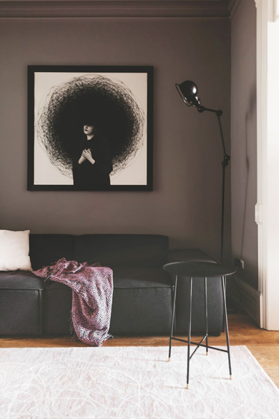
- Dark Neutrals
- Charcoal Gray brings sophistication to home offices and libraries
- Deep Navy works beautifully in bedrooms and dining rooms
- Consider light levels – darker colors need adequate lighting
- Use high-quality paint for better coverage and depth of color
- Bright Accents
- Sunshine Yellow energizes breakfast nooks and kitchens
- Coral Pink adds warmth to powder rooms and creative spaces
- Best used in small doses or as feature walls
- Balance with neutrals to prevent overwhelming the space
Pro Tip: When using dark neutrals like charcoal gray or deep navy, ensure adequate lighting to prevent the space from feeling cramped or gloomy. Incorporate a mix of natural and artificial lighting, such as overhead fixtures, wall sconces, and table lamps, to create a warm and inviting atmosphere.
Don’t Miss: Best Accent Wall Colors For Every Room in Your Home
Expert Tips for Working with Popular Paint Colors

Successfully implementing popular paint colors requires more than just selecting the right shade. Professional results come from proper preparation, testing, and application techniques. Understanding how colors interact with your space’s lighting, architecture, and existing elements will help ensure your final result matches your vision and enhances your home’s overall aesthetic.
- Testing Tips
- Paint large swatches (minimum 2×2 feet) on each wall
- Observe colors during different times of day
- View under both natural and artificial lighting
- Consider the effect of nearby room colors
- Application Techniques
- Always use appropriate primers for your chosen color
- Invest in high-quality brushes and rollers
- Apply multiple thin coats rather than one thick coat
- Consider finish choices carefully (flat, eggshell, satin)
Most Popular Post:
31 Most Important Popular Interior Design Styles You Should Know About
How to Unite Multiple Rooms with a Cohesive Look: A Comprehensive Guide
10 Best Tips to Choose the Perfect Sofa: The Ultimate Guide
15 First Steps to Creating a Decorating Plan
21 Tips To Make Your Bedroom Elegant and Extra Cozy
The Best Wall Sconces to Transform Your Space
Conclusion
Selecting from today’s popular paint colors is about more than following trends – it’s about creating spaces that reflect your personality while maintaining long-term appeal. Whether you choose classic neutrals or bold jewel tones, remember that the perfect paint color should make you feel at home while meeting your space’s functional needs.
- Key Takeaways
- Always test colors in your specific space and lighting
- Consider the room’s function and desired mood
- Factor in existing elements and furnishings
- Don’t be afraid to combine different color families
- Remember that quality paint and proper preparation are crucial
- Final Tips
- Sample at least 3-4 colors before making a final decision
- View colors during different times of day
- Consider the adjacent rooms’ colors for flow
- Document your paint choices for future touch-ups
Most Popular Paint Colors -Frequently Asked Questions
Q: How do I know if a paint color will look good in my space?
A: Test large swatches (at least 2×2 feet) on multiple walls. Observe them during different times of day and under various lighting conditions. Paint manufacturers report that 65% of customer satisfaction comes from proper color testing.
Q: Which popular paint colors make a room look bigger?
A: Light neutrals and cool tones typically make spaces feel larger. According to design experts, rooms painted in light colors can appear up to 25% larger than those painted in darker shades.
Q: How often should I repaint my interior walls?
A: Industry standards suggest repainting every 5-7 years, though high-traffic areas may need attention sooner. Studies show that 80% of homeowners repaint at least one room every 3 years.
Q: What’s the best finish for interior walls?
A: Eggshell and satin finishes are most popular, with 70% of designers recommending eggshell for living spaces due to its balance of durability and appearance.
Q: How do I coordinate popular paint colors between rooms?
A: Choose colors from the same color family or use complementary shades. Design surveys indicate that 85% of successful whole-home color schemes use a maximum of 3-4 main colors throughout the space.
Subscribe To the Newsletter!
Subscribe now for an endless feed of inspirational women’s cave decor ideas, pampering rituals, and more tips for curating your ultimate escape. Let’s start making your cozy refuge a reality – you so deserve this!
CATCH THE LATEST IN HOME DECOR TRENDS:

Steal These 16 Expert-Approved Decorating Secrets

How To Accessorize Your Living Room
How to Make a Small Room Appear Bigger

How to Make Your Home Look Expensive
GET CAUGHT UP ON ALL THE INSPIRING DECOR TIPS:

18 Fresh Decorating Ideas To Update Your Fireplace

How to Make a Gallery Wall: The Complete Step-by-Step Guide (Even If You’ve Never Hung a Picture)
