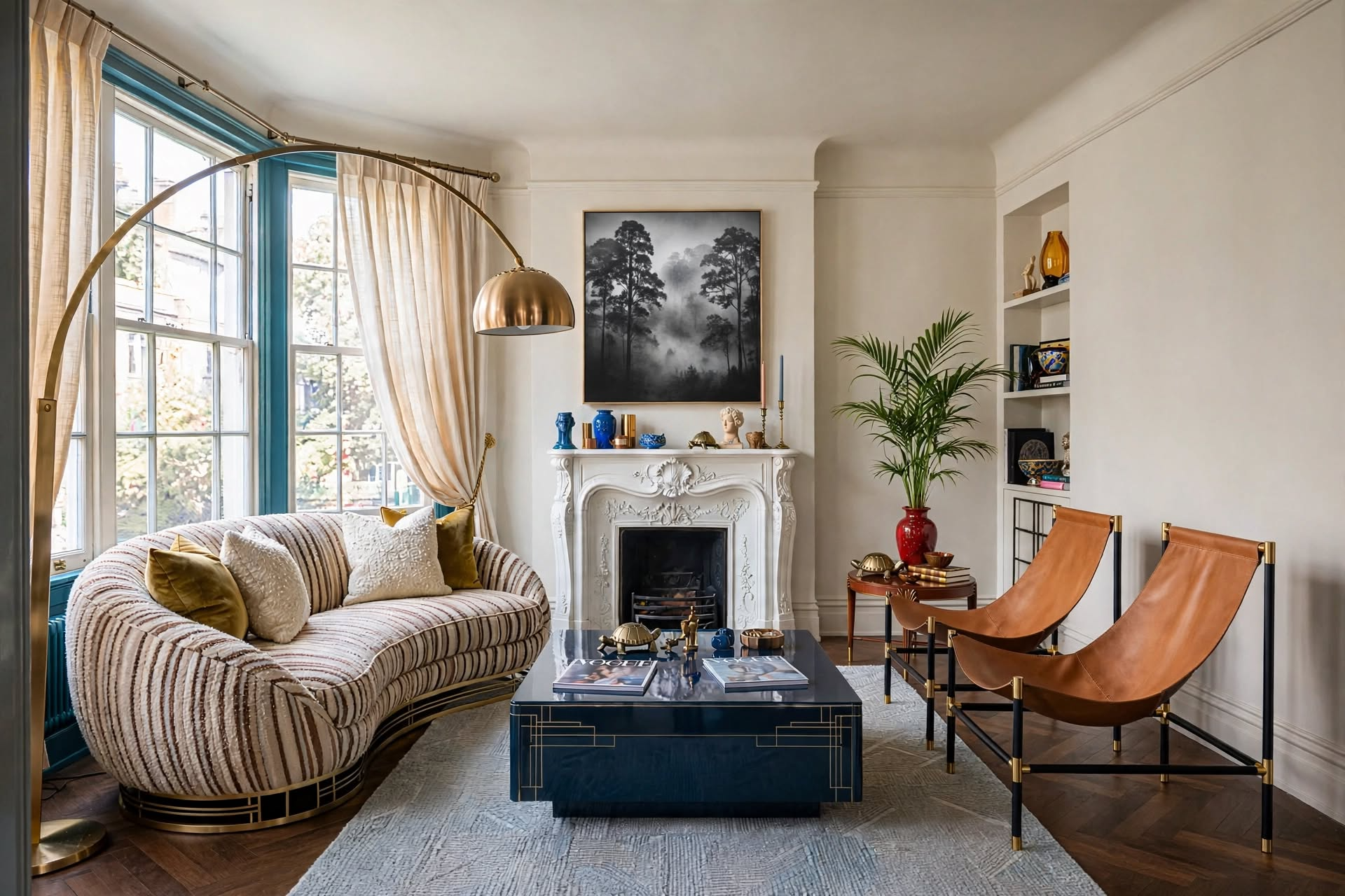
The best paint colors to promote better sleep are muted, low-saturation tones — dusty blue, sage green, warm gray, and soft brown — that keep your nervous system out of “alert” mode. Skip anything bright, high-contrast, or high-gloss, aim for an LRV (light reflectance value) between 25-55, and match the finish to matte or eggshell so the room absorbs light instead of bouncing it around at 2 a.m.
Paint colors to promote better sleep aren’t a Pinterest myth — they’re one of the few design decisions in your home with actual sleep-science backing. You’ve probably already tried the obvious fixes: a better mattress, blackout curtains, maybe a white noise app. And you’re still staring at the ceiling at midnight, half-convinced it’s your fault.

It’s probably not your habits. It’s your walls. Most bedrooms are painted whatever color looked good on a swatch under bright store lighting, with zero thought given to how that color behaves at 9 p.m. under a warm lamp, or how it reads in a north-facing room that never sees direct sun. The gap between “looks nice on Pinterest” and “actually helps me fall asleep” is exactly where most bedrooms go wrong.
Here’s the designer’s blueprint: the exact colors, the paint-code matches, the room-by-room adjustments, and the lighting strategy that makes a color read as calming instead of flat or cold. No guesswork, no repainting twice.
Every color, LRV range, and formula in this guide comes from real client bedroom projects — not a generic listicle. If a recommendation doesn’t fit your room’s light, I’ll tell you exactly how to adjust it rather than pretend one shade works everywhere.
In This Guide ▾
- Why Paint Colors to Promote Better Sleep Actually Work
- 8 Best Paint Colors to Promote Better Sleep
- Quick Comparison: All 8 Colors at a Glance
- Room-by-Room: Matching Color to Your Sleep Space
- Lighting Strategy: Why Your Color Looks Different at Night
- Color Combinations That Won’t Wreck the Effect
- Products That Help the Color Do Its Job
- Mistakes to Avoid
- The Designer’s Cheat Sheet
- FAQs
Why Paint Colors to Promote Better Sleep Actually Work
Color affects sleep because your eyes contain light-sensitive cells (intrinsically photosensitive retinal ganglion cells) that talk directly to your brain’s sleep center, separate from the cells you use to actually “see.” Low-saturation, cool-to-neutral colors send a calm-down signal; bright, warm, high-contrast colors send a stay-alert signal — even with your eyes closed and the lights off.

This isn’t just a nice theory. It’s the same reason a hospital recovery room and a nightclub don’t use the same color palette. Your bedroom is doing constant, quiet work on your nervous system whether you’re paying attention or not, and the wrong paint color to promote better sleep will fight against every other thing you’re doing to sleep well — the cool thermostat, the blackout curtains, the white noise machine. Choosing paint colors to promote better sleep is one lever you only have to pull once.
Two things determine whether a color reads as calming: saturation (how intense the color is) and light reflectance value, or LRV (how much light the color bounces back into the room). A saturated red at LRV 60 is going to feel loud no matter what room it’s in. A dusty, desaturated version of nearly any hue, sitting in the 25-55 LRV range, will read as quiet. That’s the whole trick — and it’s why some “boring” neutral rooms feel more restful than a carefully curated jewel-toned one.
8 Best Paint Colors to Promote Better Sleep
These paint colors to promote better sleep are ranked by how consistently they show up in sleep-environment research and real client results — not just what’s trending. Each one includes the shade family to shop and three real paint matches so you’re not guessing at a swatch wall.
1. Blue Tones — The Reliable Front-Runner

Muted, dusty blue is the most consistently sleep-supportive paint color — it mimics the color of a darkening evening sky, which your brain already reads as a wind-down cue.
Keep it desaturated. A bright, saturated blue reads more “swimming pool” than “sanctuary” and can actually feel cold and sterile in a north-facing room. Stick to shades with a gray or green undertone rather than a true, crisp blue.
- Optimal shades: dusty blue, ocean blue, soft navy
- Benjamin Moore “Quiet Moments 1563”
- Sherwin-Williams “Sleepy Blue SW 6225”
- Behr “Watery HDC-CT-26”
2. Soft Green — Nature’s Tranquilizer

Sage and soft olive greens sit at the visual spectrum’s midpoint, which means your eyes make almost no adjustment to process them — that’s a genuinely relaxing effect on the nervous system, not just a marketing claim.
Green is one of the most forgiving sleep colors because it works in both warm and cool-lit rooms. Lean toward gray-green or sage rather than a true, grassy green, which can skew more “kitchen herb garden” than “restful bedroom.”
- Best options: sage, mint, soft olive
- Benjamin Moore “October Mist 1495”
- Sherwin-Williams “Clary Sage SW 6178”
- Farrow & Ball “Calke Green No.34”
3. Muted Purple — The Twilight Effect

Soft lavender and mauve borrow blue’s calm and red’s warmth in equal measure, landing on a color your subconscious associates with dusk — the natural transition window right before sleep.
Saturation control matters more here than with any other color on this list. A bright violet is genuinely stimulating. A dusty, low-saturation lavender is the whole point — think “faded” rather than “vivid.”
- Ideal shades: lavender, mauve, dusty purple
- Sherwin-Williams “Dusty Lavender SW 9068”
- Benjamin Moore “Autumn Purple 2073-20”
- Behr “Purple Mantle PPU16-13”
4. Gentle Gray — The Neutral Neutralizer

Gray works by giving your brain almost nothing to process — no emotional pull in either direction, just a quiet visual backdrop that lowers cognitive stimulation before bed.
The risk with gray is going too cool. A blue-based gray in a room with minimal natural light can feel flat and institutional. Warm grays and greige tones solve this by keeping just enough amber undertone to feel lived-in.
- Focus on: warm grays, greige tones
- Benjamin Moore “Gray Owl OC-52”
- Sherwin-Williams “Repose Gray SW 7015”
- Valspar “Gray Silt 4003-1B”
5. Warm White — Pure Sleep Serenity

Warm white reflects more light than any other color, so during the day it supports a clear circadian rhythm — and at night, with the right lamps, it takes on soft shadows instead of a sterile glow.
The word “warm” is doing all the work here. A stark, blue-based white under overhead LED lighting is one of the most sleep-disruptive combinations you can put in a bedroom — it reads as clinical, not calming.
- Benjamin Moore “White Dove OC-17”
- Sherwin-Williams “Alabaster SW 7008”
- Farrow & Ball “Wimborne White No.239”
6. Soft Medium Brown — Earth’s Embrace

Taupe, mushroom, and cappuccino tones tap into a primal sense of shelter — an enclosed, protected feeling that lets your guard down faster than a stark or bright wall color would.
This is the sleeper hit (pun intended) of the list. It’s less trend-driven than sage or blue right now, which means it also ages better and won’t feel dated in five years.
- Focus on: taupe, mushroom, cappuccino tones
- Benjamin Moore “Pashmina AF-100”
- Sherwin-Williams “Accessible Beige SW 7036”
- Behr “Perfect Taupe N220-2”
7. Warm Neutrals — The Sleep Stabilizers
Cream, soft tan, and light beige create what designers call a “zero-stimulation zone” — a baseline the brain doesn’t have to actively process, which supports steady circadian rhythms night after night.
These are the safest choice if you share a room with someone whose color preferences differ from yours, or if you’re staging a room for resale. They flatter almost every neutral bedding and furniture palette without a second thought.
- Best shades: cream, soft tan, light beige
- Benjamin Moore “Manchester Tan HC-81”
- Sherwin-Williams “Agreeable Gray SW 7029”
- Valspar “Biscuit 3007-6C”
8. Deep Brown — The Cocooning Effect

Rich mocha and chocolate tones absorb more light than any lighter color, which naturally reduces visual stimulation as the room transitions from day to night — a deliberately enclosed, “psychologically embraced” feeling.
This is a commitment color. It needs a room with genuinely good natural light during the day, or it can feel like a cave rather than a cocoon. Pair it with warm brass or wood tones to keep it from reading heavy.
- Focus on: rich mocha, chocolate, coffee tones
- Benjamin Moore “Wilmington Tan HC-34”
- Sherwin-Williams “Classic Brown SW 2837”
- Behr “Havana Coffee N180-7”
Quick Comparison: All 8 Colors at a Glance
If you’re short on time, this table breaks down the full list of paint colors to promote better sleep by LRV range, mood, and which room orientation each one suits best.
| Color | LRV Range | Best For | Mood |
|---|---|---|---|
| Dusty Blue | 35-50 | South-facing rooms | Calm, cool, twilight-like |
| Sage Green | 35-55 | Any orientation | Grounding, natural |
| Muted Purple | 30-45 | South-facing, primary suites | Luxurious, twilight |
| Warm Gray | 30-50 | South-facing, modern rooms | Quiet, neutral |
| Warm White | 55-75 | Small or low-light rooms | Clean, spacious |
| Soft Brown | 25-40 | North-facing rooms | Grounded, cozy |
| Warm Neutral | 45-65 | Guest rooms, any orientation | Stable, safe |
| Deep Brown | 10-20 | Well-lit primary suites | Cocooning, enclosed |
“Your brain processes color as more than visual input — it triggers hormonal responses that directly impact your ability to relax and fall asleep.”
Sleep environment research consensusRoom-by-Room: Matching Color to Your Sleep Space
The best paint colors to promote better sleep change depending on your room’s orientation, size, and who’s sleeping in it — a color that works beautifully in a sunny primary suite can feel flat and cold in a small, north-facing guest room.

North-Facing Bedrooms
North-facing rooms get cool, indirect light all day, which can make blues and grays feel flat or even chilly. Push your color choice 10-15% warmer than you’d normally pick — a greige instead of a true gray, a sage instead of a cool mint.
South-Facing Bedrooms
South-facing rooms get warm, direct light and can handle cooler, more saturated tones without feeling cold. This is where a true dusty blue or a deeper sage reads best, since the natural light balances it out.
Small or Apartment Bedrooms
Stick to the higher end of the LRV range (45-60) in a color like warm white, soft tan, or pale sage. Dark, cocooning colors like deep brown can work, but only with strong supplemental lighting — otherwise a small room reads cramped instead of cozy. Renters should look at peel-and-stick or removable finishes rather than committing to a full repaint.
Kids’ and Teens’ Rooms
Soft green and muted blue are the safest sleep-supportive picks for younger sleepers — calming without reading “babyish,” and flexible enough to grow with them. Save saturated accent colors for artwork and textiles instead of the walls.
Guest Rooms
Warm neutrals are the smart default here, since you’re designing for sleepers whose color preferences you don’t know. It’s the one room where “boring” is actually the correct design decision.
Lighting Strategy: Why Your Color Looks Different at Night
The exact same paint color can look sleep-supportive under warm 2700K bulbs and stimulating under cool 4000K+ bulbs — light temperature changes how your eye reads a wall color as much as the paint itself does.

This is the step almost every competitor guide skips entirely, and it’s the reason someone repaints with the “right” paint colors to promote better sleep and still doesn’t feel the effect. A dusty blue under a bright, cool-white overhead light can look flat and clinical. The same blue under a warm 2700K bedside lamp, with the overhead off, reads exactly as intended: soft, dim, and settling.
- Bulb temperature: stick to 2700K-3000K (“warm white”) for every bulb in the bedroom, including lamps and closet lights
- Layer your light: avoid a single overhead fixture as the only light source — add a bedside lamp and one ambient source so you’re not stuck choosing between “flood-lit” and “pitch dark”
- Dim before bed: a dimmer switch or smart bulb that steps down over 20-30 minutes mimics natural sunset and reinforces the color’s calming effect
- Test your color at night: paint a sample board and view it under your actual bedside lamp after dark before committing — daylight and showroom fluorescents will both lie to you
- Cool-white 4000K overhead as the only light source
- Color tested only under bright store lighting
- Glossy or semi-gloss finish that bounces light
- Same color on walls, trim, and ceiling with no variation
- Warm 2700K bedside lamp as the primary evening light
- Color tested under actual nighttime lighting first
- Matte or eggshell finish that absorbs light
- Ceiling 20% lighter than walls for a “fifth wall” cocoon effect
Color Combinations That Won’t Wreck the Effect
When you pair paint colors to promote better sleep with the wrong accent or ceiling color, you can undo the calming effect entirely — sleep-friendly color combinations stay within two shades lighter or darker than your primary wall color, since bold, high-contrast accent walls belong in a living room, not a bedroom.
The 60-30-10 rule still applies, just with lower-stakes colors: 60% primary wall color, 30% supporting color in furniture and bedding, 10% accent in accessories. Keep that 10% accent muted too — this is one of the few rooms where you don’t want a jewel-toned throw pillow doing the heavy lifting.
| Primary Wall | Accent Wall | Ceiling | Trim |
|---|---|---|---|
| Dusty Blue | Pale gray-blue or misty sage | 20% lighter than wall | Soft white |
| Sage Green | Warm cream or soft taupe | 50/50 wall + white | Match wall for modern look |
| Warm Gray | Deeper greige | Pure white, flat finish | Bright white for definition |
| Deep Brown | Warm tan or soft cream | Match wall, one shade lighter | Light neutral for transition |
Also worth bookmarking for later if you want an accent wall that still respects the sleep-friendly palette, and check your fabric choices against your wall color using the same low-contrast logic — this guide on mixing fabric patterns walks through it.
Products That Help Paint Colors to Promote Better Sleep Do Their Job
A great paint color still needs the right supporting cast. These are the four things I tell clients to buy before they buy the paint itself.

FoamPRO Color Tester Sample Board
Solves: the “tested it under store lights” problem. A reusable, movable board instead of painting a patch straight onto your wall.
Who it’s for: anyone testing more than one shade before committing to a gallon.
Designer take: move it to three spots — near the window, near the bed, under your lamp at night — before you decide. This is the single cheapest way to avoid a repaint.
Under $15. Pays for itself the first time it saves you from the wrong can of paint.
Check Current Price
Removable Sage Green Wallpaper
Solves: getting a sleep-supportive sage tone with zero paint, zero landlord approval, and your full deposit back.
Who it’s for: apartment and rental bedrooms where a full repaint isn’t an option.
Designer take: self-adhesive removable options give you the same low-saturation, nature-linked calm as a sage paint job, with a same-day install and no drying time.
No VOC smell, no waiting 24-48 hours to sleep in the room.
Check Current Price
Kasa Smart Dimmable Warm Bulbs
Solves: the lighting-strategy problem from earlier in this guide — a cool-toned bulb undercutting an otherwise perfect wall color.
Who it’s for: anyone who just repainted (or is about to) and wants the color to actually read as calming at night.
Designer take: set a scheduled 20-30 minute dim before bedtime. It mimics a natural sunset and does more for how your wall color “feels” than the paint alone ever could.
The single easiest upgrade if you’re not ready to repaint yet.
Check Current Price
WRENSONGE Sage Green Comforter Set
Solves: the 30% layer of the 60-30-10 rule — a supporting color for your furniture and bedding that echoes your wall without matching it exactly.
Who it’s for: anyone who picked sage, warm gray, or a soft neutral wall and wants the bedding to reinforce it, not compete with it.
Designer take: this is the fastest way to test a sleep-friendly palette before painting a single wall — swap the bedding first, live with the mood for a week, then paint.
Machine washable microfiber, sized for every mattress.
Check Current PriceMistakes to Avoid
Even the best paint colors to promote better sleep will underperform if one of these five mistakes is working against you.
Don’t Do This
- Picking a color from a tiny swatch under store lighting
- Choosing high-gloss or semi-gloss for a “clean” look
- Ignoring undertones — a “gray” that’s secretly purple or green
- Matching ceiling exactly to walls in a low-ceiling room
- Using a cool-white 4000K+ bulb with a warm color
Do This Instead
- Test a large sample board under your actual nighttime lighting
- Choose matte or eggshell to reduce light reflection
- Check the undertone in both daylight and lamp light before buying
- Go 20% lighter on the ceiling for a natural cocoon effect
- Stick to 2700K-3000K bulbs throughout the room
The Designer’s Cheat Sheet
Screenshot this. It’s the exact math I use to pick and test paint colors to promote better sleep, without a single repaint.
LRV Range
Keep light reflectance value between 25-55 for the calmest visual effect. Below 25 needs strong lighting; above 60 starts to feel stimulating.
Orientation Adjustment
North-facing room: shift 10-15% warmer than your instinct. South-facing room: your first instinct is usually correct.
Ceiling Formula
Standard ceilings: wall color + 20% white. High ceilings (10ft+): wall color + 50% white to bring the ceiling visually down.
60-30-10 Rule
60% walls in your primary sleep color, 30% furniture and bedding in a supporting tone, 10% accessories in a muted accent.
Bulb Temperature
2700K-3000K only, in every fixture in the room, lamps included. Anything above 3500K fights against the wall color.
Sample Test Window
View your sample board at three points: midday, dusk, and under your bedside lamp after dark. All three need to work.
Paint Colors to Promote Better Sleep: FAQs
Your Sleep Sanctuary Starts With the Right Paint Colors to Promote Better Sleep
You don’t need to overhaul your whole bedroom to feel the difference. Pick one color from the eight above, check it against your room’s light exposure, test it under your actual bedside lamp instead of trusting the store lighting, and go with a matte or eggshell finish. That’s it — that’s the whole system.
Start with a sample, not a gallon. Live with it for a few nights before you commit to the full room, and pair it with the lighting and layering tips above so the color can actually do the job it’s supposed to do. Sweet dreams are a lot closer than you think.
Want the Full Designer Playbook?
The Designer’s SECRET Cheat Sheet has 119 more rules like the ones in this guide.
Get the Free GuideLooking to transform your restless nights into peaceful slumber? The secret might be right on your walls.
CATCH THE LATEST IN HOME DECOR TRENDS:

Steal These 16 Expert-Approved Decorating Secrets

Accessorize a Small Living Room: 7 Genius Styling Secrets

How to Make a Small Room Appear Bigger

How to Make Your Home Look Expensive
GET CAUGHT UP ON ALL THE INSPIRING DECOR TIPS:

Best Fireplace Makeover Ideas

How to Make a Gallery Wall: The Complete Step-by-Step Guide (Even If You’ve Never Hung a Picture)