Home Decor · Gallery Walls · Design Guides
Eclectic Gallery Wall: The Designer’s Blueprint That Actually Works
No more Pinterest envy. Here’s the exact process designers use to create gallery walls that look intentional, personal, and stunning — every single time.
TL;DR — Quick Answer
An eclectic gallery wall is a curated mix of art, objects, and frames hung together using one or two unifying elements — like a shared color palette or frame finish — to feel intentional rather than random. Start with a large anchor piece at eye level (57 inches from the floor to center), map your layout on the floor first, space frames 2–3 inches apart, and let your collected-over-time aesthetic do the rest.
Every eclectic gallery wall you see on Pinterest took one of two things: a professional designer, or someone who finally understood the rules well enough to break them confidently. You’re about to become the second kind.

That paralysis is real. And it’s not a design failure — it’s an information failure.
This guide fixes that. I’m going to walk you through the full designer process: from choosing your anchor piece to nailing the exact spacing, handling awkward walls, working around TVs, and making it look like you’ve been collecting beautiful things your whole life (even if you bought everything from Target last week). Consider this your personal designer blueprint for an eclectic gallery wall that doesn’t just look good — it looks like you.
Renting your space? Dive deeper with this step-by-step guide on: Renter-Friendly Wall Decor: The $500 Mistake 87% of Renters Make (And How to Avoid It)
What Exactly Makes a Gallery Wall “Eclectic” (And Why It’s Harder Than It Looks)
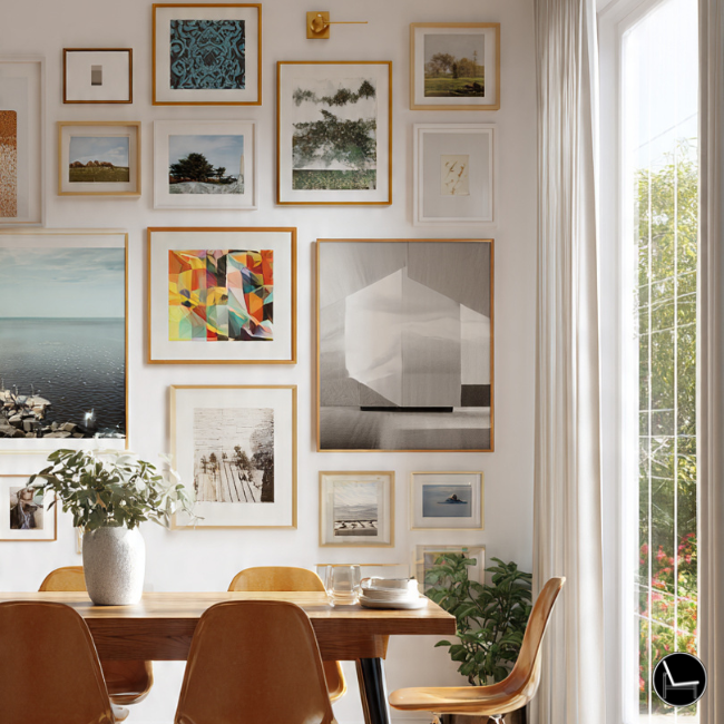
An eclectic gallery wall intentionally mixes art styles, frame types, media formats, and subject matter — unified by at least one or two consistent design elements to prevent visual chaos. The key word is intentional. Randomness and eclecticism are not the same thing, and that gap is where most DIY gallery walls go wrong.
Unlike a matched-frame grid (which is easier to pull off but far more predictable), an eclectic hang requires you to make active decisions about what connects your pieces. Without that thread, even beautiful artwork can look like a flea market wall.
“The eclectic gallery wall that works always has a secret rule the viewer can’t quite name — a color story, a recurring texture, an emotional tone. The ones that fail have no rule at all.” — Amber Lewis, Interior Designer, Amber Interiors
The “secret rule” is the key takeaway from every designer we’ve studied. Your gallery doesn’t need to be cohesive in an obvious way. It just needs a thread. One color. One material. One mood. Once you identify yours, everything else gets easier.
Visual Comparison
| Style | Frame Mix | Art Mix | Difficulty | Best For |
|---|---|---|---|---|
| Eclectic | Mixed finishes, sizes | High variety | Medium | Storytellers, maximalists |
| Curated | Unified color/finish | Moderate variety | Easy | Minimalists who want warmth |
| Grid/Salon | Identical frames | Low variety | Easiest | Perfectionists, symmetry lovers |
| Maximalist | No rules | Complete freedom | Hard | Experienced decorators only |
Keep reading for a designer-approved guide to: The Best Performance Fabric Sofas for Real Life (Kids, Pets & Spills Welcome)
The 8-Step Designer Process for an Eclectic Gallery Wall

Most tutorials jump straight to hanging. Designers never do. They spend 80% of the work before a single nail goes into the wall. Here’s the full sequence, in order.
The Designer’s 8-Step Gallery Wall Process
Define Your Unifying Thread
Choose one binding element: color palette (max 3 tones), frame material, subject matter, or overall mood. Write it down.
Measure Your Wall
Note width, height, obstructions (outlets, light switches). Your gallery fill should cover 60–75% of the wall’s width.
Gather Your Pieces & Trace Templates
Trace every frame onto kraft paper. Cut out. Label the back with the piece name and hanging hardware location.
Layout on the Floor First
Arrange paper templates on the floor to scale. Find your anchor piece and build outward. Never skip this step.
Apply the 57-Inch Rule
The center of your anchor piece should sit 57–60 inches from the floor — average human eye level. Everything else anchors to this.
Tape Templates to the Wall
Use painter’s tape to affix paper templates to the wall. Step back. Live with it for a day. Adjust before drilling.
Hang Largest Piece First
Use your paper template to mark the nail spot. Hang anchor. Then work outward in order of size, largest to smallest.
Add 3D & Filler Pieces Last
Sconces, mirrors, wall-hung plants, ceramic pieces, and small shelves go in last to break up the flat plane and add texture.
Next, explore this practical guide: How To Style Coffee Table Books That Transforms Your Space
Designer Strategy: Scale, Placement & the Rules That Actually Matter
Scale is the number-one reason a gallery wall looks amateur. Too small and it floats on the wall like a postage stamp on an envelope. Too big and it competes with your furniture. Nail the scale and everything else forgives itself.
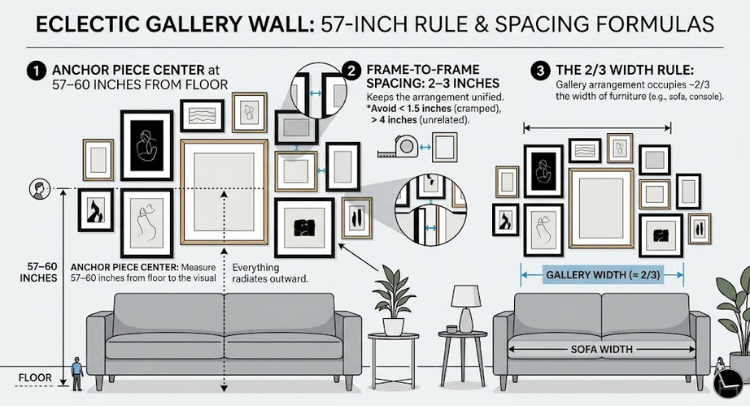
🔹 The 57-Inch Rule & Spacing Formulas
The 57-inch rule is the single most useful piece of knowledge in hanging art. Here’s how to apply it specifically to an eclectic gallery wall:
- Anchor piece center at 57–60 inches from floor. This applies to the visual center of your largest piece. Everything else radiates outward from this point.
- Frame-to-frame spacing: 2–3 inches. This keeps the arrangement reading as a unified collection rather than individual pieces scattered on a wall. Less than 1.5 inches looks cramped; more than 4 inches looks unrelated.
- The 2/3 width rule. Your gallery arrangement should occupy roughly two-thirds the width of the furniture piece it sits above (sofa, console, bed). This creates visual harmony between the art and the room’s anchor pieces.
Designer’s Cheat Sheet
Eye Level Rule
Center your anchor piece 57–60 inches from the floor. Museum standard.
Spacing Rule
Keep frames 2–3 inches apart for a cohesive, gallery-style look.
Width Rule
Your gallery should fill ⅔ the width of the furniture piece below it.
Above Furniture
Hang your lowest frame 8–10 inches above sofas and consoles.
Color Limit
Max 3 dominant colors in your arrangement. Accents can vary freely.
Anchor Rule
Always start with one large focal piece. Never place equal-sized frames in the center.
Before committing a single nail, photograph your floor layout from above (stand on a chair). You’ll immediately see balance problems, awkward clusters, and dead zones that are invisible when you’re crouching over the pieces.
Dive deeper with this step-by-step guide on: How to Style a Console Table: The Designer’s 3-Step Formula That Actually Works
Designer Strategy: Color, Mood & Texture — The Invisible Architecture
Color and texture are what make an eclectic gallery wall feel designed rather than dumped. They’re the invisible architecture that holds wildly different pieces together without the viewer being able to explain why it works.
🔹 Building a Color Story
You don’t need matching frames. You need related frames. Here’s how designers build the color story for an eclectic arrangement:
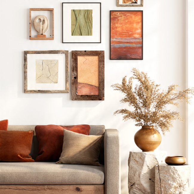
- Dominant palette: 2–3 tones max. Pick your wall color as backdrop, then let two dominant tones — say, warm walnut and matte black — run through your frames. Not every frame needs to be one of these colors, but they should appear at least 3–4 times throughout the arrangement.
- Let art set the accent colors. Instead of buying art to match your frames, buy the art first and choose frame finishes that pull one of the artwork’s secondary colors forward. A painting with sage green details pairs beautifully with an antique brass frame.
- Introduce at least one high-contrast piece. A single black-and-white photograph, a dark abstract, or a graphic print adds grounding energy to an arrangement that might otherwise feel too soft or too chaotic.
🔹 Texture as a Design Tool
Flat frames on a flat wall create a flat result — emotionally and visually. The best eclectic gallery walls introduce texture through:
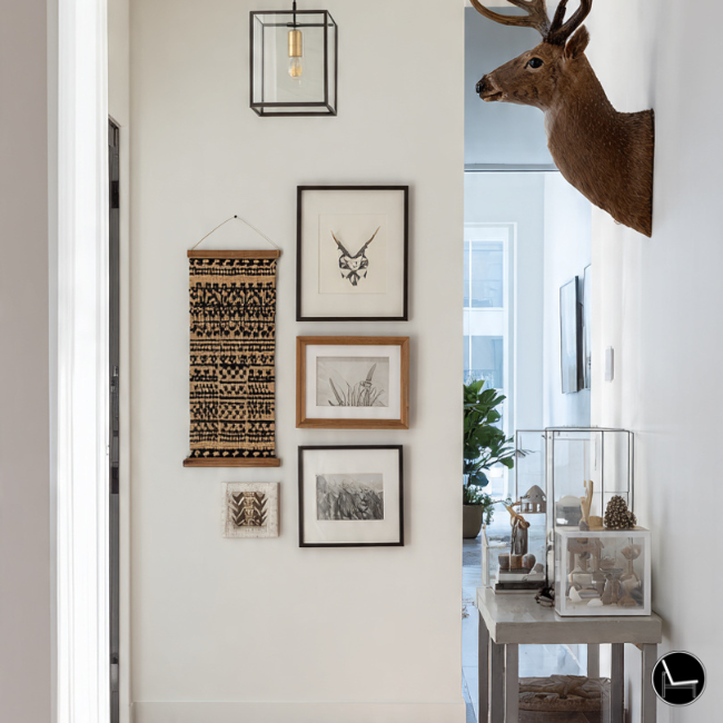
- Woven pieces. A small macramé, a wicker plate, or a textile hanging breaks the hard frame grid and introduces organic warmth that no print can replicate.
- 3D objects. Ceramic wall hangings, wall-mounted sconces, a small floating shelf with a single sculptural object — these cast actual shadows throughout the day, giving your wall a living quality.
- Mixed frame depths. Thin profile frames feel editorial and modern. Deep shadow-box frames feel collected and vintage. Mixing both signals “I’ve been living with these for years.”
What designers actually prioritize when building eclectic gallery walls
Keep reading for a designer-approved guide to: How to Arrange Pillows on a Couch Like a Pro: The Foolproof Step-by-Step Guide
The Vibe Check: Match Your Layout to Your Personality

The biggest mistake people make is copying a gallery wall style that doesn’t match how they actually live. Before you buy a single frame, figure out which of these four archetypes you are — then work from that foundation.
The Perfectionist
You want eclecticism, but you need structure. Use a consistent frame finish (all black, all brass, all natural wood) and vary only the art. Tight 2-inch spacing. No 3D objects.
The Minimalist
Less is more, even in eclecticism. Four to six pieces maximum, with significant breathing room between them. Large negative space is a design choice, not a failure.
The Storyteller
Mix family photos with travel prints, found objects, and meaningful artifacts. The arrangement should feel like a map of your life. No two pieces should be the same source.
The Trend-Driven
You want it to look current. Lean into 2026 aesthetics: organic shapes, natural materials, Identity Decor (art that reflects your specific cultural background and narrative).
Dive deeper with this step-by-step guide on: 5 Washable Area Rug Designer Secrets to Make Any Room Look Custom
Real-Life Fixes: Awkward Walls, TVs, Renters & “Why Does It Still Look Off?”
Generic tutorials always show perfect, clean, evenly-spaced walls. Your actual home almost certainly has obstacles. Here’s how designers handle the messy reality.
Fix #1 — The Awkward Wall (Narrow, Tall, or Weirdly Shaped)
Narrow walls benefit from a vertical arrangement rather than the classic horizontal scatter. Stack three to four pieces in a tight column, with a slim vertical piece (like a tall narrow print or a long mirror) as the anchor. For walls with pitched ceilings, angle your arrangement to echo the ceiling’s slope — it looks intentional instead of cramped.
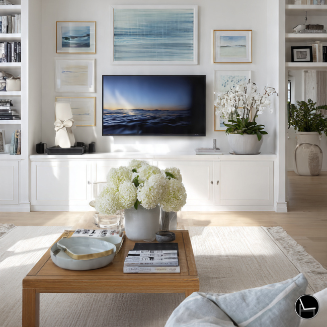
Fix #2 — Gallery Wall Around a TV
The TV is the elephant in the room. Two approaches work:
- Integrate the TV. Treat the TV as the “large dark piece” in your arrangement and frame it with art on both sides, keeping the bottom edges roughly aligned. Floating frames at the same level as the TV’s center line work beautifully.
- Go asymmetric. Place all your art to one side of the TV in an L-shaped or vertical arrangement. The visual weight on one side actually draws the eye away from the TV’s black rectangle.
Fix #3 — Renter-Friendly Gallery Walls
Command strips have a weight limit — check yours carefully (most standard strips hold 4 lbs; heavy-duty versions go up to 16 lbs). For heavier pieces, plaster anchors and small-profile nails leave holes under 3mm that most landlords consider normal wear and tear. Alternatively, leaning large pieces against the wall on a floating ledge shelf is fully damage-free and has become genuinely stylish in its own right.
Fix #4 — “Why Does Mine Still Look Off?”
This is the most common cry in every interior design forum. The usual culprits:
- The arrangement floats. Your gallery is too small for the wall or too high up. Gallery walls should relate to furniture below them — not hang in isolation in the upper third of the wall.
- Everything is the same size. True eclecticism requires dramatic size variation. You need a piece that is at least 3× the size of your smallest piece in the arrangement.
- All art, no objects. Flat frames only. Add one mirror, one textural object, or one non-frame element to break the uniformity.
- Frames are fighting. Three different metallic finishes — rose gold, chrome, and antique gold — read as chaos. Pick two at most. If in doubt, matte black and natural wood go with absolutely everything.
❌ Common Mistakes
- All same-size frames scattered randomly
- Gallery hung too high on the wall
- Three competing metallic finishes
- No anchor piece or focal point
- 2+ inches of inconsistent spacing
- Only flat framed prints, no texture
✓ Designer Approach
- Large anchor piece at 57″ eye level
- Gallery 8–10″ above furniture piece
- Unified finish + one accent (brass + black)
- Largest piece placed off-center for tension
- Consistent 2–3″ spacing throughout
- One mirror + one textile for texture
Visual Anti-Patterns: The Gallery Wall Mistakes Designers Wince At
These are the patterns that consistently make eclectic gallery walls look unintentional — regardless of how beautiful the individual pieces are.
⚠ What Not To Do
The Floating Island
Hanging your gallery in the middle of a large wall with no relationship to furniture below it. It looks lost. Always anchor your arrangement to something — a sofa, a console, a bed.
The Perfectly Symmetric Eclectic
Eclecticism and symmetry are opposing forces. A mirror-image arrangement of mismatched frames just looks confused. Embrace asymmetry — it’s where the personality lives.
The Postage Stamp Problem
Using all small frames (5×7, 4×6) creates a gallery wall that looks undersized for the space. Every arrangement needs at least one piece that is 16×20 or larger to anchor the composition.
Three-Metal Chaos
Mixing rose gold, chrome, and antique bronze in the same arrangement creates visual noise. Commit to two finishes max — ideally one warm metal and one matte neutral.
All-Poster Syndrome
A wall of nothing but digital prints in thin frames looks like a dorm room, not a curated home. Mix in at least one original piece — a painting, a sketch, a photograph you printed yourself — to add genuine character.
2026 Eclectic Gallery Wall Trends Worth Knowing
Trends in gallery wall design have shifted considerably. Here’s what interior designers and décor forecasters are actually excited about for 2026 — and what’s quietly fading out.
Trend 01 — 2026
Identity Decor
Art that directly reflects your cultural heritage, family history, or lived experience. Not “aesthetic” prints, but genuinely personal pieces. Authenticity over aesthetics.
Trend 02 — 2026
Organic Modern
Hand-thrown ceramic wall pieces, raw-edge wooden frames, and earthy abstract paintings. The reaction against the overly polished gallery walls of the late 2010s.
Trend 03 — 2026
Tactile Layers
Woven textiles, embroidered pieces, and bas-relief art mixed with traditional frames. The wall should invite touch, not just sight. Depth over flatness.
Fading Out
Script & Quote Art
The “live laugh love” era of text-heavy wall art is firmly over. Minimalist typography prints are also waning. Make room for images and objects over words.
What to Actually Buy: The Eclectic Gallery Wall Shopping Guide
Decision paralysis is real when you’re standing in an art aisle or scrolling through Etsy. Here’s how to shop with confidence — every pick below is organized around the specific problem it solves, so you can grab exactly what your wall is missing.
Amazon Picks

Amazon
ANERZA Eclectic Vintage Abstract Art Frame Set
Solves: “My gallery feels generic.” These vintage-toned abstract frames add instant character — no art-hunting required.
Shop on Amazon →
Amazon
Kate & Laurel Decorative Wall Mirror Set (3-Piece)
Solves: “It’s too flat.” Mirrors reflect light, add depth, and break up the frame grid — the easiest texture upgrade in your arrangement.
Shop on Amazon →
Amazon
Floating Picture Ledge Wall Shelf
Solves: “I’m scared of permanent holes.” Layer and rearrange art freely — the renter-friendly approach that actually looks intentional.
Shop on Amazon →
Amazon
Vintage Multi-Size Frame Set for Gallery Walls
Solves: “My frames fight each other.” A coordinated vintage set in mixed sizes — your anchor piece + fillers in one order.
Shop on Amazon →
Amazon
XYQXYQ Creative Hand Sculpture Wall Mount
Solves: “All art, no objects.” A sculptural 3D hand piece adds organic shape, shadow, and genuine conversation-starter energy.
Shop on Amazon →
Amazon
Mingzhang Wall Sculpture Farmhouse Decor
Solves: “My wall needs a rustic, textural statement.” This sculptural farmhouse piece adds organic warmth and dimension — perfect as a filler or accent object.
Shop on Amazon →Wayfair Picks

Wayfair
Wrought Studio Abstract Resin Wall Decor Set
Solves: “It needs dimension.” Abstract resin wall decor adds sculptural depth and organic modern texture without overpowering the other pieces.
Shop on Wayfair →
Wayfair
Gold Metal Animal Head Wall Decor (5-Pack)
Solves: “It all looks flat and same-y.” These sculptural gold animal pieces bring metallic warmth and 3D energy — unexpected in the best way.
Shop on Wayfair →
Wayfair
Millwood Pines Large Deer Head Faux Taxidermy
Solves: “I need a statement anchor piece.” A large-scale sculptural focal point that earns its place as the undeniable center of your arrangement.
Shop on Wayfair →
Wayfair
Ophelia & Co. Maura Gold Frame Set (Set of 4)
Solves: “I want warmth without going all-brass.” These soft gold frames bridge the gap between modern and vintage beautifully.
Shop on Wayfair →
Wayfair
Mercury Row Geometric Metal Overlapping Lines Wall Art
Solves: “I need one strong graphic anchor.” This dark metal geometric piece grounds the whole arrangement and makes softer pieces pop around it.
Shop on Wayfair →
Wayfair
Latitude Run® Ailise Gallery Wall Frame Set
Solves: “I want a polished, coordinated look.” This classic metal multi-frame set works on the wall or tabletop — a turnkey solution for an instant gallery moment.
Shop on Wayfair →* This post contains affiliate links. We may earn a small commission at no extra cost to you. We only recommend products we genuinely stand behind.
Before buying new art, audit your home for objects that could be framed or wall-mounted: vintage maps, botanical illustrations torn from old books, a child’s drawing professionally framed, pages from a coffee table book, or a piece of fabric you love. The most interesting gallery walls are 70% found and 30% purchased.
From The Decorholic
Most Popular Posts
Your Eclectic Gallery Wall Is Closer Than You Think
Here’s the reframe that changes everything: an eclectic gallery wall is not about having perfect taste or an unlimited budget. It’s about having a point of view — and the process to execute it.
You now have that process. You know the 57-inch rule. You know your unifying thread. You know how to handle awkward walls, TV situations, rental restrictions, and the haunting question of “why doesn’t mine look like Pinterest.” The answer, almost always, is scale and a missing anchor. You know how to fix both.
Start with three pieces. Get the floor layout right. Hang the anchor. The rest follows. The only gallery wall that fails is the one you never start.
Find Your Design Style →Eclectic Gallery Wall – Frequently Asked Questions
How many pieces do I need for an eclectic gallery wall?
A minimum of five to seven pieces is typically needed for an eclectic gallery wall to read as a deliberate arrangement rather than a few frames that happen to be near each other. Aim for a mix: two or three large pieces (16×20 or bigger), two to three medium pieces, and two smaller accent pieces or 3D objects. Nine to fifteen pieces is considered a full, statement-level gallery wall.
Do frames need to match in an eclectic gallery wall?
No — but they need to relate. Matching every frame defeats the eclectic purpose. Instead, choose two finishes that complement each other (matte black + natural wood is the most versatile pairing) and repeat them throughout the arrangement. Avoid three or more competing metallic finishes, which create visual noise rather than personality.
How do I hang a gallery wall without making mistakes?
Trace every frame onto kraft paper, cut out the templates, tape them to the wall with painter’s tape, and live with the layout for 24–48 hours before driving a single nail. This eliminates nearly all permanent placement errors. The paper template method has been standard practice among professional art installers for decades and takes about twenty minutes to set up.
What’s the best wall for an eclectic gallery wall?
The best walls are those that have a natural focal relationship with the room: directly above a sofa, behind a bed’s headboard, across from an entryway, or flanking a fireplace. Avoid gallery walls on walls perpendicular to your seating — you’ll rarely look at them. The wall you see first when you enter a room is almost always the right choice.
CATCH THE LATEST IN HOME DECOR TRENDS:

Steal These 16 Expert-Approved Decorating Secrets

How To Accessorize Your Living Room
How to Make a Small Room Appear Bigger

How to Make Your Home Look Expensive
GET CAUGHT UP ON ALL THE INSPIRING DECOR TIPS:

18 Fresh Decorating Ideas To Update Your Fireplace

How to Make a Gallery Wall: The Complete Step-by-Step Guide (Even If You’ve Never Hung a Picture)
