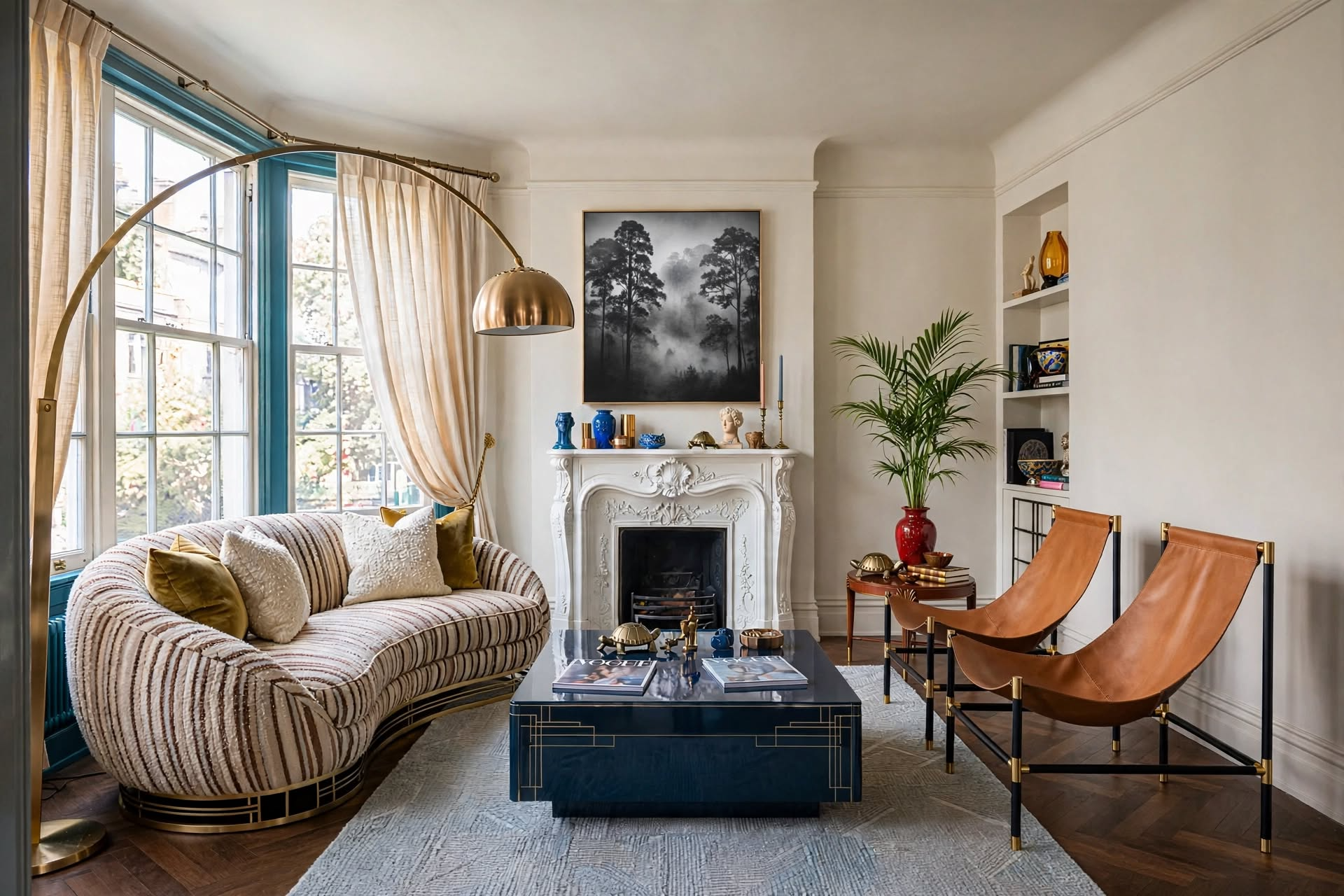
An earthy color palette is built from four color families found in nature: browns, greens, clays and stone neutrals. To make one work in a room, use the Stone-Soil-Spark Method: a light Stone color on about 60% of the room, a deeper Soil color on about 30%, and one warm Spark accent on the last 10%. Pick one of the nine palettes below, check its undertone in your own light, and add the color with textiles and ceramics first if you can’t paint.
Earth tones are easy to love and surprisingly easy to get wrong. Put five nice browns and beiges in one room and it can turn flat and muddy. Add a green with the wrong undertone and suddenly nothing sits right. The fix is to stop collecting colors one at a time and start with an earthy color palette: a small, planned set of shades that already belong together.
Free Ebook
The Small Space Playbook
Layouts, sizing rules and styling formulas for small rooms and apartments, all in one free guide.
This guide gives you nine ready-made earth tone palettes with hex codes, a three-part method for dividing the colors around a room, a quick undertone test, and a no-paint route for renters. Use it to plan one room or to tie your whole home together.

What’s in This Guide
- Throw · Best Soil layerAllModern Kannon Hand-Woven Striped Throw — Wayfair
- Throw · Best budget textureLifein Chenille Knit Throw — Amazon
- Planter · Best Stone anchorDorlis Fiberstone Pot Planter — Wayfair
- Planter · Best rough textureKante Weathered Concrete Planters — Amazon
What Is an Earthy Color Palette?
An earthy color palette is a group of colors taken from the ground and what grows on it: soil, clay, stone, sand, bark, moss and dried grass. The shades in an earth tone color palette are muted, which means each color has a little brown or gray mixed in. That softness is why they sit so easily together and why a room built on them feels calm instead of loud.

Almost every earth tone falls into one of four families. Knowing the families matters more than memorizing color names, because a good earthy color palette usually takes its colors from two or three of them.
| Family | Shades | Where it shows up | Job in a room |
|---|---|---|---|
| Browns | Espresso, walnut, cocoa, cedar, caramel | Wood furniture, floors, leather, rattan | Depth and weight |
| Greens | Olive, moss, sage, eucalyptus | Plants, painted cabinets, velvet, linen bedding | Freshness and calm |
| Clays | Terracotta, rust, clay rose, ochre | Pots, tile, pillows, art, brick | Warmth and energy |
| Stone neutrals | Limestone, linen, sand, taupe, mushroom | Walls, sofas, rugs, plaster, travertine | Light and breathing room |
Earth tones vs. neutrals: the two overlap, but they aren’t the same thing. Neutrals are colors with very little color in them, such as white, gray, beige and black. Earth tones include the warm neutrals and add real color on top: olive, rust, ochre and terracotta. If you only want wall neutrals, my guide to warm neutral paint colors covers those in detail.
The Stone-Soil-Spark Method
Most palette lists hand you a row of swatches and leave you to work out where each color goes. That’s the step where rooms go wrong. The Stone-Soil-Spark Method gives every color in your earthy color palette a job and a share of the room.
Stone · about 60%
Your lightest color. It covers the biggest surfaces: walls, the sofa, curtains or a large rug. Think linen, sand, limestone or pale sage.
Soil · about 30%
Your deepest color. It grounds the room through wood furniture, an accent chair, a rug, bedding or cabinets. Think walnut, cocoa, olive or moss.
Spark · about 10%
One warm accent, repeated two or three times in small doses: pillows, pottery, art or a throw. Think terracotta, rust or ochre.

Why it works: an earthy color palette fails in two ways. Either everything is the same mid-tone, so the room looks flat, or there are too many strong colors competing. Stone gives you light, Soil gives you contrast, and Spark gives the eye somewhere to land. The split follows the 60-30-10 design rule, which I explain fully in its own guide.
The Method in a Real Room

- Stone: the warm white walls, cream sofa and linen curtains. Together they cover well over half of what you see.
- Soil: the chestnut coffee table, the wood cabinet, the floor and the chair frame. Notice they’re all in the same brown family.
- Spark: ochre, repeated on the pillows, the throws and the art. It appears several times, but each piece is small.
Repeat your Spark color at least twice and keep each piece small. One rust pillow looks like an accident. A rust pillow, a rust vase across the room and a little rust in the art looks planned.
9 Earthy Color Palettes With Hex Codes
Each earthy color palette below is a set of three related shades, from deepest to lightest. Under every one you’ll find which shade to use as Stone and which as Soil, plus a Spark color borrowed from another palette on the chart, so all nine mix and match.

1. Clay Dusk
Stone: #D9C8B8 · Soil: #A67C65
Spark: olive #6C744F
Best in: living rooms and dining rooms that need warmth
2. Olive Grove
Stone: #B8B59C · Soil: #6C744F
Spark: terracotta #B57257
Best in: dens, libraries and rooms with wood shelving
3. Stone Taupe
Stone: #CFCAC4 · Soil: #8F8A84
Spark: rust #A65C45
Best in: bright, sunny rooms that run warm
4. Sand Dune
Stone: #E6D2B5 · Soil: #C9A77C
Spark: rust #A65C45
Best in: small rooms and open-plan apartments
5. Moss Lichen
Stone: #AAB49A · Soil: #5E6B55
Spark: soft clay #D4A082
Best in: bedrooms and reading corners
6. Terracotta Rust
Stone: borrow linen #E5DCCF · Soil: #B57257
Spark: moss #5E6B55
Best in: kitchens, entries and north-facing rooms
7. Warm Linen
Stone: #E5DCCF · Soil: #BCAE99
Spark: cocoa #7A564C
Best in: rentals, minimalist rooms and low-light spaces
8. Cocoa Bark
Stone: borrow linen #E5DCCF · Soil: #5B3E32
Spark: sand gold #C9A77C
Best in: moody dens, offices and media rooms
9. Desert Sage
Stone: #C1C7B8 · Soil: #8A9781
Spark: clay brown #A67C65
Best in: bathrooms, kitchens and calm home offices
How to read the cards: every earth tone color palette here follows the same pattern. The lightest chip is your Stone and the deepest is your Soil. The middle chip is a bridge shade. Use it on one mid-size piece, such as a rug or an armchair, to connect the light and dark ends. Two of the palettes, Terracotta Rust and Cocoa Bark, are too strong to cover 60% of most rooms, so they borrow their Stone from Warm Linen.
Hex codes are screen colors. They’re perfect for planning, mood boards and shopping for textiles, but a screen can’t show you how paint will look on your wall. For paint, take a printed chip or a fabric sample to the paint counter, ask for the closest match, and test it at home before you buy gallons.
The Palettes in Real Rooms
Swatches only tell you so much. Here is how an earthy color palette looks in practice, with six of the nine spread across walls, furniture and accessories. In each room, look for the Stone, the Soil and the Spark.

Clay Dusk
Plaster-beige walls and pale upholstery are the Stone. The wood sideboard and jute rug add Soil, and the clay vases are the Spark.

Olive Grove
Muted green walls act as the Stone here, walnut shelving is the Soil, and cognac leather chairs bring the warm Spark.

Stone Taupe
Taupe walls and an oat sofa keep it soft. The rustic wood table and dark cabinet ground the room, with leather ottomans as the Spark.

Sand Dune
Cream walls and linen sofas cover most of the room. Light oak floors are a gentle Soil, and terracotta pottery is repeated as the Spark.

Moss Lichen
White walls stay quiet so the moss-green bedding can be the Soil. The terracotta pot and the faded rug carry the clay Spark.

Warm Linen
Almost everything is Stone: walls, sofa and curtains. Wood shelves and a brown rug supply the Soil, with clay pots as a small Spark.

Warm vs. Cool Earth Tones: Check the Undertone

Not every earthy color palette is warm. Clay Dusk, Sand Dune, Terracotta Rust and Cocoa Bark lean warm, with red, orange or yellow underneath. Stone Taupe and Desert Sage lean cool, with gray underneath. Olive Grove, Moss Lichen and Warm Linen sit in the middle and get along with both.
This matters because of your light. Rooms with north-facing windows get cooler, bluer daylight, which can make cool taupes and sages look flat or gray. Those rooms usually look better in a warm earth tone color palette. Rooms with south- or west-facing windows get warmer light, which can push warm clays toward orange, so the cooler palettes help balance them.
- 1Compare against true white
Hold your sample next to a plain sheet of white printer paper. The hidden color, whether pink, yellow, green or gray, shows up right away.
- 2Test it big
Paint a sample board or a large piece of poster board, at least 12 x 12 in. Small chips always look lighter and cleaner than a full wall.
- 3Check it three times in one day
Look in the morning, at midday and at night with your lamps on. Use warm bulbs around 2700K to 3000K, since cooler bulbs turn earth tones gray.
- 4Hold it against what stays
Put the sample next to your floor, your sofa and your largest wood piece. If your floors are orange-toned oak, a pink-beige will clash; a greener or grayer Stone will calm them down.
If you’re choosing actual wall paint, my step-by-step guide on choosing the right color for your room goes deeper on sampling, and these wall color placement tips help you decide which walls get the deeper shade.
Earth Tones Room by Room
The same earthy color palette can run through your whole home. What changes from room to room is which part leads. Keep one Stone color throughout, then let the Soil and Spark shift a little in each space.

Living Room
Let Stone lead on the sofa and walls, then bring in Soil through wood tables and a textured rug. The sofa is the easiest place to add Spark, with two or three pillows.
Try: Warm Linen or Clay Dusk
Go deeper: my full guide to decorating an earthy living room covers furniture, texture and lighting.

Bedroom
Bedrooms suit a quieter mix. Keep the Spark very small or skip it, and let the contrast come from texture: linen bedding, a wool throw and a wood nightstand.
Try: Moss Lichen or Sand Dune
Watch for: too many mid-tones. Add one deep Soil piece so the room doesn’t blur together.

Kitchen
In a kitchen, the cabinets are your biggest block of color, so they decide the palette. Mushroom, putty or sage cabinets work as the Soil against light walls and counters.
Try: Desert Sage or Stone Taupe on cabinets
Renter version: leave the cabinets alone and add Spark with terracotta pots, wood boards and a runner.

Bathroom
Most bathrooms are already full of white, which makes a ready-made Stone. Add Soil with a wood vanity, stool or shelf, and Spark with a small vintage-style rug and towels.
Try: Warm Linen with a Terracotta Rust rug
More ideas: see my cozy small bathroom ideas.
The No-Paint Route: Earth Tones for Renters
You don’t need to paint to use an earthy color palette. If your walls are white or off-white, you already have your Stone. Everything else can arrive in pieces you take with you when you move.
- Start with the biggest textile. A rug or curtains in a sand, oat or olive shade changes more of the room than any accessory.
- Add Soil with wood and woven pieces. A walnut side table, a rattan chair or a dark wood tray brings depth without touching a wall.
- Add Spark with pillows and pottery. Two rust or ochre pillows and one clay vase are enough.
- Finish with something living. Green is an earth tone too, so a plant in a stone or terracotta pot counts as color.
For pillows, I like mixing one patterned cover with plain ones. A design like this cream, burnt orange and charcoal abstract pillow gives you Stone and Spark in a single piece, and a set of neutral textured pillow covers fills in around it for very little money. For help mixing fabrics, see my guide to choosing home textiles.
Throws: The Fastest Way to Add Soil

AllModern Kannon Hand-Woven Striped Throw
If your sofa is a sea of cream or gray, this brown, white and black striped throw adds a band of Soil color and real woven texture in one move.
Why it’s a must: at 50 x 70 in. it’s large enough to drape over a sofa arm or fold across the end of a bed, and it’s reversible with a fringe edge.
Skip it if you want something soft and plush; a wool-blend woven throw has more texture than a knit.
Check Current Price on Wayfair →
Lifein Chenille Knit Throw, 50 x 60 in.
If you want to try a Spark color before committing to anything bigger, a chunky knit throw is a low-cost way to test rust, olive or oat on your own sofa.
Why it’s a must: the knit texture stops a neutral room from looking flat, and the 50 x 60 in. size suits an armchair or a loveseat.
Skip it if you need full sofa or bed coverage; this is a smaller accent throw, and you’ll need to choose the color on the listing.
Check Current Price on Amazon →Planters: Stone Texture Plus Green
In an earthy color palette, a large planter does two jobs. The pot adds a stone or clay tone at floor level, and the plant adds green. For plant choices and placement, see my plant styling guide.

Dorlis Fiberstone Pot Planter
If a corner of your room looks empty and every surface is smooth, a big stone-look pot adds an earthy tone and matte texture right where the room needs weight.
Why it’s a must: at about 21.5 in. tall and 20 in. wide it’s big enough to anchor a corner, and fiberstone is much lighter than real stone.
Skip it if you need a small tabletop piece; this is a floor planter.
Check Current Price on Wayfair →
Kante Weathered Concrete Planters, Set of 2
If your room feels too polished, two weathered concrete planters bring in a rougher, more natural surface, and a pair lets you group them instead of leaving one pot on its own.
Why it’s a must: concrete gives you a true stone-gray that sits well with every palette above, and the drainage holes come with rubber plugs for indoor use.
Skip it if you move your plants around often; concrete planters are heavy once filled.
Check Current Price on Amazon →Buy the Spark pieces for your earthy color palette last. Live with the rug, throw and planter for a week, then choose pillow and pottery colors against what’s already in the room.
What Colors Go With Earth Tones?

An earthy color palette doesn’t have to be brown from floor to ceiling. A few colors from outside the four families make earth tones look better.
- Warm white. Cream and soft white keep earth tones looking clean. A stark, blue-leaning white can make them look dirty next to it.
- Dusty blue. Blue sits opposite orange on the color wheel, so a muted blue makes terracotta and wood look richer. Keep it grayed down, as in the bathroom above.
- Black, in small amounts. A black lamp base, frame or window trim sharpens a soft room. Treat it like a second Spark.
- Brass and aged metals. Warm metals read as part of the palette. Chrome and polished nickel feel cooler, so use them sparingly.
What to be careful with: cool grays, bright primary colors and neon accents. They aren’t forbidden, but they pull attention away from the quiet shades an earth tone color palette depends on. If you love deep, dark walls, read my notes on dark paint colors before you commit to Cocoa Bark on all four walls.
Earthy Colors: Do’s and Don’ts
Do
- Pick one palette before you buy anything
- Give each color a job: Stone, Soil or Spark
- Mix at least two color families
- Repeat your Spark two or three times
- Test samples in morning, midday and lamp light
- Add texture: linen, wool, jute, wood, clay
Don’t
- Fill a room with only mid-tone beiges
- Use three or four strong colors at once
- Trust a hex code for wall paint without a sample
- Pair warm clays with stark, blue-white trim
- Light earth tones with cool, blue-white bulbs
- Forget green; plants are part of the palette
Earthy Color Palette Cheat Sheet
- ◆Browns: walnut, cocoa
- ◆Greens: olive, moss, sage
- ◆Clays and stone neutrals
- ◆Stone: lightest, about 60%
- ◆Soil: deepest, about 30%
- ◆Spark: accent, about 10%
- ◆North light: go warmer
- ◆South or west light: go cooler
- ◆Compare against white paper
- ◆Sample at least 12 x 12 in.
- ◆Check three times a day
- ◆Bulbs at 2700K to 3000K
- ◆Rug or curtains first
- ◆Wood and woven pieces next
- ◆Pillows and pottery last
- ◆Warm white and cream
- ◆Dusty blue
- ◆Black and brass accents
Earthy Color Palette: Your Questions
An earthy color palette draws on four families: browns such as walnut and cocoa, greens such as olive, moss and sage, clays such as terracotta, rust and ochre, and stone neutrals such as sand, linen and taupe. All of them are muted, meaning they have some brown or gray mixed in.
Neutrals are colors with very little color in them, such as white, gray, beige and black. Earth tones include the warm neutrals but also real colors taken from nature, such as olive green, rust, ochre and terracotta. Every warm neutral is an earth tone, but not every earth tone is a neutral.
Warm white, cream, dusty blue, black and warm metals like brass all pair well with an earthy color palette. Dusty blue is especially useful because blue sits opposite orange on the color wheel, so it makes terracotta and wood tones look richer.
Three main colors is enough for an earthy color palette in most rooms: a light Stone color on about 60% of the room, a deeper Soil color on about 30%, and one Spark accent on about 10%. You can add a bridge shade between the light and dark, but keep the strong accent to one color.
Yes. In a small room, choose a lighter earthy color palette such as Warm Linen or Sand Dune and keep the deep Soil color to furniture and accessories. In a dark or north-facing room, pick warm earth tones over cool taupes and sages, which can look gray in cool light, and use warm bulbs around 2700K to 3000K.
Use the hex codes in an earthy color palette for planning, not for ordering paint. A hex code describes a color on a screen, and screens vary. Take a printed chip or fabric sample to a paint store, ask for the closest match, and test a large sample on your wall in daylight and lamp light before you buy.
Your Earthy Color Palette Action Plan
Decorating with earthy colors gets simple once you stop choosing shades one by one. Pick an earthy color palette, give each color a job, and build the room in this order:
- 1Choose one of the nine palettes
Match it to your light: warmer palettes for north-facing rooms, cooler ones for sunny rooms.
- 2Name your Stone, Soil and Spark
Write down which color goes on the big surfaces, which grounds the room and which is the accent.
- 3Test before you commit
Check samples against your floor and sofa in morning, midday and evening light.
- 4Add color from largest to smallest
Walls or rug first, then furniture and wood, then pillows, pottery and plants.
That’s the whole Stone-Soil-Spark Method. Start with one room, and once it feels right, carry the same Stone color into the next one so your home reads as a whole.
If you want the full formulas, spacing rules, and layout math from this guide (and every other room in your home) in one place, grab The Designer’s SECRET Cheat Sheet — it’s the shortcut version of everything a designer checks before calling a room finished.
Get the Cheat Sheet →And if you want more of this in your feed, come find us @thedecorholic on Instagram, Facebook, TikTok, and Pinterest for more room-by-room styling breakdowns like this one.

CATCH THE LATEST IN HOME DECOR TRENDS:

Accessorize a Small Living Room: 7 Genius Styling Secrets

How to Make a Small Room Appear Bigger

How to Make Your Home Look Expensive
GET CAUGHT UP ON ALL THE INSPIRING DECOR TIPS:

Best Fireplace Makeover Ideas

How to Make a Gallery Wall: The Complete Step-by-Step Guide (Even If You’ve Never Hung a Picture)