
When it comes to crafting an inviting and visually captivating living space, wall colors often take center stage. Designers worldwide recognize the transformative power wall colors hold—they influence mood, perception, and even the functionality of a home.

Let’s explore the art of choosing wall colors by diving into expert insights, practical tips, and real-life applications to create an ambiance that reflects your style and personality.
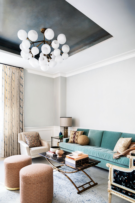
I. The Science of Color Perception
Before we dive into the specifics of color selection, let’s touch on the fascinating science behind how our brains perceive colors. Colors have the remarkable ability to evoke emotions and trigger sensory responses, making them a potent tool in interior design. However, striking the right balance is crucial, as an excess of colors can lead to sensory overload, while too few can result in monotony.
How to Choose Effectively:
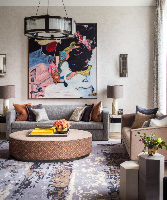
- Follow the “Rule of Three”: Select three key colors—a dominant wall color, a complementary secondary shade, and a vibrant accent hue. For example:
- Dominant: Light gray for walls
- Secondary: Subtle beige for furniture or trims
- Accent: Bright coral in décor
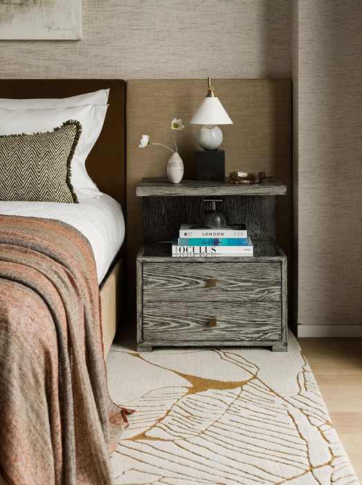
- Adapt to Room Functionality: Bedrooms may call for calming hues like powder blue, while social spaces benefit from energizing tones like yellow.
Wall colors hold the key to setting the mood of your home. Whether you use muted tones for relaxation or bold hues for energy, a well-thought-out palette can elevate your interior to match its purpose and aesthetics.
Beyond Three: Exploring Variation
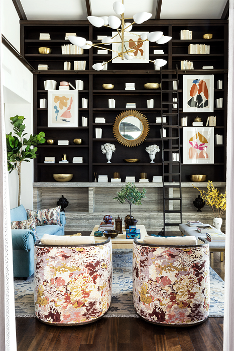
While the Rule of Three provides a solid foundation, it’s essential to note that creativity knows no bounds. Some designers choose to expand the palette slightly, incorporating additional shades or tints to amplify the richness of the ambiance.
For instance, a modern kitchen might showcase a quartet of colors, with a soft gray joining the trio mentioned earlier, adding a touch of elegance and versatility.
Related Post: The Rule Of Three For Decorating Your Home
II. The Importance of a Thoughtful Color Palette
Creating your home’s color palette is not just about aesthetics; it’s about creating an environment that supports your lifestyle and resonates with your personality. Colors have the ability to:
- Evoke Emotions: Soft blues and greens calm the mind, while bold reds and yellows energize the space.
- Create Functionality: Lighter hues make small spaces feel larger, while darker tones add intimacy to larger areas.
A carefully curated color palette sets the mood and ensures your home feels balanced, functional, and welcoming.
Don’t Miss: Choosing Vibrant Colors: A Complete Room-by-Room Guide
III. The Art of Visual Balance
Why Wall Colors Shape Perceptions: Wall colors play a significant role in creating visual balance by influencing how spaces are perceived in terms of size, openness, and intimacy. The strategic use of lighter or darker wall colors can make rooms feel expansive or cozy, respectively.
How to Achieve Balance:
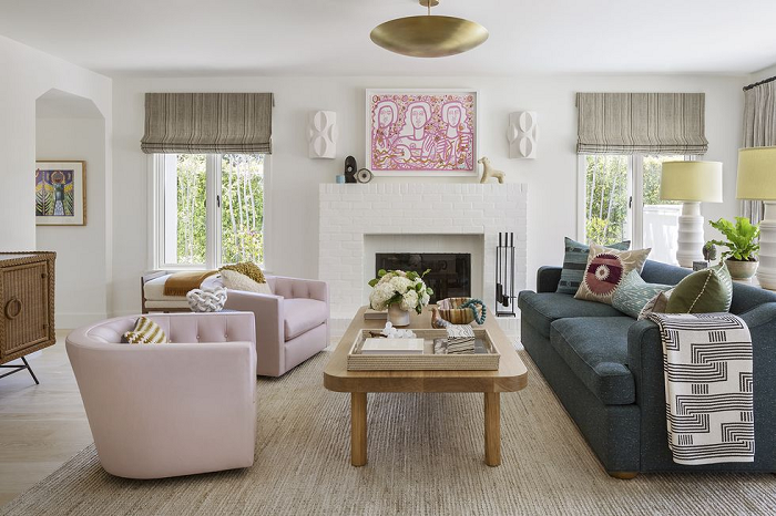
- Light Colors for Openness: Use pale yellows or pastel pinks on walls to make smaller rooms appear larger and airier. These hues reflect light and erase boundaries, adding to the feeling of spaciousness.
- Dark Colors for Intimacy: In larger rooms, opt for rich, dark wall colors like deep emeralds or velvety burgundies. These shades create a sense of enclosure and warmth, perfect for areas meant to feel cozy.
Understanding how wall colors interact with light and space empowers you to design rooms that serve their intended purpose. From brightening compact areas to adding allure in expansive rooms, the thoughtful selection of wall colors enhances the overall ambiance.
How Wall Colors Affect Mood:
- Serenity in Soft Hues:
- Pastels like lavender and powder blue are soothing and restful.
- Ideal for serene bedrooms or cozy reading nooks, these colors encourage relaxation and help unwind after a busy day.
- Energizing with Bold Tones:
- Fiery red and electric yellow inspire vitality and excitement.
- Perfect for dynamic social spaces like dining rooms or entertainment areas, where cheerful interactions thrive.
By choosing wall colors with purpose, you can transform each room into a space that not only looks stunning but also aligns with its intended emotional experience. Whether you aim to relax or energize, your palette becomes an essential tool in crafting a harmonious living environment.
Trending: 10 Best Couch Colors That Make a Room Look Bigger

IV. Crafting Your Own Color Palette: A Step-by-Step Guide
Designing a captivating color palette for your home is an exciting endeavor that requires a delicate balance of creativity and strategy. By following a step-by-step approach on how many colors you should have in your home, you can curate a harmonious color plan that resonates with your space and preferences.
Step 1: Understand Your Space
Your room’s architecture and layout lay the foundation for selecting the right wall colors. Factors such as natural light, room size, and existing elements like furniture or fixtures play a vital role in guiding your choices.
How to Assess Your Space:
- Natural Light:
- Sunlit rooms can benefit from cooler wall colors like soft blues or greens, which enhance the airy, open ambiance.
- Dimmer spaces might call for warmer tones to add a cozy glow.
- Room Size:
- For smaller rooms, lighter wall colors expand the space visually.
- Larger spaces can handle bolder, darker hues without feeling overwhelming.
- Existing Features:
- Coordinate wall colors with prominent furniture or fixtures for a cohesive design.
By understanding the interplay between your space and wall colors, you’ll set the stage for a harmonious and visually appealing environment.
Step 2: Select Your Dominant Color
Your dominant wall color serves as the anchor for your color palette, defining the room’s mood and establishing a visual foundation.
How to Choose Your Dominant Wall Color:
- Select a hue that resonates with the room’s purpose:
- For intimate spaces like living rooms, try warm neutrals like caramel or terracotta.
- In modern, minimalist rooms, cool grays or whites create a sleek backdrop.
- Apply the dominant color to larger surfaces like walls or main furniture pieces to ensure it stands out.
Choosing the right dominant wall color ensures your space embodies the atmosphere you want to convey, whether it’s warm and inviting or sleek and modern.
Step 3: Introduce Secondary Shades
Secondary wall colors add dimension and depth to your design, complementing the dominant hue.
How to Introduce Secondary Colors:
- Use shades that harmonize with your dominant wall color:
- For example, pair rich navy blue walls with muted gold or sage green.
- Incorporate secondary hues into:
- Furniture upholstery
- Curtains or rugs
- An accent wall for added visual interest
Well-chosen secondary shades enhance the richness of your palette, creating a cohesive and inviting space.
Step 4: Play with Accent Colors
Accent colors infuse personality and vibrancy into your design, appearing in smaller yet impactful details.
How to Use Accent Colors:
- Opt for bold, striking hues to contrast the primary palette:
- With navy blue walls and gold secondary shades, vibrant coral or mustard yellow makes a compelling accent.
- Apply accent colors to:
- Throw pillows
- Artwork or framed décor
- Decorative objects or vases
Thoughtfully placed accents elevate your wall color scheme, turning ordinary rooms into extraordinary expressions of personal style.
Step 5: Test and Refine
Testing wall colors ensures they appear harmonious under different lighting conditions and in various parts of the room.
How to Test Your Wall Colors:
- Sample paint swatches and observe them at different times of the day under natural and artificial lighting.
- Pay attention to how colors interact with the room’s architecture and furnishings.
Testing refines your choices, guaranteeing that your wall colors look flawless in every lighting scenario.
Step 6: Embrace Visual Balance
Achieving balance is the key to creating a well-proportioned, harmonious color palette. The 60-30-10 rule guides this process perfectly.
How to Distribute Wall Colors:
- 60% Dominant Color: Cover walls and ceilings with the main hue.
- 30% Secondary Shade: Use complementary colors in trims, rugs, or furniture.
- 10% Accent Color: Add bold pops of personality in artwork, cushions, or smaller décor.
By embracing balance through this formula, you ensure that your wall colors are not only visually stunning but also well-proportioned and thoughtfully curated.
Step 7: Reflect Your Personality
Your home is a canvas to showcase your unique style and preferences. Wall colors set the backdrop, but it’s the personal touches that make a space truly yours.
How to Incorporate Your Personality:
- Cherished Collections:
- Display vintage ceramics or heirloom décor that resonate with your personal history.
- Use wall-mounted shelves or shadow boxes to tie these items into your color story.
- Artwork and Décor:
- Incorporate abstract paintings or framed photographs that complement your wall colors.
- Choose pieces with accent hues to highlight your chosen color palette.
- Textiles and Accessories:
- Add bold-colored cushions, patterned throws, or textured rugs that align with your personality and preferred style.
By infusing your space with personal elements that harmonize with your wall colors, you create a design that feels authentic and expressive. These thoughtful details transform a house into a home that reflects your identity in every corner.
Don’t Miss: 15 Best Interior Design Rules For Decorating Your Home
V. The 60-30-10 Rule: Your Color Blueprint
Imagine having a blueprint that effortlessly guides you through the process of color selection. The 60-30-10 rule is exactly that – a foolproof formula that designers swear by to create an appealing and harmonious color scheme.
How to Apply the 60-30-10 Rule:
- 60% – The Dominant Wall Color: Choose a main color to cover large surfaces like walls and ceilings. For instance:
- Light gray for a calm and neutral foundation in living spaces.
- Soft beige to add warmth in cozy family rooms.
- 30% – The Secondary Shade: Use complementary colors to enhance visual depth and texture:
- Muted blue for accent walls or curtains in bedrooms.
- Warm terracotta for furniture or rugs in dining areas.
- 10% – The Accent Color: Inject personality with bold, eye-catching hues in smaller details:
- Vibrant mustard in cushions or décor objects.
- Bright coral in wall art or frames.
By adhering to this rule, you create a well-proportioned interplay of wall colors, ensuring no single hue overwhelms the design. The result is a visually engaging yet cohesive aesthetic that feels professionally curated.
Also: Faux Plants Secrets to Decorate Like a Pro (And Fool Everyone!)
VI. Mastering Your Wall Color
Why Wall Colors Hold the Key: Wall colors have the unique power to tie all design elements together, creating a unified and immersive experience. A thoughtful selection of colors serves as the foundation upon which all other decor choices build.
How to Master Wall Colors:
- Start with Neutrals: Use subtle base colors like creams and grays to establish versatility.
- Layer Bold Elements: Bring in statement shades through feature walls or large artworks.
- Use Textures for Depth: Pair solid wall colors with textured finishes like wallpaper or exposed brick.
- Match Across Spaces: Maintain a consistent palette across open-concept areas to ensure seamless transitions.
- Incorporate Seasonal Variations: Refresh accent wall colors with seasonal hues—for example, warming orange in fall or soft pastels in spring.
Wall colors are the backbone of a cohesive design. With strategic choices and careful planning, they become the storyteller of your home, capturing your style and setting the mood for every room.
Most Popular Post:
10 Surprising Benefits of Printable Wall Art
15 Must-Have Accessories For Styling A Coffee Table
How to Choose the Perfect Interior Color Scheme for Your Home
Expert Guide On How To Buy A Rug For Each Room
Conclusion
Wall colors aren’t just a design element—they’re a language of style, comfort, and expression. Designers have long mastered the ability to transform spaces using hues that inspire, calm, or energize.
From the monochrome serenity of urban escapes to vibrant symphonies of bold tones, the right wall colors elevate interiors into living works of art. So, as you embark on your journey to redefine your spaces, remember that the magic of wall colors lies in their ability to turn mere walls into reflections of your lifestyle and imagination.
How Many Colors You Should Have In Your Home–(FAQs)
1. Why is color selection important in home design?
Color selection is a crucial aspect of home design as it sets the tone, mood, and ambiance of your living space. Colors have the power to influence emotions, perceptions, and even functionality within a room. Choosing the right color palette can transform a space from ordinary to extraordinary, creating a harmonious and visually pleasing environment.
2. How do I choose the right color palette for my home?
Choosing the right color palette involves considering factors such as natural light, room size, existing furniture, and personal preferences. Begin by understanding the architecture of your space and selecting a dominant color that reflects the desired mood. Complement it with secondary and accent colors that add depth and interest. Test the chosen colors in different lighting conditions to ensure harmony and balance.
3. What is the 60-30-10 rule and how do I use it?
The 60-30-10 rule is a color scheme guideline that suggests dividing your color palette into three main proportions: 60% dominant color, 30% secondary color, and 10% accent color. This rule provides a balanced and visually appealing composition. Apply the dominant color to the majority of the room, use the secondary color for furniture and draperies, and introduce the accent color through smaller decor elements.
4. Can I deviate from the 60-30-10 rule?
While the 60-30-10 rule is a widely used guideline, it’s not a strict requirement. Design is about creative expression, and you can certainly adapt the rule to suit your preferences. Some designers choose to use variations of the rule, such as 70-20-10 or 50-30-20, depending on the desired visual impact.
5. How can I create a cohesive color palette for an open-concept space?
For open-concept spaces, maintaining color cohesion is essential to ensure a seamless flow. Choose a consistent dominant color that unifies the entire area. Introduce variations of this color as secondary shades to create a harmonious transition between different zones. Use accent colors strategically to define specific areas and add visual interest.
6. What role does color psychology play in home design?
Color psychology explores the emotional and psychological effects of colors on individuals. Different colors evoke different emotions and moods. For example, blues and greens are often associated with calmness and serenity, while yellows and oranges can convey energy and warmth. Incorporating color psychology into your design can help create spaces that resonate with the desired atmosphere and emotions.
7. Should I follow trends or choose timeless colors?
Both approaches have their merits. Following trends can give your home a contemporary and stylish look, but it’s important to ensure that the chosen trends align with your personal style. Timeless colors, on the other hand, offer longevity and versatility. Consider a balance between current trends and classic hues to create a timeless yet fashionable color palette.
8. How can I incorporate my personal style into my color palette?
Incorporating your personal style involves infusing elements that reflect your tastes, interests, and experiences. Consider using accent colors inspired by your favorite artworks, textiles, or travel experiences. Incorporate meaningful decor pieces that carry sentimental value. Your color palette should not only be visually pleasing but also a reflection of your unique personality.
9. Can I change my color palette over time?
Absolutely, your color palette isn’t set in stone. As your preferences and lifestyle evolve, you can update your color scheme to align with your current tastes. Consider repainting walls, updating upholstery, or changing decor elements to breathe new life into your space. Flexibility in color selection allows you to create a home that grows and adapts along with you.
10. Where can I find inspiration for my home color palette?
Inspiration for your home color palette can be found everywhere – from nature and art to fashion and travel. Explore design magazines, online platforms, and social media for ideas. Create mood boards or collages to visualize how different colors come together. Pay attention to colors that resonate with you in everyday life and use them as a starting point for your palette.
Remember, choosing a color palette is a creative journey that allows you to shape your living spaces according to your vision and personality. Whether you’re drawn to bold and vibrant hues or prefer a serene and understated palette, the possibilities are as limitless as your imagination.
Subscribe To the Newsletter!
Subscribe now for an endless feed of inspirational women cave decor ideas, pampering rituals and more tips for curating your ultimate escape. Let’s get started on making your cozy refuge a reality – you so deserve this!
CATCH THE LATEST IN HOME DECOR TRENDS:

Steal These 16 Expert-Approved Decorating Secrets

How To Accessorize Your Living Room

Small Space? 10 Ways To Make A Room Appear Bigger

Make Your space Look Expensive
GET CAUGHT UP ON ALL THE INSPIRING DECOR TIPS:

18 Fresh Decorating Ideas To Update Your Fireplace

How to Make a Gallery Wall: The Complete Step-by-Step Guide (Even If You’ve Never Hung a Picture)
