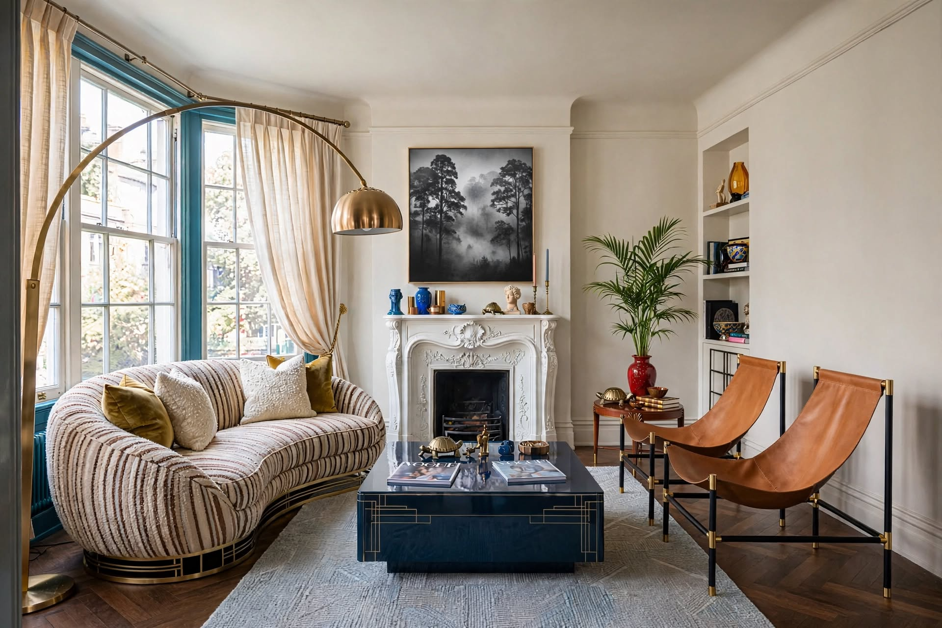
The rule of three in interior design says décor grouped in odd numbers, especially threes, looks more balanced and interesting than pairs or even groupings. Its partner, the rule of thirds, divides a wall, shelf, or room into three equal parts so your art, furniture, and focal points land in the right spots. Use both together: group accessories in threes, size art to about two-thirds of the furniture below it, and split rooms into three zones.
You’ve probably spent hours scrolling through #ShelfieGoals on Instagram, wondering why their floating shelves look curated and yours look… chaotic. Or maybe you’ve hung a piece of art above your sofa three times, each attempt feeling somehow “off”: too small, too high, too lonely on that big blank wall.

Here’s the truth: You’re not bad at decorating. You’re just missing the formula.
The rule of three in interior design, and its partner, the rule of thirds, is the hidden framework behind every magazine-worthy living room, every perfectly styled console table, and every gallery wall that makes guests ask, “Wait, you didn’t hire someone?” It’s not about buying more expensive furniture. It’s about understanding the simple principle that tricks your eye into seeing balance, movement, and intention.
In this guide, you’ll learn exactly how to apply the rule of three (and the rule of thirds) across every area of your home, from wall art placement to furniture arrangement to those maddening coffee table vignettes. No design degree required. Just a willingness to see your space through a new lens (and maybe rearrange a few things).
In This Guide
- What Is the Rule of Three in Interior Design?
- Why Your Eye Craves Threes & Thirds
- How to Apply It to Wall Décor
- The Rule of Thirds for Furniture Arrangement
- Styling Shelves & Surfaces
- Color & Texture (The 60-30-10 Connection)
- Common Rule of Three Mistakes
- When to Break the Rule
- The Rule of Three Across Design Styles
- Where to Splurge vs. Save
- Renter-Friendly Ways to Use It
- Free Apps to Test the Rule Before You Buy
- Before & After Examples
- FAQs
What Is the Rule of Three in Interior Design?

The rule of three in interior design is the principle that objects grouped in odd numbers, most often three, look more balanced, interesting, and memorable than pairs or even-numbered groupings. You can apply it to accessories, colors, textures, furniture, and focal points.
This isn’t random decorator wisdom. It’s borrowed from centuries of artistic tradition. Photographers use the rule of thirds to frame compelling shots, and painters have long used odd groupings to guide the viewer’s gaze. Interior designers apply it because our brains find odd-numbered groupings more engaging than even ones.
Here’s why: Even numbers feel “resolved.” Two matching lamps on a dresser? Your brain registers it as symmetrical and moves on. There’s no visual tension, no reason to linger. But three objects? Now there’s a story. The eye bounces between them, looking for relationships, which creates a sense of movement and life.
Artists call this the Rule of Odds: when we see two objects, the brain files them as “a pair” and moves on. Three objects create a triangle that keeps the eye engaged, searching for hierarchy and connection.
Think of the rule of three as a cheat code for avoiding both the sterile hotel-lobby look (too symmetrical) and the cluttered thrift-store vibe (no structure). It’s the Goldilocks zone of design.
Rule of Three vs. Rule of Thirds: What’s the Difference?
People mix these two up all the time, and that’s fine, because they work as a team. The rule of three is about how many things you group. The rule of thirds is about where you place them, by dividing a space into three equal parts.
| Rule of Three | Rule of Thirds | |
|---|---|---|
| What it controls | How many items you group | Where items sit and how big they are |
| The core idea | Odd numbers (3, 5) feel more natural than pairs | Split a wall, shelf, or room into three equal parts |
| Everyday example | Vase + books + tray on a coffee table | Art about two-thirds the width of the sofa below it |
| Best for | Vignettes, shelves, pillows, colors, textures | Wall art, furniture layout, vertical balance |
The rest of this guide uses both: threes for your groupings, thirds for your placement and scale.
Why Your Eye Craves Threes & Thirds

The rule of three works with the Rule of Odds, and the rule of thirds adds four “power points,” the spots where lines divide a space into nine equal sections. Those intersections naturally draw the eye, which makes them the best places for focal objects, lighting, and statement pieces.
When you look at a room, your eye doesn’t scan randomly. It follows a predictable path, searching for:
- Focal points: Where should I look first?
- Visual weight: What feels heavy or light in the composition?
- Negative space: Where can my brain rest?
Both rules satisfy all three by creating intentional imbalance. Instead of splitting a wall 50/50 with two pieces of art (boring), you fill two-thirds with a large statement piece and leave one-third open (interesting). Instead of lining all your furniture up along one wall, you spread seating across three zones, creating conversation pockets and flow.
Understanding the Four Power Points
When you mentally divide a wall (or room) into thirds both horizontally and vertically, you create a grid with four intersection points. Photographers call these “power points,” and your eye is naturally drawn to them.
- Place a floor lamp or sculptural object on one of these four points in your living room layout.
- Position the focal point of your art (the main subject or darkest area) at one of these intersections on your wall.
- Arrange your key furniture pieces so their visual weight hits these points from your main viewing spot.
This isn’t about pulling out a ruler. It’s about training your eye to see where objects feel “right.” Stand in your doorway and notice where your eye lands first. That’s probably close to one of those four power points.
Your viewing spot matters. Apply the rule from your doorway, your main seat, or wherever you spend the most time looking at the room. A room can feel balanced from the couch but chaotic from the entrance if you ignore the angle.
The Golden Ratio vs. the Rule of Thirds
You might have heard of the Golden Ratio (1:1.618), a proportion found in nature, architecture, and art. It’s related, but the rule of thirds is simpler and more forgiving. The Golden Ratio demands precision; the rule of thirds just asks for roughly equal divisions. For everyday decorating, thirds are your best friend. Save the Golden Ratio for a custom built-in.
Symmetry vs. the Rule of Three: Choosing Your Vibe
Let’s clear up a common misconception: symmetry isn’t bad. It just serves a different purpose.
Symmetry
Creates grandeur and authority. Think hotel lobbies, traditional dining rooms, and French parlors. Two matching sconces flanking a centered mirror says elegant, timeless, refined.
Best for: formal entryways, dining rooms, architecture
Rule of Three & Thirds
Creates comfort and livability. Think layered living rooms, collected-over-time spaces, and homes that feel “designed but not decorated.”
Best for: living rooms, bedrooms, reading nooks, styling
Many successful rooms use both: symmetry for architectural elements (windows, built-ins) and the rule of three for styling and décor. The magic is knowing when to use each one.
Section 03 · WallsHow to Apply the Rule of Thirds to Wall Décor

When hanging art, your piece (or gallery grouping) should span about two-thirds of the width of the furniture below it, with the rest left as breathing room so the wall doesn’t feel cramped or the art doesn’t look tiny.
This is where most people go wrong. You buy a piece of art you love, hang it above the sofa, step back, and… it looks like a postage stamp floating in the ocean. The problem? It ignores the two-thirds rule.
Measure the Furniture
Measure the width of your sofa, bed, or console. Example: 84 inches.
Multiply by 0.66
That’s two-thirds. 84 × 0.66 = about 55 inches.
Shop to That Width
Your art or gallery wall should span roughly 50–60 inches across.
Now your art anchors the furniture instead of floating awkwardly above it.
For Tall Walls (Like Above a Fireplace)
- Divide the wall height into three horizontal bands.
- Hang your art in the middle third, centered at 57–60 inches from the floor, which is average eye level and the standard most galleries use.
- Let the top and bottom thirds breathe. Negative space is décor.
- Use floor lamps or sconces to highlight texture and add a third layer of interest. Light is the invisible third element.
The two mistakes I see most with wall art are hanging it too high and buying it too small. Measure the furniture first, then shop for the art.
The Rule of Thirds for Furniture Arrangement
When arranging furniture, the rule of thirds divides the room into three functional zones (conversation, circulation, and breathing space) so no single area feels overcrowded and the whole room flows.
Think of your living room like a stage. If all the actors (furniture) are shoved into one corner, the performance feels awkward. The rule of thirds gives you a “blocking” plan.

- 1Divide the room into three zones
Front third: primary seating (sofa, coffee table). Middle third: secondary seating or the rug that anchors the space. Back third: a console, bookshelf, or intentional open space.
- 2Ground two-thirds, leave one-third open
Your rug should cover about two-thirds of the floor under the main seating area, with the rest of the floor showing. That keeps the room from feeling floaty (rug too small) or cramped (rug too big). See our area rug guide for sizes.
- 3Build three-point seating clusters
Arrange seating in triangles, not lines. A sofa plus two chairs (not four chairs) creates conversation and movement.
Vertical Thirds: The Three-Level Strategy

Most decorating advice treats rooms as flat. But you live in three dimensions. The rule of thirds works vertically too, which matters most if you have high ceilings (10+ feet) or low ceilings (under 8 feet).
Upper Third (6+ feet): The Drama Layer
Statement lighting, crown molding, high shelves, tall plants. In high-ceiling rooms, don’t leave this zone empty or it will feel cavernous.
Middle Third (3–6 feet): The Eye-Level Layer
Wall art and mirrors (centered at 57–60 inches), window treatments, console tables. This is where your eye lands first.
Lower Third (0–3 feet): The Foundation Layer
Sofas, coffee tables, ottomans, area rugs, baskets, and low benches.
High ceilings: If you only decorate the lower and middle thirds, the top feels like a dead zone. Add a dramatic pendant, hang curtains from the ceiling (not the window frame), or install floating shelves at 7–8 feet to pull the eye up.
Low ceilings: Put most of your visual interest in the middle third. Skip heavy upper elements like bulky crown molding or dark paint near the ceiling, which compress the space. Floor-to-ceiling curtains “stretch” the height.
In a small apartment, flip the ratio: fill one-third with furniture and leave two-thirds for walking room. It prevents the “can’t walk through my own apartment” feeling. Our small living room layout guide shows how.
Styling Shelves & Surfaces with the Rule of Three

On shelves, mantels, and coffee tables, the rule of three means grouping objects in sets of three that vary in height, texture, and visual weight, so the arrangement looks curated instead of cluttered or sparse.
This is where the rule gets fun. You’re not just arranging; you’re telling a story.
One Tall Item
A vase, a lamp, or a sculptural object. This is your anchor.
One Medium Item
A small plant, a candle, a framed photo, or a stack of books. This adds contrast.
One Low Item
A bowl, a tray, or a trailing plant. This grounds the grouping.
Example: A Coffee Table Vignette
| Item | Height | Texture | Why It Works |
|---|---|---|---|
| Ceramic vase with pampas grass | 18″ (tall) | Matte, organic | Creates a vertical stop for the eye and anchors the grouping |
| Linen-bound coffee table book | 12″ stacked (medium) | Soft, tactile | Bridges the heights and adds personal interest |
| Wooden catchall tray | 2″ (low) | Warm, natural | Grounds the group and corrals clutter, giving the eye a place to rest |
Why this works: You’ve hit three heights, three textures, and each object has a job. The eye travels in a zigzag across the table and never lands on two identical objects.
The same formula works everywhere: on a console table (lamp, books, bowl), a side table (lamp, plant, coasters), or open shelves (one trio per shelf, staggered).
Avoid grouping in fours or sixes. Even numbers feel matchy. If you have four objects you love, split them: three on one shelf, one on another.
The Rule of Three in Color & Texture

The rule of three carries into color through the 60-30-10 rule: 60% of the room in a dominant neutral, 30% in a secondary color, and 10% in a bold accent. Three colors, three proportions.
You’ve probably heard of the 60-30-10 color rule. It’s the rule of three, just wearing a different hat.
Neutral Base
Walls, large furniture, rugs. This is your resting space; it lets the eye relax.
Secondary Color
Curtains, throw pillows, smaller furniture. This ties the room together.
Accent Pop
Art, vases, one bold chair. This is your focal point.
Choosing Your Three Textures
Just like you group objects in threes, aim for three dominant textures in a room. More than that feels chaotic. Fewer feels flat.
| Texture Trio | Best For | Example Combo |
|---|---|---|
| Linen + Travertine + Matte Black | Modern Organic, Scandi | Linen sofa + stone coffee table + black steel shelving |
| Velvet + Brass + High-Gloss Lacquer | Glam, Art Deco | Velvet armchair + brass side table + lacquered console |
| Jute + Reclaimed Wood + Terracotta | Boho, Earthy Minimalism | Jute rug + wood bench + terracotta pots |
Common Rule of Three Mistakes (And Fast Fixes)

The most common mistakes are art that’s too small for the wall, décor grouped in even numbers, and no breathing room, which leaves rooms feeling cluttered or sterile even when you’re technically “following the rules.”
The “Too-Perfect” Gallery Wall
Problem: You spaced everything evenly, and now it looks like a spreadsheet.
Fix: Cluster two-thirds of the frames on one side and keep the last third looser or lower.
Four Matching Throw Pillows
Problem: Even numbers. Your sofa looks like a hotel bed.
Fix: Use three or five pillows and vary the sizes: two 22″ and one 18″.
Centering Everything
Problem: One centered vase, one centered tray. The room feels polite and airless.
Fix: Push the vase to one side, add a stack of books, and leave the last third empty.
Ignoring Your Viewing Spot
Problem: The room looks great from the couch but chaotic from the door.
Fix: Stand at your “hero view,” take a photo, and adjust until it feels balanced from there.
When to Break the Rule of Three

The rule of three is a reliable foundation, but designers break it on purpose for maximalist drama, pared-back minimalism, or a single statement piece that deserves all the attention.
Rules exist to be broken, but only once you understand why they work. Here’s when to ignore it:
- Maximalist spaces: Full-on boho or cottagecore thrives on more than three objects per surface. Just keep variety in height and texture within each cluster.
- Statement walls: A floor-to-ceiling mural or a huge abstract painting should dominate the wall. That’s a “rule of one”: the art is the room.
- Scandinavian minimalism: Sometimes two objects are enough. A sculptural vase next to one book is intentional restraint, and the empty space becomes the third element.
- When grandeur is the goal: Two matching wingback chairs flanking a fireplace, or twin chandeliers over a dining table, create ceremony. The rule of three is for comfort; symmetry is for impact.
Breaking the rule works when you do it on purpose. If something feels off and you don’t know why, go back to threes. If it feels off and you like the tension, you’ve mastered intentional imbalance.
The Rule of Three Across Design Styles

The rule of three adapts to every style. It shows up as white space in Scandinavian rooms, layered zones in boho spaces, and tone-on-tone shades in Japandi, because it’s based on how people see, not on a trend.
| Style | How the Rule Shows Up | Key Example |
|---|---|---|
| Scandinavian | White space counts as one of the three | Two objects + intentional emptiness on a shelf |
| Boho | Layered textures in three vertical zones | Floor cushions + hanging plants + macramé wall hanging |
| Modern Organic | Three natural materials lead the palette | Linen + wood + stone repeated around the room |
| Industrial | Three metal finishes | Black metal shelving + steel table + brass pendants |
| Japandi | Three shades of one neutral family | Cream walls + oat linen + sand-colored wood |
 Section 10 · Budget
The Rule of Three Budget Strategy: Splurge vs. Save
To get the most impact for your money, split your spending into three tiers: splurge on one anchor piece, spend moderately on a supporting piece, and save on small accents. It mirrors the visual hierarchy the rule creates.
Here’s the truth: you don’t need three expensive things. You need one great thing and two smart things.
Budget Breakdown for a Coffee Table Vignette
| Spend Tier | Item | Why | Typical Cost |
|---|---|---|---|
| Splurge | Handmade ceramic vase or sculptural object | Your conversation piece and anchor | $150–$250 |
| Moderate | Vintage or artisan coffee table book | Adds sophistication without breaking the bank | $40–$60 |
| Save | Organic filler (dried eucalyptus, decorative box) | High visual impact, low cost | $15–$25 |
Shop your home first. That vase you bought two years ago and shoved in a closet might be the anchor you need. The rule of three is about repositioning, not always re-buying.
Renter-Friendly Ways to Use the Rule of Three

Renters can use the rule of three without permanent changes: three-object groupings on movable furniture, removable hooks for art sized to two-thirds of the furniture, and rugs or freestanding dividers to create zones.
You don’t own the walls. You can’t paint. You definitely can’t install built-ins. You can still design like a pro.
- Art placement: Use removable picture-hanging strips rated for your frame’s weight. Measure your two-thirds width, hang the art, and peel it off damage-free when you move.
- Furniture zones: Use area rugs to divide a studio into three zones (sleeping, living, dining) without walls.
- Shelf styling: One good leaning ladder shelf styled with a three-object cluster on each tier. When you move, it moves.
Free Apps to Test the Rule Before You Buy
Before you buy furniture or hang anything, mock up the room in a free app. Canva works for 2D mood boards, Floorplanner for to-scale layouts, and Homestyler for 3D views, so you can test the two-thirds proportions without costly trial and error.
The fastest way to fail at the rule of three? Buying first, measuring later.
Canva
Drop in images of your furniture, art, and décor, and arrange them in three-object groupings. If it feels balanced on screen, it will feel balanced in real life.
Floorplanner
Enter your room dimensions and place furniture to check you’re hitting “two-thirds filled, one-third open.”
Homestyler
Build your room in 3D, place furniture and art, and adjust until the proportions look right. Screenshot it and shop with confidence.
Why this works: You’re training your eye to see threes and thirds before you spend money. By the third mock-up, you won’t need the app; you’ll just know.
Rule of Three Before & After Examples
Here’s what the rule of three and the rule of thirds look like in three common scenarios.

The Too-Small Living Room Art
Before: A 24″ × 36″ print above a 90″ sofa. It covered about a quarter of the sofa’s width and looked lost.
After: A 60″ × 40″ statement piece, about two-thirds of the sofa width. The room feels grounded and intentional.
Typical cost: A large canvas print this size often runs $150–$400.
Rule used: Two-Thirds Art Formula
The Cluttered Coffee Table
Before: Six small objects (coasters, candles, a bowl, random keys). Visual chaos, no hierarchy.
After: Three objects: an 18″ vase, a 12″ stack of books, and a 2″ wooden tray. Clean and purposeful.
Typical cost: $0. Shop your home and edit out the rest.
Rule used: Three-Object Formula
The High-Ceiling Bedroom
Before: 12-foot ceilings with all furniture and art in the lower 6 feet. The top half felt empty and cavernous.
After: A pendant light at 8 feet (upper third), art at eye level (middle third), and a tall floor plant bridging the lower and middle thirds.
Typical cost: Roughly $150–$250 for a pendant and $40–$80 for a tall plant.
Rule used: Vertical ThirdsYour Space, Redesigned Without the Designer Price Tag
You now have the framework designers use to create those “I can’t explain it, but it just works” rooms. The rule of three (and its partner, the rule of thirds) isn’t about perfection. It’s about perception: your eye craves movement, balance, and just enough asymmetry to stay interested.
Here’s what happens next: walk through your home with fresh eyes. Spot the two matching lamps on your dresser and swap one for a stack of books. Measure the art above your couch: is it about two-thirds of the sofa’s width? Restyle your coffee table with three objects at three heights. Then stand in your doorway and check the room from there.
Start with one room this weekend. Once you see the difference, you’ll stop second-guessing, shop with purpose, and feel proud every time someone walks in.

If you want the full formulas, spacing rules, and layout math from this guide (and every other room in your home) in one place, grab The Designer’s SECRET Cheat Sheet — it’s the shortcut version of everything a designer checks before calling a room finished.
Get the Cheat Sheet →And if you want more of this in your feed, come find us @thedecorholic on Instagram, Facebook, TikTok, and Pinterest for more room-by-room styling breakdowns like this one.