Are you looking to transform you home, then the 60/30/10 rule will help you achieve just that! Now, imagine stepping into a living room bathed in the soothing hues of a coastal sunset – soft blues, sandy tans, and pops of coral – effortlessly creating a sense of tranquility and relaxation. Or envision a kitchen bursting with vibrant energy, where crisp white walls provide a clean backdrop for bold splashes of yellow, orange, and turquoise. Color, the chameleon of interior design, has the power to transform a space, evoking a myriad of emotions and setting the tone for our daily lives.
Color psychology, the study of how colors affect human behavior, emotions, and perceptions, reveals the profound impact color has on our well-being. Warm hues like red, orange, and yellow stimulate energy and excitement, while cool tones like blue, green, and purple promote calmness and serenity. Neutrals, such as white, beige, and gray, offer a sense of balance and versatility, serving as a foundation for bolder accent colors.
In interior design, mastering color harmony is essential for creating harmonious and visually appealing spaces. The 60/30/10 rule, a simple yet effective guideline, provides a framework for achieving color balance and transforming your home into a sanctuary of style and comfort.
“The 60-30-10 rule is like a recipe for color. It provides a simple framework for creating balanced and visually pleasing spaces.”
Emily Henderson, Founder of Emily Henderson Design
What’s The 60/30/10 Rule

The 60/30/10 rule is a simple yet effective guideline for creating harmonious color schemes in interior design. It suggests that 60% of the visual space should be covered in a dominant color, 30% in a secondary color, and 10% in an accent color. This formula helps to distribute colors evenly and prevents any one color from becoming too overwhelming.
The dominant color typically serves as the foundation of the space, often seen in walls, flooring, or large furniture pieces. It establishes the overall mood and atmosphere of the room. The secondary color complements the dominant color and adds depth and dimension to the space, often seen in upholstery, curtains, or accent furniture. The accent color provides pops of vibrancy and visual interest, often seen in decorative items like throw pillows, artwork, or accessories.
The 60/30/10 rule is a versatile tool that can be applied to various rooms in your home, from living rooms to bedrooms to kitchens. It provides a framework for creating balanced and aesthetically pleasing spaces, while still allowing for personal expression and creativity.
“The 60-30-10 rule is a valuable tool, but remember that color is a personal journey. Experiment, have fun, and don’t be afraid to break the rules if it creates a space you love.”
Kelly Wearstler, Interior Designer
Understanding the 60/30/10 Rule: A Practical Guide to Harmonious Color Schemes
The 60/30/10 rule, a cornerstone of interior design principles, serves as a roadmap for creating balanced and visually appealing color palettes. This simple yet powerful guideline divides the color scheme into three distinct proportions, each playing a crucial role in establishing the overall ambiance of a space.
“If you are looking for a way to style your space with wall art without breaking your piggy bank, then I recommend reading “10 Surprising Benefits of Printable Wall Art”

The Dominant Color (60%)

The dominant color, forming the foundation of the color scheme, occupies approximately 60% of the visual space. It typically appears on walls, large furniture pieces, or flooring, setting the overall mood and tone of the room. Choosing a dominant color that aligns with the desired atmosphere is essential. For instance, soothing neutrals like white, beige, or gray create a sense of spaciousness and tranquility, while bolder hues like deep blue or rich burgundy exude elegance and sophistication.
The Secondary Color (30%)

The secondary color, playing a supporting role, accounts for approximately 30% of the color palette. It complements the dominant color, adding depth, dimension, and visual interest to the space. Often seen in upholstery, curtains, or accent furniture, the secondary color should harmonize with the dominant color, creating a cohesive and aesthetically pleasing ensemble. For example, pairing a warm cream dominant color with a soft sage green secondary color evokes a sense of natural harmony, while combining a crisp white dominant color with a rich navy secondary color creates a striking contrast.
The Accent Color (10%)

The accent color, injecting pops of personality and excitement, makes up the remaining 10% of the color scheme. It adds vibrancy and draws attention to specific features in the room, such as artwork, throw pillows, or decorative accents. The accent color should be bold and eye-catching, contrasting with the dominant and secondary colors to create visual interest. For instance, incorporating pops of turquoise into a neutral-toned living room can add a touch of coastal charm, while introducing accents of fiery red into a serene bedroom can infuse a spark of energy.
Real-Life Examples of the 60/30/10 Rule in Action

To illustrate the versatility of the 60/30/10 rule, let’s explore a few examples of how it can be applied to different interior spaces:
Living Room:
- Dominant Color: Soft White (walls, flooring, or large furniture pieces)
- Secondary Color: Pale Blue (upholstery, curtains, or accent furniture)
- Accent Color: Orange and Yellow Accents (throw pillows, artwork, or accessories)
Bedroom:
- Dominant Color: Tranquil Gray
- Secondary Color: Delicate Lavender
- Accent Color: Pops of Peach and Coral
Kitchen:
- Dominant Color: Crisp White
- Secondary Color: Refreshing Mint Green
- Accent Color: Vibrant Turquoise Accents
Bathroom:
- Dominant Color: Calming Beige
- Secondary Color: Serene Seafoam Green
- Accent Color: Spa-Like Blue Accents
Flexible Application and Personal Touches
The beauty of the 60/30/10 rule lies in its flexibility and adaptability to individual preferences and styles. The proportions can be adjusted slightly to accommodate personal tastes and the unique characteristics of a room. For instance, a smaller space might benefit from a higher percentage of dominant color to create a sense of spaciousness, while a larger room can handle a bolder secondary color for added visual interest.
Moreover, the rule doesn’t restrict the use of additional colors. While the 60/30/10 framework provides a solid foundation, incorporating complementary or analogous color schemes can further enhance the overall design.
The 60/30/10 rule, a simple yet powerful tool in the interior designer’s arsenal, empowers individuals to transform their homes into havens of style, comfort, and personalized expression. By understanding the interplay of dominant, secondary, and accent colors, anyone can create harmonious and visually appealing spaces that reflect their unique tastes and aspirations. Embrace the power of color and embark on a journey of transforming your home into a reflection of your inner world.
Specific Items/Examples for the 60-30-10 Rule

The 60-30-10 rule provides a framework for achieving harmonious color schemes in interior design. Here’s a breakdown of specific items or examples that fall into each color percentage category:
60% (Dominant Color):
- Walls: The dominant color typically covers the largest area of a room, making walls a prime candidate for this percentage.
- Accent Pieces: Large accent pieces like headboards, armoires, or bookshelves can also effectively incorporate the dominant color.
- Rugs: A large area rug can anchor the space and provide a significant expanse of the dominant color.
- Sofa: The sofa is often the focal point of a living room, making it an ideal choice for showcasing the dominant color.
- Large “Foundation” Pieces: Other large furniture pieces like dressers, dining tables, or bed frames can also contribute to the dominant color scheme.
30% (Secondary Color):
- Curtains: Curtains can add a touch of the secondary color and complement the dominant walls.
- Painted Furniture: Painted furniture pieces, such as nightstands, side chairs, or accent cabinets, can introduce the secondary color.
- Side Chairs: Side chairs can provide a subtle yet noticeable presence of the secondary color, especially when grouped together.
- Smaller “Foundation” Pieces: Smaller furniture pieces like ottomans, benches, or console tables can also contribute to the secondary color scheme.
10% (Accent Color):
- Throw Pillows/Patterned Fabrics: Throw pillows, blankets, or patterned fabrics can add pops of the accent color to various areas of the room.
- Decorative Accessories: Decorative items like vases, candlesticks, picture frames, or wall hangings can introduce the accent color in a subtle yet impactful way.
- Artwork: Artwork, whether it’s paintings, prints, or tapestries, can serve as a focal point for the accent color.
“Think of the 60-30-10 rule as a pie chart. 60% is your dominant color, the foundation of your space. 30% is your secondary color, adding depth and interest. And 10% is your accent color, the exclamation point that ties everything together.”
Joanna Gaines, Home Decorator and Television Personality
Selecting Your Dominant Color (60%): The Foundation of Your Color Scheme

In interior design, the dominant color, encompassing approximately 60% of the visual space, serves as the cornerstone of the color palette. It sets the overall mood, tone, and ambiance of the room, establishing the foundation upon which other colors are layered. Choosing the right dominant color is crucial for creating a harmonious and inviting space that aligns with your personal style and desired atmosphere.
Considerations for Dominant Color Selection
When selecting your dominant color, several factors should be taken into account:
Architectural Style: The architectural style of your home plays a significant role in guiding your dominant color choice. For instance, a traditional-style home might benefit from classic hues like beige, cream, or deep navy, while a contemporary space can embrace bolder colors like crisp white, charcoal gray, or vibrant red.
Natural Light Exposure: The amount of natural light a room receives influences the perceived brightness and spaciousness. In rooms with ample natural light, consider darker dominant colors like deep blue, rich burgundy, or earthy green to create a cozy and inviting atmosphere. Conversely, in spaces with limited natural light, opt for lighter dominant colors like white, beige, or pale yellow to maximize brightness and openness.
Personal Taste and Style: Ultimately, the dominant color should reflect your personal preferences and style. Do you gravitate towards serene neutrals, calming blues, or energizing yellows? Choosing a dominant color that resonates with your taste will create a space that feels authentic and welcoming.
Examples of Dominant Color Choices
To illustrate the versatility of dominant color selection, let’s explore a few examples:
Living Room:
- Tranquil Escape: Embrace a sense of serenity with a dominant color of soft white, creating a clean and airy backdrop for pops of color through artwork, throw pillows, or decorative accents.
- Sophisticated Elegance: Exude sophistication and refinement with a dominant color of deep navy, complemented by rich leather furniture, metallic accents, and warm wooden tones.
- Coastal Charm: Infuse a touch of seaside tranquility with a dominant color of sandy beige, paired with accents of turquoise, coral, and natural wood elements.
Bedroom:
- Relaxing Retreat: Create a haven of relaxation with a dominant color of pale blue, fostering a sense of calm and tranquility.
- Romantic Retreat: Embrace romance and femininity with a dominant color of soft pink, complemented by accents of lace, velvet, and delicate floral patterns.
- Modern Sanctuary: Achieve a sleek and modern aesthetic with a dominant color of charcoal gray, paired with crisp white accents, geometric patterns, and metallic touches.
Kitchen:
- Clean and Fresh: Maintain a clean and refreshing ambiance with a dominant color of crisp white, allowing other colors to shine through appliances, cabinetry, and décor.
- Country Charm: Embrace a warm and inviting atmosphere with a dominant color of farmhouse beige, complemented by accents of natural wood, copper accents, and rustic textures.
- Modern Gourmet: Create a stylish and sophisticated culinary space with a dominant color of deep black, paired with stainless steel appliances, sleek countertops, and minimalist accents.
Balancing the Dominant Color
While the dominant color occupies a significant portion of the visual space, it shouldn’t overwhelm the room. The key lies in balancing the dominant color with complementary and contrasting hues, ensuring a harmonious and visually appealing ensemble.
Selecting the right dominant color is a crucial step in creating a cohesive and inviting interior space. By considering architectural style, natural light exposure, personal taste, and the overall ambiance you wish to achieve, you can establish a foundation upon which your color palette can flourish. Embrace the power of color and transform your home into a reflection of your unique style and personality.
Incorporating the Secondary Color (30%): Adding Depth and Dimension

The secondary color, accounting for approximately 30% of the color palette, plays a complementary role in the 60/30/10 rule, adding depth, dimension, and visual interest to the space. It harmonizes with the dominant color, creating a cohesive and aesthetically pleasing ensemble. Often seen in upholstery, curtains, or accent furniture, the secondary color should complement the dominant color, establishing a sense of unity and balance.
Choosing the Secondary Color: Considerations and Guidelines
Selecting the secondary color requires careful consideration to ensure it complements the dominant color seamlessly. Here are some key guidelines:
Color Harmony: The secondary color should harmonize with the dominant color, creating a sense of visual unity. Consider using complementary colors, which lie opposite each other on the color wheel, for a striking contrast, or analogous colors, which are adjacent on the color wheel, for a more subtle and harmonious pairing.
Emotional Impact: Consider the emotional impact of the secondary color. Warm hues like red, orange, and yellow evoke energy and excitement, while cool tones like blue, green, and purple promote calmness and serenity. Choose a secondary color that aligns with the desired mood of the space.
Existing Colors and Elements: If there are existing colors or elements in the room, such as furniture, flooring, or artwork, consider incorporating those hues into your secondary color selection. This creates a sense of cohesion and ties the entire space together.
Examples of Secondary Color Choices
To illustrate the versatility of secondary color selection, let’s explore a few examples:
Living Room:
- Dominant Color: Soft White (walls, flooring, or large furniture pieces)
- Secondary Color: Pale Blue (upholstery, curtains, or accent furniture)
- Overall Effect: The pale blue secondary color creates a calming and serene atmosphere, complementing the clean and airy feel of the dominant white.
Example 2:
- Dominant Color: Deep Navy (walls, flooring, or large furniture pieces)
- Secondary Color: Rich Burgundy (upholstery, curtains, or accent furniture
- Overall Effect: The rich burgundy secondary color adds a touch of elegance and sophistication, contrasting beautifully with the dominant navy hue.
Example 3:
- Dominant Color: Sandy Beige (walls, flooring, or large furniture pieces)
- Secondary Color: Turquoise (upholstery, curtains, or accent furniture)
- Overall Effect: The turquoise secondary color injects a touch of coastal charm, harmonizing with the sandy beige dominant color to create a tranquil and inviting space.
Bedroom:
- Dominant Color: Pale Blue (walls, flooring, or large furniture pieces)
- Secondary Color: Delicate Lavender (upholstery, curtains, or accent furniture)
- Overall Effect: The delicate lavender secondary color reinforces the calming and relaxing ambiance established by the dominant pale blue.
Example 2:
- Dominant Color: Tranquil Gray (walls, flooring, or large furniture pieces)
- Secondary Color: Soft Lavender (upholstery, curtains, or accent furniture)
- Overall Effect: The soft lavender secondary color adds a touch of femininity and romance to the tranquil gray dominant color, creating a serene and inviting retreat.
Example 3:
- Dominant Color: Charcoal Gray (walls, flooring, or large furniture pieces)
- Secondary Color: Crisp White (upholstery, curtains, or accent furniture)
- Overall Effect: The crisp white secondary color balances the boldness of the charcoal gray dominant color, achieving a modern and sophisticated aesthetic.
Balancing the Secondary Color
While the secondary color adds depth and dimension, it should remain harmonious with the dominant color and not overpower the space. The key lies in maintaining a balance between the two, ensuring that each color complements and enhances the other.
The secondary color plays a vital role in establishing a cohesive and visually appealing color scheme. By carefully selecting a secondary color that complements the dominant color, you can add depth, dimension, and visual interest to your interior space, transforming it into a harmonious and inviting haven. Embrace the power of color and create a space that reflects your unique style and the desired ambiance.
Introducing the Accent Color (10%): Adding Pops of Personality

The accent color, accounting for approximately 10% of the color palette, serves as the finishing touch in the 60/30/10 rule, injecting pops of personality, excitement, and visual interest into the space. It often appears in accessories, artwork, throw pillows, or decorative accents, providing a contrast to the dominant and secondary colors and drawing attention to specific features in the room. The accent color should be bold and eye-catching, creating a sense of vibrancy and dynamism.
Choosing the Accent Color: Considerations and Guidelines
Selecting the perfect accent color requires careful consideration to ensure it complements the overall color scheme and enhances the desired atmosphere. Here are some key guidelines:
Contrast and Harmony: The accent color should provide a clear contrast with the dominant and secondary colors, creating a sense of visual interest and preventing the space from becoming monotonous. However, it should still harmonize with the overall color scheme, avoiding clashes or jarring transitions.
Personal Expression: The accent color is an opportunity to express your unique personality and style. Choose a color that resonates with you and brings you joy, whether it’s a vibrant hue that energizes you or a soothing shade that calms you.
Balance and Proportion: The accent color should be used sparingly, occupying approximately 10% of the visual space. Overusing the accent color can create a chaotic and overwhelming feel. Instead, use it strategically to highlight specific features and add pops of vibrancy.
Examples of Accent Color Choices
To illustrate the versatility of accent color selection, let’s explore a few examples:
Living Room:
- Dominant Color: Soft White (walls, flooring, or large furniture pieces)
- Secondary Color: Pale Blue (upholstery, curtains, or accent furniture)
- Accent Color: Orange and Yellow Accents (throw pillows, artwork, or accessories)
- Overall Effect: The pops of orange and yellow accents add a touch of warmth, energy, and vibrancy to the serene and airy living space.
Example 2:
- Dominant Color: Deep Navy
- Secondary Color: Rich Burgundy
- Accent Color: Pops of Metallic Gold
- Overall Effect: The metallic gold accents elevate the sophisticated and elegant ambiance of the living room, adding a touch of luxury and glamour.
Example 3:
- Dominant Color: Sandy Beige
- Secondary Color: Turquoise
- Accent Color: Pops of Coral and Peach
- Overall Effect: The pops of coral and peach accents infuse the coastal-inspired living room with a touch of warmth and tropical vibrancy, reminiscent of a seaside escape.
Bedroom:
- Dominant Color: Pale Blue
- Secondary Color: Delicate Lavender
- Accent Color: Pops of Sage Green
- Overall Effect: The pops of sage green accents add a touch of nature and serenity to the calming and relaxing bedroom, creating a harmonious blend of colors.
Example 2:
- Dominant Color: Tranquil Gray
- Secondary Color: Soft Lavender
- Accent Color: Pops of Charcoal Black
- Overall Effect: The pops of charcoal black accents add a touch of drama and sophistication to the tranquil gray and soft lavender bedroom, creating a modern and stylish retreat.
Example 3:
- Dominant Color: Charcoal Gray
- Secondary Color: Crisp White
- Accent Color: Pops of Bright Red
- Overall Effect: The pops of bright red accents inject a burst of energy and excitement into the sleek and modern bedroom, adding a touch of personality and vibrancy.
Using the Accent Color Strategically
The accent color should be used strategically to draw attention to specific features and enhance the overall design. Consider incorporating accent colors in:
- Artwork: A vibrant painting or a series of framed prints can introduce pops of accent color to the walls.
- Throw Pillows and Blankets: Decorative throw pillows and blankets are a simple yet effective way to add pops of accent color to beds, sofas, and chairs.
- Accessories: Accent color can be introduced through decorative accessories like vases, candlesticks, wall hangings, or patterned rugs.
The accent color is the final touch that brings a room to life, injecting personality, vibrancy, and visual interest. By carefully selecting an accent color that complements the overall color scheme and using it sparingly, you can create a space that is both stylish and inviting. Embrace the power of color and express your unique style through the thoughtful use of accent colors.
Applying the 60/30/10 Rule in Different Rooms

The 60/30/10 rule is a versatile tool that can be applied to various rooms in your home, each with its own unique considerations and design opportunities. Let’s explore how to effectively utilize this rule in three common living spaces: living rooms, bedrooms, and kitchens.
“The 60-30-10 rule is especially helpful for beginners who are unsure how to use color in their homes. It takes the guesswork out of creating a cohesive and stylish look.”
Sarah Richardson, Interior Designer and Television Personality
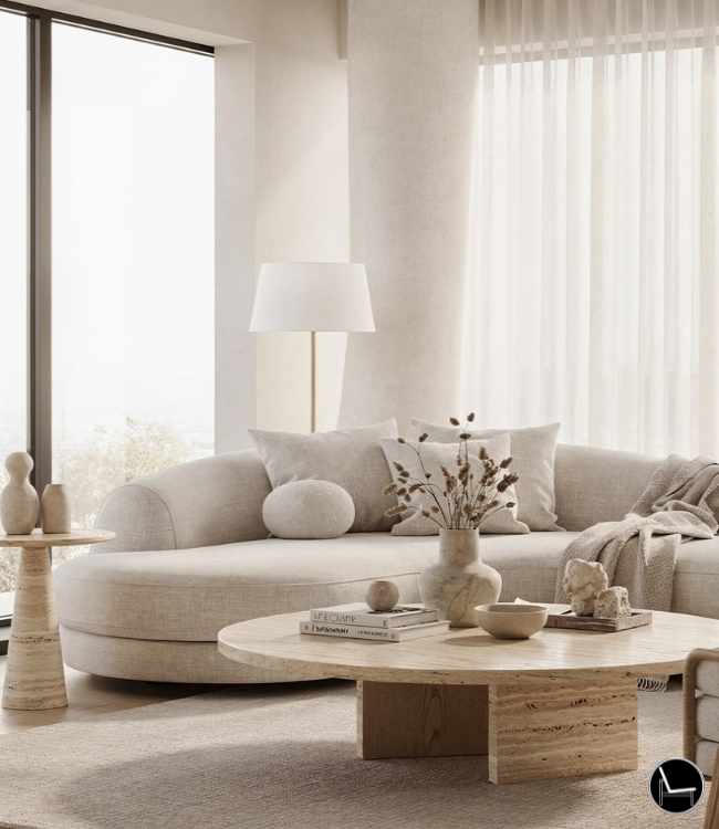
Living Room:
The living room is a central gathering space, inviting relaxation, conversation, and entertainment. When applying the 60/30/10 rule in this setting, consider the following:
- Dominant Color (60%): Establish a calming and airy ambiance by opting for a dominant color like soft white, beige, or pale gray. These neutral hues create a spacious feel and provide a clean backdrop for other colors.
- Secondary Color (30%): Introduce a touch of personality and depth with a secondary color like pale blue, sage green, or muted yellow. These colors complement the neutral dominant color while adding a sense of tranquility or subtle energy.
- Accent Color (10%): Inject pops of vibrancy and visual interest with an accent color like orange, turquoise, or deep red. Use these accent colors sparingly in throw pillows, artwork, or decorative accents to enhance the overall design.
Bedroom:
The bedroom is a sanctuary for rest and rejuvenation. When applying the 60/30/10 rule in this intimate space, prioritize tranquility and relaxation:
- Dominant Color (60%): Create a calming and serene atmosphere with a dominant color like tranquil gray, soft white, or delicate lavender. These neutral hues promote relaxation and create a sense of spaciousness.
- Secondary Color (30%): Introduce a touch of softness and femininity with a secondary color like pale pink, delicate lilac, or soft sage green. These colors complement the dominant color while enhancing the calming ambiance.
- Accent Color (10%): Add a touch of personality and vibrancy with pops of accent color like charcoal black, soft peach, or muted blue. Use these accent colors subtly in artwork, throw pillows, or decorative accents to enhance the overall design.
Kitchen:
The kitchen is a hub of activity and culinary creativity. When applying the 60/30/10 rule in this energetic space, consider both functionality and aesthetics:
- Dominant Color (60%): Establish a clean and refreshing base with a dominant color like crisp white, beige, or light gray. These neutral hues promote cleanliness and provide a versatile backdrop for other colors.
- Secondary Color (30%): Introduce a touch of vibrancy and energy with a secondary color like refreshing mint green, cheerful yellow, or tranquil seafoam green. These colors complement the dominant color while adding a sense of liveliness.
- Accent Color (10%): Inject pops of sophistication and personality with an accent color like vibrant turquoise, sunny orange, or pops of metallic accents. Use these accent colors sparingly in appliances, artwork, or decorative accents to enhance the overall design.
Enhancing the 60/30/10 Rule with Additional Tips

While the 60/30/10 rule provides a solid foundation for creating harmonious color schemes, incorporating additional design elements can further elevate your interior spaces. Here are some helpful tips to enhance the 60/30/10 rule and create truly exceptional designs:
1. Consider Pattern and Texture:
Patterns and textures add visual interest and depth to your color palette. Incorporate patterns through textiles like curtains, throw pillows, or area rugs. Introduce textures through natural elements like wood, stone, or woven accents.
2. Embrace Architectural Features:
Highlight architectural features like moldings, fireplaces, or built-in shelves by painting them in contrasting colors or adding decorative accents. This draws attention to these unique elements and enhances the overall design.
3. Utilize Natural Light Effectively:
Natural light significantly impacts the perception of color. Maximize natural light by keeping windows unobstructed and using sheer curtains or blinds. Position accent colors in areas with ample natural light to showcase their vibrancy.
4. Balance Warm and Cool Tones:
Create a harmonious balance between warm and cool tones. Warm hues like red, orange, and yellow evoke energy and excitement, while cool tones like blue, green, and purple promote calmness and serenity. Use a mix of warm and cool accents to achieve a balanced and inviting atmosphere.
5. Experiment with Color Variations:
Don’t limit yourself to the exact shades mentioned in the 60/30/10 rule. Experiment with slightly lighter or darker variations of the suggested colors to create a more personalized and unique color scheme.
6. Accessorize with Intention:
Accessories play a crucial role in enhancing the 60/30/10 rule. Choose accessories that complement the color scheme and overall design style. Use them strategically to add pops of color, texture, or pattern.
7. Personalize with Meaningful Objects:
Incorporate objects that hold personal meaning to you, such as artwork, souvenirs, or family heirlooms. These meaningful pieces add a touch of personality and make the space feel truly your own.
8. Seek Professional Guidance:
If you feel overwhelmed or unsure about color selection, consider consulting an interior designer. They can provide expert advice and guidance tailored to your specific needs and preferences.
Most Popular Post:
10 Surprising Benefits of Printable Wall Art
15 Must-Have Accessories For Styling A Coffee Table
How to Choose the Perfect Interior Color Scheme for Your Home
Expert Guide On How To Buy A Rug For Each Room
Conclusion: Mastering Color Harmony with the 60/30/10 Rule
The 60/30/10 rule, a simple yet powerful tool in the interior design toolkit, empowers individuals to transform their homes into havens of style, comfort, and personalized expression. By understanding the interplay of dominant, secondary, and accent colors, anyone can create harmonious and visually appealing spaces that reflect their unique tastes and aspirations.
Embrace the power of color and embark on a journey of transforming your home into a reflection of your inner world. Let the hues you choose evoke emotions, inspire creativity, and foster a sense of tranquility or vibrancy, depending on your desired ambiance.
FAQs: Frequently Asked Questions about the 60/30/10 Rule
1. What is the 60/30/10 rule?
The 60/30/10 rule is a simple and effective guideline for creating harmonious color schemes in interior design. It suggests that 60% of the space should be covered in a dominant color, 30% in a secondary color, and 10% in an accent color. This formula helps to balance different colors and create visually appealing spaces.
2. What are the benefits of using the 60/30/10 rule?
The 60/30/10 rule offers several benefits for interior design:
- Creates a balanced and cohesive color scheme: The rule helps to distribute colors harmoniously, preventing any one color from becoming too dominant or overwhelming.
- Adds visual interest and depth to the space: The use of multiple colors adds visual interest and dimension to the room, making it feel more inviting and dynamic.
- Provides a framework for personal expression: While the rule provides a structure, it also allows for flexibility and personal expression by choosing colors that align with individual preferences and styles.
3. How do I choose the right colors for the 60/30/10 rule?
Choosing the right colors for the 60/30/10 rule depends on several factors, including the desired ambiance of the space, the architectural style of the room, and personal preferences. Some general guidelines to consider:
- Dominant Color: Opt for neutral hues like white, beige, or gray to establish a clean and spacious foundation.
- Secondary Color: Introduce a touch of personality with complementary or analogous colors that harmonize with the dominant color.
- Accent Color: Inject pops of vibrancy and contrast with bold and eye-catching colors that complement the overall color scheme.
4. Can I use more than three colors in the 60/30/10 rule?
While the 60/30/10 rule provides a framework for using three main colors, it’s possible to incorporate additional colors sparingly. However, it’s important to maintain a balance and avoid overwhelming the space with too many hues.
5. What if I don’t have a natural eye for color coordination?
If you’re unsure about color selection, consider seeking guidance from an interior designer or using online color palettes or tools. Additionally, experiment with different color combinations and seek feedback from others to refine your choices.
6. Is the 60/30/10 rule applicable to all rooms in my home?
Yes, the 60/30/10 rule can be applied to various rooms in your home, including living rooms, bedrooms, kitchens, bathrooms, and home offices. Adapt the rule to suit the specific needs and desired ambiance of each space.
7. How can I enhance the 60/30/10 rule for a more personalized design?
Incorporate additional design elements to further enhance the 60/30/10 rule and create a truly personalized space:
- Introduce patterns and textures: Patterns and textures add visual interest and depth to the color palette.
- Highlight architectural features: Draw attention to unique architectural elements with contrasting colors or decorative accents.
- Utilize natural light effectively: Maximize natural light to enhance the perception of colors.
- Balance warm and cool tones: Create a harmonious balance between warm and cool hues to achieve the desired ambiance.
- Experiment with color variations: Try slightly lighter or darker variations of the suggested colors for a more personalized touch.
- Accessorize with intention: Select accessories that complement the color scheme and overall design style.
- Personalize with meaningful objects: Incorporate objects with personal significance to add warmth and character.
- Seek professional guidance: If needed, consult an interior designer for expert advice tailored to your specific preferences.
CATCH THE LATEST IN HOME DECOR TRENDS:

Steal These 16 Expert-Approved Decorating Secrets

How To Accessorize Your Living Room
How to Make a Small Room Appear Bigger

How to Make Your Home Look Expensive
GET CAUGHT UP ON ALL THE INSPIRING DECOR TIPS:

18 Fresh Decorating Ideas To Update Your Fireplace

How to Make a Gallery Wall: The Complete Step-by-Step Guide (Even If You’ve Never Hung a Picture)
