Are you staring at your blank walls, feeling completely stuck on how to bring your space to life without going overboard? Pastel wall colors offer the perfect solution, but choosing the right shade can feel like navigating a minefield of potentially childish or dated looks.

You’ve probably seen those gorgeous, light-filled rooms on Pinterest with soft, dreamy walls that somehow look both sophisticated and soothing. The secret? It’s all about selecting the right pastel tones for your specific space and understanding how to make them work with your existing decor.
In this guide, I’ll walk you through everything you need to know about choosing perfect pastel wall colors that transform your home into a stylish sanctuary. You’ll discover which shades work best in different rooms, how to create cohesive color schemes, and professional application tips that ensure stunning results. By the end, you’ll have the confidence to embrace these versatile hues and create spaces that feel both refreshed and timeless.
I. Understanding the Pastel Palette: More Than Just “Light Colors”

Many people think pastels are simply watered-down versions of regular colors. This common misconception leads to disappointing results. “Colors that are created with a lot of white in them create a soft look that is easy on the eye and can help to create a relaxed feeling in a space.” Says Gillian C. Rose, certified color therapist and founder of The Science of Color.
True pastels have specific color profiles that make them unique. They contain high levels of white mixed with pure pigments, creating that signature soft appearance.
Pastels aren’t just light versions of primary colors. They have complex undertones that determine how they’ll appear in different lighting conditions and against other colors in your space.
Let’s break down what makes pastels special:
The Science Behind Pastels
- Contain 65-85% white mixed with pure pigments
- Reflect more light than saturated colors
- Create optical illusion of expanded space
- Affected dramatically by lighting conditions
Pastel vs. Muted Colors
- Pastels: High white content, soft appearance
- Muted colors: Contain gray undertones, more subdued
- Washed-out colors: Lack pigment intensity, can look dingy
- Bright colors: High saturation, low white content
According to paint manufacturer Benjamin Moore, pastel paint colors have seen a 45% increase in popularity since 2020, with homeowners specifically requesting “complex pastels” rather than simple light tints.
Pro Tip: When selecting pastels, pay attention to the undertones. A pale blue with green undertones will feel very different from one with purple undertones. Hold samples against a pure white background to see the true undertone.
Picture This: You’re standing in your freshly painted living room, noticing how the pale aqua walls shift from slightly green in morning light to a clearer blue in the afternoon. This subtle color transformation creates a dynamic space that feels alive and responsive to natural rhythms.
Also: Most Popular Paint Colors To Transform Your Space
II. Why Pastel Colors Create The Perfect Space

Ever walked into a room and instantly felt your shoulders relax? That’s the magic of pastel colors at work. These soft, light hues do more than just look pretty – they actually affect your mood and wellbeing in positive ways.
Pastels have grown up a lot in recent years. No longer just for nurseries or teen bedrooms, today’s sophisticated pastel palette brings a touch of serenity to any space in your home.
- Light blue pastels reduce blood pressure and heart rate
- Soft greens improve focus and decrease anxiety
- Gentle pinks promote feelings of nurturing and comfort
- Pale yellows boost optimism without overwhelming energy
Pro Tip: Choose pastel tones with gray undertones for a more sophisticated, less “sweet” appearance that works well in adult spaces. These “griege” pastels feel modern rather than childish.
Picture This: You walk into your living room after a stressful day at work. Soft sage walls greet you, instantly lowering your blood pressure. The color reflects natural light beautifully, making the space feel larger and more open. This is the power of well-chosen pastels.
Trending Post: Choosing Vibrant Colors: A Complete Room-by-Room Guide
III. Exploring Key Pastel Color Families and Their Vibes

Each pastel color family brings its own unique energy and feeling to your space. Understanding these characteristics helps you choose colors that create your desired atmosphere.
The right pastel can completely transform not just how a room looks, but how people feel in that space, It’s about selecting colors that align with the room’s purpose and the emotions you want to evoke.
Blues Pastel
- Energy: Calming, expansive, cooling
- Best for: Spaces where you want to relax or focus
- Psychological effect: Lowers blood pressure, reduces stress
- Popular shades: Sky blue, powder blue, duck egg blue
Greens Pastel
- Energy: Refreshing, balancing, natural
- Best for: Spaces connecting to nature or requiring concentration
- Psychological effect: Improves focus, reduces eye strain
- Popular shades: Mint, sage, seafoam, celadon
Pinks Pastel
- Energy: Nurturing, uplifting, soothing
- Best for: Spaces where comfort is key
- Psychological effect: Reduces aggression, promotes compassion
- Popular shades: Blush, ballet slipper, rose quartz, pale coral
Purples Pastel
- Energy: Creative, spiritual, meditative
- Best for: Spaces for reflection or artistic pursuits
- Psychological effect: Enhances imagination, promotes restfulness
- Popular shades: Lavender, lilac, periwinkle, heliotrope
Yellows Pastel
- Energy: Cheerful, optimistic, warm
- Best for: Spaces needing brightness or morning energy
- Psychological effect: Boosts mood, stimulates conversation
- Popular shades: Buttercream, lemon chiffon, pale gold
Pro Tip: Consider the room’s function before choosing your pastel. Active spaces like kitchens can handle slightly more energetic pastels like soft yellow, while bedrooms benefit from the calming effects of blue or lavender.
Picture This: Friends gather in your dining room, where soft peach walls cast a flattering glow on everyone’s faces. The conversation flows easily, and the meal seems to taste better in this warm, inviting space. That’s the subtle power of choosing the right pastel for each room’s purpose.
Also: Splurge vs. Save in Decorating: A Room-by-Room Guide
IV. The Art of Pairing: Making Pastels Work in Your Home

Pastels don’t exist in isolation – they need to play nicely with your furniture, floors, and fixtures. Creating successful combinations is where many homeowners struggle. “When paired with crisp white, pastels feel fresh and modern. When combined with deeper tones, they can even look sophisticated.” Says Jamie Drake, award-winning interior designer.
Pastels are actually incredibly versatile. They can function almost as neutrals when paired thoughtfully with more saturated elements. The key is balance – something soft with something bold.
Neutrals + Pastel: The Classic Approach
- White trim creates clean, defined edges for pastel walls
- Gray furniture provides grounding for lighter pastels
- Beige and cream soften the transition between colors
- Black accents add sophistication and prevent “sweetness”
Metallics + Pastel: Adding Glamour
- Gold and brass warm up cool pastels like mint and blue
- Silver and chrome add modern edge to pink and lavender
- Copper brings depth to neutral pastels like beige and gray
- Bronze creates vintage appeal with any pastel shade
Wood Tones + Pastel: Natural Harmony
- Light woods (maple, ash) brighten pastel surroundings
- Medium woods (oak, cherry) add warmth to cool pastels
- Dark woods (walnut, mahogany) create dramatic contrast
- Weathered woods bring rustic texture to refined pastels
Bold Accents + Pastel: Statement Making
- Deep navy anchors light blue and pink pastels
- Forest green complements mint and buttercream
- Burgundy adds sophistication to lavender and blush
- Charcoal creates dramatic contrast with any pastel
A Pinterest trend report showed that searches for “pastel and black decor” increased 189% year-over-year, indicating a growing preference for pastel palettes with strong contrasting elements.
Pro Tip: Use the 60-30-10 rule when combining colors: 60% dominant color (your pastel walls), 30% secondary color (furniture and large textiles), and 10% accent color (decorative items). This formula creates visual balance while preventing color chaos.
Picture This: Your bedroom features soft lavender walls paired with crisp white bedding, warm brass lighting fixtures, and touches of deep eggplant in throw pillows and art. The combination feels both soothing and sophisticated – like a boutique hotel suite designed just for you.
Don’t Miss:Most Popular Paint Colors To Transform Your Space
V. Pastel Power: Room-by-Room Inspiration
Looking for specific ideas on how to use pastels in different spaces? Each room in your home presents unique opportunities and challenges for pastel implementation.
Pastels have different effects depending on the room’s function and lighting. What works beautifully in a south-facing living room might feel completely wrong in a north-facing bedroom.
Bedrooms: Sanctuaries of Soft Color

- Best pastels: Lavender, pale blue, blush pink
- Why they work: Promote relaxation and better sleep quality
- Design tip: Layer different tones of the same pastel for dimension
- Accent with: Crisp white bedding, natural wood, touches of velvet
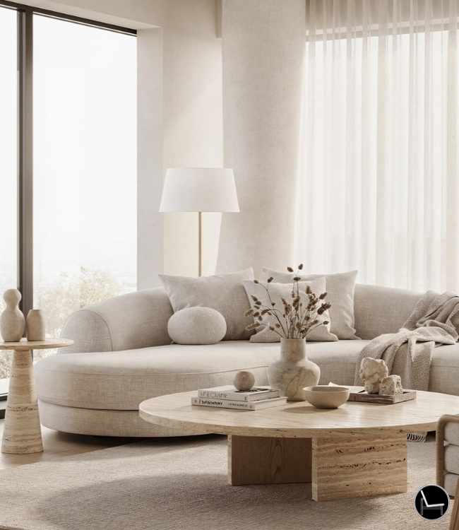
Living Rooms: Everyday Elegance

- Best pastels: Sage green, duck egg blue, warm beige with pink undertones
- Why they work: Create backdrop for conversation without overwhelming
- Design tip: Use slightly deeper pastels in large spaces to prevent feeling too stark
- Accent with: Textured neutrals, brass or bronze, rich wood tones
Kitchens: Fresh and Inviting

- Best pastels: Mint green, pale yellow, soft aqua
- Why they work: Energizing without being too stimulating
- Design tip: Apply pastels to cabinets or islands for unexpected charm
- Accent with: White countertops, stainless steel, clear glass
Bathrooms: Spa-Like Serenity

- Best pastels: Pale blue, lavender, light aqua and mint-green
- Why they work: Create clean, airy feeling in smaller spaces
- Design tip: Use same pastel on walls and ceiling in small bathrooms to expand space
- Accent with: White fixtures, marble, transparent shower doors
Home Offices: Focus with Flair

- Best pastels: Soft green, pale blue-gray, gentle peach
- Why they work: Promote concentration without distraction
- Design tip: Paint only the wall behind your desk for a focused accent
- Accent with: Natural wood desk, ergonomic seating, minimal art
A 2023 Houzz survey found that homeowners using pastel colors in bedrooms reported falling asleep an average of 21 minutes faster than those with bright or dark wall colors.
Pro Tip: Consider the transition between rooms when using different pastels. Colors that share similar undertones will flow more naturally from room to room, creating a cohesive home experience rather than a disjointed feeling.
Picture This: Guests wander through your home, each room offering a distinct feeling while still feeling connected to the whole. Your soft sage living room flows naturally into your pale aqua dining space, which transitions beautifully to your buttery yellow kitchen. The entire home feels thoughtfully designed rather than randomly colored.
Don’t Miss: How to Unite Multiple Rooms with a Cohesive Look: A Comprehensive Guide

VI. The 5 Most Versatile Pastel Wall Colors and Where They Work Best

Not all pastels are created equal when it comes to decorating your home. Some shades work better in certain spaces based on lighting, room function, and existing decor.
The most successful pastel rooms consider the direction the room faces. North-facing rooms benefit from warmer pastels like peach or butter, while south-facing rooms can handle cooler tones like mint or powder blue.
1. Pale Blue (Sky Blue, Duck Egg, Powder Blue)
- Best rooms: Bedrooms, bathrooms, home offices
- Why it works: Creates a sense of calm and expansion
- Pairs well with: White trim, natural wood, navy accents
2. Mint Green
- Best rooms: Kitchens, sunrooms, craft spaces
- Why it works: Energizes without overwhelming, connects to nature
- Pairs well with: White cabinets, brass fixtures, botanical prints
3. Blush Pink
- Best rooms: Dining rooms, powder rooms, dressing areas
- Why it works: Flattering to skin tones, creates a warm glow
- Pairs well with: Gray, gold, walnut wood tones
4. Lavender
- Best rooms: Bedrooms, reading nooks, meditation spaces
- Why it works: Promotes relaxation and creativity
- Pairs well with: White, silver, deeper purples
5. Buttercream Yellow
- Best rooms: Kitchens, breakfast nooks, north-facing rooms
- Why it works: Brightens dark spaces, creates morning cheerfulness
- Pairs well with: White cabinets, gray countertops, blue accents
Pro Tip: Test pastel colors in different lighting conditions before committing. What looks perfect at noon might appear too cool or warm in evening light. Paint large swatches (at least 2×2 feet) on different walls to see how the color changes throughout the day.
Picture This: Imagine a home office with soft mint walls, white furniture, and natural wood accents. The color energizes without distracting, creating the perfect balance for productivity and creativity. Your video calls look professional, and the background gets compliments from colleagues.
Also: How to Create a Cozy Home Office
VII. How to Create Cohesive Color Schemes with Pastels

The secret to using pastels successfully is contrast. Pair them with something unexpected – a bold pattern, a touch of black, or even metallic accents – to keep them from feeling too sweet.
Feeling overwhelmed by how to combine pastels with your existing furniture and decor? Creating cohesive color schemes is one of the biggest challenges homeowners face.
Let’s break down some foolproof combinations:
Monochromatic Magic
- Use different shades of the same pastel color family
- Vary textures to create visual interest
- Add white and cream to brighten and define spaces
Complementary Combinations
- Pair cool pastels (blue, mint) with warm accents (coral, brass)
- Balance pale lavender with subtle yellows
- Use color wheel opposites in different intensities
Neutral Base with Pastel Accents
- Keep walls in soft neutrals (white, cream, light gray)
- Introduce pastels through furniture, textiles, and art
- Change accent colors seasonally without repainting
According to a 2024 Houzz survey, 67% of homeowners who used pastel wall colors reported higher satisfaction with their spaces compared to those who chose traditional neutral colors.
Pro Tip: When in doubt, follow the 60-30-10 rule: 60% main pastel wall color, 30% secondary colors in furniture, 10% accent colors in accessories. This formula creates balance while preventing pastel overload.
Picture This: Your dining room features pale blush walls that transition seamlessly to your living room’s soft beige. The shared brass lighting fixtures and navy blue accent pillows create a cohesive flow. Friends constantly ask if you hired a professional designer because everything feels so thoughtfully connected.
Don’t Miss: Artificial Cherry Blossom Branches: Room-by-Room Styling Guide
VIII. Practical Application Guide – From Selection to Painted Walls

So you’ve fallen in love with a pastel shade – now what? Getting from color swatch to beautifully painted walls requires some know-how to ensure professional-looking results. “Always view a paint color in the room where it will be used. Light drastically affects the way a color appears and each room has a different quality of light.” Says, Debbie Zimmer, color expert at the Paint Quality Institute.
The biggest challenge with pastels is achieving even coverage. Most pastel colors require proper surface preparation and often an extra coat compared to deeper colors.
Follow these steps for pastel perfection:
1. Sample Colors Properly
- Purchase sample pots of your top 2-3 color choices
- Paint 2×2 foot squares on multiple walls
- View samples during morning, afternoon, and evening light
- Live with them for at least 48 hours before deciding
2. Choose the Right Finish
- Matte or flat: Best for hiding wall imperfections, creates soft look
- Eggshell: Slightly washable, good for living areas
- Satin: More durable for kitchens and bathrooms
- Avoid: High-gloss finishes that can make pastels look clinical
3. Prep Surfaces Thoroughly
- Fill holes and sand smooth
- Clean walls completely to remove dust and oils
- Apply primer tinted to match your pastel color
- Allow primer to dry fully (at least 24 hours)
4. Application Techniques
- Use high-quality brushes and rollers with short nap
- Apply in “W” pattern for even coverage
- Work in 3×3 foot sections
- Apply thin coats rather than thick ones
Pro Tip: Pastels often require primer and multiple coats. Budget for an extra can of paint to ensure you don’t run short halfway through your project. Nothing’s worse than mixing a new batch and finding it doesn’t quite match!
Picture This: Standing back after the final coat dries, you admire how your new lavender walls transform your bedroom from ordinary to magazine-worthy. The color catches the morning light perfectly, creating a sanctuary that feels both elegant and deeply personal. All your effort in proper preparation has paid off with a flawless finish.
Trending Post: How to Style a Sideboard: Room-by-Room Decorating Guide
IX. Common Mistakes to Avoid When Using Pastel Wall Colors

Even design professionals occasionally struggle with pastels. Knowing the common pitfalls can save you time, money, and disappointment.
The biggest mistake I see as a designer with pastels is choosing a shade that’s too saturated or bright. The most livable pastels have a touch of gray to keep them grounded and sophisticated.
#1: Too Many Competing Colors
- Choose one dominant pastel for large spaces
- Limit to 2-3 complementary pastels throughout home
- Use neutral transitional spaces to prevent color clash
#2: Ignoring Natural Light Sources
- North-facing rooms need warmer pastels to prevent feeling cold
- South-facing rooms can handle cooler pastels
- East/west rooms change dramatically throughout the day
#3: Clashing With Fixed Elements
- Consider undertones in flooring, countertops, and cabinets
- Bring home samples of existing materials when selecting paint
- Some wood tones fight with certain pastels (especially pink)
#4: Going Too Sweet
- Balance pastels with contrasting elements
- Add black or charcoal accents for sophistication
- Incorporate natural materials like wood, stone, or rattan
#5: Neglecting Proper Testing
- Paint chips look different than actual walls
- Lighting in stores differs dramatically from homes
- Digital color tools can be misleading
A study by Sherwin-Williams found that 43% of homeowners who expressed dissatisfaction with their pastel wall colors cited “looks different than expected” as their primary complaint.
Pro Tip: Create a physical mood board with paint chips, fabric swatches, and photos of your furniture to visualize how everything will work together before you paint. This extra step can prevent costly mistakes and disappointment.
Picture This: Instead of a mismatched mess, your home flows naturally from room to room, with pastel colors that complement each other and create distinct moods for each space. Friends comment on how “put together” your home feels, not realizing it’s because you carefully considered how each color would interact with your existing elements.
Most Popular:
10 Affordable Home Decor Finds Under $50 to Elevate Your Space
Studio Apartment Decorating Expert Tips: Maximize Your Space and Style
Most Affordable Amazon Home Decor Finds
Best Home Decor Ideas On a Budget
How To Decorate a Desk at Home
Conclusion: Your Pastel-Perfect Home Awaits
Pastel wall colors offer a beautiful balance of personality and serenity for today’s homes. When chosen thoughtfully and applied correctly, these gentle hues create spaces that feel both current and timeless.
Remember that the perfect pastel is highly personal. What matters most is how the color makes you feel in your space.
If you’re feeling hesitant, start small with a powder room or accent wall. These smaller commitments let you experiment with pastels without overwhelming your home or your comfort zone.
The data backs up what designers have long known: homes with thoughtfully chosen color schemes increase both owner satisfaction and potential resale value. According to a 2024 report by the National Association of Realtors, homes with updated, cohesive color schemes sold 29% faster than comparable properties with dated or mismatched colors.
I’d love to see how you incorporate pastel wall colors into your home! Share your before-and-after photos in the comments, or ask any questions about specific color combinations you’re considering.
Happy painting, and enjoy watching your spaces transform with the gentle power of pastels!
Frequently Asked Questions About Pastel Wall Colors
Q. Are pastel wall colors suitable for small spaces?
Absolutely! Pastels are excellent for small spaces because they reflect light and create an illusion of openness. Soft blues and greens are particularly effective at making compact rooms feel larger and more airy. Just be sure to use lighter pastel tones rather than deeper ones to maximize this space-expanding effect.
Q. Will pastel walls make my home look too feminine?
Not necessarily. While pastels have traditionally been associated with feminine spaces, modern interpretations incorporate sophisticated undertones and thoughtful pairings that work well in any home. Balance pastels with natural wood, metal accents, or black elements for a more gender-neutral approach. Designer Timothy Corrigan notes: “What makes a space feel masculine or feminine isn’t the color itself, but what you pair it with.”
Q. How do I prevent pastel walls from looking like a nursery?
The key is using complex pastels with gray or beige undertones rather than pure, sweet pastels. Pair them with sophisticated furnishings, contemporary art, and touches of contrast through darker accents. Avoid overly cute accessories or too many matching pastel items. Interior designer Nicole Gibbons advises: “Mix in metals, rich textures, and bold accent pieces to give pastel rooms adult sophistication.”
Q. Do pastel colors work with modern design styles?
Yes! Pastels work surprisingly well with modern and contemporary design. The key is choosing clean-lined furniture and minimalist accessories that create an interesting contrast with soft wall colors. Architectural Digest featured designer India Mahdavi’s work noting: “Her signature use of pastels with modern forms proves these gentle hues can be as contemporary as they are charming.”
Q. How often will I need to repaint pastel walls?
With quality paint and proper application, pastel walls should last 5-7 years before showing significant wear. However, lighter colors can show scuffs and marks more readily than darker shades. Consider using washable paint formulations in high-traffic areas. Consumer Reports testing found: “Many pastel paints now offer excellent washability without compromising their soft appearance.”
Q. Can I use pastels in a north-facing room?
Yes, but choose wisely. North-facing rooms receive cooler, indirect light that can make some pastels appear flat or gray. Opt for pastels with warm undertones like pale peach, buttercream yellow, or soft coral. Color expert Maria Killam explains: “North-facing rooms need warming pastels that compensate for the cool northern light.”
Q. What’s the best white trim color to pair with pastel walls?
While bright white creates classic contrast with pastels, designer Sherwin-Williams color expert Sue Wadden recommends: “For a more sophisticated look with pastels, try off-whites that share undertones with your pastel color rather than stark white. This creates a more cohesive, intentional appearance.”
Q. Can I use multiple pastels in an open floor plan?
Yes, but maintain cohesion by choosing pastels from the same color family or with similar undertones. Use the most neutral pastel for largest spaces and save more distinctive pastels for smaller areas or accent walls. HGTV host Breegan Jane suggests: “In open concept spaces, pastels should tell a connected color story, even when the exact shades differ from room to room.”
Subscribe To the Newsletter!
Subscribe now for an endless feed of inspirational women’s cave decor ideas, pampering rituals, and more tips for curating your ultimate escape. Let’s start making your cozy refuge a reality – you so deserve this!
CATCH THE LATEST IN HOME DECOR TRENDS:

Steal These 16 Expert-Approved Decorating Secrets

How To Accessorize Your Living Room
How to Make a Small Room Appear Bigger

How to Make Your Home Look Expensive

18 Fresh Decorating Ideas To Update Your Fireplace

How to Make a Gallery Wall: The Complete Step-by-Step Guide (Even If You’ve Never Hung a Picture)
