When it comes to interior design and home decorating, how to choose a wall color is one of the most important decisions you’ll make. The perfect wall color has the power to completely transform a room, setting the overall mood and vibe. Getting that wall color choice right can be the difference between a space that feels warm and inviting versus one that misses the mark completely.

However, knowing how to choose a wall color that achieves your desired ambiance is often trickier than it seems at first glance. With thousands of shade options, factoring in lighting conditions, permanent fixtures, and your existing decor, it can quickly become an overwhelming process. That’s why we’ve created the ultimate guide on how to choose a wall color that you’ll absolutely love.
Whether you’re painting an entire home or just refreshing one room, this step-by-step guide covers everything from identifying your color preferences to considering a room’s purpose to implementing tried-and-true color principles. By the end, you’ll have all the tools and tips needed to confidently select a stunning wall color that makes your space look and feel exactly how you envisioned. Let’s dive in!
Step 1: Consider the Room’s Purpose
The very first step on how to choose a wall color is determining the main purpose and function of the room you want to paint. Different rooms serve different needs, and certain colors are more conducive for specific activities and moods than others.
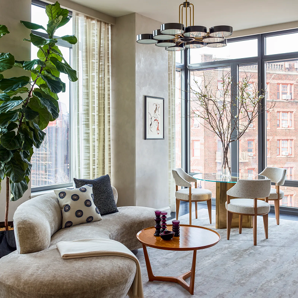
The Living Room
For example, living rooms and family rooms are typically spaces meant for relaxation, entertaining, and spending quality time together. You’ll want to choose comforting, calming wall colors like light blues, greens, warm neutrals or even a slate gray. These hues create a welcoming, laid-back atmosphere that’s ideal for lounging and unwinding after a long day.
Also: The Rule Of Three For Decorating Your Home
The Home Office
On the other hand, home offices and work spaces tend to require more energizing, focus-enhancing colors that boost productivity and concentration. Bold shades of blue like navy or teal can be great options, as well as woods tones or warm terracotta accents. You want hues that are stimulating without being overly distracting.
The Kids Bedroom
Kids’ bedrooms and playrooms are spaces where you can get more creative and adventurous with color. Vibrant oranges, lime greens, cheery yellows or even chalkboard walls are all fun ways to encourage expressiveness and imagination while making the space feel youthful and energetic.
No matter what room you’re painting, be mindful of how you want that space to ultimately make you feel. Do you need it to be a calm oasis, a creative studio, a productive workspace? Let the room’s purpose guide your initial color direction as you begin your search for the perfect hue.
According to a Survey by Sherwin-Williams, over 80% of people believe that wall color has a significant impact on their mood. This highlights the importance of choosing a color that evokes the desired feeling in your space.
“If you are looking for a way to style your space with wall art without breaking your piggy bank, then I recommend reading “10 Surprising Benefits of Printable Wall Art”
Step 2: Determine Your Color Preferences

After considering the room’s main function, the next step is to identify your own personal color preferences. We all have instinctive leanings toward certain shades and hues that make us feel happier, calmer, or more energized.
Look for Inspiration
One way to pinpoint your color inclinations is to look at inspiration photos of rooms or color palettes that instantly draw you in. What hues are calling your name? Create a folder or Pinterest board of appealing spaces and look for common color threads.
Do you tend to gravitate more toward warm, earthy tones like terracotta, mustard yellow and mossy greens? Or do you prefer cooler shades with blue, green and gray bases? Warm colors create an inviting, cozy vibe whereas cool tones feel more refreshing and airy.
Look at Your Wardrobe
You can even look to your current wardrobe for guidance. The colors you’re drawn to for your clothing and accessories can provide clues about what shades resonate with you most.
Don’t just think about your favorite single colors either. Look at photos where you love the way multiple hues are combined into a cohesive palette. This will help you choose a main wall color along with accents down the line.
The key is to go with colors you simply feel drawn to and love rather than following strict decorating rules. Your wall color should inspire a sense of happiness and peace every time you enter the room. So trust your instincts as you start building your personal color palette.
Also: How To Set Up A Small Home Gym
Step 3: Choosing the Right Paint Sheen and Type

Once you’ve landed on the perfect color, another important decision is what paint finish or sheen to use. The sheen level can not only affect how the color appears, but also the durability and maintenance required.
“Selecting the perfect wall color is just one piece of the puzzle. IIDA emphasizes that choosing the right paint sheen and type is equally important for achieving a beautiful and functional finish. For example, a high-gloss paint might be ideal for a bathroom due to its durability and easy cleaning, while a flat finish might be preferable for a living room as it hides imperfections better.”
IIDA
Flat/Matte Paint
This has little to no shine or light reflective properties. Flat paint helps hide imperfections well, but can be difficult to clean. It’s best suited for low-traffic areas like ceilings, formal rooms or adult bedrooms.
Eggshell or Satin
These low-lustre sheens have a very slight glossiness that’s more cleanable than flat. They are ideal for living rooms, dining rooms, hallways and nurseries/kids’ rooms. The subtle sheen enriches the color.
Semi-Gloss
This shiny, light-reflecting finish is good for high-moisture areas like bathrooms, kitchens, and trim work. The glossy finish is very durable and easy to wipe down, though it can highlight surface imperfections.
High-Gloss
This ultra-shiny finish is best suited for surface trim, cabinets and furniture for a sleek, polished look. High-gloss walls can appear almost mirror-like and make imperfections very obvious.
In addition to sheen, you’ll want to decide what kind of interior paint based you need on the room. Interior paints come in different bases like latex, acrylic or oil-based formulas. Latex tends to be most popular for its durability and easy clean-up.
Take time to run paint samples in your selected sheen on the wall to examine how it looks, reflects light, and shows color variation from different angles. The right paint finish can enrich your color choice or leave it appearing flat and dull.
Also: Aesthetic Work Desk Setup Ideas
Step 4: Evaluate the Lighting

One of the most important yet often overlooked factors on how to choose a wall color is lighting. The same paint swatch can look vastly different depending on the lighting conditions of a room. Considering both natural and artificial light sources is crucial to ensuring your color turns out as expected.
“Understanding how natural light interacts with a space is crucial for choosing the right wall color. Warmer colors tend to work better in north-facing rooms with cooler light, while cooler colors can balance the warmth of south-facing spaces. Additionally, consider the undertones of your furniture and flooring – matching cool undertones with cool colors and vice versa creates a cohesive and harmonious look.”
Says Interior Designer, Justina Blakeney
Natural Lighting
Natural Light Take a good look at how much natural light the room receives and at what times of day. Direct sunlight streaming through windows can make colors appear much warmer and more vibrant. North-facing rooms with less direct sunlight may cause colors to read as more muted and cool.
Try to observe the room at multiple times to see how the light changes from morning to afternoon to evening. This will give you a better sense of the color’s variance throughout the day.
Artificial Lighting
Artificial Light In addition to sunlight patterns, also evaluate the types of artificial light sources, both overhead and lamps. Incandescent bulbs can bring out warm, yellow/red undertones while LED and fluorescent lights tend to cast a cooler, bluish tone.
Buy Samples
Before committing to your wall color, buy sample sizes and apply them to different walls. Examine how the colors look under your room’s lighting condition at various times. You may be surprised at how much lighting can alter and transform a shade.
Too many homeowners have made the mistake of choosing a wall color based off a tiny paint chip, only to be disappointed once it goes up on the walls at home. Taking the time to test colors in your actual lighting environment can save you that frustration and cost of repainting.
Also: Japandi Living Room 101: A Beginner’s Guide To A Serene Design Style
Step 5: Consider Permanent Features

As you’re narrowing down potential wall colors, another important factor to take into account is the permanent features and elements already in the room. Things like floors, countertops, cabinets, trim, and fireplaces are not easily changed, so you’ll want your new wall color to flow and coordinate with them.
Hardwood Floors
For example, if you have light-toned wood floors, choosing wall colors with warm undertones like beige, terracotta, or gold can create a cohesive, inviting look. On the other hand, cool gray or blue walls may clash against those warm wood tones.
Kitchen Tops
If your kitchen has granite or quartz countertops, look closely at their undertones and veining colors to find complementary wall shades. Do you see hints of green, blue, purple or warmer tinted creams and beiges? Selecting wall colors that tie in those same undertones will help the space feel intentionally pulled together.
Floor Tiles
Even large tiled areas like bathroom floors, kitchen backsplashes, or fireplace surrounds should be considered when choosing a wall color. You can either go tonal by picking a color from within those tiles, or you can choose an accent color that makes the permanent tile a focal point.
Open Floor Plan
Those with open floor plans need to be particularly mindful of creating a natural color flow from room to adjoining room. Using the same wall color or maintaining a cohesive color palette throughout connected spaces will give the full home a settled, thoughtful feel.
Whenever possible, live with those larger permanent elements first before making any paint decisions. It’s much easier and more affordable to change wall colors than to replace floors, counters and cabinets.
Also: Feng Shui Bedroom Decorating Guide
Step 6: Use the Color Wheel

Another helpful tool for choosing a cohesive and appealing wall color is the classic color wheel. This simple circular diagram showcases the primary colors (red, yellow, blue), secondary colors (orange, green, purple) and tertiary colors.
“The color wheel is a designer’s best friend when it comes to selecting harmonious color palettes. Understanding the relationships between colors – complementary, analogous, triadic – allows you to create cohesive and visually pleasing schemes. Whether you crave a bold and energetic space or a calming and serene one, the color wheel empowers you to make informed decisions and achieve the desired effect.”
Says Interior Designer, Kelly Wearstler
Understanding basic color theory principles and common color schemes from the wheel can make the selection process much easier. Some of the most popular and effective color palettes include:
Monochromatic – This uses various shades, tints and tones within the same base hue. For example, a soft sage green wall combined with deeper olive and pale mint accents.
Analogous – Neighboring colors on the wheel like blue, blue-green and blue-violet create this smooth, flowing palette with one color as the clear main shade.
Complementary – These high-contrast color schemes use two hues directly across from each other like blue and orange or red and green. One shade would be the dominant wall color with the other used as accents.
Triadic – Using three colors equidistant from each other on the wheel like purple, orange and green. This vibrant palette is best with one color dominance and the others as accents.
As you look to gather paint swatches and test colors, having the color wheel on hand can help you develop richer, multi-toned combinations that are visually pleasing rather than randomly selecting tones.
Start by defining your main wall color first, using that as your signature shade. Then look at neighboring hues as potential accent colors for things like trim, decor, pillows, and furnishings. The color wheel allows you to map out these palettes more purposefully.
Also: Modern Boho Living Room Decoration Tips
Step 7: Don’t Forget About Undertones

When it comes to choosing the perfect wall color, undertones can make or break the entire look. Undertones refer to the subtle hints of other colors that lie beneath the surface of a paint shade. Failing to properly identify and account for undertones is one of the most common mistakes people make.
A poll conducted by Apartment Therapy, indicated that over 60% of respondents were unaware of the importance of considering undertones when choosing a paint color. This emphasizes the need to educate readers about undertones and their influence on the overall look.
Use the Right Undertone
Every color, even neutrals like gray, tan and “pure” white, has underlying red, blue, green or yellow undertones. These undertones can appear more pronounced depending on certain lighting conditions and what other colors they’re combined with in a space.
For example, a gray wall color may lean more blue-toned or have green/yellow undertones you don’t initially notice. Once up on the walls with your existing furnishings and lighting, those undertones suddenly become very apparent and possibly clash.
Manufacturers sometimes try to describe these undertones in paint names like “Wheaton Gray” (green undertones) or “Accessible Beige” (with pink/red undertones). However, these subtle nuances are extremely hard to detect from tiny paint swatches alone.
Examine the Right Undertones
The best way to examine undertones is by painting actual samples directly on your walls, around 2′ x 2′ large. Step back and look at the dried samples in the morning, afternoon and evening to see how both natural and artificial light sources bring out or diminish those underlying tones. Live with the samples for a few days to make a final determination.
Paying close attention to undertones from the start can prevent you from making an expensive and time-consuming mistake. You want to embrace those subtle shades rather than fighting them once the paint goes up.
Also: How To Decorate an Earthy Living Room
Step 8: Go Bold or Neutral?

Once you’ve identified your main color preferences and considered things like lighting and undertones, another key decision is whether to go bold and saturated with your wall color or stick to more neutral, toned-down shades.
“Accent walls are making a comeback, but with a twist. Don’t be afraid to experiment with bolder and moodier colors like deep charcoals or navy blues. A well-placed accent wall can add drama and visual interest to a space, while still reflecting the latest trends in interior design.”
Says Interior Designer, Joanna Gaines
There are pros and cons to each approach:
Bold, Saturated Wall Colors Pros:
- Create a vivid, high-impact focal point
- Reflect your unique, daring style
- Lively and energizing atmosphere
- Help define open floor plans
Cons:
- Can feel overwhelming in smaller spaces
- May need to be balanced with plenty of white/neutral accents
- Bolder colors can make walls feel closer
- Taste preferences can change over time
Neutral Wall Colors Pros:
- Calming, serene background
- Allow other decor elements to pop
- Easy to build upon with different accent colors
- Feel more timeless and mainstream
Cons:
- Can potentially look bland or flat
- Require thoughtful styling to keep from looking washed out
- May want to liven things up with colorful art or textiles
The level of natural and artificial light in your room can help determine if you want to go bold or neutral as well. Spaces with abundant natural light can handle richer, brighter wall colors more easily while lower-light rooms may need softer, airier neutrals to keep from feeling cave-like.
If you love bold color but are nervous about going overboard, consider just an accent wall in that saturated shade. Or commit to a neutral backdrop but use vivid bursts of color in fabrics, rugs, artwork and decor pieces.
There’s no right or wrong choice when it comes to how to choose a wall color – it all comes down to your personal style and design vision. Don’t be afraid of color but also don’t discount the appeal of calming neutrals. Find what balance resonates best for you.
Also: How To Create a Hypebeast Bedroom Decoration On a Budget
Step 9: Let the Existing Decor Guide You

If you plan on keeping your current furniture and decor elements after painting, it’s wise to let those pieces help guide your wall color selection. The right wall hue can either complement and elevate your existing style or stick out like a sore thumb.
Take Inventory
Take inventory of the larger furnishings, window treatments, rugs, and accents you intend to keep in the room. What are the predominant colors and undertones? Consider how certain wall shades may work in harmony with those items or potentially clash.
For example, rooms with warm wood tones like oak or cherry call for wall colors in the warm color family such as terracotta, sandy tans or golden yellows. Trying to force a trendy cool gray or icy blue would likely feel jarring against those warm furniture pieces.
On the other hand, that same cool gray could be gorgeous alongside upholstered furniture with blue, green or purple undertones in the fabrics. It creates a cohesive, tonal look.
Notice any pops of bold color within your existing decor as well. Perhaps your sofa has accent pillows in a lively coral or teal hue. You may want to repeat one of those shades on an accent wall for intentional color continuity.
If you don’t have the ability or budget to replace all new decor after painting, bringing home good-sized paint swatches and holding them up against your furniture can help visualize what may work well together.
Use Removable Wallpaper
You can also use removable wallpaper, fabrics or even colored papers taped to the wall as temporary “sampling” to get a better feel for how the wall color will interact with your kept pieces. The goal is a balanced, purposeful look that blends old and new seamlessly.
Also: How To Create a Dining Room Gallery Wall
Step 10: When in Doubt, Use Tried-and-True Shades

With thousands of color options at your disposal, the decision of how to choose a wall color can admittedly feel overwhelming at times. If you find yourself stuck in analysis paralysis, it can be helpful to consider some universally appealing, tried-and-true shade options.
Certain classic colors have remained popular for interior wall colors for decades because of their versatility and timeless quality. A few fail-safe choices to consider include:
Warm Whites Whites like Swiss Coffee, Cloud White or Chantilly Lace add brightness while still feeling soft and inviting. The warmer undertones prevent them from looking sterile.
Soft Grays Light gray colors with brown/green undertones such as Agreeable Gray or Classic Gray create a soothing, contemporary backdrop.
Warm Tans/Beiges Muddy beige shades like Kilim Beige or tans with pink undertones like Accessible Beige feel cozy yet fresh.
Light Blues Calming powder or robin’s egg blues add subtle color without being overpowering. Popular blues include Copen Blue and Sleepy Blue.
Greiges A mix of gray and beige, these “greige” colors like Revere Pewter or Amazing Gray have mass appeal for their neutral flexibility.
In addition to their widespread popularity, these classic colors tend to be relatively inoffensive and easy to build upon over time as your tastes evolve. Neutrals give you a blank slate to regularly refresh accent colors in textiles, art and decor pieces.
Of course, there’s no substitute for testing out any color (even tried-and-true neutrals) in your actual space and lighting conditions. But these timeless ranges can provide an easy starting point if you’re struggling with how to choose that perfect wall hue.
Also: Western Gothic Design: Embracing Rustic Charm for the Modern Pioneer
Mistakes to Avoid When Choosing a Wall Color

How to choose a wall color can seem overwhelming with so many options, there are some common pitfalls to be aware of during the process. One major mistake is failing to properly test samples in the actual space before committing. Lighting conditions can drastically impact and alter how a color appears when painted on all four walls.
Another misstep is neglecting to take existing features and decor into account. If the new wall color clasborrow with permanent elements like floors, countertops or upholstery you’ll be stuck replacing those more expensive items down the road.
Overlooking Undertones
Overlooking undertones in colors is a frequent issue as well. Every shade has subtle underlying hints of other colors that can become amplified or toned down depending on lighting and surrounding hues. Failing to identify and embrace those undertones beforehand can leave you with an undesirable result.
Trendy Colors
Finally, some people get overly influenced by trendy colors without considering how the shade aligns with their personal taste and their home’s overall style. While experimenting with bold and trendy hues can be exciting, it’s important to remember you’ll be living with this color for a while. The key to how to choose a wall color that stands the test of time is to prioritize colors you truly love over fleeting trends.
By being aware of these potential pitfalls early on, you can avoid some of the most common disappointments and mistakes when tackling such an impactful decision. Proper planning and preparation are key to how to choose a wall color.
Also: Dopamine Decor: Design Your Home for Happiness and Productivity
Most Popular Wall Colors by Room
Living Rooms

Warm neutrals like taupes, soft grays, and greiges tend to be go-to favorites for living room wall colors. Shades like Agreeable Gray,Revet Pewter, and Accessible Beige create a cozy yet modern vibe. Light blues like Copen Blue and powder blues also provide a calming atmosphere for relaxing spaces.
Kitchens

Many homeowners opt for more lively, invigorating hues in kitchens. Soft whites like Swiss Coffee or off-whites with colored undertones are popular for cabinets and trim, while deeper shades of blue, green, or warmer terra cotta tones add life to walls. Yellows and soft greens can also make kitchens feel vibrant and fresh.
Bathrooms

For bathrooms, cool spa-like colors remain classics including light blue-greens, seafoam shades, and soft grays that have a slightly green undertone. Whites with just a tinge of color help prevent sterile, cold feels. Bringing in warmer tan or beige tones can also create a relaxing, organic aesthetic.
Dining Rooms

Since dining rooms are spaces for entertaining, richer wall colors make an impact. Deep reds, warm terracotta shades, saturated olive greens, and shades of navy or eggplant purple add drama and depth. For smaller dining areas, keep walls lighter and more neutral.
Bedrooms:

Soothing, tranquil tones are ideal for bedrooms meant for rest and relaxation. Muted shades of blue, green, or soft warm grays create a calming ambiance. Richer plums, dusty roses, and darker charcoal grays can also work for Primary bedrooms.
Entry/Hallways

For high traffic areas, low-maintenance neutral colors that are easy to keep clean are practical. Soft whites, light grays, taupes, and tans are popular choices. Warm whites help entries feel welcoming. Cool coastal blues can also work well in entries.
A study by Houzz revealed that blue is the most popular color for bedrooms (40%), followed by gray (30%) and green (20%). In kitchens, white remains the dominant choice (60%), followed by gray (25%) and beige (15%). While trends can evolve, this information gives readers a general idea of popular color schemes for different rooms. No matter what room you’re painting, be sure to test out paint samples first to ensure it achieves the desired look and mood you’re going for.
Also: How To Decorate a Desk at Home
Most Popular Post:
10 Surprising Benefits of Printable Wall Art
How to Choose The Right TV Size to Decorate Your Living Room
The ultimate Smart Home Design Guide: Automate your life
Tips for Home Decorating on a Budget: Where to Splurge and Save
10 Best Couch Colors That Make a Room Look Bigger
Conclusion:
How to choose a wall color can be intimidating with so many shades and factors to consider. However, by following the step-by-step guidance in this guide, it becomes an exciting opportunity to unleash your creativity and design vision for your space.
I highlighted the transformative power of a fresh coat of paint in your home and covered crucial considerations like the room’s purpose, defining your color preferences, understanding lighting, coordinating with decor, and leveraging the color wheel.
With patience to test samples and put in the upfront work, the end result will be a showstopper of a wall color tailored to your unique style and the room’s optimal ambiance. Embrace the opportunity to cast an entirely new mood in your space through the profound impact of the perfect paint color.
How to Choose a Wall Color-FAQs
Q: How many paint sample colors should I test?
It’s generally recommended to test between 5-10 paint samples at a time on your walls. Any more can become visually overwhelming when comparing shades side-by-side. Apply two coats to get the truest color representation.
Q: Should I use the same wall color throughout my home?
For an open, cohesive flow, it’s ideal to use the same wall color or closely related hues throughout connecting living spaces. However, feel free to change colors when rooms are more separate and defined for varied purposes and moods.
Q: How much do paint samples cost?
Sample quarts or pints tend to range from $3-$7 at most hardware/paint stores. It’s a very affordable way to test colors before investing in multiple gallons. Look for holiday weekend sales when sampler prices are discounted even further.
Q: Can I just paint one accent wall instead of the whole room?
Absolutely! Accent walls allow you to get a bit bolder with color since it won’t feel as overwhelming as painting all four walls the same saturated shade. Just be mindful that the accent color coordinates nicely with the other colors/decor in that space.
Q: What colors make a room feel bigger?
Lighter colors like soft whites, tans, grays and cool blues tend to make rooms feel more open and airy. Rich, darker tones can make wall feel closer and smaller. Use these hues strategically to create desired effects.
Subscribe To the Newsletter!
Subscribe now for an endless feed of inspirational women cave decor ideas, pampering rituals and more tips for curating your ultimate escape. Let’s get started on making your cozy refuge a reality – you so deserve this!
CATCH THE LATEST IN HOME DECOR TRENDS:

Steal These 16 Expert-Approved Decorating Secrets

How To Accessorize Your Living Room

Small Space? 10 Ways To Make A Room Appear Bigger

Make Your space Look Expensive
GET CAUGHT UP ON ALL THE INSPIRING DECOR TIPS:

18 Fresh Decorating Ideas To Update Your Fireplace

How to Make a Gallery Wall: The Complete Step-by-Step Guide (Even If You’ve Never Hung a Picture)
