Overwhelmed by paint swatches, endlessly searching for the perfect warm shade from the soft autumn color palette? You’re not alone. Many homeowners crave the cozy, sophisticated feel of muted fall colors but struggle to integrate them without making their space feel dark or dated.

If you’ve ever felt frustrated trying to create a cohesive color scheme that captures the essence of autumn without making your space feel dark or dated, you’re not alone. According to interior design experts, 85% of homeowners say soft or warm white colors will add the most home value when selling, yet many struggle to incorporate the richer, more complex tones they truly love.
This comprehensive guide will show you exactly how to use the soft autumn color palette in every room of your home. You’ll discover specific paint colors, foolproof combinations, and professional design strategies that create the warm, inviting atmosphere you’re craving. Ready to transform your space into an autumn-inspired haven?
I. What is the Soft Autumn Color Palette?

The soft autumn color palette represents the gentlest interpretation of fall’s natural beauty. Unlike the bold, saturated colors of deep autumn or the bright warmth of true autumn, soft autumn colors are muted, sophisticated, and beautifully balanced.
These colors share three key characteristics:
- Warm undertones with subtle yellow bases
- Medium-light value that’s neither too bright nor too dark
- Low chroma creating soft, dusty, elegant hues
Think of soft autumn as autumn colors viewed through a soft-focus lens. The palette includes warm neutrals, muted sage greens, soft browns, dusty roses, and gentle blue-grays that work together to create spaces that feel both cozy and refined.
How Soft Autumn Differs from Other Autumn Palettes
True Autumn features vibrant, clear colors like golden yellow and burnt orange. Deep Autumn showcases rich, saturated tones like burgundy and forest green. Soft Autumn takes these seasonal inspirations and softens them into sophisticated, livable hues perfect for interior design.
Pro Tip: Interior designers report that warm, earthy color palettes have been gaining momentum since 2024, steering away from the cooler gray tones that have dominated in recent years. This makes soft autumn colors particularly on-trend for today’s homes.
Trending Post: Timeless Paint Colors That Never Go Out of Style
II. Core Soft Autumn Colors for Home Design
Warm Neutrals
A creamy off-white perfect for walls.
A sophisticated warm gray.
A versatile gray with warm undertones.
Muted Greens
The ultimate soft autumn staple.
A fresh, muted green with warmth.
A deeper green with brown undertones.
Soft Browns
Rich brown with reddish undertones.
A comforting medium brown.
Deep, chocolatey elegance.
Dusty Roses and Soft Reds
A gentle pink with earthy nuances.
Soft coral with warm undertones.
A classic, muted red.
Gentle Blues
Soft blue with gray undertones.
A refined blue-gray.
A muted bluish-green.
Interior designer Sarah Richardson notes: “Soft autumn colors create the perfect foundation for homes that feel both contemporary and timeless. They’re sophisticated enough for formal spaces yet warm enough for everyday living.”
Don’t Miss: How To Use Muted Colors In Your Home
III. Room-by-Room Soft Autumn Color Guide
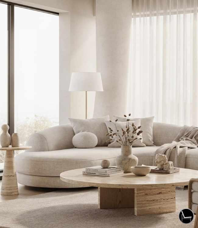
1. Living Room: Creating the Perfect Gathering Space

Your living room sets the tone for your entire home. The soft autumn color palette creates an inviting foundation that works year-round.
Picture This: Imagine walls painted in Sweet Corn, anchored by a Burlwood leather sofa and accented with Sage Green throw pillows. The space feels immediately more sophisticated and cohesive.
Implementation Strategy:
- Use warm neutrals (Sweet Corn, Turtledove) as your base wall color
- Introduce deeper tones through furniture (Carob Brown sectional, Olive Night accent chair)
- Add soft pops of color with textiles (Tea Rose curtains, Dusk Blue throw blanket)
- Include natural wood elements in medium tones to complement the palette
The key to success lies in the 60-30-10 rule: 60% neutral base, 30% secondary colors, and 10% accent colors from your soft autumn color palette.
Pro Tip: Layer different textures within the same color family. A Sage Green velvet pillow paired with a Sage Green linen throw creates visual interest without disrupting the cohesive color story.
2. Kitchen: Warm and Welcoming Culinary Spaces

While 46% of Americans choose white kitchen cabinets, soft autumn colors offer a sophisticated alternative that still maintains broad appeal.
Why Soft Autumn Works in Kitchens: Warm undertones create an inviting atmosphere that makes cooking and entertaining more enjoyable. These colors also complement natural materials like wood and stone beautifully.
Implementation Ideas:
- Paint cabinets in Turtledove or Overcast for a sophisticated neutral base
- Use Sage Green for kitchen islands or accent cabinets
- Choose Burlwood for wood elements and open shelving
- Add Coral Almond through bar stools or small appliances
- Incorporate natural stone countertops in warm gray or beige tones
Picture This: Lower cabinets in Turtledove, upper cabinets in Sweet Corn, with a Sage Green island and Burlwood floating shelves. The result is a kitchen that feels both modern and timeless.
Pro Tip: Balance cool and warm tones by using cooler soft autumn shades (like Dusk Blue backsplash tiles) to prevent the space from feeling too warm or overwhelming.
3. Bedroom: Serene Autumn Retreat

The bedroom is where the soft autumn color palette truly shines, creating a cocoon of comfort and sophistication.
Creating the Perfect Sleep Sanctuary: Soft autumn colors naturally promote relaxation while maintaining visual interest. The muted tones create a sophisticated backdrop that doesn’t compete with sleep.
Color Application Strategy:
- Feature wall in Tea Rose or Dusk Blue behind the headboard
- Remaining walls in Sweet Corn or White Asparagus
- Bedding in layered Sage Green and Turtledove tones
- Window treatments in Olive Night or Bristol Blue
- Accent furniture in Carob Brown or Burlwood
Picture This: A Tea Rose accent wall behind a Burlwood bed frame, with Sweet Corn walls and layered bedding in Sage Green and Turtledove. The space feels both romantic and grounding.
The bedroom should feel like a gentle embrace, and soft autumn colors deliver exactly that sensation.
Pro Tip: Use different values of the same color family to create depth. For example, pair light Sage Green sheets with deeper Olive Night curtains for a sophisticated monochromatic look.
4. Bathroom: Spa-Like Sophistication

Transform your bathroom into a spa-like retreat using the soft autumn color palette’s most calming elements.
Why These Colors Work: Soft autumn tones complement both modern and traditional bathroom fixtures while creating a sense of warmth that’s often missing in bathrooms.
Design Applications:
- Vanity cabinets in Sage Green or Turtledove
- Walls in Sweet Corn or Overcast
- Accent tiles in Bristol Blue or Dusk Blue
- Natural wood elements in Burlwood tones
- Soft textiles in Tea Rose or Coral Almond
Picture This: A Sage Green vanity with Carob Brown wood accents, Sweet Corn walls, and Bristol Blue subway tiles. The space feels both fresh and grounding.
Bathrooms benefit from the palette’s more muted tones, which create sophistication without overwhelming the typically smaller space.
Pro Tip: Use the cooler tones from the soft autumn palette (Dusk Blue, Bristol Blue) in bathrooms to create a fresh, clean feeling while maintaining the overall warm aesthetic.
5. Dining Room: Elegant Entertaining

The dining room is perfect for showcasing the soft autumn color palette’s more dramatic possibilities while maintaining sophistication.
Creating Memorable Dining Experiences: Soft autumn colors create an atmosphere that’s both intimate and elegant, perfect for both casual family meals and formal entertaining.
Implementation Strategy:
- Feature walls in deeper tones (Cardinal, Olive Night)
- Complement with lighter neutrals (Sweet Corn, Turtledove)
- Choose dining furniture in Carob Brown or Burlwood
- Add elegant touches through Tea Rose or Coral Almond accessories
- Include natural elements like wood and stone
Picture This: Cardinal accent wall behind a Burlwood dining table, with Sweet Corn on remaining walls and Sage Green dining chairs. The space feels both dramatic and welcoming.
The dining room allows you to use slightly more saturated versions of soft autumn colors since it’s used primarily during evening hours when warm lighting enhances their beauty.
Pro Tip: Use lighting to enhance the warmth of soft autumn colors. Warm white LED bulbs (2700K-3000K) make these colors glow beautifully during evening meals.
6. Home Office: Productive and Peaceful

Create a workspace that’s both inspiring and calming using the soft autumn color palette‘s most balanced tones.
Why Soft Autumn Works for Productivity: These colors provide visual interest without being distracting, creating an environment that supports both creativity and focus.
Design Elements:
- Walls in Overcast or Turtledove for a sophisticated backdrop
- Built-in shelving in Sage Green or Aloe
- Desk and furniture in Burlwood or Carob Brown
- Accent pieces in Dusk Blue or Bristol Blue
- Natural elements and plants to enhance the organic feel
Picture This: Turtledove walls with Sage Green built-ins, a Burlwood desk, and Dusk Blue accent chair. The space feels both professional and personally satisfying.
The home office benefits from soft autumn’s balance of warmth and sophistication, creating a space that’s both inviting and professional.
Pro Tip: Use the cooler tones from the palette (Dusk Blue, Bristol Blue) for areas where you need to stay alert, and warmer tones (Tea Rose, Coral Almond) for relaxation zones within the office.
Don’t Miss: Best Fall Decor Finds That Will Make Your Home Feel Like Autumn
IV. Professional Design Tips for Soft Autumn Success

1. Balancing Warm and Cool Tones
The soft autumn color palette includes both warm and cool undertones, and mastering this balance is crucial for sophisticated results.
The 70-30 Rule: Use 70% warm tones and 30% cool tones from the palette. This maintains the autumn warmth while preventing spaces from feeling too cozy or overwhelming.
Strategic Cool Tone Placement:
- Use cooler tones (Dusk Blue, Bristol Blue) in areas where you want to maintain alertness
- Apply them in smaller doses as accents rather than dominant colors
- Choose cooler tones for north-facing rooms that need warmth balance
Pro Tip: Test paint colors at different times of day. Soft autumn colors can look dramatically different in morning light versus evening light, so observe them in various conditions before committing.
2. Lighting Considerations
Lighting dramatically affects how soft autumn colors appear in your space.
Natural Light:
- South-facing rooms: Use cooler soft autumn tones to balance intense sunlight
- North-facing rooms: Embrace warmer tones to counteract cool natural light
- East/West-facing rooms: Consider how colors will look in both morning and evening light
Artificial Lighting:
- Warm white LEDs (2700K-3000K) enhance the cozy feeling
- Avoid cool white lights that can make colors look muddy
- Use dimmer switches to adjust ambiance throughout the day
Picture This: A Sage Green living room with warm white lighting creates a completely different mood than the same room with cool white lighting. The warm lighting enhances the sophisticated, cozy atmosphere.
3. Common Mistakes to Avoid
Using Too Many Colors at Once: Limit yourself to 4-5 colors from the soft autumn color palette per room. More colors create chaos rather than sophistication.
Ignoring Undertones: All soft autumn colors share warm undertones. Mixing them with cool-toned colors from other palettes creates discord.
Forgetting About Texture: Soft autumn colors can appear flat without varied textures. Mix smooth, rough, matte, and glossy surfaces within the same color family.
Pro Tip: Create a color board with paint swatches, fabric samples, and material samples before starting any room. This prevents costly mistakes and ensures cohesion.
The key to success with soft autumn colors is restraint and intentionality. Each color should have a purpose and contribute to the overall harmony of the space.
Trending Post: 9 Budget-Friendly Home Office Upgrades: Obtain a Productive and Beautiful Workspace

V. How Did I Choose These Soft Autumn Design Recommendations?

My Experience with Soft Autumn Color Palettes: As an interior design professional, I’ve personally implemented soft autumn color schemes in many homes. My expertise comes from both formal training in color theory and hands-on experience helping clients create spaces that truly reflect their personalities.
Research and Development: I’ve spent years studying how personal color palettes translate to interior spaces, working with clients who identify as soft autumn types to understand what works in real homes. This guide represents the culmination of that research, combined with current design trends and practical application.
Continuous Learning: I regularly attend color forecasting conferences and stay current with paint manufacturer releases to ensure my recommendations reflect the latest developments in color technology and availability.
This guide represents not just design theory, but practical, tested strategies that create beautiful, livable spaces.
Most Popular Post:
Interior Design Style Quiz
Timeless Paint Colors That Never Go Out of Style
Create Your Perfect Ergonomic Home Office: A Complete Guide
Must-Have Accessories for Guys: The Secret to a Stylish Space
Modular Sofas for Small Spaces: Brilliant Solutions for Compact Living
VI. Transform Your Home Today
The soft autumn color palette offers the perfect solution for creating sophisticated, warm, and inviting interiors that feel both current and timeless. By following the room-by-room strategies outlined in this guide, you’ll create a cohesive color story that flows beautifully throughout your home.
Remember these key principles:
- Start with neutral bases and add color through furniture and accessories
- Balance warm and cool tones for sophisticated results
- Consider lighting when making color selections
- Layer textures within the same color family for visual interest
- Use the 60-30-10 rule for balanced color distribution
Whether you’re planning a complete home makeover or simply want to refresh a single room, the soft autumn color palette provides endless possibilities for creating spaces that feel both elegant and welcoming.
Ready to get started? Choose one room and begin with a soft autumn neutral on the walls. Add one piece of furniture or a few accessories in a complementary soft autumn color. You’ll be amazed at how quickly your space transforms into the cozy, sophisticated retreat you’ve been dreaming of.
The beauty of the soft autumn color palette lies in its versatility and timeless appeal. These colors work with virtually any decorating style and create spaces that feel personally meaningful and professionally designed. Your perfect autumn-inspired home awaits.
Frequently Asked Questions About Soft Autumn Color Palettes
1. What colors should I avoid with a soft autumn palette?
Avoid bright, saturated colors and anything with cool undertones. Skip neon colors, pure white, stark black, and cool grays. Colors like lime green, hot pink, electric blue, and lavender will clash with the warm, muted nature of soft autumn color palette.
Instead, if you want brighter accents, choose muted versions like dusty rose instead of hot pink, or sage green instead of bright emerald.
Pro Tip: When in doubt, hold potential colors next to your chosen soft autumn shades. They should feel harmonious, not jarring.
2. Can I use soft autumn colors in a modern home?
Absolutely! The soft autumn color palette works beautifully in modern homes. The key is using these colors in contemporary ways—think clean lines, minimalist furniture, and strategic color placement.
Use soft autumn neutrals like Turtledove or Overcast for walls, add Sage Green through modern furniture pieces, and incorporate Carob Brown through sleek wood elements. The muted nature of these colors actually enhances modern design’s sophisticated simplicity.
3. How do I know if I’m using too many soft autumn colors?
Follow the 60-30-10 rule: 60% neutral base colors, 30% secondary colors, and 10% accent colors. If every surface in your room is a different soft autumn color, you’ve gone too far.
Signs you’re using too many colors:
- The room feels busy or chaotic
- Your eye doesn’t know where to rest
- Colors compete for attention rather than complement each other
Picture This: A successful soft autumn living room might have Sweet Corn walls (60%), Sage Green sofa (30%), and Tea Rose pillows (10%).
4. What’s the best way to test soft autumn colors before committing?
Always test paint colors in your actual space with your lighting conditions. Purchase sample sizes and paint large swatches (at least 2×2 feet) on different walls.
Testing Strategy:
- View colors at different times of day
- Test in both natural and artificial light
- Live with the samples for at least a week
- Consider how they look next to your existing furniture and flooring
Pro Tip: Paint samples on poster board so you can move them around the room and see how they look in different areas and lighting conditions.
5. Do soft autumn colors work with existing furniture?
The soft autumn color palette is remarkably versatile and works with most existing furniture. These colors particularly complement:
- Natural wood tones (oak, walnut, pine)
- Cream and beige upholstery
- Brass and gold metallic finishes
- Natural materials like jute and linen
If you have cool-toned furniture (like gray or black), you can still make it work by adding warm soft autumn accessories and textiles to bridge the gap.
6. Are soft autumn colors suitable for small spaces?
Yes! Soft autumn colors are excellent for small spaces because they create warmth without overwhelming. The muted nature prevents colors from closing in the space.
Small Space Strategy:
- Use lighter soft autumn neutrals (Sweet Corn, White Asparagus) for walls
- Add deeper colors through easily changeable accessories
- Choose one feature wall in a deeper tone (Sage Green or Dusk Blue)
- Use mirrors and good lighting to enhance the warmth
7. How do I incorporate soft autumn colors if I rent?
Focus on elements you can take with you:
- Throw pillows and blankets in Tea Rose or Sage Green
- Area rugs in Turtledove or Overcast
- Curtains in Dusk Blue or Bristol Blue
- Artwork featuring soft autumn tones
- Plants and natural elements
- Removable wallpaper in soft autumn patterns
Pro Tip: Many landlords allow accent walls, so consider one soft autumn feature wall that can be easily painted back when you move.
8. What lighting works best with soft autumn colors?
Warm white LED bulbs (2700K-3000K) are ideal for enhancing the soft autumn color palette. This lighting temperature brings out the warm undertones and creates the cozy atmosphere these colors are known for.
Lighting Tips:
- Avoid cool white or daylight bulbs (5000K+) which can make colors look muddy
- Use dimmer switches to adjust ambiance
- Layer lighting with table lamps, floor lamps, and overhead fixtures
- Consider warm-toned light fixtures in brass or bronze
9. Can I mix soft autumn colors with other seasonal palettes?
It’s challenging but possible if done carefully. Soft autumn colors work best with:
- Warm Spring colors (both have warm undertones)
- True Autumn colors (same season family)
Avoid mixing with:
- Cool Summer or Cool Winter palettes
- Any colors with strong cool undertones
Pro Tip: If you want to mix palettes, use one as the dominant scheme (80%) and the other as minimal accents (20%).
10. How often should I update my soft autumn color scheme?
The beauty of the soft autumn color palette is its timeless nature. Unlike trendy color schemes that feel dated quickly, soft autumn colors remain sophisticated year after year.
Update Strategy:
- Change small accessories seasonally (pillows, throws, artwork)
- Update larger elements (furniture, rugs) every 5-7 years
- Repaint walls every 7-10 years or when they show wear
- Add new elements gradually rather than complete overhauls
11. Are there any rooms where soft autumn colors don’t work?
Soft autumn colors work in virtually every room, but consider these adjustments:
- Bathrooms: Use cooler soft autumn tones (Dusk Blue, Bristol Blue) for freshness
- Kitchens: Balance warm colors with plenty of lighting to avoid feeling too cozy
- Children’s rooms: Add brighter (but still muted) soft autumn colors for energy
The key is adapting the intensity and proportion of colors to match each room’s function and natural lighting.
Subscribe To the Newsletter!
Subscribe now for an endless feed of inspirational women’s cave decor ideas, pampering rituals, and more tips for curating your ultimate escape. Let’s start making your cozy refuge a reality – you so deserve this!
CATCH THE LATEST IN HOME DECOR TRENDS:

Steal These 16 Expert-Approved Decorating Secrets

How To Accessorize Your Living Room
How to Make a Small Room Appear Bigger

How to Make Your Home Look Expensive
GET CAUGHT UP ON ALL THE INSPIRING DECOR TIPS:

18 Fresh Decorating Ideas To Update Your Fireplace

How to Make a Gallery Wall: The Complete Step-by-Step Guide (Even If You’ve Never Hung a Picture)
