Staring at your beige walls while the summer heat builds outside? You’re not alone. Choosing the right cool summer color palette can feel overwhelming when you’re facing endless Pinterest boards and conflicting advice.

Here’s the truth: Most homeowners struggle with creating a cohesive color scheme that actually works in their space. They end up with rooms that feel disconnected or, worse, expensive mistakes they have to live with for years.
This guide solves that problem. You’ll discover exactly which cool summer colors work best in each room, how to implement them on any budget, and insider tips that interior designers use with their high-end clients. No more guesswork. No more expensive do-overs.
I. Why Cool Summer Color Palettes Work Better Than Warm Tones

Cool colors aren’t just trendy—they’re scientifically proven to create the atmosphere your home needs during summer months. While warm colors like reds and oranges can make spaces feel energetic, they also make rooms feel hotter and smaller.
Cool summer color palettes do the opposite. They create visual breathing room and can actually make your space feel 5-10 degrees cooler. This isn’t just perception—it’s backed by environmental psychology research.
- Blues and greens lower heart rate and reduce stress
- Cool grays and lavenders promote relaxation and better sleep
- Soft teals and aquas create spa-like tranquility
Pro Tip: Start with paint samples and observe them at different times of day. Cool colors can shift dramatically under various lighting conditions.
Picture This: Walking into your living room after a hot day and immediately feeling that sense of calm you get at a luxury spa. That’s the power of a well-planned cool summer color palette.
Don’t Miss: Timeless Paint Colors That Never Go Out of Style
II. The Science Behind Cool Summer Color Palette Psychology
Color psychology isn’t just interior design fluff—it’s real science that affects your daily mood and energy levels. Research shows that room paint colors can affect mood, energy levels, and even appetite.
Cool colors in the blue family have been shown to slow down heart rate, metabolism, and blood pressure. This makes them perfect for creating restorative spaces in your home where you can truly relax.
According to recent studies, 85% of people say color is the main reason they choose to buy a product—and the same principle applies to how we feel in our homes. When you choose the right cool summer color palette, you’re not just decorating; you’re creating an environment that supports your wellbeing.
Pro Tip: Use the 60-30-10 rule when implementing your cool summer color palette. 60% dominant cool color, 30% secondary shade, and 10% accent color for perfect balance.
The key is understanding that different cool colors serve different purposes. Blues promote focus and calm. Greens connect us to nature and reduce eye strain. Soft purples encourage creativity and introspection.
Don’t Miss: How to Create a Soft Color Palette That Transforms Your Entire Home
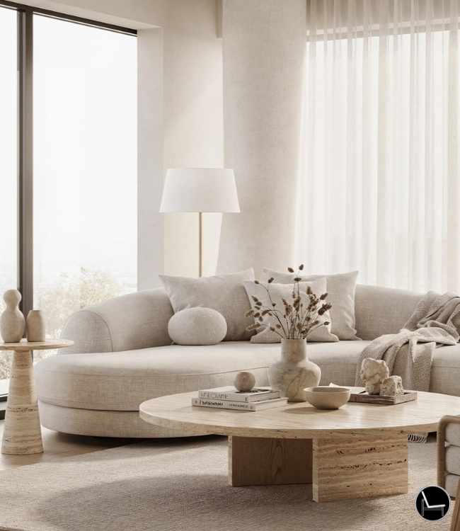
III. Living Room Cool Summer Color Palette Ideas

Your living room is where your cool summer color palette makes its biggest impact. This is the space where families gather, where guests form first impressions, and where you spend most of your relaxation time.
The most successful living room palettes start with these foundational cool colors:
- Soft powder blue as your primary wall color
- Sage green in furniture pieces or large textiles
- Warm white to prevent the space from feeling cold
- Lavender gray for accent pieces and throw pillows
Picture This: Settling into your sofa surrounded by gentle blues and greens, feeling like you’re in a coastal cottage even if you’re miles from the ocean.
Implementation is simpler than you think. Start with paint—it’s your biggest impact for the lowest cost. Choose a soft blue-gray for the main walls, then bring in sage green through a statement sofa or large area rug.
Pro Tip: Add warm white trim and plenty of white accessories to prevent your cool palette from feeling stark or cold. The contrast creates visual interest while maintaining the refreshing summer vibe.
Also: 5 Secrets to a Designer Look Living Room For Less
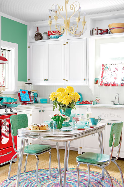
IV. Kitchen Cool Summer Color Palette Transformations

Kitchens benefit enormously from cool summer color palettes because they’re naturally warm spaces with lots of heat-generating appliances. Cool colors provide the perfect visual counterbalance.
The most popular kitchen cool summer color palette combinations right now include:
- Dusty blue cabinets paired with white countertops
- Sage green lower cabinets with white uppers
- Soft gray cabinets with blue or green subway tile backsplash
Don’t have the budget for new cabinets? No problem. You can achieve a stunning kitchen transformation by painting existing cabinets, updating hardware to brushed nickel or matte black, and adding a cool-toned backsplash.
Picture This: Preparing your morning coffee in a kitchen that feels like a breath of fresh air, surrounded by calming blues and greens that make even the busiest cooking sessions feel peaceful.
Pro Tip: Cool colors can make small kitchens feel significantly larger. Use lighter shades of your chosen cool colors in compact spaces to maximize the effect.
Also: 10 Hottest Kitchen Trends For 2025
V. Bedroom Cool Summer Color Palette for Better Sleep

Your bedroom’s cool summer color palette directly impacts your sleep quality. Warm colors can be overstimulating in spaces designed for rest, while cool colors promote the relaxation your body needs to wind down.
Sleep researchers consistently recommend cool colors for bedrooms because they naturally lower body temperature and heart rate—two essential components of quality sleep.
The most effective bedroom cool summer color palette includes:
- Soft lavender or pale blue walls for primary color
- Cool gray or sage green bedding for layering
- White or cream accents to add warmth without overwhelming
Picture This: Slipping into bed surrounded by colors that immediately signal to your brain that it’s time to relax, like being enveloped in a peaceful mountain retreat.
Pro Tip: Layer different shades within the same cool color family rather than mixing multiple cool color families. This creates depth without visual chaos.
Also: 10 Hottest Bedroom Trends to Try Now
VI. Bathroom Cool Summer Color Palette Spa Vibes

Bathrooms are perfect candidates for cool summer color palettes because they naturally lend themselves to spa-like atmospheres. Cool colors enhance the clean, fresh feeling you want in these spaces.
The challenge with bathroom color palettes is humidity and lighting. You need colors that work well in both bright task lighting and softer ambient lighting.
- Soft aqua or seafoam tiles for shower areas
- Cool white or pale gray walls for versatility
- Sage green or dusty blue vanity for personality
Picture This: Starting your day in a bathroom that feels like a luxury spa, with colors that make you feel refreshed and energized for whatever comes next.
Pro Tip: Use glossy or semi-gloss finishes in bathrooms to reflect light and enhance your cool tones. The reflective quality makes colors appear more vibrant and keeps the space feeling bright.
Don’t Miss: How to Create a Soft Color Palette That Transforms Your Entire Home

VII. Dining Room Cool Summer Color Palette for Entertaining

Dining rooms require a special approach to cool summer color palettes. While you want the calming benefits of cool colors, you also need to maintain an inviting atmosphere for meals and entertaining.
The secret is balancing cool colors with warm accents and strategic lighting. Cool colors can actually enhance the dining experience by creating a more relaxed environment where conversations flow naturally.
- Soft blue-green walls as your base
- Warm wood dining table to ground the space
- Brass or gold light fixtures to add warmth
- White or cream dining chairs for balance
Picture This: Hosting summer dinner parties where your guests immediately feel welcome and relaxed, surrounded by colors that encourage lingering conversations and genuine connection.
Pro Tip: Add warm metallic accents through lighting, picture frames, and serving pieces to prevent your cool dining room palette from feeling too formal or cold for entertaining.
Also: How To Create a Dining Room Gallery Wall
VIII. Home Office Cool Summer Color Palette for Productivity

Working from home demands a cool summer color palette that enhances focus without causing fatigue. The wrong colors can decrease productivity and increase stress—exactly what you don’t need in your workspace.
Blue is scientifically proven to enhance concentration and mental clarity. Green reduces eye strain from computer screens. Together, they create the ideal environment for sustained focus and creativity.
- Soft blue accent wall behind your desk
- Sage green or white for remaining walls
- Natural wood desk to add warmth
- White or cream storage solutions for organization
Picture This: Sitting down to work in a space that immediately helps you focus, where the colors actually boost your energy and creativity instead of draining them.
Pro Tip: Use cool blues specifically to enhance concentration. Studies show that blue environments can improve cognitive performance by up to 12%.
Also: Create Your Perfect Ergonomic Home Office: A Complete Guide
IX. Budget-Friendly Ways to Add Cool Summer Color Palette
“Don’t just dream it, decorate it! Click below to shop the exact pieces I love for a beautiful home.”

Throw Pillows | Throw Blanket | Fiddle Plant | Gallery Wall(6 Piece) | Table Runner
Creating a stunning cool summer color palette doesn’t require a complete renovation. Smart homeowners know that strategic updates can transform any space without breaking the bank.
Under $70 transformations:
- New throw pillows in sage green and dusty blue
- Cool-toned artwork or photography prints
- Plants in blue or green ceramic pots
- Light blue or seafoam table runner and placemats
Under $200 transformations:
- Paint one accent wall in your chosen cool color
- New area rug in cool tones
- Set of cool-colored curtains or roman shades
- Updated lamp shades in soft blues or greens
Picture This: Walking into your completely transformed living room, amazed that less than $200 could create such a dramatic and refreshing change.
Pro Tip: Start with textiles and accessories before committing to paint. This lets you test how colors work in your space and adjust before making permanent changes.
Don’t Miss: How To Accessories Your Living Room
X. Common Cool Summer Color Palette Mistakes to Avoid
Even with the best intentions, homeowners make predictable mistakes when implementing cool summer color palettes. Learning from others’ errors saves you time, money, and frustration.
Mistake #1: Using only cool colors without any warm balance. This creates spaces that feel sterile and unwelcoming. Always add warm accents through wood, metallics, or cream tones.
Mistake #2: Ignoring your home’s natural light. North-facing rooms with limited natural light can feel cold and gloomy with too many cool colors.
Mistake #3: Choosing colors based on small paint samples. Colors look completely different on large walls than they do on tiny swatches.
Picture This: The relief of getting your color choices right the first time, avoiding the costly and time-consuming process of repainting because something looked different than expected.
Pro Tip: Always test paint colors in large swatches (at least 2×2 feet) and observe them at different times of day before making final decisions.
Trending Post: How to Layer a Rug: A Complete Room-by-Room Guide
XI. How I Choose the Perfect Cool Summer Color Palette
As an interior designer and working with many of homeowners, I’ve developed a systematic approach to selecting cool summer color palettes that actually work in real homes.
My process starts with understanding how each family uses their space. A busy household with young children needs different colors than empty nesters who entertain frequently. Cool colors must serve the lifestyle, not just look pretty in photos.
I always begin with the room’s natural light and existing elements that won’t change—like flooring, built-ins, or major furniture pieces. The best cool summer color palette works with what you have, not against it.
My signature approach involves creating color stories that flow from room to room while allowing each space to have its own personality. This means using variations of the same cool color family throughout the home, adjusted for each room’s specific function and lighting.
Don’t Miss: Shop Floor Lamps: Light Up Your Room with Style and Functionality
XII. Conclusion: Cool Summer Color Palette
Your home should be your sanctuary, especially during the busy summer months. The right cool summer color palette creates spaces that restore your energy instead of draining it, that welcome you home after long days, and that make everyday moments feel a little more special.
Remember, you don’t need to transform every room at once. Start with the space where you spend the most time—often the living room or bedroom—and let your success there inspire your next project.
The most important thing is to trust your instincts while using the guidelines in this article. If a color makes you feel calm and happy when you look at it, it’s probably right for your space.
Final Pro Tip: Take photos of your rooms at different times of day as you’re testing colors. Your camera often picks up color variations that your eye might miss, helping you make better decisions.
Ready to begin your cool summer color palette transformation? Start small, test thoroughly, and enjoy the process of creating a home that truly reflects the peaceful, refreshing energy you want in your life.
Most Popular Post:
Interior Design Style Quiz
Timeless Paint Colors That Never Go Out of Style
Create Your Perfect Ergonomic Home Office: A Complete Guide
Must-Have Accessories for Guys: The Secret to a Stylish Space
Modular Sofas for Small Spaces: Brilliant Solutions for Compact Living
Frequently Asked Questions About Cool Summer Color Palette
What exactly is a cool summer color palette?
A cool summer color palette consists of colors with blue, green, or purple undertones that create a calming, refreshing atmosphere. Think soft blues, sage greens, lavender grays, and dusty teals—colors that make spaces feel cooler and more relaxing during warm months.
Will cool colors make my room feel cold and unwelcoming?
Not when balanced properly! The key is adding warm accents like natural wood, brass fixtures, or cream-colored textiles. Cool colors provide the base, while warm elements prevent the space from feeling sterile.
Can I use cool summer colors in a north-facing room?
Yes, but choose lighter shades and add plenty of warm lighting. North-facing rooms get less natural light, so opt for pale blues or soft greens rather than deeper cool tones. Always test colors in your specific lighting conditions.
What’s the biggest mistake people make with cool color palettes?
Using only cool colors without any warm balance. This creates spaces that feel like hospitals rather than homes. Always include at least 10-20% warm elements through wood, metallics, or warm whites.
How do I transition from warm to cool colors without repainting everything?
Start with accessories and textiles. Swap out warm-toned throw pillows, artwork, and rugs for cool alternatives. Once you’re happy with the look, consider painting accent walls or updating larger pieces.
Do cool colors really make rooms feel cooler temperature-wise?
While they don’t actually change the temperature, cool colors can make spaces feel 5-10 degrees cooler due to color psychology. Your brain associates these colors with coolness, creating a psychological cooling effect.
Which cool color works best for small spaces?
Light sage green or soft powder blue work beautifully in small spaces. These colors reflect light well and create visual expansion. Avoid darker cool tones in compact rooms as they can make spaces feel cramped.
Can I mix different cool colors together?
Absolutely! The most successful cool palettes often combine 2-3 cool colors. Try pairing soft blue with sage green, or lavender gray with dusty teal. Keep one color dominant and use others as accents.
How long do cool color trends typically last?
Cool colors are classic rather than trendy. Blues, greens, and soft grays have been popular for decades and aren’t going anywhere. Specific shades may evolve, but the overall cool palette remains timeless.
What’s the most budget-friendly way to test cool colors?
Buy sample paint colors and paint large poster boards (2×2 feet minimum). Move these around your room at different times of day to see how the colors look in various lighting conditions before committing to full walls.
Subscribe To the Newsletter!
Subscribe now for an endless feed of inspirational women’s cave decor ideas, pampering rituals, and more tips for curating your ultimate escape. Let’s start making your cozy refuge a reality – you so deserve this!
CATCH THE LATEST IN HOME DECOR TRENDS:

Steal These 16 Expert-Approved Decorating Secrets

How To Accessorize Your Living Room
How to Make a Small Room Appear Bigger

How to Make Your Home Look Expensive
GET CAUGHT UP ON ALL THE INSPIRING DECOR TIPS:

18 Fresh Decorating Ideas To Update Your Fireplace

How to Make a Gallery Wall: The Complete Step-by-Step Guide (Even If You’ve Never Hung a Picture)
