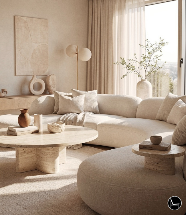

A calm living room comes from four things working together: enough negative space to let your eyes rest, color kept to a low-saturation palette, lighting layered in warm, soft sources instead of one bright overhead, and surfaces edited down so nothing fights for your attention. Get those four right and the “calm” follows on its own — no all-white room required.
You bought the cream boucle throw. You painted a sample swatch of “greige” on the wall. You even cleared the coffee table for that one perfect photo. And somehow, your calm living room still feels like it’s humming with static — not loud, exactly, just… never quiet.
Here’s the thing nobody tells you: calm isn’t a color. It’s not a single Pinterest-worthy sofa, either. It’s a system — a set of decisions about space, light, texture, and what’s allowed to sit out in the open — and most living rooms feel “almost calm” because they’re only getting one or two of those decisions right. The rest is still working against you.

This guide walks you through the entire system, step by step — the exact lighting temperatures, spacing ratios, and styling rules designers use to make a room feel like it’s exhaling. No vague “just declutter” advice. Real numbers, real fixes, and real solutions for renters, small spaces, and that one TV you can’t seem to make disappear.
- What Is a Calm Living Room?
- Curated Calm Living Room Ideas for Every Style
- Calm Living Room Color Palette: The Psychological Rules
- Sensory Layering: Textures for a Calm Living Room
- Calm Living Room Lighting: The Strategy That Works
- Clearing Clutter Without Making It Feel Cold
- Calm Living Room Furniture Layout
- Calm Living Room Ideas by Room Type
- Calm Living Room Mistakes to Avoid
- The Designer’s Cheat Sheet
- Frequently Asked Questions
What Is a Calm Living Room (And Why Yours Might Not Feel Like One)

A calm living room is a space designed around visual rest rather than visual interest — low-saturation color, layered warm lighting, limited object count on every surface, and enough negative space for your eyes to settle instead of scan. It’s a measurable design system, not a single style or color.
According to a study published in the journal Color Research & Application, colors like blue and green are associated with feelings of calmness and serenity. They found that 80% of participants reported feeling more relaxed in rooms painted in these colors compared to warmer tones.
This is exactly why a room can check every “calm” box on Pinterest — soft neutrals, a cozy throw, a candle — and still feel a little tense in person. Usually one piece of the system is missing: an overhead light that’s too cool and bright, a console with too many small objects, or furniture spaced just a little too tight to move through comfortably. Fix the system, and the “calm” follows automatically, regardless of which aesthetic you’re drawn to.
Curated Calm Living Room Ideas for Every Style
“Calm” doesn’t look the same in every house, and it shouldn’t. A calm room is really just a room where every element supports the same mood instead of competing with it — but the mood itself can be warm, airy, rustic, or polished depending on what actually feels restful to you. Here are four directions that consistently read as calm, no matter which one you pick.

Warm Minimalism
The opposite of stark, cold minimalism. Think rounded furniture, warm beige instead of stark white, and just enough texture to keep things from feeling sterile.
Why it’s calm: Fewer objects, but every one is soft to the eye — no hard angles, no glossy surfaces fighting for attention.

Organic Modern
Raw wood, rattan, linen, and a plant or two doing real work — not just sitting in a corner for decoration. Clean lines, but nothing feels manufactured.
Why it’s calm: Natural materials read as “unforced” to the brain. Nothing here looks staged, even when it absolutely is.

Soft Cottage
Slipcovered sofas, layered vintage textiles, and a slightly worn-in feel. More personality than warm minimalism, but still restrained on color.
Why it’s calm: Familiarity reads as safe. A room that looks lived-in (not messy — lived-in) lowers your guard the second you walk in.

Quiet Luxury
Elevated, but never flashy. Soft lighting, muted gold or brass accents, and high-quality basics over statement pieces.
Why it’s calm: Nothing is shouting “look at me,” including the expensive parts. The room feels resolved instead of styled.
Don’t mix more than one of these directions in the same room. A warm-minimalist sofa next to soft-cottage curtains is how rooms end up feeling “off” without anyone being able to say why. Pick one lane, then borrow small details from the others if you want — one or two pieces, not the whole vibe.
Calm Living Room Color Palette: The Psychological Rules

The direct answer: A calming palette isn’t about going all-white or all-gray — it’s about keeping every color in the room at low saturation, so nothing demands attention faster than your eye can process it. Muted sage, soft terracotta, and dusty sky blue all calm a room just as well as beige, as long as they’re desaturated.
The design psychology: Saturation, not hue, is what your brain reads as “loud.” A bright red and a bright blue both spike visual alertness. A dusty terracotta and a dusty sage do not — even though they’re technically warm and cool opposites. This is why all-white rooms can still feel cold and clinical: they’ve removed color, but they haven’t necessarily added warmth. A true calm palette feels more like a quiet spa than a hospital waiting room, and the difference is almost always saturation and temperature, not the absence of color itself.
Base Neutral
Walls, large furniture, rugs. Warm white, soft greige, or putty — never stark white.
Muted Secondary
One desaturated color: sage, terracotta, or dusty blue, used on textiles or one accent wall.
Grounding Accent
Charcoal, deep walnut, or black in small doses — a frame, a lamp base — to keep the palette from floating.
That last 10% matters more than people think. A room that’s only soft, light colors with nothing dark anywhere can feel washed out and strangely unsettling, the same way a photo with no shadows looks flat. One or two genuinely dark, grounding notes — not black walls, just a black picture frame or a dark wood coffee table — give your eye somewhere to land.
If your room already has color you love but it still feels chaotic, the issue is probably saturation, not the colors themselves. Try swapping one bright accent pillow or throw for the same color in a muted, dustier version before you touch the walls.
Sensory Layering: Textures for a Calm Living Room

Once you strip a room of bold patterns and bright colors, texture has to do all the work that pattern used to do — otherwise the room reads as flat and a little boring instead of calm. The fix is layering at least four distinct textures into every room: something soft, something woven, something hard, and something matte.
A survey conducted by the International Interior Design Association (IIDA) found that 73% of respondents felt that incorporating soft textures and fabrics in their living spaces enhanced their sense of calm and comfort. This supports the idea that texture plays a significant role in creating a serene living room environment.
The design psychology: Visual interest doesn’t disappear when you remove pattern — it has to move somewhere. Texture creates depth through light and shadow instead of through color contrast, which is exactly why a monochrome room full of texture still feels rich, while a monochrome room with zero texture feels sterile. This is the actual mechanism behind why “boring” all-beige rooms in real life often look nothing like the cozy beige rooms on Pinterest: the Pinterest version has six textures stacked on top of each other.
- Soft: bouclé upholstery, a chunky knit throw, a sheepskin on a chair
- Woven: a jute or wool rug, rattan side table, woven lampshade
- Hard, matte: raw or white oak wood, unglazed ceramic vases, linen drapery
- Hard, reflective (used sparingly): a brushed brass lamp base or a single mirror — one shiny surface, max two
Limit yourself to one glossy or reflective material per room. Glass, polished chrome, and high-gloss lacquer all bounce light unpredictably, which is the opposite of calm. One mirror or one metallic lamp is a feature. Three is visual noise, even if every individual piece is beautiful.
This is also where a lot of “all-neutral” rooms go wrong. If every texture in the room is roughly the same — say, everything is a smooth cotton — your brain stops finding anything new to settle on, and the room feels flat rather than restful. Mixing rough with smooth, matte with a touch of sheen, gives your eye small, gentle places to land instead of one undifferentiated wash of beige.
Calm Living Room Lighting: The Strategy That Works

One bright overhead light is the single fastest way to kill a calm room, because it flattens shadows and floods the space evenly at a color temperature that’s closer to daylight than to candlelight. Swap it for three layers of light — ambient, task, and accent — all kept around 2700K, and the same furniture in the same room will read as noticeably calmer by evening.
The design psychology: Bright, even, cool-toned light mimics daytime alertness — useful for a kitchen, counterproductive in a room meant for unwinding. Warmer light (lower Kelvin numbers) signals evening and rest to your nervous system, which is part of why a room lit only by lamps feels instantly more relaxed than the same room under a flush-mount ceiling fixture, even at the same brightness.
Ambient Layer
Soft, indirect overall light — a dimmable floor lamp or wall sconces, not a single bright overhead. Aim for one fixture per 150-200 sq ft of room, dimmed to about 50% in the evening.
Task Layer
A table lamp at seated eye level (roughly 58-64 inches from the floor when on a side table) for reading or close work, without lighting the whole room.
Accent Layer
A low, ground-level glow — a console lamp or uplight behind a plant — placed at a different height than your other two layers to create depth instead of one flat wash.
Stick to bulbs labeled 2700K (sometimes marketed as “soft white” or “warm white”) throughout the room. Mixing a 5000K daylight bulb in one lamp with 2700K everywhere else is one of the most common reasons a “cozy” room still feels slightly off — the color casts clash even if you can’t immediately tell why.
- ◆ 2700K everywhere, no exceptions
- ◆ Avoid 4000K+ “daylight” bulbs
- ◆ Match temperature across every fixture
- ◆ Floor lamp: 58-64″ to shade top
- ◆ Table lamp: shade at seated eye level
- ◆ Accent: ground level or behind objects
- ◆ Evening: dim ambient to ~50%
- ◆ Use plug-in dimmers if rewiring isn’t an option
- ◆ Never run all three layers at full brightness
Clearing Visual Clutter Without Making It Feel Cold

A calm room needs roughly 30-40% visible negative space — actual empty surface area you can see at a glance — but “empty” doesn’t mean stark. The goal is editing what’s visible, not removing personality. A console with three curated objects feels calmer and warmer than a console with twelve random ones, even though both are “decorated.”
The design psychology: Every object in your sightline is something your brain has to process, even passively. Clutter isn’t really about mess — it’s about object count. A room can be perfectly clean and still feel chaotic if there are simply too many individual items competing for attention at once.
Before vs. After: The Surface Audit
Run this on every open surface in your living room — coffee table, console, mantle, bookshelves. Pick up everything, then add back only what earns its spot.
- Remote controls scattered loose on the coffee table
- Mail, charging cables, and random papers on the console
- 8-10 small objects of similar size on the mantle
- Mixed metal finishes (gold lamp, silver frame, black candle holder)
- Everything at the same height, nothing layered
- Remotes in a single woven tray or closed drawer
- Console holds 3-5 objects max, varied in height
- Mantle: one large piece, two smaller supporting pieces
- One consistent metal finish throughout the room
- At least one tall element on every surface for visual rhythm
How Do I Style a Console Table in a Calm Living Room?
This is the single most common styling mistake we see: a console table either left completely bare (which feels cold and unfinished) or piled with too many small matching objects (which feels busy). The fix designers actually use is simple — style in odd numbers, varying heights, with one item that anchors the rest.
- Tall anchor (18-24″): A table lamp, a tall vase, or one piece of framed art leaned against the wall
- Mid-height (8-14″): A stack of 2-3 books, a small sculptural object, or a low bowl
- Low/textural (under 6″): A small dish, a single stem in a bud vase, or a smooth stone
Three to five objects total, in three distinct height ranges, is the formula. Anything beyond that starts to look like a display shelf instead of a styled surface.
What’s Your Outdoor Style?
Take the free Patio Furniture Style Quiz and find the look that matches how you actually want to relax.
Take the Free QuizHow Do You Decorate Around a TV in a Calm Living Room?
The direct answer: Conceal the cords, flank the screen with something soft like plants or art, and choose a matte frame over a glossy one so the TV recedes into the wall instead of catching light. A black rectangle is the least calming object in most rooms, but it doesn’t have to dominate the space.
A few fixes actually work:
- Conceal the cords: A cord raceway painted to match the wall, or a cord cover kit, removes the single biggest source of visual noise around any TV setup
- Balance the visual weight: Flank the TV with something soft — tall plants, woven baskets, or art — so it’s not the only large, hard-edged object on the wall
- Choose a matte frame TV over glossy: A matte black bezel recedes into a dark wall far better than a glossy or silver frame
- Lower the stand height: Center of screen at seated eye level (about 42″ from the floor) keeps it from dominating the wall the way a too-high mount does
Decorating Around a Frame TV Specifically
A Frame TV is built to solve this exact problem, but only if you style it like art and not like a TV. A few things make the difference:
- Match the bezel to your existing frames: If your gallery wall is mostly black frames, get the matching bezel color — a mismatched bezel breaks the illusion immediately
- Keep “Art Mode” muted: Choose art with the same low-saturation palette as the rest of the room. A bright, high-contrast piece on the screen undoes everything else you’ve done
- Mount it where art would actually go: At standard gallery height (center around 57-60″ from the floor), not lower like a typical media TV — this is what makes it read as art rather than tech
- Don’t surround it with more screens or tech: Keep soundbars and consoles tucked away below; visible tech next to “art” cancels the effect
Calm Living Room Furniture Layout: Flow, Not Just Looks

A calm room needs at least 30-36 inches of clear walking path between major furniture pieces, and seating placed no more than 8 feet apart for easy conversation. Cramped traffic flow and seating that’s too far apart both create low-grade tension, even if you can’t name why a room feels uncomfortable to move through.
The design psychology: Spatial discomfort is processed almost instantly and mostly unconsciously. If you have to angle your body to get past a coffee table, your nervous system registers friction — small, but real — every single time you walk through the room.
Coffee Table Gap
Distance between sofa and coffee table — close enough to reach, far enough to walk past comfortably.
Conversation Distance
Maximum distance between facing seats. Beyond this, conversation feels like an effort, not a flow.
Rug Coverage Rule
At least the front two legs of your main seating pieces should sit on the rug — anchors the whole grouping.
If your room feels chaotic but you’ve already decluttered, measure your walking paths before changing anything else. Most “unsettled” rooms have less than 24 inches of clearance somewhere, and that’s often the real source of the discomfort, not the decor.
Calm Living Room Ideas by Room Type

Every rule above assumes a fairly standard rectangular living room. Most people don’t have one. Here’s how to adapt when your space, your lease, or your household doesn’t cooperate.
Small or Studio Living Rooms
- Drop the layer count, not the quality: Use two lighting layers instead of three — ambient and one task lamp is enough in under 200 sq ft
- Float furniture off the walls slightly: Pulling a sofa just 4-6 inches away from the wall, rather than pushing everything to the perimeter, makes a small room feel more intentional and less like storage
- One textile story, not five: In a small space, limit yourself to 2-3 textures instead of the usual four — more reads as busy fast in tight square footage
Open-Plan Living and Dining Combos
- Use the rug to define the “room”: A rug under just the living area creates a visual boundary without a wall, which keeps the whole space from blurring into one undifferentiated zone
- Repeat one material across both zones: The same wood tone on a dining chair and a coffee table ties the spaces together so the eye doesn’t have to recalibrate moving between them
- Keep dining-area lighting warmer too: A bright dining chandelier next to dim, cozy living room lighting creates the same clash as mixing 5000K and 2700K bulbs — match temperatures across the whole open zone
Living Rooms With Kids
- Closed storage over open shelving: A calm room with kids leans even harder on concealment — ottomans with hidden storage and a console with doors do more work than baskets that still show toys visibly
- Durable textures that still feel soft: Performance fabrics and washable slipcovers now come in the same bouclé and linen looks, so you don’t have to trade calm for practical
- One “reset” rule, not constant tidying: A nightly 10-minute reset of just the main surfaces (not the whole room) maintains the calm system without requiring it to look showroom-perfect all day
Renter-Friendly Swaps
- Can’t paint? Get the calm palette through textiles instead — a slipcover, curtains, and a rug can shift a whole room’s color story without touching the walls
- Can’t hardwire sconces? Plug-in wall sconces with a cord cover achieve the same layered-lighting effect without an electrician
- Can’t mount art or shelves? Lean large-format art against the wall instead of hanging it — it reads as intentional, not temporary, and solves the “nothing on the walls feels unfinished” problem instantly
- Can’t repaint trim or doors? Removable wallpaper on a single accent wall gets you texture and color without violating a lease
Calm Living Room Mistakes to Avoid
Most “failed calm rooms” aren’t missing a great piece of furniture — they’re undone by one or two small habits repeated throughout the space. Here are the ones we see most often, and the quick correction for each.
| The Mistake | Why It Breaks the Calm | The Fix |
|---|---|---|
| One bright overhead light, no other sources | Flattens shadows, reads as daytime/alert instead of restful | Add at least one floor or table lamp at 2700K |
| Mixing metal finishes (gold, silver, black) freely | Each finish catches and reflects light differently, creating visual static | Pick one dominant metal finish per room |
| Matching everything in the same exact tone | No depth or contrast for the eye to rest on | Vary texture and shade within one color family |
| Surfaces left either bare or overloaded | Bare feels cold; overloaded feels chaotic — both skip the middle ground | Style in odd numbers, 3-5 objects, varied height |
| Furniture pushed flush against every wall | Creates an unnaturally large, undefined “dead zone” in the middle | Float seating slightly inward, anchor with a rug |
The Designer’s Cheat Sheet
Every formula from this guide, in one place. Screenshot it, save it, take it with you to the store.
- ◆ 60% base neutral / 30% muted secondary / 10% dark grounding accent
- ◆ Low saturation over “no color”
- ◆ 3 layers: ambient, task, accent
- ◆ 2700K throughout, no exceptions
- ◆ Dim ambient to ~50% in the evening
- ◆ 4 textures minimum: soft, woven, matte, hard
- ◆ Max 1-2 reflective/glossy surfaces per room
- ◆ Rule of 3 Heights: 3-5 objects, varied height
- ◆ 30-40% visible negative space
- ◆ 14-18″ sofa-to-coffee-table gap
- ◆ 8 ft max conversation distance
- ◆ 30-36″ clear walking paths
- ◆ 2/3 of seating legs on the rug
- ◆ Screen center ~42″ (standard) or ~57-60″ (Frame TV, gallery height)
- ◆ Conceal cords, match bezel to frames, keep Art Mode muted
- 01 Interior Design Style Quiz
- 02 Timeless Paint Colors That Never Go Out of Style
- 03 Create Your Perfect Ergonomic Home Office: A Complete Guide
- 04 Must-Have Accessories for Guys: The Secret to a Stylish Space
- 05 Modular Sofas for Small Spaces: Brilliant Solutions for Compact Living
- 06 Bathroom Peel and Stick Wallpaper Ideas: 7 Designer Tricks That Look High-End
Frequently Asked Questions
You Don’t Need a Renovation — Just a System
None of this requires gutting your living room. It requires a handful of small, specific swaps: warmer bulbs, an edited console, one consistent metal finish, a little more breathing room between your sofa and your coffee table. Tackle them one at a time, in whatever order feels most doable this week, and the room will start to feel different before you’ve spent a dollar on anything new.
Start with lighting if you want the fastest visible change, or start with the surface audit if clutter is what’s bothering you most. Either way, you’re not chasing a finished, perfect room — you’re building toward one that simply feels easier to be in.
Want the Full Designer Playbook?
Get the exact room-by-room formulas, shopping checklists, and styling cheat sheets in The Decorator’s Black Book.
Get the GuideCATCH THE LATEST IN HOME DECOR TRENDS:
Steal These 16 Expert-Approved Decorating Secrets

How To Accessorize Your Living Room

Small Space? 10 Ways To Make A Room Appear Bigger

Make Your space Look Expensive
GET CAUGHT UP ON ALL THE INSPIRING DECOR TIPS:

18 Fresh Decorating Ideas To Update Your Fireplace

How to Make a Gallery Wall: The Complete Step-by-Step Guide (Even If You’ve Never Hung a Picture)
