TL;DR: Jewel-tone paint colors are rich, highly saturated hues inspired by precious gemstones like emerald, sapphire, ruby, and amethyst. These moody, luxurious colors add drama and sophistication to any room, creating cocooning, elegant spaces perfect for renters and apartment owners seeking impactful transformations without permanent renovations.
A Guide to Best Jewel Tone Paint Colors 2026
You stare at your apartment walls—bland, builder-grade beige stretching endlessly, and dream of transforming them with jewel-tone paint colors. You crave something bold, something that makes guests stop mid-sentence when they enter, a change that transforms your rental into a sanctuary worthy of an interior design magazine.

That’s where jewel-tone paint colors enter the scene. These rich, saturated hues inspired by precious gemstones offer the perfect solution for homeowners, renters, and apartment owners who want maximum impact without breaking their lease or their decor budget. Whether you’re drawn to the depth of emerald green, the tranquility of sapphire blue, or the regal elegance of amethyst purple, jewel tones deliver instant sophistication and personality to any space.
In this definitive guide, you’ll discover everything you need to know about selecting, pairing, and applying jewel-tone paint colors—from the best shades from Sherwin-Williams and Benjamin Moore to practical tips for small spaces and rental-friendly applications.
I. What Are Jewel-Tone Paint Colors and Why Are They Trending?
Jewel-tone paint colors are deeply saturated, rich hues that mirror the intensity and vibrancy of precious gemstones like emerald, sapphire, ruby, and amethyst. These colors typically contain a hint of black in their undertones, which grounds the hue and creates that signature depth and drama that sets them apart from standard bright or pastel shades.
Unlike muted neutrals or soft pastels, jewel tones command attention while maintaining sophistication. They create what designers call a “cocooning effect”—making spaces feel intimate, luxurious, and purposefully designed rather than generic or builder-grade.
The trend toward jewel tones gained significant momentum in 2024 and continues strongly into 2025-2026. Interior design expert sources indicate that jewel tones like garnet, amethyst, and emerald are trending because they add a stately nature to rooms and offer calming choices for bedrooms and studies. The shift reflects a broader move away from the gray-dominated palettes of the past decade toward bolder, more emotionally resonant color choices.
Why Jewel Tones Work Perfectly for Renters
For apartment dwellers and renters, jewel tones offer several distinct advantages:
- High impact with minimal commitment: A single accent wall transforms an entire room without requiring full-space painting
- Covers imperfections: Rich, saturated colors effectively disguise minor wall blemishes, nail holes, and texture issues common in rental properties
- Cost-effective luxury: One gallon of premium paint creates a designer look for $50-80, far less than furniture or décor investments
- Easily reversible: When moving out, prime and repaint with neutral colors—most landlords appreciate improved wall condition
Pro Tip: Before painting any rental, photograph the original wall color and save leftover paint samples. Many landlords prefer you leave bold accent walls rather than repaint, as they enhance property appeal for future tenants.
Don’t Miss: 15 Professional Decor Styling Tricks to Transform Your Home Like an Interior Designer
II. The Psychology and Impact of Jewel-Tone Colors in Your Home
Colors profoundly affect our mood, productivity, and perception of space. Jewel tones create specific psychological effects that make them ideal for various rooms and purposes.
Emotional Responses to Popular Jewel Tones
Emerald Green: Evokes nature, balance, and renewal. Studies in color psychology show green reduces stress and promotes concentration, making it ideal for home offices and bedrooms.
Sapphire Blue: Creates feelings of calm, trust, and stability. Blue tones can lower blood pressure and heart rate, perfect for relaxation spaces like bedrooms and bathrooms.
Amethyst Purple: Represents luxury, creativity, and spirituality. Purple stimulates imagination while maintaining sophistication, working beautifully in creative spaces and dining rooms.
Ruby Red: Energizes and stimulates conversation. Red increases adrenaline and creates warmth, excellent for dining rooms and entertainment spaces.
Topaz Yellow/Gold: Brings optimism and energy while maintaining richness. Unlike bright yellows, jewel-tone golds create warmth without overwhelming.
The “Cocooning Effect” in Small Spaces
Contrary to traditional design advice suggesting light colors for small rooms, jewel tones can actually make compact spaces feel more intentional and luxurious. The rich saturation creates an enveloping effect that transforms a “small room” into a “jewel box”—a deliberate design choice rather than a spatial limitation.
Pro Tip: In studios and small apartments, paint one wall in a jewel tone and use the complementary color in lighter shades for accessories. This creates visual depth while maintaining the spacious feel renters need.
Don’t Miss: Modular Sofas for Small Spaces: Brilliant Solutions for Compact Living
III. Best Jewel-Tone Paint Colors: Top Picks from Sherwin-Williams
Sherwin Williams offers an extensive collection of jewel-inspired hues perfect for creating dramatic, sophisticated spaces. Here are the standout selections:
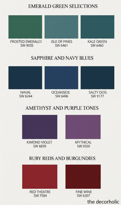
Emerald Green Selections
Sherwin Williams Frosted Emerald Green (SW 9035): The namesake color delivers true jewel-tone intensity with balanced undertones that work in both natural and artificial light. Ideal for accent walls in living rooms and dining spaces.
Sherwin Williams Isle of Pines (SW 6461): A deeper, more mysterious green with blue undertones. Creates a forest-like sanctuary perfect for bedrooms and reading nooks.
Sherwin Williams Kale Green (SW 6460): Slightly softer than pure emerald, this shade offers sophistication without overwhelming smaller rooms.
Sapphire and Navy Blues
Sherwin Williams Naval (SW 6244): This rich navy blue with subtle purple undertones consistently ranks as one of the most popular jewel tones. Creates instant sophistication in any room.
Sherwin Williams Oceanside (SW 6496): A true sapphire blue with slightly teal undertones. Brings coastal luxury without the beachy clichés.
Sherwin Williams Salty Dog (SW 9177): A moody blue-gray that bridges the gap between jewel tone and neutral, perfect for renters seeking bold but versatile color.
Amethyst and Purple Tones
Sherwin Williams Kimono Violet (SW 6839): Rich purple with red undertones creates warmth and luxury. Stunning in powder rooms and bedrooms.
Sherwin Williams Mythical (SW 6550): A lighter amethyst that maintains jewel-tone saturation while feeling less intense. Works beautifully in spaces with abundant natural light.
Ruby Reds and Burgundies
Sherwin Williams Red Theatre (SW 7584): Deep, dramatic red perfect for creating focal points. Use sparingly in dining rooms or as accent features.
Sherwin Williams Fine Wine (SW 6307): Burgundy with brown undertones offers sophistication without the intensity of true red. Excellent for cozy libraries or intimate dining spaces.
Pro Tip: Sherwin Williams offers 8 oz. peel-and-stick samples (Samplize) that apply directly to walls without painting. Test multiple jewel tones in different lighting conditions before committing to a full gallon.
IV. Best Jewel-Tone Paint Colors: Top Picks from Benjamin Moore
Benjamin Moore’s jewel-tone collection emphasizes depth, quality, and historically-inspired richness. Here are their most compelling options:
Emerald and Green Jewel Tones
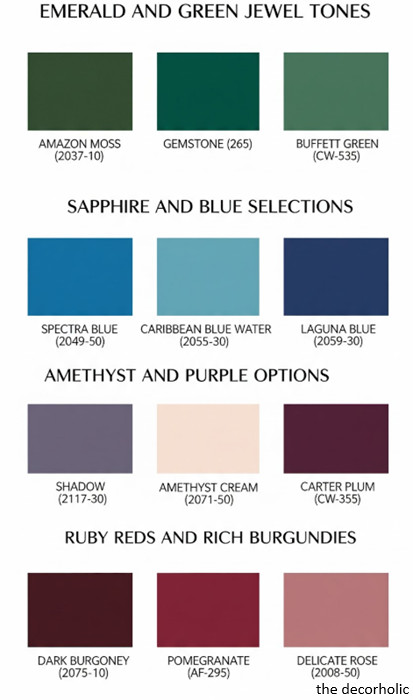
Benjamin Moore Amazon Moss (2037-10): According to Benjamin Moore’s color experts, this deep green creates jungle-inspired sophistication. The company showcases this shade in their marketing materials featuring coordinated trim in an even darker green (Rainforest Foliage 2040-10) for maximum drama.
Benjamin Moore Gemstone (265): A classic emerald with perfect saturation—not too bright, not too dark. Versatile enough for multiple room types.
Benjamin Moore Buffett Green (CW-535): From the Williamsburg Collection, this historical green brings authentic period charm with modern jewel-tone intensity.
Sapphire and Blue Selections
Benjamin Moore Spectra Blue (2049-50): Featured prominently in their jewel-tone marketing, this vibrant blue transforms dining rooms into glamorous jewel boxes, especially when paired with gold accents.
Benjamin Moore Caribbean Blue Water (2055-30): Perfect for kitchen islands or accent furniture. This turquoise-leaning sapphire brings tropical luxury without overwhelming small spaces.
Benjamin Moore Laguna Blue (2059-30): True sapphire intensity ideal for statement walls. Pairs beautifully with Marine Blue (2059-10) for monochromatic sophistication.
Amethyst and Purple Options
Benjamin Moore Shadow (2117-30): Hannah Yeo, color and design expert for Benjamin Moore, highlights this deep purple-gray as perfect for creating moody, dramatic spaces with reflective surfaces and candlelight.
Benjamin Moore Amethyst Cream (2071-50): A softer, more romantic approach to purple jewel tones. Maintains saturation while feeling welcoming and light.
Benjamin Moore Carter Plum (CW-355): From the Williamsburg Collection, this historical plum brings authentic elegance to modern spaces.
Benjamin Moore: Ruby Reds and Rich Burgundies
Dark Burgundy (2075-10): Featured in their jewel-tone bedroom inspiration, this deep red creates luxurious, cocooning spaces perfect for romantic or dramatic styling.
Pomegranate (AF-295): A sophisticated red-purple that works beautifully when used on both walls and trim in different sheens for subtle dimension.
Delicate Rose (2008-50): For those wanting jewel-inspired pink without full red commitment. Creates inviting, lively entryways.
Pro Tip: Benjamin Moore’s Color Preview collection features 1,232 highly saturated hues across the spectrum. This collection specifically targets jewel-tone enthusiasts seeking expressive, vibrant colors with professional-quality formulation.
Don’t Miss: Moody Living Room: The Complete Design Guide for Renters Creating Drama with Dark, Sophisticated Style
V. How to Choose the Right Jewel-Tone Paint Color for Your Space
Selecting the perfect jewel tone requires more than loving a paint chip. Consider these critical factors:
Assess Your Lighting Conditions
Natural light direction matters:
- North-facing rooms receive cool, consistent light: Choose warmer jewel tones like ruby red or topaz gold to add warmth
- South-facing rooms get warm, abundant light: Cooler jewel tones like sapphire blue and emerald green maintain their true color
- East-facing rooms have morning sun: Medium-intensity jewel tones work best, as morning light is cooler
- West-facing rooms get afternoon sun: Any jewel tone works, but test how colors transform from day to night
Artificial lighting considerations:
- LED bulbs (3000K-4000K) show true color accurately
- Warm incandescent bulbs make blues appear muddier; reds appear warmer
- Cool fluorescent lighting enhances blues but can make reds look harsh
Match Jewel Tones to Room Function
Living rooms: Medium-intensity jewel tones like emerald green or navy blue create sophistication without overwhelming. These spaces benefit from colors that encourage conversation and relaxation.
Bedrooms: Deeper, more saturated tones like amethyst purple or forest green create the cocooning effect ideal for rest. According to sleep research, blue tones promote better sleep quality than warmer colors.
Home offices: Emerald green enhances concentration and reduces eye strain—ideal for productivity. Avoid reds, which can increase stress during work hours.
Dining rooms: Ruby reds and deep purples stimulate appetite and conversation. These dramatic colors work perfectly in spaces used primarily during evening hours.
Bathrooms: Sapphire blues and teals create spa-like tranquility. The smaller square footage makes bathrooms perfect jewel-tone testing grounds.
Kitchens: For renters, jewel-tone islands or lower cabinets provide impact without overwhelming. Caribbean blues and forest greens pair beautifully with white or neutral countertops.
Consider Existing Furnishings and Flooring
- Wood tones: Warm woods (oak, pine) pair beautifully with cooler jewel tones (sapphire, emerald). Cool woods (maple, birch) complement warmer jewel tones (ruby, amethyst).
- Neutral furniture: Gray, beige, and white furniture provides the perfect backdrop for any jewel tone—you have complete freedom.
- Existing bold pieces: If you have colorful furniture or art, choose jewel tones from the same color family but deeper in saturation.
- Carpet and flooring: Beige and tan carpets work with any jewel tone. Gray flooring pairs best with cooler jewel tones. Avoid matching flooring and wall colors exactly—aim for contrast.
Pro Tip: Take photos of your space at different times of day. Upload these to your phone along with screenshots of your favorite paint colors. Virtually “place” the colors in your photos to see how they’ll actually look throughout the day.
Trending Post: 9 Scandinavian Style Living Room Essentials
VI. Jewel-Tone Color Combinations and Pairing Strategies
Jewel tones create stunning visual impact when paired thoughtfully. Here’s how to combine these rich hues effectively:
Monochromatic Jewel-Tone Schemes
Using multiple shades of the same jewel tone creates sophisticated depth without visual chaos. This approach works exceptionally well in small apartments where too many colors can feel overwhelming.
How to execute monochromatic jewel palettes:
- Choose one jewel tone as your base (e.g., sapphire blue)
- Select 2-3 variations in different saturations (navy, medium blue, powder blue)
- Use the darkest shade on a single accent wall
- Apply medium shades to larger furniture pieces or additional walls
- Incorporate the lightest version in accessories, artwork, or a ceiling treatment
Benjamin Moore specifically recommends pairing Laguna Blue (2059-30) on walls with Marine Blue (2059-10) on trim for a saturated, dynamic monochromatic look that maintains visual interest.
Jewel Tones with Neutrals

The safest and most versatile approach combines one jewel tone with neutral backgrounds. This strategy gives renters maximum flexibility since neutral walls remain lease-friendly while jewel accents provide personality.
Classic neutral combinations:
- Emerald green + crisp white: Clean, modern, and fresh. The contrast makes the green pop without overwhelming.
- Navy blue + warm beige/white: Sophisticated and timeless. Creates a coastal elegance without beach clichés.
- Amethyst purple + soft gray: Modern and calming. The gray softens purple’s intensity while maintaining its luxury.
- Ruby red + cream: Traditional and warm. Cream prevents red from feeling too aggressive.
Trim and accent strategies:
- Traditional approach: Use bright white (Benjamin Moore’s Simply White OC-117 or Sherwin Williams’ Pure White SW 7005) on all trim, doors, and ceilings
- Modern approach: Paint walls and trim in the same jewel tone using different sheens (matte walls, satin trim) for subtle dimension
- Bold approach: Use a darker jewel tone on trim (Benjamin Moore’s technique with Pomegranate AF-295 matte on walls and satin on trim)
Complementary Jewel-Tone Pairings

For the adventurous, pairing two jewel tones creates dynamic, memorable spaces. Use the color wheel as your guide:
Successful complementary combinations:
- Emerald green + ruby red: Classic holiday pairing that works year-round when using sophisticated shades. Use 70% green, 30% red.
- Sapphire blue + topaz gold: Luxurious and regal. Gold accents against blue walls create instant elegance.
- Amethyst purple + emerald green: Unexpected and artistic. Keep one color on walls and use the other in fabrics and accessories.
Analogous jewel combinations (colors next to each other on the color wheel):
- Sapphire blue + amethyst purple: Creates a cool, calming gradient perfect for bedrooms
- Emerald green + topaz yellow: Energizing yet sophisticated, ideal for creative spaces
- Ruby red + amethyst purple: Rich and dramatic, perfect for dining rooms
Pro Tip: When combining two jewel tones, follow the 60-30-10 rule: 60% dominant jewel tone (walls), 30% secondary jewel tone (furniture or large accent), 10% accent color (accessories). This prevents visual overwhelm while maintaining drama.
Don’t Miss: 15 Expert Painting Tricks That Make Any Room Look More Expensive
VII. Application Techniques: Where and How to Use Jewel-Tone Paint
Strategic application determines whether jewel tones elevate your space or overwhelm it. Here’s where to apply these rich hues for maximum impact:
The Power of the Accent Wall

A single jewel-tone accent wall transforms entire rooms without the commitment or cost of painting all four walls. This approach is particularly valuable for renters who want dramatic change with minimal paint and easy restoration.
Best walls for jewel-tone accents:
- Behind the bed: Creates an instant headboard effect and draws the eye to the room’s focal point
- Fireplace wall: Emphasizes architectural features and creates natural gathering spots
- Longest uninterrupted wall: Maximizes visual impact in living rooms and open concepts
- Behind open shelving: The jewel tone acts as a backdrop, making décor and books pop visually
Application best practices:
- Use painter’s tape designed for delicate surfaces (ScotchBlue for Delicate Surfaces) to protect trim
- Apply two coats minimum—jewel tones require full coverage for proper saturation
- Feather edges slightly where the jewel tone meets neutral walls to avoid hard lines
- Allow 24 hours drying time between coats for optimal color depth
Beyond Walls: Creative Jewel-Tone Applications

Kitchen islands: Transform builder-grade kitchens by painting just the island in Caribbean Blue or Emerald Green. This rental-friendly update requires no landlord permission if the island is movable furniture.
Cabinet interiors: Paint the inside of glass-front cabinets or open shelving backs in jewel tones. This subtle pop of color shows personality without overwhelming the space.
Ceiling statements: The often-overlooked “fifth wall” creates unexpected luxury. Paint a bedroom or bathroom ceiling in a lighter jewel tone (Amethyst Cream or Sonoma Skies) for an elevated twist.
Door drama: Transform hollow-core rental doors by painting them in high-gloss jewel tones. A sapphire blue or emerald green door against neutral walls creates instant architectural interest.
Furniture transformation: Apply jewel tones to dated furniture pieces. A tired dresser becomes a statement piece when painted in Benjamin Moore’s Shadow or Sherwin Williams’ Fine Wine.
Sheen Selection for Jewel Tones
The finish you choose dramatically affects how jewel tones appear and feel in your space. Hannah Yeo, Benjamin Moore’s color and design expert, explains that “when it comes to jewel tones, an eggshell or matte offers understated elegance, while a higher gloss ramps up the drama.”
Matte/Flat (no shine):
- Best for: Bedrooms, ceilings, walls with imperfections
- Effect: Sophisticated, velvety depth that absorbs light
- Consideration: Harder to clean; avoid in high-traffic areas
Eggshell (slight sheen):
- Best for: Living rooms, dining rooms, bedrooms
- Effect: Subtle sophistication with easier cleaning than matte
- Consideration: The most versatile option for jewel-tone walls
Satin (soft glow):
- Best for: Bathrooms, kitchens, trim, doors
- Effect: Reflects light gently, adding dimension to colors
- Consideration: Shows application imperfections more than matte
Semi-gloss (noticeable shine):
- Best for: Trim, doors, cabinets, furniture
- Effect: Dramatic, jewelry-like finish that amplifies color intensity
- Consideration: Requires excellent wall preparation; shows every flaw
High-gloss (mirror-like):
- Best for: Furniture, accent pieces, doors, creative ceiling applications
- Effect: Maximum drama and light reflection—true jewel effect
- Consideration: Professional application recommended for walls
Pro Tip: Create dimension by using the same jewel tone in multiple sheens. Benjamin Moore demonstrates this with Amazon Moss in matte on walls and high-gloss Advance paint on trim—the same color family with dramatically different finishes creates sophisticated depth.
Don’t Miss: How to Create a Conversation Area in Your Living Room (Even in Small Spaces)
VIII. Jewel-Tone Decorating: Styling Your Painted Spaces

Once you’ve applied your jewel tones, thoughtful styling amplifies their impact. Here’s how to decorate around these rich hues:
Selecting Complementary Textiles and Fabrics
Velvet and jewel tones: The natural match. Velvet’s light-reflective properties mirror the way gemstones catch light. Use velvet pillows, curtains, or upholstery in either the same jewel tone (for monochromatic richness) or complementary shades.
Metallic accents: Different metals pair better with specific jewel tones:
- Gold/brass: Pairs beautifully with emerald green, sapphire blue, and ruby red—creates classic luxury
- Silver/chrome: Complements amethyst purple, teal, and lighter jewel tones—modern and cool
- Copper/rose gold: Works with deep greens and burgundies—adds warmth and contemporary edge
- Black metal: Universal pairing that adds modern sophistication to any jewel tone
Textile patterns:
- Geometric patterns in neutral colors prevent visual overwhelm against jewel-tone walls
- Floral patterns incorporating your wall color plus neutrals create cohesive flow
- Solid textiles in lighter versions of your jewel tone (emerald walls + sage pillows) create depth
Artwork and Wall Décor Strategies
Frame colors matter:
- Black frames: Create gallery-style sophistication against any jewel tone
- Gold frames: Add traditional elegance, particularly with blues and greens
- White frames: Provide breathing room and contrast, preventing visual heaviness
- Natural wood frames: Warm up cool jewel tones and add organic texture
Art selection guidelines:
- Abstract art with neutral backgrounds and small pops of your wall color creates unity
- Black and white photography provides striking contrast without competing for attention
- Mirrors amplify light and make jewel-tone rooms feel larger—crucial for small apartments
- Oversized single pieces work better than gallery walls against saturated colors
Furniture Selection for Jewel-Tone Rooms
Neutral furniture as foundation:
- Light gray sofas allow jewel-tone walls to star without competing
- Natural wood tones (walnut, oak, teak) add warmth and prevent coldness in blue or green rooms
- White or cream upholstery creates classic elegance and makes spaces feel larger
- Black furniture adds drama and works particularly well with lighter jewel tones
When to use jewel-tone furniture:
- In neutral-walled rooms: A sapphire blue sofa against white walls becomes the room’s focal point
- As accent pieces: One emerald green chair in a neutral room adds personality without commitment
- In monochromatic schemes: Different jewel-tone shades in furniture create sophisticated layering
Lighting Design for Jewel-Tone Spaces
Proper lighting prevents jewel-tone rooms from feeling cave-like. Layer your lighting for optimal ambiance:
Ambient lighting (overall room illumination):
- Install dimmer switches to adjust intensity based on time of day
- Use warm LED bulbs (2700K-3000K) to add warmth to cool jewel tones
- Consider ceiling fixtures with multiple bulbs to eliminate dark corners
Task lighting (functional lighting):
- Table and floor lamps with white or cream shades diffuse light without color distortion
- Adjustable arm lamps for reading nooks in jewel-tone rooms prevent eye strain
- Under-cabinet lighting in kitchens with jewel-tone cabinets ensures workspace visibility
Accent lighting (decorative lighting):
- Picture lights highlight artwork against jewel-tone walls
- LED strip lighting behind mirrors or under furniture creates depth
- Candles and candlelight amplify the luxurious mood jewel tones naturally create
Pro Tip: Install smart bulbs that allow you to adjust both brightness and color temperature via smartphone. This lets you warm up cool jewel tones in winter and cool them down in summer without changing paint colors.
Also: No-Fail Formula to Create a Gallery Wall
IX. Common Mistakes to Avoid When Using Jewel-Tone Paint Colors

Even beautiful jewel tones can miss the mark without proper planning. Avoid these frequent missteps:
Mistake #1: Skipping the Sample Stage
The problem: Paint chips and digital screens never accurately represent how colors appear on your actual walls under your specific lighting conditions.
The solution: Purchase 8 oz. sample sizes and paint 2×2 foot sections on multiple walls. Observe these samples for at least 48 hours during different times of day and various lighting conditions. Colors that look perfect at noon might feel oppressive at night.
Mistake #2: Painting All Four Walls Immediately
The problem: Jewel tones in small spaces can overwhelm when applied to every surface, making rooms feel smaller and cave-like rather than cozy.
The solution: Start with one accent wall. Live with it for a week. If you love it and want more saturation, proceed to additional walls. Most find that 1-2 jewel-tone walls provide sufficient drama without overwhelming compact apartments.
Mistake #3: Ignoring Undertones
The problem: Not all “sapphire blues” are created equal. Some lean purple, others lean teal. Mismatched undertones create discord rather than harmony.
The solution: Identify your paint’s undertones by comparing it to true primary colors. Place your sample next to pure red, blue, and yellow swatches. Which does it lean toward? Ensure all colors in your space share compatible undertones (all warm or all cool).
Mistake #4: Insufficient Prep Work
The problem: Jewel tones’ rich saturation makes every wall imperfection, brush stroke, and uneven patch glaringly obvious.
The solution: Properly prepare surfaces by:
- Filling all holes and cracks with spackle
- Sanding rough patches smooth
- Applying primer (gray-tinted primer works best under darker jewel tones)
- Using high-quality brushes and rollers designed for the sheen you’ve selected
Mistake #5: Matching Everything
The problem: Buying matching jewel-tone curtains, pillows, rugs, and accessories creates a one-note, theme-park effect rather than sophisticated design.
The solution: Follow the 60-30-10 rule. If your walls are emerald green (60%), use neutrals for 30% of the room (furniture, larger pieces), and introduce complementary jewel accents in just 10% of décor (pillows, artwork, vases).
Mistake #6: Forgetting About Resale and Restoration
The problem: Renters paint entire apartments in dark jewel tones without considering move-out costs and security deposit deductions.
The solution: Document everything. Take dated photos of original wall colors, save paint codes, and set aside restoration funds. Better yet, limit jewel tones to easily restored accent walls or furniture pieces. Most landlords won’t require repainting a single well-executed accent wall.
Pro Tip: Create a “paint journal” documenting every color you use, including brand, name, code, finish, and which walls received it. This eliminates guesswork during restoration and helps if you want to replicate colors in your next home.
Also: 7 Mistakes To Avoid For A Clutter-Free Living Room

X. Jewel-Tone Paint Colors for Small Spaces and Rentals
Small apartments and rental restrictions require special considerations when using bold colors. Here’s how to maximize jewel-tone impact in compact spaces:
The “Jewel Box” Effect in Compact Rooms
Traditional design wisdom suggests light colors make small rooms feel larger. However, design experts increasingly embrace the opposite approach: rich, saturated jewel tones create intentional “jewel box” spaces that feel deliberately cozy rather than accidentally cramped.
How the jewel box effect works:
- Dark, saturated colors recede visually, making walls feel farther away
- Rich colors envelope the space, creating an intimate, curated atmosphere
- The eye focuses on the color’s beauty rather than the room’s dimensions
- Jewel tones add perceived value, making small spaces feel luxurious rather than inadequate
Best jewel tones for small spaces:
- Powder rooms: Perfect jewel-tone testing grounds. Try Benjamin Moore’s Shadow or Sherwin Williams’ Fine Wine for dramatic half-baths.
- Walk-in closets: Transform utilitarian spaces into luxurious dressing rooms with emerald or sapphire walls.
- Reading nooks: Define small corner spaces with jewel-tone accent walls that signal “this is a special zone.”
Rental-Friendly Jewel-Tone Applications
Removable wallpaper: Temporary wallpaper in jewel-tone patterns provides color without paint commitment. Brands like Spoonflower and Tempaper offer renter-friendly options in rich emerald, sapphire, and amethyst patterns.
Peel-and-stick tiles: Transform rental bathrooms and kitchens with jewel-tone tile alternatives that remove without damage.
Strategic furniture painting: Paint only furniture items you own—dressers, nightstands, bookshelves. When you move, your jewel-tone pieces move with you.
Large-scale art: Commission or purchase oversized artwork incorporating your desired jewel tones. This provides color impact without wall alteration.
Area rugs in jewel tones: Ground your space with richly colored rugs that define zones and introduce color without landlord concerns.
Light Amplification Techniques for Dark Jewel Tones
When using deep jewel tones in small or naturally dark spaces, strategic light placement prevents cave-like effects:
Mirror placement:
- Position large mirrors opposite windows to bounce natural light throughout the room
- Lean oversized floor mirrors against jewel-tone walls to amplify both light and visual space
- Use mirrored furniture (coffee tables, side tables) to multiply light sources
Strategic white or light neutrals:
- Keep ceilings bright white to reflect light downward
- Use white or cream bedding, curtains, and upholstery to balance dark walls
- Paint trim, doors, and moldings in contrasting white to create visual breaks
Glossy finishes:
- Choose satin or semi-gloss sheens for jewel-tone walls in small spaces—they reflect light better than matte
- Use high-gloss jewel tones on accent furniture to create jewelry-like focal points
- Apply metallic glazes over jewel-tone base coats for subtle shimmer
Pro Tip: In studio apartments, use jewel tones to define zones. Paint the sleeping area wall in deep amethyst while keeping living/dining areas neutral. This creates visual separation in open-concept layouts without building walls.
Trending Post: The 3-5-7 Decorating Rule: Transform Any Space with This Designer Secret (That Actually Works)
XI. Seasonal Styling: Adapting Jewel-Tone Spaces Throughout the Year
One advantage of jewel-tone walls is their versatility across seasons. Unlike trendy colors that feel appropriate only at specific times, jewel tones adapt beautifully with simple accessory changes:
Spring and Summer Jewel-Tone Styling
Even rich, dramatic jewel tones can feel fresh and light during warmer months:
Textile swaps:
- Replace heavy velvet pillows with linen or cotton versions in white, cream, or soft pastels
- Swap dark curtains for sheer white panels that allow maximum natural light
- Introduce lightweight throws in neutral tones rather than heavy wool blankets
Accessory additions:
- Fresh flowers in white or complementary colors brighten jewel-tone spaces
- Add metallic accents in silver, chrome, or white gold for cooler aesthetics
- Display summer collections: seashells against sapphire walls, botanical prints against emerald
Color temperature adjustments:
- Switch to cooler-temperature LED bulbs (3500K-4000K) to counteract summer heat
- Introduce white or light gray area rugs over darker winter versions
- Display artwork with lighter, airier subjects
Fall and Winter Jewel-Tone Styling
Jewel tones naturally excel during cooler months, creating cozy, enveloping spaces perfect for hibernation:
Layering textures:
- Reintroduce velvet, chenille, and faux fur textiles
- Layer multiple throws and pillows in varying jewel-tone shades
- Add thick, plush area rugs in complementary jewel tones or warm neutrals
Metallic warmth:
- Swap to gold, brass, or copper metallic accents for warmth
- Introduce candleholders and lanterns for ambient flickering light
- Display warm-toned artwork and photography
Lighting adjustments:
- Return to warm LED bulbs (2700K-3000K) for cozy ambiance
- Add string lights or fairy lights for gentle, layered illumination
- Use candles extensively—their warm glow amplifies jewel tones’ luxurious quality
Pro Tip: Create two accessory collections stored in labeled bins: “Jewel Tone Summer” and “Jewel Tone Winter.” This makes seasonal refreshes quick and maintains a cohesive design approach year-round.
Most Popular Post:
Interior Design Style Quiz
Timeless Paint Colors That Never Go Out of Style
Create Your Perfect Ergonomic Home Office: A Complete Guide
Must-Have Accessories for Guys: The Secret to a Stylish Space
Modular Sofas for Small Spaces: Brilliant Solutions for Compact Living
Conclusion: Your Jewel-Tone Transformation Starts Now
Jewel-tone paint colors offer renters, apartment dwellers, and homeowners an unparalleled opportunity to create sophisticated, personality-filled spaces without massive budgets or permanent commitments. Whether you choose the calming depth of sapphire blue, the revitalizing energy of emerald green, or the regal elegance of amethyst purple, these rich, saturated hues transform ordinary rooms into curated sanctuaries that reflect your unique style.
The key takeaways for jewel-tone success:
- Start with comprehensive testing using actual paint samples on your walls in your lighting
- Choose colors that align with room function and natural light direction
- Begin with single accent walls before committing to full-room applications
- Pair jewel tones with neutrals for versatility or complementary jewel shades for drama
- Select appropriate sheens based on desired effect and room function
- Style thoughtfully with metallics, varied textures, and strategic lighting
- Maintain your investment through proper cleaning and touch-up practices
Remember that bold color choices require confidence. Trust your instincts, embrace the drama, and create spaces that make you excited to come home. Your jewel-tone transformation isn’t just about paint—it’s about claiming your space and expressing your design personality in the most impactful, affordable way possible.
Ready to begin? Visit your local Benjamin Moore or Sherwin Williams retailer this week. Request samples of three jewel tones that resonate with you. Apply them to your walls, observe them for 48 hours, and take the leap. Your elevated, luxurious space awaits.
Jewel Tone Paint Colors: Frequently Asked Questions (FAQ)
Q: Are jewel-tone paint colors still in style in 2025?
A: Yes, jewel tones continue trending strongly in 2025 and show staying power beyond typical color trends. Unlike trendy shades that quickly feel dated, jewel tones offer timeless sophistication that design professionals and homeowners consistently embrace. Their rich saturation and luxurious associations keep them perpetually relevant.
Q: Do dark jewel-tone colors make small rooms look smaller?
A: Not necessarily. While traditional design advice suggests light colors for small spaces, dark jewel tones create a “jewel box effect” that makes small rooms feel intentionally cozy and luxurious rather than accidentally cramped. The key is using jewel tones strategically on one or two walls, maintaining white or light ceilings, and incorporating ample lighting and mirrors.
Q: What’s the best jewel-tone paint color for beginners?
A: Navy blue (like Sherwin Williams Naval SW 6244 or Benjamin Moore Hale Navy) serves as the ideal starter jewel tone. It’s bold enough to create impact but versatile enough to work with multiple décor styles. Navy pairs easily with neutrals, metallics, and other colors, making it forgiving for design newcomers.
Q: Can I paint jewel tones in a rental apartment?
A: Most rental agreements allow interior painting with landlord permission. Request approval in writing before beginning. Stick to accent walls for easier restoration, document original wall colors with photos, and save restoration paint for move-out. Many landlords appreciate well-executed accent walls as property improvements.
Q: How many coats of jewel-tone paint do I need?
A: Plan for two coats minimum for proper jewel-tone saturation. Darker, more saturated jewel tones may require three coats for consistent coverage, especially over lighter existing colors. Always apply gray-tinted primer under dark jewel tones to improve coverage and color accuracy.
Q: What’s the difference between jewel tones and moody colors?
A: Jewel tones are a subset of moody colors. All jewel tones are moody (dark, saturated, dramatic), but not all moody colors are jewel tones. Jewel tones specifically reference gemstone-inspired colors (emerald, sapphire, ruby, amethyst) with rich saturation and slight black undertones. Moody colors include these plus charcoals, deep browns, and other dark, atmospheric hues.
Q: Which paint finish is best for jewel-tone walls?
A: Eggshell offers the best balance for most jewel-tone walls—sophisticated appearance with easier maintenance than matte and more subtlety than satin. For maximum drama, use satin or semi-gloss. For bedroom coziness, choose matte. The finish significantly impacts how jewel tones appear, so test samples in your desired sheen before committing.
Q: How do I choose between Sherwin Williams and Benjamin Moore jewel tones?
A: Both brands offer excellent jewel-tone options with minor differences. Benjamin Moore provides slightly richer pigmentation with better one-coat coverage. Sherwin Williams offers broader retail availability and typically costs $5-15 less per gallon. Test samples from both brands in your space and choose based on the specific color that resonates, not the brand name.
Q: Can jewel-tone paint colors work in modern or minimalist spaces?
A: Absolutely. Jewel tones work beautifully in minimalist design when used strategically. A single jewel-tone accent wall against white walls and minimal furniture creates striking, intentional focal points. The key is restraint—let the jewel tone be your statement piece while keeping everything else pared down and neutral.
Q: How long do jewel-tone painted walls last before needing repainting?
A: With proper care, jewel-tone walls maintain their appearance for 5-7 years. Factors affecting longevity include direct sunlight exposure (UV causes fading), wall traffic, cleaning frequency, and paint quality. Premium paints from Benjamin Moore and Sherwin Williams typically outlast budget alternatives by 2-3 years.
Subscribe To the Newsletter!
Subscribe now for an endless feed of inspirational women’s cave decor ideas, pampering rituals, and more tips for curating your ultimate escape. Let’s start making your cozy refuge a reality – you so deserve this!
CATCH THE LATEST IN HOME DECOR TRENDS:

Steal These 16 Expert-Approved Decorating Secrets

How To Accessorize Your Living Room

Small Space? 10 Ways To Make A Room Appear Bigger

Make Your space Look Expensive
GET CAUGHT UP ON ALL THE INSPIRING DECOR TIPS:

18 Fresh Decorating Ideas To Update Your Fireplace

How to Make a Gallery Wall: The Complete Step-by-Step Guide (Even If You’ve Never Hung a Picture)
