Welcome to my blog post, where I unveil the secrets to transforming your living space in 2024 with the best wall colors for this new year. Your home isn’t just a place; it’s an extension of your personality, your sanctuary, and a canvas waiting to be painted with the hues that resonate with your soul. The colors you choose for your walls can set the tone for every moment spent indoors, from cozy nights to lively gatherings with friends.T
This new year has brought forth a delightful array of wall colors that are not just visually stunning but also deeply in tune with the ever-evolving world of interior design. In this blog post, I’ll guide you through the best wall colors that are set to make waves in 2024.

So, let’s explore the hues that will shape your surroundings and create the backdrop for your life’s most cherished moments. Without further ado, let’s unveil the best wall colors for 2024 and transform your home into a masterpiece of style and comfort.
Behr: Cracked Pepper

Now that we’ve set the stage for your colorful transformation in this new year, it’s time to introduce you to our first contender on the list of the best wall colors for 2024 – Behr’s enchanting Cracked Pepper.
A Chic, Sophisticated Color
Imagine walking into a room painted in Cracked Pepper. It’s like stepping into a chic, sophisticated world where every corner exudes elegance. This deep, charcoal gray carries an air of mystery and intrigue, making it a perfect choice for those who appreciate the finer things in life.
“Don’t let the darkness of charcoal gray deter you! The right shade can actually enhance natural light, adding depth and dimension to a room. Its versatility extends beyond aesthetics. Studies show that certain shades of charcoal gray can promote feelings of focus and concentration, making them ideal for home offices or libraries. The key is to find the perfect balance with warmer accents and textures to avoid a cold feel.”
– Maria Killam, Color Expert and Founder of Maria Killam Interiors.
Add a Touch of Luxury
Cracked Pepper doesn’t just paint your walls; it adorns them with a touch of luxury that’s hard to resist. The color exudes confidence, making it ideal for spaces where you want to create a bold statement. Its timeless appeal ensures it won’t go out of style any time soon, making it a fantastic investment for your home.
Great For All Design Styles
What’s truly fascinating about Cracked Pepper is its versatility. It plays well with various design themes, whether you lean towards modern, industrial, or even classic styles. It’s a chameleon of the color world, adapting effortlessly to the ambiance you desire.
Provides a Stunning Contrast
Whether you’re aiming for a sleek and contemporary look or a warm and inviting atmosphere, Cracked Pepper has you covered. Its richness and depth make it a great companion for light and dark furnishings alike, providing a stunning contrast that draws the eye.
“If you are looking for a way to style your space with wall art without breaking your piggy bank, then I recommend reading “10 Surprising Benefits of Printable Wall Art”
Related Post: How to Choose the Perfect Fabrics to Decorate Your Home
Graham & Brown: Viridis

Viridis is one of the best wall colors for 2024 that you need to learn about. If you’re a nature enthusiast, or simply someone who craves tranquility and balance, this shade is about to capture your heart.
A Soothing Color
Viridis is a lush, verdant green that evokes the calm of a secluded forest. In the chaos of the modern world, it’s a soothing balm, an oasis of serenity. Just one glance at this color, and you’ll feel a connection to the great outdoors. The psychology of green in interior design is fascinating; it’s associated with growth, renewal, and peace, making Viridis the ideal choice for those who wish to infuse their spaces with these qualities.
“Verdant greens, reminiscent of lush foliage and vibrant meadows, bring the vitality of nature indoors. They create a sense of sanctuary and rejuvenation, making any space feel fresh and alive. These bold hues evoke growth and new beginnings, ideal for inspiring creativity and a positive outlook.”
Kelly Wearstler, renowned interior designer and author.
It Offers a Tranquil Retreat
This color isn’t just about paint; it’s about creating an atmosphere. Viridis has the power to transform your living space into a tranquil retreat, a place where you can escape the daily hustle and bustle. Whether it’s your bedroom, living room, or even your home office, Viridis is a versatile shade that thrives in various settings.
Bring Outdoors Inside
Pair it with wooden furniture and earthy decor elements to bring the essence of the outdoors inside. Imagine the sound of rustling leaves and the gentle caress of a cool breeze, all while you’re comfortably nestled within your “Viridis”-painted haven.
So, if you’re ready to invite the calming energy of nature into your home and discover why Viridis is one of the best wall colors for 2024, continue this journey with us. We’re about to unveil more colors that will breathe life and personality into your living spaces, one wall at a time.
Related Post: 7 Ways to Create a Beautiful Color Palette For Your Home
Sherwin-Williams: Upward

As we continue learning about the best wall colors for 2024, we find ourselves ascending to new heights with Sherwin-Williams’ Upward. This color isn’t just a hue; it’s an elevator to serenity and positivity.
A Fresh Color
Upward is a pale, almost ethereal shade of blue that immediately brings to mind open skies and tranquil seas. It’s like a breath of fresh air, a visual reminder of optimism and infinite possibilities. This color has the remarkable ability to make a room feel light, airy, and, well, upward.
“Don’t underestimate the power of light and shadow with pale walls. Their subtle variations throughout the day add depth and visual interest to a space. They also reflect natural light beautifully, creating a warm and inviting atmosphere. Pair them with natural materials like wood and linen for a cozy feel, or go sleek and modern with metallic accents and clean lines. The options are endless!”
Suzanne Hawkins, Color Expert and Founder of Studio*SH.
Create a Calm Space
When you choose Upward for your walls, you’re setting the stage for a space that exudes calm and tranquility. It’s the perfect backdrop for quiet contemplation, unwinding with a good book, or even nurturing creativity in your home office. This color has a way of making you feel weightless as if you’re floating on a cloud.
Upward isn’t just a color; it’s an invitation to escape the daily grind and embrace the serene moments in life. Imagine yourself surrounded by this soothing shade, sipping your morning coffee and feeling inspired to take on the day. It’s an everyday retreat, and it’s right there in your home.
Related Post: How to Decorate with Earthy Colors
alspar: Renew Blue

Let’s dive into the serene depths of Valspar’s Renew Blue. If you’re seeking a color that embodies relaxation, renewal, and the endless expanse of the sky, you’re in for a treat.
Perfect for a Calm Space
Renew Blue is a tranquil, soft blue that invokes a sense of calm and rejuvenation. It’s like a deep breath of fresh air on a clear, sunny day. This color has a magical ability to whisk you away to a place of peace, making it an ideal choice for bedrooms, bathrooms, and spaces where serenity is a priority.
“Soft blue walls are like a summer breeze, whispering calmness and serenity into your space. They evoke the tranquility of a clear sky or the gentle lull of ocean waves, making any room feel like a restful haven. These airy hues have a magical ability to expand the perceived size of a room, adding a touch of lightness and openness that instantly invites relaxation.”
Joanna Gaines, co-founder of Magnolia Market and TV host.
Create a Spa Day
Imagine stepping into a bathroom painted in Renew Blue. The color itself feels like a spa day, setting the stage for relaxation and self-care. It’s a hue that encourages you to unwind, let go of the day’s stress, and simply be in the moment.
Goes Well With Various Styles
Renew Blue is a versatile color that can blend seamlessly with various design styles. Whether you’re aiming for a coastal-inspired space or a more contemporary feel, this shade provides a canvas for your creativity. Its gentle and welcoming nature makes it an excellent choice for creating a sense of tranquility in any room.
Related Post: How to Choose Paint Colors for Your Entire House
Benjamin Moore: Blue Nova 825

Let’s continue to uncover the best wall colors for 2024 with Benjamin Moore’s Blue Nova 825. If you’re yearning for a color that captures the essence of the cosmos, this shade will transport you to a starry night’s dreamscape.
Evoke a Sense of Wonder
Blue Nova is a deep and mysterious blue that embodies the enigmatic beauty of the night sky. It’s like having a piece of the galaxy right on your walls. This color evokes a sense of wonder, making it perfect for spaces where you want to foster creativity and introspection.
“Blue walls have a magical ability to transport you to another world. Whether it’s the calming serenity of a tranquil ocean or the energizing spark of a clear sky, the right shade of blue can set the mood for your entire space. They’re also incredibly versatile, working beautifully with both warm and cool color palettes and offering a timeless elegance that never goes out of style.”
Nate Berkus, award-winning decorator and TV personality.
Stimulate Artistic Expression
Picture yourself in a room adorned with Blue Nova. It’s like stargazing from the comfort of your own home, with each wall a canvas for your imagination. This color has the ability to stimulate artistic expression and contemplation, making it an excellent choice for studios, libraries, or spaces where inspiration flows freely.
Blue Nova doesn’t just paint your walls; it paints a story. It’s a shade that speaks to those who are not afraid to embrace the unknown and seek inspiration from the depths of the universe. Pair it with metallic accents and celestial-themed decor to complete the cosmic ambiance.
Related Post: Designers Reveal How Many Colors You Should Have In Your Home
Dunn-Edwards: Skipping Stones

Let’s talk about the serene shores of Dunn-Edwards’ Skipping Stones. If you’ve ever longed for the tranquility of a lakeside retreat or the gentle rhythm of ripples on the water, this shade will whisk you away to that idyllic setting.
Create a Serene Space
Skipping Stones is an earthy, muted gray-green that captures the essence of a serene pond’s surface. It’s a color that invites you to slow down and savor the simple moments in life. With its natural, calming appeal, it’s an ideal choice for creating a peaceful oasis within your home.
“Dark green walls offer a touch of nature’s calming power, creating a sanctuary-like haven for relaxation and focus. Think of them as a refreshing escape from the digital world, providing a grounding and serene atmosphere. They also create a stunning backdrop for natural materials like wood and woven textures, bringing a touch of organic beauty to the space.”
Joanna Gaines, co-founder of Magnolia Market and TV host.
A Tranquil Color
Imagine stepping into a room adorned with Skipping Stones. It’s like entering a world of rustic charm, where the boundaries between indoors and outdoors blur. This color has the power to infuse your space with the tranquility of nature, making it perfect for bedrooms, dining areas, or any place where you seek to unwind.
Skipping Stones harmonizes effortlessly with organic textures and natural materials, bringing a sense of the outdoors inside. It’s a versatile color that works well with a wide range of design themes, from farmhouse chic to minimalist contemporary.
Related Post: Best Paint Wall Colors That Increases Your Listing’s Value
Dutch Boy: Ironside

Another best wall color for 2024 is Dutch Boy Paint’ Ironside. If you’re seeking a color that exudes strength, character, and a hint of industrial charm, you’re about to discover a shade that’s both bold and enduring.
A Strong Color
Ironside is a deep, dark gray with a rugged undertone that makes it ideal for those who appreciate the enduring qualities of solid construction. It’s a color that carries a sense of permanence and reliability, making it a fantastic choice for spaces where you want to project a strong and grounded presence.
“Darker grays can create a cozy and intimate atmosphere, making a large space feel more inviting and comfortable. They also provide a dramatic backdrop for artwork, furniture, and decorative accents, allowing them to truly pop.”
Suzanne Hawkins, Color Expert and Founder of Studio*SH.
Great For a Industrial Space
Imagine entering a room adorned with Ironside. It’s like stepping into an industrial loft or a historic building with a rich story to tell. This color provides a sense of stability, creating a warm and inviting atmosphere while maintaining a modern, urban edge.
Ironside pairs beautifully with both contemporary and vintage decor elements. Its versatility allows it to be incorporated into a variety of design themes, from minimalist spaces to industrial-chic interiors. The depth of this color adds a touch of elegance to any room, making it a unique and striking choice for your walls.
Related Post: How to Choose the Perfect Interior Color Scheme for Your Home
Krylon: Bluebird

Now let’s learn about the vibrant and playful realm of Krylon’s Bluebird. If you’re someone who craves a pop of color, a touch of cheerfulness, and a sense of creativity, you’re about to be enchanted by this vivid shade.
Bold and Bright Color
Bluebird is a bold, bright blue that radiates energy and optimism. It’s like a burst of sunshine on a clear day, a color that immediately lifts your spirits. This shade has a magical ability to infuse your space with a sense of playfulness and adventure, making it perfect for rooms where you want to encourage creativity and fun.
“Don’t shy away from the drama of bright blue! They offer surprising versatility beyond just energizing a space. Cooler shades can evoke the calming serenity of a clear ocean, while warmer blues add a touch of tropical vibrancy. Pair them with natural textures like rattan and woven grass for a coastal feel, or go modern with white accents and pops of contrasting colors. The key is to balance the boldness with lighter elements to create a space that’s both stimulating and inviting.” –
Suzanne Hawkins, Color Expert and founder of Studio*SH.
Create a Joyful Space
Picture yourself in a room painted with Bluebird. It’s like walking into a world of boundless possibilities, where each wall is a canvas for your imagination. This color is a statement, a declaration that your living space is a place of joy and inspiration.
A Vibrant Color
Bluebird pairs wonderfully with white or neutral furnishings, allowing it to take center stage and create a sense of vibrancy in your home. Whether it’s a children’s playroom, a home office, or even your kitchen, Bluebird has the power to make your space come alive.
So, if you’re ready to embrace the vibrancy and creativity of Bluebird and discover why it’s among the best wall colors, keep reading. I have more captivating colors to explore, each with its unique charm and potential to breathe life and personality into your living spaces.
Related Post: How To Choose The Right Color For Your Room
C2: Thermal

Forget gloomy greys and boring beiges! This new year, is all about embracing the beauty of the boundless blue sky with C2’s color of the year: Thermal. Think crisp autumn days and cozy winter nights, bottled up in a paint can. This mid-tone blue isn’t just pretty, it’s mood-altering magic.
A Calming Color
Philippa Radon, C2’s resident color guru, describes Thermal as “a reminder of the calming power of nature and the endless ways blue can shift our emotions.” It’s bright enough to energize a large kitchen gathering, yet soothing enough to transform your bedroom into a tranquil haven.
It Whispers Loyalty
But don’t let its serenity fool you. Thermal packs a punch too. Radon calls it “bespoke pale, yet punchy blue” – perfect for those seeking adventure and a touch of hope. It whispers loyalty, trust, and confidence, a color that lifts your spirits while keeping you grounded.
Create a Harmonious Palette
Ready to paint your own story with Thermal? C2’s 2024 color capsule has you covered. They’ve paired Thermal with two trusty companions: Brulee, a soft, warm neutral, and Marshland, a moody deep green. Think of them as Thermal’s supporting cast, creating a harmonious palette inspired by nature’s own color schemes. Remember, color never exists alone, and this capsule tells a story where each hue plays a vital role.
So, ditch the bland and embrace the boundless. Welcome Thermal, the color of endless skies and endless possibilities, into your home and let it redefine your mood and your space.
Related Post: How To Find Your Interior Design Style: A Step By Step Guide
Glidden: Limitless

In 2024, there are endless possibilities offered by Glidden’s Limitless. If you’re a fan of versatility, simplicity, and the potential for boundless creativity, this shade is about to captivate your imagination.
Great For Any Space
Limitless is a soft and soothing nearly-yellow neutral that sets the stage for a world of design possibilities. It’s like a blank canvas awaiting your artistic expression, a color that adapts to your vision. This shade has the remarkable ability to act as the perfect backdrop for your unique style, making it an ideal choice for nearly any space.
“Soft yellow walls are like sunshine bottled up, radiating warmth and optimism like a summer day. They bring a gentle cheerfulness to any space, promoting feelings of happiness and connection. These inviting hues act as a blank canvas for your creativity, blending seamlessly with a variety of styles and décor. Think of them as a welcoming hug for your eyes, instantly brightening any room.” –
Emily Henderson, founder of Emily Henderson Design.
A Limitless Color
Picture yourself in a room adorned with Limitless. It’s like stepping into a world of endless potential, where your decor choices take center stage. This color allows you to experiment with various design themes, from bold and eclectic to minimalist and sophisticated.
Limitless pairs beautifully with a wide range of furnishings and decor elements, making it a versatile choice for homeowners who appreciate flexibility. It’s the perfect color for those who wish to showcase their personal style and design preferences without the limitations of a dominant wall color.
Related Post: How To Choose the Right Coffee Table: A Comprehensive Guide
Minwax: Bay Blue

The best wall colors for 2024, bring us to the captivating depths of Minwax’s Bay Blue. If you’re yearning for a color that marries the richness of wood stains with the serenity of blue, you’re in for a delightful revelation.
Create a Seaside Retreat
Bay Blue is a beautiful blend of coastal blue and the warmth of wood tones, capturing the essence of a serene seaside retreat. It’s like gazing at the tranquil expanse of the ocean, a color that invokes a sense of peace and relaxation. This shade is perfect for creating spaces where you want to combine coastal charm with a touch of rustic elegance.
“Coastal blue walls are an invitation to breathe deeply and escape to a seaside sanctuary. They evoke the calming rhythm of the ocean waves, washing away stress and inviting serenity into any space. These airy hues instantly expand the perceived size of a room, bringing a touch of light and openness that whispers freedom and relaxation.”
Joanna Gaines, co-founder of Magnolia Market and TV host.
Great For a Beachy Chic Space
Imagine walking into a room adorned with Bay Blue. It’s like stepping into a beachside cottage, where every wall exudes the calming presence of the sea. This color has the power to transform your living space into a haven of relaxation and a reminder of sunny days by the shore.
Bay Blue pairs wonderfully with wooden furniture and coastal decor elements, creating an atmosphere that’s both inviting and stylish. It’s a versatile color that can complement various design themes, from beachy chic to traditional interiors. With Bay Blue, you’re not just painting your walls; you’re embracing the soothing vibes of coastal living.
Related Post: Best Living Room Layout for Small Spaces
Most Popular Post:
10 Surprising Benefits of Printable Wall Art
15 Must-Have Accessories For Styling A Coffee Table
How to Choose the Perfect Interior Color Scheme for Your Home
Expert Guide On How To Buy A Rug For Each Room
Conclusion
We just explored an array of captivating hues that can redefine your living spaces and create the backdrop for your life’s most cherished moments for this new year 2024.
From the bold and sophisticated Cracked Pepper by Behr to the tranquil and earthy Skipping Stones by Dunn-Edwards, and from the warm and cozy Thermal by C2 to the versatile Limitless by Glidden, each of these colors is a story waiting to be told, emotions waiting to be expressed, and atmospheres waiting to be crafted.
As you contemplate the best wall colors for 2024 and consider your next design adventure, remember that the ultimate decision should be a reflection of your personal preferences and the design themes you hold dear. Each color tells a different story, and it’s up to you to write the next chapter in your home’s tale.
So, whether you’re leaning towards the sophistication of Cracked Pepper or the boundless possibilities of Limitless, it’s time to unleash your creativity and transform your living space into a masterpiece of style and comfort.
Best Wall Colors for 2024–Frequently Asked Questions
1. Why are these the “Best Wall Colors for 2024”?
- These colors have been selected based on current interior design trends, as well as their ability to evoke a specific mood or atmosphere. They represent a range of styles and preferences to cater to different tastes.
2. Can I use these colors in any room of my house?
- Yes, the colors are versatile and can be used in various rooms, from bedrooms and living rooms to kitchens and home offices. It’s essential to consider the lighting and overall design theme of the space.
3. How do I choose the right color for my room?
- Consider the mood you want to create in the room. Think about the existing decor, lighting, and your personal preferences. Sample paint patches on the wall to see how the color looks in your specific space before making a final decision.
4. Are these colors easy to pair with furniture and decor?
- Yes, each color has its unique pairing possibilities. The post provides guidance on how to complement each color with various furniture and decor elements to create a harmonious look.
5. What’s the significance of wall color psychology in interior design?
- Wall color psychology refers to the emotional and psychological impact of different colors on individuals. Understanding this can help you choose a color that creates the desired ambiance in your space.
6. Are these colors suitable for both modern and traditional interior styles?
- Yes, many of the colors discussed in the post are versatile and can be adapted to both modern and traditional design styles. The post highlights the adaptability of each color.
7. Do I need to hire a professional painter to use these colors?
- While hiring a professional painter can ensure a high-quality finish, you can certainly tackle a painting project yourself if you have some experience. It’s important to follow proper painting techniques and use high-quality materials for the best results.
8. Can I use these colors for accent walls or entire rooms?
- These colors can be used for both accent walls and entire rooms, depending on your preferences and design goals. An accent wall can add a pop of color and create a focal point in a room.
9. Can I use these colors in commercial spaces or just residential?
- These colors are versatile and can be used in both residential and commercial spaces. However, for commercial spaces, it’s essential to consider the nature of the business and the desired atmosphere.
10. How can I ensure that the paint colors I choose will stay in style beyond 2024?
- To ensure your chosen colors remain in style beyond 2024, consider timeless and classic options or use these trendy colors as accent elements that can be easily updated in the future. Staying true to your personal style is key to longevity in design choices.
Subscribe To the Newsletter!
Subscribe now for an endless feed of inspirational women cave decor ideas, pampering rituals and more tips for curating your ultimate escape. Let’s get started on making your cozy refuge a reality – you so deserve this!
CATCH THE LATEST IN HOME DECOR TRENDS:
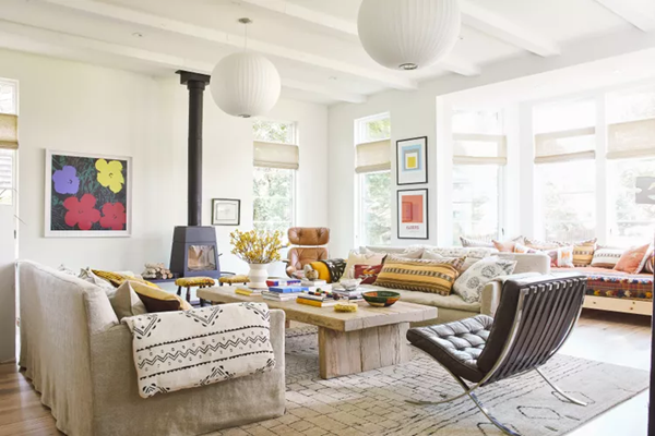
Steal These 16 Expert-Approved Decorating Secrets

How To Accessorize Your Living Room
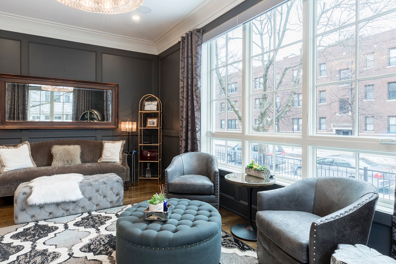
Small Space? 10 Ways To Make A Room Appear Bigger
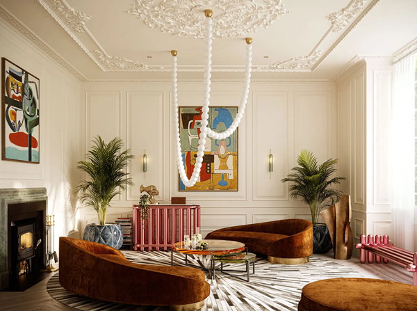
Make Your space Look Expensive
GET CAUGHT UP ON ALL THE INSPIRING DECOR TIPS:
18 Fresh Decorating Ideas To Update Your Fireplace
How to Make a Gallery Wall: The Complete Step-by-Step Guide (Even If You’ve Never Hung a Picture)


