To decorate an apartment bedroom, start by anchoring the layout with your bed placement, then layer in a rug, lighting, storage, and art in that order. Every decision should solve a real constraint — small square footage, no-drill walls, or a tight budget — before it solves an aesthetic one. Follow the 8-step sequence below and your room will feel finished, not random.
How to Decorate an Apartment Bedroom (The Right Order Matters)
You scroll Pinterest for twenty minutes, screenshot six different rooms, and then stand in your own bedroom feeling completely stuck. The inspiration is there. The blank walls are there. The gap between them feels enormous.

Here’s what nobody tells you: most apartment bedrooms look unfinished not because of bad taste, but because things were added in the wrong order. A lamp before a rug. Art before furniture placement. A throw pillow collection before a headboard. The result looks like a room that can’t make up its mind.
This guide is a step-by-step blueprint — built specifically for apartment renters — that walks you from an empty room to a space that genuinely looks designed. No contractor required. No permanent changes. No guessing.
Whether your bedroom is 100 square feet or 200, whether you’ve just moved in or you’ve been staring at the same bare walls for two years — by the end of this, you’ll know exactly what to do, in exactly what order.
- Set Your Style Direction
- What Bedroom Do You Have?
- Color Palette Formula
- How to Style the Nightstand
- Anchor the Layout
- Dress the Bed
- Layer In a Rug
- Light It Right
- Add Storage That Looks Good
- Hang Art the Designer Way
- Finish with Mirrors & Styling
- What to Put on the Dresser
- Decorating Around a Frame TV
- Complete Shopping List
- Mistakes to Avoid
- The Designer’s Cheat Sheet
- FAQ
Set Your Style Direction First

Before you buy a single thing, you need a filter. Without one, every pretty piece you see online looks like a good idea — and your room ends up looking like a clearance sale. Your style direction is that filter.
The direct answer: Pick two words that describe how you want this room to feel, not how it looks. “Calm and warm” is a style direction. “Scandinavian minimalist with rattan accents” is an aesthetic rabbit hole that leads to buyer’s remorse.
“A well-decorated room has a point of view. It doesn’t have to be perfect — it just has to know what it’s trying to say.”
Design Rule of ThumbHow to Choose Your Two Words
Walk through your phone’s camera roll right now. Find 5 rooms you’ve saved. What do they share? Not the furniture style — the feeling. That overlap is your direction.
Common two-word directions that work well in apartment bedrooms:
- Warm + Minimal — Neutral palette, few objects, natural materials. Think linen, light oak, cream walls.
- Calm + Layered — Soft color stacks, texture-heavy bedding, lots of organic curves.
- Bold + Grounded — One statement color or pattern, anchored by dark wood and solid neutrals.
- Cozy + Eclectic — Mix of eras, saturated accents, gallery walls, collected-not-curated feel.
Not sure which direction fits you? Take the Interior Design Style Quiz — it’ll narrow it down in about 2 minutes.
Once you have your two words, run every future purchase through them. “Does this fit calm and layered?” If yes — add to cart. If you’re not sure — leave it.
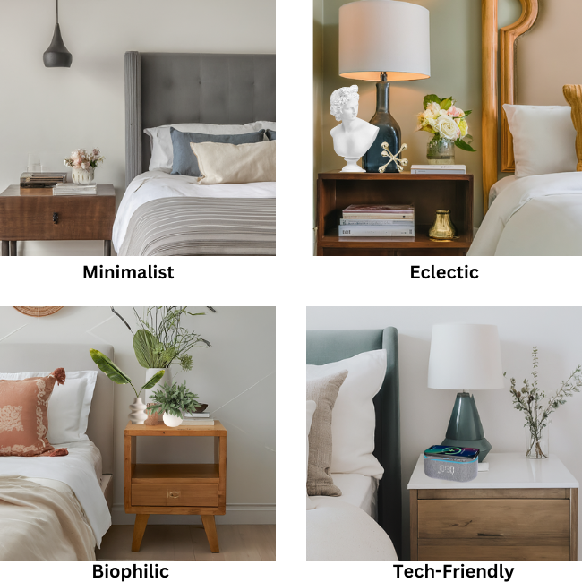
What Bedroom Do You Have?

Before you buy a single piece of furniture, you need to know which category your room falls into. Tiny, standard, and large bedrooms each have a completely different set of rules — and what works beautifully in one size actively makes another size worse.
The Bedroom Color Palette Formula
Color is the decision most people get wrong — not because they pick bad colors, but because they don’t know how much of each color to use. The 60/30/10 rule is the formula every designer uses, and it works in every room at every budget.
Four Ready-to-Use Apartment Bedroom Palettes
Pick one. Apply the 60/30/10 formula to it. Every product in this guide — the rug, the lamp, the dresser, the art — is compatible with at least two of these palettes.
Color Mistakes That Kill the Room
- ✓Pick ONE dominant color and commit to 60% of the room in it
- ✓Keep your 10% accent truly at 10% — restraint is the point
- ✓Use texture to add interest within the same color family
- ✓Test paint or fabric swatches in your actual lighting before committing
- ✓Let the rug carry color if you can’t paint the walls
- ✗Using five or more unrelated colors with no distribution system
- ✗Matching everything to the same exact color (flat and lifeless)
- ✗Buying an accent color pillow and then repeating it everywhere
- ✗Choosing paint color from a screen — it will look different in person
- ✗Using cool white walls with warm wood furniture (undertone clash)
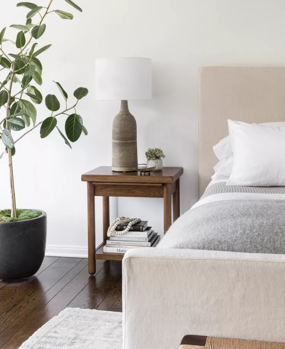
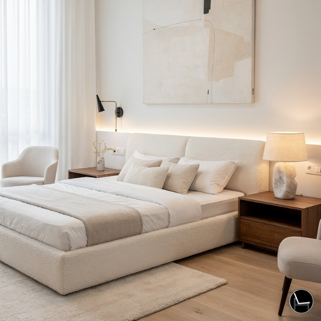
How to Style the Nightstand
The nightstand is the most-looked-at surface in the bedroom — it’s at eye level from the bed, it’s in every morning photo, and it’s the last thing you see before you fall asleep. Most people treat it like a dumping ground. A designer treats it like a tiny vignette with exactly three jobs: light, function, and one moment of beauty.
The direct answer: Style your nightstand with a maximum of four objects using the tall-medium-low formula. Everything on the nightstand should serve a purpose — visual or functional. If you have to ask whether it belongs there, it doesn’t.
The Nightstand Edit: Keep vs. Remove
- ✓One lamp — the right height, always
- ✓One small tray to contain daily essentials
- ✓One book (the one you’re actually reading)
- ✓One small plant or sculptural object
- ✓A glass of water — it’s practical and looks intentional
- ✗A stack of 4+ books — it looks like a shelf fell over
- ✗Loose jewelry, hair ties, charging cables
- ✗Medication bottles (use the drawer)
- ✗Multiple candles — one, in a holder
- ✗Anything that belongs in the bathroom or kitchen
Asymmetry is fine — and often better. Your two nightstands don’t need to be identical arrangements. Same lamp on both sides, but different medium objects. This reads as intentionally curated rather than showroom-matched.
The Right Lamp Makes Everything Else Work

Anchor the Layout Before You Buy Anything

The most expensive decorating mistake you can make is buying furniture before you know where it goes. Layout comes first — always. In an apartment bedroom, this is especially true because you likely have at least one or two constraints: a window that interrupts a wall, a closet door that swings out, a radiator in an inconvenient corner.
The direct answer: Place your bed against the most unobstructed wall, ideally the one you see first when you enter. Center it on that wall if possible. Everything else — dresser, nightstands, seating — gets placed in relation to the bed, not independently of it.
The Bedroom Layout Rules That Actually Matter
Renter-Specific Layout Constraints
Before you finalize placement, walk the room and note: which walls have outlets? Where are the light switches? Which walls get natural light, and at what time of day? These invisible constraints shape your layout more than any design rule. Placing the bed directly in front of the only window, for instance, blocks light and makes the room feel smaller.
If your room is narrow (under 10 feet wide), placing the bed lengthwise along a long wall rather than centered on a short wall can open up more usable floor space. Counterintuitive, but effective.
Use painter’s tape to outline furniture footprints on the floor before you move anything. It’s the cheapest floor plan tool you’ll ever use — and you’ll know instantly if the layout works before you throw your back out.
The Bed Frame: Your Room’s Architectural Backbone
Your bed frame is the single piece of furniture that sets the visual scale of the entire room. Get this right, and everything else has something to respond to.

Designer note: For a bedroom under 200 sq ft, a platform bed or low-profile frame keeps the sightlines open. A four-poster or high footboard will make a small room feel claustrophobic. Opt for an upholstered headboard over a wood one if you want the room to feel softer — fabric absorbs visual noise in a way solid wood can’t.
Before vs. After: Layout Decisions
The same room — completely different energy — based on two layout choices.
Dress the Bed Like a Designer Would

The bed takes up 40–60% of a bedroom’s visual real estate. How you dress it doesn’t just change comfort — it changes whether the room looks finished or messy from the doorway.
The direct answer: Layer bedding in three stages: a base layer (fitted sheet + duvet), a mid layer (throw blanket folded at the foot or draped diagonally), and a top layer (pillows in decreasing size from back to front). This creates visual depth without looking precious or hard to maintain.
The 5-Pillow Formula
This is the pillow arrangement most designers default to for a queen bed because it looks full without looking chaotic:
2× Euro shams (26″ × 26″) against the headboard
These create the architectural backdrop. Go textured or patterned here — they read from across the room.
2× standard sleeping pillows in shams
These sit in front of the Euros. They should match or tone-coordinate with your duvet — not compete with it.
1× lumbar pillow (12″ × 24″) in front
This is your accent. Pattern, texture, contrasting color — this is where personality lives. Keep it to one; two lumbar pillows usually look cluttered.
Duvet color should repeat at least once elsewhere in the room — in a throw, a pillow, or even a small object on the nightstand. This visual echo is what makes a room feel intentional rather than assembled.
Layer In a Rug (With the Right Size)

A rug does three things in a bedroom: it defines the sleeping zone as its own distinct space, it adds warmth underfoot when you get out of bed, and it visually grounds all the furniture so pieces don’t look like they’re floating.
The direct answer: For a queen bed, an 8×10-foot rug is the standard go-to. For a king, go to 9×12. Place the rug so the front legs of all nightstands sit on it, and so at least 18–24 inches of rug extends beyond both sides and the foot of the bed. If the rug barely peeks out from under the bed, it’s too small.
The 2/3 Rug Rule for Bedrooms
The rug should cover roughly two-thirds of the visible floor area in the sleeping zone. If you stand in the doorway and the rug looks small, it is. The single most common rug mistake in apartments is buying a size too small because the larger option “seemed like too much.” It never is.
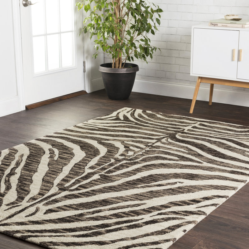
If your landlord has carpet, you can still layer a rug over it — just make sure it’s a flat-weave style so it doesn’t bunch. A rug pad under it will prevent sliding and protect the carpet beneath.
Lighting Strategy: The Layer Most People Skip
This is the step that separates rooms that look like a hotel suite from rooms that look like a dorm room with nicer furniture. Lighting is the one design element that affects how everything else looks — your bedding, your wall color, your art — and yet most apartment bedrooms rely entirely on a single overhead fixture.
The direct answer: Every bedroom needs at least three light sources at three different heights. The overhead fixture handles ambient light. Table or wall-mounted fixtures at nightstand level handle task and mood light. A floor lamp or accent light in the corner handles warmth. All three together give you control over the room’s atmosphere at any time of day.
The Three-Layer Lighting Formula
Ambient Layer — Overhead
Your overhead ceiling light or flush-mount. If it’s harsh or ugly, swap the bulb to a warm 2700K LED (not the blue-white “daylight” bulbs). Adding a dimmer switch is a renter-friendly upgrade that costs $15 and transforms the room.
Task Layer — Nightstand Level
Table lamps or plug-in wall sconces at the head of the bed. The bottom of the shade should sit roughly at seated eye level — about 20–22 inches above the nightstand surface. This puts light at reading height, not glare-in-your-face height.
Accent Layer — Corner or Low
A floor lamp in the far corner, fairy lights draped behind the headboard, or even a small LED candle on a shelf. This is the layer that makes a room feel warm rather than just lit.
“The right bulb color temperature matters more than the fixture. Warm white (2700–3000K) makes skin and fabric look beautiful. Cool white (4000K+) makes a bedroom look like an office.”
Lighting Design Principle
Renter-Friendly Lighting Upgrades
Can’t install a hardwired sconce? Plug-in wall sconces are widely available and require only a single hook or the lightest Command strip to keep the cord tidy. Battery-operated puck lights inside a dark closet, under a shelf, or behind the headboard are another zero-install option that genuinely elevates the atmosphere.
Add Storage That Actually Looks Good

In an apartment bedroom, storage is an aesthetic problem as much as a practical one. A cluttered surface undermines every other design decision you’ve made. The goal is storage that disappears visually — so the room reads as curated, not crammed.
The direct answer: Prioritize vertical storage (tall dressers, floating shelves) over horizontal storage (low cabinets, visible bins) to preserve floor space. Every storage piece should do two things: hold stuff and look good when empty — because the surfaces that frame it will always be visible.
The Dresser as Decor Moment
Your dresser’s top surface is prime real estate. It’s at eye level from the doorway, it reflects in mirrors, and it directly supports wall art or a mirror above it. Treat the top as a mini vignette: one lamp, one small tray, one object of interest. That’s it. Anything more becomes visual static.

The Ottoman: Hidden Storage That Earns Its Place
A storage ottoman at the foot of the bed solves two problems: extra throw storage (no more draping blankets over the bed) and a perch for getting dressed. It also visually closes the gap between the foot of the bed and the far wall, which helps rooms with higher ceilings feel more intimate.

Not Sure Which Style Is Right for You?
Take the free style quiz and get a personalized design direction in under 2 minutes.
Take the Free Style Quiz →Hang Art the Designer Way
Art is where most people give up. Either they hang it too high (the most common mistake in every home, not just apartments), or they buy a piece too small for the wall, or they keep it leaning against the baseboard for eighteen months “until they decide.”
The direct answer: The center of any piece of wall art should hang at exactly 57 inches from the floor — eye level for the average standing adult. This rule works for single pieces, gallery walls, and anything in between. The only exception is art above furniture, where you hang the piece 6–8 inches above the furniture top instead.
Art Sizing Rules for Bedrooms
For a piece hung above the bed: the art (or gallery arrangement) should be 2/3 to 3/4 the width of the headboard. A queen bed with a 62-inch headboard calls for art that spans roughly 42–46 inches. One large piece or a tight gallery cluster both work — just hit the width.

Renter Wall Solutions
No-drill picture hanging strips (3M Command Strips) hold up to 16 lbs per pair — enough for most framed prints. Adhesive hooks handle lighter items. For anything over 20 lbs, you need a stud and a small nail, which most landlords allow as a minor repair at move-out. Know your lease terms before you pull out the drill.
Finish with Mirrors & Final Styling

Mirrors are the last design move, and arguably the most powerful one for a small apartment bedroom. A mirror reflects light, makes the room feel larger, and — if placed correctly — doubles the visual impact of whatever’s across from it.
The direct answer: Place a large mirror on the wall opposite the window, not opposite the bed. Opposite the window, it bounces natural light into the room. Opposite the bed, it reflects the bed back at you while you sleep — which most people find subtly unnerving once they notice it.
Mirror Sizing and Placement
A leaner mirror (full-length, leaned against the wall) is the most renter-friendly option because it requires no wall hardware at all. Go as tall as ceiling height allows — a 65-to-72-inch leaner makes a room feel significantly more spacious without occupying any floor area beyond its own footprint.

The Final Styling Pass
Once everything is placed, do one final walk through the room. Look at each surface. For any surface with more than three objects on it, remove one. For any surface with zero objects, add one. The goal is visual rhythm — alternating moments of interest and rest — not minimalism for its own sake and not maximalism for its own sake.
Group objects in odd numbers (3 or 5). Two identical objects feel like a matched set — intentional but static. Three mismatched objects of varying heights feel curated. The odd number creates natural movement for the eye.
What NOT to Do: The Costly Mistakes
Every one of these is fixable — and every one of them is more common than you’d think. The good news: knowing the mistake in advance means you never have to make it.
✓ Do This Instead
- Hang art at 57″ center from floor
- Buy a rug one size larger than you think you need
- Use warm white bulbs (2700–3000K) throughout
- Pick a style direction before shopping
- Layer three light sources at different heights
- Place bed on the most prominent wall, centered
- Let one nightstand surface be empty
- Repeat your duvet color somewhere else in the room
✗ Stop Doing This
- Hanging art too high (above the sofa / above the headboard)
- Buying a rug that barely peeks under the bed frame
- Using a single overhead fluorescent as the only light
- Shopping without a style filter — then returning half of it
- Stacking all lighting at the same height
- Tucking the bed into a corner to “save space”
- Using nightstands as a dumping ground
- Ignoring color echo — room feels random without it
All Products at a Glance
| Item | Product | Best For | Link |
|---|---|---|---|
| Bed Frame | Iokaste Upholstered Lift Storage Bed | Hidden storage + hotel-quality look | Shop → |
| Dresser | Sladen Fluted 6-Drawer Dresser | Design-forward full wardrobe storage | Shop → |
| Table Lamp | Triche Sculptural Rabbit Lamp | Warm mood lighting + sculptural accent | Shop → |
| Rug | Saifa Hand-Hooked Wool Rug | Texture + pattern in a neutral palette | Shop → |
| Wall Art | Large Framed Neutral Abstract Canvas | Above-bed statement in any neutral room | Shop → |
| Ottoman | Leiani Round Storage Ottoman | Foot-of-bed storage + seat combo | Shop → |
| Mirror | Genan Scalloped Rectangle Mirror | Light-amplifying art-adjacent accent | Shop → |
Follow This Order — Every Time
Skipping ahead is how rooms end up looking like a collection of things instead of a designed space.
What to Actually Put on Your Dresser

This is the question nobody answers directly. You’ve got a beautiful dresser. You’ve hung a mirror above it. And now you’re staring at the top surface wondering whether to put your candles there, or your jewelry tray, or that stack of books that’s been on your floor for a month.
The direct answer: A styled dresser top should contain no more than five objects grouped into one cohesive vignette. Think in terms of height variation, material contrast, and one item that has personal meaning. Everything else lives in a drawer or a different room entirely.
The Dresser Vignette Formula
Designers use a simple three-tier structure when styling any flat surface. Apply it to your dresser and it works every time:
Tall — One Vertical Element (12″+ height)
A table lamp, a tall vase with dried stems, or a framed vertical print. This creates the visual “ceiling” of your vignette and gives the arrangement height. Without it, everything sits flat and reads as clutter rather than composition.
Medium — One or Two Mid-Height Objects (4″–10″)
A small plant, a candle in a vessel, a stacked pair of books, or a sculptural object. These sit beside or slightly in front of the tall piece and add depth. Two mid objects should differ in material — one hard (ceramic, glass, metal) and one soft or organic (plant, linen, wood).
Low — One Grounding Element (flat or under 3″)
A small tray, a flat dish, a folded linen cloth, or a thin stack of coasters. This grounds the arrangement and — crucially — contains the smaller loose objects (rings, hair ties, charging cables) so they don’t visually bleed across the surface. The tray is doing real functional work here.
“A tray doesn’t just hold things — it creates a boundary. Objects inside the tray read as intentional. Objects outside the tray read as forgotten.”
Vignette Styling PrincipleWhat Does NOT Belong on a Dresser Top
✓ Dresser Top: Yes
- One lamp (counts as your tall element)
- One small tray or dish (contains small items)
- One plant or organic element
- One personal object with meaning (small sculpture, inherited piece)
- One candle — in a vessel, not a jar candle on its own
✗ Dresser Top: No
- Open jewelry — it reads as clutter, full stop
- Folded laundry (even temporarily — it always becomes permanent)
- More than two books stacked; they become a tower, not decor
- Charging cables without cable management
- Multiples of the same object — three candles, four plants
The Nightstand: Same Rules, Smaller Scale
Apply the same tall-medium-low logic to each nightstand, but compress it. Your tall element is the lamp. Your medium is one object — a small book, a glass of water, a phone charging pad. Your low is nothing, or at most a small tray. That’s it. The nightstand is a working surface, not a styling surface. It should look good when you’re in a hurry, not just when you’ve tidied up.
If your nightstand looks cluttered no matter what you do, the problem is probably the lamp. A lamp that’s too small forces everything else to compete for visual weight. Go one size up on the lamp and suddenly everything else looks intentional.
How to Decorate Around a Frame TV in a Bedroom

A television in the bedroom is a design problem most guides ignore entirely — probably because it’s easier to pretend TVs don’t exist in bedrooms than to solve the actual challenge. But they do exist. And a 55-inch screen on the wrong wall, at the wrong height, with nothing around it, is the fastest way to make a beautifully decorated room look like a Best Buy display.
The direct answer: Treat the TV wall as a dedicated design zone, not an afterthought. The Frame TV (or any flat screen) should sit at seated eye level — the center of the screen at roughly 42–48 inches from the floor when you’re lying in bed propped on pillows. Everything you put around it should reduce the visual impact of the screen when it’s off, and support it when it’s on.
The Correct Height for a Bedroom TV
Most people hang a bedroom TV too high — at standing eye level, which means you’re tilting your neck up while lying in bed. The right height for a bedroom TV is based on your reclined viewing position, not standing. Measure the height of your mattress plus the height of your typical pillow stack. The center of the screen should align with your eyes at that height. For most beds and people, this lands between 42 and 48 inches from the floor to the center of the screen.
Four Ways to Style the Wall Around a Frame TV
Option 1: The Floating Media Console Look. Mount the TV above a low floating media console or low dresser (no taller than 18–20 inches). Flank the TV on the console with two symmetrical objects — matching lamps, matching vases, or a lamp on one side and a plant on the other. This grounds the screen visually and makes the whole wall read as a composed zone rather than a screen on a blank wall.
Option 2: The Gallery Wall Integration. Build a gallery wall around the TV so the screen becomes one element in a larger composition. Key rule: the TV should not be the geometric center of the gallery. Offset it slightly so the arrangement feels collected, not engineered. Use frames with thin profiles and matte finishes so they don’t compete with the screen’s reflective surface.
Option 3: The Recessed Alcove Effect. If you have a fireplace surround, a built-in niche, or a wall with architectural detail, mounting the TV inside or above that feature instantly legitimizes its presence. No built-in? Create the illusion with two floor-to-ceiling vertical shelving units flanking the TV wall. The screen reads as “framed” and the shelves add storage and styling space simultaneously.
Option 4: The Samsung Frame TV Art Mode. If you already own a Frame TV, use it. When the screen is off, it displays artwork — and with the right mat color selected to match your wall color, it genuinely reads as a framed piece from across the room. This is the cleanest bedroom TV solution available right now and it requires zero additional styling work around it.
Can’t mount into a stud? A TV floor stand or a TV credenza (a low, wide media console that the TV sits on rather than mounts to) is a completely valid no-drill solution. Look for a stand with cable management channels built in — visible cords are the fastest way to undermine an otherwise styled room.
The Cable Problem: Solve It Before You Style Anything
Cables are the single detail that most undermines a styled bedroom TV wall. Before you add a single decorative object around the TV, deal with the cables. Options in order of permanence: a cable raceway (paintable plastic channel that adheres to the wall), a cord cover kit (fabric sleeve that bundles all cables into one), or an in-wall cable management kit (the cleanest look, requires cutting into drywall — check your lease before attempting). Any of these costs under $30 and takes 20 minutes. It is always worth doing first.
“A beautifully styled bedroom with visible TV cables is like wearing a great outfit with the price tag still attached. One small thing ruins the whole effect.”
Design ObservationThe Complete Bedroom Shopping List
Every piece below was chosen to solve a specific decorating problem in an apartment bedroom. Here’s the full curated list — with designer commentary on why each one earns its place.
You Don’t Need a Bigger Space. You Need Better Order.
Decorating an apartment bedroom isn’t about having access to the right stores or an unlimited budget. It’s about making decisions in the right sequence. Style direction first. Layout second. Then bed, rug, lighting, storage, art, and final styling — each step building on the last.
Every rule in this guide exists for a practical reason, and every number is a real dimension a designer would use in a real room. The 57-inch hang height works whether your art costs $15 or $1,500. The rug sizing rule works whether you’re in a 90-square-foot studio or a 300-square-foot primary suite.
Start with step one. Your two-word style direction. Everything else follows from there.
“Not sure where your style lives? Take the quiz — it’ll tell you in two minutes what some people spend years figuring out.”
Take the Free Style Quiz →Frequently Asked Questions
CATCH THE LATEST IN HOME DECOR TRENDS:

Steal These 16 Expert-Approved Decorating Secrets

How To Accessorize Your Living Room
How to Make a Small Room Appear Bigger

How to Make Your Home Look Expensive
GET CAUGHT UP ON ALL THE INSPIRING DECOR TIPS:

18 Fresh Decorating Ideas To Update Your Fireplace

How to Make a Gallery Wall: The Complete Step-by-Step Guide (Even If You’ve Never Hung a Picture)
