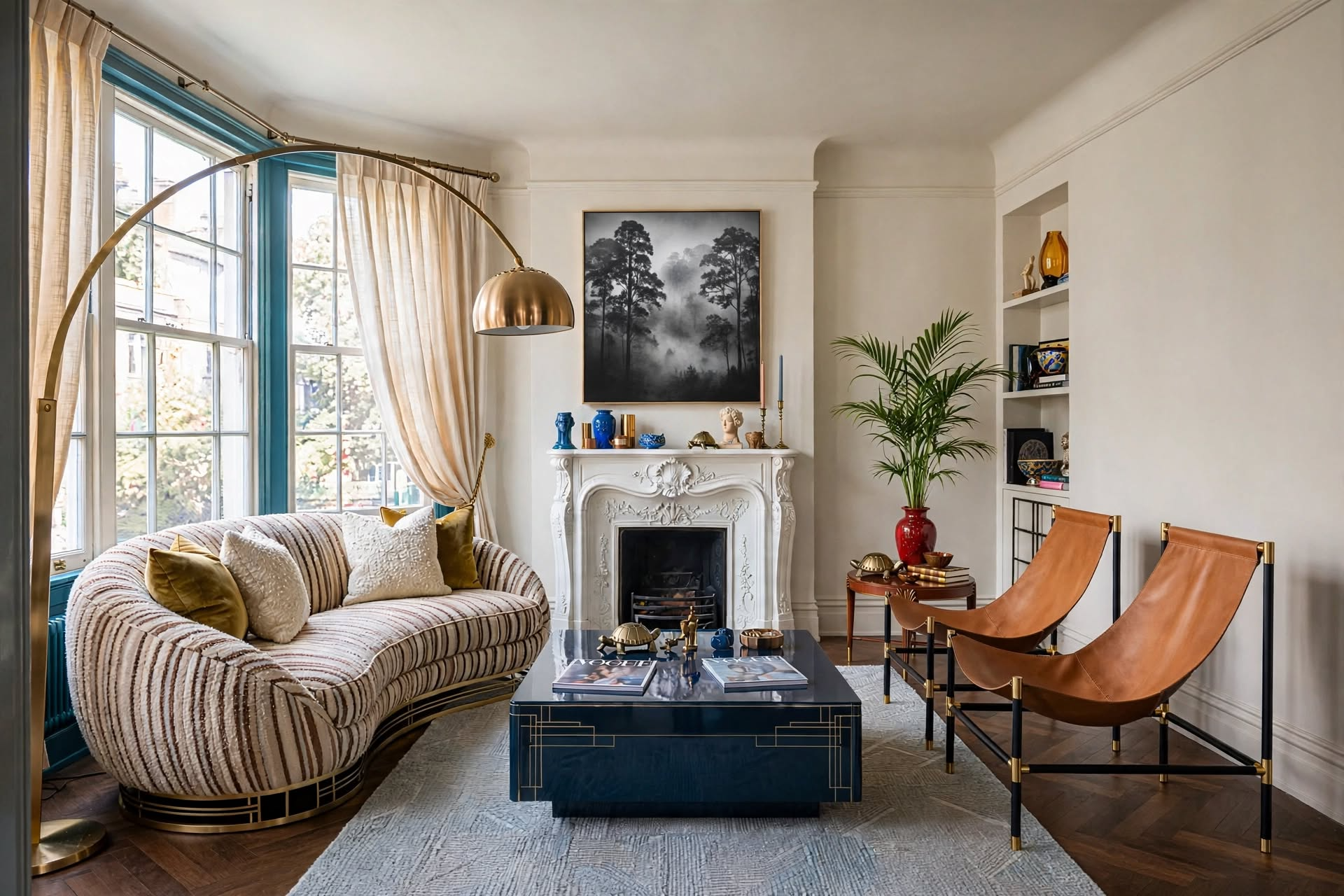
“Still rearranging the same room hoping it’ll click? It won’t — until you know this.”
The Designer’s SECRET Cheat Sheet121 designer-approved rules for every room in your home. The shortcut every well-styled home is built on.
The fastest way to learn how to choose colors for a room is to stop starting with paint chips. Start with what you can’t change or won’t give up (floors, sofa, a rug or art you love). Match the color to your light (window direction and bulbs). Then test three finalists on large boards for 48 hours. I call it the Fixed–Light–Test Method, and every number you need is in the cheat sheet near the end.
You pick a color that looks perfect on the chip. You paint the room. And somehow the soft gray you chose now looks purple, or the warm white looks like old butter.

The paint didn’t change. The room changed it. Your floor, your sofa, your windows and your light bulbs all push a color one way or another, and a two-inch chip under store lighting can’t show you any of that.
This guide shows you how to choose colors for a room in the order a designer does it, with real numbers, tables you can screenshot, and a section for renters who can’t touch the walls.
What’s in this guide
- The Fixed–Light–Test Method
- Step 1, Fixed: start with what you can’t change
- Step 2, Light: match your windows and bulbs
- Step 3, Test: the 48-hour sampling protocol
- Build the whole palette with 60-30-10
- Choosing colors room by room
- Do dark colors make a room look smaller?
- How renters choose colors for a room
- Making colors flow between rooms
- 7 mistakes that waste a gallon
- The designer’s cheat sheet
- FAQs
How to Choose Colors for a Room: The Fixed–Light–Test Method

Most color advice starts with the color wheel. That’s backwards. The wheel tells you which colors look good together in theory. It can’t tell you which ones will look good next to your orange-toned oak floor at 7 p.m. under a warm bulb.
So the method runs in this order: what’s already in the room, then the light, then proof.
Fixed
List what you can’t change or won’t give up. Read its undertone. That narrows hundreds of colors to a handful.
Light
Check which way your windows face and which bulbs you use. Lean the color warmer or cooler to balance them.
Test
Put three finalists on large boards. Watch them for 48 hours next to your fixed pieces. Then buy.
Each step removes options, so by the time you’re standing at the paint counter you’re choosing between two or three colors instead of two hundred.
Want the rest of the designer rules in one place? The Designer’s SECRET Cheat Sheet has 119 of them.
Get the Cheat SheetFixed: Start With What You Can’t Change (or Won’t Give Up)

The first rule of how to choose colors for a room is that paint goes last. It’s the easiest thing in a room to change. Your floor, your countertops and your sofa are staying. The wall color has to agree with them, not the other way around.
The fixed-element checklist
Walk the room and write down every item that falls into one of these two groups.
- Can’t change: flooring, countertops, tile, cabinets, a brick or stone fireplace, trim you aren’t repainting, and (if you rent) the walls themselves.
- Won’t give up: the sofa, a rug, a piece of art, a chair, curtains you just bought. Anything you love enough to design around.
That second group is where the best palettes come from. One client and I chose colors for every room in her home this way. We didn’t start with paint chips. We started with three things she already owned and loved: a piece of art she bought on a trip to Barcelona, an area rug her mother had given her, and a floral accent chair. Because she loved those pieces, she already loved their colors. We pulled colors out of them for the walls and the accessories, one room at a time.
If you own one patterned thing you love (a rug, a fabric, a painting), you already have a palette. Pick its quietest color for the walls, a mid-tone for the big furniture, and its boldest color for accents.
How to read an undertone with a sheet of paper
An undertone is the faint second color hiding inside a neutral. It’s the reason two beiges can look completely different side by side: one leans pink, the other leans yellow or green.
To find it, hold a sheet of plain white printer paper flat against the surface in daylight. Next to pure white, the hidden color shows up fast. A “white” tile suddenly looks cream. A “gray” carpet looks a little blue or a little purple. Whatever color you see is the undertone your wall color has to get along with.
Common fixed finishes and the wall colors that suit them
| What you have | Undertone you’ll usually see | Wall colors that work | Wall colors that fight it |
|---|---|---|---|
| Honey or golden oak floors | Orange-yellow | Warm whites, greige, muted greens, soft blue-greens | Pink-beige, icy cool grays |
| Cherry or red-toned wood | Red | Cream, greige, sage and olive greens | Pink or red-leaning beige, bright yellow |
| Cool gray carpet or tile | Blue or violet | Clean whites, soft grays, blues | Yellow creams (they look dingy) |
| Beige tile or carpet | Pink or yellow (check with paper) | Warm whites and taupes that share the same lean | A beige that leans the opposite way |
| White counters with gray veining | Cool | Crisp whites, grays, blues, most deeper colors | Creamy yellow whites |
| Espresso or dark brown wood | Deep neutral | Warm whites, earthy greens, most mid-tones | Very dark walls with no contrast |
These pairings are my working rules of thumb. Your own finish may lean differently, which is why the paper test and Step 3 matter.
If your fixed elements disagree with each other (warm floor, cool counter), choose a wall color for the one that covers the most area you can see at eye level. If you’re still deciding on your overall look, my guide on how to find your interior design style will help you settle that first.
Light: Match the Color to Your Windows and Bulbs

The same can of paint will look like two different colors in two different rooms. That’s why light is the second step in how to choose colors for a room. There are two kinds to check: the daylight coming through your windows, and the bulbs you turn on at night.
Which way do your windows face?
Open the compass app on your phone and stand facing the main window. Then use this table. The light behavior comes from Benjamin Moore’s guide to how light affects colour; the “lean toward” column is how I apply it.
| Window faces | What the light does | Lean toward | Watch out for |
|---|---|---|---|
| North | Indirect and cool all day | Colors with a warm undertone, or go deep and cozy on purpose | Cool grays and stark whites, which can look flat and cold |
| South | Warm, and strong around midday | Almost anything; cooler colors help calm the brightness | Very pale colors, which can wash out |
| East | Bright and warm in the morning, cooler by afternoon | The color that looks right at the time of day you use the room | Judging the color only in the morning |
| West | Cooler early, warm and golden late in the day | Balanced neutrals; soft greens and creams | Strong warm colors, which can turn very orange at sunset |
Directions are for homes in the Northern Hemisphere.
What the LRV number on a paint chip means
LRV stands for Light Reflectance Value. It’s a number from 0 to 100 that tells you how much light a color bounces back. Zero is absolute black. One hundred is pure white. Paint brands print it on the back of the chip or list it on the color’s web page.
You don’t need to memorize it. Just use it as a tiebreaker:
- Above about 60: the color will help a dim room feel brighter.
- Around 35 to 60: a true mid-tone. It shows up as “a color” on the wall without darkening the room much.
- Below about 20: dark and dramatic. Plan your lighting before you commit.
These bands are my rule of thumb, not an industry standard. Two colors with the same LRV can still feel different because of their undertones.
Your bulbs change the color after sunset
Bulb color is measured in Kelvin (K), and it’s printed on the box. Lower numbers give warmer, yellower light. Higher numbers give cooler, bluer light.
| Bulb label | Kelvin | What it does to wall color |
|---|---|---|
| Soft white / warm white | 2700K–3000K | Adds yellow. Warm colors glow; cool grays and blues look a little muddier. |
| Cool white / bright white | 3500K–4100K | More neutral. Colors look closer to how they do in daylight. |
| Daylight | 5000K–6500K | Adds blue. Cool undertones get stronger; warm colors can look flat. |
Decide on your bulbs before you choose paint, and make every bulb in the room the same Kelvin. I also look for a CRI of 90 or higher on the box, which means the bulb shows colors more accurately.
Test: The 48-Hour Sampling Protocol

Steps 1 and 2 get you to a short list. Step 3 is where you find out which color is actually right, in your room, with your stuff. It’s the step most people skip when they’re working out how to choose colors for a room, and it’s the one that saves you from repainting.
- Limit yourself to three finalists. More than that and they start to blur together.
- Use boards, not the wall. Paint two coats on white poster board or foam board, at least 12 by 12 inches. Peel-and-stick paint samples work too. If you paint a patch straight onto the old wall, the old color around it changes how the new one looks.
- Leave a white border. About an inch of bare white board around the paint gives your eye a clean reference.
- Hold it upright. Walls are vertical. A sample lying flat on a table catches light differently.
- Put it next to your fixed elements. Stand the board on the floor against the wall, beside the sofa, up against the tile or the counter.
- Move it around. Check the brightest wall and the darkest corner.
- Look three times a day for two days. Morning, midday, and evening with your lamps on.
The scorecard
Give each color a score from 1 to 5 in every row. The highest total wins. If two tie, pick the one that scored better at the time of day you use the room most.
| Check | Color A | Color B | Color C |
|---|---|---|---|
| Next to the floor | |||
| Next to the sofa or biggest piece | |||
| Morning light | |||
| Midday light | |||
| Evening, lamps on | |||
| Darkest corner |
One more thing before you buy: sheen changes how a color looks too. A shinier finish bounces more light and shows more wall flaws. There’s a sheen column in the room-by-room table below.
Build the Whole Palette With 60-30-10

Knowing how to choose colors for a room means choosing more than the wall color. The 60-30-10 rule is how you color coordinate everything else so the room feels pulled together instead of busy.
| Share | Job | What counts |
|---|---|---|
| 60% main color | Sets the mood and the background | Walls, and often the largest rug |
| 30% second color | Adds depth and interest | Sofa and chairs, curtains, bedding, an accent wall |
| 10% accent | Gives the eye somewhere to land | Pillows, throws, art, lamps, vases |
Whites, blacks, wood tones and metals are neutrals. They don’t count toward your three colors. Trim and ceilings are usually a white that shares the wall color’s undertone: a warm white with warm walls, a cleaner white with cool walls.
If you like grouping things in threes, the same idea shows up in my guide to the rule of three for decorating.
Three color schemes that are hard to get wrong
| Scheme | How it works | Example | Feels |
|---|---|---|---|
| One color, three depths | Light, medium and dark versions of a single color | Pale sage walls, olive sofa, deep green pillows | Calm, grown-up |
| Neighbors | Two or three colors that sit side by side on the color wheel | Blue, blue-green and green | Relaxed, natural |
| Opposites | Two colors from opposite sides of the wheel, one doing most of the work | Navy as the 30, burnt orange as the 10 | Lively, high contrast |
If you want to see where color is heading before you commit, I keep a running list of wall color trends for 2027. And if your walls are staying white, here’s how to decorate a living room with white walls so it doesn’t feel empty.
Choosing Colors Room by Room

How to choose colors for a room depends partly on which room it is. The method stays the same. What changes is which fixed element is in charge and what the room is for.
| Room | What’s in charge | Color direction | Wall sheen |
|---|---|---|---|
| Living room | Sofa, rug, flooring | Mid-tones and warm neutrals that look good day and night | Matte or eggshell |
| Bedroom | Bedding, headboard, flooring | Softer, muted colors; test with your bedside lamps on | Matte or eggshell |
| Kitchen | Cabinets, counters, backsplash | Let the cabinets lead; walls are usually the quiet partner | Satin |
| Bathroom | Tile, vanity top | Test under the vanity bulbs, since there’s often little daylight | Satin or semi-gloss |
| Home office | Desk, shelving, what’s behind you on calls | Mid-tone greens, blues or warm neutrals that cut glare | Matte or eggshell |
| Hallway | The rooms it connects | A neutral that agrees with every room you can see from it | Eggshell or satin |
Sheen guide: matte hides wall flaws, eggshell and satin wipe clean more easily, and semi-gloss is for trim, doors and damp rooms.
For specific shades, I have separate lists of calming paint colors for a living room and the best paint colors for better sleep. And before you fall for a bold chip, read the 5 worst colors to paint your home.
Do Dark Colors Make a Room Look Smaller?

Not always. Dark colors reflect less light (that’s the low LRV number from Step 2), so a room can feel more enclosed. Whether that reads as “small” or “cozy” depends on how you use the color.
- It’s on one chopped-up wall beside bright white trim
- The room has one overhead light and nothing else
- Furniture, floor and walls are all dark with no contrast
- Walls and trim are the same color, so corners blur
- There are lamps at two or three heights
- Lighter bedding, rugs or art break it up
If making the space feel larger is your main goal, lighter colors with a higher LRV are the safer choice, and I cover the full set of tricks in how to make a small room appear bigger. If you want to go dark anyway, start with one wall using my black accent wall ideas, and read when dark paint colors are the wrong call first. Your sofa matters here too: these couch colors make a room look bigger.
Can’t Paint? How Renters Choose Colors for a Room

If you rent, the method still works. You just have one more fixed element: the walls.
- Read the landlord’s white. Do the paper test on the wall. Most rental whites lean either warm (creamy, a little yellow) or cool (a little gray or blue). Now you know which family your rug, curtains and bedding should come from.
- Your 60 is already chosen. The walls are your main color. Put all your personality into the 30 (sofa cover, curtains, rug, bedding) and the 10 (pillows, art, lamps).
- Go big with the 30. In a white box, small accents get lost. A large rug and full-length curtains in your second color do more than ten small accessories.
- Add color you can take with you. Peel-and-stick wallpaper on one wall, oversized art, a painted secondhand dresser, colored lampshades.
- Ask before you assume. Some landlords allow painting. Get the yes in writing, and ask whether you need to return the walls to the original color when you move out.
If you’re still apartment hunting, light and wall color are two of the things I check in how to choose a rental apartment.
Making Colors Flow Between Rooms

In a small home or an open floor plan, you see more than one room at a time. The colors need to make sense together, even if every room is different.
- Do the doorway check. Stand in each doorway and list every room you can see. Those rooms need to agree.
- Keep one undertone family. All warm or all cool. You can change the color from room to room as long as the undertone stays the same.
- Cap the count. For an apartment or small house, I keep it to three to five colors in total, including the white.
- Repeat something. Let one accent color show up in at least two rooms. A rust pillow in the living room and a rust throw in the bedroom is enough to tie them together.
This is how my client’s home came together. Each room took its lead from a different piece she loved, but because we kept the undertones in the same family, walking from room to room felt like one home. For more on tying a small place together, see how to make a small apartment look cohesive.
7 Mistakes That Waste a Gallon
Most of what goes wrong when people choose colors for a room comes down to these seven habits.
Don’t
- Choose from a tiny chip in the store
- Pick the wall color before the sofa and rug
- Ignore the undertone of your floor
- Paint test patches straight onto the old wall color
- Judge a color at one time of day
- Mix warm and cool bulbs in one room
- Ask five people for their opinion
Do
- Bring samples home and view them in the room
- Choose paint last, to suit what’s staying
- Do the white paper test on every fixed finish
- Use boards with a white border
- Check morning, midday and evening for two days
- Match every bulb to the same Kelvin first
- Trust the scorecard, and one person who knows the room
The Designer’s Cheat Sheet
Everything you need for how to choose colors for a room, on one screen. Screenshot it before you go to the paint store.
- ◆List what can’t change
- ◆List what you won’t give up
- ◆White paper test for undertone
- ◆North light: lean warm
- ◆South light: most colors work
- ◆East/west: judge at your hours
- ◆3 finalists, 2 coats
- ◆Boards 12 x 12 in. or larger
- ◆3 looks a day for 48 hours
- ◆Scale runs 0 to 100
- ◆60+ brightens a dim room
- ◆Under 20 needs a lighting plan
- ◆2700K–3000K: warm
- ◆3500K–4100K: neutral
- ◆5000K+: cool, bluish
- ◆60% walls and big rug
- ◆30% furniture and curtains
- ◆10% accents
How to Choose Colors for a Room: Your Questions
Choose the Color Last, and You’ll Choose It Once
Knowing how to choose colors for a room comes down to order. Look at what’s staying. Look at your light. Then let three sample boards prove which color belongs. When you work in that order, the paint chip stops being a guess.
And if you take one idea from this guide, take the one my client taught me: the things you already love are the best color advice you’ll ever get. Start with the rug, the art or the chair, and build out from there.
For more rules like these, The Designer’s SECRET Cheat Sheet collects 119 of them in one place. You can also follow @thedecorholic on Instagram, Facebook, TikTok and Pinterest for daily small-space ideas.

CATCH THE LATEST IN HOME DECOR TRENDS:

Steal These 16 Expert-Approved Decorating Secrets

Accessorize a Small Living Room: 7 Genius Styling Secrets

How to Make a Small Room Appear Bigger

How to Make Your Home Look Expensive
GET CAUGHT UP ON ALL THE INSPIRING DECOR TIPS:

Best Fireplace Makeover Ideas

How to Make a Gallery Wall: The Complete Step-by-Step Guide (Even If You’ve Never Hung a Picture)