Ever stared at a paint chip mountain feeling more lost than a penguin in the Sahara? Choosing the right color for your home can feel like a tightrope walk blindfolded (been there!). But fear not! This guide is your paintbrush to a brighter future (literally and figuratively).

I’ll unveil the top 5 worst colors to paint your home, explore why they might turn your haven into a headache, and most importantly, offer up some amazing alternatives that’ll have your guests swooning. So, grab your favorite (calmingly colored) beverage, settle in, and let’s banish those bad paint choices from your home forever! ✌️
Bold Red: A Fiery Foe to Relaxation

The fist worst colors to paint your home is red. Bold red can be a bold and energetic choice, but painting your entire home in a fiery hue might leave you feeling more like you’re living inside a chili pepper than a peaceful oasis. Studies suggest that bold red can trigger the body’s fight-or-flight response, making it less conducive to relaxation and sleep (source: University of Rochester). Think about it: would you want to unwind in a room that feels like it’s constantly on high alert?
“Color is a powerful tool that can evoke emotions, set the mood, and even influence our behavior. Choosing the wrong color for your home can create an unwelcome atmosphere, while the right choice can transform it into a haven of peace and comfort.”
Emily Henderson, Decorator and Author
Alternatives: If you crave a touch of red’s vibrancy, consider warmer, earthier tones like terracotta or coral. These shades offer a similar punch without the potential to overwhelm.
Yellow: Sunshine Gone Sour
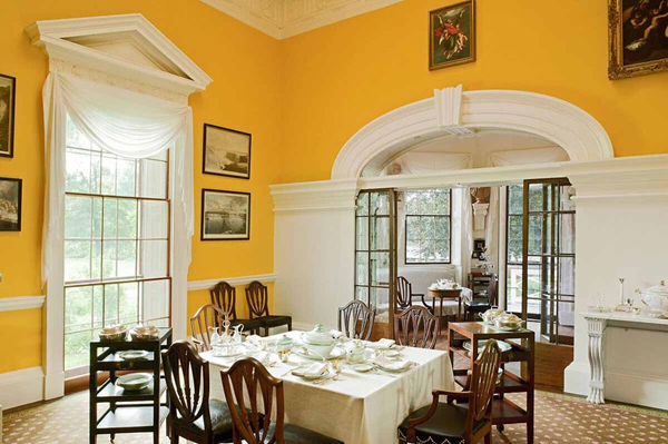
Sunshine yellow might sound cheerful, but painting your entire home in a harsh, lemon-drop shade can have the opposite effect. This intense yellow can strain the eyes and create a feeling of anxiety. One study even found that workers in yellow-painted rooms made more errors on tasks requiring focus (source: University of Texas). Not exactly the recipe for a productive or visually calming environment, right?
Alternatives: Softer, warmer yellows like buttercup or banana cream can bring a touch of sunshine without the eye-searing intensity. These shades are more inviting and easier on the eyes, creating a more harmonious atmosphere.
“If you are looking for a way to style your space with wall art without breaking your piggy bank, then I recommend reading “10 Surprising Benefits of Printable Wall Art”
Dark, Gloomy Purple: Shrinking Your Space Away
While dark purple can be elegant in moderation, drenching your entire home in this shade can backfire. Deep purples tend to absorb light, making small rooms feel even smaller and creating a cold, uninviting atmosphere. Remember, our brains associate darkness with enclosed spaces, which can trigger feelings of claustrophobia and unease (source: Journal of Environmental Psychology). Not exactly the vibe you’re going for in your cozy home, right?
Also: 10 Best Couch Colors That Make a Room Look Bigger
Alternatives: Lighter, airier purples like lavender or lilac offer a touch of sophistication without the heaviness. These shades reflect light, making rooms feel more spacious and inviting, creating a more balanced and calming atmosphere.
Pepto-Bismol Pink: A Feast for the Eyes (in the Wrong Way)

While some pinks exude elegance and charm, certain shades can veer into unappetizing territory. Think Pepto-Bismol pink. This particular hue can evoke associations with nausea and discomfort, not exactly the feeling you want to cultivate in your home sweet home.
Science Alert: Our brains associate colors with specific stimuli, including foods. So, while you might not consciously connect that Pepto-Bismol pink wall to your stomach, the subconscious connection could be influencing your feelings in the space (source: Science Daily).
“There are no inherently ‘bad’ colors, but some colors are less well-suited to specific spaces or functions. For example, using a bold red in a small bedroom might feel overwhelming and impede relaxation, while a calming blue could create a more serene environment.”
Kelly Wearstler, Interior Designer
Alternatives: More sophisticated, calming pinks like blush or dusty rose offer a delightful touch of color without the potential to turn your stomach. These shades are elegant and versatile, creating a serene and inviting atmosphere perfect for relaxation and rejuvenation.
Also: How to Decorate with Earthy Colors
Institutional Green: Channeling the Hospital Waiting Room

The last worst colors to paint your home in my list is green. While nature-inspired greens can be incredibly refreshing, certain institutional greens can evoke feelings of coldness and sterility. Think of the sterile green walls you might encounter in a hospital waiting room. These shades lack warmth and personality, making your home feel less like a haven and more like…well, an institution.
The Power of Undertones: Remember, undertones play a crucial role in how a color feels. A green with cool blue undertones can appear sterile, while one with warm yellow undertones feels more inviting.
Alternatives: Nature-inspired greens like sage or olive offer a touch of earthy elegance without the institutional vibe. These shades evoke feelings of peace and tranquility, creating a warm and inviting atmosphere perfect for unwinding and reconnecting with nature.
Remember, “worst” is subjective, and ultimately the best color for your home is the one that makes you feel happy and comfortable. But by understanding the potential pitfalls of certain shades and exploring their more inviting alternatives, you can make informed decisions that create a space that truly reflects your unique style and personality.
Also: How to Choose Paint Colors for Your Entire House
Finding the Perfect Color for Your Space: Your Canvas Awaits!

Now that we’ve banished those worst colors to paint your home from your paint chip dreams, let’s dive into finding the perfect color for your space. Remember, the “perfect” hue isn’t just about aesthetics; it’s about creating a space that reflects your personality, enhances your mood, and suits the room’s intended function.
Matching Color to Mood: Painting with Emotion
Colors have a powerful impact on our emotions and can set the tone for an entire room. Here’s a quick guide to some popular color associations:
- Calming and Relaxing: Soft blues, greens, and lavenders evoke feelings of peace and tranquility, perfect for bedrooms and living rooms.
- Energizing and Uplifting: Brighter yellows, oranges, and pinks can boost your mood and creativity, ideal for kitchens and home offices.
- Warm and Inviting: Earthy tones like browns, beiges, and terracottas create a sense of comfort and coziness, perfect for family rooms and dining areas.
According to Psychology Today “70% of people report feeling happier and more relaxed in rooms painted with calming colors.”
Remember: Consider the desired mood for each room when selecting your color palette. For example, a calming blue in your bedroom might help you drift off to sleep easier, while a cheerful yellow in your kitchen might jumpstart your mornings.
The 60-30-10 Rule: Balancing Your Palette
Creating a harmonious color scheme doesn’t have to be a guessing game. The 60-30-10 rule offers a simple yet effective framework:
- 60% Dominant Color: This is your main wall color, setting the overall tone of the space.
- 30% Secondary Color: This is your accent color, used on accent walls, furniture, or decor.
- 10% Accent Color: This is a pop of color used sparingly for visual interest, like throw pillows or artwork.
Related Post: The 60-30-10 Design Rule: A Comprehensive Guide
Experiment Like a Pro: Tools and Techniques
Before committing to a gallon of paint, experiment like a pro! Here are some helpful tools and techniques:
- Paint Swatches: Test different colors in various lighting conditions to see how they transform throughout the day.
- Visualization Tools: Online tools like RoomSketcher allow you to virtually “paint” your space with different colors.
- Sample Jars: Purchase small amounts of paint to create larger test areas on your walls.
Remember: Don’t be afraid to experiment! The more you explore different colors and their effects, the more confident you’ll feel in making your final decision.
Also: Fall Decor Palette: Expert Tips to Nail Your Home’s Autumn Color Scheme
Seeking Expert Help: When to Call in the Color Cavalry
Feeling overwhelmed by the vast world of color options? Don’t fret! Consulting an interior designer can be a great investment. They can help you:
- Navigate color trends and styles.
- Select colors that complement your existing furniture and decor.
- Create a cohesive color scheme throughout your home.
“When choosing paint colors, consider the natural light in the room, the size of the space, and the overall mood you want to create. Remember, trends come and go, but you should live with a color that makes you feel happy and inspired.”
Nate Berkus, Decorator
Remember: Investing in professional guidance can save you time, money, and the stress of making costly mistakes.
Most Popular Post:
10 Surprising Benefits of Printable Wall Art
How to Choose The Right TV Size to Decorate Your Living Room
The ultimate Smart Home Design Guide: Automate your life
Tips for Home Decorating on a Budget: Where to Splurge and Save
10 Best Couch Colors That Make a Room Look Bigger
Conclusion
Remember that drab living room painted in Pepto-Bismol pink? Banish those bad paint choices forever with the knowledge you’ve gained! We’ve explored the worst colors to paint your home and their alternatives, navigated the art of matching color to mood, and discovered tools and techniques to experiment like a pro.
But remember, the journey doesn’t end here. Embrace your inner artist and continue exploring the world of color! Here are some parting tips:
- Don’t be afraid to break the rules: While understanding color psychology and design principles is valuable, don’t be afraid to experiment and inject your own personality into your color choices.
- Embrace the power of lighting: Natural and artificial light can dramatically impact how colors appear. Consider the lighting conditions in each room when making your selections.
- Accessorize with intention: Use colorful throw pillows, artwork, or rugs to add pops of personality and complement your chosen color scheme.
- Most importantly, have fun! Choosing paint colors should be an enjoyable experience. So, put on some music, grab your favorite paint chips, and let your creativity flow!
Remember, your home is a reflection of you. So, don’t be afraid to paint it with colors that make you feel happy, inspired, and truly at home. With the tips and knowledge in this guide, you’re well on your way to creating a space that reflects your unique style and personality, brushstroke by beautiful brushstroke.
Worst Colors To Paint Your Home-(FAQs)
We’ve covered a lot of ground, but you might still have some lingering questions about worst colors to paint your home. This FAQ section is here to address your painting concerns and empower you to make confident choices:
Q: What if I accidentally choose a “worst color”? Can I fix it?
A: Absolutely! While some colors might be less ideal, remember, it’s your space and your preference. If you’re not thrilled, don’t despair! Repainting is always an option. However, consider these tips first:
- Accessorize strategically: Introduce complementary colors through furniture, rugs, or artwork to balance the overall feel.
- Embrace lighting adjustments: Experiment with different lighting schemes to see if they alter the color’s perception.
- Seek professional help: An interior designer can offer advice on salvaging the existing color or suggest subtle changes to improve the ambiance.
Q: I’m renting, can I still experiment with color?
A: Of course! Many landlords allow temporary paint changes with prior approval and proper restoration upon move-out. Explore removable wallpaper, peel-and-stick tiles, or fabric wall hangings for a splash of color without permanent commitment.
Q: Where can I find more color inspiration?
A: The world is your oyster! Browse design magazines, online decor blogs, or social media platforms like Pinterest and Instagram. Visit home improvement stores or paint manufacturers’ websites for curated color palettes and trends. Don’t forget to draw inspiration from nature, art, or even your favorite fashion pieces!
Q: What are some resources for choosing paint quality?
A: Consider factors like durability, coverage, and finish when selecting paint. Research online reviews, consult paint professionals, and compare prices across different brands. Remember, investing in quality paint can save you time and money in the long run.
Q: I’m still feeling overwhelmed! What should I do?
A: Take a deep breath! Choosing paint colors can be exciting, but it’s okay to take it slow. Start with one room at a time, gather inspiration, and don’t be afraid to experiment. Remember, there’s no right or wrong answer – the perfect color is the one that makes you feel happy and at home.
CATCH THE LATEST IN HOME DECOR TRENDS:

Steal These 16 Expert-Approved Decorating Secrets

How To Accessorize Your Living Room
How to Make a Small Room Appear Bigger

How to Make Your Home Look Expensive
GET CAUGHT UP ON ALL THE INSPIRING DECOR TIPS:

18 Fresh Decorating Ideas To Update Your Fireplace

How to Make a Gallery Wall: The Complete Step-by-Step Guide (Even If You’ve Never Hung a Picture)
