TL;DR Summary: Calming paint colors transform any home into a peaceful sanctuary through strategic use of soft blues, muted greens, warm neutrals, and earthy tones. Blue relaxes the mind and slows down heart rate, metabolism, blood pressure, and hypertension, making it ideal for creating tranquil environments. The key is selecting hues with subtle undertones that promote visual rest and emotional well-being while complementing your personal style and home’s architecture.
Introduction: Why Calming Paint Colors Matter in Your Home
Calming paint colors are the foundation of a peaceful home, setting the emotional tone for your entire living space. The walls that surround you every day have a profound impact on your mood, stress levels, and overall well-being—yet most homeowners underestimate the power of the right paint color.

Your home should be your refuge from the chaos of modern life. Yet too many people live in spaces that feel chaotic, overstimulating, or simply uninspiring. The problem isn’t always clutter or poor furniture choices. Often, it’s the wall colors working against you rather than for you.
The right calming paint color can lower your blood pressure, improve your sleep quality, and create a sense of sanctuary the moment you walk through the door. This guide will show you exactly how to select and apply calming paint colors that transform your home into the peaceful retreat you deserve—room by room, color by color, with real science backing every recommendation.
I. Understanding the Psychology Behind Calming Paint Colors

Color profoundly impacts our emotional state, cognitive function, and physical well-being. Research on university students living in color-coded residence halls found that blue interiors were the top preference, followed by green, violet, orange, yellow, and red, with blue specifically considered to facilitate studying activity. This scientific validation confirms what interior designers have known for decades.
The science behind color psychology reveals measurable physiological changes. Blue has an array of positive effects with little to no negative impact on the psyche, as aquatic shades particularly have a healing effect on the mind. Green works similarly by connecting us to nature’s inherent calm, while warm neutrals create psychological safety through their association with earth and shelter.
Understanding these psychological effects helps you make informed decisions about which colors belong in which rooms. A color that energizes your kitchen might disrupt sleep in your bedroom. The goal is matching color psychology to room function for maximum benefit.
Pro Tip: Test paint samples in different lighting conditions throughout the day. A color that feels calming at noon might appear cold and uninviting at dusk. Always observe samples for at least 48 hours before committing to ensure the color maintains its soothing quality in all lighting situations.
Don’t Miss: Soft Autumn Color Palette: Room-by-Room Interior Design Guide
II. The Best Calming Blue Paint Colors for Every Home
Blue remains the most universally calming color in interior design. Its association with sky and water creates instant psychological safety. A significant relation was found between a calm mood and preference for blue in residential settings, making it the safest choice for any room where you want guaranteed tranquility.
Light Blues for Airy Serenity

Pale sky blues create visual expansiveness without overwhelming the senses. Blue adds a touch of calmness and serenity, turning your house into a very peaceful place. These lighter shades work particularly well in bedrooms, bathrooms, and any space where you want to feel refreshed and open.
Light blue shades evoke clear skies and calm waters, instantly soothing anxious minds. They’re forgiving colors that work with most decor styles from traditional to contemporary.
- Benjamin Moore’s Quiet Moments: A gentle blue-green hybrid that shifts subtly with natural light throughout the day
- Sherwin Williams’ Sea Salt: Perfect for creating spa-like bathrooms with its green-gray undertones
- Benjamin Moore’s Palladian Blue: A soft, ethereal shade that brings the tranquility of the outdoors inside
Medium Blues for Balanced Calm

Mid-tone blues offer more personality while maintaining calming properties. These shades work beautifully in living rooms, home offices, and dining rooms where you want sophistication alongside serenity.
Pacific Sea Teal creates serene atmospheres perfect for reading nooks and study spaces, offering enough depth to feel intentional without overwhelming. These blues pair exceptionally well with white trim and natural wood furniture.
- Benjamin Moore’s Breath of Fresh Air: A balanced blue that feels crisp without being cold
- Sherwin Williams’ Rainwashed: A blue-green that adapts beautifully to changing natural light
- Benjamin Moore’s Beach Glass: Evokes peaceful coastal vibes in any home
Deep Blues for Cocooning Comfort
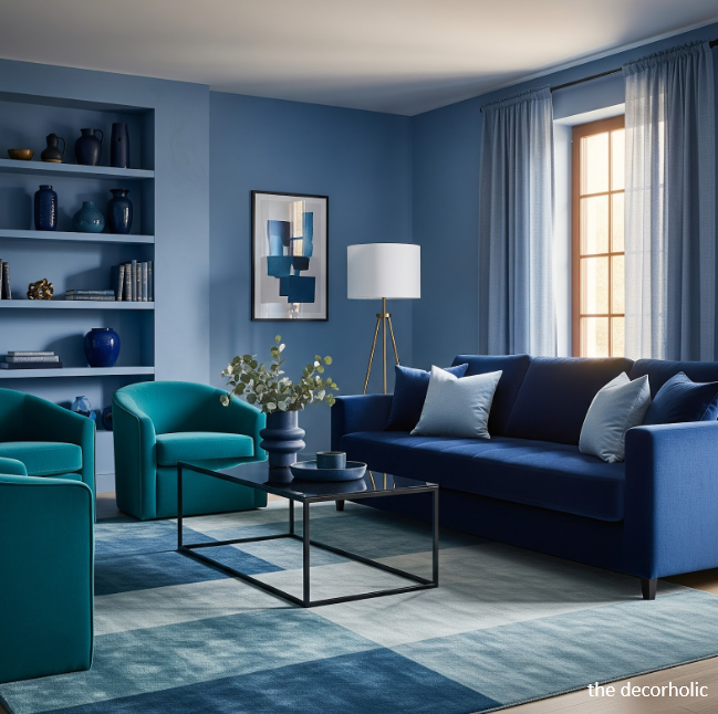
Dark colors, when used with plenty of natural light and lighter accents, can help to cocoon a space in calm. Navy and deeper blues ground any space with sophisticated warmth, creating intimate atmospheres perfect for bedrooms and media rooms.
Deep blues work especially well as accent walls, creating focal points that draw the eye while maintaining an overall sense of tranquility. They’re particularly effective in rooms with high ceilings where you want to create coziness.
- Benjamin Moore’s New Providence Navy: Sophisticated depth that grounds without overwhelming
- Sherwin Williams’ Naval: A timeless navy that feels both elegant and relaxing
- Benjamin Moore’s Hale Navy: Rich yet approachable, perfect for statement walls
Pro Tip: Balance deep blues with ample white trim and light-colored furnishings. The contrast prevents the space from feeling heavy while maintaining that cocooning effect. Add metallic accents in brass or gold to warm up cooler blue tones.
Trending Post: 10 Ideas To Create a Bedroom Accent Wall
III. Soothing Green Paint Colors That Ground Your Space
Green connects us instinctively to nature, making it inherently calming. Green interior design tends to have a relaxing effect, helping to lower blood pressure and hypertension, while light green promotes feelings of calm and olive is closely associated with harmony and peace. For any decor style, green offers versatility that blue can’t match.
Sage and Muted Greens

Eucalyptus green, with overtones of silver, gray, and blue, may be equally calming, restorative, and energizing, evoking nature and growth. These sophisticated greens work beautifully in kitchens, living spaces, and bedrooms where you want organic warmth.
Sage green has become increasingly popular across all design styles for good reason. Its gray undertones prevent it from reading as too vibrant, while its connection to herbs and nature provides organic warmth without feeling overly rustic.
- Sherwin Williams’ Evergreen Fog: Muted yet rich, creating depth without overwhelming any space
- Benjamin Moore’s Eucalyptus Green: Recently popular in bedrooms, kitchens, and living rooms
- Benjamin Moore’s Saybrook Sage: A versatile sage that works in both traditional and modern homes
Light Green for Fresh Tranquility

Mint green provides light, refreshing qualities great for small bedrooms and bathrooms, bringing a spa-like quality to everyday spaces. These lighter greens feel clean and uplifting while maintaining calming properties.
Light greens work particularly well in spaces that receive limited natural light, as they brighten without feeling artificial. They’re also excellent choices for nurseries and children’s rooms.
- Benjamin Moore’s Mint Chocolate Chip: A fresh, modern mint that doesn’t feel juvenile
- Sherwin Williams’ Softened Green: Barely-there green that whispers rather than shouts
- Benjamin Moore’s Italian Ice Green: Crisp and refreshing without being cold
Olive and Forest Tones

Deeper greens bring cozy sophistication to any space. Hunter Green, a lush hue reminiscent of deep forests, adds depth and opulence to any space, making it ideal for accent walls in living rooms, dining rooms, or home libraries.
These richer greens create grounded, earthy environments that feel both calming and intentional. They pair beautifully with leather furniture, brass fixtures, and natural wood elements.
Pro Tip: Use green in rooms where you want to encourage both calm and productivity. Home offices benefit enormously from sage or olive tones that keep you focused without inducing sleepiness. Add plants to amplify green’s connection to nature and enhance air quality simultaneously.
Don’t Miss: Modular Sofas for Small Spaces: Brilliant Solutions for Compact Living
IV. Warm Neutral Paint Colors for Inviting Calm
Neutral doesn’t mean boring—warm neutrals create peaceful sophistication. In recent years, interior design has seen a clear shift towards warmer shades instead of the cooler tones that proved popular in the past, as warm neutrals allow us to create spaces that feel simple and open yet inviting and comfortable.
Greige: The Perfect Balance

Greige, a combination of gray and beige, gives your home a calm atmosphere and works well in small rooms to help them open up, while also being used in large, busy rooms to provide a calming effect. This versatility makes greige invaluable for virtually any home and decor style.
Greige serves as an ideal backdrop for colorful artwork and furnishings while maintaining its own subtle personality. It’s neither too warm nor too cool, making it work with various lighting conditions throughout the day.
- Benjamin Moore’s Revere Pewter: The gold standard of greige for living rooms and open concepts
- Benjamin Moore’s Balboa Mist: Delivers elegant backdrops with warmth in any room
- Sherwin Williams’ Accessible Beige: A reliable, versatile greige for whole-home color schemes
Warm Whites and Creams

Instead of choosing a bright, brilliant white, opt for more nuanced whites with specific undertones that will create warmth and depth. These sophisticated whites prevent spaces from feeling cold or institutional while maintaining brightness.
Warm whites work beautifully in homes with traditional architecture, complementing crown molding and classic details. They also serve as excellent backgrounds for homes with abundant natural wood.
- Benjamin Moore’s White Heron: Timeless warmth without starkness, perfect for entire homes
- Benjamin Moore’s White Dove: Warm, inviting haven with beige-tinged cream tones
- Sherwin Williams’ Alabaster: A creamy off-white that provides a neutral backdrop with a cozy feel
Soft Beige and Tan

Beige has made a major comeback as homeowners seek warmer, more welcoming alternatives to cool grays. Soft beiges create enveloping warmth that makes any space feel like home.
These colors work exceptionally well in homes with oak or honey-toned wood flooring, creating cohesive flow. They’re also forgiving colors that hide imperfections well.
- Benjamin Moore’s Grant Beige: A soft, sophisticated beige without yellow undertones
- Sherwin Williams’ Kilim Beige: Warm and versatile, working in any room
- Benjamin Moore’s Chelsea Gray: A beige-gray hybrid that grounds without heaviness
Pro Tip: Layer warm neutrals by painting walls in slightly different shades than trim. This subtle variation adds depth and visual interest while maintaining an overall sense of calm. Use the lighter shade on walls and slightly deeper tones on trim for sophisticated dimension.
Trending Post: How To Mix Interior Design Styles
V. Soft Pastel Paint Colors for Gentle Calm
Pastels offer calming properties with personality and charm. Soft pastels like First Light, a gentle blush pink, and Blue Danube, a serene yet playful blue, lend a sense of whimsy and warmth to interiors, perfect for nurseries, bedrooms, or any space where a touch of softness is desired.
Blush and Pink Tones

Powder pink is a shade of pastel painting color which adds a touch of fun, fresh feeling to your home space, and varied hues can drastically alter the tone of a space. In modern contexts, soft pinks create warmth without sacrificing sophistication.
Blush tones have evolved beyond nurseries to become sophisticated choices for bedrooms, powder rooms, and even living spaces. They create instant warmth and work beautifully with gold fixtures and velvet textures.
- Benjamin Moore’s First Light: Gentle blush that feels modern and elevated
- Sherwin Williams’ Touching White: Barely-there pink with incredible warmth
- Benjamin Moore’s Paisley Pink: Soft enough to read as neutral, warm enough to feel intentional
Muted Lilac and Lavender

Benjamin Moore’s French Lilac creates a calming effect that looks both subtle and sweet, particularly effective in bedrooms and spaces dedicated to relaxation. Lavender’s association with the calming herb makes it psychologically soothing.
These purple-toned pastels bring unexpected sophistication to bathrooms and bedrooms. They work beautifully with white bedding and silvery accents.
- Benjamin Moore’s Lavender Ice: Subtle purple that feels fresh, not dated
- Sherwin Williams’ Potentially Purple: A modern take on lavender that works in contemporary homes
- Benjamin Moore’s Purple Haze: Sophisticated lavender-gray hybrid
Soft Yellow and Peach

Gentle yellows and peaches bring sunshine indoors without overwhelming. These warm pastels create cheerful calm—an uplifting quality perfect for kitchens, breakfast nooks, and rooms that need energy alongside tranquility.
- Benjamin Moore’s Lemon Sorbet: Soft yellow that brightens without stimulating
- Sherwin Williams’ Peach Fuzz: Warm, enveloping peach that reads almost neutral
- Benjamin Moore’s Wispy Peach: Subtle peach perfect for east-facing rooms
Pro Tip: Use pastels strategically as accent walls or in smaller rooms like powder rooms and nurseries. This approach introduces warmth and personality while maintaining sophistication. In larger spaces, pair pastel walls with deeper-toned furnishings to prevent the room from feeling washed out.
Don’t Miss: 15 Expert Painting Tricks That Make Any Room Look More Expensive
VI. How to Choose the Right Calming Color for Each Room
Room function dictates color psychology needs. A bedroom requires different emotional cues than a home office or living room. Understanding these distinctions ensures your home truly supports your lifestyle and well-being.
Bedrooms: Prioritize Deep Relaxation

Bedrooms need colors that actively lower your heart rate and prepare your body for rest. Blue’s calming effect slows down metabolism, heart rate, and blood pressure, making it the premier choice for sleep spaces where quality rest is paramount.
Soft blues, dusty lavenders, and pale greens work beautifully in bedrooms. Sage green offers earthy, muted tones perfect for grounding energy, while mint green provides light, refreshing qualities. Avoid overly stimulating colors like bright reds, oranges, or vibrant yellows in sleeping spaces.
- Choose matte finishes that absorb rather than reflect light for better sleep
- Avoid colors with strong red or orange undertones that stimulate rather than relax
- Test colors at night when you’ll actually use the space for sleep
Living Rooms: Balance Energy and Calm

The living room is the heart of your home, and the paint color should reflect your style while accommodating social gatherings and quiet evenings. Living rooms benefit from colors that feel both grounding and welcoming.
Warm greiges, soft sages, and muted teals strike this balance perfectly. They’re neutral enough to work with changing decor but have enough character to feel intentional and designed.
- Consider how the color works with your furniture and artwork
- Think about the mood for entertaining versus relaxing
- Ensure adequate contrast with trim and architectural details
Kitchens: Create Inviting Warmth

Eucalyptus green has been recently used anywhere in interiors, from bedrooms and kitchens to living rooms, bringing a calming sense that evokes nature. Soft whites, warm greiges, and muted greens create inviting kitchen atmospheres where families naturally gather.
Kitchens benefit from colors that feel clean and fresh while maintaining warmth. Avoid overly cool tones that can make the space feel clinical rather than welcoming.
Bathrooms: Design Your Spa Retreat

Bathrooms are perfect candidates for calming colors. Blue adds a touch of calmness and serenity, turning your bathroom into a very peaceful place, particularly in spa-like primary bathrooms where you start and end your day.
Soft aquas, pale greens, and creamy whites transform ordinary bathrooms into personal retreat spaces. Use semi-gloss or satin finishes for moisture resistance while maintaining soothing aesthetics.
Home Offices: Enhance Focus Without Stress

Farrow & Ball’s Brinjal, a rich yet relaxing shade, creates a soothing backdrop perfect for workspaces. Blues and greens support concentration without inducing drowsiness, making them ideal for productive work environments.
Avoid pure white or very pale colors that can cause eye strain during long work sessions. Choose colors with enough depth to provide visual rest during screen breaks.
Pro Tip: Consider the direction your room faces. North-facing rooms benefit from warmer colors to compensate for cooler natural light, while south-facing rooms can handle cooler tones without feeling cold. East-facing rooms are beautiful with soft yellows, while west-facing rooms benefit from colors that glow in afternoon light.
Don’t Miss: The 3-5-7 Decorating Rule: Transform Any Space with This Designer Secret (That Actually Works)
VII. Paint Finish Selection for Maximum Calm
Finish dramatically affects how color reads in your space. Matte finishes create a soft, velvety look perfect for walls, helping to hide imperfections and create a calming atmosphere, while glossy finishes reflect light and create a shiny, polished look better for accent pieces and trim.
Matte and Flat Finishes
These paing colors absorb light rather than bouncing it around the room. This quality creates visual softness essential for calming spaces. They hide wall imperfections naturally, maintaining clean surfaces without sheen.
Best for bedrooms, living rooms, and any space dedicated to relaxation. The slight downside is that matte finishes clean less easily, so avoid them in high-traffic areas or homes with young children who might touch walls frequently.
Eggshell and Satin
These mid-level sheens offer the best of both worlds. They provide subtle light reflection that prevents spaces from feeling flat while remaining soft enough to support calm. They’re also more durable and washable than matte finishes.
Best for hallways, dining rooms, kitchens, and moderate-traffic areas where you need durability without sacrificing tranquility. Eggshell has become the standard for most interior walls due to its versatility.
Semi-Gloss for Trim and Details
Semi-gloss finishes belong on trim, doors, and architectural details. The slight sheen creates definition that highlights these elements without creating visual chaos. It’s also the most durable and cleanable option.
Use semi-gloss exclusively on trim and cabinetry, not on walls, to maintain calming aesthetics while ensuring long-lasting results in high-touch areas.
Pro Tip: Use eggshell on walls and semi-gloss only on trim. This contrast defines architectural elements without creating visual chaos. The interplay between subtle wall sheen and brighter trim sheen adds depth and sophistication that flat walls alone cannot achieve.
Trending Post: 10 Hottest Bedroom Trends to Try Now
VIII. Complementary Elements to Enhance Calming Paint Colors

Color succeeds or fails based on surrounding elements. Thoughtfully selected furniture, warm wood, and layered textiles add dimension to painted walls. These complementary elements amplify the calming properties of your paint choices and complete the peaceful atmosphere.
Natural Materials and Textures
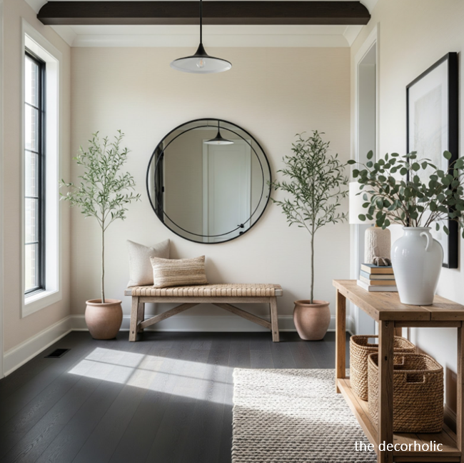
Combining earthy hues with natural materials like jute, linen, leather and wood creates warmth and authenticity. These organic elements amplify the calming properties of your paint choices through textural variety.
Wood brings warmth and grounding energy. Keep wood tones in the same temperature family as your wall color—warm wall colors with honey and oak woods, cooler wall colors with walnut or espresso finishes.
- Natural fibers: Layer linen curtains, cotton throws, and wool rugs for tactile warmth
- Stone and ceramic: Ground spaces with natural imperfection in countertops and accessories
- Rattan and wicker: Add organic texture without visual weight
Lighting Considerations
Natural light makes or breaks calming color schemes. Warm white paint paired with wood flooring makes spaces feel inviting and calm, even with many hard surfaces and textures. Lighting transforms how colors appear throughout the day.
Maximize natural light with sheer curtains that diffuse harsh sunlight while maintaining brightness. Choose warm-toned LED bulbs (2700-3000K) for evening ambiance that enhances rather than fights your wall colors. Position task lighting thoughtfully to avoid creating dramatic shadows that disrupt calm.
Art and Decor Accents
Match accent pillows or artwork to wall undertones for cohesion, using contrasting textures like linen curtains against matte walls. This approach maintains visual simplicity while preventing monotony.
Choose artwork that complements rather than clashes with your calming color palette. Abstract art in analogous colors creates harmony, while black and white photography provides contrast without color competition.
Pro Tip: Follow the 60-30-10 rule for balanced color distribution. Your calming wall color should cover 60% of visual space, secondary neutral elements like furniture 30%, and accent colors just 10%. This ratio maintains calm while preventing blandness and creating visual interest.
Don’t Miss: 30 Interior Decorating Rules You Can (and Should!) Break
IX. Common Mistakes to Avoid When Choosing Calming Colors
Even calming colors can fail when poorly executed. Understanding these pitfalls saves you from costly repainting projects and helps you achieve that serene atmosphere on the first try, avoiding frustration and wasted time.
Choosing Colors Based Only on Paint Chips
The biggest amateur mistake is selecting colors based on tiny paint chips in store lighting. That perfect “neutral” beige might have pink undertones that clash with your wood floors, or that soft gray could read purple against your white trim.
Paint colors look completely different in your home’s unique lighting compared to the paint store. Those small chips simply cannot convey how a color will actually appear on your walls.
Always test large swatches (at least 2×2 feet) on multiple walls. Observe them for several days in morning, afternoon, and evening light. Notice how they interact with your existing furnishings, flooring, and natural light patterns.
Ignoring Undertones
Every “neutral” has undertones that become apparent once on the wall. Gray can have blue, purple, or green undertones. Beige can lean pink, yellow, or orange. These undertones determine whether a color feels calming or agitating in your space.
Test colors next to your existing elements—flooring, countertops, furniture. The undertones must harmonize with these fixed elements for the color to feel cohesive and calming.
Painting Before Testing
Never paint an entire room based on a paint chip or even someone else’s recommendation. Colors behave differently in every space based on lighting, room size, and surrounding elements.
Sample paint on large poster boards that you can move around the room. This mobility lets you see how colors look on different walls and in various lighting conditions without committing to painting directly on surfaces.
Forgetting About Ceiling Color
Room ceiling was preferred white in residential studies, but that doesn’t mean stark white works everywhere. In rooms with calming blue or green walls, continuing that color onto the ceiling at 50% saturation creates a cocooning effect.
Ceilings painted the same color as walls can make rooms feel larger and more enveloping. This technique works beautifully in bedrooms and small spaces where you want maximum tranquility.
Choosing Trendy Over Timeless
Trends come and go, but you’ll live with your paint color for years. Choose colors that genuinely resonate with your personal sense of calm rather than whatever’s currently popular on social media.
Pro Tip: Take photos of your paint samples in different lighting conditions. Sometimes cameras reveal color shifts our eyes unconsciously adjust to. These photos help you make objective decisions about whether a color maintains its calming quality throughout the day.
Trending Post: Transform Your Home with the 60/30/10 Rule: Interior Design Made Easy
X. Trending Calming Paint Colors for 2026
Design trends increasingly favor warm, nature-inspired palettes. Benjamin Moore’s 2026 trends emphasize serene neutrals like White Heron and Gray Cashmere that evoke calm and clarity, perfect for creating peaceful retreats in any home style.
Warm Earth Tones

Amazon Soil, a rich brown with hints of red, creates harmonious environments that connect us to nature’s calming influence. These grounded tones represent a departure from cool minimalism toward warmer, more inviting spaces that feel like home.
Clay, terracotta (muted versions), soft browns, and sand tones bring cozy stillness to homes. They pair beautifully with natural materials like wood, stone, and woven textures, creating organic, grounded environments.
- Sherwin Williams’ Warm Stone: Soft taupe with terracotta undertones
- Benjamin Moore’s Clay Beige: Sophisticated earth tone for living spaces
- Benjamin Moore’s Sandy Hook Gray: Warm greige with sandy undertones
Soft Dusty Blues and Greens
Muted, dusty versions of traditional blues and greens dominate 2025 trends. These sophisticated colors provide personality without overwhelming, offering calm with character.
These colors work across all design styles from farmhouse to modern, making them safe yet interesting choices for homeowners seeking lasting appeal.
- Sherwin Williams’ Tradewind: Dusty blue-green perfect for any room
- Benjamin Moore’s Wythe Blue: Historic blue with modern appeal
- Benjamin Moore’s October Mist: Sophisticated blue-gray hybrid
Warm Whites with Character
The stark white trend has ended. Today’s whites have subtle undertones that create warmth and depth. These aren’t cream or beige—they’re whites with barely-there color that prevents cold, institutional feelings.
- Benjamin Moore’s Chantilly Lace: Crisp white with warm undertones
- Sherwin Williams’ Greek Villa: Warm white perfect for whole-home schemes
- Benjamin Moore’s Decorator’s White: Clean white with incredible warmth
Pro Tip: Don’t chase trends blindly. Choose colors that genuinely resonate with your personal sense of calm. A trendy color you dislike will never create the peaceful sanctuary you’re seeking, regardless of its popularity or Instagram-worthiness.
Don’t Miss: Masculine Color Palette Ultimate Guide for Home Decorating (2026)
XI. Step-by-Step Process for Implementing Calming Paint Colors
Successful color implementation requires methodical planning. Rushing this process leads to buyer’s remorse, wasted money, and continued dissatisfaction with your space. Follow these steps for confident, successful results.
Step 1: Assess Your Space and Needs
Walk through each room noting the natural light quality, existing furnishings, and room function. Ask yourself what emotional experience you want each space to provide. Be honest about how each room currently makes you feel.
Consider room size. Smaller spaces benefit from lighter calming tones that create visual expansion. Larger rooms can handle deeper, richer calming colors without feeling closed in or oppressive.
Step 2: Gather Inspiration and Samples
Create a physical mood board with paint chips, fabric swatches, photos from magazines, and images of rooms you love. Notice patterns in your selections—do you gravitate toward cool or warm tones? Muted or slightly saturated colors?
Order large sample pots of your top 3-5 choices. Don’t rely on tiny chips that don’t show how colors truly behave. Paint large sections (at least 2×2 feet) on multiple walls in each room.
Step 3: Test in Real Lighting Conditions
Live with your samples for at least three full days before deciding. Observe them at different times and in different weather conditions.
- Early morning: Does the color feel too cold or harsh when you’re waking up?
- Midday: How does it handle bright, direct sunlight? Does it wash out or intensify?
- Evening: Does artificial lighting make it feel cozy or clinical? Warm or cold?
- Cloudy days: Many colors look completely different without direct sunlight
Take photos in each lighting condition to capture what you’re seeing. These photos help you make objective decisions.
Step 4: Consider the Whole-Home Flow
Stand in doorways between rooms. Do the colors transition smoothly or jar the eye with clashing undertones? You don’t need identical colors throughout, but they should share similar temperature (all warm or all cool).
Consider sight lines from your main living areas. Colors visible from one room to another should harmonize even if they’re different hues. This creates cohesive flow that enhances overall calm.
Step 5: Execute with Quality Materials
Invest in premium paint brands like Benjamin Moore, Sherwin-Williams, or Farrow & Ball. They offer superior coverage, more sophisticated color formulations, and better longevity. Cheap paint requires more coats and often doesn’t achieve the subtle tones that create true calm.
Use proper preparation: clean walls thoroughly, fill holes and cracks, sand smooth, and prime if necessary. The smoothest paint application won’t save poorly prepped surfaces. Good prep work ensures professional-looking results.
Step 6: Paint Strategically
Start with trim and ceiling if painting them. Let them dry completely before taping for wall color. This prevents damage to fresh paint and creates crisp lines.
Apply two coats minimum for even color and proper coverage. Don’t skimp—one coat rarely achieves the true color. Cut in carefully around trim and corners, then roll walls for smooth, even finish.
Pro Tip: Paint one room completely and live with it for a full week before continuing to other spaces. This pause lets you catch any issues early and adjust your color plan if needed. It’s much easier to pivot after one room than after painting your entire home.
Popular Post: 15 Professional Decor Styling Tricks to Transform Your Home Like an Interior Designer
XII. Real-World Applications: Calming Color Success Stories

Seeing how others have successfully used calming colors provides practical inspiration. These real-world applications demonstrate how the right paint colors transform ordinary homes into peaceful sanctuaries across different styles and situations.
The Stressed Professional’s Bedroom Transformation
One homeowner struggled with insomnia in a bedroom painted bright white. After repainting with Benjamin Moore’s Palladian Blue, sleep quality improved dramatically. The soft blue-green shade lowered stimulation levels, creating an environment conducive to rest.
The lesson: Bedrooms need active calm, not stark neutrality. Choose colors with proven psychological benefits for sleep rather than what looks good in photos.

The Family Home with Flow
A family with an open-concept home chose Benjamin Moore’s Balboa Mist for main living areas, transitioning to Quiet Moments in bedrooms and Sea Salt in bathrooms. The connected yet distinct palette created whole-home calm with room-specific intention.
The lesson: Use color families rather than single colors throughout your home. Variations within warm or cool families create interest while maintaining cohesive flow.
The Historic Home Modernization
Owners of a 1920s home wanted to honor traditional architecture while creating contemporary calm. They selected Benjamin Moore’s Chantilly Lace for walls with Gray Cashmere in the dining room. The warm whites brought lightness while respecting crown molding and original details.
The lesson: Calming colors work in any home style when you respect the architecture and choose appropriate undertones.
Pro Tip: Visit open houses or model homes to see calming colors in real spaces rather than just in magazines. Notice how colors look in full rooms, how they transition between spaces, and how they feel rather than just how they look. This real-world observation trains your eye better than any online research.
Don’t Miss: 10 Steps To A Minimalist Living Room: The Complete 2026 Design Guide
XIII. Maintaining Your Calming Color Scheme Over Time

Paint colors require maintenance to keep their calming effect. Even the best paint job won’t maintain its serenity without proper care, especially in high-traffic homes with children, pets, or frequent entertaining.
Cleaning Calming Colors
Different finishes require different cleaning approaches. Matte finishes need gentle cleaning with minimal water. Use magic erasers sparingly as they can damage flat paint. Satin and eggshell finishes tolerate gentle scrubbing with mild soap and water.
Clean walls regularly to prevent buildup that dulls color. Use a microfiber cloth for dusting and gentle spot cleaning for marks and smudges.
When to Refresh
High-quality calming paints in low-traffic areas last 5-7 years before needing refresh. However, your psychological response to a color can change over time. If your “calming” blue starts feeling cold or boring after 3-4 years, that’s your cue to refresh.
Touch up scuffs and marks promptly. Keep leftover paint properly sealed and labeled for easy touch-ups. These small repairs maintain the pristine look that supports calm.
Evolving Your Palette
As your life changes, your color needs may shift. A calming lavender perfect for a nursery might need updating as children grow. A soft blue ideal for your forties might feel too cool in your sixties.
Allow your colors to evolve with you. There’s no virtue in keeping colors that no longer serve your needs simply because they were once perfect.
Pro Tip: Keep detailed records of your paint colors including brand, name, and finish. Take photos of paint can labels and store this information digitally. When you need touch-ups or want to replicate a color in another room years later, you’ll have exact information rather than guessing.
Most Popular Post:
Interior Design Style Quiz
Timeless Paint Colors That Never Go Out of Style
Create Your Perfect Ergonomic Home Office: A Complete Guide
Must-Have Accessories for Guys: The Secret to a Stylish Space
Modular Sofas for Small Spaces: Brilliant Solutions for Compact Living
Conclusion: Creating Your Calm Home Sanctuary
Calming paint colors transform houses into homes and spaces into sanctuaries. The right hues create psychological safety, promote relaxation, and enhance your daily well-being in measurable ways backed by science and design expertise.
Blue promotes calm with little negative impact, green reduces blood pressure while connecting us to nature, and warm neutrals create inviting spaces that feel like home. These scientifically-backed choices ensure your home truly supports your peace of mind and overall quality of life.
Start with one room. Test thoroughly in your actual lighting conditions. Trust your instincts about what feels personally calming—not what influencers promote or what’s trending. The best calming paint color is the one that makes you exhale with relief every time you enter your space.
Your peaceful sanctuary awaits. The perfect calming color palette is within reach—now you have the comprehensive knowledge to choose it confidently and implement it successfully.
Calming Paint Colors–Frequently Asked Questions
Q: What is the most calming paint color for a bedroom?
A: Soft blue remains the most universally calming bedroom color. Blue relaxes the mind and slows down heart rate, metabolism, blood pressure, and hypertension, making it scientifically proven to support better sleep. Pale blues, dusty blues, and blue-greens like Benjamin Moore’s Sea Salt or Palladian Blue work exceptionally well. For those who prefer warmer tones, sage green or warm greige with minimal red undertones also promote restful sleep without the coolness of blue.
Q: Can I use dark calming colors in small rooms?
A: Yes, but strategically. Dark colors, when used with plenty of natural light and lighter accents, can help to cocoon a space in calm rather than overwhelm it. Use deep blues or forest greens on a single accent wall, keeping other walls lighter. Balance with white trim, light-colored furniture, ample lighting, and mirrors to reflect light. This approach adds depth and sophistication without making the space feel cramped or oppressive.
Q: How do I choose between warm and cool calming colors?
A: Consider your room’s natural light direction and personal temperature preferences. North-facing rooms with limited sunlight benefit from warm calming colors like greige, warm whites, or peachy neutrals to compensate for cooler light. South-facing rooms can handle cooler blues and greens without feeling cold. East-facing rooms are beautiful with soft yellows that glow in morning light, while west-facing rooms benefit from colors that warm up in afternoon sun. Also consider your own preferences—if you tend to run hot, cooler tones may feel more refreshing and calming. Test samples in your specific lighting before committing.
Q: What’s the difference between greige and beige for calming spaces?
A: Greige, combining gray and beige, gives your home a calm atmosphere and is versatile enough for both small rooms that need to open up and large rooms requiring a calming effect. Pure beige can read too warm or traditional for some modern homes and may clash with cooler-toned furnishings. Greige offers the warmth of beige with the sophistication of gray, making it ideal for contemporary aesthetics while maintaining calming properties. Greige also tends to photograph better and look more intentional than straight beige, which can sometimes appear dated.
Q: Should I paint my home office a calming color?
A: Yes, but choose stimulating calm rather than sedating calm. Soft blues and muted greens support focus and concentration without inducing drowsiness. Blue was considered to facilitate studying activity in residential research, making it excellent for home offices where productivity matters. Sage green, soft gray-blue, or warm greige all work beautifully. Avoid very pale, washed-out colors that might make you feel sluggish, and steer clear of stark whites that cause eye strain during long work sessions. Add warmer accent colors through artwork or desk accessories to prevent the space from feeling too cool or clinical.
Q: How many calming paint colors should I use throughout my home?
A: Limit yourself to 3-5 related calming tones maximum for whole-home cohesion. Use one primary color for main living areas, a slightly deeper or lighter variation for private spaces like bedrooms, and keep trim consistent (usually white or off-white). Colors should share similar undertones—all warm or all cool—to create smooth transitions between rooms. You can use different colors in each room as long as they’re in the same color family or temperature range. This creates interest while maintaining the calm, cohesive flow essential for a peaceful home.
Q: Do calming paint colors work in kitchens?
A: Absolutely. Eucalyptus green has been recently used anywhere in interiors, from bedrooms and kitchens to living rooms, bringing a calming sense that evokes nature. Soft whites, warm greiges, and muted greens create inviting kitchen atmospheres where families naturally gather. Use eggshell or satin finishes for easier cleaning in this high-traffic, high-moisture area. Balance calming walls with warmer wood tones, natural materials, or copper/brass fixtures to prevent the kitchen from feeling too clinical. Avoid overly cool colors that can make food preparation spaces feel uninviting.
Q: Can I use calming colors in a home with dark furniture?
A: Yes—calming colors actually work beautifully with dark furniture by creating contrast that makes both elements stand out. Light calming blues, soft greens, and warm neutrals provide backdrop that allows dark wood or upholstered furniture to become focal points. The key is ensuring enough contrast so the dark furniture doesn’t disappear into the walls. If you have very dark furniture, choose calming colors at least 3-4 shades lighter on the paint fan deck. This combination creates sophisticated spaces that feel both grounded and serene.
Q: How long should I wait before deciding if a calming color works?
A: Live with large paint samples for at least 3-5 days before making your final decision, observing the color in all lighting conditions and weather situations. Once you’ve painted the full room, give it at least two weeks before making judgments. Our eyes and brains need time to adjust to new colors, and initial reactions often differ from long-term feelings. Many colors that seem “too bold” initially become comfortable favorites after proper adjustment time. If after two weeks the color still doesn’t feel calming, then consider repainting—but don’t make hasty decisions based on day-one reactions.
Q: Are white walls calming or just boring?
A: White walls can be calming when they’re the right white with appropriate undertones. Stark, cool whites often feel institutional rather than peaceful. Instead, choose warm whites with subtle beige, cream, or gray undertones that create softness. Benjamin Moore’s White Dove, Chantilly Lace, or Swiss Coffee all provide calming white backdrops with warmth. The key is layering—white walls need textured fabrics, varied materials, and thoughtful accessories to feel calming rather than empty. Pure white works best when you have strong architectural details, abundant natural light, and colorful furnishings that need a neutral backdrop.
Q: How do I know if my calming color is working?
A: Pay attention to how you feel when entering the room. Truly calming colors should make you instinctively exhale, relax your shoulders, and feel a sense of relief or contentment. If you consistently feel energized, agitated, or uncomfortable in the space, the color isn’t working regardless of whether it’s technically a “calming” shade. Your physiological and emotional responses are the ultimate test. Also notice if guests comment positively—”This room feels so peaceful” indicates success. Trust your gut feelings over trendy recommendations or online opinions.
Subscribe To the Newsletter!
Subscribe now for an endless feed of inspirational women’s cave decor ideas, pampering rituals, and more tips for curating your ultimate escape. Let’s start making your cozy refuge a reality – you so deserve this!
CATCH THE LATEST IN HOME DECOR TRENDS:

Steal These 16 Expert-Approved Decorating Secrets

How To Accessorize Your Living Room

Small Space? 10 Ways To Make A Room Appear Bigger

Make Your space Look Expensive
GET CAUGHT UP ON ALL THE INSPIRING DECOR TIPS:

18 Fresh Decorating Ideas To Update Your Fireplace

How to Make a Gallery Wall: The Complete Step-by-Step Guide (Even If You’ve Never Hung a Picture)
