TL;DR Summery: Professional painting tricks like color-drenching walls, using premium finishes, and painting trim in contrasting colors can instantly elevate any room to look more expensive. These budget-friendly techniques focus on paint quality, strategic color placement, and professional application methods that create a high-end appearance without the luxury price tag.
Painting tricks can transform your ordinary room into a space that rivals expensive interior designs, and the secret isn’t spending thousands on premium materials. You’re looking at blank walls wondering how to achieve that sophisticated, high-end look you see in luxury hotels and designer showcases, but your budget says otherwise.

The truth is shocking: 80% of real estate agents believe painting your home has a positive impact on its value, and painting the interior costs on average $967, and offers a $2,001 increase in value. This means strategic painting decisions can deliver over 100% return on investment while creating the expensive aesthetic you crave.
What if you could achieve that coveted designer look using nothing more than paint, technique, and insider knowledge from professional decorators? In this comprehensive guide, you’ll discover 15 proven painting tricks that interior designers use to create million-dollar looks on modest budgets, plus the exact color formulas and application methods that make the difference between amateur and professional results.
Ready to transform your space into something that looks like it belongs in Architectural Digest? Let’s dive into these game-changing techniques.
I. What Makes Paint Look Expensive vs. Cheap?

Premium paint appearance comes down to three key factors: quality of materials, application technique, and strategic color choices. The difference between expensive-looking and amateur paint jobs lies in attention to detail, proper surface preparation, and understanding how light interacts with different finishes and colors.
The Science Behind Expensive-Looking Paint
Professional painters know that expensive appearances start with high-quality primer and paint formulations. Premium paints contain higher pigment concentrations, better binders, and superior coverage properties that create:
- Uniform color saturation without streaks or patches
- Smooth, consistent finish that reflects light evenly
- Enhanced durability that maintains appearance over time
- Richer color depth that appears more sophisticated
Key Visual Indicators of Quality Paint Work
Professional-grade paint jobs exhibit specific characteristics:
- Clean, crisp lines where different colors meet
- Consistent sheen levels across entire surfaces
- No visible brush marks, roller stipple, or texture variations
- Proper color temperature balance that complements natural and artificial lighting
- Strategic use of contrasting elements like painted trim and accent walls
Also: Pastel Wall Colors – Your Guide to Serene, Stylish Spaces
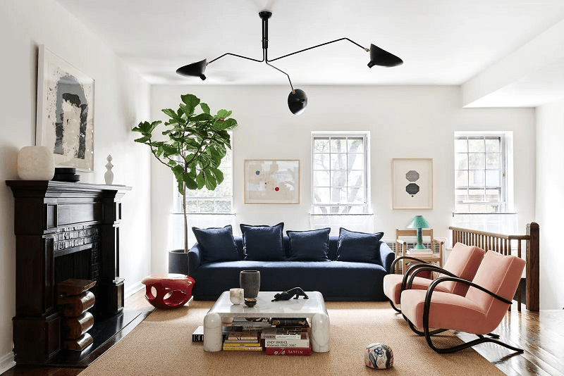
II. The Psychology of Expensive-Looking Colors
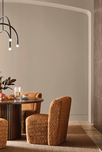
Neutral and sophisticated color palettes create an immediate impression of luxury and intentional design. Most luxury houses, apartments, or hotels tend to have a neutral color palette, with options like white, beige, or taupe creating a sleek, expensive look.
Colors That Signal Luxury
Classic expensive-looking colors include:
- Warm whites and off-whites: Benjamin Moore Cloud White, Sherwin Williams Alabaster
- Sophisticated grays: Farrow & Ball Elephant’s Breath, Benjamin Moore Revere Pewter
- Rich, deep jewel tones: Rich jewel tones with heavy and deep pigments ooze richness without spending a fortune
- Timeless navy and charcoal: Create dramatic sophistication
- Warm taupe and mushroom: Provide elegant neutrality
Color Temperature and Lighting Considerations
Understanding undertones prevents costly color mistakes:
- Cool undertones work best with north-facing rooms and LED lighting
- Warm undertones complement south-facing spaces and incandescent bulbs
- Neutral undertones provide versatility across different lighting conditions
- Sample testing in various light conditions reveals true color appearance
Trending Post: Secrets to Mixing Textures at Home Like an Interior Designer
15 Professional Painting Tricks for Expensive Looks
1. Master the Art of Color-Drenching

Color-drenching involves painting walls, trim, and ceiling in the same sophisticated color family to create seamless, expensive-looking continuity. This monochromatic approach eliminates visual breaks that can make spaces feel choppy and amateur.
Implementation steps:
- Choose your base color in three different sheens: flat/matte for ceilings, eggshell for walls, semi-gloss for trim
- Use slightly lighter tints of the same color family rather than stark white for ceilings
- Paint window frames, baseboards, and door trim in the same color family but higher sheen
- Consider using the same color in different intensities (50%, 75%, 100% saturation)
💡 Pro Tip: Before committing to this painting trick and trying color-drenching an entire room, test your color family on a single wall section including a piece of trim. View it for 48 hours in different lighting conditions—what looks sophisticated in daylight might feel overwhelming under evening artificial lighting. This $30 test can save you from a $300 mistake.
2. Paint Your Trim and Doors in Bold, Contrasting Colors
High-contrast trim creates architectural interest and draws attention to quality craftsmanship details. Painting doors a different color instead of standard, basic white can make a front porch look expensive.
Expert color combinations:
- Charcoal gray walls with crisp white trim – timeless and sophisticated
- Warm white walls with black window frames – modern farmhouse luxury
- Navy walls with brass-toned cream trim – rich and traditional
- Sage green walls with deep forest trim – nature-inspired elegance
💡 Pro Tip: Use a small artist’s brush to paint the inside corners where trim meets walls first, then use your larger brush to fill in the flat surfaces. This “cutting behind” technique ensures complete coverage in tight spaces and eliminates the visible gap that screams amateur work. Professional painters call this “back-cutting.”
3. Use Premium Paint Finishes Strategically

Different sheen levels create visual hierarchy and professional polish. Each surface should have the appropriate finish based on function and desired appearance:
Finish selection guide:
- Flat/Matte (0-5% sheen): Ceilings, low-traffic accent walls, hiding surface imperfections
- Eggshell (10-25% sheen): Living rooms, bedrooms, dining rooms – subtle sophistication
- Satin (25-35% sheen): Hallways, children’s rooms, moderate durability needs
- Semi-gloss (35-70% sheen): Trim, doors, kitchen cabinets – easy cleaning and durability
- High-gloss (70-85% sheen): Front doors, furniture, dramatic accent pieces
💡 Pro Tip: To use this painting trick, first create a “sheen map” before starting your project by painting sample strips of each finish you plan to use on poster board. Label each strip and view them together under your room’s lighting. This prevents the costly mistake of accidentally using satin where you meant semi-gloss, which would require complete repainting to fix.
4. Create Architectural Interest with Painted Wainscoting

Painted wainscoting adds instant architectural sophistication and visual weight to any room. This technique works especially well in dining rooms, hallways, and bedrooms.
DIY wainscoting painting method:
- Install board and batten or purchase pre-made wainscoting panels
- Paint the lower portion in a darker, richer color than the upper walls
- Use chair rail molding as the dividing line
- Paint all trim elements (baseboards, chair rail, crown molding) in coordinating colors
- Consider classic combinations: navy bottom with cream top, charcoal bottom with white top
💡 Pro Tip: Measure your chair rail height at 32-36 inches from the floor, but adjust based on your ceiling height using the “golden ratio.” Multiply your ceiling height by 0.618 to find the optimal chair rail placement. For 9-foot ceilings, this puts the rail at 67 inches (5’7″), creating more dramatic proportions than the standard 36-inch height.
5. Paint Kitchen Cabinets for Maximum Impact
Cabinet painting delivers the highest visual transformation per dollar spent in kitchens. Professional cabinet painting can make a dated kitchen look completely renovated.
Cabinet color trends that add value:
- Classic white: Timeless and increases perceived space
- Navy blue: Buyers will pay an average of $1,597 more for a home with a kitchen in verdant hues
- Forest green: Rich and sophisticated, trending upward
- Charcoal gray: Modern and hides wear better than white
- Two-tone combinations: Upper cabinets in lighter colors, lower cabinets in darker tones
💡 Pro Tip: Remove cabinet doors and paint them flat on sawhorses using a foam roller designed for smooth finishes. This eliminates drip marks and brush strokes that occur when painting doors in vertical position. Number each door and its corresponding hinge location with painter’s tape before removal—this simple step saves hours during reinstallation.
6. Master Professional Cutting-In Techniques

Clean, precise lines where paint colors meet separate amateur from professional work. Perfect cut-in lines require proper tools and technique:
Professional cutting-in method:
- Use high-quality angled brushes (2-2.5 inches for most applications)
- Load brush properly: dip 1/3 of bristle length, tap excess on container rim
- Start cuts 1/4 inch from edge, gradually work closer to create straight line
- Maintain wet edge and work in small sections to avoid lap marks
- Use painter’s tape only for complex cuts; freehand for standard wall-to-ceiling lines
💡 Pro Tip: Practice your cutting-in technique on cardboard before touching your walls. Draw lines with a ruler and practice painting straight lines along them. Most DIYers fail at cutting-in because they haven’t developed the muscle memory—15 minutes of practice can mean the difference between professional and amateur-looking results.
7. Apply Paint in Optimal Lighting Conditions

Proper lighting during application ensures consistent coverage and professional results. Most paint defects become apparent only under specific lighting conditions.
Lighting requirements for quality application:
- Natural light: Paint during daylight hours when possible, avoid direct harsh sunlight
- Artificial lighting: Use bright, even LED work lights to illuminate entire work surface
- Cross-lighting: Position lights to eliminate shadows and reveal coverage gaps
- Final inspection: Check work under both natural and artificial lighting before declaring completion
💡 Pro Tip: Use a smartphone flashlight held at a shallow angle against the wall to reveal missed spots, roller stipple, and brush marks that are invisible under overhead lighting. This “raking light” technique is what professional painters use for quality control—it shows every imperfection that will become visible once furniture casts shadows on your walls.
8. Use the Box Method Painting trick for Consistent Color
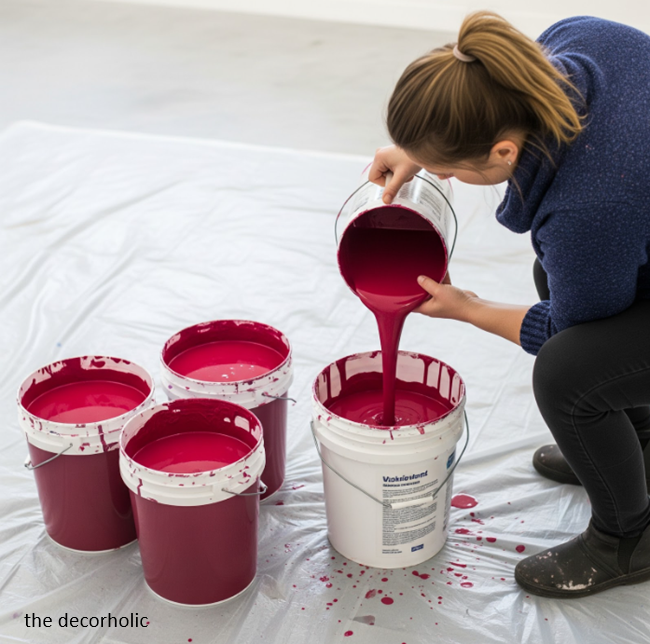
Color variations between paint cans can create noticeable patches in finished work. The box method ensures uniform color across large surfaces:
Boxing technique:
- Purchase all paint for each color at the same time
- Open all cans of the same color
- Pour all paint into a large container (5-gallon bucket)
- Mix thoroughly with paint paddle
- Pour back into manageable containers for application
- This eliminates slight color variations between manufacturing batches
💡 Pro Tip: Save one unmixed can from each color batch as your “master reference.” When you need touch-ups months later, you can color-match this unmixed paint rather than trying to match your boxed mixture. Paint stores can scan this reference can and recreate the exact color, even if the mixed paint has slightly faded or changed over time. between manufacturing batches
9. Perfect Your Primer Application
High-quality primer application determines final paint appearance and longevity. Skipping primer or using inferior products creates amateur results.
Primer selection and application:
- Bonding primer: For glossy surfaces, cabinets, and challenging materials
- Stain-blocking primer: For water stains, crayon marks, and discoloration
- Tinted primer: When making dramatic color changes, tint primer toward final color
- Application technique: Apply primer with same care as final coats, maintaining wet edges
💡 Pro Tip: Add 2 ounces of your finish paint color to each quart of white primer to create a “blocking primer.” This tinted primer reduces the number of finish coats needed and prevents the chalky appearance that can show through dark colors. This technique is especially crucial when painting over bright or bold existing colors.
10. Create Depth with Accent Walls

Strategic accent walls add visual interest and create focal points that mimic expensive architectural features. The key is selecting the right wall and color combination.
Accent wall selection rules:
- Choose the wall you see when entering the room
- Select walls with architectural features (fireplaces, built-ins, headboard walls)
- Avoid walls with multiple interruptions (windows, doors, outlets)
- Use colors 2-3 shades deeper than main wall color for subtle sophistication
- Consider textural paint techniques for added visual interest
💡 Pro Tip: Use the “one-third rule” for accent walls—the accent wall should represent approximately one-third of the visible wall space in the room. If your accent wall is too large (more than 40% of wall space), it will overwhelm the room. If it’s too small (less than 25%), it will look like a mistake rather than an intentional design choice.
11. Paint Ceilings for Added Luxury

Painted ceilings create the illusion of custom millwork and architectural sophistication. This often-overlooked surface can dramatically impact room perception.
Ceiling painting trick strategies:
- Same color as walls: Creates seamless, enveloping atmosphere
- Slightly lighter tint: Maintains color family while adding brightness
- Bold contrast: Dark ceilings in light rooms create dramatic sophistication
- Glossy finish: Reflects light and creates jewelry-box effect in small spaces
💡 Pro Tip: Paint your ceiling the same color as your walls, but use the next lighter tint from the paint company’s color strip (usually marked as 50% or 75% strength). This creates subtle depth while maintaining the color-drenched effect. Most people won’t consciously notice the difference, but they’ll sense the room feels more sophisticated and professionally designed.
12. Use Painter’s Tape Like a Professional

Proper taping technique ensures crisp lines and prevents paint bleed that ruins expensive-looking finishes.
Professional taping method:
- Use high-quality tape: 3M ScotchBlue or similar professional-grade products
- Apply to clean, dry surfaces free of dust and debris
- Press edges firmly with putty knife or burnishing tool to prevent bleed
- Remove while paint is slightly wet for cleanest lines
- Pull at 45-degree angle away from painted surface
💡 Pro Tip: After pressing down your tape edges, run a thin bead of clear caulk along the tape edge and smooth it with your finger. This creates an impermeable seal that prevents paint bleed-through, even with textured walls. Remove the tape immediately after painting while the caulk is still wet—this technique guarantees razor-sharp lines that look professionally painted.
13. Perfect Your Wall Preparation
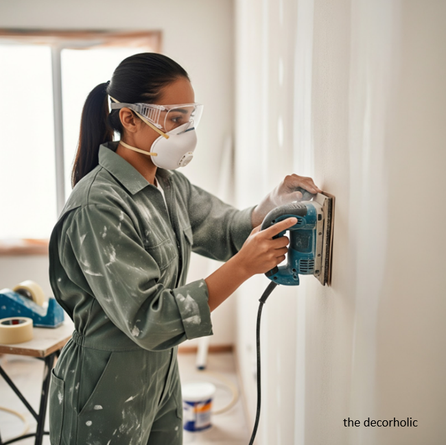
Professional-quality paint jobs start with meticulous surface preparation. This step separates expensive-looking results from amateur attempts:
Preparation checklist:
- Fill nail holes and cracks with appropriate filler
- Sand glossy surfaces for proper primer adhesion
- Clean walls with TSP or degreasing agent
- Remove loose or peeling paint completely
- Prime all repairs before applying finish coats
- Caulk gaps between trim and walls for seamless appearance
💡 Pro Tip: Use a bright LED work light positioned at a shallow angle to the wall during prep work. This “raking light” reveals every nail hole, crack, and surface imperfection that needs attention. What looks smooth under overhead lighting often shows significant flaws when lit from the side—the same way natural light will reveal these defects after painting is complete.
14. Choose Paint Colors Based on Room Function

Different room functions benefit from specific color strategies that enhance their expensive appearance:
- Living areas: Warm neutrals that photograph well and complement various lighting
- Bedrooms: Sophisticated colors that promote relaxation: soft grays, warm whites, muted blues
- Kitchens: Colors that enhance appetite and complement cabinetry: creams, soft greens, classic whites
- Bathrooms: Light blue can bring a 1.6% increase in selling price, or $5,000 on a $290,000 home
- Dining rooms: Rich, dramatic colors that create intimacy: deep blues, sophisticated grays, warm charcoals
💡 Pro Tip: Test your paint colors at different times of day and under various lighting conditions, but also consider the room’s “golden hour”—the time when the space looks most beautiful. For dining rooms, this might be evening candlelight. For kitchens, morning sunlight. Choose colors that look stunning during your room’s golden hour, as this is when the space will make its strongest impression on guests.
15. Layer Colors for Sophisticated Depth

Multi-layered color schemes create the visual complexity found in expensive, professionally designed spaces.
Layering techniques:
- 60-30-10 rule: 60% dominant color, 30% secondary color, 10% accent color
- Tonal variations: Use 3-4 shades of the same color family throughout connected spaces
- Complementary accents: Add small doses of colors opposite on the color wheel
- Metallic highlights: Incorporate painted metallic accents on trim or decorative elements
💡 Pro Tip: Create a “paint story” by using the same base color in different intensities throughout your home’s connected spaces. For example, use a warm gray at 100% strength in the dining room, 75% in the living room, and 50% in the hallway. This creates sophisticated flow and makes your home feel professionally designed, as if an interior designer planned the entire color scheme from the beginning.
Don’t Miss: Make Your space Look Expensive

Common Painting Mistakes That Scream “Amateur”
Paint Quality Compromises
Using low-quality paint creates multiple expensive-looking problems:
- Poor coverage requiring multiple coats, increasing labor costs
- Color fading within months of application
- Chalky or flat appearance that lacks sophistication
- Visible brush marks and texture inconsistencies
- Poor adhesion leading to chipping and peeling
Inadequate Surface Preparation
Rushing preparation creates lasting problems:
- Visible nail holes and cracks detract from expensive appearance
- Paint adhesion failures cause embarrassing peeling
- Uneven surfaces become more apparent with paint application
- Stain bleed-through ruins final appearance despite multiple coats
Incorrect Color Selection
Color mistakes immediately reveal amateur decision-making:
- Trend-driven choices that date quickly and look cheap
- Poor undertone selection that clashes with existing elements
- Ignoring lighting conditions resulting in unexpected color appearances
- Lack of color flow between connected spaces creates choppy, amateur feel
Trending Post: 12 Designer-Approved Hanging Chair Tips for a Stylish Space
Expert Color Combinations for Expensive Looks

Classic Sophisticated Palettes
Time-tested combinations that never look cheap:
The Timeless Neutral:
- Walls: Benjamin Moore White Dove (OC-17)
- Trim: Benjamin Moore Super White (PM-1)
- Accents: Charcoal gray or navy blue
The Modern Farmhouse:
- Walls: Sherwin Williams Accessible Beige (SW 7036)
- Trim: Pure white
- Accents: Black iron or dark bronze
The Sophisticated Gray:
- Walls: Farrow & Ball Pavilion Gray (No. 242)
- Trim: Strong White (No. 2001)
- Accents: Deep navy or forest green
Trending Color Combinations for 2025
Contemporary palettes that signal current sophistication:
The Warm Contemporary:
- Walls: Sherwin Williams Balanced Beige (SW 7037)
- Trim: Sherwin Williams Pure White (SW 7005)
- Accents: Terracotta or sage green
The Dramatic Modern:
- Walls: Benjamin Moore Hale Navy (HC-154)
- Trim: Benjamin Moore Simply White (OC-117)
- Accents: Brass or warm gold
Don’t Miss: How to Create a Soft Color Palette That Transforms Your Entire Home
Professional Application Tips and Techniques
Tool Selection for Professional Results
Quality tools create quality finishes that look expensive:
Essential professional tools:
- High-quality brushes: Purdy or Wooster angled sash brushes for cutting in
- Premium rollers: 3/8″ nap for smooth surfaces, 1/2″ for textured walls
- Professional roller frames: Sherlock or Wooster heavy-duty frames
- Extension poles: For reaching high areas without ladders
- Paint trays and liners: Proper paint loading creates even coverage
Temperature and Humidity Considerations
Environmental conditions dramatically affect paint appearance:
Optimal painting conditions:
- Temperature range: 65-75°F for water-based paints, 45-85°F for oil-based
- Humidity levels: 40-50% relative humidity prevents drying issues
- Air circulation: Gentle air movement aids proper curing without dust
- Avoid direct sunlight on wet paint to prevent lap marks and color variations
Brush and Roller Techniques
Application method determines final appearance quality:
Professional brush technique:
- Load brush properly: Dip 1/3 bristle length, remove excess on container rim
- Apply paint smoothly: Long, steady strokes in single direction
- Feather edges: Light brush strokes blend wet and dry areas seamlessly
- Maintain wet edge: Work quickly enough to blend new paint with previously applied areas
Professional roller technique:
- Load roller evenly: Roll in paint tray until nap is saturated but not dripping
- Apply in “W” pattern: Initial application spreads paint evenly across surface
- Back-roll smoothly: Even strokes in single direction eliminate stipple texture
- Overlap slightly: Each pass should overlap previous by 2-3 inches
Don’t Miss: Timeless Paint Colors That Never Go Out of Style
Budget-Friendly Ways to Achieve Expensive Paint Effects

DIY Faux Finishing Techniques
Professional-looking texture effects add visual interest without expensive materials:
Sponge Painting Technique:
- Base coat in lighter color, allow to dry completely
- Apply darker glaze with natural sea sponge in random patterns
- Blend harsh edges while glaze remains workable
- Seal with appropriate topcoat for durability
Color Washing Method:
- Apply base coat, allow to dry 24 hours
- Mix glaze with paint in 4:1 ratio
- Apply glaze with large brush in random X-patterns
- Soften with dry brush immediately after application
Strategic Use of Premium Paint
Maximize expensive paint impact through selective application:
High-impact areas for premium paint:
- Focal walls: Invest in premium paint for accent walls and main viewing areas
- Trim and doors: High-quality paint on trim provides maximum visual impact
- Kitchen cabinets: Premium paint ensures durability and professional appearance
- High-traffic areas: Invest in washable, durable finishes for longevity
Money-Saving Paint Purchasing
Professional purchasing strategies reduce costs without compromising quality:
Cost-effective paint buying:
- Buy during sales: Major retailers offer 30-40% discounts during promotional periods
- Purchase in larger quantities: Gallon containers cost less per ounce than quarts
- Choose paint and primer combinations: Single-product solutions reduce labor and material costs
- Invest in quality tools: Good brushes and rollers last for multiple projects
Trending Post: 5 Interior Decorating Basics You Must Have In Your Room
Lighting Considerations for Paint Colors
How Light Affects Color Perception
Understanding light interaction prevents expensive color mistakes and creates professional results.
Natural light changes throughout the day, affecting paint color appearance:
Morning light (east-facing rooms):
- Cool, blue-tinted light makes warm colors appear muted
- Enhances cool colors like blues and greens
- White and light colors appear crisp and clean
Afternoon light (west-facing rooms):
- Warm, golden light intensifies warm paint colors
- Can make cool colors appear muddy or gray
- Dramatic color changes throughout the day require careful selection
Northern exposure:
- Consistent, cool light throughout the day
- Blue undertones in light affect warm paint colors
- Requires warm paint colors to balance cool natural light
Southern exposure:
- Bright, warm light most of the day
- Can wash out pale colors and make bold colors appear more intense
- Most flattering light for most paint colors
Artificial Lighting Impact
Different light bulb types dramatically change paint color appearance:
LED lighting (most common):
- Cool white LEDs enhance blues and greens, mute warm colors
- Warm white LEDs complement yellows and reds, flatten cool colors
- Full-spectrum LEDs provide most accurate color rendering
Incandescent lighting (traditional):
- Warm, yellow light enhances warm paint colors
- Makes cool colors appear muddy or gray
- Creates cozy, intimate atmosphere with warm paint palettes
Testing Colors in Different Light
Professional color testing prevents expensive mistakes:
Proper testing method:
- Paint large samples (at least 2×2 feet) on different walls
- Observe samples in morning, afternoon, and evening light
- Test under artificial lighting you’ll use in the space
- Live with samples for several days before making final decisions
- Compare adjacent colors to ensure harmonious relationships
Don’t Miss: How To Mix Interior Design Styles
Room-by-Room Paint Strategy
Living Room Paint Strategies

Living rooms require versatile colors that photograph well and complement various lighting conditions.
Professional living room approach:
- Main walls: Sophisticated neutrals that work with changing natural light
- Accent wall: Behind sofa or fireplace, 2-3 shades deeper than main color
- Trim: Crisp white or matching wall color in higher sheen
- Ceiling: Same as walls or one shade lighter to maintain intimacy
Recommended living room colors:
- Benjamin Moore Revere Pewter (HC-172): Versatile warm gray
- Sherwin Williams Accessible Beige (SW 7036): Warm neutral with broad appeal
- Farrow & Ball Elephant’s Breath (No. 229): Sophisticated pink-gray
Kitchen Paint Considerations

Kitchen paint must balance aesthetic appeal with practical durability requirements.
Kitchen-specific paint requirements:
- Washable finishes: Semi-gloss or satin for easy cleaning
- Grease resistance: Quality paint prevents staining and yellowing
- Color coordination: Must complement cabinetry, countertops, and backsplash
- Lighting considerations: Under-cabinet lighting affects color perception
High-value kitchen colors:
- Classic white: Timeless and increases perceived space
- Soft gray: Modern and hides wear better than pure white
- Sage green: Verdant kitchen hues can increase buyer willingness to pay $1,597 more
- Navy blue: Rich and sophisticated, pairs well with brass hardware
Bedroom Paint Psychology

Bedroom colors should promote relaxation while maintaining sophisticated appearance.
Bedroom color psychology:
- Cool blues and greens: Naturally calming and promote better sleep
- Warm grays: Sophisticated and versatile with various decor styles
- Soft lavenders: Romantic and relaxing without being overly feminine
- Warm whites: Clean and serene while maintaining coziness
Professional bedroom painting tips:
- Avoid bright, stimulating colors that can interfere with sleep
- Consider the headboard wall as a natural accent wall location
- Use matte or eggshell finishes to create a softer, more intimate feel
- Coordinate with bedding and window treatments for cohesive design
Bathroom Paint Solutions

Bathroom paint must withstand high humidity while creating spa-like sophistication.
Bathroom-specific requirements:
- Moisture resistance: Semi-gloss or satin finishes prevent mold and mildew
- Easy cleaning: High-quality paint resists soap scum and water spots
- Ventilation considerations: Proper ventilation prevents paint failure
- Small space color strategy: Light colors expand perceived space
Bathroom color recommendations:
- Light blue: Can bring a 1.6% increase in selling price
- Soft gray: Sophisticated and spa-like
- Warm white: Clean and timeless
- Sage green: Naturally calming and on-trend
Don’t Miss: How to Layer a Rug: A Complete Room-by-Room Guide
Maintenance and Longevity
Protecting Your Investment
Proper maintenance preserves expensive-looking paint finishes and extends their lifespan.
Professional maintenance schedule:
Monthly:
- Dust painted surfaces with microfiber cloth or vacuum brush attachment
- Clean fingerprints and smudges immediately with damp cloth
- Check for damage from furniture, pets, or normal wear
Quarterly:
- Wash painted walls in high-traffic areas with mild soap solution
- Touch up minor scuffs and scratches with matching paint
- Clean painted trim and doors thoroughly
Annually:
- Inspect all painted surfaces for wear patterns and damage
- Plan touch-up projects before small problems become large ones
- Evaluate color satisfaction and plan updates if needed
Touch-Up Techniques
Professional touch-up methods maintain expensive appearance:
Proper touch-up procedure:
- Clean area thoroughly before applying touch-up paint
- Use same paint batch if possible, or blend carefully with existing paint
- Apply thin coats building up to match surrounding finish
- Feather edges to blend seamlessly with existing paint
- Allow proper drying time between coats for best results
When to Repaint
Understanding repaint timing protects your investment and maintains expensive appearance:
Repaint indicators:
- Color fading from UV exposure or normal aging
- Wear patterns in high-traffic areas become noticeable
- Stains or damage that cannot be cleaned or touched up successfully
- Style changes or desire to update color palette
- Selling preparation to maximize home value and buyer appeal
Most Popular Post:
Interior Design Style Quiz
Timeless Paint Colors That Never Go Out of Style
Create Your Perfect Ergonomic Home Office: A Complete Guide
Must-Have Accessories for Guys: The Secret to a Stylish Space
Modular Sofas for Small Spaces: Brilliant Solutions for Compact Living
Conclusion: Transform Your Space with Professional Painting Tricks
The difference between amateur and expensive-looking paint jobs lies in understanding professional techniques, selecting appropriate materials, and executing proper application methods. Combined interior and exterior painting can reach 107% ROI, making it one of the most profitable home improvement tasks.
Key takeaways for expensive-looking paint results:
Invest in quality materials: Premium paint and proper tools create lasting, professional results that justify the investment through appearance and longevity.
Master application techniques: Proper surface preparation, cutting-in methods, and finish application separate professional results from amateur attempts.
Understand color psychology: Sophisticated color selections based on room function, lighting conditions, and current trends create timeless expensive appearance.
Pay attention to details: Clean lines, consistent coverage, and proper sheen selection demonstrate quality craftsmanship that signals expensive taste.
Ready to transform your space? Start with one room using these professional techniques, and experience how proper painting methods can create the expensive, sophisticated look you’ve been seeking. Your walls will thank you, your guests will notice, and your home’s value will reflect the quality investment you’ve made.
Share your painting transformation in the comments below, or save this guide for your next room makeover project. Which painting trick will you try first?
Painting Tricks-Frequently Asked Questions
Q: What’s the most cost-effective way to make a room look expensive with paint?
A: Focus on high-quality trim paint and professional application techniques. Painting all trim, doors, and window frames in a premium semi-gloss or satin finish creates immediate visual sophistication. This targeted approach costs less than painting entire rooms but delivers maximum visual impact.
Q: Should I hire a professional painter or do it myself?
A: DIY painting works for simple projects, but complex techniques benefit from professional expertise. Consider hiring professionals for intricate trim work, color-drenching techniques, or when working with expensive paint colors. The cost difference often justifies itself through superior results and time savings.
Q: How do I choose paint colors that won’t look dated in five years?
A: Stick with sophisticated neutrals and avoid trend-driven colors for main wall areas. Classic whites, warm grays, and timeless beiges maintain expensive appearance over time. Reserve trendy colors for easily changeable accent walls or accessories.
Q: What’s the biggest mistake people make when trying to create expensive-looking paint finishes?
A: Skipping surface preparation and using low-quality paint. No amount of technique can overcome poor preparation or inferior materials. Invest time in proper prep work and use high-quality paint for professional results.
Q: How long should I wait between paint coats for professional results?
A: Follow manufacturer recommendations, typically 2-4 hours between coats for water-based paints. Rushing between coats creates adhesion problems and visible lap marks that ruin expensive appearance. Proper drying time ensures optimal finish quality.
Q: Can I create expensive looks with budget paint if I use professional techniques?
A: Professional application improves any paint, but quality materials are essential for truly expensive appearance. Invest in premium paint for high-visibility areas and use professional techniques throughout. The combination of quality materials and proper application creates lasting, sophisticated results.
Subscribe To the Newsletter!
Subscribe now for an endless feed of inspirational women’s cave decor ideas, pampering rituals, and more tips for curating your ultimate escape. Let’s start making your cozy refuge a reality – you so deserve this!
CATCH THE LATEST IN HOME DECOR TRENDS:
Steal These 16 Expert-Approved Decorating Secrets

How To Accessorize Your Living Room
How to Make a Small Room Appear Bigger

How to Make Your Home Look Expensive
GET CAUGHT UP ON ALL THE INSPIRING DECOR TIPS:

18 Fresh Decorating Ideas To Update Your Fireplace

How to Make a Gallery Wall: The Complete Step-by-Step Guide (Even If You’ve Never Hung a Picture)
