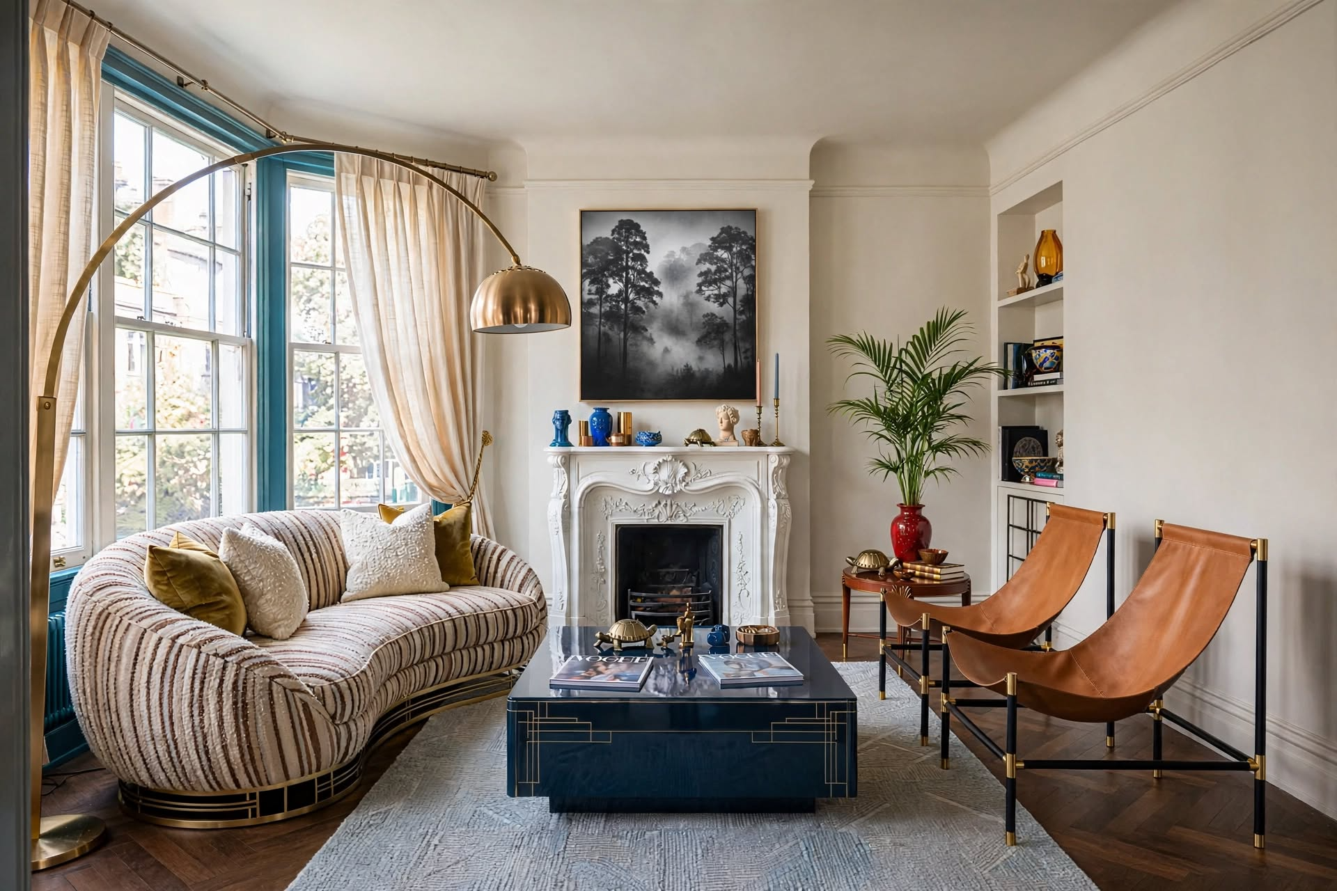
The 7 No-Fail Steps to Build a Soft Color Palette That Transforms Your Entire Home
A soft color palette uses low-saturation, muted tones to create visual harmony and emotional calm throughout your home. To build one successfully, start with a nature-inspired anchor color, map your home’s visual flow, apply the 60-30-10 rule across rooms, and use consistent undertones to prevent jarring color clashes — even when each room varies slightly in shade.
You walk into someone’s home and immediately feel it — that impossible-to-name sense of peace, like the whole space exhales. The colors aren’t loud. They don’t demand attention. They just work. That’s a well-executed soft color palette, and it’s the single most transformative design decision you can make for your home.

Here’s the frustrating reality most homeowners face: they paint each room in isolation, buy furniture they love in a vacuum, then stand back wondering why nothing flows. Reddit’s r/DesignMyRoom is full of it — “I love each piece separately but together it looks like a mess.” Sound familiar?
The problem isn’t your taste. It’s the absence of a cohesive soft color palette strategy. And that’s exactly what this guide fixes. You’ll get a step-by-step framework used by professional interior designers — not watered-down advice, but the actual decision-making process — to create a home that feels serene, intentional, and unmistakably yours.
What Is a Soft Color Palette? (And Why Every Home Needs One)
A soft color palette is a curated collection of muted, low-saturation tones that share compatible undertones — creating visual harmony and emotional calm without competing for attention. Think dusty sage rather than forest green, warm cream rather than bright white, blush rather than fuchsia. The colors whisper instead of shout.

Unlike bold, saturated palettes that make a statement, soft palettes do something harder: they make you feel something. Calm. Held. At home. That’s why they’re the consistent choice of top designers working on residential projects — not because they’re safe, but because they’re smart.
Key Characteristics of Soft Color Palettes
- Low saturation: Colors appear muted and dusty rather than vibrant or electric
- Compatible undertones: All colors share warm or cool undertone families — never both
- Natural inspiration: Morning mist, beach stones, faded botanicals, aged linen
- Subtle contrast: Gentle transitions between shades rather than jarring jumps
- Timeless quality: Won’t feel dated in five years the way trend colors do
- Texture-forward: Rely on material layering for depth rather than color drama
Soft does not mean bland. The most sophisticated interiors use subtle tonal variation — five shades of the same greige, layered with linen, oak, and stone — to create richness that loud colors can never achieve.
Popular Soft Color Palette Combinations
The Science Behind Why Soft Color Palettes Work So Well
Our brains process muted, low-contrast tones with significantly less cognitive effort than high-saturation combinations — which is why soft color palettes literally make us feel calmer just by being in the room. This isn’t interior design folklore. It’s environmental psychology.

“I tend to lean toward a natural color scheme with a focus on soft, muted tones, paired with bolder contrasts — like walnut wood or black detail — to create sharpness and depth without disrupting the calm.”
— Laetitia Laurent, Laure Nell InteriorsWhy Muted Tones Outperform Bold Ones for Everyday Living
- Reduce visual stress: Low-saturation colors don’t trigger the same alerting response as saturated hues — your nervous system stays calm
- Create perceived spaciousness: Light, muted tones reflect natural light better, making rooms feel larger and more open
- Improve sleep quality: Muted blues, greiges, and sage tones are clinically associated with deeper, longer sleep cycles
- Enhance natural light: Soft wall colors become luminous in morning light rather than overwhelming it
- Support visual flow: When colors share undertones, the eye moves through a space effortlessly rather than catching on jarring transitions
Research shows people spend 23% more time in rooms with soft, cohesive color schemes compared to high-contrast spaces. That’s not just comfort — that’s how much your palette affects where you actually want to be in your own home.
How to Choose Your Perfect Soft Color Palette
Choosing a soft color palette isn’t about picking random muted colors — it’s about identifying a color family with shared undertones, then selecting 3-5 variations in different intensities that work together as a system. Here’s the exact process designers use.

The Soft Palette Selection Process
Find Your Anchor
Choose one nature-inspired color that makes you feel calm. This becomes your palette’s emotional foundation.
Identify Undertones
Determine if your anchor leans warm (yellow/red base) or cool (blue/green base). All other colors must match.
Build 3-5 Shades
Select a light, medium, and deep version plus 1-2 complementary muted tones in the same family.
Test in Light
Place large paint samples in natural morning, afternoon, and evening light. Colors shift dramatically.
Apply 60-30-10
60% dominant (walls), 30% secondary (furniture), 10% accent (accessories). Never equal distribution.
Add One Grounding
A slightly deeper tone — dark wood, matte black, aged brass — prevents the palette from feeling washed out.
Palette Combinations That Always Work
| Palette Name | Primary Color | Secondary | Accent | Best For |
|---|---|---|---|---|
| Neutral Warmth | Warm cream / ivory | Soft taupe / mushroom | Camel or aged brass | Traditional, transitional styles |
| Coastal Calm | Cloud white | Driftwood gray / sandy beige | Dusty seafoam | Relaxed, beach-inspired rooms |
| Garden Serenity | Ivory / linen | Sage green / lavender gray | Dusty rose | Feminine, botanical, cottagecore |
| Modern Minimalist | Warm greige | Pale oak / soft charcoal | Matte black or warm white | Contemporary, Scandinavian, japandi |
| Earthy Retreat | Terracotta blush / warm sand | Warm clay / muted sienna | Olive or deep mushroom | Organic modern, wabi-sabi |
Choosing colors you love individually rather than as a family. A dusty blue and a warm blush can both be “soft,” but if one has cool undertones and the other warm, they’ll fight each other constantly — no matter how muted they are.
How to Create Whole-Home Harmony with Your Soft Color Palette
Whole-home color harmony requires mapping your home’s visual flow first, establishing a clear color hierarchy second, and only then assigning colors to rooms — not the other way around. Most homeowners do it backwards, which is why their homes feel disjointed.
 Photo: Nicole Franzen
Step 1: Map Your Home’s Visual Flow
Before touching a paint brush, walk through your home and photograph every sight line — what you see the moment you enter each room. Adjacent rooms that are visible to each other must have colors that are harmonious, not just individually pleasing.
Entry Points
Use your lightest palette shade here — it sets the emotional tone for the entire home before a single room is seen.
Main Pathways & Hallways
Consistent undertones in hallways are the connective tissue of your palette. Use your primary shade in a different finish (eggshell vs. flat) for subtle variation.
Key Sight Lines
Colors visible from each other must share undertones. A warm cream living room cannot flow into a cool gray hallway without a deliberate bridge.
Destination Rooms
Bedrooms and bathrooms can have slightly deeper or more personal variations — they’re journeys from the main palette, not departures from it.
Step 2: Establish Your Color Hierarchy
Not all colors in your soft palette should carry equal weight. Use this distribution as your non-negotiable starting point:
- Primary (60%): Your main wall color — used in 3-4 rooms minimum, including the largest spaces
- Secondary (30%): Supporting shade — appears in large furniture, area rugs, window treatments
- Accent (10%): Your visual punctuation — artwork, throw pillows, small decorative objects
- Grounding element: One slightly deeper tone (dark wood, aged metal) that prevents the palette feeling washed out
Step 3: Create Transition Zones
✓ Do This
- Use the same undertone family throughout all connected spaces
- Vary the depth of a color (lighter in hallways, slightly deeper in rooms)
- Repeat one accent color in every room to thread the palette together
- Keep ceiling colors consistent across rooms for visual unity
- Use architectural elements (molding, arches) as natural color breaks
✗ Avoid This
- Mixing warm and cool undertones in adjacent visible spaces
- Using a completely different palette per room with no bridge
- Introducing a bold, saturated color in an otherwise soft home
- Changing ceiling colors room by room — it fragments the space
- Choosing each room’s color independently from a different paint chip deck
How to Apply Your Soft Color Palette Throughout Your Home
The most common mistake in applying a soft color palette isn’t choosing the wrong colors — it’s starting with walls instead of fixed elements. Always begin with what you can’t change, then build your palette outward.
 Photo: Courtney Nye
The Foundation-First Approach
Before choosing a single paint color, photograph and assess every fixed element in your home — flooring, cabinetry, built-ins, any large furniture you’re keeping. These are your true palette anchors, and your soft color palette must work with them, not compete against them.
- Existing hardwood floors: Do they have orange/red undertones (choose warm soft palette) or gray/brown (cool palette works)?
- Kitchen cabinets: White cabinets with a yellow undertone pull toward warm creams; stark white cabinets prefer cool grays
- Large upholstered furniture: Your existing sofa color often dictates whether you go warm or cool across the whole home
- Natural light direction: North-facing rooms need warmer palette tones; south-facing can handle cooler muted shades
The 3-2-1 Application Rule
Three Main Colors
From your soft palette, used in large amounts across walls, large furniture, and flooring. These are the colors that define each room’s character.
Two Supporting Shades
Medium-volume elements like area rugs, window treatments, accent chairs, and bedding. They bridge your main colors without competing.
One Grounding Element
A slightly deeper or contrasting tone — dark wood furniture legs, matte black hardware, aged brass fixtures — that gives the eye a resting point and prevents visual blandness.
The Anchor Room Strategy
Choose one primary room — usually the living room or kitchen in open-plan homes — as your palette’s headquarters. Every other room is a variation on this room’s color story.
Interior designer Amber Lewis recommends using your darkest palette color as your “grounding element” — it appears in every room but in different ways: furniture legs here, a picture frame there, hardware in another space. This is what creates the feeling of a curated home rather than a coordinated one.
Room-by-Room: Where to Use Your Soft Color Palette
Each room has a unique role in your home’s color story — the living room sets the tone, the kitchen bridges function and beauty, the bedroom is where your palette goes its most personal, and the bathroom is where soft tones create the most dramatic transformation.
Living Room: Your Palette’s Foundation
 Photo: @mdezeiner
The living room carries the heaviest color responsibility because it’s seen first, seen most, and visible from other spaces. Use your primary soft shade on the walls, build your furniture in neutral foundations, then layer in all your palette colors through accessories — pillows, throws, artwork, plants. The living room is where your entire palette lives together.
- Walls: Primary soft shade (sage, warm greige, ivory linen)
- Sofa: Neutral foundation in cream, taupe, or soft warm gray — this is your 30% secondary color doing its job
- Accents: Introduce all palette colors in small doses through pillows, throws, and decorative objects
- Texture: Linen, jute, wool, and natural wood add depth without adding color noise
Kitchen: Where Soft Palettes Perform Best
 Photo: Emilie Munroe
The kitchen is where most soft palette plans fall apart — people choose cabinet colors they love in isolation without considering how they connect to the rest of the home. Your kitchen palette needs to bridge your living spaces while also feeling functional and energizing.
- Cabinets: Soft whites, muted sage, or warm greige — always test against your wall color first
- Countertops: Natural stone in soft, veined tones pulls everything together beautifully
- Backsplash: Subtle pattern that incorporates two or three of your palette shades
- Hardware: Brushed brass warms a cool palette; matte black grounds an all-soft palette with elegant contrast
Bedroom: Your Most Personal Palette Variation

Bedrooms allow the most personal interpretation of your soft color palette. The same family of colors applies, but you can go slightly deeper on walls, slightly softer in bedding, and more textural throughout. This is where linen, velvet, and natural wool earn their keep.
- Walls: The most muted, quietest version of your palette — what feels calm at 6am and 11pm both
- Bedding: Layer different tones and textures within your palette — linen duvet in ivory, wool throw in sage, cotton pillows in blush
- Furniture: Warm wood tones or painted pieces in soft hues; avoid cold metals in the bedroom
- Lighting: Warm-toned bulbs (2700K) enhance soft palette colors beautifully; cool daylight bulbs flatten them
Bathroom: Soft Palettes’ Most Dramatic Room
 Photo: East Living
No room transforms more dramatically with a soft color palette than the bathroom. What was a clinical white box becomes a spa-like retreat with nothing more than the right muted wall color, natural stone surfaces, and deliberately chosen accessories.
- Walls: Soft whites, pale warm gray, or muted spa blues — the powder room can handle your deepest palette shade
- Tile: Soft-toned large-format tiles in warm beige, clay, or muted slate read as luxurious rather than trendy
- Accessories: Natural materials — stone soap dish, bamboo tray, linen hand towels — complement every soft palette
- Plants: A single fern or trailing pothos adds life without disrupting your palette’s calm
The Most Common Soft Palette Mistakes (And How to Fix Them)
Even the most carefully chosen soft color palette can fail in execution. These are the four mistakes that appear most frequently in online design forums — and the exact fixes designers use to rescue them.
 Photo: Calimia Home
- Mistake 1 — Everything the Same Shade: Soft doesn’t mean monotonous. Variation in tone depth (light to medium to slightly deeper) is what creates the visual interest that prevents a room from feeling like a waiting room. Fix: add at least three distinct tonal levels.
- Mistake 2 — Ignoring Undertones: That “neutral” beige might have pink undertones that clash with your cool gray sofa. Test every color against your fixed elements in natural light before committing. Fix: hold paint chips against your fixed elements for 10 minutes before purchasing.
- Mistake 3 — No Contrast at All: Soft palettes need grounding. Without a darker element — dark wood furniture, matte black frames, aged brass fixtures — everything floats without weight. Fix: introduce one dark element per room, even if small.
- Mistake 4 — Ignoring Light Direction: A soft sage that looks perfect in a south-facing room will look muddy and dull in a north-facing space. Fix: compensate with warm artificial lighting (2700-3000K bulbs) and strategic mirror placement to bounce light.
Use 80% soft, muted tones throughout your home and reserve 20% for slightly deeper elements that provide visual anchoring. This ratio prevents the two most common soft palette complaints: “it looks washed out” and “it feels too flat.”
The Best Pieces to Anchor Your Soft Palette
The biggest challenge in building a soft color palette isn’t choosing colors — it’s finding furniture and textiles that honor them. You need pieces in quiet, versatile shades that let your palette do the work. Here are two hand-picked favorites:


Wimberly 80.5″ Farmhouse Slipcovered Sofa
A beautifully proportioned farmhouse silhouette in a warm, washable slipcover — the perfect anchor for any soft neutral palette. The removable cover means you can refresh your look seasonally without replacing the whole piece.
✦ Ships in the neutral linen tone that works across warm cream, sage, and greige palettes
Shop on Wayfair →
Pack of 2 Genuine Cowhide Leather Cushion Covers
Textural, tactile, and instantly grounding — these genuine cowhide pillow covers add the natural contrast that keeps soft palettes from feeling flat. The organic patterning means no two are identical, exactly how nature intended.
✦ The perfect “one dark element per room” rule in pillow form — adds weight without adding color noise
Shop on Amazon →Keeping Your Soft Palette Fresh Through Every Season
One of the underrated advantages of a soft color palette is its seasonal adaptability. Because the base is quiet, you can shift the emotional tone of your home dramatically with small accessory changes — without painting a single wall.
 Photo: Jessica Nelson Design
| Season | Color Shift | Textile Move | Natural Element |
|---|---|---|---|
| Spring | Add dusty blush and pale sage accents | Switch to lightweight linen throws | Fresh branches, soft botanicals |
| Summer | Pull toward whites and lighter palette tones | Sheer curtains, cotton slipcovers | Sea glass, driftwood, shells |
| Fall | Warm undertones forward — amber, deep mushroom | Cashmere throws, wool accent pillows | Dried botanicals, pinecones, branches |
| Winter | Layer your deepest palette tones for cocooning | Velvet, boucle, heavy knit textures | Evergreen sprigs, warm candlelight |
Keep a “palette box” — a small container with your paint swatches, fabric samples, and photos of key rooms. Every seasonal shopping trip starts with this box in hand, not with browsing online without reference. It prevents the #1 seasonal decorating mistake: impulse buying that looks beautiful in the store but fights with your established palette at home.
Shopping Tips: Finding the Right Pieces for Your Soft Palette
The single most expensive soft-palette mistake people make is shopping before the palette is finalized. Every piece you buy without a confirmed palette reference is a gamble — and an expensive one. Here’s how designers shop with intention, plus our curated picks that work beautifully in any soft color palette.
Furniture Shopping Strategy
- Start with the largest pieces first: Sofas, beds, dining tables — these carry the most visual weight and are the hardest to return. Get these right in your soft palette before buying anything else.
- Choose natural materials: Linen, cotton, wool, solid oak, and cane read as “soft palette” inherently — they add texture without adding color noise.
- Avoid overly trendy silhouettes: The palette may be timeless but the furniture shape can date it. Stick to clean, classic forms that work in multiple style contexts.
- Consider slipcovers strategically: A neutral-base sofa with swappable slipcover keeps your grounding element constant while allowing seasonal palette shifts through cover changes.
- Bring physical swatches: Never shop from memory or phone screen. Bring actual paint chips and fabric samples to every furniture showroom.
Accessory Guidelines
- Textiles first: Pillows, throws, curtains, and rugs are your most powerful palette tools — they’re inexpensive relative to their visual impact and easy to change.
- Art within the palette: Choose artwork that incorporates your palette colors without being literal. Abstract pieces in soft tones add sophistication; overly obvious color-matched art looks staged.
- Greenery as a soft-palette tool: Plants are the one element that complements every soft color palette without needing to “match.” They add life, oxygen, and a connection to the natural inspiration that grounds most soft palettes.
- Metals with intention: Brushed brass and bronze warm up cool soft palettes; matte black and polished nickel work beautifully in warm-neutral palettes. Avoid mixing metal finishes in the same room.
Create a digital mood board and a physical swatch board before shopping. The digital version is great for planning; the physical one — with actual paint chips, fabric swatches, and material samples — is what you bring to every store. Screens lie about color. Swatches don’t.
Shop the Look: Soft Palette Essentials
Every piece below was selected because it works across multiple soft palette directions — warm cream, sage, dusty blush, and greige — without locking you into one specific look.




Why You Can Trust This Soft Color Palette Advice
This guide is built on years of hands-on interior design work — helping real homeowners move from color confusion to cohesive, calm homes they actually love living in. Every framework here has been tested in real spaces with real lighting conditions, real existing furniture, and real budget constraints.

The soft color palette strategies in this post come from a combination of formal color theory training, ongoing industry education, and direct collaboration with professional designers. The mistakes section, in particular, was built from the most frequently asked questions across design forums, Reddit threads, and client consultations — because knowing what breaks a palette is just as important as knowing how to build one.
“Color is 90% about undertones and 10% about the color itself. Most homeowners focus entirely on the hue and wonder why nothing feels cohesive. The moment they start thinking about undertone families instead of individual colors, everything changes.”
— Interior Design Principle, Color Theory TrainingIf you want to go deeper — into specific paint color recommendations, room-by-room color formulas, or designer-approved color combinations by style — the resources linked throughout this guide are your next step. And if you’re still not sure where your own aesthetic sits, the Interior Design Style Quiz is the fastest way to get clarity before you buy a single paint chip.
Most Popular Posts
- 01 Interior Design Style Quiz
- 02 Timeless Paint Colors That Never Go Out of Style
- 03 Create Your Perfect Ergonomic Home Office: A Complete Guide
- 04 Must-Have Accessories for Guys: The Secret to a Stylish Space
- 05 Modular Sofas for Small Spaces: Brilliant Solutions for Compact Living
- 06 Bathroom Peel and Stick Wallpaper Ideas: 7 Designer Tricks That Look High-End
Your Soft Color Palette Journey Starts Now
A soft color palette isn’t a design trend — it’s a design principle. It’s the reason certain homes feel instantly calm the moment you walk in, and why they still feel that way five years later when everything trendy has aged out. You’ve now got the full framework: how to choose compatible colors, how to map them across rooms, how to avoid the undertone traps that sink most DIY palette projects, and how to keep them fresh season after season.
Here’s what to do next: take one room — your living room is ideal — and test three paint samples on 12×12 inch boards. View them in morning light, afternoon light, and lamplight. Notice how they shift. That single exercise will teach you more about your palette than any mood board you’ll ever make.
Your home’s transformation doesn’t require a renovation. It requires one intentional soft color palette decision — and the confidence to commit to it. Start there.
“Your room can feel completely different with one intentional color decision — choose the palette that creates the mood you actually want to live in.”
Discover Your Design Style →⚠️ Affiliate Disclosure: This post may contain affiliate links. If you purchase through them, I earn a small commission at no extra cost to you. I only recommend products I genuinely love.
FAQFrequently Asked Questions About Soft Color Palettes
- → How to Hire an Interior Designer
- → 15 Best Interior Design Rules For Decorating Your Home
- → 31 Most Important Popular Interior Design Styles
- → How To Make An Interior Design Mood Board: Step-By-Step Guide
- → How To Mix Interior Design Styles
- → The Interior Design Rule of Thirds
- → Modern Organic Interior Design: The Ultimate 2026 Guide
- → 15 Professional Decor Styling Tricks to Transform Your Home Like an Interior Designer
- → The 15 Golden Rules of Interior Design for a Stunning Home
- → Secrets to Mixing Textures at Home Like an Interior Designer
- → Interior Design Style Quiz
- → Interior Design Photography Hack: Make Your Home Look Better in Photos
CATCH THE LATEST IN HOME DECOR TRENDS:

Steal These 16 Expert-Approved Decorating Secrets

Accessorize a Small Living Room: 7 Genius Styling Secrets

How to Make a Small Room Appear Bigger

How to Make Your Home Look Expensive
GET CAUGHT UP ON ALL THE INSPIRING DECOR TIPS:

Best Fireplace Makeover Ideas

How to Make a Gallery Wall: The Complete Step-by-Step Guide (Even If You’ve Never Hung a Picture)