TL;DR Section: Design magazines deliberately avoid featuring the most practical, long-lasting wall color because it doesn’t photograph dramatically. This industry bias has left homeowners confused about beige wall paint color—the chameleon neutral that adapts to any light, any style, and any decade without ever looking dated.
Introduction: The Color They Don’t Want You to Notice
Here’s something that will change how you see design magazines forever: flip through any interior design publication from the past five years. Notice what’s on the covers? Moody charcoals. Jewel-toned emeralds. Crisp, clinical whites. Dramatic navies that scream “photographer was here.”
Now notice what you’ll never see.

You’re being sold excitement and newness because that’s what moves magazines off shelves. But there’s a color that professional designers reach for in over 60% of their residential projects—a color that appears in million-dollar homes, award-winning interiors, and spaces that somehow never look dated. Yet it’s treated like the industry’s embarrassing secret, too “ordinary” for the spotlight.
Why? Because it doesn’t photograph with the punch editors need. Or it’s not trendy enough to build a “2026 Color of the Year” campaign around. Because teaching you about this color doesn’t require you to hire a designer to “get it right.”
You’ve been conditioned to believe that sophisticated design requires bold choices and on-trend risks. Meanwhile, the most versatile, forgiving, and timeless wall color sits in the shadows—dismissed, underestimated, and working flawlessly in homes you actually want to live in.
Today, we’re pulling back the curtain.
I: The Industry’s Dirty Secret: Why Designers Keep This Color Off the Cover
The design industry has built a $20 billion empire on making you doubt the simplest, most effective choices—and it starts with what lands on magazine covers.
Let’s talk about the economics of aspiration. Design publications don’t survive by showing you what works—they survive by showing you what sells. A cover needs to stop your thumb mid-scroll, make you gasp, make you feel like your own home is inadequate. Dramatic colors photograph with contrast. They create “before and after” moments. They generate clicks.
But here’s the truth no editor will tell you: those cover-worthy rooms are often styled specifically for the camera, not for living. That moody charcoal library? Gorgeous in a photograph. Oppressive after 6 PM when you’re trying to unwind. That millennial pink bedroom? Instagram gold in 2019. Cringe-inducing by 2021.
Interior designers—the ones actually working in homes, not just staging for photoshoots—have a dirty little secret. When clients hire them for timeless, livable spaces (not trend experiments), they return to the same foundational palette again and again. It’s the color that:
- Works in north-facing rooms and south-facing rooms
- Looks current whether it’s 2015, 2025, or 2035
- Allows furniture and art to be the stars
- Forgives imperfect lighting and DIY paint jobs
- Increases perceived home value without screaming “I’m trying too hard”
This color exists in the background of million-dollar listings. It’s in the Architectural Digest homes you covet—you just don’t notice it because it’s doing its job perfectly.
The industry keeps it off the cover because boring doesn’t sell magazines. But “boring” isn’t the same as basic—it’s strategic invisibility.
💡 Pro Tip: Next time you tour a high-end model home or luxury Airbnb, check the wall color. Nine times out of ten, it’s a sophisticated neutral doing the heavy lifting while the styled furniture gets the credit.
You’ll Also Like: 15 Best Interior Design Rules For Decorating Your Home
II: The Big Reveal: The One Color That Bends to Light, Not Trends
The chameleon of wall colors isn’t white, gray, or greige—it’s a properly chosen beige wall paint color, and it’s the most underestimated tool in residential design.
There. I said it. Beige.
I can feel you recoiling. You’re thinking “builder grade.” Or “1990s apartment complex.” You’re thinking “giving up.” But that reaction? That’s exactly what the design industry has trained you to feel. They’ve conflated “beige” with “boring” because they need you to believe that sophistication requires risk, trend-awareness, and—conveniently—a designer to guide you.
Here’s what they’re not telling you: beige wall paint color is not a single color. It’s a family of hundreds of complex neutrals that behave like optical shapeshifters.
Unlike stark white (which can feel sterile and expose every imperfection) or gray (which reads cold in north-facing rooms and changes dramatically with different lightbulbs), a well-chosen beige wall paint color has undertones that allow it to adapt. It contains microscopic amounts of pink, yellow, gray, or green that respond to your specific lighting conditions.
In a south-facing room flooded with warm afternoon light, that same beige reads slightly cooler, preventing the space from feeling too yellow. In a north-facing room with blue-toned light, the warm undertones activate, adding coziness. At night under artificial lighting, it creates a soft, enveloping backdrop that makes spaces feel larger and more expensive.
This is why beige wall paint color is the professional’s secret weapon. It’s not about playing it safe—it’s about playing it smart.
Why Beige Wall Paint Color Outperforms Trendy Neutrals
The modern “greige” movement tried to improve on beige by adding gray for a more contemporary feel. But greiges are notoriously finicky—they can skew purple, green, or flat-out gray depending on your home’s lighting. They’re trend-responsive neutrals, which means they’ll eventually look dated.
True beige wall paint color—the warm, slightly creamy neutrals with balanced undertones—transcends trends because it mimics natural materials humans have been drawn to for millennia: limestone, sand, linen, parchment, unbleached wool. These aren’t trendy colors. They’re elemental.
Your great-grandmother’s home likely had beige walls. So did the homes in 1960s California modernism. So do today’s $5 million Parisian apartments. The specific shade evolves slightly, but the family remains constant.
💡 Pro Tip: When testing beige wall paint color samples, view them at three different times: morning, mid-afternoon, and evening with your artificial lights on. A true chameleon beige will feel cohesive across all three, not fight against them.
In Case You Missed It: Bold Wall Art: The Complete Guide to Transforming Your Space with Statement Pieces
III: The Science Behind the Shapeshifter: Understanding Undertones and LRV

Beige wall paint color succeeds where other neutrals fail because of two technical factors most DIYers never learn: undertones and Light Reflectance Value (LRV).
Let’s demystify why some beiges feel like a warm hug while others look like sad oatmeal.
Undertones: The Invisible Architecture of Color
Every beige wall paint color contains trace amounts of other pigments that create its undertone. This is why two colors that look “close enough” on the paint chip can read completely differently on your wall. The most common undertones in beige are:
- Yellow/Gold Undertones: Warm, cozy, traditional. Best in rooms with limited natural light or north-facing exposure.
- Pink/Red Undertones: Soft, sophisticated, slightly feminine. Works beautifully in bedrooms and bathrooms.
- Gray Undertones (Greige): Contemporary, cooler, more modern. Can read flat or cold in the wrong light.
- Green Undertones: Earthy, organic, surprisingly versatile. Often the secret sauce in the most sophisticated beiges.
The key is matching your undertone to your lighting. South-facing rooms get warm, yellow-toned sunlight, so a beige wall paint color with pink or gray undertones will balance that warmth. North-facing rooms get cool, blue-toned light, so you want yellow or green undertones to add warmth back.
Light Reflectance Value: The Number That Changes Everything
LRV measures how much light a color reflects on a scale of 0 (pure black) to 100 (pure white). Most successful beige wall paint colors fall between 50-65 LRV. This range is critical because:
- Below 50 LRV: The color starts feeling heavy, cave-like, and can make small rooms shrink.
- Above 70 LRV: You’re moving into off-white territory, which loses the warmth and adaptability that makes beige special.
- 50-65 LRV (The Sweet Spot): Enough reflectivity to keep spaces feeling open and bright, with enough depth to hide imperfections and create dimension.
This is why professional designers can confidently specify a beige wall paint color for an entire open-concept home—it has enough light reflection to work with the ceiling and trim, but enough depth to define spaces.
You can find the LRV of any paint color on the manufacturer’s website or by asking in-store. This single number will tell you more about how a color will perform than any paint chip.
[IMAGE SUGGESTION: Infographic showing a visual LRV scale from 0-100, with the ideal beige range (50-65) highlighted, and examples of colors at different LRV levels. ALT TEXT: Light Reflectance Value scale showing optimal LRV range 50-65 for beige wall paint color with visual examples]
💡 Pro Tip: If you have dark hardwood floors or heavy furniture, choose a beige wall paint color on the higher end of the LRV range (60-65) to prevent the room from feeling too heavy overall.
You’ll Also Like: Calming Paint Colors: The Complete Guide to Creating Your Serene Home Sanctuary
IV: Beige Wall Paint Color vs. Other Neutrals: The Honest Comparison

| Factor | Beige Wall Paint Color | Gray | White/Off-White | Greige |
| Warmth | Naturally warm and inviting | Can read cold and institutional | Sterile without careful styling | Varies wildly by undertone |
| Trend Longevity | Timeless (decades of relevance) | Peak trend was 2010-2020 | Always relevant but stark | Trend-dependent (currently fading) |
| Lighting Adaptability | Excellent (warms or cools as needed) | Poor in north-facing rooms | Shows every color cast | Unpredictable (can shift colors) |
| Resale Value Impact | High (appeals to broadest audience) | Moderate (can feel dated) | High but less cozy | Moderate (can confuse buyers) |
| Works with Wood Tones | Yes (all wood tones) | No (fights warm woods) | Yes but creates stark contrast | Sometimes (depends on greige) |
| Forgiving for DIY | Very (hides brush strokes, patches) | Somewhat (shows imperfections) | Not at all (every flaw visible) | Not very (tricky undertones) |
| Best Room Types | Every room, especially living areas | Modern spaces, offices | Trim, ceilings, minimalist spaces | Transition spaces, hallways |
The verdict: Beige wall paint color wins on versatility, longevity, and real-world livability. Gray had its moment but dates your home. White is timeless but unforgiving. Greige tries to have it both ways and often fails at both.
You’ll Also Like: How To Mix Interior Design Styles
V: How to Choose Your Perfect Beige Wall Paint Color (Without Hiring a Designer)

The difference between “builder beige” and “sophisticated neutral” comes down to three strategic decisions you can make yourself.
Decision 1: Assess Your Natural Light
Walk through the room at different times of day. Does it get:
- Abundant warm light (south/west-facing): Choose a beige wall paint color with pink, gray, or green undertones to balance the warmth.
- Cool blue light (north/east-facing): Choose a beige with yellow or warm gold undertones to add coziness.
- Limited natural light: Go with a higher LRV (60-65) in a warm yellow-based beige.
Decision 2: Consider Your Existing Elements
Your flooring and furniture will dictate which beige works:
- Warm wood tones (oak, honey maple): Yellow or green-undertoned beige wall paint color
- Cool wood tones (gray-washed, whitewashed): Pink or gray-undertoned beige
- Dark furniture: Higher LRV beige to prevent the room from feeling heavy
- Light furniture: More flexibility—choose based on undertone preference
Decision 3: Test in Large Swatches
Forget tiny paint chips. They lie. Here’s the professional approach:
- Buy sample pots of 3-4 beige wall paint color options
- Paint 2′ x 2′ squares directly on your wall (not poster board—it needs to interact with your actual surface)
- View them for 3 full days in morning, afternoon, and evening light
- Live with them. The right beige will feel increasingly “right.” The wrong one will nag at you.
💡 Pro Tip: Take photos of your paint swatches with your phone at different times of day. Your camera will often pick up undertones your eye misses in person, helping you make a more informed choice.
Don’t Miss This Popular Post: How To Create An Art Gallery Wall
VI: The Top 5 Beige Wall Paint Colors Designers Actually Use
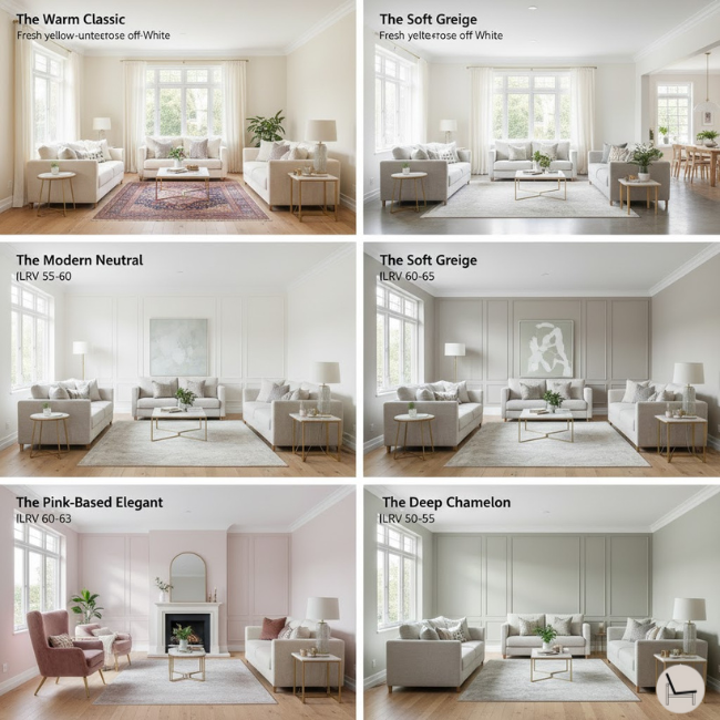
These aren’t the beiges your builder slapped on in 2005. These are the sophisticated neutrals doing the heavy lifting in award-winning interiors.
While I can’t make specific product recommendations without knowing your lighting (and I’m not getting affiliate kickbacks to push certain brands), here are the characteristics of the five beige wall paint color profiles that professionals return to repeatedly:
- The Warm Classic: LRV 58-62, yellow undertones, reads like fresh cream. Best for traditional homes and north-facing rooms.
- The Modern Neutral: LRV 55-60, green undertones, slightly earthy. Works in contemporary spaces without feeling cold.
- The Soft Greige: LRV 60-65, balanced gray and beige, the most adaptable. Good for open concepts.
- The Pink-Based Elegant: LRV 60-63, subtle pink undertones, sophisticated and soft. Perfect for bedrooms and formal spaces.
- The Deep Chameleon: LRV 50-55, complex multi-toned undertones, reads differently in every light. For confident DIYers.
When shopping, tell the paint store consultant: “I need a beige wall paint color in the [X] LRV range with [Y] undertones for a [Z]-facing room.” This language signals you’ve done your homework and will get you expert-level service.
You’ll Also Like: How To Accessorize Your Living Room

VII: Styling Your Beige Walls: Making “Boring” Look $10K
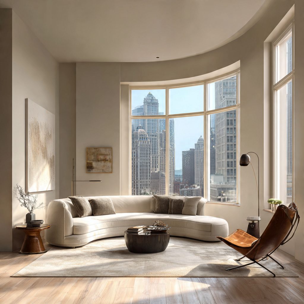
![Sophisticated beige wall paint color styled with layered textures, warm metallics, and strategic color contrast]](https://www.thedecorholic.com/wp-content/uploads/2025/05/timeless-paint-color-modern-living-room-1.png)
Beige wall paint color isn’t boring—improperly styled beige is boring. Here’s how to make it look expensive.
The reason designer-styled beige rooms look elevated while some beige rooms look sad? Layering and contrast.
Layer Textures Aggressively
Beige walls are your backdrop for a textural symphony:
- Chunky knit throws
- Linen curtains
- Leather furniture
- Woven baskets
- Natural wood accents
- Velvet pillows
Flat, beige-on-beige-on-beige is what reads as boring. Beige walls with rich, varied textures read as sophisticated neutrality.
Add Strategic Contrast
Your beige wall paint color creates a neutral canvas, but you need contrast to make it pop:
- Artwork with bold colors (the beige makes them sing)
- Black accents (light fixtures, frames, hardware)
- Deep wood tones (walnut, mahogany)
- Pops of jewel tones (emerald, sapphire, rust)
Embrace Warm Metallics
Cool metallics (chrome, brushed nickel) can fight beige. Warm metallics (brass, aged bronze, copper) amplify its sophistication. This is the fastest way to elevate beige from builder-grade to boutique-hotel.
[IMAGE SUGGESTION: A beautifully styled room with beige walls showing layered textures—linen curtains, leather chair, chunky knit throw, brass lighting, and artwork providing color contrast. ALT TEXT: Sophisticated beige wall paint color styled with layered textures, warm metallics, and strategic color contrast]
💡 Pro Tip: The 60-30-10 rule is your friend. 60% beige (walls and large furniture), 30% secondary neutral (like warm wood or cream), 10% accent color. This prevents beige overload while maintaining the calm foundation.
Most Popular Post:
Interior Design Style Quiz
Timeless Paint Colors That Never Go Out of Style
Create Your Perfect Ergonomic Home Office: A Complete Guide
Must-Have Accessories for Guys: The Secret to a Stylish Space
Modular Sofas for Small Spaces: Brilliant Solutions for Compact Living
VIII: The Bottom Line: Why the Industry’s “Dirty Secret” Is Your Design Superpower
The design industry profits from your confusion, your trend anxiety, and your fear of making the “wrong” choice. Beige wall paint color is the antidote to all three.
Here’s what we’ve uncovered:
The reason you’ll never see this color dominating magazine covers has nothing to do with its effectiveness and everything to do with publishing economics. Beige doesn’t create drama. It doesn’t generate “Color of the Year” campaigns. It doesn’t require you to hire a professional to navigate its complexity (once you understand undertones and LRV).
But beige wall paint color does something far more valuable: it creates homes that feel good to live in for years, not just for the photoshoot. It adapts to your life instead of demanding your life adapt to it. It allows your furniture, your art, your memories to be the stars while it plays the perfect supporting role.
The stakes of ignoring this? You’ll continue riding the trend roller coaster, repainting every few years, wasting thousands of dollars, and never achieving the timeless, calm foundation that makes a house feel like a home. You’ll keep chasing the rooms you see online without understanding why they work—or more importantly, why they’d never work in your real-world lighting with your real-world life.
The homeowners who get this right—who choose a sophisticated beige wall paint color with intention—stop stressing about their walls and start living in their spaces.
They’re not worried about their paint color looking dated next year. They’re not paralyzed by paint chip decisions. They’ve created a foundation that allows their homes to evolve with them, trend-proof and timeless.
Your Next Step: Break Free from Trend Tyranny
Here’s what to do right now:
- Assess your lighting (which direction do your main living spaces face?)
- Identify your undertone needs (warm light = cooler undertones, cool light = warmer undertones)
- Request paint samples with specific LRV ranges (50-65) and undertone requests
- Test for 72 hours in large swatches on your actual walls
- Commit without fear knowing you’ve made a choice that will serve you for the next decade
The design industry doesn’t want you to know how simple this can be. They profit from complexity, from trends, from your self-doubt. But you now have the framework professionals use—and that’s power they can’t take back.
Your home deserves better than trend anxiety. It deserves the quiet confidence of a color that works with you, not against you. That’s the gift of getting beige wall paint color right.
Ready to stop second-guessing your paint choices? Download our free “Undertone Decoder Worksheet” to identify your perfect beige wall paint color in under 10 minutes. [Insert opt-in CTA]
What’s your biggest fear about choosing beige for your walls? Drop it in the comments—I’m here to bust the myths.
Frequently Asked Questions About Beige Wall Paint Color
Q: Won’t beige make my home look dated or “builder grade”?
A: “Builder beige” from the 1990s-2000s was a flat, yellow-toned contractor-grade paint applied with zero thought to undertones or styling. Modern beige wall paint color is a strategic choice with complex undertones and proper LRV. The difference is intention. When you choose beige deliberately (not because it was already there), style it with texture and contrast, and select the right undertone for your light, it reads as sophisticated, not cheap.
Q: How do I know if my beige has the right undertones for my room?
A: Paint large test swatches (at least 2′ x 2′) and observe them for 72 hours in all lighting conditions. If your beige wall paint color looks peachy, muddy, or gray (and you didn’t want that), the undertone is wrong for your lighting. The right beige will feel neutral and cohesive throughout the day—never fighting your space.
Q: Can I use the same beige throughout my entire home?
A: Yes, and it’s actually a professional move. Using one beige wall paint color throughout creates flow and makes your home feel larger. Just make sure you’ve chosen a true chameleon beige (LRV 55-65 with balanced undertones) that can adapt to different lighting situations. Test it in your brightest and darkest rooms first.
Q: Is beige wall paint color still relevant in 2025 and beyond?
A: Beige has been relevant since humans started painting walls and will remain relevant for the same reason linen, wood, and stone remain relevant—it mimics the neutral tones found in nature that humans are evolutionarily drawn to. Trends come and go (remember the 2015 gray explosion?), but beige wall paint color transcends trends because it’s not trying to be trendy.
Q: What if I want something more exciting than beige?
A: Beige walls don’t mean a boring home—they mean a versatile backdrop for excitement. Save your bold colors for furniture, art, and accessories that you can change without repainting. This gives you the freedom to evolve your style without commitment. Your walls don’t have to do all the talking.
Subscribe To the Newsletter!
Subscribe now for an endless feed of inspirational women’s cave decor ideas, pampering rituals, and more tips for curating your ultimate escape. Let’s start making your cozy refuge a reality – you so deserve this!
CATCH THE LATEST IN HOME DECOR TRENDS:

Steal These 16 Expert-Approved Decorating Secrets

How To Accessorize Your Living Room

Small Space? 10 Ways To Make A Room Appear Bigger

Make Your space Look Expensive
GET CAUGHT UP ON ALL THE INSPIRING DECOR TIPS:

18 Fresh Decorating Ideas To Update Your Fireplace

How to Make a Gallery Wall: The Complete Step-by-Step Guide (Even If You’ve Never Hung a Picture)


