
The best calming paint colors for a living room fall into three families: soft sage greens (like SW Sea Salt or BM October Mist), muted blue-grays (like BM Smoke), and warm greiges (like BM Balboa Mist). The secret most guides skip? Always match your undertone to your room’s natural light direction — a cool blue in a north-facing room will feel icy, not calming. Aim for colors with an LRV between 50–70 for maximum serenity.
9 Calming Paint Colors for a Living Room That Actually Feels Like a Sanctuary
The step-by-step designer’s blueprint for choosing, testing, and committing to the perfect calming wall color — with LRV data, trim pairings, and room-by-room guidance.
By The Decorholic Editorial Team · Updated July 2025 · 18 min read

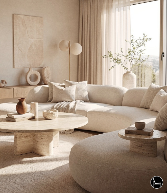
A living room designed with calming intention — soft sage walls, natural textures, and abundant light.
You finally decided to paint your living room. You spent two hours on Pinterest. You felt inspired. You picked a gorgeous sage green, ordered a gallon, and rolled it onto the walls with the enthusiasm of a home-renovation-show contestant.
Then you stepped back. And the room looked like a hospital waiting area. Or a nursery. Or a sad seafoam cave.

Here’s the truth: the gap between “calming living room on Pinterest” and “calming living room in your actual house” comes down to three things most guides completely ignore — undertone, natural light direction, and LRV (Light Reflectance Value). Without those three, you’re just guessing at a paint chip under fluorescent store lighting and hoping for the best.
This guide on how to choose calming paint colors for a living room is the antidote to that guesswork. Think of it as your designer-friend sitting beside you at the paint store, telling you exactly which swatches to grab, why they’ll work in your specific room, and what trim to pair them with — so you never waste another $70 gallon.
- The 3 Golden Rules of Calming Color (LRV, Undertone, Light)
- 9 Vetted Calming Colors Organized by Family
- Your Room’s Lighting: The Silent Deal-Breaker
- How to Test Paint Like a Designer (Not a Gambler)
- The 5 Costly Mistakes Amateurs Make
- The Designer’s Cheat Sheet (Copy-Paste Formulas)
- FAQ: Real Questions, Direct Answers
The 3 Golden Rules of Calming Paint Colors for a Living Room

Before you fall in love with a single swatch, you need a framework. These three rules are what separate a living room that accidentally feels nice from one that was designed to feel calming. Every color recommendation in this guide was chosen because it passes all three.
Rule 1: Know Your LRV Sweet Spot (50–70)
LRV (Light Reflectance Value) measures how much light a paint color bounces back into the room on a scale of 0 (pure black) to 100 (pure white). For a calming living room, the sweet spot is an LRV between 50 and 70. This range is bright enough to feel open and airy, but muted enough to wrap you in warmth.
Why it works: Colors below LRV 50 start absorbing too much light — they feel cozy but can quickly become heavy or cave-like, especially in smaller rooms. Colors above 70 edge into stark “off-white” territory and lose the grounding quality that actually makes a room feel like a retreat. The 50–70 zone creates that “just right” visual weight.
You can find any paint color’s LRV on the manufacturer’s website or by searching “[color name] LRV.” It’s the single most useful number in paint selection that almost nobody outside the design industry knows about.
Rule 2: Match the Undertone to Your Goal
Every paint color has a hidden undertone — a secondary hue lurking beneath the surface that only shows up once it’s on the wall. A “gray” might lean violet, green, or blue. A “beige” might lean pink, yellow, or taupe. The undertone determines whether your room feels warm and cozy or cold and clinical.
Why it works: Your brain reads undertones subconsciously. A blue-gray with a green undertone (like Silver Strand) reads as spa-like. That same blue-gray with a purple undertone reads as moody or melancholy. For calming spaces, lean toward green, warm gray, or soft taupe undertones. Avoid strong violet or pink undertones unless you’re very confident about your lighting.
“The undertone is the character of the color. The LRV is how loudly it speaks.”
— PROFESSIONAL COLOR CONSULTANT PRINCIPLERule 3: Your Room’s Light Direction Overrules Everything
The direction your windows face (north, south, east, west) changes how every single paint color looks — sometimes dramatically. A color that looks perfect in a south-facing showroom can turn icy and depressing in a north-facing living room. This is the #1 reason people hate their paint after it dries.
How to use it:
- North-facing rooms get cool, flat, blue-ish light. Choose colors with warm undertones (greige, warm sage, creamy white) to compensate.
- South-facing rooms get warm, golden light all day. You can use cooler blues and crisp greens without them feeling cold.
- East-facing rooms get warm morning light and cool afternoon light. Warm neutrals stay balanced here all day.
- West-facing rooms get intense golden-orange light in the afternoon. Cool blues and greens work beautifully to counterbalance.
For a deeper dive into how these design principles create harmony in any space, see our full guide to 15 Best Interior Design Rules for Decorating Your Home.
North-Facing
Cool, flat light. Colors look grayer and cooler. Warm undertones fight back.
South-Facing
Warm, golden light. Colors look truest. Cool tones stay balanced.
East-Facing
Warm AM, cool PM. Color shifts throughout the day. Warm neutrals stay stable.
West-Facing
Cool AM, golden PM. Intense sunset warmth. Cool tones counterbalance.
9 Vetted Calming Paint Colors for a Living Room, Organized by Family
Every color below has been selected because it passes all three golden rules. I’ve organized them by color family so you can scan straight to the palette that calls to you — then drill into the technical details that will help you commit with confidence.

The three calming color families: sage greens, blue-grays, and warm greiges.
Family A: Serene Sage & Earthy Greens
Green is the color your brain processes most easily — it’s the most abundant color in nature, and studies show it reduces heart rate and blood pressure. For a living room, soft sage greens strike the perfect balance between color and calm.
Sherwin-Williams Sea Salt (SW 6204)
LRV: 63 | Undertone: Green with a soft gray-blue shift | Best light: South or west-facing
The vibe: Sea Salt is a chameleon. In bright light, it reads as a soft seafoam. In low light, it pulls more gray-green. It’s one of the most universally loved calming paint colors because it never looks harsh.
Trim pairing: Sherwin-Williams Alabaster (SW 7008) — a creamy warm white that keeps the palette grounded without going too yellow.
Room-by-room: Living room all-over walls, bedroom accent wall, or a bathroom for spa energy. In the living room specifically, Sea Salt pairs beautifully with cream linen upholstery and warm wood tones.
Benjamin Moore October Mist (CC-550)
LRV: 46.54 | Undertone: Gray-green sage | Best light: South, west, or east-facing
The vibe: October Mist is a grounded, mature sage. The gray backbone keeps it from veering into “nursery green” territory. It was Benjamin Moore’s 2022 Color of the Year for good reason — it reads sophisticated in every lighting condition.
Trim pairing: Benjamin Moore White Dove (OC-17) — warm enough to complement the sage without clashing.
Design tip: October Mist sits at an LRV of 46, which is slightly below our 50–70 sweet spot. It works because the gray in its formula keeps it light-feeling even at a deeper value. But in a small, dark room, test carefully — it can read heavier than expected.
Sherwin-Williams Evergreen Fog (SW 9130)
LRV: 30 | Undertone: Green-gray with a touch of blue | Best light: South-facing or well-lit rooms
The vibe: Deeper and moodier than Sea Salt, Evergreen Fog is for the person who wants their living room to feel like a forest cabin retreat. It’s Sherwin-Williams’ 2022 Color of the Year and pairs beautifully with dark walnut wood and creamy linen textures.
Trim pairing: Sherwin-Williams Extra White (SW 7006) for crisp contrast, or SW Alabaster for a softer transition.
Caution: At LRV 30, this is a statement color. It’s calming in the right room, but it needs plenty of natural light to avoid feeling heavy. Best used as a modern organic anchor wall rather than all four walls in a small space.
Family B: Soothing Blue-Grays
Blue has long been associated with calm — think open sky, still water, quiet twilight. The trick for a living room is to pick a blue that has enough gray in it to prevent it from feeling childish or cold. These three nail that balance.

Blue-grays create instant calm — the key is choosing enough gray to ground the blue.
Benjamin Moore Smoke (2122-40)
LRV: 56.21 | Undertone: Blue with a gray anchor | Best light: Any direction (extremely versatile)
The vibe: Smoke is the living room chameleon. In daylight, it reads as a tranquil oceanic blue. Come evening, it deepens to an almost-gray that invites cozy blankets and soft lighting. Multiple designers I follow call it “the spa color.”
Trim pairing: Benjamin Moore Simply White (OC-117) — crisp enough for contrast but not stark.
Room-by-room: This is a living room superstar, but it’s equally stunning in a primary bedroom. It has enough body to use on all four walls without feeling overwhelming.
Sherwin-Williams Silver Strand (SW 7057)
LRV: 59 | Undertone: Green-gray-blue (true chameleon) | Best light: South or west-facing
The vibe: Silver Strand shifts from light gray to soft greenish-blue depending on the time of day. It’s the paint equivalent of that quiet moment right before sunset when the sky can’t decide if it’s blue, gray, or green. Homeowners describe it as “instant spa.”
Trim pairing: Sherwin-Williams Pure White (SW 7005) — clean without being cold.
Farrow & Ball Skylight (No. 205)
LRV: 65 | Undertone: Powdery pale blue | Best light: Any direction
The vibe: Skylight is a pale, powdery blue that evokes the feeling of looking up at a clear morning sky. It’s the lightest option in this family and works as a foolproof calming shade regardless of room size or light direction. If you’re nervous about committing to color, start here.
Trim pairing: Farrow & Ball All White (No. 2005) or BM Simply White for a clean frame.
Family C: Warm, Enveloping Greiges & Neutrals
Not a color person? That’s completely fine. The most calming living rooms I’ve ever walked into were wrapped in warm, complex neutrals — colors that feel like they have no color at all, but are actually doing invisible emotional heavy-lifting through subtle warmth and depth.

Greige — the designer’s secret weapon for warmth without color commitment.
Benjamin Moore Balboa Mist (OC-27)
LRV: 67.37 | Undertone: Warm gray with a whisper of violet-pink | Best light: Any direction
The vibe: Balboa Mist is the warm hug of the paint world. It sits right between gray and beige — technically a “greige” — with just enough pink-violet undertone to add instant, subtle warmth. It makes every room feel collected and intentional without demanding attention.
Trim pairing: Benjamin Moore Chantilly Lace (OC-65) — a true, clean white that gives Balboa Mist the contrast it needs to shine.
Sherwin-Williams Gossamer Veil (SW 9165)
LRV: 62 | Undertone: Gentle green (warm gray base) | Best light: Any direction
The vibe: Gossamer Veil is a warm gray-greige with gentle green undertones that actually show up. It hits LRV 62, which is right in the calming sweet spot. Color consultant Kylie M. calls this her “magic number” LRV, and it’s easy to see why.
Trim pairing: Sherwin-Williams Pure White (SW 7005) or BM White Dove for warmth-on-warmth.
Benjamin Moore Swiss Coffee (OC-45)
LRV: 81.65 | Undertone: Warm creamy yellow | Best light: North or east-facing
The vibe: Swiss Coffee is a warm, creamy white that adds just enough warmth to avoid the sterile “hospital” feel of pure whites. It earns a spot here because it’s the perfect backdrop color — the base that makes everything else in the room feel calmer by association.
Trim pairing: Benjamin Moore Simply White (OC-117) for a subtle tone-on-tone effect, or BM Chantilly Lace for crisper trim lines.
North-facing room hack: Swiss Coffee is one of the few whites that doesn’t go gray and depressing in a north-facing room. Its yellow-cream undertone fights the cool light beautifully.
Notice how every color above comes with a specific trim pairing. That’s intentional. Your next question after picking a wall color is always “what white for the trim?” — and most guides leave you hanging. For a deeper look at how to layer textures alongside these colors, that’s where your room really comes alive.
Your Room’s Lighting: The Silent Deal-Breaker
Natural light is the single biggest variable in how your paint will actually look. Two identical living rooms painted the same color can feel completely different if one faces north and the other faces south. Ignoring this is how “I love this swatch” becomes “I hate this wall.”

Same paint color, different light direction — the difference is dramatic.
The Light Direction Cheat Code
Here’s the framework professional color consultants use. Grab your phone compass right now and check which direction your living room windows face — this 30-second step will save you from a $200 mistake.
Artificial Lighting Matters Too
Your living room doesn’t exist in daylight only. Here’s what most guides miss: the color temperature of your lightbulbs changes the paint just as much as your windows after sunset.
- 2700K (warm white) bulbs: Push colors toward yellow/amber. Great with greiges and cool blues — they add warmth at night.
- 3000K (soft white) bulbs: The neutral sweet spot. Most calming palettes look their best under 3000K.
- 4000K+ (cool/daylight) bulbs: Make warm tones look washed out and cool tones look icy. Avoid these in calming living rooms.
Replace every bulb in your living room with 3000K LED bulbs before you even pick a paint color. It costs under $15 and instantly makes any calming color look better at night. For more layering strategies, see our 15 professional decor styling tricks guide.
The Frame TV Exception
Here’s a scenario that didn’t exist ten years ago: you’ve painted your walls a gorgeous calming sage, and now there’s a 65-inch Samsung Frame TV displaying art in the middle of it. How do you make it blend?
- Match the matte display: Set the Frame TV’s “art mode” brightness to 1-2 notches below default. The factory setting is too bright and creates a glowing rectangle on your calm wall.
- Frame bezel color: Choose the bezel (or aftermarket frame) that matches your trim color, not your wall color. This creates a deliberate “framed art” look instead of a “trying-to-hide-the-TV” look.
- Wall color pairing: Muted, mid-toned colors (LRV 50–65) like Smoke, Sea Salt, or Gossamer Veil make Frame TVs disappear best because they don’t create harsh contrast with the dark screen.
✗ What NOT to Do
- ✗Choose paint under fluorescent store lighting
- ✗Leave the ceiling stark white with colored walls
- ✗Paint 3 different colors in an open floor plan
- ✗Use high-gloss finish on calming living room walls
- ✗Skip testing the trim color alongside the wall color
- ✗Pick a cool blue for a north-facing room
✓ Do This Instead
- ✓Always bring large peel-and-stick samples home to test
- ✓Paint the ceiling a 50% lighter version or warm off-white
- ✓Use one base color throughout open-plan connected spaces
- ✓Use matte or eggshell finish for calming, velvety walls
- ✓Test wall color and trim color side-by-side for 3 days
- ✓Choose warm undertones (greige, warm sage) for north rooms
How to Test Paint Like a Designer
Never paint a small swatch directly onto your existing wall and call it a test. The old wall color bleeds through and skews your perception. Instead, use large, movable samples you can view in different spots and at different times of day.
The 3-Day Testing Protocol
This is the exact process I use with clients. It takes 3 days, costs under $30, and eliminates regret.
Day 1: Get Large Peel-and-Stick Samples
Order 12″×12″ peel-and-stick samples (like Samplize) for your top 3 colors. These are real paint on adhesive sheets — far more accurate than paint chips or tiny brush-ons.
Day 2: The Wall Tour
Tape each sample to at least 3 different walls in the room — the wall nearest the window, the wall opposite the window, and a wall perpendicular to both. Check each sample in the morning, afternoon, and after sunset with your lamps on.
Day 3: The Elimination Round
One sample will clearly “feel right” on Day 3. If two are still tied, place them side-by-side on the largest wall and stand at the room’s entrance — the one you see yourself living with daily wins.
Renting and your landlord won’t allow paint? Peel-and-stick paint samples can still help you choose the right accent colors for throw pillows, curtains, and rugs that match these calming palettes. You can also look into renter-friendly peel-and-stick wallpaper in these exact tones — several brands now offer matte finishes that look identical to paint.
Stuck on the broader design decisions? Our step-by-step mood board guide helps you visualize your entire color scheme before you commit to a single gallon.
The 5 Costly Mistakes Amateurs Make

These are the real-world mistakes I see in client homes over and over. Each one is easy to make and even easier to avoid once you know the pattern.
Mistake 1: Choosing Color Under Store Lighting
Paint store fluorescent lights have a color temperature around 5000K — cool, harsh, and completely unlike any room in your house. A color that looks like a soft sage under those lights might be a completely different green on your wall. The fix: Never make a final decision in-store. Always bring samples home.
Mistake 2: Ignoring the Ceiling
You paint four beautiful calming walls and leave the ceiling bright white. Suddenly the room feels like a box with a lid. The ceiling reflects white light downward, which dilutes the color on your walls and creates a visual disconnect. The fix: Paint the ceiling in a 50% lighter version of your wall color, or use a warm off-white like Swiss Coffee instead of stark white.
Mistake 3: Too Many Colors in One Open-Plan Space
In an open floor plan, painting the living room sage, the kitchen gray, and the dining room blue creates visual chaos — the exact opposite of calm. The fix: Use one base wall color throughout the open space. Add variety through accents, textiles, and furniture — not competing wall colors. For the complete philosophy, see our guide to mixing interior design styles cohesively.
Mistake 4: Forgetting the Sheen
Sheen changes how color reads. High-gloss finishes reflect more light and make colors appear lighter and more intense. For calming living rooms, matte or eggshell finishes are your best friends — they absorb light softly and create that quiet, velvety quality that defines serenity.
Mistake 5: Not Sampling Your Trim Color Too
You tested your wall color for three days and it’s perfect. Then you slap on “whatever white” from the store for trim — and the whole palette feels off. The fix: Always test your trim white at the same time as your wall color. Place the samples next to each other. The pairing matters as much as the individual choice. Every color in this guide has a recommended trim pairing for exactly this reason.
“A wall color is only as good as the trim color standing next to it.”
— DESIGNER’S RULE #1For the full list of principles that professional designers follow, explore The 15 Golden Rules of Interior Design.
The Designer’s Cheat Sheet
Copy this. Screenshot this. Pin this to your fridge. These are the hard formulas distilled from everything above — the numbers you actually need when you’re standing in the paint aisle or staring at your living room walls.
- ◆ Calming sweet spot: LRV 50–70
- ◆ Statement/moody: LRV 25–45
- ◆ Bright backdrop: LRV 70–85
- ◆ Ceiling: LRV 85+ (or 50% lighter than walls)
- ◆ North → Warm undertone (greige, warm sage)
- ◆ South → Cool is fine (blue-gray, crisp green)
- ◆ East → Warm neutrals (balanced all day)
- ◆ West → Cool tones (counter golden PM light)
- ◆ Cool walls → Crisp white trim (Simply White)
- ◆ Warm walls → Warm white trim (White Dove)
- ◆ Never pair warm walls + cool trim
- ◆ Test wall + trim side-by-side, always
- ◆ Walls: Matte or eggshell (calming = soft)
- ◆ Trim: Semi-gloss (durability + contrast)
- ◆ Ceiling: Flat/ultra-matte
- ◆ Avoid high-gloss on calming walls
- ◆ Living room: 2700K–3000K (warm/soft)
- ◆ Reading nooks: 3000K (soft white)
- ◆ Avoid 4000K+ (too clinical)
- ◆ Dimmer switches = instant mood control
- ◆ 1 base color across connected spaces
- ◆ Vary with textiles, not wall colors
- ◆ Accent wall: only in a defined room
- ◆ Flow beats variety for calm
For the complete set of spatial rules designers use, our full guide to the interior design rule of thirds pairs perfectly with these color formulas.
| Color | Brand | LRV | Undertone | Best Light | Trim Pairing |
|---|---|---|---|---|---|
| Sea Salt | SW | 63 | Green/gray-blue | South, West | SW Alabaster |
| October Mist | BM | 46 | Gray-green sage | South, West, East | BM White Dove |
| Evergreen Fog | SW | 30 | Green-gray-blue | South (well-lit) | SW Extra White |
| Smoke | BM | 56 | Blue-gray | Any direction | BM Simply White |
| Silver Strand | SW | 59 | Green-gray-blue | South, West | SW Pure White |
| Skylight | F&B | 65 | Powdery pale blue | Any direction | F&B All White |
| Balboa Mist | BM | 67 | Warm gray/violet | Any direction | BM Chantilly Lace |
| Gossamer Veil | SW | 62 | Gentle green | Any direction | SW Pure White |
| Swiss Coffee | BM | 82 | Warm creamy yellow | North, East | BM Simply White |
- 01Interior Design Style Quiz
- 02Timeless Paint Colors That Never Go Out of Style
- 03Create Your Perfect Ergonomic Home Office: A Complete Guide
- 04Must-Have Accessories for Guys: The Secret to a Stylish Space
- 05Modular Sofas for Small Spaces: Brilliant Solutions for Compact Living
- 06Bathroom Peel and Stick Wallpaper Ideas: 7 Designer Tricks That Look High-End
Frequently Asked Questions Calming paint colors for a living room
Your Calm Room Starts With One Decision
Here’s the truth about choosing calming paint colors for a living room process less scary: you don’t need to find the perfect color. You need to find a good color — one that passes the three golden rules — and then surround it with the right trim, the right lighting, and the right textures. The room does the rest.
The easiest win right now? Pick one color family from this guide that speaks to you (sage green, blue-gray, or warm greige). Order peel-and-stick samples for 2-3 colors within that family. Run the 3-day testing protocol. And commit.
The living room you actually want to sit in at the end of a long day? It’s three days of testing away.
If you want to go deeper into creating a complete calm living room — from furniture arrangement to textile layering — our full guide to the calm living room formula picks up right where this paint guide leaves off.
Ready to Transform Your Space?
Take our free quiz to discover which design style matches your personality — then apply these calming colors to a space that truly reflects you.
TAKE THE FREE STYLE QUIZ →Looking for professional guidance? How to hire an interior designer — our guide walks you through the entire process.