Most guides tell you to “choose frames you love.” That’s about as useful as “just be confident.” Here’s the actual system — from layout math to renter-friendly hanging — so your wall looks like it was designed on purpose.
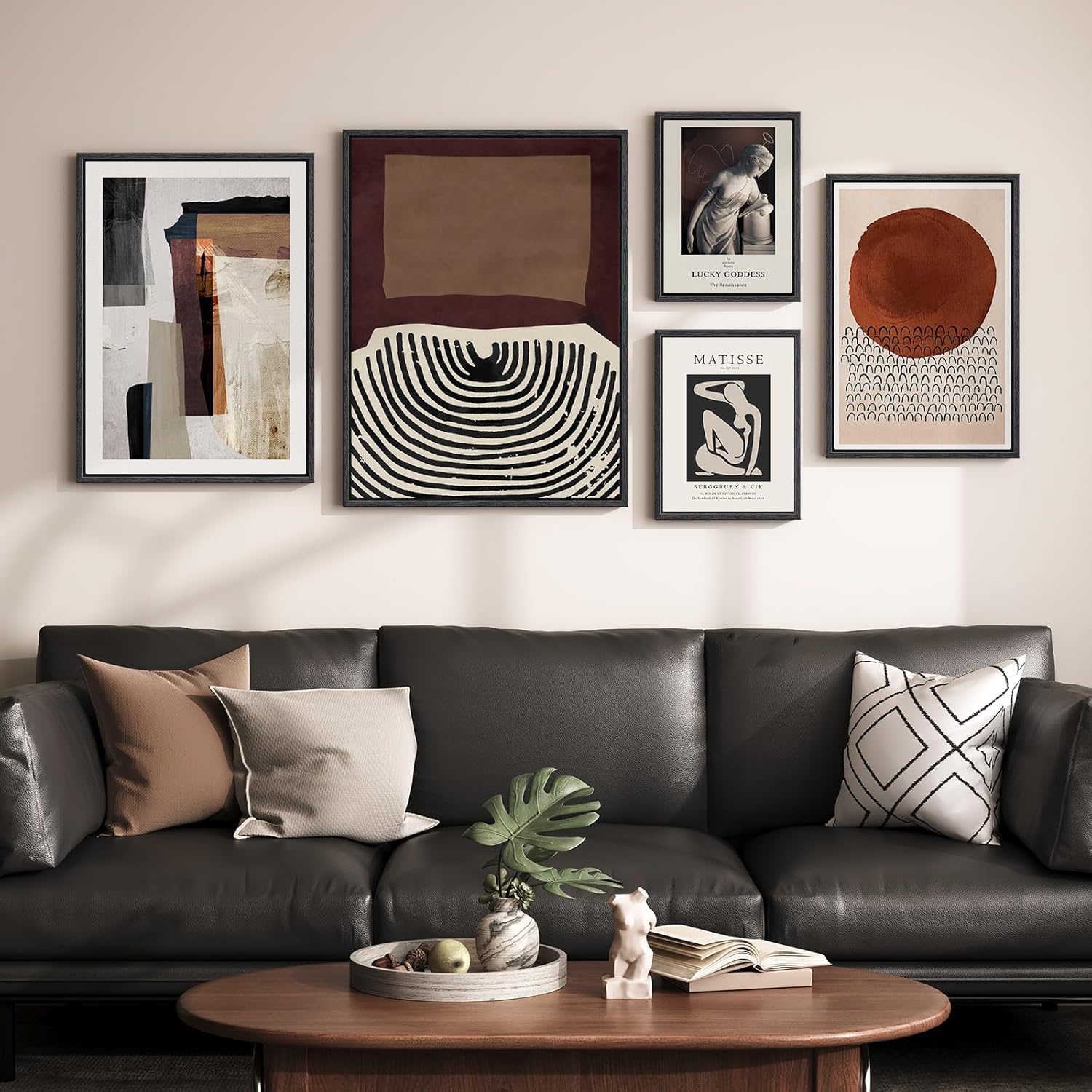
A masculine gallery wall works when you nail three things: a cohesive dark-and-neutral color palette, a deliberate layout built around the 57-inch eye-level rule, and a mix of textures — metal, matte print, raw wood — rather than matched sets. Start with a large anchor piece, build outward with 2–3-inch spacing, and keep frames within a family of two finishes max.
Masculine Gallery Wall: The Designer Blueprint No One Else Will Give You
Masculine gallery walls are everywhere on Pinterest. On actual apartment walls? They look like a different species. Crooked frames, random sizing, too much white space here and none there — and that creeping suspicion that something is just off, even after you’ve moved every piece three times.
Whether you’re building a moody bedroom focal point, a high-contrast living room wall, or a home office that looks like it belongs to someone who has their life together — this is your blueprint.
What Actually Makes a Gallery Wall Look “Masculine”?
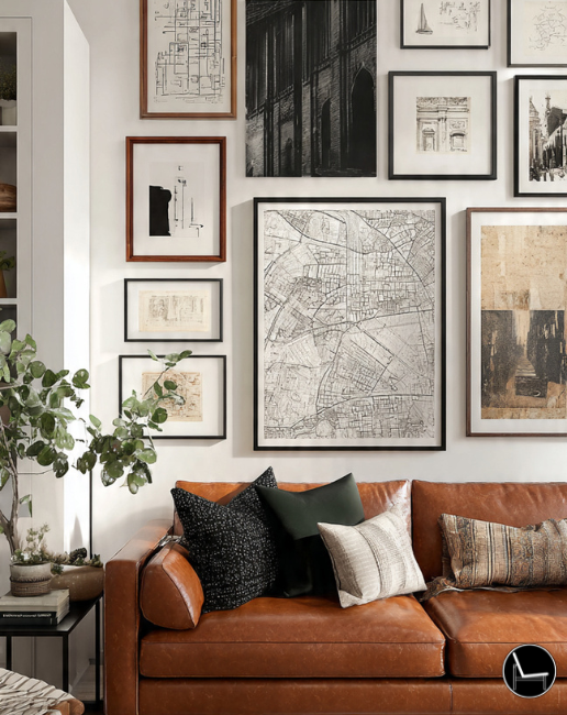
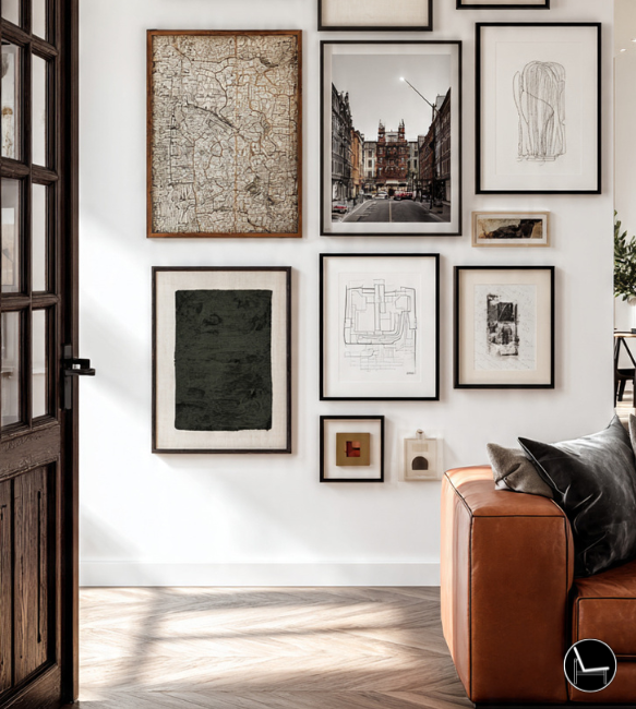
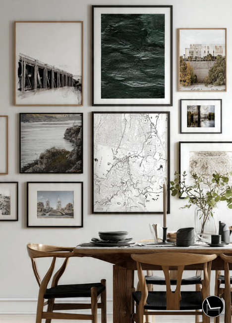
There’s no official design decree. But visually, masculine gallery walls share a specific vocabulary: low-saturation palettes (charcoal, slate, warm black, aged brass), subject matter with intentionality (architecture, abstract geometry, maps, photography, typography), and — most importantly — a restraint that says the collector knew what they were doing.
The difference between a gallery wall that reads as masculine versus one that just reads as “a lot of frames” comes down to three design principles:
- Cohesion over collection. Every piece earns its spot by connecting to at least one other piece — in color, subject, or material.
- Contrast with intention. Black and matte white. Raw wood and polished metal. Contrast makes it interesting; randomness makes it chaotic.
- Scale confidence. Small frames clustered together signal uncertainty. One large anchor piece signals commitment.
“Men tend to over-think the art and under-think the wall as a composition. Treat it like a single design object, not a collection of individual items.” — Interior Designer, New York (composite from design industry insight)
| Element | Masculine Gallery Wall | Generic Gallery Wall |
|---|---|---|
| Frame palette | ✔ Max 2 finishes (e.g. black + walnut) | ✘ Mixed metals, wood tones, white, gold |
| Color range | ✔ Tight — 3 tones max (dark, neutral, accent) | ✘ Whatever matched the room 5 years ago |
| Subject matter | ✔ Intentional theme or visual throughline | ✘ Random travel photos, quotes, printables |
| Anchor piece | ✔ One large piece (24×36″+ or similar) | ✘ All frames similar size — no visual hierarchy |
| Spacing | ✔ Consistent 2–3″ between frames | ✘ Eyeballed, inconsistent |
| Texture | ✔ Mixed — canvas, print, mirror, object | ✘ All flat prints, same profile depth |
Step-by-Step: How to Build Your Masculine Gallery Wall

This is the process designers use — and the order matters. Skip steps and you’ll end up re-hanging everything twice.
Is this a living room focal point, a bedroom headboard alternative, or a hallway statement? Function determines scale, height, and mood. A bedroom wall should feel calmer; an entryway can go bolder.
Lock in your frame finishes (max 2) and your color story for the art (max 3 tones). Black + walnut is a classic masculine combination. Gunmetal + concrete tones reads more industrial.
Start with the largest piece — ideally 24×36″ or bigger. This is your visual center of gravity. Everything else orbits it. Don’t buy supporting pieces until you have this locked in.
Lay everything on the floor or trace frames onto kraft paper and tape to the wall. The floor plan phase catches proportion errors before you make nail holes. This step alone saves 90% of the “why does it look off?” problems.
Eye level is universally agreed to be 57–60 inches from the floor. The visual center of your entire gallery arrangement — not any single piece — should hit this height. Measure it, don’t eyeball it.
Start with your largest frame. Work outward in a balanced (not necessarily symmetrical) pattern. Leave 2–3 inches between frames. Keep the outer edge of the arrangement 6–8 inches from adjacent furniture edges.
Hang everything with removable strips first. Live with it for 24 hours. The eye catches composition problems it missed in planning. Only then make it permanent.
The Designer’s Cheat Sheet: Rules That Actually Work
These aren’t design school theory — they’re the practical formulas designers use on every project. Memorize three and you’ll outperform 95% of DIY installs.
The visual center of your gallery (not the top frame) hangs at 57–60 inches from the floor. Always measure from the floor, not the ceiling.
Two inches feels tight and editorial. Three inches feels airy and relaxed. Pick one and apply it consistently across every gap in the arrangement.
Your gallery arrangement should span roughly two-thirds the width of the furniture below it — sofa, desk, bed. Wider reads chaotic; narrower reads shy.
Two frame finishes only. Black + natural wood or matte black + brushed gold. Three or more finishes dilutes the masculine, curated look.
Always one large dominant piece — at least 2× the size of supporting frames. Without hierarchy, the eye doesn’t know where to land.
Leave 8–10 inches between the bottom of your gallery and the top of any furniture below it. Less feels cramped; more feels disconnected.
Color, Mood & Texture: The Real Reason Yours Looks Different From Pinterest
This is the section most guides skip entirely — and it’s why your wall looks “a bit off” even when the layout is right. Color and texture are the emotional layer. They’re what make a gallery wall feel moody, sophisticated, and intentional rather than just organized.
🔹 The Masculine Color Formula
Masculine gallery walls succeed on low saturation and high contrast. That means your art should live in a palette of warm blacks, charcoals, raw whites, aged earths, and exactly one accent — deep blue, burnt sienna, or forest green. That one accent is a thread, not a declaration.
- Dark palette art on light walls: High contrast, dramatic, hotel-level.
- Warm neutral art on dark walls: Cozy, library-like, surprisingly masculine.
- Black-and-white photography: The most reliably masculine choice — timeless, requires zero color coordination.
🔹 Texture: The Layer Most People Skip

A flat grid of framed prints, even well-curated ones, still reads as flat. Texture is what elevates a collection into a room feature. The goal is to add dimensional variation without adding visual chaos.
- Add one non-print element: A small shelf, a sculptural wall object, a woven fiber piece, a mounted clock, or a mirror. This single addition shifts the gallery from 2D to 3D.
- Mix mat textures within frames: Linen mat vs. white mat vs. no mat (floated canvas). Visual depth without changing the palette.
- Frame depth matters: A 1.5″ deep canvas floater next to a flat ½” profile frame creates physical shadow variation — subtle but significant.
The Mirror Rule: Adding one mirror to a masculine gallery wall does two things: it bounces light into the arrangement and creates a practical anchor. Go for an industrial round mirror or a frameless rectangle — avoid ornate baroque frames entirely.
Real-Life Fixes: The Problems No One Talks About

These are the actual questions showing up in forums, Reddit threads, and DMs — the situations that generic blog posts ignore because they’re messier than “pick frames you love.”
🔹 “My gallery wall is above the TV. Is that a mistake?”
It depends on the height. If your TV is wall-mounted at correct eye level (typically 42–48 inches to the center of screen), the wall above it is often underused and awkward — usually not enough vertical space for a full gallery arrangement. Better approach: use that space for one large piece or a tight row of 3–5 small frames at equal heights. Spreading multiple frames above a TV creates visual competition with the screen itself.
🔹 “I’m a renter. I can’t make 40 nail holes.”
Command picture-hanging strips have genuinely improved — Velcro’s large ones now hold frames up to 16 lbs each. For heavier pieces, find the studs (free stud finder apps work reasonably well) and make two intentional holes rather than twenty wrong ones. Also consider a leaning gallery arrangement — a large format print leaning against the wall with smaller framed pieces in front creates depth without a single nail.
🔹 “I laid it all out and hung it — it still looks off. Why?”
This is the most common frustration. Here are the real culprits:
- The center isn’t where you think it is. If the arrangement leans left or right when you step back, it’s because you centered it on the wall rather than on the furniture below it. Center over furniture, not the room.
- The frames are too similar in size. If every frame is 8×10, you have a series, not a gallery. Add one piece that’s at least twice the area of the others.
- Too little or too much white space inside the frames. Thin mats on small art disappear. Go thicker mats or no mats on small pieces.
- The art has conflicting temperature. Cool-toned black and white photography next to warm-toned sepia prints or warm-palette illustrations creates a visual clash that’s hard to diagnose but easy to feel.
- Seven 8×10″ frames, same size
- Three different frame finishes
- Mixed warm + cool art tones
- Hung at random heights
- No clear anchor or focal piece
- Centered on blank wall, not furniture
- One 24×36″ anchor + four 5×7″ supports
- Black frames only, walnut one shelf
- All cool-tone B&W photography
- Visual center at 57″ from floor
- 2″ consistent spacing throughout
- Centered over sofa at ⅔ width
The Vibe Check: Match Your Gallery Wall to Your Personality

The same rules above apply regardless of your personal style — but the execution looks very different depending on who you are. Here’s how to translate “masculine gallery wall” into your specific aesthetic.
Grid layout. Identical frame sizes. Perfect 2″ spacing. All black frames, all B&W photography. Mathematical, architectural, clean.
Three frames max. One large, two small. Lots of negative wall space. Every piece earns its place by being exceptional, not just present.
Personal photography, maps of meaningful places, vintage prints from real travels. Mix of frame sizes and a loose salon-style hang with intentional imperfection.
Organic modern shapes, arched mirrors, textural fiber art. Warm neutrals over deep black. Following 2026’s identity decor movement — it reads personal, not Pinterest.
Visual Anti-Patterns: What Not to Do

These are the silent saboteurs. Each one is genuinely common, and each one has a simple fix.
Gallery hung too high on the wall, disconnected from furniture below. Fix: drop the arrangement until it reads as connected to the sofa, bed, or desk beneath it. 8–10″ gap maximum.
Every frame is a different color, finish, and style. Looks like decor from five different life phases. Fix: commit to one frame family. It feels restrictive and looks intentional.
Mirrored arrangements (left = right) look rigid and corporate. Fix: use asymmetrical balance — heavier visual weight on one side, balanced by negative space or a different scale on the other.
Fifteen frames crammed together with no breathing room. Feels anxious, not curated. Fix: fewer pieces with more intentional spacing. White wall space is not wasted space — it’s what makes the pieces visible.
Text-heavy art (“Hustle,” “Live Your Best Life”) as a primary piece undermines the design sophistication. Fix: if you want type, use architectural lettering, technical diagrams with text, or vintage posters — typography as design, not as affirmation.
2026 Masculine Gallery Wall Trends Worth Knowing

Design trends are most useful when they align with something you’d actually want — not as something to chase. Here’s what’s resonating in 2026 and why it works for masculine spaces specifically.
Identity Decor. Pieces that tell a specific story about the person — not generic “travel” or “adventure” aesthetics, but actual places visited, actual interests, actual cultural touchpoints. A gallery wall built on specificity always outperforms one built on vibes.
Organic Modern Masculine. Moving away from the ultra-dark, ultra-industrial look toward warm blacks, aged bronze, natural linen mats, and organic textures. Think rich, not gloomy.
Tactile Layers. Adding physical dimension to gallery walls — woven wall hangings, small shelf brackets with objects, sculptural elements. The 2D flat print wall is being replaced by arrangements that occupy real space.
The Curation Edit. Less is gaining traction over more. A wall with five exceptional pieces beats a wall with twenty mediocre ones. Investing in one artist’s original work (or high-quality print) as an anchor changes the entire feel of the arrangement.
What to Buy: The Masculine Gallery Wall Shopping Guide
You don’t need a big budget — you need the right pieces in the right category. Below are editor-vetted picks organized by what they solve, with direct links so you can build your wall without twelve browser tabs open.


Conclusion: It’s Not Hard — It’s Just a System
A masculine gallery wall isn’t about having expensive art or a designer’s eye. It’s about using a system that accounts for the things most people skip: a coherent palette, a dominant anchor piece, consistent spacing, and a deliberate relationship between the art and the furniture below it.
The floor-plan step. The 57-inch rule. The two-frame-finish limit. These aren’t design school trivia — they’re shortcuts that collapse months of trial and error into one intentional afternoon.

Start with one large piece you genuinely like. Build the palette around it. Then add supporting pieces outward with 2-inch gaps and patience. Step back more than you think you need to.
The wall that looked impossible to get right will, at some point, just look right. And that’s the version you’ll keep for years.
Most Popular on The Decorholic
- Interior Design Style Quiz
- Timeless Paint Colors That Never Go Out of Style
- Create Your Perfect Ergonomic Home Office: A Complete Guide
- Must-Have Accessories for Guys: The Secret to a Stylish Space
- Modular Sofas for Small Spaces: Brilliant Solutions for Compact Living
- Bathroom Peel and Stick Wallpaper: 7 Designer Tricks That Look High-End
Masculine Gallery Wall-FAQ
Black-and-white photography, architectural prints, abstract geometric art, topographic maps, and vintage technical illustrations all work well. The key is that the subject matter reads as deliberate — chosen for a reason — rather than decorative. Avoid soft-edged, pastel, or floral-adjacent imagery.
There’s no fixed number, but 5–9 pieces is the sweet spot for most walls. One large anchor (24×36″ or bigger), two to four medium supports, and two to three small accent pieces. Fewer than five risks looking sparse; more than twelve starts to feel chaotic regardless of curation quality.
Matte black is the most consistently masculine and most versatile frame choice — it works against any wall color, in any style, and never competes with the art inside. Walnut or dark walnut wood is the second-best option. Brushed bronze works well in warmer, richer interiors. Avoid chrome, ornate gold, or white frames entirely.
Yes. Use Command Large Picture Hanging Strips for frames under 16 lbs — they hold reliably and remove cleanly. For heavier anchor pieces, find one stud and make a single intentional hole. A leaning arrangement (large print leaning against the wall, smaller frames in front) requires zero hardware and looks intentional when done with scale in mind.
CATCH THE LATEST IN HOME DECOR TRENDS:

Steal These 16 Expert-Approved Decorating Secrets

How To Accessorize Your Living Room
How to Make a Small Room Appear Bigger

How to Make Your Home Look Expensive
GET CAUGHT UP ON ALL THE INSPIRING DECOR TIPS:

18 Fresh Decorating Ideas To Update Your Fireplace

How to Make a Gallery Wall: The Complete Step-by-Step Guide (Even If You’ve Never Hung a Picture)
