15 Rules of Interior Design That Make Every Room Look Intentional
The rules of interior design are the proven principles — scale, proportion, balance, color, lighting, flow, and texture — that separate rooms that feel finished from rooms that feel almost there. These 15 rules are what professional designers apply to every project, in order, before they touch a single accessory. Learn them, apply them, and stop second-guessing every decision you make about your home.
The rules of interior design have been gatekept inside design school curriculums and $300/hour consultations for long enough. The truth is, most rooms that feel “off” aren’t suffering from bad taste — they’re suffering from skipped steps. You bought the sofa. You painted the wall. You added the plants. And yet something still doesn’t look like the rooms you save on Pinterest.
That gap has a name. It’s called missing the framework.

These 15 rules of interior design are not abstract theory. They’re the specific, measurable, step-by-step decisions that make a room look like a professional made it — even when you did it yourself. From the 57-inch rule for hanging art to the psychology behind why your furniture layout makes a room feel cold, every rule here has a reason, a fix, and a result. Let’s get into it.
- Rule 1: Start With a Focal Point
- Rule 2: Scale & Proportion Before Anything Else
- Rule 3: The 60-30-10 Color Rule
- Rule 4: Float Your Furniture
- Rule 5: Always Size Up on Rugs
- Rule 6: The 57-Inch Art Hanging Rule
- Rule 7: Layer Lighting in Three Tiers
- Rule 8: Balance — Symmetrical vs. Asymmetrical
- Rule 9: The Rule of Odds
- Rule 10: Mix Texture, Not Just Color
- Rule 11: Create Zones in Every Room
- Rule 12: Vary Heights Deliberately
- Rule 13: Control Your Negative Space
- Rule 14: Anchor Every Seating Group
- Rule 15: Know Your Style — Then Break Rules Intentionally
All 15 Rules of Interior Design at a Glance
Before we go deep on each rule of interior design, here’s the full map. Keep this as your reference before any room project:
Start With a Focal Point

Every room in interior design needs one dominant element that the eye finds first. A focal point gives the room a hierarchy — it tells your eye where to start, and the rest of the space organizes itself around it. Without one, the eye wanders without landing anywhere, and the room feels restless even when it’s beautifully furnished.
Focal points can be architectural (a fireplace, a window with a view, a bay window seat), added (a large piece of art, a statement headboard, an accent wall), or created through furniture arrangement (sofas angled toward a TV console, a dining table under a dramatic pendant light). The key is that there’s only one dominant focal point per room. Two competing anchors cancel each other out.
- In living rooms: A fireplace, large-format art over a console, or a well-styled media wall all work. The sofa arrangement should face it.
- In bedrooms: The headboard wall is the natural focal point — make it count with wallpaper, a large framed piece, or a canopy bed.
- In awkward rooms: If there’s no natural focal point, create one with a large mirror, a gallery wall, or a bold piece of furniture placed with intention against the most visible wall.
Walk into the room and let your eyes go wherever they want to go. Where do they land? If the answer is “nowhere specific,” that’s the problem. The first job before any decorating decision is establishing — or creating — that anchor. Everything else in the room is in service of it.
Scale & Proportion Before Anything Else

Scale is the most violated rule in interior design, and it’s responsible for more rooms that feel “off” than any other single factor. Scale refers to how an object’s size relates to the human body. Proportion refers to how objects relate to each other and to the room. Get either wrong and the room will feel uncomfortable — even if every individual piece is beautiful.
“The most common mistake I see in clients’ homes is scale. A gorgeous sofa that’s 4 inches too short for the room. A coffee table that’s beautiful but too small to anchor the space. Measure twice, buy once.” — Nate Berkus, Interior Designer & Author
The Numbers Behind Scale
- Before buying furniture: Use painter’s tape on the floor to mark out the exact footprint of each piece. Live with the tape for 24 hours and walk through the space. This one habit alone saves thousands in return shipping fees.
- Sofa scale guide: In most living rooms, a sofa should be approximately 2/3 the length of the wall it sits against. A 9-foot wall calls for a 6-foot sofa. A 12-foot wall can take an 8-foot sofa or sectional.
- Ceiling height matters: High ceilings need taller furniture and vertically-oriented art. Low ceilings need lower-profile furniture and horizontal arrangements to avoid that pressed-down feeling.
The 60-30-10 Color Rule

The 60-30-10 rule of interior design is the most reliable formula in interior design for building a color palette that feels cohesive without being boring. It works for every style, every budget, and every room size. The logic: distribute three colors in a ratio that creates visual hierarchy — a dominant, a supporting, and an accent.
- 60% — Dominant Color: Your walls, large sofa, and major upholstered pieces. This is the room’s foundation and should feel calming or neutral enough to live with every day.
- 30% — Secondary Color: Curtains, accent chairs, rugs, and bedding. This color creates contrast and depth without fighting the dominant shade.
- 10% — Accent Color: Throw pillows, art, ceramics, fresh flowers, and small accessories. This is where you can take risks and introduce personality.
Colors can follow the 60-30-10 rule perfectly and still clash — because of undertones. All three colors in your palette need to share a temperature: either all warm (yellow, red, orange undertones) or all cool (blue, green, grey undertones). Mixing undertone temperatures is the real reason rooms feel “almost right but not quite.”
Float Your Furniture

Pushing every piece of furniture flush against the walls is the instinct of someone maximizing floor space — but it actually makes rooms feel smaller, not larger. When furniture lines the perimeter of a room, the center becomes dead space, conversation feels distant, and the room reads as a waiting area rather than a living space.
Floating furniture — pulling pieces 6 to 18 inches away from walls — creates a central zone that anchors the space and makes it feel designed rather than moved-in. The human eye reads “space between furniture and wall” as breathing room, not wasted space.
- In small rooms: Even pulling a sofa just 6 inches from the wall creates visual depth. The room actually appears larger because the eye can see all the way around the furniture.
- In large rooms: Floating furniture toward the center prevents the disconnected “furniture showroom” feeling where you have to cross open floor to reach a seat.
- In narrow rooms: Angle two chairs slightly toward each other across a small rug. This breaks the linear corridor feeling and creates an intimate conversation zone.
Always Size Up on Rugs

A rug that’s too small is the single most common interior design mistake in living rooms and bedrooms. It makes furniture look like it’s floating in the middle of the room rather than grounded in a space. The fix is almost always to go one size larger than feels instinctively right when you’re standing in a rug store.
- Only the coffee table legs sit on the rug
- Sofa and chairs appear to float above the floor
- Rug looks like a small island in open space
- Room feels disconnected, furniture unanchored
- Common mistake: buying a 5×8 for a medium living room
- All front legs of sofas and chairs sit on rug
- Rug extends 18–24″ past each side of sofa
- In bedroom: extends 18–24″ on sides + foot of bed
- Furniture grouping feels anchored and intentional
- Most living rooms: minimum 8×10, ideal 9×12
The rule of interior design for rugs: all four legs on or all four legs off. Never a mix. The worst outcome is back legs off and only front legs on — it looks accidental. Pick a side and commit. Most designers prefer all-front-legs-on as a middle ground that’s forgiving for smaller spaces.
The 57-Inch Art Hanging Rule
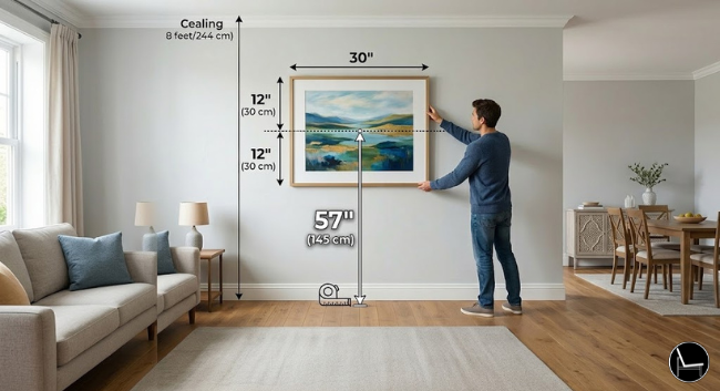
Hang art so the center of the piece — not the top, not the hook — sits at 57 inches from the floor. This is the average human eye level, the same standard used in every gallery, museum, and well-designed home. Art hung higher than this feels disconnected from the space and requires you to tilt your head up to view it. Art hung lower feels like it belongs in a dentist’s office.
- Above a sofa: The bottom edge of the artwork should sit 6 to 8 inches above the top of the sofa cushions. This connects the art to the furniture rather than sending it floating toward the ceiling.
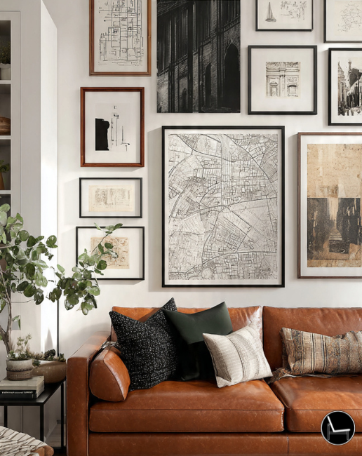
- Gallery walls: Treat the entire arrangement as one piece. The center of the whole gallery (not each individual piece) should sit at 57 inches. Map it on paper first, tape it on the wall second, nail it third.
- In stairwells: The 57-inch rule still applies — measure from the step level of whoever is viewing the piece at that point on the staircase, and keep a consistent visual line as the wall rises.
Layer Lighting in Three Tiers

Lighting is the design element that determines how everything else is perceived — color, texture, scale, and mood. A room with only one light source (overhead) always feels flat, clinical, or incomplete, regardless of how beautiful the furniture is. The rule of interior design here is non-negotiable: every room needs three tiers of light.
| Tier | Type | Examples | Purpose | Common Mistake |
|---|---|---|---|---|
| 1 — Ambient | General illumination | Overhead fixtures, flush mounts, recessed lights | Base layer — lights the whole room | Relying on this as the only source |
| 2 — Task | Functional & directed | Reading lamps, under-cabinet lights, desk lamps | Where work or detail happens | Forgetting task lighting in bedrooms & kitchens |
| 3 — Accent | Decorative & atmospheric | Picture lights, uplights, LED shelf strips, candles | Drama, depth, and highlights | Skipping this tier entirely — the room stays flat |
Install a dimmer switch on every overhead fixture in your home. Bright for mornings and cleaning, medium for daytime living, low for evenings and entertaining. This single hardware change shifts the entire atmosphere of a room and makes any interior design — at any budget — feel more elevated and intentional.
Balance — Symmetrical vs. Asymmetrical

Balance in interior design is about distributing visual weight so no single area of the room feels heavier than the rest. But balance doesn’t automatically mean symmetry — and that distinction matters enormously for the feeling a room creates.
Symmetrical balance (matching nightstands, identical lamps flanking a sofa, mirror-image bookshelves) creates a sense of order, calm, and formality. It’s the backbone of traditional, transitional, and classic interior design styles. Asymmetrical balance (a large piece of art on one side counterbalanced by a cluster of objects on the other) creates energy, movement, and a modern, curated feel. The key to asymmetrical balance is equal visual weight — a large dark object balanced by multiple smaller light-colored objects.
- Traditional rooms: lean symmetrical. Pair nightstands, match lamps, mirror your shelving.
- Contemporary rooms: lean asymmetrical. One oversized art piece balanced by a floor lamp and plant grouping on the opposite side.
- Eclectic rooms: mix both. A symmetrical furniture arrangement with asymmetrical accessories on top reads as “intentionally curated” rather than “randomly collected.”
The Rule of Odds

Objects grouped in odd numbers — 3, 5, or 7 — are more visually interesting than even-numbered groups. This is one of the most well-documented principles in both art and interior design. When objects are paired (2 or 4), the eye immediately finds the center and stops. When they’re grouped in odds, the eye has to move between them, which creates the perception of rhythm and intentional arrangement.
- On a shelf: Three vases of varying heights beats two perfectly matched ones every time. Five objects with varied textures and forms creates a vignette. Seven is the upper limit before it tips into clutter.
- Plant groupings: Odd-numbered plant clusters on a windowsill or floor arrangement feel like a designed moment. Even-numbered rows feel like a garden center display.
- Candles on a dining table: Three pillar candles at different heights — not two of the same. Not four in a row.
“The rule of odds isn’t about superstition — it’s about visual movement. The eye can’t rest on an odd number the way it rests on an even one. That restlessness is what we call ‘interesting.'” — Kelly Wearstler, Interior Designer
Mix Texture, Not Just Color

Texture is the most underused tool in interior design, and it’s the secret ingredient in every room that feels rich and finished without being visually loud. When you’re working in a neutral palette — which most rooms are — texture is your color. It’s what separates a beige room that looks flat from a beige room that looks like it belongs in an architectural digest spread.
The rule: aim for at least four distinct textures in every room. Pair matte with shiny, rough with smooth, hard with soft, organic with refined.
- Classic pairings that work: Linen sofa + rattan side table + ceramic lamp + velvet cushion. All neutral in color, dramatically different in texture.
- Avoid texture monotony: An all-smooth room (glass coffee table, leather sofa, painted walls, hardwood floors) feels cold regardless of the color palette. One jute rug or bouclé throw changes everything.
- Think about touch, not just sight: Run your hand across the surfaces in your room mentally. If everything feels the same, it looks the same too.
Create Zones in Every Room
Open-plan living has made zoning one of the most important rules of interior design for modern homes. Without defined zones, large rooms feel cavernous and purposeless. Small rooms feel chaotic. Even a single-function room (a bedroom, a living room) benefits from clearly defined areas within it — a seating zone, a reading nook, a dressing area.
Zones are defined by five tools: rugs, lighting, furniture arrangement, partial walls or shelving units, and — most powerfully — the combination of at least two of those at once.
- Open-plan spaces: Use a rug to anchor the living zone, a pendant light over the dining table for the dining zone, and a console or open bookcase as a visual divider between the two. No construction required.
- Studio apartments: A sofa or low bookcase with its back to the “bedroom” area, angled toward the “living” area, creates instant separation without a wall.
- Long narrow rooms: Treat each end as its own zone. A seating group at one end + a desk or reading chair at the other transforms a hallway into two purposeful spaces.
Vary Heights Deliberately

A room where every piece of furniture and every accessory sits at the same height reads as flat — visually boring in a way that’s hard to articulate but immediately felt. Interior design rules call for deliberate variation in height across three levels: low (floor, trays, low coffee tables), mid (sofa backs, tabletops, chair seats), and high (floor lamps, tall plants, wall art, bookshelves).
- In a living room: The eye should travel from a low tray arrangement on the coffee table, up to the mid-height sofa back and side tables, up to a floor lamp or tall plant in the corner. That visual journey is what makes a room feel dynamic.
- On a shelf: Stack books horizontally and vertically. Use objects of varying heights. Break up the rows with a plant, a leaning frame, or a sculpture. Uniform rows of books look like a library, not a living room.
- In a bedroom: Nightstands at mattress height, a headboard that reaches toward (but doesn’t touch) the ceiling, art hung at 57 inches, and a low bench or tray at floor level creates the full height spectrum.
Control Your Negative Space
Negative space — the empty areas within and around objects — is not empty. It’s an active design element. In interior design rules, the guideline is to keep surfaces and shelves at 60–70% full, leaving the remaining 30–40% as intentional breathing room. Overcrowded shelves, over-accessorized coffee tables, and surfaces with too many objects make a room feel anxious and cluttered even when every individual piece is beautiful.
-
✕
Every surface covered with objects Fix: Remove 30% of what’s on every shelf and surface. Put it in a box. Live with it for a week. You’ll notice almost nothing is missing.
-
✕
Gallery walls so dense they become visual noise Fix: Leave at least 2.5–3 inches between frames. The gaps are part of the composition, not wasted wall space.
-
✕
Throw pillows that swallow the sofa Fix: The rule is that you should be able to sit on the sofa without removing all the pillows first. 4–6 for a standard sofa, 2–3 for a loveseat.
-
✕
Too many competing focal points Fix: One dominant focal point per room. Secondary elements support it — they don’t compete with it.
Anchor Every Seating Group

Every seating arrangement needs an anchor — a rug, a coffee table, or both — that defines it as a deliberate zone rather than a collection of chairs that happen to be near each other. Unanchored seating feels transactional. Anchored seating feels like a destination.
- The rug anchor: A correctly sized rug (Rule 5) pulls all the seating into one cohesive grouping. It says “this is a place to sit and stay” rather than “this is a holding area.”
- The coffee table anchor: A central table at the right height (15–18 inches for standard sofas) gives the seating arrangement purpose. People can set things down, lean forward, interact. Without it, a ring of sofas feels like a waiting room.
- Both together: Rug + coffee table anchors the group visually (rug) and functionally (table). This is the designer standard for any primary seating arrangement.
Know Your Style — Then Break Rules on Purpose
The 15th rule of interior design is perhaps the most important: every other rule is a guideline, not a law. The designers whose work you stop scrolling for are the ones who know the rules well enough to subvert them with intention. Hanging art at 75 inches in a room with soaring ceilings. Using a monochromatic palette that violates the 60-30-10 rule and looks magnificent. Choosing perfect symmetry in an eclectic bohemian room as an unexpected anchor.
But breaking rules intentionally requires knowing your style filter first. Style isn’t a trend — it’s the lens everything passes through. Before you buy, before you paint, before you accessorize, you need a clear answer to: “What is this room trying to feel like?”
The Rules Are the Starting Point, Not the Finish Line
Now you have all 15 rules of interior design — the complete framework that professional designers apply to every project before they buy a single accessory or paint a single wall. The rooms you love the most aren’t accidents. They’re the result of these principles applied with intention.
Start with whichever rule addresses the biggest problem in your space right now. Fix the rug size. Float the sofa. Hang the art 6 inches lower. Add a floor lamp to a room that only has overhead lighting. Each change compounds. Every rule you apply makes the next one more obvious.
You don’t need a designer’s budget. You need a designer’s framework. You’ve got it now.
Want a Designer to Apply These Rules for You?
Sometimes knowing the rules and knowing how to execute them in your specific space are two different things. Here’s exactly how to find and hire the right interior designer for your project — without overpaying.
How to Hire an Interior Designer →Frequently Asked Questions About the Rules of Interior Design
The foundational rules of interior design are: establish a focal point, resolve scale and proportion before buying, apply the 60-30-10 color rule, float furniture away from walls, size up on rugs, hang art at 57 inches, layer lighting in three tiers, and define zones in every room. These eight form the backbone of every well-designed space, regardless of style or budget.
Scale and proportion is arguably the most impactful rule because it affects how every other element performs. A beautiful room with incorrect scale still feels wrong. Furniture that’s too small or too large for the space undermines everything placed around it. Measure first, buy second — this one habit eliminates the most common and most expensive interior design mistakes.
The 60-30-10 rule distributes color in a room across three tiers: 60% dominant color (walls and large furniture), 30% secondary color (rugs, curtains, accent chairs), and 10% accent color (pillows, art, small accessories). This ratio prevents visual monotony while keeping the palette cohesive. It applies to every style of interior design and every room size.
Yes — but only after you understand them. Designers who break rules effectively do so intentionally, knowing exactly which principle they’re subverting and why it serves the space. Breaking the rule of odds in a maximalist room for bold symmetrical impact is a choice. Breaking it by accident because you bought an even number of objects is just a mistake. Learn the rules first, then decide which ones to keep.
The rule of odds states that groupings of objects in odd numbers (3, 5, 7) are more visually interesting than even-numbered groupings. When objects are grouped in even numbers, the eye finds the center and stops. In odd groupings, the eye moves between the objects — creating the rhythm and visual interest designers call “curated” rather than “placed.” It applies to decorative objects, plants, candles, and art arrangements.
Use light, cool-toned paint to visually recede walls. Mount curtains close to the ceiling and wider than the window frame to exaggerate window height and width. Choose furniture with visible legs rather than ground-hugging pieces. Use mirrors to double perceived depth. Keep surfaces 60–70% clear to maximize negative space, and ensure the rug is large enough to anchor all furniture — a too-small rug makes every room feel smaller.
All 15 rules apply without touching walls or floors. Use Command strips rated for the artwork weight (57-inch rule still applies). Size up on rugs to anchor zones without installation. Layer lighting with floor and table lamps on separate circuits — no wiring required. Lean large mirrors against walls instead of mounting them. Use peel-and-stick removable wallpaper on a single accent wall for color and pattern without permanent commitment.
According to design professionals, the three rules applied most consistently regardless of project or style are: the three-tier lighting rule (ambient, task, accent in every room), the scale and proportion rule (measure before buying, use 2/3 formulas), and the negative space rule (edit to 60–70% full on all surfaces). These three fundamentals distinguish professionally designed spaces from self-styled ones more reliably than any other principles.
CATCH THE LATEST IN HOME DECOR TRENDS:

Steal These 16 Expert-Approved Decorating Secrets

How To Accessorize Your Living Room

Small Space? 10 Ways To Make A Room Appear Bigger

Make Your space Look Expensive
GET CAUGHT UP ON ALL THE INSPIRING DECOR TIPS:

18 Fresh Decorating Ideas To Update Your Fireplace

How to Make a Gallery Wall: The Complete Step-by-Step Guide (Even If You’ve Never Hung a Picture)
