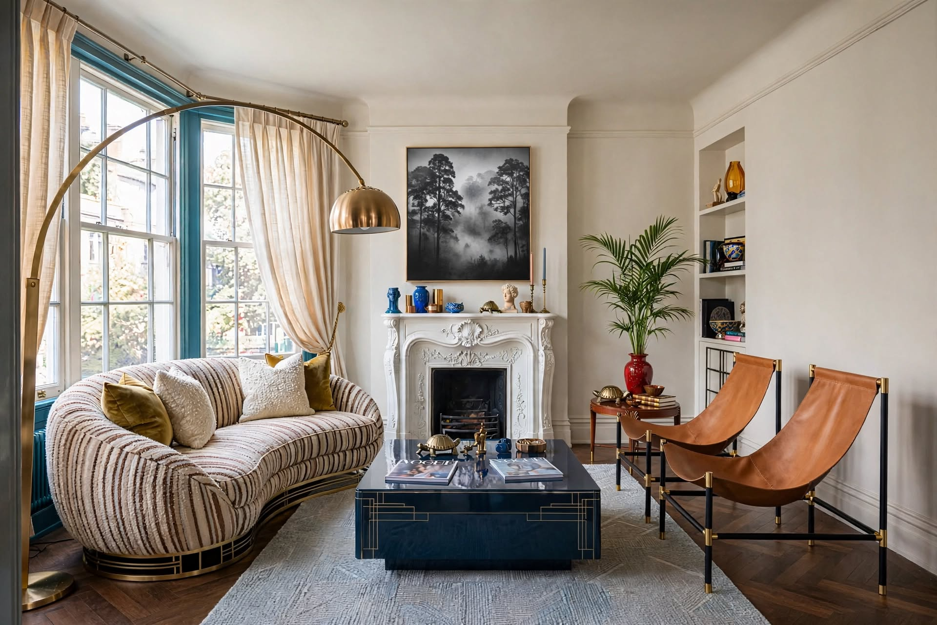
Timeless paint colors are low-saturation, nature-inspired shades with balanced undertones: warm neutrals (White Dove, Revere Pewter), cool neutrals and greiges (Agreeable Gray, Repose Gray), classic whites (Simply White, Pure White), and deep blues and greens (Hale Navy, Saybrook Sage). Pick one undertone family for the whole house, test large swatches in morning and evening light for a week, and let furniture and accessories carry the trends instead of your walls.
Choosing a timeless paint color shouldn’t feel like gambling with your home. You spend weeks comparing swatches, buy the paint, give up a weekend to roll it on, and eighteen months later the color you found on Instagram already looks tired.

Paint trends are built to come and go. Today’s must-have shade becomes tomorrow’s “that’s so 2024,” and your accent wall starts dating your home faster than your sofa does.
This guide skips the trend cycle. You’ll get the exact shades designers reach for again and again, sorted by color family, plus why they last, the one color I’d put in almost any room, and a simple way to test them so you only paint once. It isn’t about playing it safe with beige. It’s about choosing a backdrop that still looks right in twenty years.
What’s Inside This Guide
- What Are Timeless Paint Colors?
- Why Timeless Colors Are the Smart Investment
- What Makes a Paint Color Timeless
- The One Paint Color That Works in Every Room
- 16 Timeless Paint Colors by Color Family
- Quick Comparison: Every Shade at a Glance
- How to Test Paint Colors in Your Home
- Creating Color Flow Through Your Home
- Mistakes That Make a Home Look Dated
- Making Timeless Colors Feel Personal
- The Timeless Color Cheat Sheet
- FAQs
What Are Timeless Paint Colors?

Ashe Leandro Studio
Timeless paint colors are shades that look fresh and sophisticated for decades instead of seasons. Think of them as the classic trench coat of your home: they never steal the show, and they never look wrong. Here’s what they have in common.
- Versatile: they work with any decorating style, from modern to farmhouse, so your furniture and art can change without a repaint.
- Light-friendly: they have enough depth to look good in morning sun and lamplight, instead of turning flat or “off.”
- Nature-inspired: soft greens, sky blues, stone, and earthy browns feel calm and familiar to almost everyone.
- Quietly complex: nuanced undertones keep them interesting without overwhelming the room.
A timeless wall color is a backdrop, not a statement. If you can picture swapping every pillow, rug, and piece of art in the room and the walls still work, you’ve picked well.
Why Timeless Colors Are the Smart Investment

Paint rarely wears out before it starts to look dated. That’s why trend colors are expensive: they put you back on a ladder every few years, while a classic shade keeps working as your style changes around it.
Timeless Colors Give You
- Fewer repaints and less wasted money
- Walls that work with any future furniture
- Wider appeal if you sell or rent the home
- No second-guessing every time a new trend hits
Trend Colors Cost You
- A repaint once the shade looks dated
- Decor choices limited to match the walls
- A room that dates your photos to one year
- A narrower pool of buyers who share your taste
Timeless doesn’t mean boring. It means your personality lives in things that are easy to change, like textiles, art, and furniture, instead of in a color you have to repaint.
The ScienceWhat Makes a Paint Color Timeless

People are naturally drawn to colors they see in nature, which is why soft sky blues, warm earth tones, and gentle greens keep returning decade after decade. Every color in this guide passes the same four tests.
Low saturation
Muted colors feel calm. Bright, pure hues are what date a room fastest.
Balanced undertones
Not too yellow, not too blue. Slight warmth with a touch of gray is the sweet spot.
Depth that shifts with light
A complex color looks slightly different morning to night, which keeps it from feeling flat.
Nature as the source
Stone, sand, sky, sea, and leaves. If you can find it outdoors, it will age well indoors.
For walls you want to live with long term, look at the LRV (Light Reflectance Value) on the paint chip. Shades between about 50 and 85 reflect enough light to feel open without looking stark.
The One Paint Color That Works in Every Room
Clients ask me this all the time: if you could only use one paint color in the whole house, what would it be? My answer is a soft, warm white, and the one I reach for most is Benjamin Moore White Dove (OC-17).
A creamy white with just enough warmth to stay soft in north light, and just enough gray to keep from turning yellow in south light.
Why it works everywhere: it reads as white on walls, trim, and cabinets, so one can of paint can carry an entire house. It sits next to wood floors, marble, brass, and black hardware without fighting any of them.
Where it shines: living rooms, bedrooms, kitchens, hallways, and trim throughout. It’s also a safe trim color next to any other shade in this guide.
When to skip it: in a very dark, north-facing room, test it next to a slightly brighter white like Simply White before you commit.
Why do designers hesitate to say this out loud? Because “paint it all one warm white” doesn’t sound like design. But using one shade on walls and trim is one of the easiest ways to make a home feel calm, connected, and quietly expensive. If you want to go further, the same idea taken to deeper colors is called color drenching.
The Shades16 Timeless Paint Colors by Color Family
Instead of scrolling through thousands of chips, start with these four families. Walk into most high-end hotels or designer showrooms and you’ll find their walls painted in one of them. Swatch dots below are approximate on screen, so always test the real paint.

Warm Neutrals That Never Fail
The comfort colors. They mimic soft natural light, so rooms feel welcoming and look great with wood floors and natural stone.

Cool Neutrals and Greiges
Contemporary without feeling cold. Just enough gray to look modern, just enough warmth to live with every day. Photo: Coco Lapine Design

Classic Whites That Always Work
The right white transforms a home; the wrong one feels clinical. These have subtle undertones that keep them crisp but warm. Photo: Heju Studio

Timeless Blues and Greens
Color with staying power. Think ocean depths and forest shade, not electric brights. Photo: littlegreene.eu
Navy is as much a neutral as brown. It works with almost every other color, which is why a navy dining room or a Hale Navy guest bedroom with white trim never looks dated.
Quick Comparison: Every Shade at a Glance
| Color | Family | Undertone | Best For |
|---|---|---|---|
| White Dove (BM OC-17) | Warm neutral | Warm, creamy | Whole-house walls and trim |
| Accessible Beige (SW 7036) | Warm neutral | Warm greige | Living rooms, kitchens |
| Elephant’s Breath (F&B 229) | Warm neutral | Warm with mauve | Bedrooms, dining rooms |
| Revere Pewter (BM HC-172) | Warm neutral | Warm gray | Living rooms, hallways |
| Agreeable Gray (SW 7029) | Cool neutral | Balanced greige | Open-concept spaces |
| Classic Gray (BM OC-23) | Cool neutral | Soft, near-white | Home offices, bedrooms |
| Pavilion Gray (F&B 242) | Cool neutral | Cool, slightly blue | Bathrooms, studies |
| Repose Gray (SW 7015) | Cool neutral | Gray with warmth | Kitchens, living rooms |
| Simply White (BM OC-117) | White | Slightly warm | Bright rooms, cabinets |
| Pure White (SW 7005) | White | Neutral, crisp | Modern spaces, trim |
| Cloud White (BM OC-130) | White | Soft, warm | Traditional homes |
| All White (F&B 2005) | White | Clean, gentle | Ceilings, low-light rooms |
| Hale Navy (BM HC-154) | Blue | Gray-blue navy | Dining rooms, cabinetry |
| Green Smoke (F&B 47) | Green | Smoky blue-green | Libraries, accent walls |
| Naval (SW 6244) | Blue | Deep navy | Bedrooms, front doors |
| Saybrook Sage (BM HC-114) | Green | Earthy sage | Bedrooms, kitchens |
How to Test Paint Colors in Your Home

Michael Partenio
Even the most timeless shade can look completely different in your room, because lighting changes everything. The goal isn’t finding a color you like on a chip; it’s finding one that works in your actual light.
- 1Pick 3–4 samples from one family
Choose all warm or all cool so you’re comparing like with like.
- 2Go big with your swatches
Paint 2 × 2 ft squares, or use large peel-and-stick samples, on at least two different walls.
- 3Check them morning, noon, and night
North-facing rooms pull colors cooler; south-facing rooms warm them up. Look under your lamps after dark too.
- 4Hold your furnishings against them
Sofa fabric, rug corner, cabinet door, floor. The wall has to work with what’s staying.
- 5Live with them for a week
Notice which one you stop noticing. That calm, invisible feeling is usually the winner.
Never judge a white against a bare wall that’s already white. Tape a sheet of plain printer paper next to each sample; it shows the undertone instantly.
Creating Color Flow Through Your Home

Proem Studio
Choosing colors room by room creates a choppy, disjointed home. Designers think about the whole house at once, so every color you can see from another room feels related.
- Choose one undertone family: all warm or all cool across connected spaces.
- Use the 60-30-10 rule: 60% main color, 30% secondary, 10% accent.
- Check sightlines: any two colors visible at the same time should harmonize.
- Vary depth, not hue: go lighter or darker within the same color rather than switching families.
- Unify with trim: one consistent trim color ties different rooms together.
Picture walking from a warm white kitchen into a greige living room and a soft taupe bedroom. Three colors, one story. For more, see how to unite multiple rooms with a cohesive look and these paint color combos.
Avoid TheseMistakes That Make a Home Look Dated

Indie and Co
Even inside the safe color families, a few subtle choices can make a home feel tired. They look fine on the chip and cause problems on the wall.
Do This
- Pick grays with a little warmth in them
- Choose beiges with a gray or greige base
- Vary whites by room and light direction
- Keep one undertone family in connected rooms
- Choose color by the room’s orientation
Not This
- Icy, blue-gray “builder gray” everywhere
- Yellow-based beiges that read 1990s
- The same stark white in every room
- Warm and cool neutrals side by side
- Choosing from a chip in the store’s lighting
Making Timeless Colors Feel Personal

Leanne Ford
Worried that classic walls mean a boring house? The most stylish homes use timeless colors as the supporting cast and let everything else star.
- ✦Pillows, throws, and art in your favorite colors pop harder against calm walls.
- ✦Limewash or a matte finish adds depth without adding a trend color.
- ✦Sconces and sculptural lamps bring personality and mood.
- ✦A painted ceiling, a navy door, or one deep accent wall.
Your style should change with your accessories, not your paint. Swap the textiles and flowers, and a neutral dining room goes from cozy fall to fresh spring without a single brushstroke. To build a room on top of these backdrops, see how to layer a room.
The Timeless Color Cheat Sheet
- ◆Muted, low-chroma shades only
- ◆About 50–85 for main walls
- ◆One family (warm or cool) per home
- ◆No more than three
- ◆2 × 2 ft swatches, one full week
- ◆White Dove on walls and trim
Timeless Paint Colors: FAQs
A soft, warm white is the most timeless choice, because it works on walls, trim, and cabinets in almost any style. Benjamin Moore White Dove (OC-17) is a designer favorite: creamy enough to stay soft, with enough gray to avoid looking yellow.
Timeless colors are low in saturation, have balanced undertones, and are inspired by nature, like stone, sand, sky, and leaves. They look good in changing light and work with many decorating styles.
No. They’re a backdrop that lets your furniture, art, and textiles stand out. You can change your style with accessories instead of repainting.
Hold the sample next to plain white paper. Warm undertones lean yellow, pink, or beige; cool undertones lean blue, green, or gray. Check it in your own room at different times of day, because undertones shift with the light.
Yes. Modern design relies on sophisticated neutrals, and shades like Agreeable Gray and Simply White are staples in contemporary spaces. Choose undertones that match your materials.
Not necessarily. Choose two or three colors from the same undertone family and vary their depth from room to room. One shade throughout, like a warm white, also works and makes a home feel calm and connected.
Beige has warm, yellow-based undertones. Greige mixes gray and beige, so it keeps beige’s warmth with a more contemporary, neutral feel.
About a week. Paint large swatches on more than one wall and look at them in morning, afternoon, and evening light, next to your furniture and floors.
Paint Once, Love It for Years
Timeless paint colors aren’t about playing it safe. They’re a strategic choice: shades inspired by nature, chosen within one undertone family, and tested in your own light. Let the walls stay quiet and let your style live in the things you can change.
Your next step: pick one room this week, choose three samples from the family that fits it, and run the one-week test. If you’re stuck, start with White Dove.
Want the color rules, spacing formulas, and finishing checklists designers use, all in one place? Grab The Designer’s SECRET Cheat Sheet.
Get the Cheat Sheet →Find more color and styling breakdowns @thedecorholic on Instagram, Facebook, TikTok, and Pinterest.
CATCH THE LATEST IN HOME DECOR TRENDS:

Accessorize a Small Living Room: 7 Genius Styling Secrets

How to Make a Small Room Appear Bigger

How to Make Your Home Look Expensive
GET CAUGHT UP ON ALL THE INSPIRING DECOR TIPS:

Best Fireplace Makeover Ideas

How to Make a Gallery Wall: The Complete Step-by-Step Guide (Even If You’ve Never Hung a Picture)