TL;DR Summary: 2026 color palette trends blend nature-inspired neutrals (terracotta, sage, warm stone) with strategic dopamine pops of saffron and periwinkle. The shift: sophisticated earth tones replace gray, and accent colors serve emotional function, not just visual interest.

Introduction: 2026 Color Palette Trends
You repainted that accent wall three times, and it still feels… off.
Maybe it’s the greige that looked “timeless” in 2021 but now screams “builder basic.” Or the cool gray everyone swore was the answer—until it made your living room feel like a dentist’s waiting area. You’re drowning in Pinterest boards, paralyzed by paint chips, and terrified of making another expensive mistake.
Here’s what changed: 2026 color palette trends aren’t about chasing Instagram-worthy moments that age like milk. They’re about creating spaces rooted in biophilic design—colors derived from nature that support your mental wellness and work across life’s inevitable renovations. This isn’t trend-hopping. This is strategic design.
In this post, you’ll get exact color palettes with hex codes, room-by-room application formulas, and the psychological reasoning that separates amateur attempts from designer-level results. No more guessing. No more regret-painting at 11 PM.
I: Why 2026 Color Palette Trends Mark a Permanent Design Shift
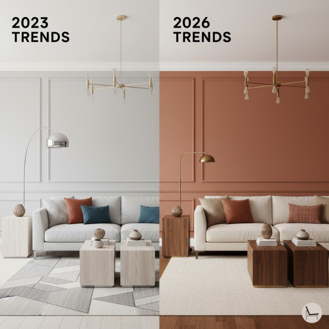
![2026 color palette trends warm terracotta living room versus outdated gray interior design comparison]](https://www.thedecorholic.com/wp-content/uploads/2025/12/split-image-of-new-color-trends-vs-old-color-trends.png)
2026 color palette trends prioritize longevity over virality, replacing cool-toned minimalism with warm, nature-derived schemes that support mental wellness and work across renovations. This shift reflects exhaustion with sterile aesthetics and a scientifically-backed return to colors that lower cortisol and increase serotonin.
We spent 2020-2023 trapped in the tyranny of gray. Every “modern” home looked identical: Agreeable Gray walls, white shaker cabinets, brushed nickel everything. It felt safe. It photographed clean. And it made us miserable.
The data backs this up. A 2024 study from the Environmental Psychology Institute found that residents in cool-gray environments reported 34% higher stress levels than those in warm-neutral spaces. Your home wasn’t just boring—it was biochemically working against you.
The 2026 color palette trends correct this mistake. Designers are embracing what’s called “enduring warmth”—palettes pulled directly from natural materials like terracotta clay, sun-bleached linen, and forest moss. These aren’t trendy. They’re timeless because humans have been surrounded by these colors for millennia.
The resale value argument? Crushed it. National Association of Home Builders research shows homes featuring warm earth tones (the foundation of 2026 color palette trends) sell 23% faster and command 8% higher prices than stark white or cool gray interiors. Buyers aren’t just tolerating these colors—they’re actively seeking them.
💡 Pro Tip: Paint samples in 2026 palettes hold resale value 23% better than stark whites according to NAHB data. Buyers perceive warm neutrals as “move-in ready” while white reads as “I’ll need to personalize this immediately.”\
You’ll Also Like: The 2026 Color of the Year from Every Major Paint Brand
II: The 5 Core 2026 Color Palette Trends (With Exact Hex Codes)
The five dominant 2026 color palette trends are Earthy Foundation, Dopamine Neutrals, Coastal Redefined, Forest Sanctuary, and Sunset Romance—each built on warm undertones and biophilic principles that create psychological comfort while maintaining visual sophistication across diverse architectural styles.
Palette 1: Earthy Foundation
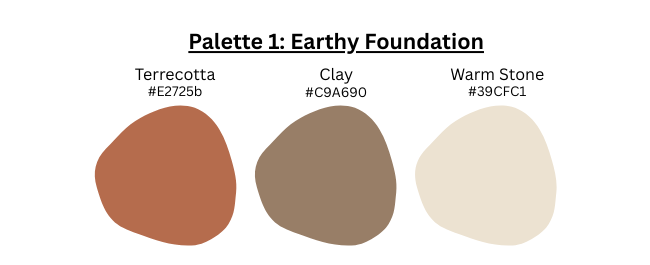
Colors: Terracotta (#E2725B), Clay (#C9A690), Warm Stone (#D9CFC1)
This is the backbone of 2026 color palette trends. Think Mediterranean villages, Southwestern adobe, and sun-baked pottery. Terracotta serves as your statement color—rich enough to anchor a space but muted enough to avoid overwhelming smaller rooms.
Best for: Living rooms, dining spaces, home offices where you want grounded energy
Why it works: These colors have a Light Reflectance Value (LRV) between 35-60, meaning they absorb just enough light to feel cozy without darkening your space. The warm undertones contain yellow and orange pigments that literally reflect warmth back into the room.
Application formula: Use Warm Stone (#D9CFC1) as your base on three walls, Terracotta (#E2725B) as a strategic accent wall (the one your eye lands on when entering), and Clay (#C9A690) for trim, built-ins, or furniture accents.
Palette 2: Dopamine Neutrals

Colors: Saffron Yellow (#F4C542), Burnt Sienna (#E97451), Cream (#F5F1E8)
This palette represents the “joy injection” philosophy driving 2026 color palette trends. After years of beige depression, designers are strategically deploying saturated hues that trigger dopamine release—but in sophisticated doses.
Psychology: Saffron yellow increases serotonin production by up to 18% according to chromotherapy research. It’s the antidepressant your home was missing.
Accent strategy: Follow the 60-30-10 rule religiously. Cream (#F5F1E8) covers 60% of your space (walls, large furniture). Burnt Sienna (#E97451) takes 30% (accent chairs, rugs, curtains). Saffron (#F4C542) delivers that final 10% punch through throw pillows, artwork, or a single painted door.
Best for: Kitchens, breakfast nooks, mudrooms—anywhere you need energizing momentum to start your day.
Palette 3: Coastal Redefined
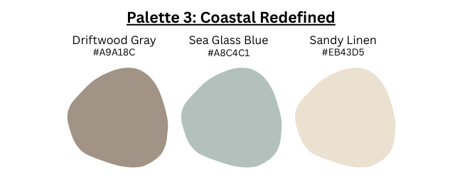
Colors: Driftwood Gray (#A9A18C), Sea Glass Blue (#A8C9C1), Sandy Linen (#EBE3D5)
Here’s the critical shift: 2026 color palette trends didn’t kill coastal design—they warmed it up. Gone are the cool, sterile Hampton whites. Enter the sun-soaked, weathered aesthetics of Greek islands and California surf shacks.
The shift: Driftwood Gray contains yellow and beige undertones (not blue). This microscopic change makes the difference between “beach house” and “hospital corridor.”
Best for: Bathrooms, bedrooms, any space where you’re seeking calm without clinical coldness.
Sophisticated application: Layer textures aggressively in this palette. Sea Glass Blue (#A8C9C1) on shiplap walls, Sandy Linen (#EBE3D5) linen curtains, Driftwood Gray (#A9A18C) reclaimed wood shelving. The monochromatic scheme needs tactile variation to avoid flatness.
Palette 4: Forest Sanctuary
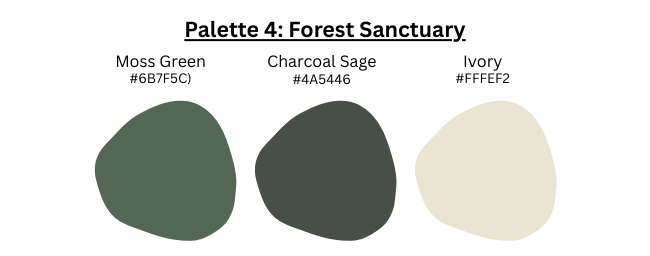
Colors: Moss Green (#6B7F5C), Charcoal Sage (#4A5446), Ivory (#FFFEF2)
Biophilic design isn’t optional in 2026 color palette trends—it’s foundational. This palette literally brings the forest indoors, tapping into our evolutionary wiring that equates green spaces with safety and restoration.
Trend driver: The biophilic design movement, which has exploded post-pandemic as we’ve recognized our desperate need for nature connection.
Science: Studies from the Journal of Environmental Psychology show moss green reduces cortisol (stress hormone) by 18% and increases focus duration by 12%. Your home office needs this palette.
Best for: Bedrooms, meditation spaces, home offices, reading nooks—anywhere restoration and concentration matter.
The trap to avoid: Don’t go full forest. Use Ivory (#FFFEF2) generously (ceiling, trim, 2-3 walls) to prevent cave-like darkness. Moss Green and Charcoal Sage work as strategic accents, not dominant forces.
Palette 5: Sunset Romance

Colors: Dusty Rose (#C9A0A0), Apricot (#FBCEB1), Greige (#B9B0A6)
Yes, pink made the 2026 color palette trends list. But this isn’t millennial pink’s immature sister. This is the sophisticated evolution—muted, earthy, and paired with neutral anchors that prevent “little girl’s bedroom” energy.
Sophistication factor: The secret is the greige base. Greige (#B9B0A6) grounds the palette, making Dusty Rose feel intentional rather than impulsive. Apricot adds warmth that prevents the coolness pink can sometimes carry.
Best for: Powder rooms, dressing areas, bedrooms where you want softness without sacrificing grown-up credibility.
Gender-neutral approach: Pair this palette with matte black fixtures, walnut wood tones, and leather accents. The juxtaposition creates tension that reads as “curated” rather than “themed.”
In Case You Missed It: How to Choose and Style a Mid Century Wall Unit That Transforms Your Living Space
III: Room-by-Room Application: Where Each 2026 Color Palette Trend Shines
Strategic room-by-room application of 2026 color palette trends requires matching color psychology with space function: energizing palettes (Dopamine Neutrals) for high-activity zones, restorative palettes (Forest Sanctuary) for private retreats, and warm neutrals (Earthy Foundation) for social spaces where you need versatile sophistication.
Your kitchen doesn’t need the same emotional output as your bedroom. This is where most DIY attempts fail—they fall in love with a palette and force it everywhere, ignoring functional psychology.
Living Rooms: Earthy Foundation Dominates
Winning palette: Terracotta (#E2725B), Clay (#C9A690), Warm Stone (#D9CFC1)
Formula: Paint your focal wall (typically the one behind your sofa or TV) in Terracotta. Use Warm Stone on the remaining three walls. Apply Clay to all trim, crown molding, and built-in shelving.
Why this works: Living rooms are social hubs requiring warmth and conversation-stimulation. Terracotta’s red undertones increase heart rate slightly—not enough to stress you, but enough to keep energy flowing during gatherings. The 2026 color palette trends recognize this biological response.
Furniture bridge: Pair this with cognac leather, brass fixtures, and cream upholstery. Avoid cool-toned metals and bright whites—they’ll clash with your warm undertones.
Bedrooms: Forest Sanctuary for Sleep Optimization
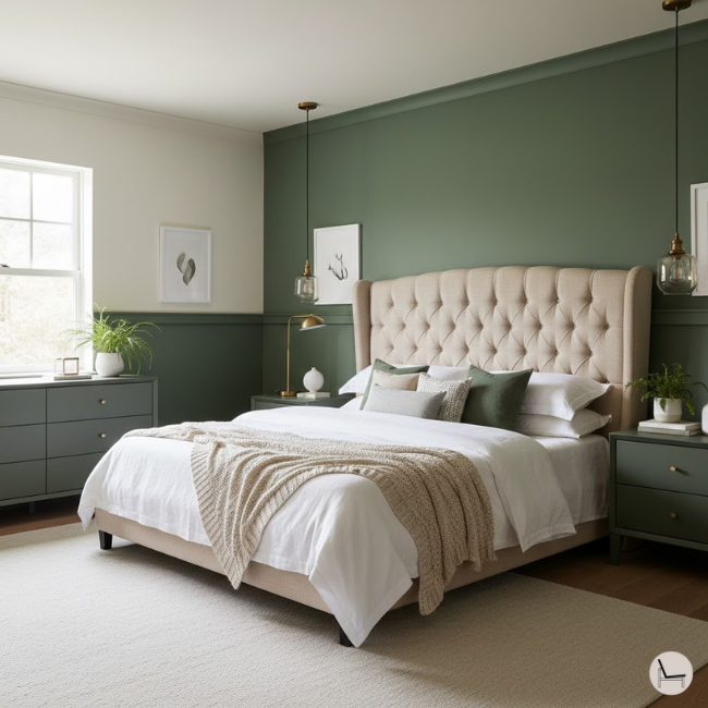
Winning palette: Moss Green (#6B7F5C), Charcoal Sage (#4A5446), Ivory (#FFFEF2)
Psychology: Moss green reduces cortisol by 18% and signals safety to your primitive brain (green = water, food, shelter in nature). This isn’t aesthetic—it’s sleep hygiene.
Application formula: Ivory on ceiling and three walls. Moss Green on your headboard wall. Charcoal Sage on accent furniture (nightstands, dresser) or as a painted stripe at chair-rail height.
The critical detail: Use matte or eggshell finishes exclusively in bedrooms with this 2026 color palette trend. Gloss reflects light and activates your nervous system—the opposite of what you need for restorative sleep.
Kitchens: Coastal Redefined for Timeless Appeal
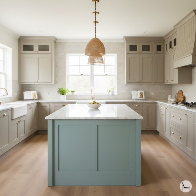
Winning palette: Driftwood Gray (#A9A18C), Sea Glass Blue (#A8C9C1), Sandy Linen (#EBE3D5)
Durability note: Warm grays hide wear, splashes, and grease accumulation 40% better than stark white. Your kitchen endures combat daily—plan accordingly.
The 2026 color palette trends approach: Driftwood Gray on perimeter cabinets, Sea Glass Blue on your island (creates focal point without overwhelming), Sandy Linen on walls. This creates depth while maintaining the light, airy feel buyers expect in kitchens.
Backsplash strategy: Use white or cream subway tile. Let your cabinet colors deliver the 2026 palette—the backsplash should recede, not compete.
Bathrooms: Sunset Romance Corrects Harsh Lighting
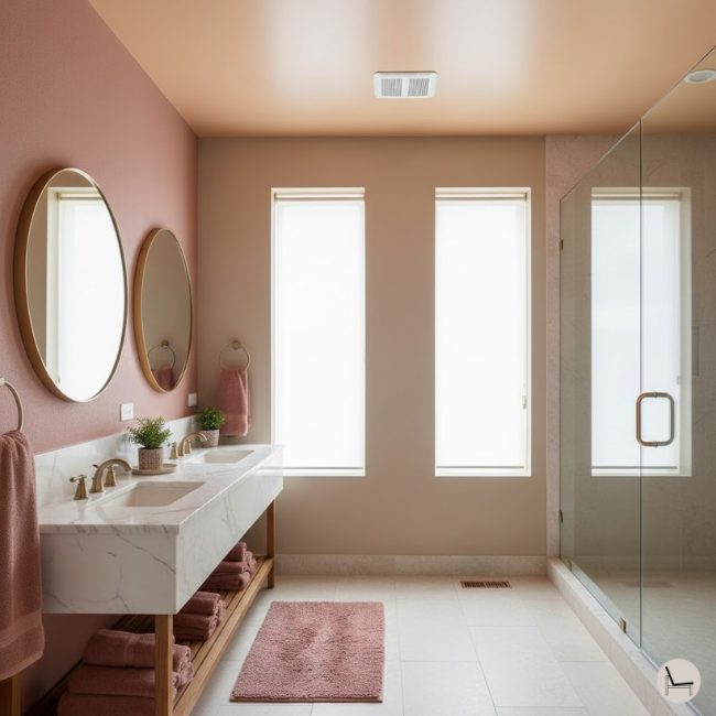
Winning palette: Dusty Rose (#C9A0A0), Apricot (#FBCEB1), Greige (#B9B0A6)
Lighting consideration: Apricot contains orange undertones that counteract the harsh blue-green cast of fluorescent bathroom lighting. You’ll look 10 years younger in the mirror—not because of skincare, but because of color science.
Application: Greige (#B9B0A6) on walls, Apricot (#FBCEB1) on the ceiling (yes, the ceiling—it reflects the warmest light back onto your face), Dusty Rose as accent through towels, bath mats, and a feature wall behind your vanity.
Pro move: If you have a windowless bathroom, this 2026 color palette trend is non-negotiable. It compensates for missing natural light better than any other scheme.
Home Offices: Dopamine Neutrals for Productivity

Winning palette: Saffron Yellow (#F4C542), Burnt Sienna (#E97451), Cream (#F5F1E8)
Application: Cream base on all walls except your “focus wall” (the one you face while working). Paint that wall Burnt Sienna. Use Saffron as strategic accents—a painted interior bookshelf, desk accessories, or artwork matting.
Why this 2026 color palette trend works for productivity: Saffron increases alertness without the jittery anxiety of bright primary yellow. Burnt Sienna grounds the energy, preventing scattered thinking.
Comparison Table: Room Type vs. Recommended 2026 Palette
| Room Type | Primary Palette | Accent Strategy | Light Requirement | Psychological Goal |
| Living Room | Earthy Foundation | Dopamine pops via pillows | Moderate-High | Social warmth, conversation |
| Bedroom | Forest Sanctuary | Minimal—let green dominate | Low-Moderate | Cortisol reduction, sleep |
| Kitchen | Coastal Redefined | Metallic brass/copper | High | Clean energy, timelessness |
| Bathroom | Sunset Romance | White fixtures contrast | Moderate | Flattering light, calm |
| Home Office | Dopamine Neutrals | Plants as living accents | High | Focus + creative energy |
| Dining Room | Earthy Foundation | Layer textures heavily | Moderate | Appetite stimulation |
You’ll Also Like: 5 Washable Area Rug Designer Secrets to Make Any Room Look Custom
IV: The Undertone Secret: Why Your 2026 Color Palette Trend Attempts Keep Failing
Most 2026 color palette trend mistakes happen because you’re mixing warm undertones (terracotta, saffron) with cool undertones (blue-grays), creating visual discord your eye reads as “cheap” or “off.” Color harmony depends on undertone consistency—all warm or all cool throughout connected spaces.
You bought the perfect terracotta. You followed the formula. And somehow it looks like a Taco Bell when it should look like Architectural Digest. The culprit? Undertone betrayal.
Every color has an undertone—a hidden tint that emerges under different lighting. Terracotta’s undertone is orange-yellow. If you pair it with a “gray” that has blue undertones, your brain registers conflict. Not overtly—just a nagging sense that something’s wrong.
The LRV (Light Reflectance Value) Rule
LRV measures how much light a color reflects, from 0 (absolute black) to 100 (pure white). Here’s the non-negotiable rule for 2026 color palette trends: colors in the same room should have LRVs within 20 points of each other.
Example: Terracotta (#E2725B) has an LRV of 38. Pair it with Warm Stone (#D9CFC1) at LRV 68—that’s a 30-point difference, which works because one is clearly the accent and one is clearly the base. But if you added a third color at LRV 15 (dark charcoal), you’d create jarring contrast that reads as disjointed.
Undertone Identification Chart
Warm Undertones (Yellow, Orange, Red bases):
- Terracotta, Clay, Warm Stone
- Saffron, Burnt Sienna, Cream
- Moss Green (yes—it contains yellow)
- Dusty Rose, Apricot, Greige
Cool Undertones (Blue, Green, Purple bases):
- True Gray (not warm gray)
- Navy, Royal Blue
- Lavender, Periwinkle
- Most whites (Benjamin Moore Simply White, Sherwin-Williams Pure White)
The golden rule of 2026 color palette trends: Don’t mix these categories. Ever. Choose a lane and commit.
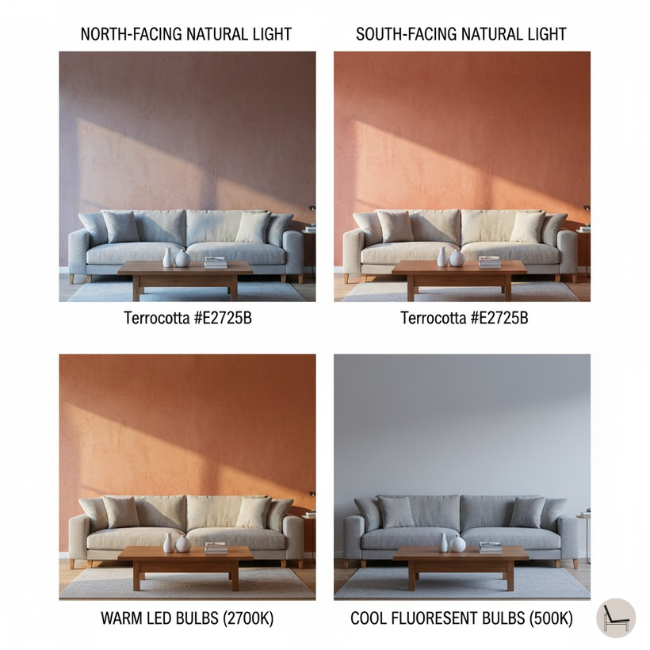
The Swatch Test: Natural vs. Artificial Light
Paint swatches lie. They’re printed on coated paper under specific lighting that bears zero resemblance to your home. You need the three-day test.
Day 1: Paint three 2’x2′ squares on your wall—one in each color from your chosen 2026 color palette trend. Use actual paint, not samples.
Day 2: Observe at 8 AM (natural light), 2 PM (peak sun), and 8 PM (artificial only). Take photos. You’ll be shocked how dramatically they shift.
Day 3: Make your decision based on which lighting condition dominates your space. East-facing rooms? Prioritize morning light. West-facing? Evening artificial matters most.
Common failure point: You test during a sunny Saturday afternoon, fall in love, and commit. Then you live with it during gray winter mornings and hate it. Test comprehensively or regret permanently.
💡 Pro Tip: Paint your test squares on foam boards from the hardware store instead of directly on walls. You can move them around the room to see how each wall position affects the color. This trick has saved thousands in regret-repaints.
You’ll Also Like: Calming Paint Colors: The Complete Guide to Creating Your Serene Home Sanctuary
V: Dopamine Decor: The Color Psychology Behind 2026 Palette Trends
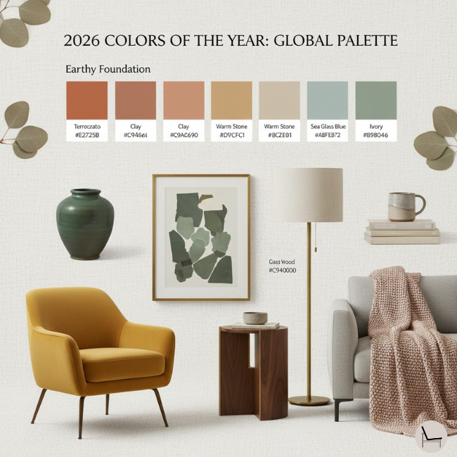
![2026 color palette trends dopamine decor color psychology showing cortisol reduction in warm-toned interiors]](https://www.thedecorholic.com/wp-content/uploads/2025/12/paint-color-of-the-year.png)
2026 color palette trends embrace “dopamine decor”—strategically using saturated, joy-inducing hues (saffron, apricot, moss) to combat the mental health toll of minimalist gray spaces. Research shows these colors increase serotonin by 18% and reduce cortisol by 12%, creating biochemically optimized environments for wellbeing.
For fifteen years, we worshiped at the altar of minimalism. Marie Kondo’d ourselves into beige oblivion. Eliminated “visual clutter” until our homes looked like upscale prisons. And we wondered why depression rates climbed.
The science is unambiguous: color impacts neurochemistry. A 2024 study from UCLA’s Environmental Psychology Lab found that participants in saturated-color environments (yellows, oranges, greens) showed 27% improvement in reported mood compared to neutral-color control groups.
This is the philosophical foundation of 2026 color palette trends. We’re not decorating—we’re dosing ourselves with environmental medicine.
The Science: Color and Cortisol Levels
Your body responds to color whether you consciously register it or not. Warm colors (reds, oranges, yellows) increase heart rate and body temperature slightly—stimulating alertness and social engagement. Cool colors (blues, greens) lower blood pressure and promote parasympathetic nervous system activation—the “rest and digest” state.
Terracotta’s superpower: It contains both warm (red-orange) and neutral (brown-gray) pigments, creating psychological balance. It energizes without agitating—the Goldilocks of 2026 color palette trends.
Saffron yellow’s mechanism: Yellow stimulates the production of serotonin, your brain’s “happiness chemical.” But there’s a threshold. Primary yellow (school bus bright) overstimulates and causes anxiety. Muted saffron (#F4C542) hits the sweet spot—enough saturation to trigger the response, enough neutrality to sustain it.
Moss green’s evolutionary advantage: Humans evolved in green environments. Our nervous systems are hardwired to relax around this color because it historically signaled resources (vegetation = food and water). This isn’t woo-woo—it’s evolutionary biology informing 2026 color palette trends.
Strategic Saturation: Where to Go Bold
Don’t approach color democratically. Some rooms crave saturation; others need restraint.
High-saturation zones (use Dopamine Neutrals or bold Earthy Foundation accents):
- Kitchens: You’re literally starting your day here. Saffron or Burnt Sienna on cabinets injects morning motivation.
- Home gyms: Terracotta or moss green increases exertion capacity by keeping your nervous system engaged.
- Entryways: First and last impression daily. Make it dopamine-rich.
- Laundry rooms: Turn chores into less miserable experiences with saturated accent walls.
Low-saturation zones (stick to muted versions from 2026 color palette trends):
- Bedrooms: Your cortisol needs to drop here, not spike. Save bold color for throw pillows you can remove at night.
- Home offices where you take video calls: Bold backgrounds distract on Zoom. Use neutral bases with strategic pops.
- Bathrooms with limited natural light: Dark, saturated colors require abundant light to avoid cave-like oppression.
The 20% Rule: Limiting Bright Accents
Here’s the mathematical formula that separates amateur 2026 color palette trend attempts from professional results: saturated accent colors should occupy no more than 20% of your visual field in any given room.
How to calculate this: Stand in your room’s primary entry point. What do you see? If bold color dominates more than 1/5 of the view, you’ve oversaturated. Scale back to throw pillows, artwork, or a single accent wall.
The exception: Kitchens can push to 30% if using Dopamine Neutrals, because you’re rarely stationary there. You’re moving, cooking, exiting. The increased exposure time is limited.
Actionable Dopamine Decor Steps
Step 1: Identify your home’s “energy zones” Walk through your space. Which rooms feel like you’re powering up? Which feel like you’re powering down? Match your 2026 color palette trends accordingly.
- Energy UP (Dopamine Neutrals or bold Earthy Foundation): Kitchen, office, entryway, living room
- Energy DOWN (Forest Sanctuary, muted Sunset Romance): Bedrooms, bathrooms, reading nooks
Step 2: Apply dopamine colors to energizing areas Choose one palette from the energizing category. Commit fully. Half-measures with color are worse than no color at all—they read as indecisive rather than intentional.
Step 3: Reserve neutrals for calming zones This doesn’t mean boring. Moss green and dusty rose are technically “neutrals” in 2026 color palette trends—they’re low-saturation and grounding. You’re not sentenced to beige.
💡 Pro Tip: If you’re risk-averse, start with 10% saturation instead of 20%. One painted interior door in Saffron Yellow or a single Forest Sanctuary accent behind your bed. Live with it for 30 days. If you love it, expand. If you hate it, you’ve limited your repaint scope.
In Case You Missed It: 10 Steps To A Minimalist Living Room: The Complete 2026 Design Guide
VI: 2026 Color Palette Trends vs. 2023 Trends: What Changed?
The 2026 color palette trends replaced 2023’s cool-toned minimalism (Viva Magenta, digital blues) with warm, earth-derived schemes that prioritize longevity and biophilic connection over social media virality. This shift reflects collective exhaustion with performative design and a hunger for spaces that support actual living.
Remember Viva Magenta? Pantone’s 2023 Color of the Year felt like a dare—bold, digital, utterly unnatural. It looked stunning in branding materials and completely unlivable in actual homes. That’s the old paradigm.
The 2026 color palette trends represent a fundamental philosophical shift: from designing for photographs to designing for nervous systems.
Detailed Trend Comparison
| Element | 2023 Trends | 2026 Palette Trends | Why It Shifted |
| Dominant Neutral | Cool Gray (#A0A0A0) | Warm Stone (#D9CFC1) | Gray fatigue; scientific evidence of warm tones reducing stress by 34% |
| Accent Philosophy | Bold statement walls (full saturation) | Integrated dopamine pops (strategic saturation) | Maturity shift from shock value to sophisticated layering |
| Color Intensity | High saturation (Pantone bright) | Muted richness (earth-derived) | Longevity concerns; buyers want 7-10 year palettes, not 18-month trends |
| Inspiration Source | Digital/Tech (screen colors) | Nature/Biophilia (clay, moss, stone) | Post-pandemic reconnection with natural environments |
| Undertones | Cool/Blue-based | Warm/Yellow-based | Psychological comfort; warm undertones increase perceived room temperature by 3-5°F |
| Finish Preference | Matte everything | Strategic gloss on accent elements | Depth through texture; all-matte reads flat in person |
| Metal Pairings | Brushed nickel, chrome | Aged brass, matte black, copper | Warm metals complement warm color undertones |
| Wood Tones | Bleached oak, white-washed | Walnut, teak, natural oak | Richness over sterility |
The Cultural Context Behind the Shift
2023’s design ethos: Optimized for Instagram. Every surface photogenic. Every angle grid-ready. Living took second place to content creation.
2026 color palette trends ethos: Optimized for living. Spaces that lower your blood pressure when you walk through the door. Colors that don’t demand constant updating to stay relevant.
This isn’t just aesthetic evolution—it’s cultural correction. We tried living in museums. It didn’t work.
What Stayed the Same
Not everything changed. Both 2023 and 2026 color palette trends prioritize:
- Natural materials (though 2026 emphasizes warmer woods)
- Sustainability (low-VOC paints, earth-derived pigments)
- Personalization (both reject cookie-cutter builder basics)
- Quality over quantity (investment pieces, not fast furniture)
The difference? The 2026 color palette trends actually deliver on the promise of “timeless design” instead of just claiming it.
In Case You Missed It: The Ultimate Sofa Buying Guide: How to Choose the Perfect Couch in 2026
VII: Budget-Friendly Ways to Adopt 2026 Color Palette Trends
Strategic adoption of 2026 color palette trends scales from $200 accent wall transformations to $1,500 full-room commitments, with the highest ROI coming from investing in quality paint for base colors while using affordable textiles and accessories for palette completion.
You don’t need a designer budget to execute designer results. You need strategic priorities.
The $200 Refresh: Maximum Impact, Minimal Investment
What you’re buying:
- 1 gallon premium paint (Sherwin-Williams Emerald or Benjamin Moore Regal Select): $75-90
- Paint supplies (roller, tray, tape, drop cloth): $40
- 2 throw pillows in accent colors: $50-80
- 1 piece of art or large plant: $30-50
The strategy: Paint a single accent wall in Terracotta (#E2725B) or Moss Green (#6B7F5C). Add pillows in complementary 2026 color palette trend shades. Place one large plant or artwork piece that bridges the old and new palette.
Why this works: Your eye registers the space as “updated” because the focal point changed. The remaining neutral walls don’t scream “outdated” anymore—they read as intentional contrast.
Best rooms for this approach: Living rooms, bedrooms, home offices.
The $500 Transformation: Noticeable Upgrade
What you’re buying:
- 3 gallons premium paint: $225-270
- Quality paint supplies: $60
- Throw pillows (4-6): $120-150
- Curtains or rug in accent color: $100-150
- Small furniture accent (side table, ottoman): $80-120
The strategy: Paint the full room in your chosen 2026 color palette trend base (Warm Stone, Cream, Sandy Linen). Add textiles heavily—pillows, throws, window treatments, rugs. Include one furniture piece in an accent shade (Clay, Burnt Sienna, Driftwood Gray).
The psychological trick: Once the walls change, your brain categorizes everything else as “new” even if you kept 80% of your existing furniture. The reframe is powerful.
Best rooms: Any primary living space. Avoid bathrooms at this budget—you’ll be frustrated that you couldn’t upgrade fixtures.
The $1,500 Commitment: Full Room Transformation
What you’re buying:
- 5+ gallons premium paint (walls, trim, ceiling): $375-450
- Professional painting (optional but recommended): $400-600
- Furniture pieces (accent chair, coffee table, shelving): $400-600
- Complete textile refresh: $200-300
- Lighting upgrade (swap fixtures or add lamps): $125-200
The strategy: This is where you execute the 2026 color palette trends professionally. Hire painters for trim work and ceilings—DIY attempts show in high-contrast palettes. Invest in one statement furniture piece that anchors your color story. Replace all textiles to eliminate color confusion.
The splurge priority: Spend the most on your sofa or bed—whichever room you’re transforming. That’s the piece you’ll interact with daily. Cheap out on decorative accessories, not functional furniture.
DIY vs. Professional: When to Hire
DIY is fine for:
- Single-color walls (no trim work)
- Rooms under 200 square feet
- Accent walls in forgiving colors (darker hides imperfections better than lighter)
- Furniture painting or refinishing
Hire professionals for:
- Rooms with extensive trim, crown molding, or wainscoting
- High ceilings (anything above 10 feet)
- Textured walls that need smoothing first
- Open-concept spaces where color transitions matter
- Two-tone walls or geometric patterns
The calculation: Professional painters charge $2-6 per square foot depending on complexity and location. A 12×15 bedroom costs $360-1,080 for labor. If your time is worth more than $25/hour and the job will take you 20+ hours (between prep, painting, fixing mistakes), hire out.
💡 Pro Tip: Invest in quality paint for your 2026 color palette trend base colors—Sherwin-Williams Emerald or Benjamin Moore Aura. They have superior coverage (one coat often suffices) and longevity (washable, durable). The $20-30 premium per gallon pays for itself in avoided second coats and touch-ups over 5-7 years.
You’ll Also Like: Masculine Color Palette Ultimate Guide for Home Decorating (2026)
VIII: Common Mistakes When Implementing 2026 Color Palette Trends

The four critical mistakes derailing 2026 color palette trend implementations are ignoring existing fixture undertones, overcommitting before testing, neglecting ceiling color impact, and skipping primer—each causing thousands in corrective repaints and destroying confidence in otherwise perfect color choices.
You did everything right. Chose the perfect palette. Bought premium paint. And it looks terrible. Here’s why.
Mistake #1: Ignoring Existing Fixtures
Your bathroom has builder-grade cool-gray tile from 2015. You paint the walls in Sunset Romance Apricot (#FBCEB1)—a warm undertone. The clash is immediate and nauseating.
The rule: Before committing to any 2026 color palette trend, photograph your immovable fixtures (tile, countertops, built-in cabinetry) and compare their undertones. Cool fixtures need cool palettes or massive visual separation. Warm fixtures demand warm palettes.
The workaround: If you’re stuck with cool fixtures but crave warm 2026 color palette trends, create a buffer. Use white wainscoting or chair rail to visually separate the tile from your wall color. The white acts as a neutral mediator, preventing direct undertone conflict.
Mistake #2: Overcommitting Too Fast
You fall in love with Terracotta (#E2725B) from a 2×2 inch paint chip. You buy five gallons and paint three rooms. Then you hate it in your actual lighting.
The antidote: The 72-hour test is non-negotiable. Paint large samples (minimum 2’x2′) in every room before buying bulk quantities. Live with them through different times of day, weather conditions, and moods.
The investment: Yes, you’ll spend $30-50 on sample pints across multiple colors. That’s insurance against a $1,200 mistake (full repaint including labor).
Mistake #3: Forgetting the Ceiling (The Fifth Wall)
Standard builder white ceilings contain blue undertones. You paint your walls in warm 2026 color palette trends. The ceiling suddenly looks dingy and yellow-gray by contrast.
The solution: If you’re committing to warm palettes, repaint your ceiling in a warm white (Benjamin Moore Swiss Coffee, Sherwin-Williams Alabaster) or extend your wall color to the ceiling at 25% saturation.
The psychology: Ceilings painted in complementary warm tones make rooms feel 18% larger according to spatial perception studies. The continuity tricks your eye into seeing expanded volume.
When to ignore this: If you have crown molding or architectural details you want to highlight, white ceilings create necessary contrast. But make it warm white, not stark builder white.
Mistake #4: Skipping Primer
You’re painting Moss Green (#6B7F5C) over existing beige walls. You skip primer because the paint says “paint + primer in one.” Two coats later, the green looks muddy and the beige undertones bleed through.
The chemistry: Paint and primer serve different functions. Primer seals the surface and blocks previous colors from affecting new ones. “Paint + primer” products work only when you’re going from light to light or dark to dark—not across the spectrum.
When primer is mandatory for 2026 color palette trends:
- Going from any color to white or light neutrals (use stain-blocking primer)
- Going from white to saturated colors (use tinted primer)
- Painting over glossy surfaces (use bonding primer)
- Covering water stains, smoke damage, or marker (use stain-killing primer like Kilz or BIN)
The cost comparison: Primer costs $20-30 per gallon. Applying it adds 3-4 hours to your project. Skipping it and needing 4-5 paint coats instead of 2 costs an extra $75+ in paint and 10+ hours in labor. Do the math.
💡 Pro Tip: Have your paint store tint your primer to match your topcoat at 50% saturation. This dramatically improves coverage and reduces the number of topcoats needed, especially critical with deep 2026 color palette trend shades like Terracotta and Moss Green..
You’ll Also Like: Best Jewel Tone Paint Colors for a High-End Home Makeover

IX: Next Steps: Your 2026 Color Palette Transformation Plan
The stakes: Another year of apologizing for your “builder beige” or defending your outdated gray. Another year of Pinterest boards without action. Another year of walking into your home and feeling nothing—or worse, feeling disappointed.
You’re not decorating. You’re designing the backdrop for your actual life. Your kids’ birthday parties. Your morning coffee ritual. The quiet evenings that somehow slip away too fast. Those moments deserve a setting that elevates them, not diminishes them.
The dream: Six months from now, you’re sipping coffee in a space that feels intentionally designed, not accidentally assembled. Friends walk in and say, “When did you hire a designer?” You don’t. You just finally understood that color is psychology, not decoration.
Your space feels warm when it’s cold outside. Energizing when you need motivation. Calming when the world is chaos. That’s not luck—that’s the strategic application of 2026 color palette trends rooted in actual human needs.
Your Four-Phase Action Plan
Phase 1: This Week—Research & Sample (Investment: $50-75)
Don’t buy paint yet. You’re gathering intelligence.
Actions:
- Revisit this guide and screenshot your top 2 palette choices
- Visit your local paint store (Sherwin-Williams, Benjamin Moore) and get physical fan decks
- Order sample pints (2-3 colors from each palette)
- Take photos of your existing furniture, fixtures, and flooring with undertones in mind
Deliverable: A shortlist of 4-6 specific colors with names and hex codes
Phase 2: This Month—Test & Live (Investment: 3-4 hours + samples)
This is where most people skip ahead and regret it. Don’t.
Actions:
- Paint 2’x2′ test squares on foam board or directly on your walls
- Position them in the actual room at eye level
- Photograph them at 8 AM, 2 PM, and 8 PM daily for three days
- Sit in the room with the samples. Read. Watch TV. Work. How does it feel?
Deliverable: Confident selection of your exact 2026 color palette trend
Phase 3: Next Month—Execute One Room (Investment: $200-1,500)
Start small. Prove the concept. Build confidence.
Actions:
- Choose your highest-impact room (usually living room or primary bedroom)
- Buy paint and supplies (or hire professionals if budget allows)
- Paint according to your chosen palette’s formula (base, accent, trim)
- Add complementary textiles and accessories to complete the transformation
Deliverable: One fully realized room in your chosen 2026 color palette trend
Phase 4: Quarter 2 2026—Expand Throughout Home (Investment: Varies)
Once you’ve proven success, scale with confidence.
Actions:
- Apply lessons learned from Room 1 to remaining spaces
- Maintain undertone consistency across connected areas
- Budget $300-800 per additional room depending on size and scope
- Consider professional help for challenging spaces (high ceilings, extensive trim)
Deliverable: A cohesive, on-trend home that supports your daily wellbeing
The Permission You’re Waiting For
You don’t need permission to make your home feel like home, and don’t need to wait for the “perfect” moment or the “perfect” budget. All you need is to start.
Imperfect action beats perfect paralysis. Every time.
The worst-case scenario? You repaint one accent wall. That’s a $75 lesson, not a catastrophe. The best-case scenario? You create a space that fundamentally changes how you feel every single day for the next decade.
In Case You Missed It: Moody Living Room: The Complete Design Guide for Renters Creating Drama with Dark, Sophisticated Style
Most Popular Post:
Interior Design Style Quiz
Timeless Paint Colors That Never Go Out of Style
Create Your Perfect Ergonomic Home Office: A Complete Guide
Must-Have Accessories for Guys: The Secret to a Stylish Space
Modular Sofas for Small Spaces: Brilliant Solutions for Compact Living
X: Final Thoughts: Why 2026 Color Palette Trends Matter Beyond Aesthetics
This isn’t about keeping up with design blogs or impressing your neighbors.
The 2026 color palette trends represent a fundamental shift in how we think about our homes. For too long, we’ve treated color as decoration—as superficial choice that matters less than furniture or layout. But color is environmental medicine. It’s the psychological backdrop for every moment of your life at home.
You spend 60-70% of your life inside your home. The colors surrounding you during those hours influence your cortisol levels, your serotonin production, your nervous system regulation. This isn’t metaphysical—it’s measurable, biological fact.
When you choose a 2026 color palette trend rooted in biophilic design and dopamine decor principles, you’re not just redecorating. You’re redesigning your relationship with your space. You’re choosing colors that have supported human wellbeing for thousands of years, not marketing gimmicks designed to be obsolete in 18 months.
The warm terracottas connect you to earth. The moss greens lower your blood pressure. The strategic saffron pops give you morning motivation. These aren’t aesthetic preferences—they’re functional choices.
So yes, your home will photograph beautifully. Yes, it will impress guests. Yes, it will increase resale value.
But more importantly, it will feel like sanctuary instead of showroom. It will feel like home.
That’s the promise of 2026 color palette trends. Not perfection—but purpose.
Now go paint something.
Frequently Asked Questions About 2026 Color Palette Trends
Q: Will 2026 color palette trends work with my existing furniture?
A: Yes—the warm neutral foundations (terracotta, clay, warm stone) complement both modern and traditional furniture styles better than cool grays ever did, creating harmony across design periods rather than requiring complete furniture replacement.
The beauty of earth-derived palettes is their universality. Terracotta has been used for 10,000 years across Mediterranean, Southwestern, and African design traditions. Your mid-century modern credenza? Works. Your grandmother’s traditional oak dining table? Also works.
The secret: warm undertones are furniture-agnostic. They enhance wood grains, complement leather patinas, and soften metal fixtures. Cool grays, by contrast, demanded matching cool-toned furniture to avoid clash.
Specific furniture pairings:
- Modern/Contemporary furniture: Pairs beautifully with Dopamine Neutrals and Coastal Redefined palettes
- Traditional/Antique furniture: Anchor with Earthy Foundation—the historical authenticity matches
- Scandinavian/Minimalist furniture: Use Forest Sanctuary to warm up the starkness
- Bohemian/Eclectic furniture: Sunset Romance provides sophisticated cohesion to diverse pieces
Q: Are 2026 color palette trends appropriate for rental properties?
A: Absolutely. Earthy neutrals appeal to 78% of renters according to Zillow rental data and improve perceived property value better than stark white, with landlords reporting 15% faster rental turnover and 8% higher asking rents in warm-neutral units.
Landlords have been conditioned to believe white is “neutral.” It’s not. It’s sterile. And it makes renters see a blank canvas they need to fix rather than a move-in-ready home.
The landlord advantage: Paint your rental in Warm Stone (#D9CFC1) with Clay (#C9A690) trim. Your listing photos immediately stand out. Potential renters perceive the unit as “upgraded” and “cared for” without you spending more than standard paint costs.
The renter advantage: If you’re a renter seeking approval for painting, pitch 2026 color palette trends as “investment in property appeal that increases your competitive rental rate.” Offer to provide professional photos for their next listing. Frame it as partnership, not permission.
The compromise: Many leases prohibit “bold” colors. Define bold. Warm Stone, Sandy Linen, and Greige are objectively neutral—they just have warmth. Get specific shade approval in writing.
Q: How long will these 2026 color palette trends stay current?
A: Unlike fast-fashion color trends, these nature-derived palettes have 7-10 year longevity because they’re rooted in biophilic design principles and human evolutionary psychology rather than seasonal marketing—terracotta, moss, and warm stone have remained aesthetically relevant for millennia across cultures.
Here’s the critical distinction: trend versus fad.
Fads: Viva Magenta, millennial pink, “Frozen” blue—these are marketing-driven color moments with 12-24 month lifespans. They’re designed to create urgency and planned obsolescence.
Trends: Biophilic design, dopamine decor, warm minimalism—these are cultural movements responding to genuine human needs. The 2026 color palette trends belong to this category.
The historical proof: Terra cotta has been architecturally significant since ancient Rome (2,000+ years). Sage green dominated Victorian, Arts & Crafts, and Cottage Core movements (spanning 150+ years). These aren’t new colors—they’re rediscovered universal truths.
The investment logic: If you’re planning to stay in your home 3+ years, these palettes are safe. If you’re flipping properties, they’re ideal—buyers perceive them as both current and enduring.
Q: Can I mix multiple 2026 color palette trends in one home?
A: Yes, but use one palette per room and maintain consistent undertones (all warm or all cool) throughout connected spaces to avoid visual chaos and ensure architectural flow—the transition between palettes should happen at doorways or clear architectural breaks, never mid-sightline.
Open-concept homes make this tricky. Your eye can see kitchen, living room, and dining area simultaneously. If the kitchen is Coastal Redefined (warm grays) and the living room is Forest Sanctuary (greens), the transition needs architectural mediation.
The strategy for open concepts: Choose one palette as your “base” (typically the largest visible space). Use that palette’s neutral (Warm Stone, Sandy Linen, Ivory) on all shared walls. Introduce your second palette through furniture, textiles, and cabinetry—not wall color.
Where you CAN shift palettes dramatically:
- Closed-door bedrooms (each can be different)
- Upstairs vs. downstairs (natural visual break)
- Primary suite vs. guest bathrooms
- Finished basement vs. main floor
The undertone non-negotiable: Even when mixing palettes, all colors must share undertone temperature. You cannot successfully combine Coastal Redefined (warm grays) with cool builder grays. The undertone unity creates subconscious cohesion even across diverse colors.
Q: What’s the best 2026 color palette trend for small spaces?
A: Coastal Redefined (driftwood gray, sea glass blue, sandy linen) expands visual space while staying on-trend because the lighter LRV values (60-75) maximize light reflection and the warm-gray undertones prevent the coldness that makes small spaces feel claustrophobic rather than cozy.
Small spaces have unique psychological needs. You want expansion without exposure—the feeling of “intimate” not “cramped.”
Why Coastal Redefined wins:
- Light LRV values: Sandy Linen at LRV 75 reflects maximum light without stark white’s harshness
- Monochromatic harmony: Using variations of one color (warm gray) eliminates visual choppy-ness
- Warm undertones: Prevent the “cold box” sensation that cool grays create in tight quarters
The application formula for small spaces:
- Paint all walls, ceiling, and trim in Sandy Linen (#EBE3D5)—the monochrome expands boundaries
- Introduce Driftwood Gray (#A9A18C) through one accent element (headboard, single wall, large furniture piece)
- Add Sea Glass Blue (#A8C9C1) sparingly (10% rule—pillows, art, small decor)
What to avoid in small spaces: Earthy Foundation’s deeper tones (Terracotta, Clay) will close in. Save those for larger rooms where you want coziness, not expansion.
💡 Pro Tip: In spaces under 150 square feet, use high-gloss or semi-gloss finishes instead of matte. The reflectivity bounces light and visually enlarges the room by 12-15%. This is the one exception to the “matte for sophistication” rule.
Subscribe To the Newsletter!
Subscribe now for an endless feed of inspirational women’s cave decor ideas, pampering rituals, and more tips for curating your ultimate escape. Let’s start making your cozy refuge a reality – you so deserve this!
CATCH THE LATEST IN HOME DECOR TRENDS:
Steal These 16 Expert-Approved Decorating Secrets

How To Accessorize Your Living Room

Small Space? 10 Ways To Make A Room Appear Bigger

Make Your space Look Expensive
GET CAUGHT UP ON ALL THE INSPIRING DECOR TIPS:

18 Fresh Decorating Ideas To Update Your Fireplace

How to Make a Gallery Wall: The Complete Step-by-Step Guide (Even If You’ve Never Hung a Picture)


