TL;DR Summary: Warm neutral paint colors create inviting, timeless spaces by balancing beige, gray, and greige undertones with your home’s natural lighting. The key is testing samples in your specific lighting conditions and understanding LRV values to ensure cohesion across rooms.
Introduction: Why Your Paint Color Choice Feels Impossible
You’re standing in the paint aisle, holding your fifth “greige” sample card, and they all look identical. You’ve bookmarked 47 Pinterest images of rooms painted in warm neutral paint colors, but when you brought samples home, that perfect “Sandy Beach” looked disturbingly pink in your living room.
Here’s what nobody tells you: The difference between a warm neutral that transforms your space and one that feels like a dingy waiting room comes down to three technical factors that most homeowners don’t understand—undertones, Light Reflectance Value, and the color temperature of your lighting.

If you’re exhausted from second-guessing every paint decision, you’re not alone. The warm neutral paint color category has exploded from a handful of beiges to hundreds of “greiges,” taupes, and warm grays, each with subtle variations that photograph beautifully but behave unpredictably in real homes.
This guide will teach you the exact framework professional designers use to choose warm neutral paint colors that work specifically for YOUR room’s lighting, architecture, and existing finishes—eliminating the guesswork and costly repaints.
I: What Are Warm Neutral Paint Colors (And Why Undertones Change Everything)

Warm neutral paint colors are hues that blend beige, gray, taupe, or greige bases with warm undertones—subtle hints of yellow, red, or orange that create inviting, cozy atmospheres without appearing overtly colorful.
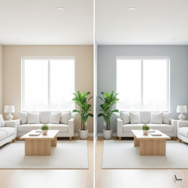
The undertone is the hidden pigment that emerges once paint is on your wall and interacting with natural light. This is where most homeowners make catastrophic mistakes. A paint chip might look like the perfect greige in the store, but if it has cool blue undertones and your living room gets warm afternoon sunlight, it’ll shift dramatically—appearing either sickly green or stark gray.
Understanding Light Reflectance Value (LRV) is equally critical. LRV measures how much light a color reflects on a scale from 0 (absolute black) to 100 (pure white). Warm neutral paint colors typically range from LRV 50-70, creating brightness without the sterility of pure white. A color with LRV 65 like Sherwin-Williams Accessible Beige (SW 7036) will feel significantly lighter and more open than Benjamin Moore Revere Pewter (HC-172) at LRV 55.
The undertone test:
Paint large poster board samples (at least 24″x24″) and observe them at different times of day. Warm neutrals should maintain their inviting quality in both morning and evening light. If the color shifts dramatically from cream to gray depending on the hour, the undertones are fighting your lighting.
💡 Pro Tip: Always test your warm neutral paint colors on all four walls of a room, not just one. The wall receiving direct light will look 2-3 shades lighter than the wall in shadow, which is why testing in context is non-negotiable.
You’ll Also Like: The One Paint Color That Designers Are Too Afraid to Tell You Works in Every Room
II: The 5 Most Popular Warm Neutral Paint Colors (And When to Use Each)
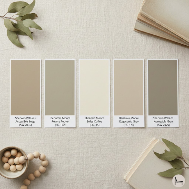
The most versatile warm neutral paint colors include Sherwin-Williams Accessible Beige (SW 7036), Benjamin Moore Revere Pewter (HC-172), Sherwin-Williams Swiss Coffee (SW 0030), Benjamin Moore Edgecomb Gray (HC-173), and Sherwin-Williams Agreeable Gray (SW 7029)—each suited to specific lighting conditions and design goals.
Sherwin-Williams Accessible Beige (SW 7036)
This is the workhorse of warm neutral paint colors. With an LRV of 58, it’s a true chameleon that reads slightly more beige in north-facing rooms and more greige in south-facing spaces. The warm undertones prevent it from ever feeling cold or institutional. It’s ideal for open-concept homes where you need one color to flow seamlessly from room to room.
Best for: Living rooms, kitchens, and hallways with moderate to good natural light.
Benjamin Moore Revere Pewter (HC-172)
This is the “safe” warm neutral that appears on every designer’s recommendation list—for good reason. At LRV 55, it’s deeper than Accessible Beige, creating more drama while remaining neutral. The gray-beige balance with subtle green-gray undertones makes it sophisticated without feeling sterile. However, it can read cooler in rooms with northern exposure.
Best for: Bedrooms, dining rooms, and south-facing rooms where you want depth without darkness.
Sherwin-Williams Swiss Coffee (OC-45)
This warm neutral leans more cream than gray, making it the perfect choice if you’re moving away from stark white but still want brightness. With an LRV of 83, it’s one of the lighter warm neutral paint colors that still maintains warmth. The yellow undertones are subtle enough to feel classic, not dated.
Best for: Trim, ceilings, and rooms with limited natural light that need brightening without going cool.
Benjamin Moore Edgecomb Gray (HC-173)
Despite the name, this is a warm greige with beige undertones that prevent it from reading as true gray. It’s slightly lighter than Revere Pewter (LRV 63) and more adaptable to varying light conditions. The complexity of its undertones means it pairs beautifully with both warm woods and cool metals.
Best for: Whole-home color schemes, especially in homes with mixed natural light conditions.
Sherwin-Williams Agreeable Gray (SW 7029)
This is the most popular warm neutral paint color in America, and it’s earned that status through versatility. At LRV 60, it’s a true greige that works in almost any lighting. The warm gray base with beige undertones creates a contemporary feel without the coldness of pure gray. It’s the color homeowners choose when they want to appeal to the broadest audience (hello, home sellers).
Best for: Entire home painting projects, especially for resale preparation or when you want a cohesive, modern-traditional look.
💡 Pro Tip: Order 8oz sample sizes of your top three warm neutral paint colors and paint them directly on your wall in 2’x2′ squares. Live with them for a week, observing morning, afternoon, and evening light before committing to gallons.
In Case You Missed It: Swivel Chairs Ultimate Guide: How to Choose & Style the Perfect One for Your Home
III: How to Choose Warm Neutral Paint Colors for Each Room (The Lighting Blueprint)

Select warm neutral paint colors based on room orientation and natural light exposure: north-facing rooms need warmer beiges to counteract blue-toned light, south-facing rooms can handle cooler greiges, east-facing rooms require mid-tone neutrals, and west-facing rooms benefit from colors with balanced undertones.
North-Facing Rooms: Combat the Cool
North-facing rooms receive consistent but cool, indirect light throughout the day, which amplifies cool undertones and makes spaces feel gray and unwelcoming. You need warm neutral paint colors with strong yellow or beige undertones to compensate.
Best choices:
- Sherwin-Williams Accessible Beige (prevents the blue-gray shift)
- Benjamin Moore Manchester Tan (HC-81) for more pronounced warmth
- Farrow & Ball Jitney (creates a cozy, enveloping feel)
Avoid: Cooler greiges like Agreeable Gray, which will read flat gray in northern light, and anything with green undertones, which becomes amplified.
South-Facing Rooms: Embrace Versatility
South-facing rooms are the jackpot of natural light—they receive warm, consistent sunlight throughout the day that enhances warm neutral paint colors beautifully. You have the most flexibility here and can even use cooler-toned warm neutrals without them feeling cold.
Best choices:
- Benjamin Moore Revere Pewter (the sunlight brings out the warmth)
- Sherwin-Williams Agreeable Gray (stays perfectly balanced)
- Sherwin-Williams Repose Gray (SW 7015) for a cooler greige that won’t feel stark
Avoid: Overly warm or yellow-based neutrals that can look dingy or cream-heavy when flooded with warm afternoon light.
East-Facing Rooms: Plan for the Shift
East-facing rooms receive beautiful warm morning light but transition to cooler, dimmer light in the afternoon and evening. You need warm neutral paint colors that maintain their warmth even when natural light fades.
Best choices:
- Sherwin-Williams Kilim Beige (SW 6106) with reliable warm undertones
- Benjamin Moore Edgecomb Gray (stays consistent through light changes)
- Sherwin-Williams Balanced Beige (SW 7037) for mid-range warmth
West-Facing Rooms: Balance the Extremes
West-facing rooms can feel dark and cool in the morning but are flooded with intense, golden afternoon light. The warm neutral paint colors you choose must handle both extremes without looking washed out at sunset or dingy at dawn.
Best choices:
- Benjamin Moore Gray Owl (OC-52) for a sophisticated greige
- Sherwin-Williams Accessible Beige (adapts to both lighting scenarios)
- Sherwin-Williams Worldly Gray (SW 7043) for a deeper, more dramatic neutral
💡 Pro Tip: Use the “white paper test” to determine your room’s undertones. Hold a piece of pure white paper against your wall at different times of day. If the light makes the paper look blue-ish, you have cool light and need warmer neutrals. If it looks yellow-ish, you can handle cooler greiges.
You’ll Also Like: How to Choose and Style a Mid-Century Wall Unit That Transforms Your Living Space
IV: Warm Neutral Paint Colors vs. Cool Neutrals (The Comparison You Need)
| Factor | Warm Neutral Paint Colors | Cool Neutral Paint Colors |
| Undertones | Yellow, beige, taupe, slight red/orange | Blue, gray, green, violet |
| Best Lighting | North-facing rooms, spaces with cool natural light | South-facing rooms, spaces with abundant warm light |
| Emotional Impact | Cozy, inviting, traditional-meets-modern | Clean, contemporary, crisp, spacious |
| LRV Range | Typically 50-70 for mid-tones | Often 55-75 for comparable depth |
| Undertone Visibility | More forgiving—undertones blend | Undertones become stark in wrong lighting |
| Resale Appeal | Universally appealing, timeless | Modern buyers love them, but can feel cold to some |
| Coordination Difficulty | Easier to pair with wood tones and mixed metals | Requires careful selection of decor to avoid sterility |
| Popular Examples | Accessible Beige, Revere Pewter, Kilim Beige | Repose Gray, Stonington Gray, Classic Gray |
Why this matters:
Cool neutrals dominated the 2010s farmhouse aesthetic, but the pendulum has swung back toward warm neutral paint colors as homeowners crave comfort and timelessness over stark minimalism. Warm neutrals work with a broader range of design styles—from traditional to transitional to modern organic—making them the smarter long-term investment.
According to interior designer Maria Killam, “The mistake most people make is choosing a gray that’s too cool. Cool grays need very specific lighting and decor to work, whereas warm neutrals are endlessly forgiving.”
💡 Pro Tip: If you already have cool-toned gray walls and want to warm up your space without repainting, layer in warm-toned textiles, wood accents, and brass/gold fixtures. This creates visual warmth even with cool wall colors.
In Case You Missed It: 5 Washable Area Rug Designer Secrets to Make Any Room Look Custom
V: The 7-Step Process to Choose Your Perfect Warm Neutral Paint Colors

Follow this designer-approved system to select warm neutral paint colors that you’ll love for years: assess your lighting, identify undertones, test samples, evaluate LRV needs, consider adjacent spaces, test with furnishings, and commit with confidence.
Step 1: Assess Your Natural Lighting
Document which direction each room faces using a compass app on your phone. Note how light changes throughout the day—take photos at 9 AM, 12 PM, 3 PM, and 6 PM. This becomes your lighting roadmap for selecting warm neutral paint colors.
Step 2: Identify Your Undertone Goals
Decide if you want to lean more beige (traditional, cozy) or more greige (contemporary, sophisticated). Look at your existing flooring and fixed elements—do they have warm honey tones or cool gray tones? Your warm neutral paint colors should harmonize with what you can’t change.
Step 3: Order and Test Large Samples
Never trust paint chips alone. Order 8oz samples of 3-5 warm neutral paint colors and paint 24″x24″ poster boards or directly on your walls. Place samples on all four walls—the same color looks dramatically different depending on light exposure.
Step 4: Evaluate Your LRV Needs
Measure your room’s natural light using a light meter app or simply observe: Does the room feel dim or bright at midday? Darker rooms (LRV 50-60) need higher LRV warm neutrals to feel open. Bright rooms can handle deeper neutrals (LRV 45-55) without feeling cave-like.
Step 5: Consider Adjacent Spaces
If you have an open floor plan, your warm neutral paint colors must flow seamlessly from room to room. Test samples where rooms connect—you want subtle variation (maximum 10 points of LRV difference), not jarring contrast.
Step 6: Test With Your Actual Furnishings
Live with your samples for at least 5-7 days. Place your furniture, textiles, and art against them. Do your warm neutral paint colors enhance your existing pieces or fight them? The right neutral should make your decor look more intentional and cohesive.
Step 7: Commit and Execute Properly
Once you’ve selected your warm neutral paint colors, buy high-quality paint (Benjamin Moore Aura or Sherwin-Williams Emerald are worth the investment). Use proper primer, apply two coats minimum, and use the same sheen throughout adjacent spaces for flow.
💡 Pro Tip: Professional designers use the “50-30-20 rule” for whole-home color: 50% is your main warm neutral paint color (walls), 30% is a secondary neutral (trim/ceiling), and 20% is accent colors (furnishings/decor). This creates cohesion without monotony.
You’ll Also Like: Calming Paint Colors: The Complete Guide to Creating Your Serene Home Sanctuary
VI: Common Mistakes When Choosing Warm Neutral Paint Colors (And How to Avoid Them)

The biggest mistakes with warm neutral paint colors include testing samples in only one lighting condition, ignoring undertones, choosing colors that clash with fixed elements, painting without primer, and selecting colors based on trends rather than your home’s specific needs.
Mistake #1: The Paint Chip Trap
Paint chips are designed under fluorescent lighting and are too small to show how undertones behave in your actual space. What looks like a perfect warm beige in the store can read pink, yellow, or gray once on your walls.
The fix: Always test warm neutral paint colors using large samples (at least 2’x2′) in your actual room, observing them for multiple days in different lighting conditions.
Mistake #2: Ignoring Your Flooring
Your flooring is the largest fixed element in your room and has its own undertones. If you have honey oak floors and choose warm neutral paint colors with cool gray undertones, they’ll clash visually, making your space feel disjointed.
The fix: Identify whether your flooring leans warm (yellow/orange tones) or cool (gray/white tones), and choose warm neutral paint colors with complementary undertones.
Mistake #3: Using Different Sheens in Adjacent Rooms
Changing from eggshell in the living room to satin in the hallway disrupts visual flow, even if you’re using the same warm neutral paint color. The light reflection differs, making the colors appear inconsistent.
The fix: Use the same sheen throughout your main living spaces. Eggshell or satin work best for most areas—save matte for low-traffic spaces and semi-gloss for trim only.
Mistake #4: Skipping Primer
Primer isn’t optional—it’s essential for true color accuracy. Without it, your existing wall color bleeds through, altering the undertones of your carefully selected warm neutral paint colors and requiring 3-4 coats instead of 2.
The fix: Always use a high-quality primer, especially when covering darker colors or painting new drywall. Tinted primer matching your top coat creates better coverage.
Mistake #5: Following Trends Over Function
Just because Agreeable Gray is America’s favorite doesn’t mean it’s right for your north-facing bedroom. Choosing warm neutral paint colors based on popularity rather than your specific lighting conditions leads to disappointment.
The fix: Use trend colors as starting points for research, but always test them against your room’s unique lighting and existing elements before committing.
Mistake #6: Not Considering Artificial Lighting
You live in your home at night too. Warm neutral paint colors can shift dramatically under LED bulbs versus incandescent lighting. A color that looks perfect during the day might feel flat or dingy under your evening lighting.
The fix: Test your samples in the evening with your actual light fixtures on. If your warm neutrals look dull, switch to warmer LED bulbs (2700K-3000K color temperature) to enhance the cozy undertones.
💡 Pro Tip: Create a “color story” for your home by selecting 2-3 warm neutral paint colors that differ by 10-15 LRV points. Use the lightest for main living areas, medium for bedrooms, and deepest for accent walls or powder rooms. This creates cohesion with intentional variation.
You’ll Also Like: 25 Easy Renter-Friendly Hacks On a Budget
VII: Coordinating Trim, Ceilings, and Accents With Warm Neutral Paint Colors

When using warm neutral paint colors on walls, pair them with trim that’s 20-30 LRV points lighter to create definition, keep ceilings white or one shade lighter than walls, and limit accent walls to colors within the same undertone family to maintain cohesion.
The Trim Decision: White vs. Neutral
The Great Trim Debate has a simple answer: it depends on your home’s style and your warm neutral paint color’s LRV. For traditional homes or when using darker warm neutrals (LRV below 55), crisp white trim (Benjamin Moore Simply White OC-117 or Sherwin-Williams Pure White SW 7005) creates elegant contrast.
For modern or transitional spaces with lighter warm neutral paint colors (LRV 60+), consider tone-on-tone trim using a color just 10-15 LRV points lighter than your walls. This creates a more seamless, contemporary look. Sherwin-Williams Swiss Coffee on walls pairs beautifully with trim in Sherwin-Williams Alabaster (SW 7008).
Designer rule of thumb: The contrast between your wall color and trim should be noticeable but not stark. If you’re squinting to see the difference, they’re too close. If the contrast feels jarring, they’re too different.
Ceiling Strategy: The Fifth Wall
Ceilings painted in flat white (Benjamin Moore Decorator’s White or Sherwin-Williams Extra White) create maximum light reflection and the illusion of height. This works with any warm neutral paint color.
However, modern design is embracing ceilings painted the same color as walls or just one shade lighter. This creates an enveloping, cocooning effect that works beautifully in bedrooms or intimate spaces. If your walls are Accessible Beige, consider painting the ceiling in Swiss Coffee for subtle definition without harsh white contrast.
Never paint ceilings darker than walls unless you want the room to feel smaller and more intimate—sometimes desirable in home theaters or dramatic powder rooms, but generally not ideal.
Accent Walls: Strategic, Not Random
Accent walls work best when they’re the same warm neutral paint color as your main walls but 2-3 shades deeper. For example, if your living room is Revere Pewter, accent the fireplace wall with Chelsea Gray (HC-168). This creates focal-point drama while maintaining undertone harmony.
Alternatively, introduce a warm accent color that shares undertones with your neutral. If you’re using greige walls with beige undertones, a deep terracotta, warm sage, or muted navy accent wall will feel intentional rather than random.
Accent wall mistakes to avoid:
- Accenting walls with no architectural interest (random walls feel arbitrary)
- Using cool accent colors with warm neutral paint colors (undertone clash)
- Painting all four walls different colors (creates visual chaos)
💡 Pro Tip: If you’re painting trim and walls in similar warm neutral paint colors for a tone-on-tone look, use different sheens to create definition: flat or eggshell on walls, satin or semi-gloss on trim. The sheen difference provides subtle contrast even with minimal color variation.
In Case You Missed It: The Ultimate Sofa Buying Guide: How to Choose the Perfect Couch
VIII: The Best Warm Neutral Paint Colors for Specific Rooms
Living Rooms: Create a Welcoming Foundation
Living rooms demand warm neutral paint colors that enhance conversation and relaxation without feeling sterile. Choose mid-tone neutrals (LRV 55-65) that provide depth without darkness.
Top picks:
- Sherwin-Williams Accessible Beige (SW 7036): The most versatile choice that works with any decor style
- Benjamin Moore Revere Pewter (HC-172): For sophisticated, layered spaces with traditional leanings
- Sherwin-Williams Balanced Beige (SW 7037): When you want reliable warmth without any gray
Designer tip from Sarah Richardson: “In living rooms, I always choose warm neutral paint colors that look equally good in morning coffee light and evening cocktail hour lighting. Your living room works hardest throughout the day, so the color needs to adapt beautifully.”
Bedrooms: Prioritize Calm and Coziness

Bedrooms benefit from slightly deeper warm neutral paint colors (LRV 50-60) that create a cocooning, restful atmosphere. You can go richer here without the space feeling closed-in because bedrooms are typically less dependent on maximum brightness.
Top picks:
- Sherwin-Williams Kilim Beige (SW 6106): Warm and enveloping without being dark
- Benjamin Moore Shaker Beige (HC-45): Classic warmth with subtle depth
- Sherwin-Williams Tony Taupe (SW 7038): For a more contemporary, sophisticated bedroom
Kitchens: Balance Warmth With Brightness

Kitchens need warm neutral paint colors that maintain brightness for task work while creating an inviting cooking and gathering space. Aim for LRV 60-70 to ensure adequate light reflection, especially if you have dark countertops.
Top picks:
- Sherwin-Williams Swiss Coffee (SW 0030): Classic, bright, and works with all cabinet colors
- Benjamin Moore Edgecomb Gray (HC-173): Modern warmth that pairs with white or gray cabinets
- Sherwin-Williams Divine White (SW 6105): Creamy warmth without going yellow
Bathrooms: Consider Humidity and Lighting

Bathrooms often have limited natural light and high humidity, requiring warm neutral paint colors with proven moisture resistance and undertones that look good under bathroom lighting.
Top picks:
- Sherwin-Williams Alabaster (SW 7008): Warm white that stays bright in limited light
- Benjamin Moore Classic Gray (OC-23): Sophisticated warmth that handles steam well
- Sherwin-Williams Accessible Beige (SW 7036): Creates spa-like warmth in master bathrooms
Important: Always use paint specifically formulated for bathrooms (moisture-resistant formula) to prevent mildew and peeling.
Home Offices: Enhance Focus Without Coldness

Home offices need warm neutral paint colors that promote concentration without the sterility of stark white or the drowsiness of overly warm beiges. Aim for balanced greiges with LRV 58-65.
Top picks:
- Sherwin-Williams Agreeable Gray (SW 7029): Professional but not cold
- Benjamin Moore Gray Owl (OC-52): Sophisticated focus-enhancing neutral
- Sherwin-Williams Repose Gray (SW 7015): Contemporary and clean for modern offices
💡 Pro Tip: Use a slightly cooler warm neutral in home offices to promote alertness and productivity, reserving your warmest neutrals for living and sleeping spaces where relaxation is the priority.
Most Popular Post:
Interior Design Style Quiz
Timeless Paint Colors That Never Go Out of Style
Create Your Perfect Ergonomic Home Office: A Complete Guide
Must-Have Accessories for Guys: The Secret to a Stylish Space
Modular Sofas for Small Spaces: Brilliant Solutions for Compact Living

IX: Conclusion & Next Steps: Your Warm Neutral Paint Colors Action Plan
You now understand that warm neutral paint colors aren’t a guessing game—they’re a strategic decision based on lighting, undertones, and your home’s specific needs. The difference between a neutral that transforms your space and one that disappoints comes down to testing, understanding LRV, and respecting the science of undertones.
Here’s your action plan:
- This week: Assess your room’s lighting direction and document how natural light changes throughout the day
- Next week: Order samples of 3-5 warm neutral paint colors based on your lighting needs and test them on large boards or directly on your walls
- Live with samples: Observe your warm neutral paint colors for 5-7 days in all lighting conditions before committing
- Execute: Purchase quality paint, proper primer, and apply two coats for professional-looking results
The homes that feel cohesive, inviting, and timeless all share one thing: carefully selected warm neutral paint colors that enhance rather than fight their architecture and lighting. Your perfect neutral is waiting—it just requires the right methodology to find it.
The stakes are clear: Another year living in a space that doesn’t feel like home, or the confidence to finally create the serene, cohesive environment you deserve. The paint is the easy part—the knowledge you now have is the real transformation.
Ready to start? Choose three warm neutral paint colors from this guide, order your samples, and begin testing this weekend. Your dream space is two coats of paint away.
Frequently Asked Questions About Warm Neutral Paint Colors
Q: What’s the difference between beige and greige, and which is better?
A: Beige is a warm neutral with yellow or tan undertones, while greige is a hybrid of gray and beige. Greige has gray’s sophistication with beige’s warmth. Neither is objectively “better”—beige reads more traditional and cozy, while greige feels more contemporary. Your choice depends on your home’s style and existing elements. If you have honey-toned wood floors, lean toward beige. If you have gray-toned tile or modern finishes, greige creates better harmony.
Q: Can I use the same warm neutral paint color throughout my entire home?
A: Yes, but with strategic variation. Using one warm neutral paint color on all walls creates incredible flow and makes small homes feel larger. However, vary the trim color, ceiling treatment, or use deeper shades of the same color in accent areas to prevent monotony. Benjamin Moore Edgecomb Gray or Sherwin-Williams Accessible Beige are popular whole-home colors because they adapt to different lighting conditions while maintaining consistency.
Q: How do I prevent warm neutral paint colors from looking too yellow?
A: Yellow undertones become amplified in warm afternoon light, especially in south-facing rooms. Choose warm neutral paint colors that lean more toward taupe or greige rather than pure beige. Test samples in afternoon light specifically—if you see strong yellow at 3-4 PM, that color will always read yellow-heavy. Sherwin-Williams Balanced Beige and Benjamin Moore Revere Pewter have warm undertones without excessive yellow.
Q: Should my ceiling be the same color as my walls?
A: It depends on your ceiling height and desired aesthetic. Standard 8-foot ceilings benefit from white or very light ceilings to maximize height perception. 9+ foot ceilings can handle being painted the same warm neutral paint color as walls for a modern, enveloping look. This works especially well in bedrooms and intimate spaces. For most homes, painting ceilings one shade lighter than walls provides subtle definition without harsh white contrast.
Q: How many paint samples should I test before deciding?
A: Test 3-5 warm neutral paint colors maximum. More than five creates analysis paralysis. Start with two warmer options, two cooler options, and one middle ground. Paint large samples (2’x2′ minimum) and live with them for at least a week, observing them at different times of day. The right color will feel consistently good across all lighting conditions.
Q: What’s the best warm neutral for resale value?
A: Sherwin-Williams Agreeable Gray is the most popular choice for home staging and resale because it appeals to the broadest audience. It’s contemporary enough for modern buyers but warm enough to not feel cold or institutional. Benjamin Moore Revere Pewter and Sherwin-Williams Accessible Beige are close seconds. Avoid overly trendy colors or anything too beige-heavy, which can read dated to younger buyers.
Q: How do I transition between different warm neutral paint colors in an open floor plan?
A: Use architectural breaks like doorways, room transitions, or ceiling beams as natural color-change points. Your warm neutral paint colors should be within the same undertone family and no more than 10-15 LRV points apart. For example, transition from Accessible Beige (LRV 58) in the living room to Swiss Coffee (LRV 83) in the adjacent kitchen using the door frame as your break point. This creates intentional flow rather than jarring contrast.
Subscribe To the Newsletter!
Subscribe now for an endless feed of inspirational women’s cave decor ideas, pampering rituals, and more tips for curating your ultimate escape. Let’s start making your cozy refuge a reality – you so deserve this!
CATCH THE LATEST IN HOME DECOR TRENDS:

Steal These 16 Expert-Approved Decorating Secrets

How To Accessorize Your Living Room

Small Space? 10 Ways To Make A Room Appear Bigger

Make Your space Look Expensive
GET CAUGHT UP ON ALL THE INSPIRING DECOR TIPS:

18 Fresh Decorating Ideas To Update Your Fireplace

How to Make a Gallery Wall: The Complete Step-by-Step Guide (Even If You’ve Never Hung a Picture)


