TL;DR Summary: The interior design rule of thirds divides any space—walls, shelves, or rooms—into three equal parts to create visual balance. By grouping décor in threes, sizing art to fill two-thirds of a wall, and distributing furniture across three zones, you achieve the “intentionally styled” look professionals use. This guide shows you exactly how to apply it, avoid common mistakes, and adapt the rule for small spaces or rental limitations.
Introduction: The Design Secret That’s Been Hiding in Plain Sight
You’ve probably spent hours scrolling through #ShelfieGoals on Instagram, wondering why their floating shelves look curated and yours look… chaotic. Or maybe you’ve hung a piece of art above your sofa three times, each attempt feeling somehow “off”—too small, too high, too lonely on that big blank wall.
Here’s the truth: You’re not bad at decorating. You’re just missing the formula.
The interior design rule of thirds is the hidden framework behind every magazine-worthy living room, every perfectly styled console table, and every gallery wall that makes guests ask, “Wait, you didn’t hire someone?” It’s not about buying more expensive furniture. It’s about understanding the mathematical principle that tricks your eye into perceiving balance, movement, and intentionality.
In this guide, you’ll learn exactly how to apply the rule of thirds across every area of your home—from wall art placement to furniture arrangement to those maddening coffee table vignettes. No design degree required. Just a willingness to see your space through a new lens (and maybe rearrange a few things).
I: What Is the Rule of Thirds in Interior Design (And Why Does Your Brain Love It)?
The interior design rule of thirds is a compositional principle that divides any visual space—whether a wall, a shelf, or an entire room—into three equal sections, either horizontally or vertically, to create balanced, dynamic arrangements that feel naturally pleasing to the human eye.
This isn’t arbitrary decorator wisdom. It’s borrowed from centuries of artistic tradition. Photographers use the rule of thirds to frame compelling shots. Renaissance painters used it (before it even had a name) to guide the viewer’s gaze. Interior designers apply it because our brains are wired to find odd-numbered groupings more engaging than even ones.
Here’s why: Even numbers feel “resolved.” Two matching lamps on a dresser? Your brain registers it as symmetrical and moves on—there’s no visual tension, no reason to linger. But three objects? Now there’s a story. The eye bounces between them, searching for the relationships, creating a sense of movement and life.
This psychological phenomenon is known as the Rule of Odds—a principle in visual perception that states the human brain finds odd-numbered groupings more interesting, dynamic, and memorable than even-numbered ones. When we see two objects, the brain quickly categorizes them as “a pair” and moves on. But three objects create a triangular relationship that keeps the eye engaged, searching for hierarchy and connection.
💡 Pro Tip: Think of the rule of thirds as a “cheat code” for avoiding both the sterile hotel-lobby look (too symmetrical) and the cluttered thrift-store vibe (no structure). It’s the Goldilocks zone of design.
You’ll Also Like: Modern Organic Interior Design: The Ultimate Guide
II: The Science Behind the Rule: Why Your Eye Craves Thirds
The rule of thirds leverages both the Rule of Odds from visual psychology and the four “power points” created when dividing a space into nine equal sections—these intersection points naturally draw the human eye and serve as optimal placement zones for focal objects, lighting, and architectural features.
Let’s get nerdy for a second (in a useful way). When you look at a room, your eye doesn’t scan randomly. It follows a predictable path, searching for:
- Focal points (Where should I look first?)
- Visual weight (What feels heavy or light in the composition?)
- Negative space (Where can my brain rest?)
The rule of thirds satisfies all three by creating intentional imbalance. Instead of splitting a wall 50/50 with two pieces of art (boring), you fill two-thirds with a large statement piece and leave one-third open (interesting). Instead of centering all your furniture along one wall, you distribute seating across three zones—creating conversation pockets and flow.
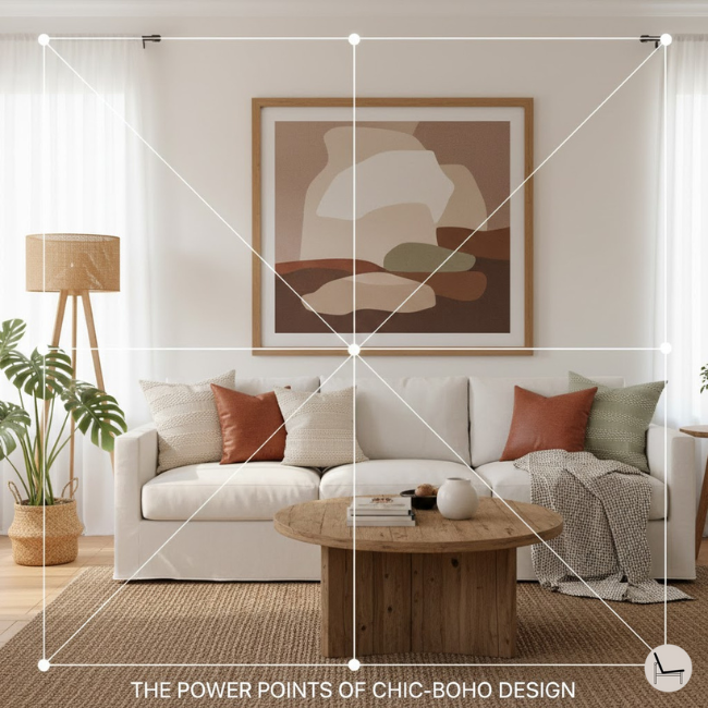
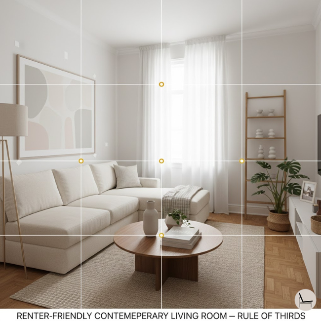
A. Understanding the Four Power Points
Here’s where the rule gets precise. When you mentally divide a wall (or room) into thirds both horizontally and vertically, you create a grid with four intersection points. In photography, these are called “power points” or “nodes”—and your eye is naturally drawn to them.
How to use this in your home:
- Place a floor lamp or sculptural object on one of these four nodes in your living room layout
- Position the focal point of your art (the main subject or darkest area) at one of these intersections on your wall
- Arrange your key furniture pieces so their visual “weight” hits these nodes when viewed from your primary vantage point
This isn’t about pulling out a ruler—it’s about training your eye to see where objects feel “right.” Stand in your doorway (your primary vantage point) and notice where your eye lands first. That’s probably close to one of those four power points.
💡 Pro Tip: The “primary vantage point” matters. Apply the rule of thirds based on the view from your doorway, your main seating area, or wherever you spend the most time looking at the space. A room can feel perfectly balanced from the couch but chaotic from the entrance if you don’t consider your viewing angle.
B. The Golden Ratio vs. Rule of Thirds: What’s the Difference?
You might’ve heard of the Golden Ratio (1:1.618), a mathematical proportion found in nature, architecture, and art. While it’s related, the rule of thirds is simpler and more forgiving. The Golden Ratio demands precision; the rule of thirds just asks for “roughly equal divisions.” For everyday decorating, thirds are your best friend. Save the Golden Ratio for when you’re feeling fancy and designing a custom built-in.
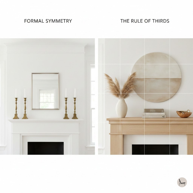
C. Symmetry vs. The Rule of Thirds: Choosing Your Design Vibe
Let’s clear up a common misconception: Symmetry isn’t bad—it just serves a different purpose.
- Formal Symmetry (50/50 balance) creates grandeur and authority. Think: hotel lobbies, traditional dining rooms, French parlors. Two matching sconces flanking a centered mirror says “elegant, timeless, refined.”
- Asymmetry through the Rule of Thirds creates comfort and livability. Think: layered living rooms, collected-over-time spaces, homes that feel “designed but not decorated.”
The decision: Ask yourself what feeling you want. A formal entryway with matching console tables and perfectly centered art? Embrace symmetry. A cozy reading nook that feels organic and inviting? Go with thirds.
Many successful interiors use both—symmetry for architectural elements (windows, built-ins) and the rule of thirds for styling and décor. The magic is knowing when to deploy each tool.
You’ll Also Like: How to Arrange Pillows on a Couch Like a Pro: The Foolproof Step-by-Step Guide
III: How to Apply the Rule of Thirds to Wall Décor (The Most Common Mistake People Make)
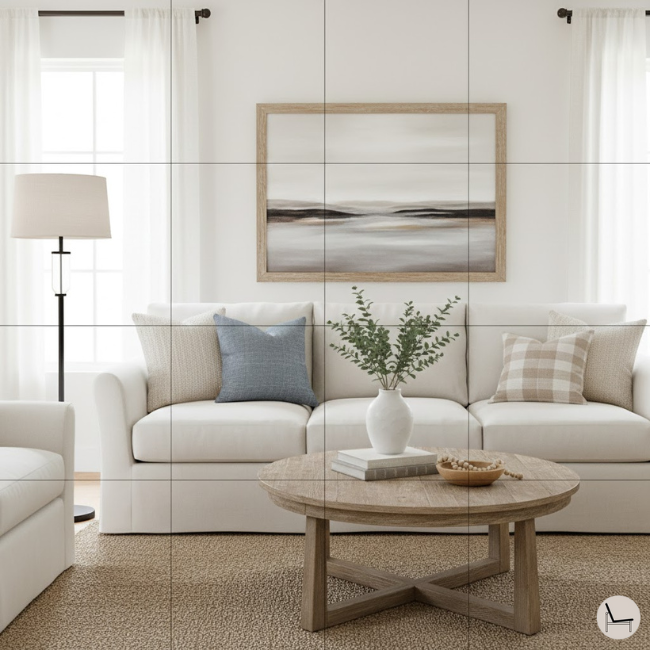
When hanging art or arranging wall décor, the rule of thirds dictates that your focal piece should occupy approximately two-thirds of the available wall space in width, with the remaining one-third left as negative space to prevent the composition from feeling cramped or insignificant.
This is where most people go wrong. You buy a piece of art you love, hang it above the sofa, step back, and… it looks like a postage stamp floating in the ocean. The problem? You violated the two-thirds rule.
The Click Strategy: Scale & Placement
Here’s the designer secret: Your art isn’t too small because it’s poorly chosen. It’s too small because you didn’t measure the relationship between the furniture and the wall. Follow this formula:
- Measure the width of your sofa or console table (let’s say 84 inches).
- Multiply by 0.66 (that’s two-thirds): 84 × 0.66 = 55 inches.
- Your art or gallery wall should span 50-60 inches horizontally.
Now your art “anchors” the furniture instead of floating awkwardly above it.
For vertical walls (like the space above a fireplace):
- Divide the wall height into three horizontal bands.
- Hang your art in the middle third, centered at 57-60 inches from the floor (the average human eye level).
- Let the top and bottom thirds breathe.
- Always measure to fill 2/3 of the wall space—not the entire wall. Negative space is décor.
- Center the art at 57 inches from the floor for perfect eye-level viewing. This is museum-gallery standard.
- Use floor lamps or sconces to highlight texture and create a third “layer” of visual interest. Light is the invisible third element.
“The biggest mistake I see is people hanging art too high and too small. The rule of thirds forces you to think about relationships—between the furniture, the wall, and the space around it. That’s when magic happens.”
— Nate Berkus, Interior Designer & Author of The Things That Matter (House Beautiful, 2022)
In Case You Missed It: Coffee Table Styling Tips: Master the Art of Effortless Design
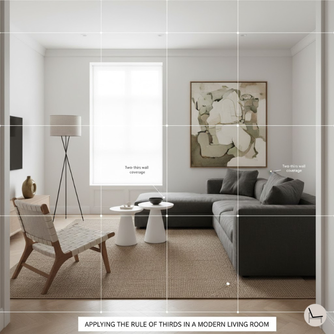
IV: The Rule of Thirds for Furniture Arrangement (Creating Flow, Not Clutter)
When arranging furniture, the interior design rule of thirds divides the room into three functional zones—conversation, circulation, and breathing space—ensuring that no single area feels overcrowded while maintaining purposeful flow and visual balance throughout the entire space.
Think of your living room like a stage. If all the actors (furniture) are shoved into one corner, the performance feels awkward. The rule of thirds gives you a “blocking” strategy.
A. Step-by-Step: Laying Out a Living Room
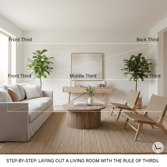
- Divide your room into three horizontal zones (imagine slicing it like a layer cake):
- Zone 1 (Front third): Primary seating (sofa, coffee table).
- Zone 2 (Middle third): Secondary seating or a rug that anchors the space.
- Zone 3 (Back third): A console table, bookshelf, or intentional negative space.
- Apply the “Two-Thirds Grounded, One-Third Open” Rule:
Your rug should cover two-thirds of the floor space under your main seating area, with one-third of the floor exposed. This keeps the room from feeling “floaty” (too much open floor) or cramped (rug too small). - Use three-point furniture clusters:
Arrange seating in triangles, not lines. A sofa + two chairs (not four chairs) creates conversation and movement.
B. Vertical Thirds: The Three-Level Design Strategy
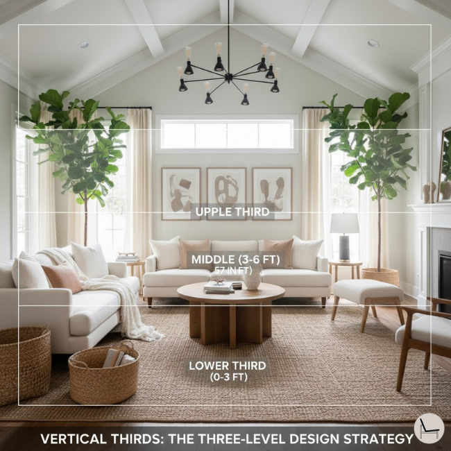
Most decorating advice treats rooms as flat, two-dimensional spaces. But you live in a three-dimensional home. The rule of thirds applies vertically too, and this is especially critical if you have high ceilings (10+ feet) or awkwardly low ceilings (under 8 feet).
Divide your room into three vertical layers:
- Lower Third (0-3 feet): This is your foundation layer.
- Furniture (sofas, coffee tables, ottomans)
- Area rugs that anchor the space
- Floor-level storage (baskets, low benches)
- Middle Third (3-6 feet): This is your eye-level engagement zone.
- Wall art and mirrors (centered at 57-60 inches)
- Windows and window treatments
- Mid-height shelving and console tables
- The visual “conversation” happens here—this is where your eye naturally lands when you enter a room
- Upper Third (6+ feet): This is your architectural drama layer.
- Statement lighting (chandeliers, pendants)
- Crown molding or ceiling treatments
- High shelving with decorative objects
- Tall plants or trailing greenery
- In high-ceiling spaces, don’t leave this zone empty—it’ll feel cavernous
Why this matters for high ceilings: If you only decorate the lower and middle thirds, you create a visual “dead zone” at the top. Add a dramatic pendant light, hang curtains from the ceiling (not the window frame), or install floating shelves at 7-8 feet to draw the eye upward and make the proportions feel intentional.
Why this matters for low ceilings: Focus 70% of your visual interest in the middle third. Avoid heavy upper-third elements like bulky crown molding or dark paint near the ceiling—these compress the space. Use vertical stripes or floor-to-ceiling curtains to “stretch” the perceived height.
💡 Pro Tip: If you’re working with a small space (under 800 sq ft), flip the ratio. Fill one-third with furniture, leave two-thirds for circulation. This prevents the “can’t-walk-through-my-own-apartment” claustrophobia.
In Case You Missed It: Swivel Chairs Ultimate Guide: How to Choose & Style the Perfect One for Your Home
V: Styling Shelves & Surfaces with the Rule of Thirds
On shelves, mantels, and coffee tables, the rule of thirds manifests as grouping objects in sets of three—varying in height, texture, and visual weight—to create layered, asymmetrical compositions that feel curated rather than cluttered or sparse.
This is where the rule gets fun. You’re not just arranging; you’re storytelling.
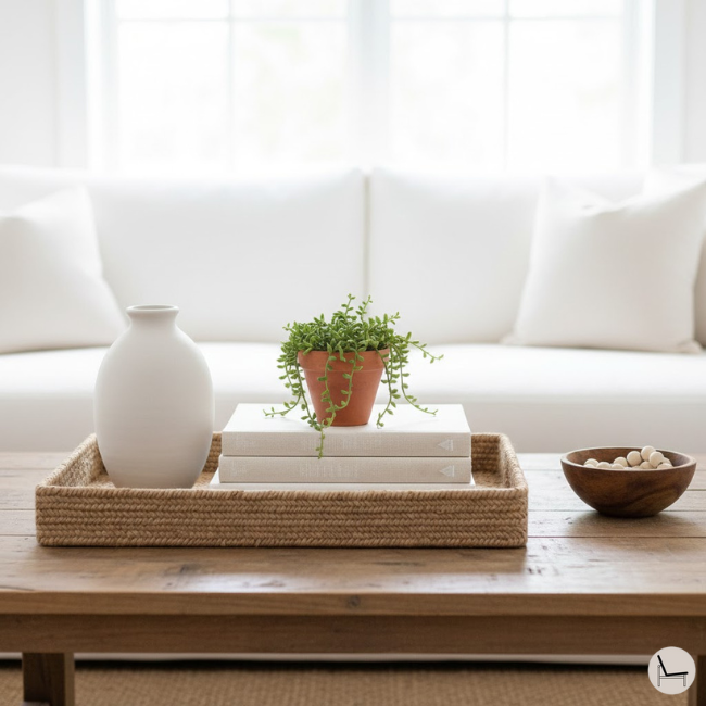
The Three-Object Formula:
- One tall item (a vase, a stack of books, a sculptural object) → This is your anchor.
- One medium item (a small plant, a candle, a framed photo) → This adds contrast.
- One low/horizontal item (a bowl, a coaster set, a trailing plant) → This grounds the composition.
Example: Coffee Table Vignette
| Item | Height | Texture | The “Why” (Design Purpose) |
| Ceramic vase with pampas grass | 18 inches (Tall) | Matte, organic | Creates vertical “stop” for the eye—draws attention upward and anchors the grouping |
| Linen-bound coffee table book | 12 inches (Medium) | Soft, tactile | Provides a bridge between heights and adds intellectual/personal interest |
| Wooden catchall tray | 2 inches (Low) | Warm, natural | Grounds the group and contains clutter—gives the eye a place to “rest” |
Why this works: You’ve hit three heights (tall, medium, low), three textures (ceramic, linen, wood), and each object serves a specific visual purpose. The eye travels in a Z-pattern across the table—never landing on two identical objects.
💡 Pro Tip: Avoid grouping items in fours or sixes. Even numbers feel “matchy-matchy” due to the Rule of Odds. If you have four objects you love, split them: three on one shelf, one on another.
You’ll Also Like: Statement Light Fixture: The Designer’s 5-Step Framework for Choosing the Perfect One
VI: The Rule of Thirds in Color & Texture (The 60-30-10 Connection)

The interior design rule of thirds extends to color theory through the 60-30-10 rule, which allocates 60% of a room to a dominant neutral, 30% to a secondary accent color, and 10% to a bold highlight—mirroring the three-part visual balance that defines the rule’s spatial applications.
You’ve probably heard of the 60-30-10 color rule. It’s the rule of thirds, just wearing a different hat.
- 60% = Your Neutral Base (walls, large furniture, rugs) → This is your “empty third” in the composition—it lets the eye rest.
- 30% = Your Secondary Color (curtains, throw pillows, smaller furniture) → This creates cohesion.
- 10% = Your Accent/Pop (art, vases, a bold chair) → This is your focal point.
Choosing Your Three Textures: Matte, Gloss, and Organic Contrast
| Texture Trio | Best For | Example Combo |
| Linen + Travertine + Matte Black | Modern Organic, Scandi | Linen sofa + stone coffee table + black steel shelving |
| Velvet + Brass + High-Gloss Lacquer | Glam, Art Deco Revival | Velvet armchair + brass side table + lacquered console |
| Jute + Reclaimed Wood + Terracotta | Boho, Earthy Minimalism | Jute rug + wood bench + terracotta pots |
Why this matters: Just like you group objects in threes, you also want three dominant textures in a room. More than that, and it feels chaotic. Fewer, and it feels flat.
You’ll Also Like: How to Choose and Style a Mid-Century Wall Unit That Transforms Your Living Space
VII: Common Rule of Thirds Mistakes (And How to Fix Them Fast)
The most frequent errors when applying the interior design rule of thirds include oversizing art to fill 100% of wall space, grouping objects in even numbers (which kills visual tension), and failing to leave intentional negative space, resulting in rooms that feel either cluttered or sterile despite technically following “the rules.”
Let’s troubleshoot the top three disasters:
Mistake #1: The “Too-Perfect” Gallery Wall
The Problem: You measured obsessively, spaced everything evenly, and now your gallery wall looks like a spreadsheet.
The Fix: Apply the rule of thirds within the gallery. Cluster two-thirds of your frames on one side, leave one-third looser or lower. Asymmetry is the goal—not chaos, not rigidity.
Mistake #2: Four Matching Throw Pillows
The Problem: Even numbers. Your sofa looks like a hotel bed.
The Fix: Use three or five pillows. Vary the sizes: two large (22″), one medium (18″). Now you’ve got movement.
Mistake #3: Centering Everything
The Problem: Your console table has one centered vase. Your coffee table has one centered tray. Your room feels… polite. Boring. Airless.
The Fix: Push that vase to one side (occupying one-third of the console width). Add a stack of books (one-third). Leave the final third empty. Boom—instant sophistication.
Mistake #4: Ignoring Your Primary Vantage Point
The Problem: Your room looks perfect from the couch, but chaotic when you walk through the door.
The Fix: Identify your “hero view”—the angle you see most often (usually the doorway or your main seating position). Arrange furniture and décor so the rule of thirds applies from that specific vantage point. Stand there. Take a photo. Adjust until the composition feels balanced.
You’ll Also Like: 5 Washable Area Rug Designer Secrets to Make Any Room Look Custom
VIII: When to Break the Rule: Intentional Imbalance for Advanced Design Confidence

While the rule of thirds provides a reliable foundation for visual harmony, experienced designers deliberately break it in moments of maximalist drama, monochromatic minimalism, or when creating a singular, commanding focal point that demands 100% of the viewer’s attention without competing elements.
Rules exist to be broken—but only once you understand why they work.
Here’s when to ignore the rule of thirds:
- Maximalist Spaces: If you’re going full-on Boho or Cottagecore, the “organized chaos” vibe thrives on more than three objects per surface. Just ensure each cluster still has variation in height and texture.
- Statement Walls: A floor-to-ceiling mural or a massive abstract painting should dominate 90% of the wall. This is a “rule of one”—the art IS the room.
- Scandinavian Minimalism: Sometimes, two objects are enough. A single sculptural vase next to one book on a shelf = intentional restraint. The negative space becomes the third “element.”
- When Grandeur is the Goal: Formal symmetry—two matching wingback chairs flanking a fireplace, twin chandeliers over a dining table—creates a sense of ceremony and timelessness. The rule of thirds is for comfort; symmetry is for impact.
💡 Pro Tip: Breaking the rule works when you do it on purpose. If something feels off and you don’t know why, return to thirds. If something feels off and you like the tension, you’ve mastered the art of intentional imbalance.
Popular Post To Read: Bold Wall Art: The Complete Guide to Transforming Your Space with Statement Pieces
IX: The Rule of Thirds Across Design Styles
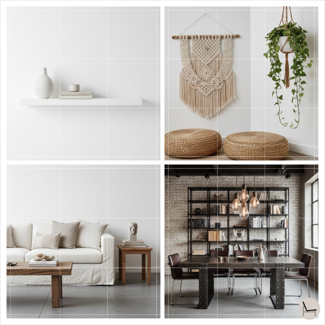
The interior design rule of thirds adapts fluidly across aesthetic movements, manifesting as whitespace in Scandinavian interiors, layered material zones in Boho spaces, and restrained tonal divisions in Japandi design—proving the principle transcends trends by addressing universal human perception rather than fleeting stylistic preferences.
| Style | How the Rule Shows Up | Key Example |
| Scandinavian | Whitespace is one “third” (negative space as décor) | Two objects + intentional emptiness on a shelf |
| Boho | Layered textures in three vertical zones (floor, mid, high) | Floor cushions + hanging plants + macramé wall hanging |
| Modern Organic | Three natural materials dominate the palette | Linen + wood + stone repeated throughout the room |
| Industrial | Three metal finishes (matte black, raw steel, aged brass) | Black metal shelving + steel table + brass pendant lights |
| Japandi | Three tonal shades of one neutral color family | Cream walls + oat linen + sand-colored wood |
Trending Post To Read: How To Set Up A Small Home Gym

X: The Rule of Thirds Investment Strategy: Where to Splurge vs. Save
To maximize both aesthetic impact and budget efficiency when applying the interior design rule of thirds, allocate your spending across three tiers: splurge on one high-impact anchor piece (60% of budget), invest moderately in two supporting elements (30%), and save on three smaller accent items (10%)—mirroring the visual hierarchy the rule creates.
Here’s the truth bomb: You don’t need three expensive things. You need one great thing and two smart things.
Budget Breakdown for a Coffee Table Vignette:
| Spend Tier | Item | Why | Cost |
| Splurge (60%) | Handmade ceramic vase or sculptural object | This is your conversation piece—the anchor. | $150-$250 |
| Moderate (30%) | Vintage or artisan coffee table book | Adds sophistication without breaking the bank. | $40-$60 |
| Save (10%) | Organic filler (dried eucalyptus, decorative box) | High visual impact, low cost. | $15-$25 each |
Total Investment: $220-$360 for a designer-level styling moment.
💡 Pro Tip: Shop your home first. That expensive vase you bought two years ago and shoved in a closet? It might be the anchor you need. The rule of thirds is about repositioning, not always re-buying.
You’ll Also Like: How To Organize a Small Walking Closet
XI: Applying the Rule of Thirds with Renter-Friendly Solutions
Renters can fully embrace the interior design rule of thirds without permanent modifications by using three-object groupings on mobile furniture, removable adhesive hooks for art (sized to two-thirds wall coverage), and freestanding room dividers to create visual zones—proving the rule relies on spatial relationships, not structural changes.
You don’t own the walls. You can’t paint. You definitely can’t install built-ins. You can still design like a pro.
Renter Hacks for the Rule of Thirds:
- Art Placement: Use 3M Command Picture Hanging Strips (holds up to 16 lbs). Measure your two-thirds wall space, hang your art, and remove it damage-free when you move.
- Furniture Zones: Use area rugs to “divide” your studio apartment into three zones (sleeping, living, dining) without needing walls.
- Shelf Styling: Invest in one beautiful leaning ladder shelf ($100-$200). Style it with three-object clusters on each tier. When you move, it moves.
In Case You Missed It: Furniture For Small Spaces: A Decorating Guide
XII: Use These Free Apps to Visualize the Rule Before You Buy
Before committing to furniture purchases or wall arrangements, digitally mock up your space using free interior design apps—Canva (for 2D mood boards), Floorplanner (for to-scale room layouts), or Homestyler (for 3D visualization)—allowing you to test two-thirds proportions virtually and eliminate costly trial-and-error guesswork.
The fastest way to fail at the rule of thirds? Buying first, measuring later.
The Three-App Strategy:
- Canva (Free): Create a mood board. Drop in images of your furniture, art, and décor. Arrange them in three-object groupings. Does it feel balanced on screen? It’ll feel balanced in real life.
- Floorplanner (Free for basic plans): Input your room dimensions. Place furniture to see if you’re hitting the “two-thirds filled, one-third open” ratio.
- Homestyler (Free): Upload a photo of your room. Virtually “place” furniture and art. Adjust until the proportions look right. Screenshot it. Shop with confidence.
Why this works: You’re training your eye to see thirds before you spend money. By the third mock-up, you won’t need the app anymore—you’ll just know.
You’ll Also Like: How Nesting End Tables Can Maximize Your Small Living Room
XIII: Real Room Transformations: Before & After Examples
To illustrate the interior design rule of thirds in action, examine these before-and-after case studies: a living room where oversized art replaced a too-small print (transforming wall impact), a bedroom where three-pillow styling replaced four-pillow symmetry (adding visual movement), and a kitchen where three-tier open shelving replaced cluttered cabinet displays (creating organized hierarchy).
Case Study #1: The Living Room Art Disaster → Triumph
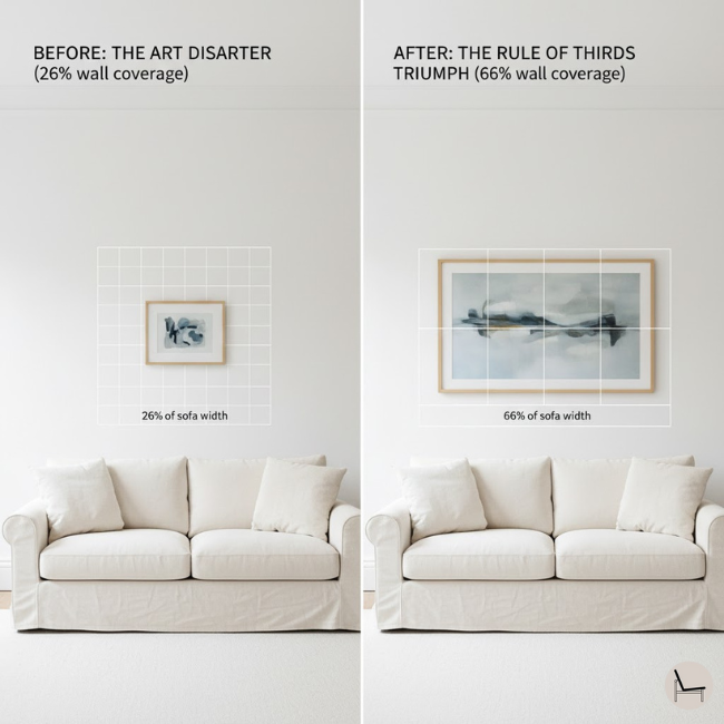
Before: A 24″ x 36″ abstract print above a 90″ sofa. The print occupied 26% of the wall width. It looked lost.
After: A 60″ x 40″ statement piece (two-thirds of the wall width). The room immediately felt grounded, expensive, and intentional.
The Investment: $400 for a large canvas print from Minted. One purchase, one install, permanent transformation.
Case Study #2: The Coffee Table Clutter → Curation
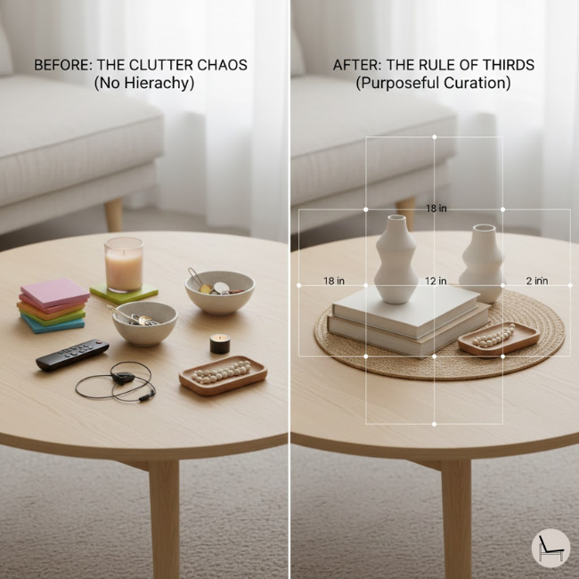
Before: Six small objects (coasters, candles, a bowl, random keys). Visual chaos. No hierarchy.
After: Three objects: one tall vase (18″), one medium stack of books (12″), one low wooden tray (2″). Clean, purposeful, magazine-ready.
The Investment: $0. Used existing items, removed the rest.
Case Study #3: The High-Ceiling Bedroom → Vertically Balanced
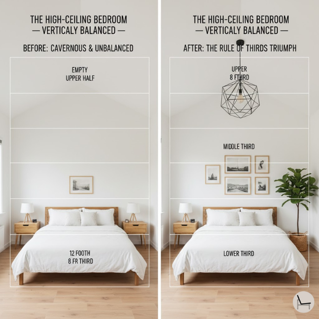
Before: 12-foot ceilings with all furniture and art in the lower 6 feet. The upper half felt empty and cavernous.
After: Added a dramatic pendant light at 8 feet (upper third), kept art at eye level (middle third), and introduced a tall floor plant (bridging lower and middle thirds).
The Investment: $200 for the pendant light, $60 for the plant. The room finally felt proportional.
Most Popular Post:
Interior Design Style Quiz
Timeless Paint Colors That Never Go Out of Style
Create Your Perfect Ergonomic Home Office: A Complete Guide
Must-Have Accessories for Guys: The Secret to a Stylish Space
Modular Sofas for Small Spaces: Brilliant Solutions for Compact Living
Conclusion & Next Steps: Your Space, Redesigned (Without the Designer Price Tag)
You now hold the exact framework professional designers use to create those “I can’t explain it, but it just works” interiors. The interior design rule of thirds isn’t about perfection—it’s about perception. It’s about understanding that your eye craves movement, balance, and just enough asymmetry to stay engaged.
Here’s what happens next:
You walk through your home with fresh eyes and notice the two matching lamps on your dresser (swap one for a stack of books). You see the art above your couch (measure it—is it two-thirds the sofa width?). You rearrange your coffee table (three objects, three heights, done). You stand in your doorway and check if the composition works from your primary vantage point.
The stakes? If you don’t apply this, you’ll keep spending money on “fixes” that never quite fix. You’ll live with a home that feels almost right, and that “almost” will quietly drain your joy every single day.
But if you do apply this—even just in one room this weekend—you’ll experience something remarkable: confidence. You’ll stop second-guessing. You’ll shop with purpose. You’ll invite people over and feel proud of your space.
Interior Design Rule of Thirds-Frequently Asked Questions
Q: Can the rule of thirds work in small apartments under 500 sq ft?
A: Absolutely. In fact, small spaces need the rule more. Focus on one-third furniture, two-thirds open floor space to prevent claustrophobia. Use vertical three-object styling on walls to draw the eye up, making ceilings feel higher.
Q: Do I have to group things in threes on every surface?
A: No. The rule is a guideline, not a law. Some surfaces (like a narrow console) might only hold one statement piece. But if you’re styling a larger surface (mantel, bookshelf, coffee table), threes create instant sophistication thanks to the Rule of Odds from visual psychology.
Q: What if my art is too small and I can’t afford a bigger piece right now?
A: Create a gallery wall with multiple smaller pieces arranged to collectively fill two-thirds of the wall. Use 3-5 frames clustered asymmetrically. The group becomes the “anchor.”
Q: Does the rule of thirds apply to color choices?
A: Yes—through the 60-30-10 color rule. 60% dominant neutral, 30% secondary color, 10% accent pop. It’s the rule of thirds applied to your palette.
Q: Can I use the rule of thirds in a maximalist or eclectic space?
A: You can, but you’ll adapt it. Instead of three objects per surface, think three material families (metals, woods, textiles) or three color stories repeated throughout the room. The structure remains; the expression changes.
Q: How do I apply the rule of thirds if I have unusually high or low ceilings?
A: Use the vertical thirds strategy. For high ceilings (10+ feet), focus on filling all three vertical layers—add statement lighting or tall plants to the upper third. For low ceilings (under 8 feet), concentrate visual interest in the middle third and avoid heavy upper-third elements like dark paint or bulky fixtures.
Q: Should I always use the rule of thirds, or is symmetry sometimes better?
A: It depends on the feeling you want. Symmetry creates grandeur and formality (perfect for entryways and traditional dining rooms). The rule of thirds creates comfort and livability (ideal for living rooms and bedrooms). Many successful spaces use both—symmetry for architecture, thirds for styling.
Subscribe To the Newsletter!
Subscribe now for an endless feed of inspirational women’s cave decor ideas, pampering rituals, and more tips for curating your ultimate escape. Let’s start making your cozy refuge a reality – you so deserve this!
CATCH THE LATEST IN HOME DECOR TRENDS:

Steal These 16 Expert-Approved Decorating Secrets

How To Accessorize Your Living Room

Small Space? 10 Ways To Make A Room Appear Bigger

Make Your space Look Expensive
GET CAUGHT UP ON ALL THE INSPIRING DECOR TIPS:

18 Fresh Decorating Ideas To Update Your Fireplace

How to Make a Gallery Wall: The Complete Step-by-Step Guide (Even If You’ve Never Hung a Picture)


