TL;DR: Choosing the best bedroom paint colors doesn’t require a design degree—it requires understanding three critical factors: color undertones (warm vs. cool), your room’s specific lighting conditions (natural and artificial), and proper testing methods using the 5-step sample protocol. This guide reveals the exact methodology professional designers use to select paint colors that transform bedrooms into restful sanctuaries, plus insider tips on avoiding the most common (and expensive) paint color mistakes homeowners make.
Introduction: Why Getting Your Bedroom Paint Color Right Matters More Than You Think
You’ve been staring at those builder-beige walls for months—maybe years—dreaming about the bedroom transformation that never quite happens.
You’ve scrolled past hundreds of gorgeous bedrooms on Pinterest, bookmarked thirty different paint colors, and maybe even bought a few sample pots that looked perfect online but somehow turned sickly yellow on your walls.
Here’s what nobody tells you: choosing the best bedroom paint colors isn’t about having an innate “design gene” or memorizing trendy color names. It’s about understanding three core principles that professionals use every single day—principles I’m about to hand you on a silver platter.

I learned this the hard way. My first bedroom paint disaster involved what the swatch called “Soft Linen”—a supposedly neutral beige that transformed into screaming orange under my west-facing afternoon light. Two weekends of labor, $300 in supplies, and one near-divorce conversation later, I finally understood why my interior designer friend always insisted on her “testing protocol.”
That protocol changed everything. And today, you’re getting the exact system that turns paint color selection from an anxiety-inducing guessing game into a confident, repeatable process.
Whether you’re working with a cozy 10×10 space or a luxurious primary suite, whether you prefer moody drama or serene minimalism, this guide will show you how to choose the best bedroom paint colors for your specific room, your lighting, and your lifestyle.
Your bedroom should be your sanctuary—not a source of regret. Let’s make sure you get it right the first time.
I. Quick Selection Guide: Find Your Perfect Bedroom Paint Color in 60 Seconds
Not sure where to start? Use this designer-approved quick reference to match the best bedroom paint colors to your specific needs:
| Mood Desired | Recommen-ded Color | Best Lighting | Pro Pick | LRV Range |
| Serene & Airy | Soft Sage / Pale Blue | North & South-Facing | Benjamin Moore Quiet Moments | 55-65 |
| Cozy & Warm | Creamy White / Greige | North-Facing | Sherwin-Williams Alabaster | 75-85 |
| Moody & Modern | Deep Navy / Charcoal | South & West-Facing | Benjamin Moore Hale Navy | 10-20 |
| Organic & Earthy | Terracotta / Clay | West-Facing | Sherwin-Williams Cavern Clay | 40-55 |
| Classic & Timeless | Warm Gray | All Directions | Benjamin Moore Revere Pewter | 60-70 |
| Fresh & Clean | Soft White | South-Facing | Benjamin Moore White Dove | 83-85 |
How to use this table: Find your “Mood Desired” in the left column, then check if your bedroom matches the “Best Lighting” condition. If yes, start with the “Pro Pick” color for your first sample test.
You’ll Also Like: 15 Expert Painting Tricks That Make Any Room Look More Expensive
II. Why Your Bedroom Paint Color Matters More Than Any Other Room

Your bedroom paint color directly impacts your sleep quality, stress levels, and daily mood in ways that kitchen or living room colors simply don’t—because this is the first and last space you see every single day.
Neuroscience research confirms what designers have known intuitively for decades: color isn’t just aesthetic decoration. It’s a psychological tool.
A 2017 study published in Sleep Medicine Reviews analyzed the relationship between bedroom environment and sleep quality, finding that participants sleeping in rooms painted in cool, muted tones (soft blues, sage greens, gentle grays) reported significantly better sleep quality compared to those in rooms with warm, intense colors like deep reds or bright yellows. The research showed that blue wavelengths specifically reduce cortisol (the stress hormone) and lower heart rate, creating optimal conditions for rest.
But here’s the catch that most color psychology articles miss: the “right” color depends entirely on your bedroom’s unique conditions.
That trendy moody navy that looks stunning in a sun-drenched south-facing room can feel like a cave in a north-facing space with limited natural light. The “perfect soft white” can read stark and cold if you’re using LED bulbs with high color temperature (5000K+) rather than warm incandescent-style lighting.
This is why choosing the best bedroom paint colors requires more than browsing “Top 10” lists. You need a methodology.
The Three Hidden Costs of Getting It Wrong:
- Financial waste: The average bedroom paint job costs $380-$790 when you factor in premium paint, supplies, and your time (or labor costs). Multiply that by two if you have to redo it.
- Emotional drain: Living with a color you hate creates low-grade daily stress—your sanctuary becomes another source of dissatisfaction.
- Decision paralysis: One bad experience often leads to years of “I’ll deal with it later,” leaving you stuck in design limbo.
💡 Pro Tip: Before you even look at paint swatches, take a photo of your bedroom at three different times: morning (natural light), afternoon (peak brightness), and evening (artificial light only). This reveals your room’s “lighting personality”—the critical first variable in selecting the best bedroom paint colors.
You’ll Also Like: Best Jewel Tone Paint Colors for a High-End Home Makeover
III. The Science of Choosing Bedroom Paint Colors: Understanding Undertones & LRV
Every paint color has an undertone—a subtle hue that emerges under different lighting conditions—and mastering undertone identification is the single most important skill for avoiding paint color disasters.
Let me tell you about my client Emily. She chose what looked like a “perfect neutral gray” from the swatch. Three days after painting, she called me in tears. Her beautiful gray had turned lavender-purple under her bedroom’s LED lighting. The culprit? A cool blue-violet undertone she never saw coming.
This happens to thousands of homeowners every year, and it’s 100% preventable once you understand undertones.
A. The Undertone Decoder: Your Three-Step Detection System
Step 1: The White Paper Test
Hold a sheet of pure white printer paper next to your paint sample in natural light. Does the sample suddenly look yellowish? Pinkish? Greenish? That’s the undertone revealing itself.
The contrast with true white forces your eye to detect the subtle color bias.
Step 2: The Comparison Cluster Method
Never evaluate a color in isolation. Paint stores love to display colors individually because it makes everything look “good enough.”
Instead, grab three similar shades and place them side-by-side. One will suddenly look too yellow, another too pink, and one will hit that sweet spot. The relative comparison is everything.
Step 3: The Time-of-Day Test
This is non-negotiable for choosing the best bedroom paint colors: you must view your sample at morning, noon, and evening. Colors shift dramatically based on:
- Morning light: Often cool and bluish (especially north-facing rooms)
- Afternoon light: Warm and golden (especially west-facing rooms)
- Evening artificial light: Depends entirely on your bulb temperature (2700K = warm/yellow, 5000K = cool/blue)
B. Understanding LRV (Light Reflectance Value): The Number That Changes Everything
Here’s a designer secret most homeowners never learn: every paint color has an LRV number (0-100) that tells you exactly how much light it reflects.
- LRV 0-30: Dark, dramatic colors (navy, charcoal, forest green)
- LRV 30-50: Medium tones (true grays, muted blues, warm taupes)
- LRV 50-70: Light, airy colors (soft whites, pale blues, light grays)
- LRV 70-100: Crisp whites and near-whites
Why this matters for bedrooms: If your room is small or has limited natural light, choosing a color with LRV below 40 will make the space feel cramped and cave-like.
Conversely, if you have massive windows and southern exposure, an LRV above 75 might feel too stark and clinical.
The sweet spot for most bedrooms? LRV 50-65—light enough to feel spacious, substantial enough to feel cozy.
💡 Pro Tip: Call the paint manufacturer’s customer service line and ask for the LRV of your top color choices. Most brands publish this data but don’t display it in stores. This one number can save you from a costly mistake.
In Case You Missed It: Calming Paint Colors: The Complete Guide to Creating Your Serene Home Sanctuary
IV. Best Bedroom Paint Colors by Mood, Style & Lighting Conditions

The best bedroom paint colors aren’t determined by trends—they’re determined by the specific mood you want to create, your room’s architectural features, and your lighting conditions.
Forget generic “Top 10” lists that ignore your bedroom’s unique personality. Let’s break this down the way professional designers actually work: by matching color families to desired psychological outcomes and practical lighting scenarios.
A. For Maximum Relaxation & Better Sleep: Cool-Toned Neutrals
Benjamin Moore
Quiet Moments
LRV: 68
Sherwin-Williams
Rainwashed
LRV: 60
Behr
Light French Gray
LRV: 65
If your primary goal is creating a sanctuary that promotes rest and reduces stress, cool-toned neutrals are your foundation. These are the colors that embrace you without demanding attention.
The Winners:
1. Benjamin Moore “Quiet Moments” (LRV 68)
- Color Profile: Soft gray-blue with subtle green undertones
- Best For: North and south-facing bedrooms, modern minimalist style
- Why It Works: This is one of the best bedroom paint colors for sleep because blue wavelengths naturally reduce cortisol levels and promote calm
2. Sherwin-Williams “Rainwashed” (LRV 60)
- Color Profile: Blue-green-gray hybrid with cool undertones
- Best For: East-facing bedrooms, coastal and transitional styles
- Why It Works: The green notes connect to nature while the gray grounds it from feeling too “beach house”
3. Behr “Light French Gray” (LRV 65)
- Color Profile: True neutral gray with minimal undertones
- Best For: South-facing bedrooms with abundant light, contemporary style
- Why It Works: Budget-friendly alternative that reads crisp and modern without the purple-cast issues of cheaper grays
Lighting Compatibility:
- North-facing bedrooms: These cool colors can feel too cold. Add warmth by choosing versions with slight taupe undertones or pair with warm-temperature lighting (2700K bulbs).
- South-facing bedrooms: Perfect canvas for cool neutrals—abundant natural light prevents them from feeling dreary.
- East/West-facing: Expect color shifts. Test morning and evening to ensure you love it in both conditions.
B. For Cozy Intimacy & Warmth: Warm Neutrals & Earth Tones
Sherwin-Williams
Alabaster (SW 7008)
LRV: 82
Benjamin Moore
White Dove (OC-17)
LRV: 83.16
Sherwin-Williams
Cavern Clay (SW 7701)
LRV: 42
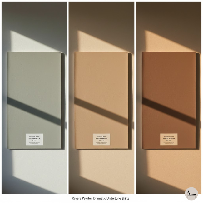
Benjamin Moore
Revere Pewter (HC-172)
LRV: 55.51
Want your bedroom to feel like a five-star boutique hotel—wrapped in luxury and warmth? Warm neutrals create that enveloping effect without the risk of overwhelming your senses.
The Winners:
1. Sherwin-Williams “Alabaster” (LRV 82)
- Color Profile: Warm white with cream undertones
- Best For: North-facing bedrooms, farmhouse and traditional styles
- Why It Works: This is the “expensive looking” white that feels intentional, not builder-grade—one of the best bedroom paint colors for creating bright but cozy spaces
2. Benjamin Moore “White Dove” (LRV 83.16)
- Color Profile: Soft white with yellow-cream undertones
- Best For: North and east-facing bedrooms, organic modern and transitional styles
- Why It Works: Warmer than pure white but still feels fresh and clean; pairs beautifully with natural wood tones
3. Sherwin-Williams “Cavern Clay” (LRV 42)
- Color Profile: Soft terracotta with pink and orange undertones
- Best For: West-facing bedrooms, modern organic and southwestern styles
- Why It Works: Earth tones are scientifically proven to create feelings of safety and groundedness—this is the sophisticated alternative to boring beige
4. Benjamin Moore “Revere Pewter” (LRV 55.51)
- Color Profile: Greige (gray + beige) with warm undertones
- Best For: Any lighting direction, transitional and contemporary styles
- Why It Works: The most popular “safe bet” among the best bedroom paint colors—warm enough to feel cozy, gray enough to feel modern
Lighting Compatibility:
- North-facing bedrooms: Warm neutrals are your best friend here—they compensate for cool natural light and create the cozy factor north-facing rooms desperately need.
- South/West-facing: Be cautious. Abundant warm afternoon light + warm paint can become too yellow/orange. Test extensively or shift slightly cooler.
C. For Bold Personality & Drama: Deep, Saturated Tones
Benjamin Moore
Hale Navy (HC-154)
LRV: 9
Sherwin-Williams
Peppercorn (SW 7674)
LRV: 6
Farrow & Ball
Studio Green (No. 93)
LRV: 18
This is where homeowners often panic—but deep colors can create the most stunning, memorable bedrooms when applied with the right strategy.
The Winners:
1. Benjamin Moore “Hale Navy” (LRV 9)
- Color Profile: Deep navy blue with minimal purple undertone
- Best For: South and west-facing bedrooms 200+ sq ft, modern and traditional styles
- Why It Works: Creates “jewel box” bedrooms that feel intentionally designed and luxurious
2. Sherwin-Williams “Peppercorn” (LRV 6)
- Color Profile: Deep charcoal gray with warm undertones
- Best For: Large south-facing bedrooms, industrial and contemporary styles
- Why It Works: Modern, sophisticated, pairs beautifully with brass and warm wood tones without the commitment level of black
3. Farrow & Ball “Studio Green” (LRV 18)
- Color Profile: Rich forest green with gray undertones
- Best For: West-facing bedrooms with good lighting infrastructure, organic modern and maximalist styles
- Why It Works: Brings nature’s restorative quality indoors with serious sophistication
Critical Rules for Dark Bedroom Colors:
- Your room needs good lighting infrastructure: Layered lighting (overhead, bedside, accent) is non-negotiable. Darkness without light sources = cave, not sanctuary.
- Test paint finish carefully: Matte finish on dark colors creates depth; satin can feel too shiny and cheap-looking.
- Contrast is your friend: Dark walls + white trim + light bedding = intentional drama. Dark walls + dark everything else = oppressive.
Lighting Compatibility:
- Large, bright rooms only: If your bedroom is under 150 sq ft or has limited natural light, save dark colors for an accent wall maximum.
- South/West-facing: Best case scenario—natural light prevents dark colors from feeling cave-like while maintaining richness.
💡 Pro Tip: Interior designer Sarah Richardson says, “The biggest mistake with dark bedroom colors is fear. Commit fully or don’t do it at all. A half-dark room (one accent wall) often looks unfinished. If you’re going moody, paint all four walls and the ceiling—it creates a cocoon effect that’s surprisingly soothing.”
You’ll Also Like: The One Paint Color That Designers Are Too Afraid to Tell You Works in Every Room
V. Best Bedroom Paint Colors for Small Spaces: How to Maximize Square Footage

Small bedrooms (under 150 sq ft) require strategic color choices that visually expand space rather than shrink it—but “paint it white” isn’t the only answer.
Here’s the truth about small bedroom paint colors that most design blogs won’t tell you: while light colors do make rooms feel larger, the wrong light color can make a small bedroom feel cold and uninviting. The goal isn’t just “bigger”—it’s “bigger AND better.”
A. The Small Bedroom Color Strategy:
Best Colors for Small Bedrooms:
| Paint Color | Brand | LRV | Why It Works for Small Spaces |
| White Dove | Benjamin Moore | 83.16 | Warm white that expands space without feeling sterile |
| Sea Salt | Sherwin-Williams | 64 | Soft blue-gray-green that recedes walls while staying serene |
| Pale Oak | Benjamin Moore | 70 | Warm greige that adds depth without closing in walls |
| Repose Gray | Sherwin-Williams | 60 | True gray that feels spacious and modern |
| Silver Strand | Sherwin-Williams | 59 | Cool gray-blue that visually pushes walls back |
B. The Monochromatic Trick: Same Color on Walls, Trim & Ceiling
The Secret: When you paint trim, walls, and ceiling the exact same color in small bedrooms, you erase visual boundaries that make the space feel choppy and confined.
How to Execute:
- Choose a color with LRV 60-75 (light but not stark)
- Use the same color on all surfaces—no white trim
- Keep ceiling the same shade (this is counter-intuitive but works)
- Use eggshell on walls, semi-gloss on trim (same color, different sheens create subtle definition)
Why It Works: Your eye can’t find where walls “stop,” so the space feels continuous and larger. This is one of the most effective techniques for choosing the best bedroom paint colors when square footage is limited.
Best Colors for Monochromatic Small Bedrooms:
Benjamin Moore
Pale Oak (OC-20)
Warm Greige
LRV: 68.64
Sherwin-Williams
Repose Gray (SW 7015)
True Neutral Gray
LRV: 58
Benjamin Moore
Classic Gray (OC-23)
Soft Warm Gray
LRV: 73.67
- Benjamin Moore “Pale Oak” (warm greige)
- Sherwin-Williams “Repose Gray” (true neutral gray)
- Benjamin Moore “Classic Gray” (soft warm gray)
💡 Pro Tip: Hang large mirrors on walls opposite windows to bounce light and double the visual impact of your carefully chosen paint color. In small bedrooms, light colors (LRV 60+) plus strategic mirrors can make a 10×10 room feel 30% larger.
Popular Post To Read: Warm Neutral Paint Colors: Designer Secrets Revealed
VI. The Lighting Factor: How Natural & Artificial Light Transform Your Paint Colors

Even the “perfect” paint color will fail if you ignore your bedroom’s lighting personality—the combined effect of natural light direction, window size, and artificial light temperature.
This is the section that will save you hundreds of dollars in mistakes. Let me explain with a story.
My friend purchased what looked like a gorgeous “soft cloud white” for her bedroom. The swatch was perfection. The online photos were dreamy. But when she painted her east-facing bedroom, the color looked cold and gray every evening (when she actually spent time there).
The culprit? She tested the sample only in morning light—when east-facing rooms receive their brief window of warmth. By evening, with her cool-toned LED bulbs, the paint’s blue undertone went into overdrive.
A. The Natural Light Direction Rule
North-Facing Bedrooms:
Receive cool, consistent, indirect light all day—no direct sun. This creates a “blue-cast” effect that makes cool colors feel even cooler and can turn whites dingy.
Your Strategy: Choose warm-toned neutrals, creams, and colors with yellow or pink undertones to compensate. Avoid pure whites, true grays, and cool blues unless you want a Scandinavian-minimal (read: cold) aesthetic.
Best Bedroom Paint Colors for North-Facing Rooms:
Sherwin-Williams
Alabaster (SW 7008)
Warm White
LRV: 82
Benjamin Moore
White Dove (OC-17)
Creamy White
LRV: 83.16
Sherwin-Williams
Accessible Beige (SW 7036)
Warm Greige
LRV: 58
- Sherwin-Williams “Alabaster” (warm white)
- Benjamin Moore “White Dove” (cream-white)
- Sherwin-Williams “Accessible Beige” (warm greige)
South-Facing Bedrooms:
The jackpot. Abundant warm, direct sunlight throughout the day makes colors appear truest to swatch. These rooms are forgiving.
Your Strategy: You have the most flexibility here. Cool colors won’t feel too cold; warm colors won’t go orange. This is where you can successfully use that trendy moody navy or crisp white.
Best Bedroom Paint Colors for South-Facing Rooms:
Benjamin Moore
Hale Navy (HC-154)
Deep Navy
LRV: 9
Sherwin-Williams
Pure White (SW 7005)
Crisp Clean White
LRV: 84
Benjamin Moore
Quiet Moments (1563)
Soft Blue-Gray
LRV: 68
- Benjamin Moore “Hale Navy” (deep navy)
- Sherwin-Williams “Pure White” (crisp clean white)
- Benjamin Moore “Quiet Moments” (soft blue-gray)
East-Facing Bedrooms:
Warm, golden morning light; cool, shadowy afternoon/evening light.
Your Strategy: Decide which time matters more to you. If you’re a morning person who lingers over coffee, choose colors that look great in morning light. If you only use your bedroom evenings, test extensively at 6-10 PM.
Best Bedroom Paint Colors for East-Facing Rooms:
Sherwin-Williams
Rainwashed (SW 6211)
Adapts to Light
LRV: 60
Benjamin Moore
Pale Oak (OC-20)
Warm Neutral
LRV: 68.64
Behr
Silver Drop (790C-2)
Soft Warm Gray
LRV: 64
- Sherwin-Williams “Rainwashed” (adapts to changing light)
- Benjamin Moore “Pale Oak” (warm neutral that doesn’t go cold)
- Behr “Silver Drop” (soft gray with warmth)
West-Facing Bedrooms:
Cool morning light; intense warm/golden afternoon light.
Your Strategy: Afternoon sun is powerful and can make colors go “hot.” Cool neutrals and soft blues balance the warmth. Avoid warm yellows, oranges, and reds unless you want an oven effect.
Best Bedroom Paint Colors for West-Facing Rooms:
Sherwin-Williams
Sea Salt (SW 6204)
Cool Blue-Green-Gray
LRV: 63
Benjamin Moore
Gray Owl (OC-52)
Cool Gray
LRV: 64.51
Sherwin-Williams
Repose Gray (SW 7015)
Neutral Gray
LRV: 58
- Sherwin-Williams “Sea Salt” (cool blue-green-gray)
- Benjamin Moore “Gray Owl” (cool gray that balances warm light)
- Sherwin-Williams “Repose Gray” (neutral gray)
B. The Artificial Lighting Temperature Game-Changer
Here’s what paint stores don’t tell you: the Kelvin temperature of your light bulbs will change your paint color as dramatically as natural light does.
| Light Temperature | Visual Effect | Best Paint Color Matches | Avoid With… |
| 2700K (Warm White/Soft White) | Yellow-orange glow, “cozy” feel | Warm neutrals, creams, whites with yellow undertones | Cool grays, blues (they’ll fight the warmth) |
| 3000K (Bright White) | Neutral, balanced—closest to natural daylight | Most versatile—works with warm and cool tones | Extreme colors (very dark or very saturated) |
| 4000K-5000K (Cool White/Daylight) | Blue-white, “clinical” feel | Cool grays, true whites, blues with gray undertones | Warm beiges, yellows, terracottas (will look muddy) |
Action Step: Check your current bedroom light bulbs. The Kelvin temperature is printed on the bulb or box. If you’re choosing the best bedroom paint colors for a cozy sanctuary, make sure you’re using 2700K-3000K bulbs. If you prefer a bright, energizing morning space, 3000K-4000K works better.
💡 Pro Tip: Layer your lighting temperature. Use 2700K in bedside lamps (for evening winding down) and 3000K in overhead fixtures (for morning tasks). This gives you color flexibility throughout the day.
You’ll Also Like: Color Capping: A Step-by-Step Guide to the 2026 Color Paint Trend
VII. Paint Finish Guide: Matte vs. Eggshell vs. Satin for Bedrooms

The paint finish you choose affects durability, light reflection, and visual texture—and choosing the wrong finish can undermine even the perfect color choice.
Most homeowners obsess over color and treat finish as an afterthought. That’s backwards. The finish determines how the color performs in real life.
Visual Guide to Paint Finishes:
A. Matte (Flat) Finish
The Look: Velvety, non-reflective, hides wall imperfections beautifully, creates sophisticated depth.
Best For:
- Master bedrooms/adult spaces where walls won’t be touched frequently
- Homes with textured or imperfect walls
- Dark, moody colors (matte finish enhances their richness)
- Creating a high-end, boutique hotel aesthetic
The Drawback: Least durable—shows scuff marks, difficult to clean. Not ideal for kids’ rooms or high-traffic areas.
Best Bedroom Paint Colors in Matte Finish:
Benjamin Moore
Hale Navy (Aura Matte)
Dramatic Depth
LRV: 9
Sherwin-Williams
Peppercorn (Emerald Matte)
Sophisticated Charcoal
LRV: 6
Farrow & Ball
Studio Green (Modern Emulsion)
Rich Forest Green
LRV: 18
- Benjamin Moore Aura Matte in “Hale Navy” (dramatic depth)
- Sherwin-Williams Emerald Matte in “Peppercorn” (sophisticated charcoal)
- Farrow & Ball Modern Emulsion in “Studio Green” (rich forest green)
B. Eggshell Finish
The Look: Slight sheen (like an actual eggshell), subtle light reflection, balances elegance with practicality.
Best For:
- The “Goldilocks” finish—works for 80% of bedrooms
- Families with children (more cleanable than matte)
- Light to medium paint colors
- Bedrooms that serve multiple functions (sleep + home office)
The Sweet Spot: This is the most popular bedroom finish for good reason—it’s washable without looking shiny or cheap.
Best Bedroom Paint Colors in Eggshell Finish:
Benjamin Moore
Revere Pewter (Regal Select)
Eggshell Finish
LRV: 55.51
Sherwin-Williams
Alabaster (Duration Home)
Eggshell Finish
LRV: 82
Behr
Silver Drop (Premium Plus)
Eggshell Finish
LRV: 64
- Benjamin Moore Regal Select Eggshell in “Revere Pewter”
- Sherwin-Williams Duration Home Eggshell in “Alabaster”
- Behr Premium Plus Eggshell in “Silver Drop”
C. Satin Finish
The Look: Noticeable sheen, reflects light, smooth and silky appearance.
Best For:
- High-humidity environments (bathrooms, basement bedrooms)
- Kids’ rooms requiring frequent cleaning
- Accent walls where you want subtle shimmer
- Trim, doors, and molding (not usually primary walls)
The Drawback: The sheen highlights wall imperfections and can look “too shiny” on large wall surfaces in formal adult bedrooms.
D. Quick Finish Selection Matrix
| Your Priority | Recommended Finish | Best Bedroom Paint Colors for This Finish |
| Hide wall flaws | Matte/Flat | Benjamin Moore “Quiet Moments,” deep colors |
| Easy cleaning | Eggshell or Satin | Sherwin-Williams “Alabaster,” light neutrals |
| Sophisticated look | Matte (light-medium) or Eggshell (all) | Benjamin Moore “Revere Pewter,” greiges |
| Budget-friendly | Eggshell | Behr Premium Plus in any color |
| Kids’ rooms | Satin or Eggshell | Washable whites and light colors |
💡 Pro Tip: Never use satin or semi-gloss finishes on all four bedroom walls unless you’re painting a kids’ room. The sheen creates a “commercial” look that undermines the restful atmosphere you’re trying to build. If you need durability in an adult bedroom, eggshell is your maximum sheen.
Keep Reading: The Ultimate Color Trend Forecast: What Paint Colors Will Define Next Year’s Home Design
VIII. The 5-Step Foolproof Paint Testing Method (The Designer Secret)

Testing paint samples the wrong way is why most homeowners end up repainting—but this 5-step protocol used by professional designers eliminates guesswork and guarantees confidence before you commit.
I’m going to share the exact testing methodology I learned from a veteran color consultant who’s been matching paint to spaces for 23 years. This process takes 5-7 days, which sounds like a long time—until you consider that it prevents a $600+ mistake and weeks of regret.
Step 1: Purchase Large-Format Samples (Not Tiny Swatches)
The Problem with Traditional Swatches: Those 2″x3″ color chips look nothing like they will on your actual walls. Color perception requires scale—your brain interprets small swatches differently than large surfaces.
The Solution: Buy quart-size samples (usually $5-10 each) from your top 3-4 color choices. Also purchase:
- Two 20″x30″ foam core boards or poster boards (white)
- Foam roller and small tray
- Painter’s tape
Your Shopping List for Testing the Best Bedroom Paint Colors:
- Sample quart: Benjamin Moore “Quiet Moments” ($8-10)
- Sample quart: Sherwin-Williams “Alabaster” ($8-10)
- Sample quart: Benjamin Moore “Revere Pewter” ($8-10)
- Two white foam core boards 20″x30″ ($6 total)
- 4″ foam roller and tray ($5)
Why This Works: You’ll paint large portable boards instead of your walls, giving you flexibility to move samples around the room and compare them side-by-side.
Step 2: Paint Your Sample Boards Properly
The Technique:
- Apply two coats to each foam board (paint color needs full coverage to read accurately)
- Let dry completely (at least 4 hours between coats)
- Label the back of each board with the color name, brand, and LRV
Critical Rule: Paint sample boards in the same room where they’ll be used. Hallway lighting is different from bedroom lighting. You need accurate environmental conditions.
Step 3: The 3-Day, 3-Time-of-Day Observation Protocol
This is where amateurs rush and professionals slow down.
Day 1:
- Morning (7-9 AM): Place boards against different walls. Take photos with your phone (camera sees differently than your eye—photos reveal truths). Which color feels too cold? Too dark?
- Midday (12-2 PM): How do colors look under peak natural light? Does one suddenly feel washed out?
- Evening (7-9 PM): Lights on, natural light gone. This is when your artificial lighting reveals undertones. Which color makes the room feel cozy vs. stark?
Days 2-3:
Repeat. Color perception needs time. What you thought was “perfect” on Day 1 might irritate you by Day 3. Trust the 72-hour test—it’s the difference between confidence and doubt.
Step 4: The Contextual Comparison Test
Place your sample boards:
- Next to your bedding/duvet
- Next to existing furniture (headboard, nightstands, dresser)
- Next to window treatments (curtains, shades)
- Next to flooring
What You’re Looking For: Does the color harmonize or clash? You’re not looking for “match”—you’re looking for complementary relationship. If the color makes your favorite du
Continue
2:13 PM
vet suddenly look dingy or makes your wood furniture look orange, that’s critical data.
💡 Pro Tip: Take photos of your samples next to existing elements and text them to a trusted friend whose design taste you respect. Sometimes a fresh pair of eyes catches undertone issues you’ve become blind to after days of staring.
Step 5: The Partner/Second Opinion Reality Check
If you share the bedroom, this step is non-negotiable (and might save your relationship).
The Approach:
- Don’t announce which color you prefer—you’ll bias their opinion
- Ask: “Which of these makes you feel most relaxed? Most energized? Rank them 1-3.”
- Discuss the why behind preferences—often the disagreement is about undertone, not the color itself
Compromise Strategies:
- If you disagree on warm vs. cool, greige (gray-beige hybrids) like Benjamin Moore “Revere Pewter” are the bridge colors
- Consider one person choosing the main color, the other choosing accent wall or décor colors
- Remember: you both have to look at this every day. Mutual satisfaction matters more than “winning”
Final Decision Framework
After 5-7 days of testing the best bedroom paint colors, you’ll know your winner because:
✓ You never got tired of looking at it
✓ It looked good in all three lighting conditions
✓ It made your existing furniture/bedding look better, not worse
✓ You felt emotionally drawn to it (relaxed, energized, cozy—whatever you wanted)
✓ Your partner agreed (or you found acceptable compromise)
💡 Pro Tip: Interior designer Emily Henderson revealed, “I always tell clients: if you’re still debating between two colors after the 5-day test, go with the one that performs better in evening light. You’ll see your bedroom far more often at 9 PM than 9 AM, so optimize for the time that matters most to your lifestyle.”
You’ll Also Like: How to Style a Bed for an Insta-Worthy Bedroom
IX. Common Paint Color Mistakes (And How to Avoid Them)

Even with a solid methodology, there are seven classic mistakes that derail bedroom paint projects—and once you recognize them, they’re completely avoidable.
Mistake #1: Choosing Color from a Tiny Swatch or Screen
The Problem: Color chips and website photos are visual liars. The 2″x2″ swatch looks nothing like 200 square feet of wall surface.
The Fix: Always use the 5-Step Testing Method above. No exceptions, no shortcuts. The $30 you spend on sample quarts prevents the $500 disaster.
Mistake #2: Ignoring Undertones
The Problem: You choose “the perfect gray” only to discover it’s actually purple-gray (hello, blue-violet undertone) once it’s on your walls.
The Fix: Use the White Paper Test religiously. Compare your sample to pure white paper in natural light—the undertone will reveal itself instantly.
Most Common Undertone Traps:
Sherwin-Williams
Agreeable Gray (SW 7029)
The Ultimate Greige
LRV: 60
Benjamin Moore
Edgecomb Gray (HC-173)
Soft Organic Tan
LRV: 63
Sherwin-Williams
Repose Gray (SW 7015)
Classic Neutral Gray
LRV: 58
- Agreeable Gray (Sherwin-Williams): Can read purple in cool light
- Edgecomb Gray (Benjamin Moore): Can look peachy-beige in warm light
- Repose Gray (Sherwin-Williams): True gray but can feel cold without warm lighting
Mistake #3: Testing in Only One Lighting Condition
The Problem: Your sample looked gorgeous in the store’s fluorescent lighting (or on your phone screen), but your bedroom has west-facing afternoon sun and warm 2700K bulbs. Two completely different environments.
The Fix: The 3-Day, 3-Time-of-Day protocol isn’t optional. Morning, midday, evening. Natural light, artificial light, both combined.
Mistake #4: Choosing Trendy Colors Without Considering Longevity
The Problem: That Instagram-famous “Millennial Pink” or “Gen Z Yellow” looks dated 18 months later, and you’ve committed to years of living with it.
The Fix: Ask yourself, “Would this color have looked good in 2015? Will it still look good in 2030?”
Best Bedroom Paint Colors with 10+ Year Staying Power:
Benjamin Moore
White Dove (OC-17)
Warm White | LRV 83.16
Sherwin-Williams
Alabaster (SW 7008)
Soft White | LRV 82
Benjamin Moore
Revere Pewter (HC-172)
Greige | LRV 55.51
Sherwin-Williams
Sea Salt (SW 6204)
Blue-Gray-Green | LRV 63
Benjamin Moore
Hale Navy (HC-154)
Deep Navy | LRV 9
Sherwin-Williams
Cavern Clay (SW 7701)
Terracotta | LRV 42
- Benjamin Moore “White Dove” (warm white)
- Sherwin-Williams “Alabaster” (soft white)
- Benjamin Moore “Revere Pewter” (greige)
- Sherwin-Williams “Sea Salt” (soft blue-gray-green)
- Benjamin Moore “Hale Navy” (deep navy)
- Sherwin-Williams “Cavern Clay” (terracotta)
If the color has a trending hashtag, think twice.

Mistake #5: Using All One Color (Paint, Ceiling, Trim) Without Intentional Strategy
The Problem: Painting everything—walls, ceiling, trim—the exact same color can create a flat, one-dimensional space that lacks visual interest (unless you’re deliberately using the monochromatic small-space trick).
The Fix: Use the “90-10” rule for most bedrooms:
- Your primary wall color covers 90% of surfaces
- Reserve 10% for contrast:
- Paint trim and molding in a brighter white (2-3 LRV points higher)
- Consider painting the ceiling in a shade lighter than walls
- If going dark (LRV below 30), keep ceiling white to prevent “cave effect”
Exception: For small bedrooms under 150 sq ft, the monochromatic approach (same color everywhere) actually works better to erase visual boundaries.
Mistake #6: Forgetting About Your Room’s Fixed Elements
The Problem: You choose the best bedroom paint colors in isolation, forgetting that you have honey-oak floors, cream carpet, or existing wood furniture that won’t be replaced.
The Fix: During sample testing (Step 4), place boards directly next to your flooring, headboard, and largest furniture pieces. If the combination makes you wince, keep searching.
Color Coordination Guide:
| Your Fixed Element | Best Bedroom Paint Colors to Pair | Colors to Avoid |
| Honey Oak Floors/Furniture | Cool grays, soft blues, sage greens | Warm yellows, beiges (creates orange overload) |
| Dark Walnut/Espresso Wood | Warm whites, creams, light greiges | Dark colors (too much contrast feels stark) |
| Beige/Tan Carpet | Warm grays, soft whites, muted blues | Cool grays (clash with warm undertones) |
| Gray Carpet | Benjamin Moore “Quiet Moments,” Sherwin-Williams “Alabaster” | Competing grays with different undertones |
Mistake #7: Choosing Cheap Paint to “Save Money”
The Problem: Budget-grade paint requires 3-4 coats for full coverage, has poor hide (shows wall imperfections), and fades within 2 years. You “save” $20 per gallon but spend 3x the labor and redo the project sooner.
The Fix: This is the ONE place to invest in quality.
| Budget Tier | Recommen-ded Brands To Use | When to Choose | Cost Per Gallon | Coverage |
| Budget-Conscious | Behr Premium Plus, Valspar Ultra | Rentals, temporary spaces, kids’ rooms you’ll repaint | $28-38 | 3-4 coats |
| Best Value | Sherwin-Williams Duration Home, Benjamin Moore Regal Select | Primary bedroom, long-term investment | $55-75 | 2 coats |
| Premium | Benjamin Moore Aura, Farrow & Ball Modern Emulsion | Low-VOC priority, flawless finish critical, color match perfection | $75-110 | 1-2 coats |
Real Talk: A $70/gallon paint that covers perfectly in 2 coats costs less (time + money) than a $35/gallon paint requiring 4 coats plus touch-ups.
💡 Pro Tip: Never compromise on paint quality for bedrooms. This is the room where you spend 8+ hours daily breathing in whatever VOCs (volatile organic compounds) remain. Invest in low-VOC or zero-VOC formulas—brands like Benjamin Moore Aura and Sherwin-Williams Harmony are specifically formulated for indoor air quality.
Most Popular Post:
Interior Design Style Quiz
Timeless Paint Colors That Never Go Out of Style
Create Your Perfect Ergonomic Home Office: A Complete Guide
Must-Have Accessories for Guys: The Secret to a Stylish Space
Modular Sofas for Small Spaces: Brilliant Solutions for Compact Living
X. Your Next Steps: From Decision to Dream Bedroom
You now have the complete methodology that professional designers use to choose the best bedroom paint colors—no guessing, no regrets, no expensive do-overs.
Here’s your reality check: the perfect bedroom paint color is out there, but it won’t find itself. Every day you delay is another day waking up in a space that doesn’t serve you. You’ve just invested 30 minutes reading this guide—don’t let that knowledge sit unused.
Your Immediate Action Plan:
This Week:
- Assess your lighting (take photos morning/midday/evening, note which direction your bedroom faces)
- Define your mood priority (relaxation? coziness? drama? Revisit the “Best Colors by Mood” section)
- Identify undertone compatibility with your existing floors, furniture, and bedding using the White Paper Test
Next Week:
- Purchase 3-4 sample quarts in your narrowed-down color choices (use the Budget-to-Luxury matrix to choose quality)
- Execute the 5-Step Testing Protocol (paint boards, test for 3 days minimum, observe in all lighting)
- Make your confident decision and order full gallons (add 10% for touch-ups)
Following Weekend:
- Paint your sanctuary—or hire a professional if DIY isn’t your strength (a skilled painter ensures even coverage that makes colors look their best)
Your 24-Hour Challenge: Take the First Step Today
Don’t let this guide sit in your bookmarks collecting digital dust. Here’s what you’re going to do in the next 24 hours:
To-Do #1: Go to your local paint store today and pick up three sample quarts based on your lighting direction:
- North-Facing: Get Sherwin-Williams “Alabaster,” Benjamin Moore “White Dove,” and Behr “Perfect Taupe”
- South-Facing: Get Benjamin Moore “Quiet Moments,” Sherwin-Williams “Sea Salt,” and Benjamin Moore “Hale Navy”
- East-Facing: Get Sherwin-Williams “Rainwashed,” Benjamin Moore “Pale Oak,” and Behr “Silver Drop”
- West-Facing: Get Sherwin-Williams “Repose Gray,” Benjamin Moore “Gray Owl,” and Sherwin-Williams “Sea Salt”
Action Item #2: Buy two white foam core boards (20″x30″) and a foam roller at any office supply or hardware store (total cost: under $15).
To-Do #3: Paint those boards tonight and start your 3-day observation protocol tomorrow morning.
That’s it. Three simple actions that take less than 2 hours total and cost under $50—but will save you from a $600+ mistake.
The Investment That Pays Daily Dividends
Yes, premium paint costs more upfront. Quality samples, proper testing, and taking your time adds days to the process. But here’s what you’re actually investing in:
✓ 7-10 years of walking into a room that makes you exhale with satisfaction
✓ 2,555+ nights of better sleep in a space scientifically designed to promote rest
✓ Eliminated decision regret and the confidence to tackle future design projects
✓ Increased home value—well-executed paint is one of the highest ROI improvements (average 107% return on investment according to Homelight)
The difference between “good enough” and “exactly right” is the difference between tolerating your bedroom and loving it.
Your Commitment Matters More Than Perfection
Let me leave you with this truth: there is no objectively “perfect” paint color—only the perfect color for your specific room, your lighting, your lifestyle, and your emotional needs.
The homeowners who successfully transform their bedrooms aren’t the ones with unlimited budgets or innate design talent. They’re the ones who trusted the process, did the unglamorous work of testing samples properly, and gave themselves permission to create a space that serves them rather than following generic trends.
Your bedroom is where you begin and end every single day. It witnesses your most vulnerable moments—your exhaustion, your joy, your quiet morning coffee, your conversations with loved ones. It deserves more than beige walls chosen by a builder who’s never met you.
You have the methodology. You have the knowledge. Now all you need is the courage to start.
Ready to choose the best bedroom paint colors with absolute confidence? Save this guide, screenshot your favorite color recommendations from the Quick Selection table, and begin your 5-Step Testing Protocol this week. Your sanctuary is waiting—and it’s closer than you think.
Have questions about your specific bedroom situation? Drop a comment below—I personally respond to every question and love helping readers navigate tricky lighting scenarios, undertone mysteries, and color commitment anxiety. Your dream bedroom starts with a single step: let’s take it together.
Pin this guide to save it for when you’re ready to start your bedroom paint project. And if you found this helpful, share it with a friend who’s been stuck in paint color paralysis—sometimes we all need permission to finally create the sanctuary we deserve.
Frequently Asked Questions: Best Bedroom Paint Colors
Q: What is the most relaxing bedroom paint color?
A: Soft blue-grays with LRV 55-65 (like Benjamin Moore “Quiet Moments” or Sherwin-Williams “Rainwashed”) are scientifically proven to be the most relaxing bedroom paint colors. Blue triggers the parasympathetic nervous system, which reduces heart rate and promotes calm, while the gray prevents the color from feeling too juvenile or cold. Gentle sage greens (LRV 50-60) are the second most effective for sleep quality, as they connect us to nature’s restorative properties according to research published in Sleep Medicine Reviews.
Q: Should bedroom paint be light or dark?
A: The answer depends entirely on your room size, natural light, and personal preference.
Light colors (LRV 60-85) work best for:
- Small bedrooms under 150 sq ft
- North-facing rooms with limited natural light
- Spaces where you want an airy, spacious feel
- Top picks: Sherwin-Williams “Alabaster,” Benjamin Moore “White Dove,” Sherwin-Williams “Sea Salt”
Dark colors (LRV 15-35) work best for:
- Large bedrooms over 200 sq ft
- South/west-facing rooms with abundant natural light
- When you want a cozy “jewel box” or boutique hotel atmosphere
- Top picks: Benjamin Moore “Hale Navy,” Sherwin-Williams “Peppercorn,” Farrow & Ball “Studio Green”
The key is matching color value to your specific lighting conditions—not following generic rules.
Q: What color should you not paint your bedroom?
A: Avoid painting bedrooms in intense, highly saturated colors that stimulate rather than soothe:
Colors to Avoid:
- Bright reds: Increases heart rate and agitation, disrupts sleep
- Neon or electric colors: Overstimulate the brain, prevent relaxation
- Stark pure white (LRV 90+): Can feel cold and clinical rather than restful in bedrooms with cool lighting
- Colors with strong yellow/green undertones in north-facing bedrooms: They’ll turn muddy and depressing without sufficient natural light
The goal is to choose the best bedroom paint colors that promote rest, not activate your nervous system.
Q: How do I know if a paint color is warm or cool?
A: Use the White Paper Test: hold a sheet of pure white printer paper next to your paint sample in natural light.
- If the sample looks yellowish, peachy, or pinkish compared to the white = warm color
- If it looks bluish, purplish, or greenish-gray = cool color
You can also ask for the paint’s undertone information from the manufacturer—most brands will tell you if a color has warm (yellow/red base) or cool (blue/green base) undertones.
Quick Reference:
- Warm: Sherwin-Williams “Alabaster,” Benjamin Moore “White Dove,” Sherwin-Williams “Cavern Clay”
- Cool: Benjamin Moore “Quiet Moments,” Sherwin-Williams “Sea Salt,” Sherwin-Williams “Repose Gray”
This is the single most important skill for choosing the best bedroom paint colors that match your lighting.
Q: How many paint samples should I test before choosing?
A: Start with 3-4 colors maximum for your first round of testing. More than that becomes overwhelming and makes comparison difficult.
The Process:
- Round 1: Test 3-4 colors using the 5-Step Testing Method (paint large boards, observe for 3 days in morning/afternoon/evening light, compare to existing furniture and bedding)
- Evaluate: If none work, identify what’s wrong (too dark, wrong undertone, clashes with flooring)
- Round 2: Narrow your next batch based on that feedback
Most people find their perfect color by the second round of testing—patience in this phase prevents expensive mistakes. The average homeowner spends $35-45 on samples but saves $400+ in avoided repainting costs.
Q: Can I paint my bedroom ceiling a different color than the walls?
A: Yes, and it’s often recommended for visual interest—but follow these guidelines:
(1) Keep ceiling lighter than walls by 5-10 LRV points to avoid “cave effect.”
(2) Use the same color family (e.g., if walls are warm gray like Benjamin Moore “Revere Pewter,” ceiling could be warm white like Benjamin Moore “White Dove”).
(3) Consider white ceilings when using dark wall colors (LRV below 30)—this prevents the room from feeling too enclosed.
(4) Paint ceilings the same color as walls only when you want a modern, enveloping “cocoon” effect—this works best with LRV 50-65 colors (too dark feels oppressive, too light lacks impact).
Best Bedroom Paint Colors for Ceilings:
- Benjamin Moore “Decorator’s White” (pairs with most wall colors)
- Sherwin-Williams “Pure White” (crisp, clean, reflects light)
- Same color as walls but 10% lighter (custom mix at paint store)
Q: What are the best bedroom paint colors for 2025?
A: The best bedroom paint colors for 2025 focus on organic, nature-inspired tones and sophisticated neutrals that promote wellness and tranquility:
Trending Colors:
- Soft sage greens: Benjamin Moore “Saybrook Sage,” Sherwin-Williams “Clary Sage”
- Warm terracottas: Sherwin-Williams “Cavern Clay,” Behr “Back to Nature”
- Creamy warm whites: Benjamin Moore “White Dove,” Sherwin-Williams “Alabaster”
- Muted blue-grays: Benjamin Moore “Quiet Moments,” Sherwin-Williams “Sea Salt”
- Rich deep greens: Farrow & Ball “Studio Green,” Behr “Forest Edge”
But remember: trends should inform, not dictate. The best bedroom paint colors are always the ones that work with your specific lighting, furniture, and desired mood—not what’s popular on Instagram.
CATCH THE LATEST IN HOME DECOR TRENDS:

Steal These 16 Expert-Approved Decorating Secrets

How To Accessorize Your Living Room

Small Space? 10 Ways To Make A Room Appear Bigger

Make Your space Look Expensive
GET CAUGHT UP ON ALL THE INSPIRING DECOR TIPS:

18 Fresh Decorating Ideas To Update Your Fireplace

How to Make a Gallery Wall: The Complete Step-by-Step Guide (Even If You’ve Never Hung a Picture)


