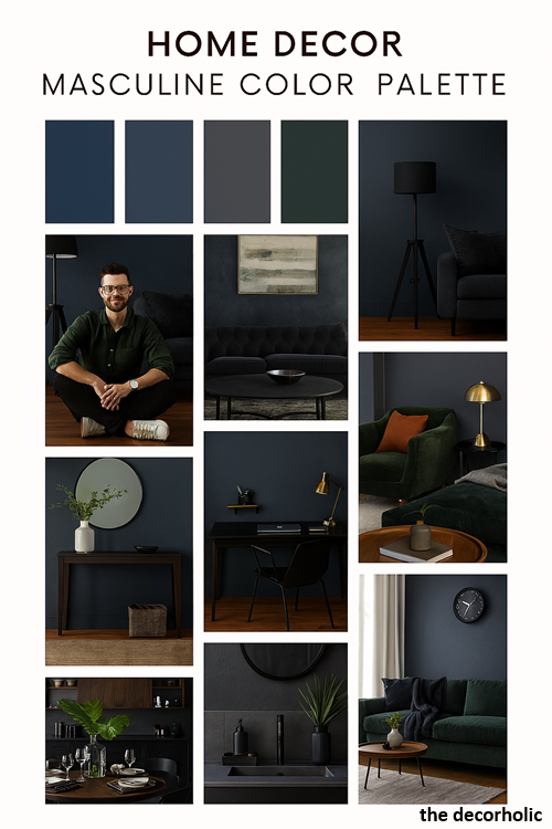
TL;DR Summary: Masculine color palette combine deep, saturated hues like charcoal, navy, forest green, and burnt orange with neutral foundations. These schemes create sophisticated spaces that balance boldness with restraint, work across any room size, and reflect confidence without sacrificing warmth or functionality.
A Guide to a Masculine Color Palette
You’ve finally got your own place, but without a clear masculine color palette, it still feels like a blank canvas that doesn’t quite represent who you are. The default beige walls and generic furniture aren’t cutting it anymore. You want a space that feels intentional, masculine, and comfortable—somewhere you actually want to spend time, not just crash after work.

The right color palette changes everything. It’s the foundation that transforms four walls into a space that reflects your personality, impresses guests, and makes coming home something you look forward to. Whether you’re working with a studio apartment or decorating your first house, understanding masculine color theory gives you the blueprint for creating rooms that feel both powerful and livable.
This guide breaks down exactly which colors work, why they work, and how to combine them without your space looking like a college dorm or a soulless corporate office.
I. What Defines a Masculine Color Palette?
A masculine color palette emphasizes deeper, more saturated colors with lower brightness levels, creating spaces that feel grounded, confident, and intentionally designed.
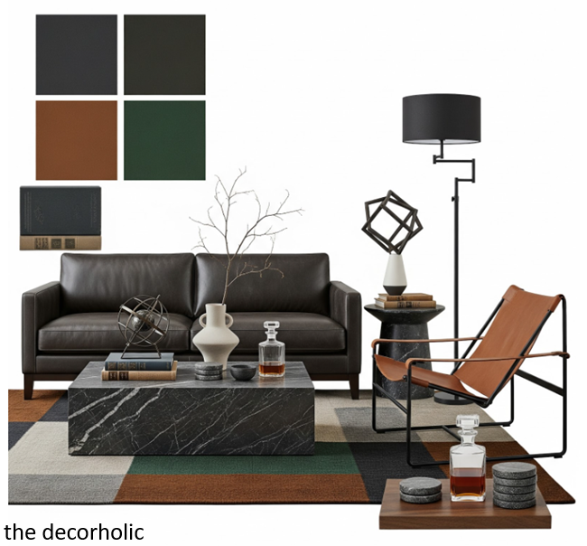
These palettes typically feature rich neutrals like charcoal and slate gray, bold accent colors such as navy blue or forest green, and warm earthy tones including cognac leather browns and burnt sienna.
The approach prioritizes visual weight and substance over lightness and airiness.
The distinction isn’t about gender rules—it’s about aesthetic preference. Masculine palettes tend toward colors found in nature’s darker moments: storm clouds, deep forests, aged leather, and stone.
They create what designers call “visual gravity,” making spaces feel anchored and substantial.
Interior designer Brian Paquette explains this concept well: “Masculine design is about creating a sense of refuge. Darker, richer colors cocoon you and make a space feel protective rather than exposed.”
Core characteristics include:
- Saturation over pastels: Deep jewel tones rather than light, airy shades
- Warm-to-neutral temperature: Avoiding overly cool or sterile color combinations
- Limited color variation: 3-5 colors maximum to maintain cohesion
- Contrast through value: Using light and dark versions of similar tones rather than opposing hues
- Natural material inspiration: Colors that mirror wood, metal, leather, and stone
Pro Tip: Test your color choices in the actual room at different times of day. Paint large swatches (at least 2×2 feet) on the wall and live with them for a week. Lighting dramatically affects how colors appear, and what looks perfect at noon might feel completely different at night.
Don’t Miss: Men’s Apartment Decor: 7 Masculine Design Rules That Actually Work (No Fluff)
II. The Psychology Behind Masculine Color Choices
Color psychology reveals why certain palettes resonate with men seeking to create purposeful spaces. Dark blues reduce stress and promote focus, making them ideal for your ergonomic home office and bedrooms.
Grays provide psychological neutrality that allows you to reset mentally when you enter a space. Deep greens connect to nature and promote calm without feeling feminine.
These aren’t arbitrary preferences—they’re rooted in how our brains process visual information and associate it with emotional states.
Research from the University of British Columbia found that blue environments enhance creative thinking and problem-solving, while warmer tones like reds and oranges increase attention to detail. For a masculine space that serves multiple functions—work, relaxation, entertainment—this matters.
Why darker colors work psychologically:
- Reduced visual noise: Dark walls make furniture and decor stand out, creating natural focal points
- Perceived intimacy: Darker rooms feel smaller in a cozy way, not claustrophobic
- Higher perceived value: Spaces with intentional dark palettes read as more expensive and considered
- Better for screens: If you’re gaming or watching movies, dark walls reduce glare and eye strain
Pro Tip: If you work from home, avoid pure black or very dark colors in your office space. Instead, use charcoal (which has slight warmth) or dark navy. Pure black can increase fatigue during long work sessions, while dark grays with warm undertones maintain energy levels.
Don’t Miss: FREE Color Palette Quiz: Find the Perfect Mood for Home!
III. Essential Color Combinations for Masculine Interiors
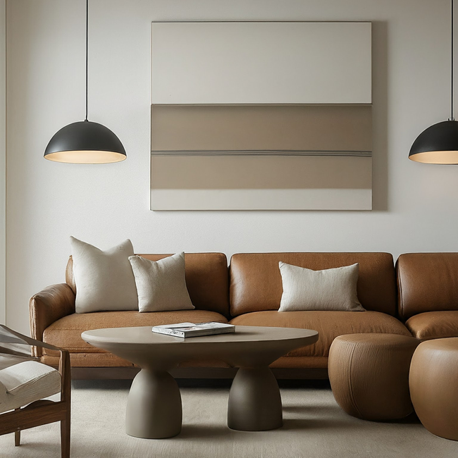
The most effective masculine color palettes follow proven combinations that balance boldness with livability. A charcoal gray foundation (walls) paired with cognac brown (leather furniture), white oak wood tones, and matte black fixtures creates the quintessential modern masculine space.
Navy blue walls with brass or gold accents, cream or off-white trim, and rich walnut furniture establishes a sophisticated, club-like atmosphere.
Forest green combined with tan or camel tones, natural wood, and black metal fixtures brings an outdoorsy, grounded aesthetic indoors.
These aren’t rigid formulas—they’re starting points. The key is maintaining a consistent temperature (warm or cool) across your palette and limiting yourself to one bold color at a time.
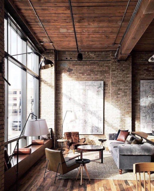
The Industrial Neutral Scheme
- Foundation: Charcoal gray walls (Benjamin Moore “Kendall Charcoal” or Sherwin-Williams “Iron Ore”)
- Accents: Matte black fixtures, raw wood, Edison bulb lighting
- Contrast: Crisp white or cream trim, light gray textiles
- Metal finish: Aged bronze or blackened steel
This palette works exceptionally well in lofts, studios, or open-concept spaces. It’s the easiest to execute because mistakes are forgiving—everything reads as intentional within this framework.
The Sophisticated Navy Study

- Foundation: Deep navy walls (Farrow & Ball “Hague Blue” or Benjamin Moore “Hale Navy”)
- Accents: Warm brass or brushed gold hardware
- Contrast: Cream, ivory, or warm white for trim and ceiling
- Secondary color: Cognac leather or rust orange for upholstery
Navy avoids the coldness of gray while maintaining masculine depth. It works particularly well in rooms with good natural light, which prevents it from feeling cave-like.
The Earthy Modern Palette
Foundation: Forest green or beige wall color
- Accents: Natural wood tones (walnut, oak, teak)
- Contrast: Tan, sand, or warm beige textiles
- Metal finish: Matte black or oil-rubbed bronze
This combination brings the outdoors in without trending into rustic or cabin territory. It’s ideal for bedrooms and living spaces where you want calm but not sterility.
The Monochromatic Gray Scale

- Foundation: Medium gray walls
- Layers: Light gray ceiling, dark gray accent wall, charcoal furniture
- Texture focus: Concrete, linen, wool, matte surfaces
- Pop color: Minimal—perhaps dark green plants or cognac leather
This is the most minimalist approach. It requires excellent lighting and varied textures to avoid feeling flat.
Pro Tip: When mixing browns and grays (a common mistake zone), ensure your brown has warm undertones and your gray leans slightly warm (greige territory). Cool gray with warm brown creates visual discord. Test them side-by-side before committing.
Must read: Masculine Bedroom Ideas: Create a Stylish, Comfortable Sanctuary
IV. The Most Popular Masculine Color Palettes for 2025-2026
Design trends for 2025-2026 reflect a shift toward warmer, more organic masculine palettes that move away from the stark industrial gray dominance of the past decade.
The leading trend is “Warm Minimalism”—rich, earthy tones paired with natural materials that create spaces feeling both grounded and inviting. Expect to see deep terracotta paired with charcoal, warm taupe with black accents, and olive green with cognac leather gaining prominence.
These palettes respond to a cultural desire for spaces that feel human and lived-in rather than showroom-perfect, while maintaining the sophisticated edge men seek.
1. The Warm Earth Palette (Top Trend)
Foundation colors: Deep terracotta, warm clay, rust Neutrals: Warm charcoal, cream, sand Accents: Matte black, aged brass, dark olive green Materials: Unfinished concrete, natural oak, clay pottery
This palette dominates 2025 design publications because it brings warmth without sacrificing masculine edge. Think southwestern modern meets industrial—earthy without being rustic.
How to apply it:
- Terracotta accent wall in living room, with remaining walls in warm charcoal
- Natural oak furniture with black metal legs and hardware
- Rust-colored textiles (throw blanket, pillows) against neutral sofa
- Clay pots and vessels as decorative elements
Best for: Men who want warmth and personality but find traditional masculine grays too cold.
Pro Tip: Terracotta and rust tones look completely different in natural vs. artificial light. Test samples in your space at morning, afternoon, and evening before committing. These colors need warm-toned LED bulbs (2700K) to avoid looking muddy.
2. The Modern Moody Green

Foundation colors: Deep forest green, hunter green, olive Neutrals: Charcoal gray, black, cream Accents: Warm brass, natural wood, burnt orange Materials: Leather, linen, marble, brushed brass
Green is having a major moment in masculine design, replacing navy as the go-to alternative to gray. It’s nature-inspired but sophisticated, working particularly well in bedrooms and home offices.
How to apply it:
- Forest green walls in bedroom or office
- Charcoal gray sofa with olive green throw pillows
- Brass lighting fixtures and hardware
- Natural wood shelving and tables
- Cream or white bedding/curtains for contrast
Best for: Men transitioning from all-neutral spaces who want color without going bold.
Pro Tip: Green walls require good lighting to prevent them from looking drab. Install warm brass or black wall sconces and use table lamps liberally. Green absorbs light more than gray, so compensate with 30% more light sources than you’d use with gray walls.
3. The Neo-Industrial (Evolved Gray)

Foundation colors: Warm gray (greige), soft charcoal, mushroom Neutrals: Off-white, cream, light oak Accents: Matte black, raw steel, cognac leather Materials: Textured concrete, light wood, industrial metal, wool
This isn’t the cold industrial gray of 2015—it’s warmer, softer, and more textured. The key difference is mixing warm and cool grays with an emphasis on tactile materials.
How to apply it:
- Greige walls (gray with brown undertones) instead of cool gray
- Mix of light and dark gray furniture pieces
- Cognac leather chair as focal point
- Textured elements: concrete lamp, wool rug, linen curtains
- Light oak or ash wood pieces to warm it up
Best for: Men who love the minimalist aesthetic but want to avoid the sterile feel.
Pro Tip: The difference between dated gray and 2025 gray is warmth. Every gray you choose should have slight warm (brown/beige) undertones. Hold paint chips next to pure white—if the gray looks blue or purple-tinged, it’s too cool. You want grays that look slightly tan or mushroom-toned.
4. The Japandi Masculine

Foundation colors: Black, charcoal, warm white Neutrals: Natural wood tones (light and dark), beige Accents: Minimal—perhaps one rust or forest green element Materials: Japanese maple, bamboo, stone, washi paper, linen
This fusion of Japanese and Scandinavian design principles creates serene, uncluttered masculine spaces. It’s minimalist but warm, emphasizing quality over quantity.
How to apply it:
- Black accent wall with remaining walls in warm white
- Low-profile furniture in natural wood (platform bed, low coffee table)
- Minimal decor—every piece serves a purpose
- Natural fiber textiles: linen, cotton, wool in neutral tones
- Plants as primary decoration (bonsai, bamboo, simple greenery)
Best for: Men who value calm, order, and intentional design over bold statements.
Pro Tip: Japandi succeeds through restraint. If you’re adding a decorative object, remove one first. The goal is visible empty space—let your walls and surfaces breathe. This palette fails when cluttered.
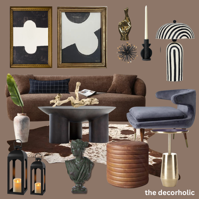
5. The Maximalist Dark Academia
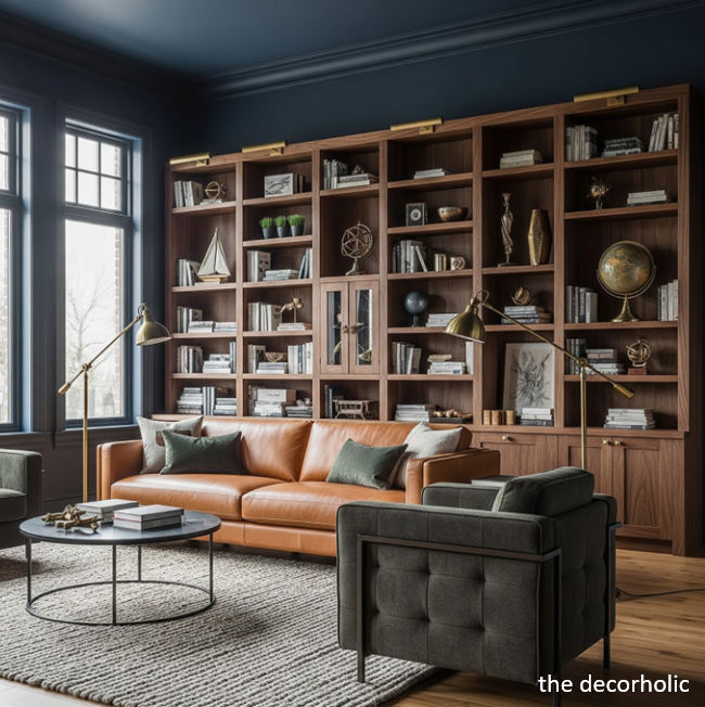
Foundation colors: Deep burgundy, navy, forest green, chocolate brown Neutrals: Cognac leather, aged brass, dark wood Accents: Gold, deep red, hunter green Materials: Leather (lots of it), rich wood, velvet, brass, marble
This trend appeals to men who want richness and drama. Think library, study, or members’ club aesthetic—unapologetically bold and layered.
How to apply it:
- Navy or burgundy walls in home office or living room
- Multiple leather pieces (sofa, chairs, ottoman)
- Floor-to-ceiling bookshelves in dark wood
- Layered lighting: brass sconces, table lamps, floor lamps
- Artwork in gold frames, vintage maps, dark-toned pieces
Best for: Men with larger spaces who want personality and aren’t afraid of commitment.
Pro Tip: This palette requires confidence and space—it doesn’t work in studios or minimalist approaches. You need at least 250 square feet to pull it off without feeling cramped. Also essential: excellent lighting, or it becomes a cave. Budget $300+ just for lighting fixtures.
6. The Coastal Masculine (Surprising Trend)
Foundation colors: Charcoal, slate blue, driftwood gray Neutrals: Sandy beige, off-white, natural linen Accents: Matte black, rope/jute, weathered wood Materials: Reclaimed wood, concrete, natural fiber, matte ceramics
Coastal design gets a masculine makeover by ditching pastels and nautical clichés. This version emphasizes natural materials and muted tones that evoke the beach without screaming “beach house.”
How to apply it:
- Slate blue-gray walls (cooler than standard charcoal)
- Weathered or reclaimed wood furniture
- Jute or sisal rugs in natural tones
- Linen textiles in sand, cream, and charcoal
- Matte black fixtures to keep it grounded
- Minimal nautical references—think texture over theme
Best for: Men in coastal areas or who want a relaxed but sophisticated atmosphere.
Pro Tip: The line between masculine coastal and beach cottage is thin. Avoid anything with shells, starfish, or obvious nautical symbols. Keep it abstract—the feeling of the coast through color and texture, not literal interpretation.
What’s Out for 2025-2026
Understanding what’s declining helps you avoid dated choices:
Cool gray + chrome: The 2010s combo feels sterile now. If you have cool gray walls, warm them up with wood and brass, or repaint in greige.
All-white minimalism: Pure white masculine spaces feel clinical. Current minimalism includes warmth through wood and subtle earth tones.
Accent walls: The single colored wall in an otherwise neutral room looks dated. If you’re going bold, commit to all four walls or stay neutral.
Overly industrial: Exposed brick, metal everything, and Edison bulbs hit peak saturation. Modern industrial includes warmth and isn’t trying as hard.
Matching furniture sets: Anything that looks like it came as a complete room package feels generic. Mix pieces intentionally.
Pro Tip: The Ultimate Guide to Sling Chairs: Design, Comfort & Style for Modern Homes
V. Room-by-Room Color Application Strategies
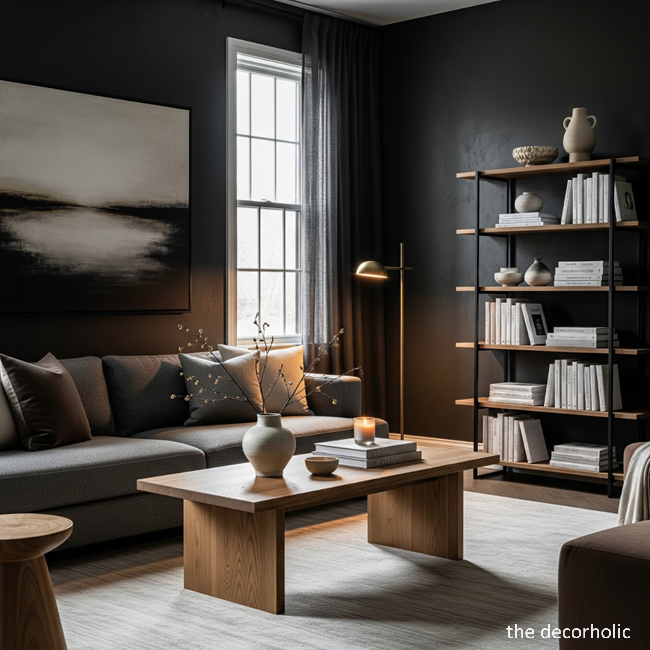
Different rooms serve different functions, requiring adapted approaches to masculine color palettes. Bedrooms benefit from deeper, more enveloping colors like charcoal or navy on all four walls to create a sleep-conducive cocoon effect—avoid the dated “accent wall” approach which breaks visual flow.
Living rooms and common areas work best with a 60-30-10 rule: 60% dominant color (walls), 30% secondary color (large furniture), 10% accent color (decor and accessories). Home offices demand focus-enhancing colors like deep blue-gray or forest green, paired with warm wood desks to balance the coolness.
Living Room & Common Areas

Your living room sets the tone for your entire space. Go bold here if you’re hesitant elsewhere.
Color strategy:
- Walls: Charcoal, navy, or dark sage (all four walls—commit to it)
- Large furniture: Leather sofa in cognac, chocolate, or even charcoal gray
- Accent furniture: Wood coffee table, black metal shelving
- Textiles: Layered neutrals (cream, tan, gray) in different textures
- Accessories: Matte black picture frames, brass or copper accents
Common mistake: Matching your wall color to your sofa color. This creates a blob effect. Your sofa should contrast with walls—dark walls need lighter furniture, or use a different hue entirely (navy walls with charcoal sofa works; navy walls with navy sofa doesn’t).
Bedroom

The bedroom is where you can go darkest without consequence. Dark walls actually improve sleep by reducing visual stimulation.
Color strategy:
- All walls: Deep navy, charcoal, or even black (matte finish only)
- Ceiling: One shade lighter than walls, or keep it dark for a cocooning effect
- Bedding: Crisp white, cream, or light gray to contrast the darkness
- Wood tones: Walnut or dark oak furniture
- Window treatments: Blackout curtains in complementary neutral
Designer Shea McGee notes: “Men often resist dark bedrooms until they try them. Then they never want to go back. It fundamentally changes sleep quality.”
Home Office
Balance focus with energy. You’ll spend hours here, so avoid colors that drain you.
Color strategy:
- Walls: Dark blue-gray (not pure gray), forest green, or charcoal with warm undertones
- Desk: Natural wood (walnut, oak) for warmth against dark walls
- Task lighting: Warm LED bulbs (2700-3000K) to counter cool wall colors
- Accent: One energizing element—rust orange chair, or brass lamp
Pro Tip: Paint the wall behind your video call background a neutral gray (not your bold color). Dark navy or forest green can look muddy on camera, while medium gray reads as professional and clean.
Kitchen & Dining

Kitchens present unique challenges with cabinets, counters, and appliances already determining much of your palette.
If you’re renting (can’t change cabinets):
- Paint walls a complementary color: dark green with white cabinets, charcoal with wood cabinets
- Add black or matte brass hardware to cabinet doors (removable)
- Use dark gray or black bar stools and dining chairs
If you’re renovating:
- Dark cabinets (navy, charcoal, black) with white or light counters create maximum impact
- All-black hardware and fixtures
- Wood elements (floating shelves, butcher block island) for warmth
Bathroom
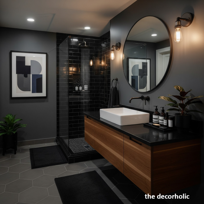
Small bathrooms actually benefit from dark colors, which blur boundaries and make the space feel intentional rather than cramped.
Color strategy:
- Walls: Dark gray, navy, or even black (use high-gloss or semi-gloss for moisture resistance)
- Fixtures: Matte black faucets, shower hardware, mirror frames
- Contrast: White subway tile, marble, or light-colored stone
- Lighting: Critical—install bright, warm LED bulbs to counter darkness
Pro Tip: In bathrooms under 50 square feet, paint the ceiling the same dark color as walls. This creates a cohesive envelope effect that makes the room feel larger, not smaller. Keep fixtures and tile light for contrast.
Trending Post: The 3-5-7 Decorating Rule: Transform Any Space with This Designer Secret (That Actually Works)
VI. How to Incorporate Bold Accent Colors Without Overwhelming Your Space
Strategic accent colors add personality to masculine palettes without undermining their grounded feel. The key is restraint: introduce bold colors like burnt orange, deep burgundy, or rust through small-scale elements representing no more than 10% of visible surfaces.
These work best in moveable items—throw pillows, artwork, a single accent chair, or decorative objects—allowing you to adjust intensity without repainting.
Pair bold accents with your neutral foundation using the “bridge” technique: if your walls are charcoal, connect a rust orange chair through a gray-and-orange patterned rug.
Masculine accent colors that work:
- Burnt orange/rust: Energizing without being aggressive; pairs with navy, charcoal, and green
- Deep burgundy: Sophisticated; works with gray and navy foundations
- Mustard yellow: Use sparingly; adds warmth to cool gray spaces
- Copper/brass tones: Through fixtures, frames, and hardware rather than paint
- Forest/emerald green: When your foundation is gray or navy
How to test accent colors:
- Buy inexpensive items first (throw pillows, small artwork)
- Live with them for two weeks
- If they still feel right, commit to larger pieces
- Remove immediately if they feel wrong—trust your gut
Wrong way to use accents: Painting one wall bright orange in an otherwise neutral room. This creates visual confusion and dates quickly.
Right way to use accents: Gray walls, charcoal sofa, cream rug, and then rust orange in three places: two throw pillows, a piece of artwork, and a small side table. The repetition creates intentional cohesion.
Pro Tip: Use the “squint test” to check if your accent colors are working. Stand in your room and squint your eyes until details blur. If the accent color still feels balanced and integrated (not jarring or floating), you’ve nailed the proportion. If it jumps out aggressively, you’ve used too much.
Don’t Miss: The 15 Golden Rules of Interior Design for a Stunning Home
VII. Textures and Materials That Enhance Masculine Color Schemes

Color alone doesn’t create masculine interiors—texture and material give colors depth and prevent them from feeling flat or monotonous. Matte and satin finishes on dark walls absorb light and create richness, while glossy finishes feel commercial.
Layer materials with visual weight: full-grain leather in cognac or chocolate tones, raw or oiled wood with visible grain, concrete or concrete-look materials, linen in heavier weights, and metals in matte black, aged brass, or blackened steel.
These materials give masculine colors physical presence and prevent spaces from reading as simply “painted dark.”
Essential textures for masculine spaces:
Leather: The non-negotiable masculine material. A cognac leather sofa against charcoal walls is the gold standard. Avoid bonded leather (cheap, peels quickly). Invest in top-grain or full-grain.
Raw wood: Visible grain, minimal finish. Think live-edge tables, reclaimed wood shelving, or even exposed ceiling beams. Wood warms up cool color palettes naturally.
Concrete: Actual concrete or concrete-look tiles for flooring, counters, or accent walls. It’s industrial without being cold when paired with wood and leather.
Linen and wool: In heavy weights for curtains, throw blankets, and upholstery. Avoid anything shiny or silky—wrong texture entirely.
Metal: Matte black is the easiest (light fixtures, cabinet pulls, curtain rods). Brass works if your palette leans warm. Avoid chrome and polished nickel—too shiny and commercial.
Mistake to avoid: All matte everything. Your space needs slight variation in sheen to catch light and create dimension. Walls in matte, some furniture in satin, one or two glossy elements (a lacquered side table, framed glass) provide necessary contrast.
Pro Tip: The 80/20 texture rule: 80% of your room should be matte to satin finishes, 20% can have slight sheen or gloss. This prevents the space from feeling either too flat (all matte) or too slick (too much shine).
Don’t Miss: Moody Living Room: The Complete Design Guide for Renters Creating Drama with Dark, Sophisticated Style
VIII. Budget-Friendly Ways to Transform Your Space with Color

Creating a sophisticated masculine color palette doesn’t require a complete renovation or designer budget. Renters and budget-conscious homeowners can achieve dramatic results through strategic, high-impact changes.
Paint is your most powerful tool: a single weekend and $150 in quality paint transforms a room more than $1,000 in furniture. Focus on one room at a time to avoid overwhelm and spreading your budget too thin. Start with the room you use most—likely your living room or bedroom—because you’ll see the return immediately.
High-impact, low-cost changes:
Paint walls (renters too): Most landlords allow painting if you return walls to original color before moving. Save a paint chip or take photos. Two gallons of premium paint costs $100-150 and covers a 12×12 room twice.
Paint furniture: That cheap IKEA bookshelf or dated wood dresser becomes intentional with matte black or charcoal spray paint. Cost: $20-30.
Swap hardware: Replace builder-grade chrome cabinet pulls, doorknobs, and light switches with matte black versions. This costs $50-100 but creates a custom look. Most hardware is standardized and installs with a screwdriver.
Update lighting: Remove generic ceiling fixtures and install matte black or aged brass alternatives. Basic pendant lights start at $40. Better lighting transforms how your colors appear.
DIY curtain rods: Spray paint existing curtain rods matte black or buy industrial black pipe from hardware stores for $30. Pair with dark linen curtains (IKEA has affordable options).
Focus on one hero piece: One quality leather chair or a large piece of artwork makes a bigger impact than spreading money across multiple mediocre items.
Where to save money:
- Textiles (IKEA, Target, Amazon for basics)
- Frames (thrift stores, then spray paint them matte black)
- Side tables and shelving (DIY or budget retailers)
Where to invest:
- Paint (buy premium—it covers better and lasts)
- One quality furniture piece
- Good lighting
Pro Tip: Join local Facebook Marketplace, Craigslist, or estate sale groups. Solid wood furniture from the 70s-90s is often cheap ($50-200) and transforms with sanding and dark stain or matte black paint. A $75 vintage dresser with new brass hardware becomes a $500-looking piece.
Also: Stylish Living Room Makeover on a Budget
IX. Common Mistakes Men Make with Masculine Color Palettes (And How to Fix Them)
Even with good intentions, several predictable errors undermine masculine interiors. The most common mistake is going too dark everywhere without sufficient contrast, creating a cave rather than a sophisticated space—fix this by keeping ceilings light, adding white or cream trim, and ensuring at least 30% of the room’s surfaces provide visual relief.
Another frequent error is neglecting lighting in dark rooms: dark colors absorb light, so inadequate lighting makes spaces feel depressing rather than cozy. Bachelor pad syndrome—all black everything with chrome accents—reads as trying too hard rather than confident. Mature masculine design includes warmth through wood tones, varied neutrals, and intentional color layering.
Mistake 1: All-Black Everything
You’re not Batman. An entirely black room (black walls, black furniture, black everything) feels costume-y and actually reduces the impact of black as a design element.
Fix: Use charcoal instead of pure black for walls. Reserve true black for accents—picture frames, hardware, one piece of furniture. Add warmth through wood and cognac leather.
Mistake 2: Ignoring Scale and Proportion
Buying furniture that’s too small for your space or overwhelming it. A tiny two-seater sofa in a large living room looks timid; an oversized sectional in a studio makes movement impossible.
Fix: Measure your room and furniture before buying. Use painter’s tape on the floor to map furniture footprints. Aim for 30-36 inches of walkway space around furniture.
Mistake 3: Overhead Lighting Only
Relying solely on harsh overhead ceiling lights creates flat, unflattering illumination that makes even good colors look bad.
Fix: Layer your lighting with three types: ambient (overhead), task (desk lamps, reading lights), and accent (picture lights, LED strips). Use warm bulbs (2700-3000K) exclusively. Dimmers are essential in bedrooms and living rooms.
Mistake 4: Matching Everything
Buying a furniture set where everything matches perfectly (same wood tone, same style) looks catalog-basic and lacks personality.
Fix: Mix wood tones (walnut and oak can coexist). Mix styles within your color palette—modern sofa with vintage leather chair. Cohesion comes from color, not matching.
Mistake 5: Forgetting About Windows
Dark walls with no window treatments or bad window treatments (dusty blinds, too-short curtains) undermines the entire design.
Fix: Install curtains that hang floor-to-ceiling, even if your windows are smaller. Extend the rod 8-12 inches beyond the window frame on each side. Use dark linen or canvas in charcoal, navy, or black. Budget option: IKEA Ritva curtains dyed darker.
Mistake 6: No Living Things
An all-dark palette with no plants or organic elements feels sterile and cold, like a showroom rather than a home.
Fix: Add low-maintenance plants. Snake plants, pothos, and ZZ plants thrive in lower light and add essential life to masculine spaces. Dark green plants against dark gray or navy walls create subtle, sophisticated contrast.
Pro Tip: If you’ve already made one of these mistakes, don’t strip the room and start over. Fix iteratively: add lighting first, then textiles, then adjust furniture placement. Most “bad” rooms are actually good rooms with 2-3 fixable issues.
Don’t Miss: How to Choose the Perfect Fabrics to Decorate Your Home
X. Adapting Masculine Palettes for Small Spaces and Apartments

The conventional wisdom that “dark colors make small rooms smaller” is wrong when applied correctly. Small spaces benefit from masculine color palettes because dark walls blur boundaries, making it harder to perceive exact dimensions—this creates a perception of infinite space rather than cramped quarters.
The key is contrast and light: paint small rooms dark, but keep ceilings white or cream, use light-colored floors if possible, and maximize lighting through layered sources.
A 300-square-foot studio with charcoal walls, white ceiling, light wood floors, and excellent lighting feels more spacious than the same studio with beige walls and poor lighting.
Strategies for small spaces:
Embrace darkness, add light sources: Dark walls work in small spaces when you compensate with multiple light sources. Install wall sconces, add table lamps, use LED strip lighting under shelves.
Same color on walls and trim: In small rooms, painting trim the same color as walls (instead of white) makes walls seem to extend further, increasing perceived size. This only works in spaces under 150 square feet.
Use mirrors strategically: A large mirror (at least 3×4 feet) on one wall reflects light and creates depth. Place it opposite a window for maximum effect. Frame it in matte black.
Furniture scale matters more: In small spaces, fewer large pieces work better than many small pieces. One substantial sofa beats a loveseat plus two chairs. Large pieces create clean sight lines; small pieces create clutter.
Vertical storage: Dark walls make mounted shelving less visually intrusive. Use vertical space for storage with black metal or dark wood shelving units that blend with walls.
Minimal color variation: Stick to your foundation color plus one accent. A small studio can’t handle the navy-gray-green-rust palette that works in a 2,000-square-foot house. Choose charcoal with cognac leather, or navy with cream and brass.
Pro Tip for renters: Removable wallpaper in dark colors (Tempaper, Chasing Paper) lets you achieve bold color without painting. It’s pricey ($50-80 per roll) but removes cleanly. Use it on one wall as an anchor, paint the rest if allowed, or leave them neutral if not.
Trending Post: 10 Must-Have Furniture Essentials You Must Own For Your Home

XI. Maintaining and Evolving Your Masculine Color Scheme Over Time

Color palettes should evolve with your life stages and changing tastes. What works at 28 in a studio might feel too severe at 45 in a house. Build flexibility into your palette by investing in neutral foundations—quality furniture in timeless charcoal, navy, or cognac leather lasts decades and works through multiple color scheme iterations.
Change accent colors seasonally or yearly through easily swapped elements: pillows, throw blankets, artwork, and small decor items. This approach prevents expensive overhauls while keeping your space feeling current and personal.
Evolution timeline:
Year 1-2: Establish your foundation. Invest in paint, one quality furniture piece, and basic lighting. Live with it.
Year 3-4: Refine with better versions of what you started with. Upgrade budget textiles to higher-quality options. Add artwork.
Year 5+: Evolve your palette through new accents. If you started with all-neutral, add rust or burgundy accents. If you started bold, you might pull back to more neutral with age.
Life stage adjustments:
Single, 25-35: Bold, commitment-free. Experiment with deep navy or black walls. Focus on style over comfort.
Partnered or family planning, 35-50: Soften edges while maintaining masculine foundation. Charcoal instead of black. Add warmer wood tones. Consider others’ input.
Established, 50+: Refined, quality over quantity. Invest in custom or heirloom pieces. Palette becomes more sophisticated—think navy with brass, gray with walnut, less about trends.
Maintenance tips:
Touch up paint annually: Dark walls show scuffs and marks. Buy extra paint and keep it labeled. Touch up with a small brush annually.
Protect leather: Condition leather furniture twice yearly with appropriate products. Quality leather improves with age if maintained.
Update hardware before it looks dated: Cabinet pulls and light fixtures date faster than paint colors. Refresh every 5-7 years.
Pro Tip: Take photos of your space every six months from the same angle. Review annually. This helps you spot what’s working, what’s not, and what needs updating without the bias of seeing it daily.
Most Popular Post:
Interior Design Style Quiz
Timeless Paint Colors That Never Go Out of Style
Create Your Perfect Ergonomic Home Office: A Complete Guide
Must-Have Accessories for Guys: The Secret to a Stylish Space
Modular Sofas for Small Spaces: Brilliant Solutions for Compact Living
Conclusion: Building Your Signature Masculine Space
Creating a masculine color palette that reflects your personality isn’t about following rigid rules—it’s about understanding principles and applying them to your specific space, budget, and life stage. Start with a foundation of deep, grounded neutrals like charcoal or navy.
Add warmth through natural materials like wood and leather. Layer in strategic accent colors that energize without overwhelming. Most importantly, commit to your choices and live with them long enough to see how they function in your daily life.
The difference between a room that looks good in photos and one that actually improves your life comes down to intention. You’re not decorating for strangers on the internet—you’re building an environment that supports how you want to live, work, and relax.
Action steps to start today:
- Choose one room to focus on first
- Select your foundation color (charcoal, navy, or forest green)
- Buy paint samples and test them on your wall for one week
- Once committed, paint that room in a weekend
- Add one quality piece (leather chair, walnut desk, substantial sofa)
- Layer in lighting before adding accessories
Your space should feel like the physical manifestation of who you are. A masculine color palette gives you the framework to make that happen without overthinking it or spending years agonizing over paint chips. Make a decision, execute it well, and adjust as you go. That’s how you build a space worth living in.
Masculine Color Palette-Frequently Asked Questions
Q: Will dark colors really work in my small apartment, or will they make it feel even smaller?
A: Dark colors in small spaces create a cocooning effect that actually makes dimensions harder to perceive, which psychologically feels larger than a cramped beige box. The critical factors are contrast and lighting: keep your ceiling light (white or cream), use light-colored floors if possible, and add multiple light sources throughout the room. A 400-square-foot studio with charcoal walls, white ceiling, and layered lighting feels more spacious and intentional than the same space in builder beige.
Q: I’m renting—can I still use these masculine color palettes without losing my security deposit?
A: Most landlords allow painting if you return walls to their original color before moving out. Document the original color with paint chips and photos. Alternatively, use high-quality removable wallpaper in dark tones for one accent wall, paint-able if your lease permits, or focus on furniture, lighting, and accessories in your chosen palette without touching walls. Black curtain rods, dark furniture, matte black hardware, and layered textiles create a masculine aesthetic even with neutral walls.
Q: What’s the best masculine color palette if I want to eventually sell my home?
A: For resale, stick with charcoal gray or navy rather than black. These read as sophisticated and intentional to buyers without being polarizing. Use them in living rooms, bedrooms, or home offices, but keep kitchens and bathrooms more neutral (white with black fixtures works well). Ensure you have strong contrast with white trim and good lighting. Dark walls paired with quality finishes actually increase perceived home value because they signal attention to design.
Q: How do I incorporate masculine colors if my partner prefers lighter, brighter spaces?
A: Compromise through room division: masculine colors in your home office, bedroom, or personal spaces, while shared areas use a middle-ground palette like warm gray with wood tones. Alternatively, use the 60-30-10 rule in shared spaces: 60% neutral (agreeable to both), 30% slightly darker (your preference), 10% lighter accent (their preference). Many couples successfully use dark walls with lighter furniture and textiles, which bridges both aesthetics.
Q: What masculine colors work best for a home office where I take video calls?
A: Avoid pure black and very dark navy for video call backgrounds—they can look muddy or cause harsh shadows on camera. Instead, use medium charcoal gray (like Sherwin-Williams “Gauntlet Gray”), which reads as professional and clean on video. Alternatively, paint just the wall behind your desk a neutral medium gray for calls, and use bolder colors on other walls you don’t film against. Ensure you have front-facing lighting (ring light or desk lamp) to properly illuminate your face.
Q: How often should I change or update my masculine color palette?
A: Your foundation colors (walls, major furniture) should last 5-10 years if chosen well. Update accent colors every 2-3 years through easily swapped items like throw pillows, artwork, and small decor. If you tire of your palette before 5 years, the issue is usually lighting, clutter, or poor furniture arrangement rather than the colors themselves. Address those factors before repainting.
Q: Can I mix warm and cool masculine colors in the same room?
A: It’s possible but requires careful balance. Stick to one temperature as dominant (70%) and use the other as a minor accent (30%). For example, cool charcoal gray walls with warm cognac leather and wood accents works because warm tones are the minority. Mixing equal amounts of warm and cool creates visual tension. When in doubt, stay within the same temperature family throughout the room.
Subscribe To the Newsletter!
Subscribe now for an endless feed of inspirational women’s cave decor ideas, pampering rituals, and more tips for curating your ultimate escape. Let’s start making your cozy refuge a reality – you so deserve this!
CATCH THE LATEST IN HOME DECOR TRENDS:

Steal These 16 Expert-Approved Decorating Secrets

How To Accessorize Your Living Room

Small Space? 10 Ways To Make A Room Appear Bigger

Make Your space Look Expensive
GET CAUGHT UP ON ALL THE INSPIRING DECOR TIPS:

18 Fresh Decorating Ideas To Update Your Fireplace

How to Make a Gallery Wall: The Complete Step-by-Step Guide (Even If You’ve Never Hung a Picture)


