TL;DR Summary: Learning how to pick paint colors for your house doesn’t require artistic talent—it requires a proven system. This guide walks you through understanding undertones, testing samples properly, and selecting colors room-by-room based on function, lighting, and your home’s unique architecture.
Introduction: Why Choosing Paint Colors Feels So Overwhelming (And How to Fix It)
You’ve been standing in the paint aisle for 20 minutes, holding five different “white” paint chips that all look identical under fluorescent lights. Your heart rate is climbing because you know that once you get these home, one will look stark and cold, another will read pink, and somehow, none of them will look like they did in the store.
If this sounds familiar, you’re not alone. The inability to confidently choose paint colors is the number one reason homeowners delay renovation projects, and it’s costing you more than just time—it’s keeping you from loving the space where you spend your life.

Here’s the truth: how to pick paint colors for your house is not an innate talent. It’s a learnable skill with specific rules and strategies that professional designers use every single day. Once you understand the framework—undertones, Light Reflectance Values (LRV), and the relationship between color and lighting—the decision becomes significantly easier.
This guide will walk you through the exact process for selecting paint colors that work for each room’s specific function, lighting conditions, and architectural features. By the end, you’ll have a systematic approach that eliminates guesswork and gives you the confidence to transform your home.
I. Understanding Undertones: The Secret Language of Paint Colors

The single most important factor in how to pick paint colors for your house is identifying undertones—the subtle color “hints” that emerge under different lighting conditions and can make or break your entire color scheme.
Undertones are why that “perfect greige” you saw on Instagram turns lavender in your north-facing bedroom, or why your “neutral tan” suddenly looks neon orange next to your oak floors. Every paint color has an undertone, and ignoring them is the fastest way to a painting disaster.
Here’s what you need to know: paint colors generally have warm undertones (red, orange, yellow) or cool undertones (blue, green, purple). Neutral colors—your grays, beiges, and whites—still lean one way or the other. A gray with blue undertones will feel crisp and modern, while a gray with brown undertones creates a softer, earthier vibe.
How to identify undertones:
- Paint large samples (at least 2′ x 2′) on your actual walls
- Observe them at different times: morning, afternoon, evening, and night with artificial lights on
- Compare them to pure white and pure black to see which direction they lean
- Look at them next to your existing fixed elements (flooring, countertops, furniture)
The most common undertone mistake? Mixing warm and cool tones unintentionally. If your flooring has warm honey tones, a cool gray with blue undertones will create visual tension rather than harmony.
💡 Pro Tip: Use the “white paper test.” Hold a piece of pure white printer paper next to your paint sample. The undertone will become immediately more visible in contrast to true neutral white.
You’ll Also Like: Swivel Chairs Ultimate Guide: How to Choose & Style the Perfect One for Your Home
II. Light Reflectance Value (LRV): The Science Behind Bright vs. Dark Rooms

LRV measures how much light a paint color reflects on a scale from 0 (absolute black) to 100 (pure white), and understanding this number is crucial when learning how to pick paint colors for your house based on each room’s natural light.
This single number tells you whether a color will make a room feel spacious and airy or intimate and cozy. Colors with LRV above 50 reflect more light than they absorb—they’ll brighten a space. Colors below 50 absorb more light, creating drama but potentially making a small or dark room feel claustrophobic.
Why this matters for your specific rooms:
- North-facing rooms receive cool, indirect light all day. They need higher LRV colors (60+) in warm undertones to compensate for the lack of direct sunlight.
- South-facing rooms are flooded with warm, direct light. They can handle lower LRV colors and actually benefit from cooler undertones to balance the golden light.
- East-facing rooms get bright morning light that shifts to cooler tones in the afternoon. Mid-range LRV (40-60) with neutral undertones works best.
- West-facing rooms receive intense, warm afternoon and evening light. Cooler undertones prevent the space from feeling overwhelmingly warm.
Here’s where homeowners go wrong: they choose a color they love without considering LRV, then wonder why their small bathroom with one tiny window feels like a cave after painting it a trendy charcoal gray (LRV: 10).
💡 Pro Tip: Most paint companies list LRV on their website or color cards. If you want a dramatic dark color but have limited natural light, use it on just one accent wall and keep the other three walls at a higher LRV to maintain balance.
In Case You Missed It: Decorating a Tiny Home: The Expert Guide to Maximizing Every Square Foot
III. Creating Color Flow: The Open Floor Plan Strategy

When learning how to pick paint colors for your house with an open layout, the critical design secret is this: you need color cohesion, not color matching—meaning your colors should relate to each other without being identical.
The biggest mistake homeowners make in open-concept spaces is either painting everything the same color (boring and visually flat) or choosing completely different colors for adjacent spaces (chaotic and visually jarring). The solution lies in the middle: a curated color palette where each room’s color connects through shared undertones or coordinated LRV values.
The Three-Color Rule for Open Floor Plans:
- Primary color: Use this for the largest, most visible spaces (usually living room and main hallways). This becomes your “anchor” color.
- Secondary color: Choose a color that’s either 2-3 shades lighter or darker than your primary color from the same paint strip. Use this in adjacent spaces like the dining area or kitchen.
- Accent color: Select a complementary color (different hue but same undertone family) for rooms that are visible but not directly connected. This adds visual interest without breaking cohesion.
The key is ensuring all three colors share the same undertone. If your primary is a warm greige, your secondary might be a deeper taupe, and your accent could be a soft warm white—all with those same warm, slightly brown undertones.
For traditionally separated rooms (bedrooms with doors, bathrooms, etc.), you have more freedom to deviate from the main palette. However, hallways and transition spaces should always tie back to your primary color to maintain flow.
💡 Pro Tip: Stand in your main living space and slowly turn 360 degrees. Any room or space you can see from that central point should be part of your coordinated color palette. Rooms hidden behind closed doors can break the rules.
You’ll Also Like: Statement Light Fixture: The Designer’s 5-Step Framework for Choosing the Perfect One
IV. Room-by-Room Paint Selection: Function Meets Color Psychology

The right answer to how to pick paint colors for your house changes dramatically based on each room’s specific function, because color psychology directly impacts mood, energy levels, and how you experience the space.
Different rooms serve different purposes, and your paint color should support that function—not fight against it. Here’s the breakdown:
Living Rooms & Family Rooms:
These high-traffic social spaces need colors that feel welcoming but not overwhelming. Mid-tone warm neutrals (LRV 40-60) like warm gray, greige, or soft taupe create the perfect backdrop for furniture and decor while feeling sophisticated. Avoid stark whites (they show every scuff mark) and very dark colors (they make TVs and screens harder to watch due to glare).
Kitchens:
Traditionally, kitchens work best with lighter, brighter colors because this is a task-oriented space where you need good visibility. Soft whites, light grays, and pale warm neutrals (LRV 65+) reflect light and make the space feel clean and larger. If you have abundant natural light and white cabinets, you can introduce softer color like pale blue-gray or sage green without the space feeling dark.
Bedrooms:
Your bedroom color should support rest and relaxation. Soft, muted tones in the blue, green, or purple family promote calmness, while warmer tones like terracotta or dusty rose create coziness. Avoid bright, saturated colors and very cool stark whites—both can feel too energizing. Mid-range LRV (40-55) creates an intimate, cocoon-like atmosphere perfect for sleep.
Bathrooms:
Bathrooms can handle more drama because they’re small, enclosed spaces where you spend limited time. If you have good lighting, this is your chance to go darker (navy, deep green, charcoal) or more colorful (dusty blue, soft sage). For bathrooms with limited natural light, stick to lighter colors with warm undertones to prevent the cave effect.
Home Offices:
You need focus and energy here. Soft blues and greens have been proven to enhance concentration and productivity. Avoid warm yellows and reds (too stimulating and potentially anxiety-inducing) and very dark colors (they can feel oppressive during long work sessions). LRV 50-70 provides enough light reflection without the harshness of pure white.
Hallways & Trim:
These transitional spaces should connect your color scheme. If your main rooms are mid-tone, your hallways should be 2-3 shades lighter to keep them from feeling tunnel-like. Trim and molding traditionally go lighter than walls—either pure white or a very light version of your wall color—to create architectural definition.
💡 Pro Tip: Paint your ceiling the same color as your walls but in a flat finish, or go one shade lighter. The old rule about white ceilings is outdated—matching ceiling and walls makes the room feel taller and more cohesive.
You’ll Also Like: The Ultimate Sofa Buying Guide: How to Choose the Perfect Couch in 2026
V. The Right Way to Test Paint Samples (Most People Do This Wrong)
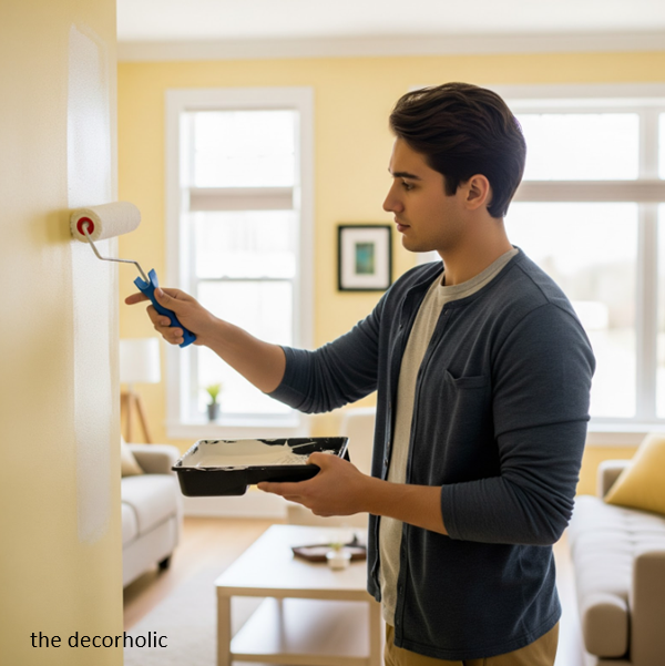
The proper sample-testing process is non-negotiable when figuring out how to pick paint colors for your house—buying quart samples and painting large test sections directly on your walls is the only method that shows you the true color.
Here’s what doesn’t work: tiny paint chips, digital color matching apps, or painting samples on poster board. All of these fail because color is entirely dependent on the surrounding environment—the lighting, the adjacent colors, and the actual wall surface.
The Professional Sample Testing Method:
- Buy quart samples of your top 3-4 color choices (costs $5-10 each, but saves you from a $400 repainting mistake)
- Paint large swatches directly on your walls—minimum 2 feet by 2 feet. Small samples don’t give you enough color saturation to see the true result.
- Paint in multiple locations in the same room: one section that gets direct light, one in shadow, and one on a perpendicular wall if your room has corner angles.
- Live with them for 72 hours minimum. Observe the colors at different times of day and in different lighting conditions. What looks perfect at noon might look completely wrong at 8 PM under artificial lighting.
- Test next to fixed elements. Paint your sample right next to your flooring, near your countertops, adjacent to your furniture—anywhere the color will actually exist in context.
- Use the elimination method. Don’t try to pick the “best” color immediately. Instead, eliminate the colors that definitively don’t work. Often, the right choice becomes obvious once you remove the wrong ones.
The most common testing mistake? Rushing the decision. You need to see these colors in morning light, afternoon light, evening light, and nighttime with your lamps on. Color shifts dramatically, and you need data from all lighting scenarios before committing.
💡 Pro Tip: Take photos of your paint samples with your phone at different times of day. Looking at the images side-by-side makes differences in undertones and brightness much more obvious than viewing them separately in real-time.
Trending Post: Best Jewel Tone Paint Colors for a High-End Home Makeover
VI. How Do I Choose a Good Paint Color?

How to choose paint colors is all about understanding your space and your preferences. Start by considering the mood you want to create. Are you aiming for relaxation, energy, or something in between?
Here’s a step-by-step guide to help you choose a good paint color:
- Assess Natural Light: Evaluate how much natural light the room receives. More light allows for a wider range of colors, while darker rooms may benefit from lighter shades.
- Consider Room Size: Smaller rooms can feel more spacious with light, cool colors, while larger rooms can handle bolder, warmer hues.
- Reflect on Your Style: Think about your personal style and the atmosphere you want to create. Do you prefer traditional, modern, or eclectic design?
- Sample Paint Colors: Don’t skip the paint samples. Purchase small paint samples and test them on your walls to see how they look in different lighting conditions.
- Consult a Color Wheel: Refer to the color wheel to understand color relationships and choose complementary or analogous colors for a cohesive look.
- Seek Inspiration: Gather inspiration from magazines, home decor websites, or even your favorite TV shows to find colors that resonate with you.
Remember, choosing a good paint color is a personal journey. Trust your instincts, experiment with samples, and don’t be afraid to go bold or stick with neutrals—it’s your space, and it should reflect your personality.
You’ll Also Like: The Ultimate 2026 Color Trend Forecast: What Paint Colors Will Define Next Year’s Home Design
VII. How Do You Coordinate Colors in a House?

Coordinating colors in a house is like composing a symphony. Here are some key tips to achieve color harmony:
- Choose a Base Color: Start with a neutral base color that runs through different areas of your home. This creates a consistent backdrop.
- Use Variations of the Base: In each room, introduce shades or complementary colors that tie back to the base, creating a sense of unity.
- Transition Gradually: When transitioning from one room to another, consider using transitional elements like hallway decor or rugs to create a gradual shift in color.
- Balance Warm and Cool Tones: Maintain a balance between warm and cool colors to avoid abrupt transitions.
- Experiment with Accents: Use accent colors in decor items like pillows, artwork, and furniture to add pops of color without overwhelming the space.
By coordinating colors effectively, you can create a sense of flow and visual harmony throughout your home, making it feel like a well-composed masterpiece.
In Case You Missed It: 15 Expert Painting Tricks That Make Any Room Look More Expensive

VIII. Paint Finish Selection: Matching Sheen to Room Function

Learning how to pick paint colors for your house includes choosing the right finish (sheen level) because the same color in different finishes will look noticeably different and perform very differently in terms of durability and maintenance.
Paint finish ranges from flat/matte (no shine) to high-gloss (very shiny), and each has specific advantages and ideal applications:
| Finish Type | Sheen Level | Best Used For | Pros | Cons |
|---|---|---|---|---|
| Flat/Matte | No sheen | Low-traffic bedrooms, ceilings, formal living rooms | Hides wall imperfections beautifully; sophisticated look | Impossible to clean; shows every touch mark |
| Eggshell | 10-20% sheen | Bedrooms, dining rooms, living rooms | Subtle sheen; washable; hides minor flaws | Still shows some imperfections |
| Satin | 20-35% sheen | Hallways, family rooms, kids’ rooms, kitchens | Very durable; easy to clean; great for high-traffic areas | Shows wall imperfections more than flatter finishes |
| Semi-Gloss | 35-70% sheen | Trim, doors, cabinets, bathrooms | Highly washable; moisture-resistant; durable | Shows every wall flaw; can look too shiny on walls |
| High-Gloss | 70-85% sheen | Furniture, accent pieces, front doors | Dramatic look; extremely durable | Very difficult to apply smoothly; magnifies imperfections |
Strategic Finish Decisions:
Your walls and ceiling should almost never be the same sheen. Here’s the professional formula:
- Ceilings: Always flat finish (unless it’s a bathroom ceiling exposed to moisture—then use satin)
- Walls: Eggshell or satin depending on traffic level
- Trim, doors, and cabinets: Semi-gloss or satin (semi-gloss is more traditional and durable)
Why this matters: a color in flat finish absorbs light and looks darker and richer. The exact same color in semi-gloss reflects light and looks brighter and lighter. If you’re matching colors across different surfaces (like matching wall paint to cabinet paint), you need to account for this shift.
💡 Pro Tip: Always go one sheen level higher than you think you need in high-traffic areas. The cleanability is worth the slight increase in sheen, especially in homes with kids or pets.
In Case You Missed It: Timeless Paint Colors That Never Go Out of Style
IX. Common Paint Color Mistakes (And How to Avoid Them)
Even when you understand how to pick paint colors for your house, these five mistakes can still sabotage your results—but they’re all easily avoidable once you know what to watch for.
Mistake #1: Choosing color in isolation
You picked a beautiful sage green at the paint store, but you forgot to consider how it will look next to your honey oak floors and brown leather sofa. Colors don’t exist in a vacuum—they’re always in relationship with everything around them. Solution: Bring home your paint samples and test them in direct context with your flooring, furniture, and fixed elements.
Mistake #2: Following trends instead of your lighting
That dark moody navy looks incredible on Instagram, but the influencer has floor-to-ceiling windows flooding the room with light. Your space has one small north-facing window. The same color will feel completely different in your home. Solution: Make decisions based on your specific lighting conditions, not social media trends.
Mistake #3: Ignoring the color of your artificial lighting
Your paint color looks perfect in daylight, then turns a completely different shade when you turn on your lamps at night. This happens when your light bulbs have a strong color temperature (very warm yellow or cool blue) that shifts the paint’s undertone. Solution: Check your samples at night with your actual light bulbs on, and consider switching to neutral white bulbs (3000K-3500K) for more accurate color rendering.
Mistake #4: Painting before you have the right tools and prep
Color choice matters, but application quality matters more. The best color in the world looks terrible with visible roller marks, unpainted edges, and uneven coverage. Solution: Invest in quality paint (premium paints have better pigment and coverage), proper brushes and rollers, painter’s tape, and do the prep work—fill holes, sand rough spots, and prime if needed.
Mistake #5: Committing too hard too fast
You bought five gallons of paint before testing a sample because you were so confident. Then you hated it on the walls. Solution: Always buy samples first, test for at least 48-72 hours, and only then purchase the full quantity. The $10 sample cost is insurance against a much bigger mistake.
💡 Pro Tip: If you’ve already made a paint mistake and need to fix it, you don’t always have to repaint. Sometimes the issue is the finish (too flat and shows marks), the lighting (wrong bulb color temperature), or the contrast (the adjacent room’s color is clashing). Diagnose the real problem before repainting.
Most Popular Post:
10 Surprising Benefits of Printable Wall Art
15 Must-Have Accessories For Styling A Coffee Table
How to Choose the Perfect Interior Color Scheme for Your Home
Expert Guide On How To Buy A Rug For Each Room
Conclusion: Your Next Steps: From Paralysis to Painted Walls
You now understand the framework professional designers use when learning how to pick paint colors for your house. This isn’t about having an “eye for color”—it’s about following a systematic process that accounts for undertones, lighting, LRV, and room function.
Here’s what happens if you don’t act on this knowledge: you’ll continue living with paint colors that don’t serve your space, or you’ll make an impulsive decision without proper testing and end up repainting within months. Both scenarios waste time, money, and keep you from experiencing the pride and satisfaction of a home that truly feels like yours.
The homeowners who succeed with paint color selection are the ones who commit to the process: they buy samples, they test properly, they observe in different lighting, and they make informed decisions based on data rather than guesswork.
Your Action Plan:
- Identify your top 3-4 color candidates based on your room’s lighting direction and function
- Check the LRV and undertones for each color on the paint company’s website
- Purchase quart samples and paint 2′ x 2′ swatches directly on your walls
- Observe for 72 hours minimum in all lighting conditions
- Eliminate colors that don’t work and choose from what remains
The difference between a house and a home often comes down to the colors on the walls. You have the knowledge now—it’s time to use it.
Ready to transform your space? The investment is minimal (under $50 in samples), the time commitment is manageable (one weekend of testing), and the payoff is enormous (a home you’re genuinely excited to walk into every day). You don’t need to be a designer to get this right—you just need to follow the system.
Frequently Asked Questions About Choosing Paint Colors
Q: Should every room in my house be a different color?
A: No. In open-concept or highly visible areas, you want color cohesion with variations rather than completely different colors. Use the three-color rule: a primary neutral for main spaces, a secondary shade for adjacent areas, and an accent color for separated rooms. Rooms behind closed doors can have more dramatic, independent colors.
Q: What’s the best white paint for trim and ceilings?
A: There’s no universal “best” white—it depends on your wall color and lighting. If your walls are warm-toned, choose a white with warm undertones (cream, ivory base). For cool-gray walls, use a white with subtle cool undertones. Popular versatile options include Benjamin Moore’s “Simply White” (warm), “Chantilly Lace” (neutral-cool), and Sherwin-Williams’ “Pure White” (neutral-warm). Always test them.
Q: How many paint samples should I test before deciding?
A: Start with 3-4 samples maximum per room. More than that creates decision paralysis. Use the elimination method: paint large swatches, observe for 48-72 hours, eliminate the ones that definitively don’t work, and choose from what remains. If none work, go back with refined criteria and test 2-3 more.
Q: Can I use the same paint color throughout my entire house?
A: Yes, if you want ultimate cohesion and have consistent lighting throughout. However, most homes have varying light conditions (north-facing bedrooms, south-facing living rooms), so one color may look perfect in some rooms and completely wrong in others. A better approach: choose one primary color and use variations (lighter/darker versions) for rooms with different lighting.
Q: How do I know if a color is too dark for my small room?
A: Check the LRV. In a small room with limited natural light, stay above LRV 50 to maintain brightness. In a small room with abundant light, you can drop to LRV 35-40 for drama without the cave effect. Dark colors can actually work in small spaces if they’re used intentionally—they make walls “recede” and can feel cozy rather than cramped when done right.
Q: What color should I paint a room that faces north?
A: North-facing rooms receive cool, indirect light all day, so they need warm undertones to balance the natural coolness. Look for warm whites, soft beiges, warm grays (greige), or warm neutrals. Avoid cool grays, stark whites, or colors with blue/green undertones—they’ll amplify the cold feeling.
Subscribe To the Newsletter!
Subscribe now for an endless feed of inspirational women’s cave decor ideas, pampering rituals, and more tips for curating your ultimate escape. Let’s start making your cozy refuge a reality – you so deserve this!
CATCH THE LATEST IN HOME DECOR TRENDS:

Steal These 16 Expert-Approved Decorating Secrets

How To Accessorize Your Living Room

Small Space? 10 Ways To Make A Room Appear Bigger

Make Your space Look Expensive
GET CAUGHT UP ON ALL THE INSPIRING DECOR TIPS:

18 Fresh Decorating Ideas To Update Your Fireplace

How to Make a Gallery Wall: The Complete Step-by-Step Guide (Even If You’ve Never Hung a Picture)


