Interior Design · Color Psychology · Bedroom Styling
7 Designer Secrets to Create the Perfect Bedroom Decor Color Scheme
The best bedroom decor color schemes follow the designer-proven 60-30-10 rule: 60% dominant neutral, 30% secondary tone, and 10% accent. Choose your palette by starting with your mood goal—serene, romantic, energizing, or glamorous—then layer in natural light, existing furniture finishes, and the psychological effect of each hue. This step-by-step guide gives you every tool to get it right the first time.
The Bedroom You Deserve Has Been One Color Decision Away

Your bedroom decor color scheme is the single most powerful decision you’ll make in any renovation—yet most people either default to “safe” greige out of fear, or spend thousands on furniture before picking a palette that makes none of it work together. You’ve scrolled Pinterest for hours. You’ve bought sample pots that sit on the wall like a rash. You’ve stared at a bedroom that feels… fine. But fine is not what you came here for.
The frustration is real: color feels personal but also deeply technical, and no one hands you a clear rulebook. The good news? Interior designers operate from a surprisingly systematic blueprint—one that removes the guesswork entirely. With the right framework, choosing a bedroom color scheme takes less than an afternoon and the result looks like you hired someone who charges $350/hour.
This guide is that blueprint. You’ll get the exact step-by-step process designers use, plus diagrams, palette lookbooks, and a curated shortlist of products that make the whole thing effortless. By the end, you won’t just have a color scheme—you’ll have a bedroom that feels intentional, elevated, and completely yours.
Why Bedroom Color Schemes Are More Than Aesthetic

The right bedroom color scheme doesn’t just look beautiful—it performs. Color directly influences cortisol levels, melatonin production, and perceived room temperature. Choosing the wrong palette isn’t a minor style misstep; it’s actively working against the one room in your home designed for rest and recovery.
Here’s what the competition isn’t telling you: most color guides treat the bedroom like a living room. They push bold accent walls and trendy palettes without acknowledging that the bedroom serves a profoundly different psychological function. Your bedroom is the room where your nervous system is supposed to downshift. Color is the architect of that shift.
The 60-30-10 Rule: Your Non-Negotiable Starting Point

Before choosing a single paint color, internalize this rule. Every professional designer uses it, and it explains why some bedrooms feel “finished” while others feel chaotic no matter how expensive the furniture is. The 60-30-10 rule creates visual balance by distributing color in specific proportions.
How to Apply It in Your Bedroom
- 60% — Dominant: This is your room’s foundation. Think walls, your largest furniture pieces, and the main bedding color. Keep this neutral-leaning or deeply considered—it lives everywhere.
- 30% — Secondary: This color creates contrast and depth. Curtains, a rug, your upholstered headboard, or an accent wall. It should complement, not compete with, your dominant.
- 10% — Accent: This is where personality lives. Throw pillows, art, decorative objects, lamp bases, cabinet hardware. Don’t be shy here—this is where designers inject drama.
The most common mistake? Reversing the ratio. When homeowners fall in love with a bold color, they paint every wall with it (60%) and pair it with a neutral (30%). The result is overwhelming. Let that bold color earn its drama at 10%, and it becomes unforgettable.
“Color is the least expensive and most dramatic element of any room. The 60-30-10 rule isn’t a restriction—it’s a permission slip to be bold in small doses.”— Nate Berkus, Award-Winning Interior Designer & TV Host
Color Psychology for Bedrooms: What Each Hue Actually Does

Stop choosing colors based purely on what’s trending. The most successful bedroom color schemes are built on intention—knowing exactly what emotional atmosphere you’re engineering before you open a paint fan deck.
The Bedroom Color Psychology Reference Table
| Color Family | Swatches | Mood | Best For | Avoid If… |
|---|---|---|---|---|
| Soft Blues & Teals | Serene · Restful | Stress-prone sleepers, small rooms | North-facing rooms (cold light) | |
| Warm Neutrals | Grounded · Versatile | Any bedroom; pairs with everything | You want a strong design statement | |
| Dusty Rose & Blush | Romantic · Soft | Primary bedrooms, feminine spaces | You dislike warm undertones | |
| Deep Navy & Midnight | Dramatic · Luxe | Large rooms; statement bedrooms | Rooms under 120 sq ft | |
| Sage & Olive Green | Organic · Calming | Nature-lovers; wellness spaces | Heavy red undertones in wood | |
| Deep Plum & Aubergine | Opulent · Mysterious | Maximalist, jewel-tone lovers | You prefer airy, light-filled spaces | |
| Crisp White & Ivory | Clean · Airy | Small rooms, Scandinavian, coastal | South-facing rooms (can feel clinical) |
Your Step-by-Step Guide to Choosing the Perfect Bedroom Color Scheme

Here is the exact process a designer follows when walking into a blank bedroom. Follow these seven steps in order—skipping ahead is why most DIY schemes fall apart.
Light Direction: Your Most Underrated Variable
This is the gap every competitor misses: most bedroom color guides ignore how your room’s orientation affects every paint color you test. Natural light is not neutral—it has color temperature, and it fundamentally changes how your palette reads throughout the day.
7 Bedroom Color Scheme Palettes That Always Work

These are the designer-approved bedroom decor color schemes that consistently deliver results—collected from real projects, not mood boards. Each palette is built on the 60-30-10 rule and anchored by a specific mood intention.
When in doubt, pull your palette from one piece of art or a textile you already love. The colors the artist chose are already in perfect proportion. Steal the ratio, scale it to your room, and you cannot go wrong.
The Texture Layer: Why Your Color Scheme Falls Flat Without It

This is the gap that separates a DIY bedroom from a designed one. Color schemes that look incredible on paper but disappointing in person almost always have the same problem: no texture variation. Texture is what creates depth, richness, and the sense that the room was curated over time.
The Designer’s Texture Hierarchy
- Matte + Sheen contrast: Pair a matte wall finish with a velvet headboard or satin throw. The light reflects differently off each surface, creating the illusion of more colors than are actually present.
- Rough + Smooth layering: A linen duvet beside a lacquered side table beside a rattan pendant. Three textures, potentially all in the same neutral—and the room looks rich.
- Natural + Man-made pairing: Organic materials (jute, linen, wood) alongside metal, glass, or lacquer. This tension is what makes “designer” rooms feel expensive rather than catalog-perfect.
- Pattern at scale: If you use pattern, vary its scale. A large geometric rug, a small-scale printed cushion, and a medium textural throw—never three patterns at the same visual weight.
“A room without texture is like a voice without tone. The color might be technically correct, but it will never move you. Texture is the emotion in the room.”— Kelly Wearstler, Architectural Digest, 2024
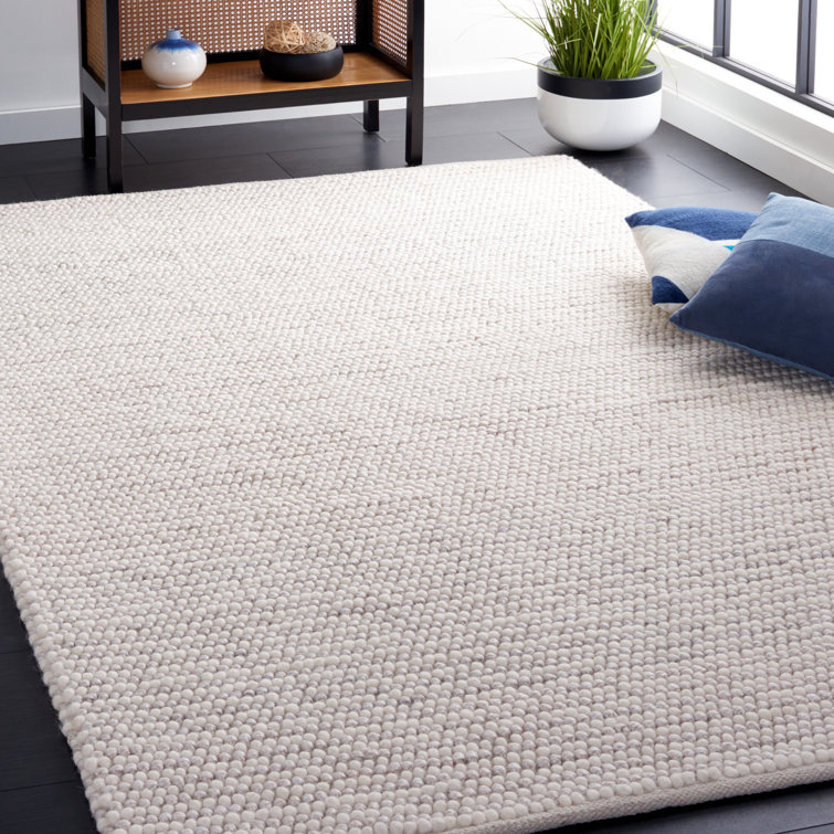
Your Designer Shortlist: The Pieces That End the Search
Stop scrolling. As a designer, I’ve done the vetting for you. These standout pieces aren’t just decor—they’re atmosphere creators, chosen because they solve the exact bedroom color-scheme challenge you’re facing. High-demand pieces like these rarely stay in stock long.
 Wayfair
 Wayfair
 Wayfair
 Wayfair
 Wayfair
 Wayfair
 Wayfair
 Wayfair
You Now Have the Designer’s Blueprint
Creating the perfect bedroom decor color scheme was never about talent or instinct—it’s always been about having the right framework. You now have it: the 60-30-10 rule, the light-direction guide, the psychology behind every hue, and seven palettes you can implement this weekend.
The difference between the bedroom you have and the bedroom you’ve been imagining is smaller than you think. It starts with one decision—your dominant color—and everything else follows with intention.
Your transformation starts with one single click. Stop waiting for the perfect moment—choose your color palette anchor tonight and feel the difference by morning.
⬆ Return to the Designer Shortlist
- How To Set Up A Small Home Gym
- Cottage Apartment Style Guide: 7 Renter-Friendly Ways to Master the Look
- How to Decorate Above a Couch: The Designer’s Step-by-Step Guide
- 10 Masculine Bar Cart Styling Tips You Must Follow
- The Complete Guide to Choosing the Best Bedroom Paint Colors: A Designer’s Proven 5-Step Method
- The 8 Best Murphy Beds of 2026: Space-Saving Solutions That Don’t Sacrifice Style
- The Best Performance Fabric Sofas for Real Life (Kids, Pets & Spills Welcome)
Frequently Asked Questions
The best bedroom color schemes for sleep use cool, desaturated tones—particularly soft blues, blue-greys, and muted sage greens. Research from the Sleep Foundation consistently identifies these as reducing heart rate and cortisol levels. Avoid high-saturation reds, oranges, and bright whites, which are neurologically activating.
Dark wood furniture anchors a room beautifully when you work with it rather than against it. Pull warm undertones: terracotta, warm ivory, forest green, or deep navy all complement dark wood. Avoid cool blues and stark whites, which create an uncomfortable color clash with warm-toned timber finishes.
No—this flattens the room. Use your wall color as the 60% dominant, then choose bedding in your 30% secondary tone, which should be adjacent on the color wheel (analogous) or significantly lighter or darker than the wall. The contrast is what creates the layered, designed look.
Light, cool, monochromatic schemes with high contrast accents create the strongest illusion of space. Soft whites, pale blues, and ivory with crisp white trim visually push the walls outward. A floor-to-ceiling curtain in the wall’s exact color also elongates ceiling height dramatically—a trick most guides skip entirely.
Three to four colors is the designer standard. One dominant (60%), one secondary (30%), and one to two accents (10% combined). Rooms with more than four colors almost always feel cluttered, while rooms with fewer than three feel stark unless very deliberately minimalist in style.
Warm neutrals + one nature-derived tone + a metallic accent has remained the gold standard of residential design for decades. Specifically: warm greige walls, sage or navy secondary elements, and brushed gold hardware and accessories. It photographs beautifully, ages well, and appeals to the broadest range of buyers if resale is a consideration.
Yes—and in fact, the most sophisticated bedroom color schemes intentionally mix temperature. The rule: choose one temperature as dominant and introduce the other at the accent level only. For example: a warm-toned room (linen, terracotta) with cool-toned accents (dusty blue pillows, sage art). The contrast creates visual tension that makes the room feel curated rather than accidental.
Most Popular Post:
Interior Design Style Quiz
Timeless Paint Colors That Never Go Out of Style
Create Your Perfect Ergonomic Home Office: A Complete Guide
Must-Have Accessories for Guys: The Secret to a Stylish Space
Modular Sofas for Small Spaces: Brilliant Solutions for Compact Living
CATCH THE LATEST IN HOME DECOR TRENDS:

Steal These 16 Expert-Approved Decorating Secrets

How To Accessorize Your Living Room

Small Space? 10 Ways To Make A Room Appear Bigger

Make Your space Look Expensive
GET CAUGHT UP ON ALL THE INSPIRING DECOR TIPS:

18 Fresh Decorating Ideas To Update Your Fireplace

How to Make a Gallery Wall: The Complete Step-by-Step Guide (Even If You’ve Never Hung a Picture)


