
The wall color trends 2027 forecasts agree on one thing: cool gray is officially out, replaced by warm neutrals as the base and a handful of confident accents — Luminous Blue, Meadowland Green, and warm Clay — layered in through accent walls, not whole-house repaints. The fastest way to use this trend well: pick your base first, then commit to exactly one accent color in exactly one room.
You’ve scrolled the mood boards. You’ve saved forty paint swatches to a folder you’ll never open again. And somehow you’re more confused about wall color trends 2027 than you were before you started — because every article shows you a gorgeous room and none of them tell you what to actually buy for yours.

Here’s the gap I keep seeing: color forecasters are brilliant at naming a mood, but terrible at telling you where the paint actually goes. So this wall color trends 2027 guide does the part they skip. We’re going room by room, wall by wall, and I’m giving you the exact framework I use with clients to pick a 2027 color they still love in 2029 — not just the one that looked good on a phone screen for four seconds.
Quick promise: no color theory lecture, no 200 paint chips. Just the wall color trends 2027 worth your time, the ones worth skipping, and a repeatable method for choosing between them.
What We’re Covering ▾
- What’s Actually Driving Wall Color Trends in 2027
- The 7 Wall Color Trends of 2027, Ranked by Commitment Level
- A Closer Look at Each Trend
- Room-by-Room: Which 2027 Wall Color Actually Works Where
- How to Choose Your Wall Color (The Commitment Ladder Method)
- Is It Worth Choosing These Color Trends of 2027?
- What NOT to Do With a Trend Color
- The Designer’s Cheat Sheet
- FAQ
What’s Actually Driving Wall Color Trends 2027
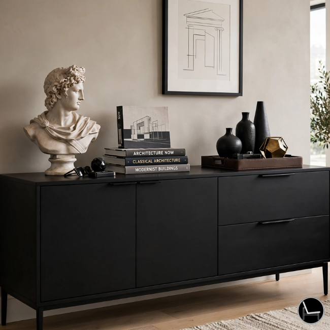
Every major forecaster landed in roughly the same place on wall color trends 2027 this year, and it’s worth understanding why before you pick a single chip. After nearly a decade of cool grays, greige, and rooms designed to photograph well more than to live in, 2027 is a correction. Pantone’s Home + Interiors forecast built its entire 2027 direction — seven palettes under a concept called “Sense-Abilities” — around the idea that color should shape mood and comfort, not just look good in a listing photo.
WGSN and Coloro named Luminous Blue their 2027 Color of the Year: a confident, almost electric sapphire that reads as more ancient (think lapis lazuli, indigo) than trendy. Alongside it, Meadowland Green, warm Clay, and a punch of Pop Pink round out the direction. The throughline across every credible wall color trends 2027 forecast is the same: warmth is back, texture matters as much as hue, and the safe, cool-toned “resale neutral” of the last decade is aging out fast.
None of this means repaint your whole house. Trend colors are seasoning, not the whole meal. The base of almost every 2027-forward room is still a warm neutral — think warm white or warm taupe, never the cool gray of 2019. The trend color is the one wall, the one nook, the one moment you build around it.
Buy the sample in the actual sheen you plan to use. Matte, eggshell, and satin all reflect a trend color differently, so a swatch in the wrong sheen can talk you out of a color that would have worked.
The 7 Wall Color Trends of 2027, Ranked by Commitment Level
I’ve ordered these wall color trends 2027 from lowest commitment (easiest to try, easiest to undo) to highest (the ones you build a whole room around). If you’re nervous about trend colors, start at the top of this list, not the bottom.
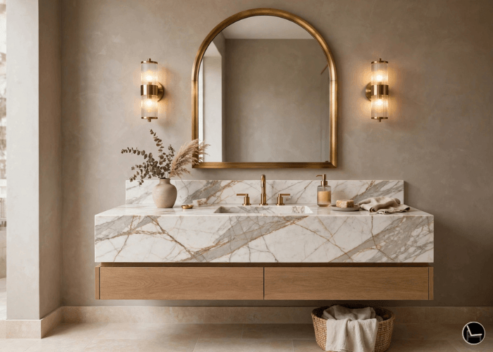
Warm White & Warm Taupe
The base coat of 2027. Not a trend so much as the new default — replacing cool gray as the “safe” whole-house color.
Best for: Full-house base, resale-conscious rooms, anywhere you want the accent color to do the talking.
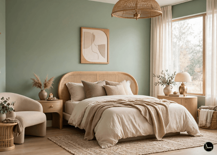
Meadowland Green
A nourishing mid-green that sits between forest and sage — softer than the moody botanical greens of the early 2020s.
Best for: Bedrooms, home offices, any room where you want “calm” without going all the way to neutral.
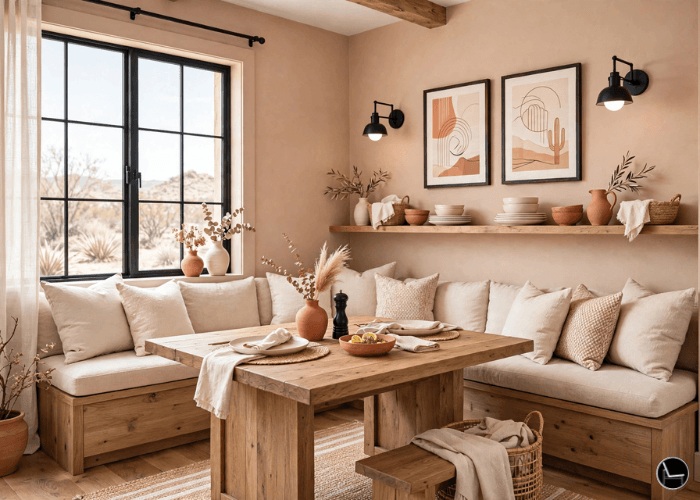
Warm Clay
The connective tissue color of 2027. Pink-adjacent but grounded, it quietly anchors bolder colors nearby instead of competing with them.
Best for: Dining rooms, entryways, and pairing with wood tones and matte black hardware.
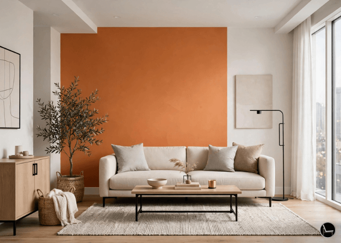
Spiced / Burnt Orange
Warmth and resilience, not 1970s harvest gold. This is a deeper, more spiced register — optimistic without feeling naive.
Best for: A single accent wall, joinery, or a powder room where you want personality without full-room commitment.
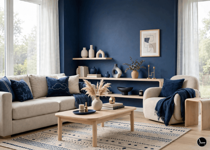
Luminous Blue
The headline color of 2027. A confident, electric, sapphire-adjacent blue named 2027 Color of the Year by WGSN and Coloro — it changes a room’s center of gravity the moment it goes up.
Best for: A small spare bedroom drenched wall-to-wall, or as a highlight color in a larger blue living room scheme.
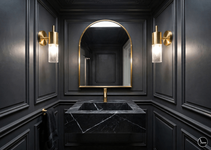
Color Drenching (Any Trend Hue)
Not a color, a technique — walls, trim, and ceiling in one continuous hue. It’s how designers make bold 2027 colors feel intentional instead of accidental.
Best for: Small rooms with awkward angles, powder rooms, and reading nooks.
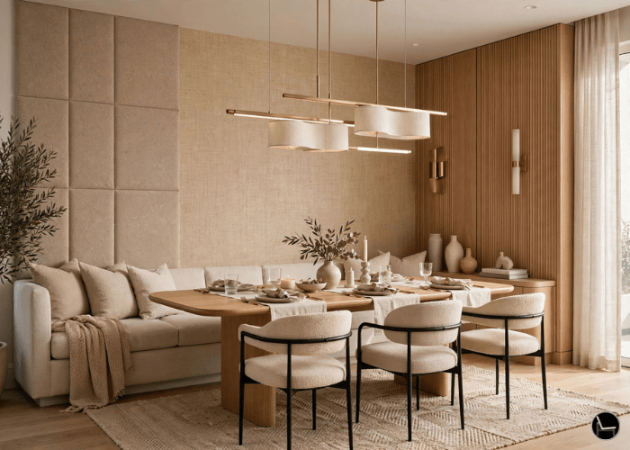
Layered Texture (Fluted Panel + Grasscloth)
The texture story behind the color story. 2027 rooms increasingly mix multiple wall textures — grasscloth on the main wall, fluted panels on the accent — rather than relying on paint color alone.
Best for: Living rooms and primary bedrooms where you want depth without adding more color.
A Closer Look at Each Trend
The cards above are your quick scan. Here’s the full story on each of these wall color trends 2027 — the exact shades, the mood they create, and how I’d actually put them to work in a room.
1. Luminous & Corundum Blues (The Hero Trend)
The Key Shades: Luminous Blue (WGSN’s official Color of the Year for 2027) and Corundum Blue (RAL) — arguably the boldest name in wall color trends 2027.
The Vibe: Electric yet deeply rooted in history — reminiscent of lapis lazuli pigment combined with modern, futuristic depth. It bridges nature, art, and technology.
How to Style It:
- Color Drenching: Painting all four walls, trim, and doors in a low-sheen or matte finish for a cozy, enveloping study, media room, or formal dining room.
- Statement Accent: Pairing it as a single focal wall alongside raw timber, cognac leather, and warm brass fixtures so the blue reads rich rather than cold.
2. Meadowland Green (The Grounding Trend)
The Key Shades: Meadowland Green (WGSN/Coloro), sitting between forest and sage — nourishing rather than moody.
The Vibe: Biophilic and unhurried. Less “botanical statement,” more “the color of rest.” It reads as the natural successor to the sage-and-olive moment without feeling washed out.
How to Style It:
- Headboard Wall: One wall behind the bed only, with warm white on the remaining three, so the room still feels calm enough to sleep in.
- Full Drench, Small Room: A home office or reading nook, paired with oak shelving and linen curtains for a grounded, tactile finish.
3. Warm Clay (The Anchor Trend)
The Key Shades: Clay, a pink-adjacent, earthy neutral forecasters describe as the connective tissue between bolder wall color trends 2027.
The Vibe: Quiet confidence. It doesn’t compete for attention — it grounds whatever bold color sits next to it, which is exactly why it pairs so well with Luminous Blue or burnt orange in the same scheme.
How to Style It:
- Sofa-Wall Anchor: The full wall behind a living room sofa, layered with warm oak furniture and a jute rug for texture contrast.
- Entryway Drench: A small entry or hallway, paired with matte black hardware and handmade ceramics for a warm first impression.
4. Spiced & Burnt Orange (The Optimist Trend)
The Key Shades: A deeper, spiced burnt orange — closer to sunset than 1970s harvest gold.
The Vibe: Warm and resilient, optimistic without tipping into novelty. Forecasters are tracking it as a direct cultural response to a desire for warmth after years of cool minimalism.
How to Style It:
- Statement Accent: One wall or a set of built-in joinery, left as the single bold note in an otherwise neutral room.
- Color Drenching, Small Space: A powder room or reading nook, drenched fully for maximum impact with minimum square footage.
5. Warm White & Warm Taupe (The Foundation Trend)
The Key Shades: Warm white, warm beige, and warm taupe — replacing the cool gray that dominated the last decade.
The Vibe: Not a trend so much as the new default. It’s the quiet base every bolder 2027 color gets layered onto.
How to Style It:
- Whole-House Base: Every wall not chosen as an accent, so the home reads cohesive even with several bold rooms.
- Resale-Conscious Rooms: Kitchens and primary living areas, where you want the accent color elsewhere to do the talking.
6. Color Drenching (The Technique Trend)

The Key Application: Walls, trim, doors, and ceiling all painted the same hue and sheen family, so no surface competes with another.
The Vibe: Enveloping and intentional. It’s how designers make a bold 2027 color feel deliberate instead of like an accidental leftover can of paint.
How to Style It:
- Small, Awkward Rooms: Powder rooms and angled nooks, where drenching erases the awkward lines instead of highlighting them.
- Media Rooms & Studies: Rooms used mostly after dark, where a fully drenched wall reads cozy rather than dark.
7. Layered Texture — Fluted Panel & Grasscloth (The Depth Trend)
The Key Application: One of the quieter wall color trends 2027 has to offer — two or three wall textures working together in one room — grasscloth on the main wall, fluted panels on the accent, acoustic panels behind seating.
The Vibe: Depth without more color. It’s the answer for readers who want a 2027-forward room but have already committed their color budget elsewhere.
How to Style It:
- Accent Wall Only: Fluted panels behind a bed or media console, left unpainted or in a matching warm neutral.
- Full-Room Layering: Grasscloth on primary walls with a paneled or acoustic accent wall, for living rooms and primary bedrooms.
- Cool gray or greige on every wall
- One “safe” neutral, house-wide
- Flat paint finish, no texture
- Color chosen for resale, not for the reader
- Warm white or warm taupe as the base
- One confident accent color per key room
- Texture layered in alongside color
- Color chosen for mood, then tested for light
Room-by-Room: Which 2027 Wall Color Actually Works Where
Bedroom

Of all the wall color trends 2027 has to offer, the bedroom is the single best room in the house to try Luminous Blue or Meadowland Green, because both read as restful rather than stimulating once the lights are low. If you’re nervous, drench a smaller secondary bedroom or guest room fully in Luminous Blue rather than starting in your primary — it’s the lowest-stakes place to test a wall-to-wall commitment. In a primary bedroom, I lean toward Meadowland Green on the headboard wall only, with warm white everywhere else, so the room still feels like a place you can fall asleep in.
Living Room

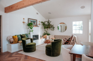
Image credit: Farrow & Ball
For living rooms, this is Clay and burnt-orange territory in the wall color trends 2027 lineup. Living rooms get more daylight and more foot traffic than bedrooms, so they can hold a warmer, more saturated color without feeling heavy. A clay-toned wall behind the sofa, paired with warm oak furniture and a jute rug, is the single most requested combination I’m styling for clients right now. If you want to go bolder, color-drench a reading nook or built-in alcove in burnt orange and leave the rest of the room in warm white — you get the drama without repainting the whole footprint.
Kitchen
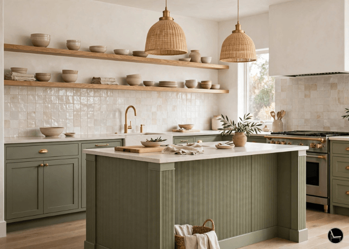
Kitchens are the one room where I’d hold off on the boldest wall color trends 2027 on full walls — grease, steam, and resale considerations make high-commitment hues riskier here. Instead, bring 2027 in through lower cabinetry in warm clay or sage-adjacent green, keep the walls in warm white, and add texture (fluted panel end caps, a textured backsplash) instead of more color. If you rent, this is also the room where a removable, solid-color wallpaper does the most work.
Bathroom
When applying wall color trends 2027 in a bathroom, small, enclosed, low-light rooms are made for high-commitment choices, because you’re rarely in them for hours at a stretch. A fully color-drenched powder room in Luminous Blue or burnt orange is one of the highest-impact, lowest-regret moves in this whole guide — go bold here before you go bold in your living room.
Judge each room’s sample at the time of day you actually use it. A home office needs to be judged at 10am, a media room after dark — not whenever the paint happens to be dry.
“Forecasted palettes are less about specific wall colors and more about relationships between tones and contexts.”
— Melaaura, 2027 Interior Colour Palettes ForecastHow to Choose Your Wall Color: The Commitment Ladder Method
Decision paralysis is the actual reason most people never commit to wall color trends 2027 — not lack of taste. Here’s the direct answer: start with the lowest-commitment version of a color you’re drawn to, test it in your actual room under your actual light for at least 48 hours, then climb the ladder one rung at a time.
If you’re testing a high-commitment color like Luminous Blue, sample it next to your largest fixed element first — the sofa, the flooring, the cabinetry — since that relationship matters more than how the color looks alone.
Is It Worth Choosing These Color Trends of 2027?
Are wall color trends 2027 actually worth it? Honest answer, from someone who gets paid to have an opinion on this: yes, for most of these — but not for all of them, and not in every room. Here’s my actual, unsponsored read, so you can skip the ones that will cost you money and regret.
Worth it, almost every time: Warm White & Warm Taupe. This isn’t really a “trend” you’re betting on — it’s a correction away from a cool gray that was already looking dated. Repainting your base color to a warm neutral is low-risk, resale-safe, and makes every other color on this list look better next to it.
Worth it, if you test first: Meadowland Green and Warm Clay. Both are genuinely wearable colors with staying power — they’re closer to “updated classic” than “trend.” I’d commit to these in a real room without much hesitation, as long as you’ve done the sample test in your own light.
Worth it, but only in the right room: Luminous Blue and Burnt Orange. These are the two I’d call true trend colors — bold, of-the-moment, and more likely to feel dated in five years than the neutrals above. Use them in a small, high-impact room (a powder room, a reading nook, a secondary bedroom) where repainting later is a half-day job, not a full-house project. I would not drench a primary living room in either one unless you already know you love bold color and don’t mind updating it again down the road.
Worth it only if you already have the layout for it: Layered Texture and Color Drenching. These aren’t colors, they’re techniques, and they only pay off if your room’s proportions support them. A tiny apartment nook drenched in one hue can look intentional and expensive; the same technique in a large, awkward-shaped room can just look unfinished. Don’t take these on as your first trend experiment — try a simple accent wall first.
If you only take one thing from this section: spend your money on the warm neutral base first. It’s the one “trend” here that isn’t really a trend, and it protects you if any of the bolder accent choices don’t age the way you hoped.
What NOT to Do With a Trend Color
Do This With Wall Color Trends 2027
- Sample at least 2 feet square, in place, for 48 hours
- Pick one accent color per room, max
- Pair bold color with at least one warm neutral surface
- Test under morning, midday, and lamp light
Not This
- Judging a color from a 2×2 inch paint chip
- Drenching every room in a different trend color
- Skipping the undertone check under your actual bulbs
- Painting before checking your HOA or lease terms
The single most expensive mistake I see with wall color trends 2027: buying the gallon before the sample dries. Trend colors shift dramatically depending on your light temperature — a Luminous Blue that looks moody and rich under warm 2700K bulbs can read cold and flat under daylight 5000K bulbs. Always test under the exact bulbs you already own.
Keep a small labeled swatch of every sample you test, even the ones you reject. Six months from now, when you’re ready for the next room, you’ll already know which trend colors your light flatters and which it doesn’t.
The Designer’s Cheat Sheet
Sample Size
Minimum 2ft x 2ft panel, moved to at least 2 spots on the wall before deciding.
The 60-30-10 Rule
60% base neutral, 30% secondary tone, 10% trend accent — applies to walls plus decor together.
Light Test Window
Check the sample at 9am, 1pm, and after dark under lamps before buying a gallon.
One-Room Rule
Introduce a high-commitment 2027 color in exactly one room before considering a second.
Drench Ratio
If drenching, match walls, trim, and ceiling in the same sheen family for a seamless look.
Undertone Check
Hold the sample next to your flooring and largest furniture piece — undertones clash more than hues do.
- ◆ Bedroom accent wall
- ◆ Reading nook
- ◆ Closet interior
- ◆ Powder room, full drench
- ◆ Secondary bedroom, full drench
- ◆ Built-in alcove
- ◆ Primary kitchen walls
- ◆ Small windowless hallways
- ◆ Rooms you’re selling within a year
Frequently Asked Questions
Bringing It All Home
You don’t need to repaint your entire house to use wall color trends 2027 well — that’s the whole point of this guide. You need one warm neutral base, one accent color you actually tested under your own light, and the discipline to climb the Commitment Ladder instead of jumping straight to a full gallon. Start with a sample. Give it two weeks. Then decide how far you want to go.
Ready to Pick Your Color With Confidence?
Grab The Decorator’s Black Book for the full wall color trends 2027 formula library and every post on this site.
Get The Black Book →CATCH THE LATEST IN HOME DECOR TRENDS:
Steal These 16 Expert-Approved Decorating Secrets

How To Accessorize Your Living Room
How to Make a Small Room Appear Bigger
How to Make Your Home Look Expensive
GET CAUGHT UP ON ALL THE INSPIRING DECOR TIPS:
18 Fresh Decorating Ideas To Update Your Fireplace
How to Make a Gallery Wall: The Complete Step-by-Step Guide (Even If You’ve Never Hung a Picture)
