TL;DR Summary: Style coffee table books by choosing 2-3 books in a coordinated color palette, stacking largest to smallest, and topping with a single decorative accessory. Place books on coffee tables, consoles, nightstands, or shelves. The key is treating display books differently than reading books—selecting for visual impact, not content.
Introduction: The Missing Piece in Your Living Room
You’ve invested in that beautiful sofa. You found the perfect throw pillows. Your area rug is exactly what you envisioned. Yet your living room still feels…incomplete.
The secret professional designers know? Style coffee table books aren’t just decorative—they’re the bridge between “furnished” and “finished.” These oversized beauties add instant sophistication, inject personality, and create visual layers that make spaces feel curated rather than catalog-ordered.
Here’s what nobody tells you: styling coffee table books is less about the books themselves and more about understanding a handful of design principles that transform how you see your entire space. Once you grasp these rules, you’ll never look at a bare coffee table the same way again.
In this guide, I’m sharing the exact framework interior designers use to select, stack, and style coffee table books—plus the common mistakes that make even expensive books look cheap.
I. Why Style Coffee Table Books Are Your Secret Weapon
Coffee table books deliver texture, depth, elevation, color, and personalization—often the final touch a space needs to feel complete and lived-in.
But here’s what separates amateurs from pros: display books follow completely different rules than reading books.
The Psychology of Display Books
When you’re choosing books for your bookshelf, content reigns supreme. You judge by the author, reviews, and whether you’ll actually read it. But style coffee table books? They’re judged purely by their cover, spine design, size, and color family.
This isn’t shallow—it’s strategic. These books serve as sculptural elements that:
- Create visual weight and balance
- Introduce color and pattern
- Provide a platform for accessories
- Communicate your interests and aesthetic
- Act as conversation starters
💡 Pro Tip: The best coffee table book collections tell a story about who you are. Travel books signal wanderlust. Design tomes showcase your aesthetic sophistication. Art books reveal your cultural interests. Choose subjects you genuinely care about—authenticity always reads better than trying to impress.
You’ll Also Like: 23 Living Room Corner Ideas That Transform Wasted Space Into Stunning Design Features
II. The Golden Rules of Selecting Coffee Table Books
Not all books deserve coffee table real estate. Here’s your selection criteria:
Rule #1: Size Matters (More Than You Think)
Coffee table books typically range from 8×10 inches up to 11×14 inches. Save larger sizes for oversized tables and reserve smaller books for narrow surfaces like consoles, side tables, or nightstands.
The Critical Size Strategy:
- Large surfaces (coffee tables, ottomans): 10×13 inches minimum
- Medium surfaces (console tables, side tables): 8×11 inches works well
- Small surfaces (nightstands, narrow shelves): 8×10 inches maximum
Small books on large coffee tables get visually lost. They lack the presence needed to anchor a space. Think of book size as the foundation of your entire styling strategy.
Rule #2: The Color Coordination Principle
Choose books that complement your home’s aesthetic by selecting 2-3 colors from your surroundings and focusing on those when picking coffee table books for display.
Your Color Palette Options:
| Palette Type | Best For | Book Colors to Choose |
| Neutral Minimalist | Scandinavian, Modern Organic, Coastal | Whites, creams, beiges, soft grays, natural linen |
| Classic Traditional | Transitional, English Country | Navy, burgundy, forest green, cognac leather |
| Bold Contemporary | Maximalist, Eclectic, Mid-Century | Vibrant covers, art books, graphic designs |
| Monochromatic | Any style | Single color in varying shades |
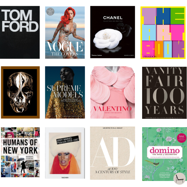
💡 Pro Tip: Don’t be afraid to remove dust jackets. Sometimes the linen-bound cover underneath is far more sophisticated than the shiny, branded jacket. This single move can instantly elevate your entire book stack.
Rule #3: Content You’ll Actually Engage With
Yes, display books prioritize aesthetics—but choose subjects that genuinely interest you. Interior design, travel, fashion, art, cooking, photography—select style coffee table books you’ll occasionally flip through. There’s nothing sadder than a beautiful book that’s obviously never been opened.
In Case You Missed It: How to Style a Console Table: The Designer’s 3-Step Formula That Actually Works
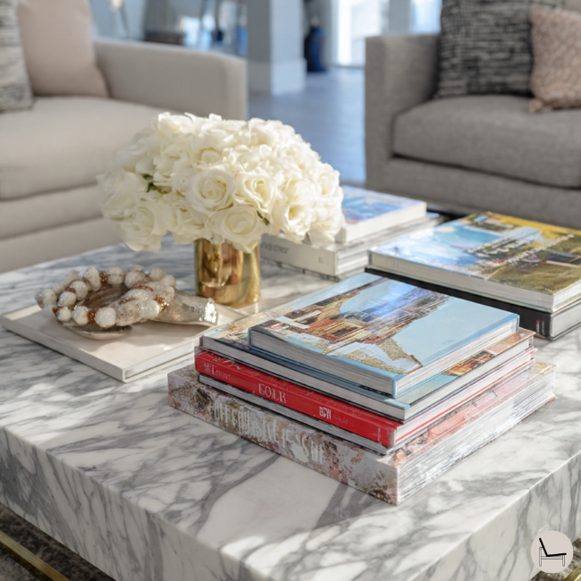
III. The Designer’s 3-2-1 Styling Formula

Professional interior designers style coffee table books, don’t randomly stack them—they follow a deceptively simple system that creates visual balance while maintaining functionality. The secret lies in understanding how the human eye processes grouped objects and using that psychology to your advantage.
The 3-2-1 System works because it mimics the natural hierarchy our brains prefer when scanning a space. Think of it as creating a visual “story” that has a beginning (base), middle (supporting elements), and ending (focal point). This isn’t just aesthetic theory—it’s rooted in the same principles museum curators use when designing exhibits.
Understanding the 3-2-1 Framework
The magic formula uses three distinct heights, two complementary color families, and one show-stopping focal point. This system prevents the two most common coffee table styling mistakes: visual flatness (everything at the same height) and color chaos (too many competing hues). By constraining your choices within this framework, you actually unlock more creative possibilities because you’re working with proven design principles rather than guessing.
3 Height Levels:
- Base layer: Use your largest books (11″x14″ or bigger) as foundation anchors
- Middle layer: Stack medium books (9″x12″) to bridge foundation and accents
- Top layer: Add small decorative objects or your smallest books as finishing touches
2 Color Families:
- Family 1: Choose neutrals (white, cream, gray, black) OR a primary color from your room
- Family 2: Add earth tones (terracotta, olive, brown) OR metallics (gold, brass, copper)
- The Rule: Books must fall within these two families—no random third colors
1 Focal Point:
- Select: Your most visually striking book with the boldest cover design
- Position: Place at eye level or the most visible spot on your table
- Purpose: This “hero” book draws attention first and anchors the entire display
“The most important thing in styling a coffee table is creating levels. Your eye needs somewhere to travel, which is why varying heights is non-negotiable.” — Emily Henderson, Interior Designer & Stylist
💡 Pro Tip: Remove dust jackets from all books before applying the 3-2-1 formula—the exposed linen bindings create instant visual cohesion that makes the color coordination step dramatically easier.
In Case You Missed It: 5 Washable Area Rug Designer Secrets to Make Any Room Look Custom
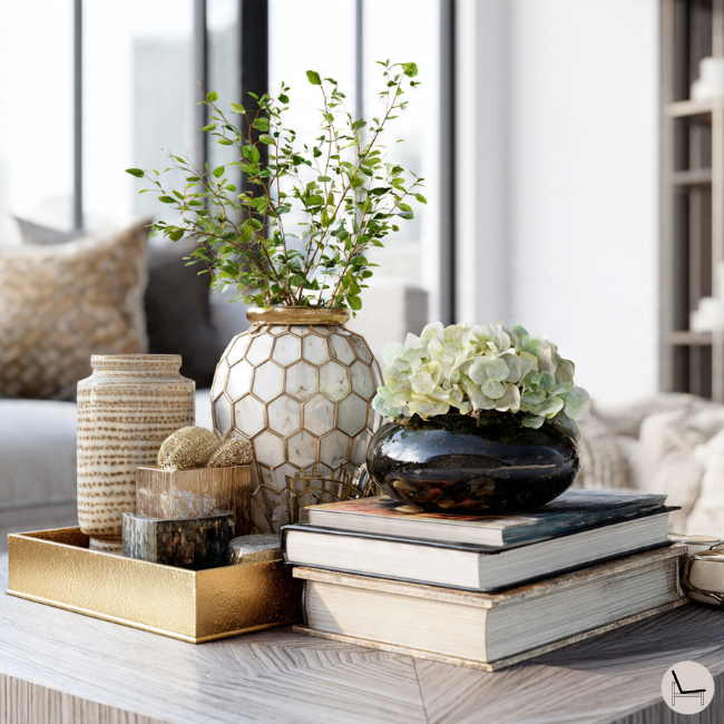
IV. Style Coffee Table Books by Shape: Customized Approaches for Every Table
Your coffee table’s shape isn’t just an aesthetic choice—it fundamentally dictates how you should arrange books and objects for maximum visual impact. Understanding these shape-specific styling principles transforms amateur arrangements into professional-looking displays that work with your table’s natural geometry rather than fighting against it. Here’s exactly how to style each shape like a designer who’s done this a thousand times.
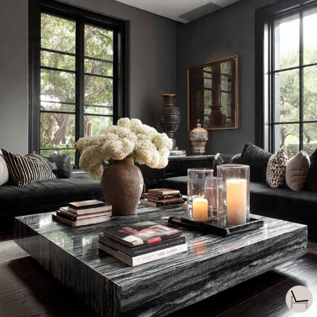
Rectangular Coffee Tables: The Two-Zone Method

Rectangular tables are the easiest to style because they naturally divide into balanced zones. The key is creating two distinct visual moments on either end while leaving the center open for actual use—coffee tables should still function for drinks, remotes, and living.
Master the linear flow by treating each end as a separate vignette that mirrors the other in visual weight without being identical. Think asymmetrical balance, not perfect symmetry. One end might feature a tall stack with a lamp, while the other showcases a lower stack with a sculptural bowl. They balance without matching, creating interest that exact duplication can’t achieve.
Step-by-Step Process:
- Foundation: Place your largest book (12″x15″+) flat on one table end
- Build height: Stack 2-3 medium books (9″x12″) on top, slightly offsetting each one
- Anchor point: Top the stack with a decorative object (ceramic bowl, brass sculpture, candle)
- Mirror side: Create second stack on opposite end using different books at varying heights
- Breathing room: Keep the center 40% of table completely clear for functionality
Common mistakes to avoid:
- Don’t make both ends identical—symmetry looks staged, not styled
- Don’t stack more than 5 books on one end—it becomes unstable and overwhelming
- Don’t forget practical space—coffee tables need to hold drinks and remotes
“I always leave the middle of a coffee table open. You need somewhere to put your wine glass down, and that practical consideration actually makes the styling look more intentional.” — Amber Lewis, Amber Interiors
💡 Pro Tip: For extra-long rectangular tables (60″+), create a third small vignette in the center using just 1-2 books flat with a single object on top. This prevents the “barbell” look of only styling the ends.
Round Coffee Tables: The Triangle Technique
Round tables fight against linear arrangements, demanding a completely different strategy. The secret lies in working with the circular geometry rather than against it—think triangulation, not straight lines.
The triangle method places elements at three strategic points around the circumference, creating natural balance that respects the table’s curved shape. This prevents the amateur mistake of creating one blob in the center that looks cluttered and blocks sightlines. By distributing visual weight around the circle’s edge, you maintain the table’s elegant proportions while creating interest.
The 3-Point Setup:
- Point 1 (12 o’clock): Stack 3-4 books of graduating sizes
- Point 2 (4 o’clock): Place a tray holding 1-2 books plus one decorative object
- Point 3 (8 o’clock): Add a vertical element like a vase or sculptural piece (no books)
- Connection: Drape a chain, beaded garland, or curved branch between points
- Center zone: Leave completely empty or use one ultra-low bowl
Key principles:
- Never fill the center—it blocks conversation and sightlines across the table
- Always vary what’s at each point (books + object, just object, just books)
- Consider your viewing angles—round tables are seen from all sides simultaneously
“Round coffee tables are all about negative space. Don’t be afraid to leave the center completely empty—that breathing room is what makes the whole arrangement work.” — Studio McGee, Interior Design Firm
💡 Pro Tip: For small round tables (under 30″ diameter), reduce to just 2 points maximum. Three points on a tiny table creates visual clutter that overwhelms the scale.
Square Coffee Tables: The Quadrant Strategy
Square tables offer perfect symmetry that can look either elegantly balanced or boringly static. The quadrant method creates intentional variation across four sections while maintaining overall harmony—preventing monotony without sacrificing cohesion.
Divide your square table into four mental sections, then intentionally vary each quadrant’s content and height. The rhythm of tall-medium-low-empty guides the eye around the entire surface in a pleasing pattern. No two quadrants should be identical, but they should feel related through your color family choices and overall aesthetic.
The 4-Quadrant Breakdown:
- Quadrant 1 (back left): Tall stack of 4-5 books creating your highest point
- Quadrant 2 (back right): Medium stack of 2-3 books topped with decorative object
- Quadrant 3 (front left): Single large book flat + small object resting on top
- Quadrant 4 (front right): Leave empty OR place small tray with coasters/candle
Design principles:
- Vary the stack heights—never create four identical piles
- Alternate between stacked and flat books for visual rhythm
- Reserve one quadrant for complete emptiness or pure functionality
- Consider diagonal balance—opposite corners should have similar visual weight
“When styling square tables, I always make sure one corner is completely empty or just holds something practical like a bowl of coasters. That restraint makes everything else look more curated.” — Shea McGee, Studio McGee
💡 Pro Tip: Rotate your square table 45 degrees (diamond orientation) to create a completely different look using the same books. This transforms the quadrant system into a more dynamic “cardinal points” arrangement that feels less predictable.
In Case You Missed It: Best Stud Finder: Your Essential Tool for Home Decor
V. Advanced Styling: Three Signature Looks
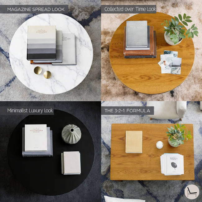
Once you’ve mastered the basics, these signature aesthetics help you develop a distinctive style that reflects current design trends. Each approach creates a completely different mood using the same fundamental technique—proof that how you style matters as much as what you’re styling.
The “Magazine Spread” Look
This editorial approach channels the polished sophistication you see in Architectural Digest by eliminating visual clutter through ruthless color discipline. Remove ALL dust jackets to reveal cohesive linen textures underneath, arrange books by color gradient (dark to light), and add metallic accents that catch light. The result looks professionally styled because you’ve applied the same techniques editorial photographers use.
Key elements:
- Strip away all dust jackets—the exposed bindings create instant sophistication
- Organize by color gradient to create subtle ombre transitions
- Add 2-3 gold or brass objects positioned to catch natural light
- Choose books with neutral linen bindings (cream, gray, tan, black)
💡 Pro Tip: Spray exposed book spines lightly with fabric protector (Scotchgard) to prevent dust absorption and maintain that fresh, editorial look longer.
The “Collected Over Time” Look
This approach tells an authentic story by intentionally mixing eras, conditions, and styles—just like real collectors accumulate books throughout their lives. Pair vintage flea market finds with brand-new releases, alternate horizontal and vertical orientations, and tuck personal souvenirs between stacks. The intentional imperfection feels lived-in rather than staged.
Building the collection:
- Mix old and new books to create visual dialogue between eras
- Include worn vintage books with patina alongside pristine new editions
- Alternate stacking directions—some horizontal, others vertical
- Tuck personal items (travel souvenirs, vintage postcards) between books
- Embrace imperfection—slightly mismatched heights and sizes add character
“The best coffee table displays look like they evolved over time, not like you bought everything in one shopping trip. Mix in pieces with history.” — Bobby Berk, Interior Designer & Queer Eye Design Expert
The “Minimalist Luxury” Look
Less becomes more when you invest in exceptional quality over quantity. This aesthetic dominates high-end 2026 design by creating breathing room that modern life desperately needs. Use only 1-2 oversized books maximum, choose neutral covers, and pair with one museum-quality sculptural object.
The minimalist formula:
- Limit yourself to 1-2 books maximum (preferably oversized format)
- Choose neutral covers exclusively—white, black, soft gray, or natural linen
- Pair with one exceptional sculptural object (handmade ceramic, abstract metal art)
- Maintain 70%+ negative space on the table surface
- Invest in truly exceptional books since each carries the entire display
💡 Pro Tip: For minimalist displays, lighting becomes crucial. Position a small spotlight or table lamp to cast shadows from your sculptural object, adding drama that compensates for the sparse arrangement.
You’ll Also Like: Calming Paint Colors: The Complete Guide to Creating Your Serene Home Sanctuary
VI. Color Coordination: Matching Books to Your Room
Color psychology determines whether your coffee table books amplify your room’s aesthetic or fight against it. Understanding which colors to introduce based on your existing palette helps you make confident purchasing decisions instead of second-guessing every selection.
Your room’s dominant color family dictates which book covers will create cohesion versus chaos. Books should either complement existing tones or provide strategic contrast—never introduce random colors that have no relationship to your space. Think of books as the finishing touch that either completes your color story or disrupts it entirely.
For Neutral Rooms (Gray/White/Beige)
Neutral backdrops desperately need color injection to prevent sterile, hotel-like vibes. These rooms offer maximum flexibility because you’re starting from a blank canvas. Choose books with covers in soft blues, sage green, terracotta, or warm browns to add personality without overwhelming the sophisticated restraint of neutrals.
What works:
- Soft blues and greens add calm, natural energy
- Terracotta and rust introduce warmth and earthiness
- Warm browns and tans create cozy, layered depth
- Muted jewel tones (dusty pink, sage) add subtle sophistication
What to avoid:
- Bright primaries (fire engine red, electric blue) create jarring contrast
- Neon or fluorescent tones that clash with neutral sophistication
- Busy patterns that introduce too much visual noise
💡 Pro Tip: In neutral rooms, your books become the “jewelry” that completes the outfit—choose them as carefully as you’d select accent pillows or artwork.
For Bold/Colorful Rooms
When your space already features saturated colors, your coffee table needs to provide visual rest. More color creates sensory overload rather than interest. Choose books with black, white, or metallic covers that act as neutralizers within your vibrant palette.
Strategic selections:
- Black-covered books ground colorful rooms and add sophisticated weight
- White or cream covers provide crisp, clean visual breaks
- Metallic gold or silver add glamour without competing color
- Match ONE room color maximum—if your sofa is navy, choose one navy-accented book
What to avoid:
- Introducing new colors not already in your room’s palette
- Rainbow arrangements that add more visual chaos
- Multiple competing hues on different book covers
“In a colorful room, I always choose coffee table books with neutral covers. They become the resting place for your eye, which is crucial when you’re surrounded by pattern and color.” — Justina Blakeney, The Jungalow
For Dark/Moody Rooms
Rooms painted in deep jewel tones or charcoal benefit from books that either embrace the drama or provide high-contrast relief. Choose rich emerald, sapphire, or ruby-covered books to amplify the luxurious mood, or introduce white and metallics for dramatic contrast moments.
Complementary choices:
- Jewel tones (emerald, sapphire, ruby) amplify the moody sophistication
- Black with gold foil adds luxury without fighting the dark palette
- White or cream creates high-contrast moments that pop
- Brass or copper metallics catch light and prevent cave-like darkness
What to avoid:
- More dark covers that simply disappear into your existing palette
- Muddy mid-tones (beige, tan) that look washed out against dark walls
- Pastels that feel out of place in moody spaces
💡 Pro Tip: In dark rooms, position one white-covered book where it catches natural or lamp light—this creates a focal point that draws the eye and prevents the display from visually disappearing.
You’ll Also Like: Best Coffee Tables Books: Buying & Style Guide
VI. Budget-Friendly Book Sourcing Strategies

You don’t need to drop $300 on a curated book collection. Here’s how to build your style coffee table books library smartly:
The Splurge vs. Save Framework
Splurge On:
- One “statement” book with a stunning cover that anchors your collection (Budget: $40-$60)
- Books from your genuine interests that you’ll revisit
Save On:
- Supporting books in coordinating colors (these can be budget-friendly)
- Vintage books from thrift stores (often $3-$10 each)
- Books during sales (Barnes & Noble, Amazon, TJ Maxx/HomeGoods)
Sourcing Secrets
- Thrift Stores & Estate Sales: Vintage design books often have beautiful linen covers once you remove outdated dust jackets
- Library Book Sales: High-quality books for $1-$5
- TJ Maxx/HomeGoods: Designer books at 50-70% off retail
- Etsy: Curated vintage book bundles by color
- Your Own Bookshelf: Shop your home first—you might have hidden gems
💡 Pro Tip: Buy books slightly worn or with damaged dust jackets at steep discounts. Once you remove the jacket, a beautifully bound book underneath often looks better anyway.
In Case You Missed It: Best Coffee Tables Books: Buying & Style Guide
VII. Common Styling Mistakes (And How to Fix Them)
Even with the best intentions, these five errors sabotage coffee table displays. The good news: they’re all easily correctable once you know what to look for.
Understanding why these mistakes happen helps prevent them. Most stem from treating coffee table books like regular bookshelf books or simply copying displays from Pinterest without understanding the underlying principles. Here’s how to identify and fix each issue immediately.
1: All Books Are the Same Size
The problem: When every book measures approximately the same dimensions, your display lacks the height variation that creates visual interest. Your eye has nowhere to travel, resulting in that “flat” look that signals amateur styling.
The fix:
- Mix sizes intentionally: Pair 12″x15″ oversized books with 9″x12″ medium and 6″x9″ small formats
- Create hierarchy: Largest books at bottom, smallest at top or as accents
- Aim for 3 distinct sizes minimum in any display
2: Books Still Have Dust Jackets
The problem: Dust jackets with glossy finishes, different fonts, and varied graphics create visual chaos. They also make books look cheap and temporary—like you just brought them home from the store and haven’t decided where they permanently belong.
The fix:
- Remove ALL dust jackets to reveal elegant linen bindings underneath
- Store jackets carefully in a closet to preserve book value if you resell
- Exception: Keep jackets only if the cloth binding underneath is damaged or plain
“I remove every single dust jacket from my coffee table books. The exposed bindings immediately make everything look more expensive and cohesive.” — Amber Lewis, Amber Interiors Founder
3: Too Many Books (Cluttered, Not Functional)
The problem: Coffee tables need to actually function as surfaces for drinks, remotes, and snacks. Covering every inch with books makes the table unusable and looks more like overflow storage than intentional styling.
The fix:
- Use 3-7 books maximum per coffee table (smaller tables = fewer books)
- Leave 40-50% clear space for practical daily use
- Remove books that don’t add to the overall aesthetic—quality over quantity
- Create defined zones: Books in designated areas, empty space in others
4: All Books Face the Same Direction
The problem: Stacking every book horizontally or displaying every spine vertically creates monotonous visual rhythm. Your eye expects variation, and when everything’s identical, the display feels rigid and unnatural.
The fix:
- Alternate orientations: Mix horizontal stacks with vertical displays
- Create visual interest: Some spines facing out, others stacked flat
- Break the pattern: After 3-4 horizontal books, change direction
- Use this variation to fill odd spaces and create dynamic arrangements
5: No Accompanying Objects (Looks Flat)
The problem: Books alone, without any decorative objects, create displays that feel incomplete and one-dimensional. The missing element is sculptural pieces that add different textures, heights, and shapes to contrast with books’ rectangular forms.
The fix:
- Add ONE object per book stack—bowl, vase, candle, small sculpture
- Vary materials: Ceramic, brass, glass, wood for textural contrast
- Choose sculptural pieces that complement book content (e.g., seashell with beach book)
- Keep it simple: One exceptional object beats three mediocre ones
💡 Pro Tip: Your decorative objects should be proportional to your book stacks—don’t place a tiny 2″ object on top of a 12″ book stack. The object should be roughly 1/3 to 1/2 the height of the stack it sits on.
You’ll Also Like: Coffee Table Styling Tips: Master the Art of Effortless Design
VIII. Styling Books in Other Spaces (Beyond the Coffee Table)
Coffee table books transcend their namesake—they enhance virtually any horizontal surface when you adapt your approach to each space’s specific function and viewing angle. The fundamental principles remain constant, but the execution changes dramatically based on whether someone views your display from above, from the side, or while walking past.
A. Console Table Styling: The Asymmetrical Balance Method

Console tables present unique challenges because they’re transition spaces viewed from multiple angles in entryways or hallways. Unlike coffee tables where you look down at displays, console styling must work at eye level as you pass by—changing everything about arrangement strategy.
Create visual interest without chaos by balancing two distinct sides in weight rather than mirroring them exactly. Think of a scale: one tall element can balance one wide element even though they’re completely different. This asymmetry keeps eyes engaged while maintaining the harmony necessary for tight hallway spaces.
The layered approach:
- Left side: Stack 3-4 books and place a table lamp on top for height + functionality
- Right side: Position one large decorative object (substantial vase, sculpture) for width
- Below: Tuck a storage basket or decorative box to ground the arrangement
- Color echo: Repeat one color from book spines in your decorative object
Console-specific considerations:
- Wall height matters: If you have a mirror or artwork above, books + lamp shouldn’t exceed 2/3 the artwork’s height
- Walkway clearance: Ensure objects don’t extend past table edge in narrow hallways
- Odd numbers rule: Use 5 or 7 total elements (books counted as one group)
“Console tables are my favorite place for coffee table books because they’re eye-level instead of looking down. You can appreciate the styling more fully.” — Studio McGee, Interior Design Firm
💡 Pro Tip: Add a small dish or tray on your console specifically for keys, sunglasses, and wallet—this practical element prevents everyday items from ruining your carefully styled book display.

B. Nightstand Styling: The Personal Touch Stack
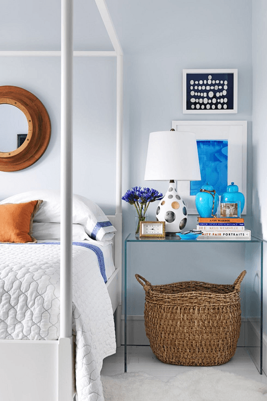
Nightstands operate under completely different rules than display surfaces because they’re deeply personal, functional spaces you interact with during your most vulnerable moments—waking up and going to sleep. Books here shouldn’t impress guests; they should serve your actual routine and create calming pre-sleep environments.
Prioritize functionality and emotional comfort over aesthetic perfection. Your nightstand holds items you reach for half-asleep in the dark—books should support this reality rather than fight it. Choose content that soothes rather than stimulates, with sizes that won’t cause injury if they fall while you’re dozing.
Building your bedside stack:
- Base layer: 2-3 books you’re genuinely reading OR topics you find personally calming
- Practical top: Small reading lamp, carafe of water, reading glasses in case
- Containment: Add a small tray to corral items and prevent scattered chaos
- Personal touches: Include items that make you feel safe and comfortable
Book genres that work for nightstands:
- Poetry collections: Offer complete experiences in short doses perfect for bedtime
- Photography books: Provide visual interest without requiring concentration
- Memoirs and essays: Create intimacy appropriate for private spaces
- Nature guides: Calming imagery and soothing subject matter
What to absolutely avoid:
- Heavy hardcovers that could fall and cause injury mid-read
- Stimulating content like true crime, thrillers, or work-related material
- Too many books that create toppling hazards in the dark
- Anything valuable you’d regret damaging with a water glass
💡 Pro Tip: Keep a bookmark or small notepad tucked in your nightstand stack—there’s nothing worse than losing your place or having a late-night idea with nowhere to write it down.
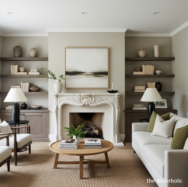
C. Dresser Styling: The Editorial Vignette

Dressers serve as getting-ready stations where you interact with personal items multiple times daily. This functional reality shapes how you should approach book styling—books become platforms that elevate objects to better viewing heights while adding visual sophistication to an otherwise purely practical surface.
Transform your dresser top into a curated getting-ready moment by treating it like a beauty editorial spread. The books don’t just look beautiful—they serve the practical purpose of raising perfumes, jewelry, and grooming items to easier viewing and reaching heights. No more hunching to see your necklace collection.
The vignette formula:
- Book foundation: Stack 2-4 books focused on fashion, beauty, or lifestyle
- Functional objects: Group perfume bottles, jewelry box or dish, small standing mirror
- Elevation strategy: Use books to raise small items to better viewing height
- Color harmony: Choose book covers that complement bedroom color scheme
Why this approach works:
- Practical benefit: Raises frequently-used items 4-6 inches for easier access
- Visual benefit: Creates intentional vignette rather than scattered items
- Cohesion benefit: Books tie together disparate objects through unified base
- Flexibility benefit: Easy to rearrange when you want a fresh look
Bedroom-specific book choices:
- Fashion books: Appropriate for where you get dressed
- Beauty/wellness: Aligns with grooming and self-care space
- Soft-covered books: Prevent damage if makeup or perfume spills
- Neutral or pastel covers: Support bedroom’s restful atmosphere
“I always use coffee table books on my dresser to create height variation. It’s much more interesting than everything sitting directly on the surface.” — Nate Berkus, Interior Designer
💡 Pro Tip: Place a small decorative tray on top of your book stack to create a defined “landing pad” for rings and earrings you remove before bed—prevents tiny items from getting lost in bedroom crevices.
D. Open Shelving & Built-Ins: The Curated Library Look
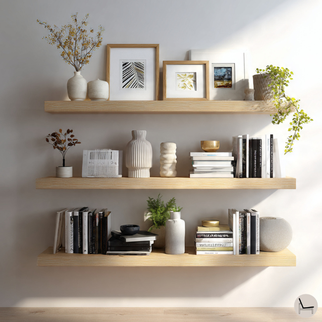
Open shelving represents the ultimate coffee table book showcase because vertical space allows more complex, layered displays accommodating larger collections. The challenge lies in preventing “library overflow” that reads as cluttered rather than intentionally curated—books everywhere versus thoughtfully displayed.
Balance traditional bookshelf functionality with visual appeal by treating your shelves like gallery walls that happen to hold books. Mix orientations, control color blocking, embrace negative space, and use decorative bookends as sculptural punctuation marks throughout your display.
The strategic approach:
- Mix orientations: Some books vertical (traditional), others horizontal (coffee table style)
- Apply the 2/3 Rule: Two-thirds books, one-third decorative objects and breathing room
- Color blocking options: Group by color for drama OR mix colors with objects for variety
- Leave intentional gaps: Don’t fill to 100% capacity—negative space signals curation
Shelf-by-shelf breakdown:
- Top shelf: Lightest books and objects (visual weight naturally belongs high)
- Eye-level shelves: Your most beautiful books displayed horizontally or with covers facing out
- Lower shelves: Larger, heavier books and substantial decorative objects
- Bottom shelf: Storage baskets OR oversized art books laid flat
Bookend strategy:
- Sculptural bookends in brass, marble, or ceramic become mini art installations
- Placement options: At shelf ends OR in the middle to section book groups
- Functional beauty: Hold books upright while adding decorative interest
- Style matching: Choose bookends that complement your overall aesthetic
“When styling built-ins, I treat each shelf like its own little vignette. Some are book-heavy, others object-heavy, and that variation is what makes the whole unit interesting.” — Shea McGee, Studio McGee Co-Founder
💡 Pro Tip: Create visual “breathing room” by pulling books forward 1-2 inches from the back edge of shelves. This subtle shadow adds depth and makes displays look professionally styled rather than stuffed full.
You’ll Also Like: 25 Easy Renter Friendly Hacks On The Budget
IX. Seasonal Book Rotation: Keeping Your Space Fresh
Change books with the seasons—opt for cheerful covers in blues and greens for spring/summer, then switch to neutral or earth-toned books in fall.
Spring/Summer Palette:
- Bright whites and soft blues
- Botanical and travel books
- Light, airy covers
Fall/Winter Palette:
- Rich burgundies and warm browns
- Cozy neutrals and deep greens
- Art and photography books with moody covers
This rotation keeps your space feeling current and prevents “decor blindness” where you stop noticing your own styling.
Most Popular Post:
Interior Design Style Quiz
Timeless Paint Colors That Never Go Out of Style
Create Your Perfect Ergonomic Home Office: A Complete Guide
Must-Have Accessories for Guys: The Secret to a Stylish Space
Modular Sofas for Small Spaces: Brilliant Solutions for Compact Living
Conclusion & Next Steps: Your Action Plan
The difference between a house and a home often comes down to these small, intentional details. Style coffee table books aren’t frivolous—they’re the visual punctuation that says, “Someone who cares lives here.”
Here’s what happens when you master this skill: Your spaces feel more cohesive. Your confidence in your design choices grows. You stop second-guessing every purchase because you understand the principles beneath the pretty pictures.
Your Simple Action Plan:
- This Week: Shop your home. Gather every oversized book you own and evaluate which work for display (color, size, condition).
- This Month: Invest in 1-2 “anchor” books that genuinely excite you—books you’ll revisit, not just display.
- This Season: Build your collection gradually through thrift stores and sales, focusing on your established color palette.
- Right Now: Clear your coffee table and practice the 3-book stack formula with what you have. Add one accessory on top.
Remember: The goal isn’t perfection. It’s creating a space that feels authentically yours—styled yet livable, beautiful yet real.
Your living room is waiting. Those style coffee table books you’ve been collecting? They’re about to earn their place.
How to Style Coffee Table Books-Frequently Asked Questions
Q: How many coffee table books should I stack together?
A: The ideal range is 2-4 books per stack, with 3 being the sweet spot for most surfaces. More than four creates a stack that’s too tall and unstable, while a single book lacks visual impact unless it’s exceptionally large. The larger your surface, the more books you can incorporate across multiple stacks.
Q: Do coffee table books need to match my decor style?
A: Yes—color coordination is crucial. Select books that pull 2-3 colors from your existing space. This doesn’t mean everything must match perfectly, but there should be a visual relationship. Neutral homes benefit from neutral-toned books; colorful spaces can handle bolder covers.
Q: Can I use regular books instead of coffee table books?
A: Standard-size books don’t have the visual weight or presence needed for display. Coffee table books are purposely larger (8×10 inches minimum) with high-quality covers designed to be seen. Using regular books will make your styling look unintentional and undersized.
Q: How do I protect coffee table books from damage?
A: Use coasters religiously, place plants in cache pots or on trays, and position books slightly away from table edges. If you have pets or small children, choose books with durable covers and avoid delicate linen or silk-wrapped editions for high-traffic areas.
Q: Where can I find affordable coffee table books?
A: Thrift stores, library book sales, TJ Maxx, HomeGoods, and estate sales offer designer books at fraction of retail prices. Look for vintage books with beautiful bindings—remove dated dust jackets to reveal stunning covers underneath. Amazon also has sales on coffee table books during holiday periods.
Subscribe To the Newsletter!
Subscribe now for an endless feed of inspirational women’s cave decor ideas, pampering rituals, and more tips for curating your ultimate escape. Let’s start making your cozy refuge a reality – you so deserve this!
CATCH THE LATEST IN HOME DECOR TRENDS:

Steal These 16 Expert-Approved Decorating Secrets

How To Accessorize Your Living Room

Small Space? 10 Ways To Make A Room Appear Bigger

Make Your space Look Expensive
GET CAUGHT UP ON ALL THE INSPIRING DECOR TIPS:

18 Fresh Decorating Ideas To Update Your Fireplace

How to Make a Gallery Wall: The Complete Step-by-Step Guide (Even If You’ve Never Hung a Picture)


