TL;DR Summary: Color capping is a tonal painting technique that transitions between light, mid-tone, and dark shades from the same color family, moving from walls to ceiling. This gradient effect adds architectural depth, makes ceilings focal points, and creates the illusion of height—all without expensive renovations. Unlike color drenching, color capping offers subtle sophistication through graduated tones rather than one bold hue.
Color Capping The New Color Paint Trend
Your ceiling is staring at you. Not metaphorically—literally. That vast expanse of flat, lifeless white hovering above your carefully curated furniture and thoughtfully chosen wall art. It’s the ignored fifth wall in your home, and it’s silently sabotaging every design choice you make at floor level.
You’ve scrolled past enough “color drenched” rooms to know that painting everything one intense shade feels like too much commitment. But what if there was a way to inject that same designer polish into your space—using color in a way that feels sophisticated, intentional, and surprisingly forgiving?

Enter color capping: the 2026 paint trend that’s transforming how homeowners approach ceilings, walls, and the art of creating depth without drama. This isn’t about slapping a coat of paint on your ceiling and calling it a day. It’s about understanding how tonal gradients can manipulate perception, guide the eye upward, and make even modest rooms feel custom-designed.
Let’s break down exactly what color capping is, why it works, and—most importantly—how you can pull it off in your own space with confidence.
I. What Is Color Capping? Breaking Down the Technique That’s Everywhere Right Now
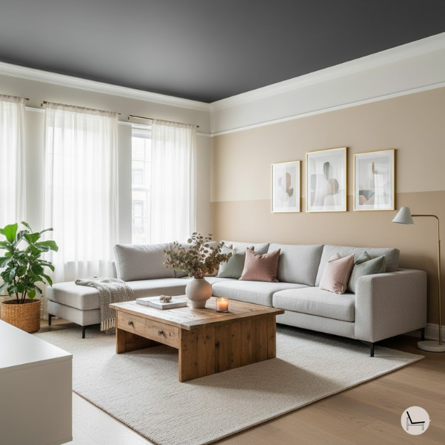
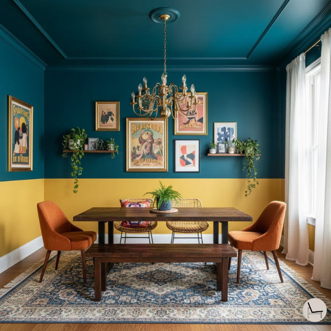
![Color capping technique comparison showing tonal gradient from light walls to dark ceiling versus traditional white ceiling]](https://www.thedecorholic.com/wp-content/uploads/2025/12/whats-color-capping.png)
Color capping is a gradient painting method where you apply two to three shades from the same color family in a layered sequence—lightest on the main wall surface, mid-tone framing architectural details or creating a visual break, and the deepest hue “capping” the ceiling. The result is a soft ombre effect that draws the eye upward while adding dimensional richness to the entire room.
Coined by Benjamin Moore in their Autumn/Winter 2025 lookbook, color capping has quickly become the go-to technique for designers looking to add sophistication without the intensity of full color drenching. Unlike color drenching (where every surface—walls, trim, ceiling—gets painted the exact same shade), color capping creates visual rhythm through tonal variation.
The Three-Layer Formula
The classic color capping structure follows this hierarchy:
Layer 1: Wall Base (Lightest Shade) – This is your foundation. The lightest tone covers the majority of your wall space, typically from baseboards up to either a natural architectural break (like a picture rail) or a point you’ve chosen—usually two-thirds up the wall.
Layer 2: Mid-Tone Transition (Optional But Impactful) – This middle shade acts as a bridge between your light walls and dark ceiling. If your room has crown molding, picture rails, or chair rails, this is where that shade lives. If not, you’ll create a horizontal break using painter’s tape, typically 12-18 inches below the ceiling line.
Layer 3: Ceiling Cap (Darkest Shade) – This is your statement moment. The richest, most saturated tone in your color family crowns the room, creating that signature “cap” effect that gives the technique its name.
💡 Pro Tip: The magic of color capping lives in selecting shades that are different enough to read as distinct layers but close enough in undertone to feel cohesive. When sampling, stack your paint chips vertically on the wall and step back 10 feet—if the transition feels jarring, adjust one shade lighter or darker.
You’ll Also Like: Modern Organic Interior Design: The Ultimate Guide
II. Color Capping vs. Color Drenching vs. The Sandwich Method: Understanding the Differences
With so many tonal painting techniques trending, it’s easy to confuse them. Here’s how color capping stands apart from its cousins:
| Technique | Application | Visual Effect | Best For |
| Color Capping | 2-3 graduated shades from one color family (light walls → dark ceiling) | Subtle ombre gradient that draws eye upward; sophisticated and dimensional | Homeowners wanting architectural interest without dramatic commitment; small rooms needing perceived height |
| Color Drenching | One single shade on every surface (walls, trim, ceiling, doors) | Monochromatic, immersive color saturation; bold and enveloping | Those ready for full color commitment; spaces needing cozy, cocoon-like atmosphere |
| The Sandwich Method | Dark walls + light ceiling OR light walls + dark trim/baseboards | High-contrast layering; graphic and structured | Rooms with strong architectural details; those wanting to highlight or downplay ceiling height |
| Double Drenching | Two contrasting colors from different families (e.g., walls in blue, ceiling in terracotta) | Daring color blocking; maximum drama | Maximalists; spaces with high ceilings and abundant natural light |
According to interior designer Nina Lichtenstein (featured in Homes & Gardens), “Color capping is essentially asking: ‘How can I create depth through subtle tonal shifts?’ while color drenching asks: ‘How bold can I go with a single shade?’ Both are valid, but color capping feels more approachable for most homeowners.”
You’ll Also Like: How to Arrange Pillows on a Couch Like a Pro: The Foolproof Step-by-Step Guide
III. The Psychology Behind Why Color Capping Works (And Why Your Ceiling Matters More Than You Think)
Your ceiling isn’t just an overlooked surface—it’s a psychological player in how you perceive space. Here’s why color capping leverages principles of spatial perception so effectively:
A. The Upward Eye Movement Effect
When you layer tones from light to dark moving upward, you’re creating a natural visual path that guides the eye toward the ceiling. This vertical flow makes rooms feel taller because your brain follows the gradient’s direction. In rooms with standard 8-foot ceilings, this can be transformative—suddenly, that compressed feeling disappears.
B. The Weight and Balance Principle
Dark colors visually “weigh” more than light ones. By placing the darkest tone at the top (ceiling), you’re creating what designers call a “top-heavy” composition. Counterintuitively, this actually makes rooms feel more grounded and anchored rather than cave-like, because the weight is distributed overhead rather than pressing in from the sides.
C. The Tonal Harmony Advantage
Because color capping uses shades from the same color family (rather than contrasting hues), your brain processes the space as cohesive and intentional. There’s no jarring color clash demanding attention—just a seamless gradient that feels natural, almost like a sunset transitioning across a wall.
D. Architectural Illusion Without Renovation
Color capping mimics the effect of layered architectural details (think coffered ceilings, picture rails, or crown molding) purely through paint. For those in builder-grade homes or rentals, this is a game-changer: you’re creating visual depth and structure without the cost of installing actual architectural features.
In Case You Missed It: Warm Neutral Paint Colors: Designer Secrets Revealed
IV. Step-by-Step Guide: How to Color Cap Any Room (Even If You’ve Never Painted Before)
Ready to transform your space? Follow this methodical process for professional-looking results—even if your DIY experience tops out at hanging curtains.
Step 1: Choose Your Color Family Strategically
Start by identifying which color family will work best for your space. Consider:
- Existing furniture and flooring: What undertones are already present? If you have warm honey oak floors, lean toward warm color families (terracotta, clay, warm sage). Cool gray flooring? Try dusty blues, mauves, or cool-toned greens.
- Natural light levels: Rooms with abundant natural light can handle richer, deeper caps. North-facing or dim rooms benefit from lighter overall palettes with a moderately dark ceiling to avoid feeling oppressive.
- Room function: Bedrooms and living rooms thrive with calming earth tones (sage, clay, dusty pink). Dining rooms can be more dramatic (deep olive, burgundy, charcoal).
Designer-Approved Color Families for Color Capping:
- Soft Pink Gradient: Blush → Rose → Deep Mauve
- Earth Clay Series: Cream → Terracotta → Burnt Sienna
- Sage to Forest: Pale Sage → Mid-tone Olive → Deep Forest Green
- Ocean Blues: Pale Sky Blue → Dusty Teal → Deep Slate Blue
- Warm Neutrals: Ivory → Warm Beige → Rich Taupe
💡 Pro Tip: Benjamin Moore’s color fan decks are organized by color family with numbered gradations. Choose three shades that are 3-4 steps apart on the same fan deck strip for foolproof coordination.
Step 2: Sample on Your Actual Walls (Non-Negotiable)
Paint colors behave completely differently on a tiny chip versus a large wall surface. Buy sample sizes of your three chosen shades and:
- Paint large swatches (at least 2′ x 2′) directly on your wall
- Stack them vertically in order (lightest at bottom, darkest at top) to preview the gradient
- Observe them at different times of day—morning light, harsh midday sun, and evening artificial light all reveal different undertones
Look for these red flags during sampling:
- Too subtle: If you can barely distinguish between shades, they’re too close together. Jump one shade darker on the ceiling color.
- Clashing undertones: One shade reads yellow while another reads pink? They’re from different undertone families. Stick within warm or cool categories.
- The “cap” disappears: If your darkest shade looks nearly identical to the mid-tone on the wall, it won’t create the dramatic ceiling effect you’re after.
Step 3: Map Your Transition Points
Decide where each shade will begin and end. Your options:
Option A: Use Existing Architecture – If you have crown molding, picture rails, or chair rails, let these features dictate your breaks. Lightest shade below the rail, mid-tone on the rail itself, darkest on ceiling.
Option B: Create Your Own Breaks – For rooms without architectural details:
- Measure your wall height from floor to ceiling
- Mark a horizontal line at the two-thirds point (e.g., in an 8-foot room, mark at 64 inches up)
- This becomes your primary transition line between lightest and mid-tone shades
- Create a second break 12-18 inches below the ceiling line for mid-tone → dark transition
Option C: The Blurred Gradient – For an ultra-soft, watercolor-like transition, skip hard tape lines entirely and blend where shades meet using a lightly dampened brush while paint is still tacky.
Step 4: Paint in Reverse Order (Darkest First)
This prevents drips from darker paint landing on freshly painted lighter surfaces. Follow this sequence:
- Paint the ceiling first (darkest shade): Use a roller with an extension pole. Cut in around edges with a brush. Don’t worry about perfect lines at the wall-ceiling junction yet—your mid-tone will clean that up.
- Paint the mid-tone transition zone: If using tape, apply it carefully along your marked line. Paint your mid-tone shade, working downward toward your lightest section. Remove tape while paint is still slightly damp to avoid peeling.
- Paint the lightest wall section last: This covers the largest surface area and has the most room for error since it’s the most forgiving shade.
- Touch up and blend (optional): If you want a softer gradient, lightly feather where shades meet using a barely damp brush in horizontal strokes while everything’s still tacky.
Step 5: Consider Your Trim Strategy
Your baseboards, crown molding, and door/window trim create the “frame” for your color capping:
- Crisp white trim: Creates the most contrast and makes the gradient pop; ideal for traditional or eclectic spaces
- Mid-tone trim: Match your mid-tone shade to the trim for a seamless, less-structured look; perfect for minimalist or Scandi styles
- Darkest shade on trim: Bold choice that bookends the room with deep color; works in maximalist or moody spaces
You’ll Also Like: The One Paint Color That Designers Are Too Afraid to Tell You Works in Every Room
V. The Best Color Palettes for Color Capping (With Specific Paint Recommendations)
Take the guesswork out of color selection with these designer-tested combinations. Each palette includes specific paint brand recommendations to ensure tonal harmony.
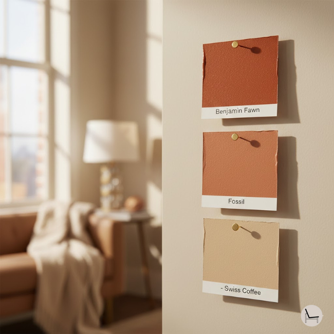
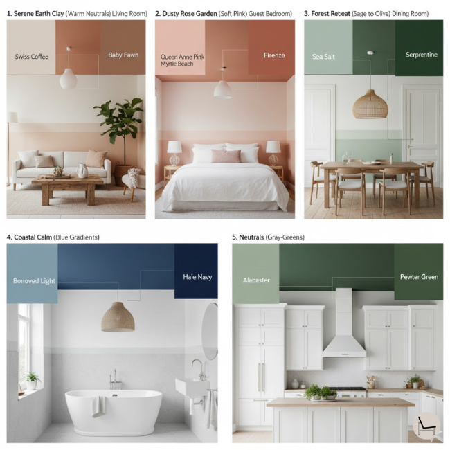
1. Serene Earth Clay (Warm Neutrals)
Best for: Bedrooms, living rooms, spaces needing warmth without color commitment
- Lightest Wall: Benjamin Moore “Swiss Coffee” (OC-45) – A creamy off-white with subtle warmth
- Mid-tone: Benjamin Moore “Fossil” (AF-65) – True versatile beige with balanced undertones
- Ceiling Cap: Benjamin Moore “Baby Fawn” (OC-15) – Deeper, slightly pink-tinged taupe
2. Dusty Rose Garden (Soft Pinks)
Best for: Guest bedrooms, powder rooms, feminine home offices
- Lightest Wall: Benjamin Moore “Queen Anne Pink” (HC-60) – Pale peach-pink with understated elegance
- Mid-tone: Benjamin Moore “Myrtle Beach” (061) – Peachy terracotta midpoint
- Ceiling Cap: Benjamin Moore “Firenze” (AF-225) – Rich, earthy orange-terracotta
3. Forest Retreat (Sage to Olive)
Best for: Dining rooms, dens, spaces with wood furniture
- Lightest Wall: Sherwin-Williams “Sea Salt” (SW 6204) – Pale sage with subtle gray
- Mid-tone: Mylands “London Plane” – Olive with yellow undertones
- Ceiling Cap: Mylands “Serpentine” – Deep, natural olive
4. Coastal Calm (Blue Gradients)
Best for: Bathrooms, coastal-themed spaces, rooms with blue accents
- Lightest Wall: Farrow & Ball “Borrowed Light” (235) – Ethereal pale blue-gray
- Mid-tone: Farrow & Ball “Oval Room Blue” (85) – Classic mid-tone blue
- Ceiling Cap: Benjamin Moore “Hale Navy” (HC-154) – Rich, complex navy
5. Unexpected Neutrals (Gray-Greens)
Best for: Modern living rooms, kitchens, open-concept spaces
- Lightest Wall: Sherwin-Williams “Alabaster” (SW 7008) – Soft white with green undertone
- Mid-tone: Sherwin-Williams “Filmy Green” (SW 6190) – Sophisticated gray-green
- Ceiling Cap: Sherwin-Williams “Pewter Green” (SW 6208) – Deep, grounded gray-green
You’ll Also Like: Swivel Chairs Ultimate Guide: How to Choose & Style the Perfect One for Your Home

VI. Common Color Capping Mistakes (And How to Avoid Them)
Even with the best intentions, these pitfalls can derail your color capping project. Here’s how to sidestep them:
Mistake #1: Choosing Colors Under Bad Lighting
The Problem: You select your palette at the paint store under fluorescent lights, or you sample during one time of day only.
The Fix: Always sample on your actual walls and observe for 48 hours minimum. Check how morning light (cool and blue), afternoon sun (warm and golden), and evening artificial light (warm if using incandescent, cool if using LEDs) transform each shade.
Mistake #2: Skipping the Mid-Tone Layer
The Problem: You jump straight from light walls to dark ceiling, creating a harsh, two-tone effect instead of a gradient.
The Fix: The mid-tone is your mediator. Even if your room lacks architectural details, create a 12-18 inch band of mid-tone just below the ceiling. This transition zone is what makes color capping feel sophisticated rather than stark.
Mistake #3: Ignoring Undertones
The Problem: Your lightest shade reads peachy-pink, your mid-tone is neutral beige, and your ceiling is gray-taupe. The gradient looks disjointed because the undertones clash.
The Fix: When sampling, place all three chips next to each other on a white background. They should tell a color story—all warm (peachy/yellow base) or all cool (blue/gray base). Benjamin Moore’s color strips are organized by undertone family for this exact reason.
Mistake #4: Painting With Cheap Materials
The Problem: You use budget paint and cheap brushes, leading to streaky coverage, poor color saturation, and visible brush marks—especially crucial on ceilings where light reveals every flaw.
The Fix: Invest in:
- Quality paint: Minimum two-coat coverage; Benjamin Moore Regal Select, Sherwin-Williams Duration, or Farrow & Ball for best results
- Premium roller covers: 3/8″ nap for smooth walls, 1/2″ for textured surfaces
- Angled brush for cutting in: Purdy or Wooster brands for clean lines
According to paint expert Helen Shaw from Benjamin Moore (Homes & Gardens interview): “The difference between cheap and quality paint isn’t just about coverage—it’s about how the color develops on the wall. Premium paints have higher pigment loads, which means your dark ceiling cap will actually read as rich and saturated rather than flat and lifeless.”
Mistake #5: Not Accounting for Sheen Differences
The Problem: You use the same sheen (matte, eggshell, satin) across all three shades, but ceiling paint is higher-gloss, making it look noticeably different despite being from the same color family.
The Fix: Keep sheen consistent across all three shades. For color capping, flat or matte finish works best on ceilings to minimize light reflection and maintain color richness. Use eggshell or satin on walls only if you need washability (kids’ rooms, high-traffic areas).
VII. Room-By-Room Color Capping Ideas: Where This Technique Shines Brightest
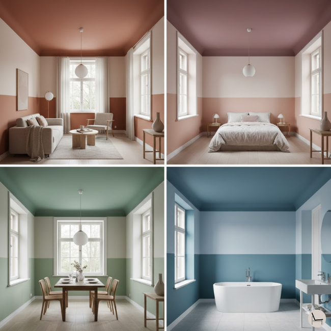
Not every room is an ideal canvas for color capping. Here’s where to focus your efforts for maximum impact:
A. Living Rooms: Creating Architectural Drama
Color capping excels in living rooms lacking original character. If you have a builder-grade space with flat walls and no molding, this technique instantly adds visual layers that mimic period architecture.
Design Strategy: Use warm neutrals (the “Serene Earth Clay” palette above) to create a grounded, cozy feeling. If your sofa is a bold color, let your gradient be more neutral to avoid color competition. Reserve jewel tones (deep plum, forest green, navy) for living rooms with high ceilings (9+ feet).
B. Bedrooms: The Cocooning Effect
Bedrooms are color capping’s natural habitat. The technique creates an enveloping, restful atmosphere perfect for sleep. Because you’re typically viewing your bedroom ceiling while lying down, the dark cap becomes a focal point without feeling oppressive.
Design Strategy: Soft pinks, muted lavenders, dusty blues, and warm grays all excel here. Avoid overly energizing colors (bright yellows, vivid greens) on the ceiling, as they can disrupt sleep. Position your mid-tone break at the height of your headboard for visual cohesion.
C. Dining Rooms: Sophisticated Intimacy
Dining rooms benefit from slightly bolder color capping because the dark ceiling creates an intimate, restaurant-like ambiance. The lowered visual ceiling makes the room feel more contained and conversation-focused.
Design Strategy: Rich colors work beautifully—deep olive, burgundy, charcoal, moody teal. Keep the lightest wall shade at least two shades lighter than you’d normally choose to maintain enough contrast for the gradient to read clearly under evening chandelier lighting.
D. Bathrooms: The Height Illusion
Small bathrooms with low ceilings are often painted all-white to “maximize space,” but color capping actually makes them feel taller through the upward eye movement effect.
Design Strategy: Stick with cool-toned palettes (blues, greens, gray-lavenders) to maintain that fresh, clean feeling bathrooms need. Because bathrooms have high moisture, use semi-gloss paint on all three gradient levels for durability and easy cleaning.
E. Where Color Capping Doesn’t Work Well
- Kitchens with upper cabinets: The cabinets block the gradient flow
- Rooms with slanted/vaulted ceilings: The gradient gets visually interrupted
- Spaces under 7-foot ceilings: The dark cap can feel too close; stick to lighter palettes only
In Case You Missed It: Statement Light Fixture: The Designer’s 5-Step Framework for Choosing the Perfect One
VIII. Beyond Traditional: The “Reverse Cap” Technique Nobody’s Talking About
While most color capping advice focuses on light walls → dark ceiling, the reverse approach deserves attention. Reverse color capping uses deep, saturated walls with a lighter ceiling—still maintaining the three-shade gradient, just inverted.
A. When Reverse Color Capping Works Best
This technique excels in:
- Rooms with extremely high ceilings (10+ feet): Dark walls “bring down” the perceived height while the lighter ceiling maintains airiness
- Maximalist spaces: If your room is packed with bold patterns, artwork, and colorful furniture, dark walls ground everything while the light ceiling provides visual relief
- South-facing rooms with excessive light: Too much brightness can wash out spaces; dark walls absorb and soften harsh light
B. How to Execute Reverse Color Capping
Follow the same three-layer approach, but flip the values:
- Ceiling: Lightest shade from your family (but not stark white—choose a soft off-white or pale tint)
- Mid-tone transition: 12-18 inches down from ceiling
- Walls from mid-tone down: Darkest, richest shade
Example Palette (Reverse Clay Tones):
- Ceiling: Benjamin Moore “Linen White” (912)
- Mid-tone band: Benjamin Moore “Smokey Taupe” (983)
- Walls: Benjamin Moore “Sable” (2166-30)
You’ll Also Like: How to Choose and Style a Mid-Century Wall Unit That Transforms Your Living Space
IX. Choosing the Right Neutrals: Navigating Warm vs. Cool Undertones (The Technical Gap Competitors Miss)
The undertone conversation is where most color capping projects succeed or fail. Here’s how to navigate this complex decision:
A. The Undertone Test
Hold your three paint chips next to each other against a white background (a piece of printer paper works perfectly). Now ask:
- Do they all lean yellow/peachy/orange? → Warm undertones
- Do they all lean blue/gray/purple? → Cool undertones
- Do some look peachy while others look gray? → Mixed undertones (this is your problem)
B. Warm vs. Cool: Which Should You Choose?
Choose Warm Undertones If:
- Your flooring is wood, bamboo, or warm-toned tile
- Your room gets abundant natural light (south or west-facing)
- Your existing furniture skews toward brown leather, warm oak, gold accents
- You want a cozy, inviting atmosphere
Choose Cool Undertones If:
- Your flooring is gray tile, painted wood, concrete
- Your room is north-facing or gets limited natural light
- Your furniture is gray, white, chrome, or cool-toned upholstery
- You want a fresh, airy, modern feeling
C. The Best “Foolproof” Neutrals for Color Capping
These whites and near-whites work as lightest shades across both warm and cool gradients:
Warm-Leaning Whites:
- Benjamin Moore “White Dove” (OC-17) – The perfect warm white with slight creaminess
- Sherwin-Williams “Alabaster” (SW 7008) – Soft white with barely-there green undertone
- Farrow & Ball “Slipper Satin” (2004) – Peachy-pink white
Cool-Leaning Whites:
- Benjamin Moore “Chantilly Lace” (OC-65) – Crisp, clean white for modern edges
- Sherwin-Williams “Pure White” (SW 7005) – True white with cool undertones
- Farrow & Ball “Borrowed Light” (235) – Pale blue-gray white
Don’t Miss: 5 Washable Area Rug Designer Secrets to Make Any Room Look Custom
X. Living With Organic Modern: Maintenance & Durability Tips (The Practical Gap)
Color capping requires no special maintenance beyond regular painted surfaces, but these strategies keep your gradient looking fresh:
A. Touch-Up Strategy
Keep small jars of all three shades labeled and stored. Over time, you’ll need to spot-fix dings, but maintaining the gradient is easier than you think—just feather your touch-up strokes horizontally where shades meet to blend seamlessly.
B. Cleaning Without Color Shift
Dark ceiling caps can show dust more readily than white ceilings. Use a microfiber duster on an extension pole monthly to prevent buildup. For walls, use a barely-damp microfiber cloth—avoid harsh cleaners that can dull the finish or create shiny spots.
C. The Repaint Timeline
Properly applied color capping (quality paint, correct prep) lasts 5-7 years before needing a full repaint. Ceilings show wear slower than walls because they experience less contact and friction.
You’ll Also Like: Bold Wall Art: The Complete Guide to Transforming Your Space with Statement Pieces
XI. Color Capping for Renters: Can You Pull This Off Without Losing Your Deposit?
Yes—with strategic modifications. Here are three renter-approved approaches:
Option 1: Ask Permission (You Might Be Surprised)
Many landlords allow paint changes if you provide color samples and agree to repaint white before moving. Frame it as “improving the property” and offer to provide paint receipts.
Option 2: The Removable Ceiling Medallion Trick
Can’t paint the ceiling? Create a faux color cap using:
- Large fabric panels attached to the ceiling with removable adhesive hooks
- Peel-and-stick wallpaper in your darkest shade (applies to ceiling just like walls)
- Paint a large, movable canvas panel your ceiling color and mount with Command strips
Option 3: Furniture-Based Gradient Illusion
Mimic color capping through strategic furniture and decor placement:
- Keep your tallest furniture (bookcases, armoires) in your darkest shade
- Mid-height furniture (chairs, side tables) in mid-tones
- Lower items (coffee tables, floor cushions) in lightest shades
Most Popular Post:
Interior Design Style Quiz
Timeless Paint Colors That Never Go Out of Style
Create Your Perfect Ergonomic Home Office: A Complete Guide
Must-Have Accessories for Guys: The Secret to a Stylish Space
Modular Sofas for Small Spaces: Brilliant Solutions for Compact Living
Conclusion: Your Ceiling Is No Longer an Afterthought
You’ve spent years decorating from the floor up—choosing furniture, arranging art, perfecting throw pillow combinations. But the ceiling? It remained a blank canvas, literally and metaphorically ignored.
Color capping changes that equation entirely.
This isn’t just a paint technique; it’s a mindset shift about how you approach space. When you commit to treating your ceiling as an intentional design element—the “fifth wall” that deserves the same consideration as the other four—you unlock a level of sophistication that can’t be achieved through furniture alone.
Yes, it requires thoughtful color selection. Yes, you’ll need to sample more than you think. And yes, the execution demands patience and precision.
But the transformation? It’s immediate, it’s dramatic, and it’s far more approachable than the intimidating “color drenching” trend that dominated last year.
The real magic of color capping lies in its forgiveness. Choose three shades from the same family, and you’re almost guaranteed a cohesive result. The gradient guides your eye naturally upward, making even modest ceilings feel like architectural features. And if you don’t love it? Two coats of your lightest shade everywhere, and you’re back to baseline.
So here’s your action plan:
Your Next Steps: From Inspiration to Execution
- This week: Grab paint chips from your local hardware store. Don’t overthink it—just pick a color family that feels good. Stack three shades vertically and tape them to your wall.
- This weekend: Buy sample sizes (1 pint each is plenty for large swatches). Paint those 2×2 foot squares on your wall. Live with them for 48 hours.
- Next weekend: If the gradient feels right, commit. Purchase your gallons (you’ll need roughly 1 gallon of ceiling paint, 1 gallon of mid-tone, and 2-3 gallons of lightest wall shade for an average bedroom).
- The following weekend: Execute. Start with your ceiling, work your way down, and trust the process.
By the time 2026 rolls around fully, you’ll be ahead of the curve. Not because you jumped on a trend blindly, but because you understood the principles behind why color capping works—and you executed it with confidence.
Your ceiling is watching. Time to give it something to be proud of.
Frequently Asked Questions About Color Capping
Q: Will a dark ceiling make my room feel smaller or cave-like? A: Counterintuitively, no. The gradient draws the eye upward, which creates the perception of height rather than compression. The key is ensuring you have enough contrast between your lightest wall shade and your darkest ceiling shade—aim for at least three steps apart on a color strip. Additionally, dark ceilings recede visually, making them feel farther away than white ceilings, which can feel “closer” and more prominent.
Q: How long does a color capping project take for an average bedroom? A: Plan for a full weekend. Day 1: Prep (taping, priming if needed, cutting in the ceiling), paint the ceiling and let it dry. Day 2: Paint mid-tone transition, then lightest wall shade. Allow 4-6 hours drying time between coats. Factor in extra time if you’re new to painting or working alone. An experienced DIYer can complete a 12×12 room in 8-10 working hours spread across two days.
Q: Can I color cap a room with textured ceilings (popcorn texture)? A: Yes, but textured surfaces require more paint and careful application. Use a high-nap roller (3/4″) for popcorn ceilings and expect to use 20-30% more paint than smooth surfaces. The texture can actually help diffuse the dark ceiling color beautifully, creating interesting shadow play. Just ensure you’re applying enough paint for full, even coverage—thin coats on texture look patchy.
Q: What if I hate the result? Is color capping easy to undo? A: Much easier than you’d think. Because you’re working with graduated shades rather than multiple contrasting colors, you can simply repaint everything in your lightest shade with 1-2 coats. Or adjust the gradient by lightening your ceiling shade one step. That’s the beauty of working within a single color family—it’s forgiving and easily modifiable.
Q: Should I color cap an open-concept space, or will it look choppy? A: Color capping works beautifully in open-concept layouts, but requires planning. Carry the same three-shade gradient throughout the connected spaces (living/dining/kitchen) for visual flow. If you want to differentiate zones, shift the color family but maintain the light-to-dark principle—for example, warm beige gradient in the living area transitioning to cool gray-green gradient in the kitchen.
Q: What’s the difference between color capping and ombre walls? A: Ombre walls blend colors horizontally with a soft, painterly transition (often DIY’d with sponges or blending techniques). Color capping uses distinct horizontal bands of graduated tones with clean breaks, creating a more structured, architectural look. Ombre feels artistic and freeform; color capping feels designed and intentional.
Q: Will my ceiling look dirty or dusty with a dark color? A: Dark ceilings actually hide imperfections better than white ceilings, which show every cobweb and dust particle. The key is choosing a flat or matte finish rather than glossy—shine amplifies flaws while matte diffuses them. A dark matte ceiling photographed in design magazines often looks cleaner than the average white ceiling in real homes.
Subscribe To the Newsletter!
Subscribe now for an endless feed of inspirational women’s cave decor ideas, pampering rituals, and more tips for curating your ultimate escape. Let’s start making your cozy refuge a reality – you so deserve this!
CATCH THE LATEST IN HOME DECOR TRENDS:

Steal These 16 Expert-Approved Decorating Secrets

How To Accessorize Your Living Room

Small Space? 10 Ways To Make A Room Appear Bigger

Make Your space Look Expensive
GET CAUGHT UP ON ALL THE INSPIRING DECOR TIPS:

18 Fresh Decorating Ideas To Update Your Fireplace

How to Make a Gallery Wall: The Complete Step-by-Step Guide (Even If You’ve Never Hung a Picture)


