[TL;DR] Summary: The best wall colors for 2025-2026 blend grounding earth tones like Cinnamon Slate with bold statement hues like Transformative Teal and Hidden Gem jade. These colors reflect our desire for both comfort and renewal, creating spaces that feel both timeless and contemporary.
Choosing the right wall color is the single most impactful design decision you can make for your home. The perfect paint shade can increase your property value by up to 5%, enhance natural light, improve your mood, and create the foundation for your entire design aesthetic.

In 2025 and 2026, color trends are shifting toward “quiet luxury” and biophilic design—colors that ground us while connecting us to nature. This comprehensive guide reveals the expert-approved color forecasts from major paint brands, plus actionable advice for selecting colors that work in your specific space.
Whether you’re planning a single accent wall or a whole-home refresh, these trending colors offer versatility, sophistication, and lasting appeal.
I. What Are the Most Popular Paint Colors for 2025-2026?
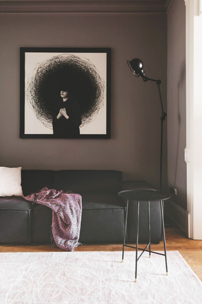
The most popular paint colors for 2025-2026 combine earthy neutrals, sophisticated jewel tones, and nature-inspired hues that create calming yet dynamic environments. Major paint brands have announced colors ranging from Benjamin Moore’s Cinnamon Slate to the global trend forecasters’ Transformative Teal and Behr’s Hidden Gem jade.
Here’s what’s driving these color trends:
- Biophilic design influence: Colors that connect us to nature
- Wellness-focused interiors: Hues that promote mental well-being
- Sustainable living: Earth-tones that feel grounding and timeless
- Maximalist confidence: Bold colors used in unexpected ways
Le’s explor expert-approved color forecasts by brand.
II. Benjamin Moore 2025-2026: Cinnamon Slate & Complementary Palette
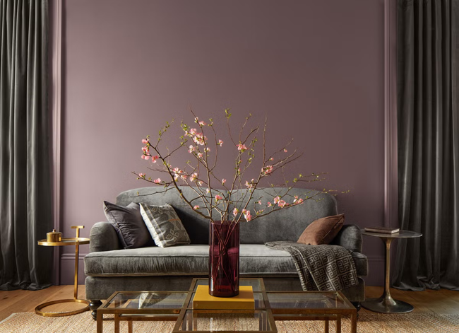
Benjamin Moore’s Color of the Year 2025, Cinnamon Slate (2113-40), is a sophisticated greige with warm undertones that works as both a neutral base and statement color.
Why Cinnamon Slate dominates 2025 trends:
- Bridges the gap between gray and beige without feeling bland
- Complements both warm and cool accent colors
- Works in every room from bedrooms to kitchens
- Pairs beautifully with natural wood tones and brass fixtures
Complementary Benjamin Moore colors for 2025-2026:
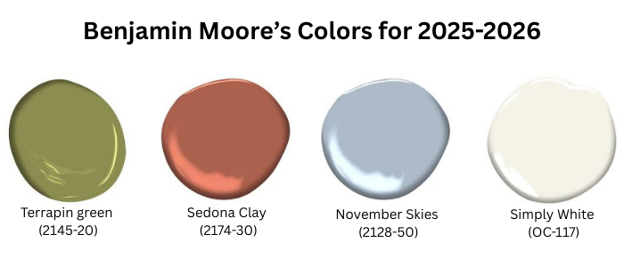
- Terrapin green (2145-20): Deep forest green for accent walls
- Sedona Clay (2174-30): Warm terracotta for dining rooms
- November Skies (2128-50): Soft blue-gray for bedrooms
- Simply White (OC-117): Crisp white for trim and ceilings
Best rooms for Cinnamon Slate:
Open floor plans: Unifies spaces without overwhelming
Living rooms: Creates sophisticated, conversation-friendly atmosphere
Home offices: Promotes focus without being sterile
Primary bedrooms: Calming yet cozy for relaxation
Related Post: Best Wall Colors To Use For 2024
III. Sherwin-Williams 2026 ColorMix Forecast: Four Trend-Setting Palettes
Sherwin-Williams’ 2026 ColorMix Forecast features four expertly curated palettes with 48 hand-selected hues, including sensational pastels, retro-inspired reds and golds, soothing darks, and modern neutrals.
1. Frosted Tints Palette
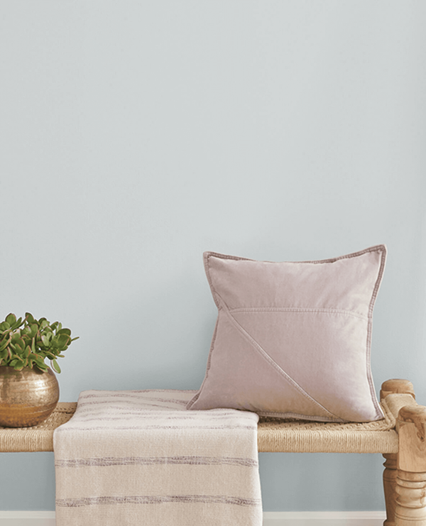
Soft, ethereal colors that create serene, spa-like environments:

- Misty Aqua (SW 6232): Perfect for bathrooms and powder rooms
- Creamy White (SW 7012): Ideal for small spaces that need brightening
- Pale Lilac (SW 6281): Sophisticated alternative to traditional pink
2. Sunbaked Hues Palette
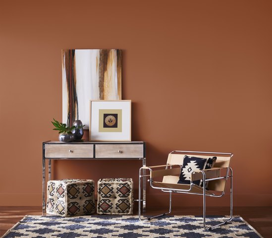
Warm, golden colors inspired by desert landscapes:
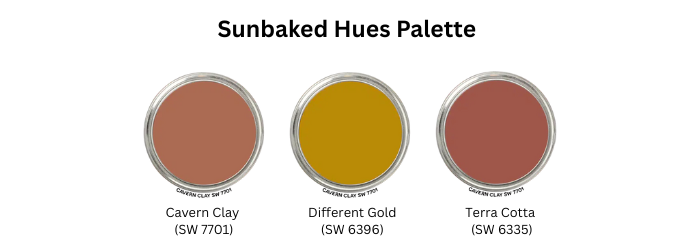
- Cavern Clay (SW 7701): 2019 Color of the Year that’s still trending
- Different Gold (SW 6396): Rich gold for dramatic dining rooms
- Terra Cotta (SW 6335): Earthy orange for cozy living spaces
3. Restorative Darks Palette
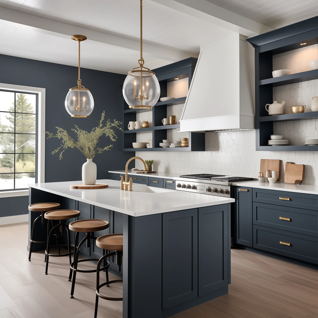
Deep, moody colors for dramatic, cocooning spaces:

- Naval (SW 6244): Sophisticated navy for home libraries
- Iron Ore (SW 7069): Near-black gray for modern exteriors
- Deep Forest Brown (SW 7531): Rich chocolate for intimate dining
4. Foundational Neutrals Palette

Versatile base colors that anchor any design scheme:
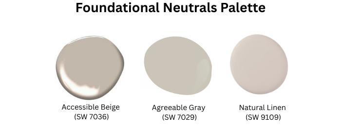
- Accessible Beige (SW 7036): Warm neutral for open floor plans
- Agreeable Gray (SW 7029): Cool-toned gray for contemporary homes
- Natural Linen (SW 9109): Creamy white with subtle warmth
IV. Behr 2026 Color Forecast: Hidden Gem & Mindful Living Hues
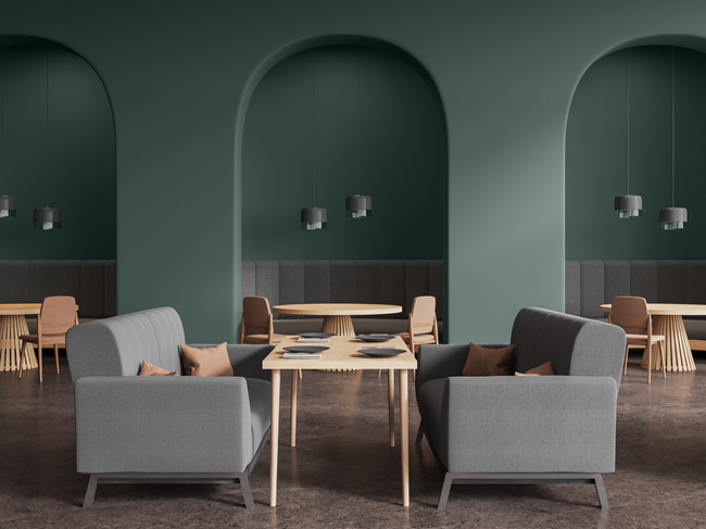
Behr’s 2026 Color of the Year, “Hidden Gem,” is a smoky jade that’s redefining design with its elegant balance of blue and green, representing a shift toward sophisticated, nature-inspired colors.
Hidden Gem (PPU10-01) key characteristics:
- Versatility: Works as both a neutral and statement color
- Sophistication: Elevates any space without overwhelming
- Nature connection: Brings the calming essence of jade into interiors
- Light adaptability: Appears different in various lighting conditions
Behr’s supporting 2026 colors:
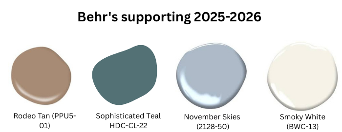
- Rodeo Tan (PPU5-01): Warm, sandy neutral
- Wheat Bread (PPU6-12): Cozy, biscuit-inspired beige
- SOPHISTICATED TEAL (HDC-CL-22): Richer version of Hidden Gem
- Smoky White (BWC-13): Clean backdrop for bold accents
V. Valspar 2026 Trends: Warm Eucalyptus & Mindful Living
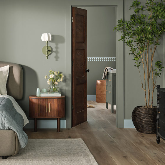
Valspar’s 2026 Color of the Year, Warm Eucalyptus, reflects the trend toward mindful living as people seek to slow down and embrace designs that feel grounding and restorative.
Warm Eucalyptus applications:
- Bedrooms: Creates tranquil sleep environments
- Bathrooms: Spa-like atmosphere for daily wellness rituals
- Home offices: Promotes calm focus and creativity
- Reading nooks: Perfect backdrop for relaxation spaces
VI. Emerging 2026 Color Trends: What Designers Predict
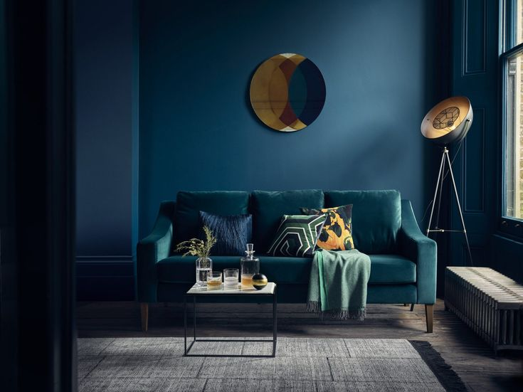
Global trend forecasters have announced Transformative Teal as the Color of the Year for 2026—a deep yet vibrant blue-green that reflects our desire for renewal and adaptability.
Top 7 Color Trends for 2026:
- Transformative Teal: Deep blue-green for statement walls
- Frosted Pastels: Soft, sophisticated alternatives to bright colors
- Full-bodied Reds: Rich, wine-inspired hues for dining spaces
- Unexpected Violets: Modern purples that feel fresh, not dated
- Elevated Neutrals: Warm grays and beiges with subtle undertones
- Smoky Jades: Green-grays that connect indoor and outdoor spaces
- Near-black Sophistication: Rich, near-black tones with undertones of brown and metallic charcoal that replace flat black with nuanced elegance
VII. How to Choose the Perfect Wall Color for Your Home: Expert Selection Guide

Selecting the right paint color requires considering your room’s natural light, size, function, and existing furnishings. Follow this systematic approach to make confident color decisions.
Step 1: Assess Your Natural Light
Natural light dramatically affects how paint colors appear throughout the day:
- North-facing rooms: Receive cool, consistent light—choose warm colors to balance
- South-facing rooms: Get warm, bright light—can handle cool or warm colors
- East-facing rooms: Morning light is warm, afternoon is cool—consider neutral flexibility
- West-facing rooms: Harsh afternoon sun—deeper colors prevent washout
Pro tip: Paint large swatches (2×2 feet minimum) and observe them at different times of day before committing.
Step 2: Consider Room Function & Psychology
Different rooms serve different purposes—choose colors that enhance their intended use:
Bedrooms: Cool blues, soft greens, or warm neutrals promote relaxation
- Best choices: Benjamin Moore November Skies, Valspar Warm Eucalyptus
- Avoid: Bright reds or oranges that can be overstimulating
Living rooms: Welcoming colors that encourage conversation
- Best choices: Sherwin-Williams Accessible Beige, Benjamin Moore Cinnamon Slate
- Consider: Accent walls in deeper tones like Hidden Gem
Home offices: Colors that promote focus without causing fatigue
- Best choices: Soft grays, muted greens, warm whites
- Avoid: Colors that are too stimulating or too dark
Kitchens: Colors that make the space feel clean and appetizing
- Best choices: Warm whites, soft blues, sage greens
- Trending: Two-tone approaches with bold lower cabinets
Step 3: Test Before You Commit
Always test paint colors in your actual space:
- Purchase sample sizes of your top 3-5 choices
- Paint poster board rather than directly on walls for easy comparison
- View samples in morning, afternoon, and evening light
- Live with samples for at least 3-4 days before deciding
- Consider undertones by comparing to pure white
VIII. Room-by-Room Color Guide: Best Paints for Every Space

Living Room Paint Colors
Create welcoming, versatile spaces with these expert-approved combinations:
For small living rooms:
- Main walls: Sherwin-Williams Accessible Beige
- Accent wall: Benjamin Moore Sedona Clay
- Trim: Simply White
For large living rooms:
- Main walls: Benjamin Moore Cinnamon Slate
- Feature wall: Behr Hidden Gem
- Ceiling: Warm white with subtle gray undertones
Bedroom Paint Colors
Promote rest and relaxation with these calming palettes:
Primary bedrooms:
- Main color: Valspar Warm Eucalyptus
- Accent: Soft cream or warm white
- Consider: Color-drenching technique for cozy cocoon effect
Guest bedrooms:
- Safe choice: Benjamin Moore November Skies
- Welcoming alternative: Sherwin-Williams Misty Aqua
- Always include: High-quality white for trim
Kitchen Paint Colors
Balance functionality with style:
Traditional kitchens:
- Walls: Warm white or soft gray
- Island: Benjamin Moore Terrarium Moss or Sherwin-Williams Naval
- Cabinets: Classic white or cream
Modern kitchens:
- Walls: Sherwin-Williams Agreeable Gray
- Accent: Bold backsplash in Transformative Teal
- Cabinets: Two-tone with darker lowers

IX. Color Combinations That Work: Professional Pairing Secrets
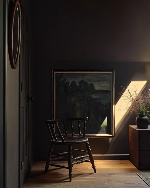
Foolproof Color Formulas:
- 60%: Dominant neutral (walls)
- 30%: Secondary color (furniture, larger accessories)
- 10%: Accent color (pillows, artwork, small decor)
Monochromatic Sophistication: Choose three shades of the same color family for effortless elegance.
Complementary Confidence:
Pair opposites on the color wheel for dynamic, balanced spaces.
X. Advanced Color Techniques: Elevate Your Paint Game

Color-Drenching
Paint walls, trim, and even built-ins the same rich hue for sophisticated, cocooning effects.
Best colors for color-drenching:
- Sherwin-Williams Naval
- Benjamin Moore Terrarium Moss
- Behr Hidden Gem
Two-Tone Walls
Create visual interest with horizontal or vertical color blocking.
Ombré Effects
Gradually transition between related colors for artistic impact.
XI. Paint Quality & Application: Professional Results at Home
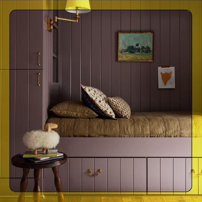
Choosing Quality Paint:
Premium paints offer:
- Better coverage and hide
- Richer, more accurate colors
- Superior durability and washability
- Easier application with fewer coats
Recommended paint finishes by room:
- Bedrooms/Living rooms: Eggshell or satin
- Bathrooms/Kitchens: Semi-gloss or satin
- Trim/Doors: Semi-gloss or gloss
- Ceilings: Flat or eggshell
Most Popular Post:
Interior Design Style Quiz
Timeless Paint Colors That Never Go Out of Style
Create Your Perfect Ergonomic Home Office: A Complete Guide
Must-Have Accessories for Guys: The Secret to a Stylish Space
Modular Sofas for Small Spaces: Brilliant Solutions for Compact Living
XII. Key Takeaways: Your 2025-2026 Color Action Plan
Transform your home with these trending colors and expert strategies:
✅ Top color picks for 2025-2026:
- Benjamin Moore Cinnamon Slate for sophisticated neutrals
- Behr Hidden Gem for nature-inspired statements
- Transformative Teal for bold accent walls
- Valspar Warm Eucalyptus for calming bedrooms
✅ Essential selection process:
- Assess your room’s natural light conditions
- Consider the space’s function and desired mood
- Test samples for at least 3-4 days
- Use the 60-30-10 color distribution rule
✅ Professional techniques to try:
- Color-drenching for intimate, luxury feel
- Two-tone approaches for visual interest
- Quality paint and proper primer for lasting results
Ready to transform your space with 2025-2026’s most beautiful colors? Start with one accent wall to test your confidence, then expand to create the cohesive, stylish home you’ve always wanted.
Download our free Color Confidence Workbook for room-by-room paint planning templates and exclusive color combination guides!
Best Wall Colors for 2025-2026: Frequently Asked Questions (FAQ)
Q: What are the most popular paint colors for 2025-2026?
A: The most popular colors include Benjamin Moore’s Cinnamon Slate, Behr’s Hidden Gem jade, Transformative Teal, and Valspar’s Warm Eucalyptus, reflecting trends toward nature-inspired, sophisticated hues.
Q: How do I choose the best paint color for my home?
A: Consider your room’s natural light, function, and existing furnishings. Test large samples for 3-4 days in different lighting conditions before making final decisions.
Q: What colors make a room look bigger?
A: Light, cool colors like soft blues, pale grays, and warm whites reflect more light and create the illusion of space. Painting trim the same color as walls also expands visual boundaries.
Q: Can I use bold colors in small rooms?
A: Yes! Consider color-drenching techniques or strategic accent walls. Colors like Hidden Gem or Naval can make small spaces feel cozy rather than cramped when applied thoughtfully.
Q: What’s the best paint finish for different rooms?
A: Use flat or eggshell for low-traffic areas like bedrooms, satin for living spaces, and semi-gloss for high-moisture areas like bathrooms and kitchens.
Q: How do I test paint colors effectively?
A: Paint large samples (2×2 feet minimum) on poster board, view them at different times of day, and live with them for several days before deciding. Compare against pure white to identify undertones.
Q: What are the best neutral paint colors that won’t go out of style?
A: Timeless neutrals include Benjamin Moore Simply White, Sherwin-Williams Accessible Beige, and warm grays like Cinnamon Slate that work with changing decor trends.
Q: Should I paint my ceiling the same color as my walls?
A: Color-drenching (painting walls and ceiling the same color) is trending for 2025-2026, especially with sophisticated colors like Naval or Terrarium Moss, creating intimate, luxurious spaces.
Q: How can paint colors improve my mood and well-being?
A: Colors significantly impact mood—blues promote calm, greens reduce stress, warm neutrals create comfort, and natural tones like the trending earth tones support mental well-being and connection to nature.
By following these expert tips and considering the psychology of paint colors, you can choose the best wall colors for your home and create a space that promotes well-being and happiness.
Subscribe To the Newsletter!
Subscribe now for an endless feed of inspirational women cave decor ideas, pampering rituals and more tips for curating your ultimate escape. Let’s get started on making your cozy refuge a reality – you so deserve this!
CATCH THE LATEST IN HOME DECOR TRENDS:
Steal These 16 Expert-Approved Decorating Secrets

How To Accessorize Your Living Room
Small Space? 10 Ways To Make A Room Appear Bigger
Make Your space Look Expensive
GET CAUGHT UP ON ALL THE INSPIRING DECOR TIPS:
[pt_view id=”8f2eadfyql”

