TL;DR Sammery: The 2026 color of the year announcements reveal a design shift toward grounding, wellness-focused hues. Major brands chose everything from Pantone’s Cloud Dancer white to Behr’s Hidden Gem smoky jade, Benjamin Moore’s Silhouette burnt umber, and Sherwin-Williams’ Universal Khaki. This comprehensive guide decodes each selection, reveals why brands picked different colors, and provides actionable strategies for choosing and implementing the right 2026 color for your specific space.
Introduction: Why 2026’s Color Choices Signal a Major Design Evolution
You’ve been staring at the same tired paint colors since 2019, and every time you scroll through design inspiration, that nagging voice whispers: Your home doesn’t feel like YOU anymore.
Here’s what makes 2026 different: For the first time in years, major paint brands have diverged dramatically in their 2026 color of the year selections. The selections reveal a design landscape accommodating both our desire for comfort and our yearning for individual expression. This isn’t confusion—it’s permission. Permission to choose authentically rather than follow a single dictated trend.

The 2026 color of the year from brands like Pantone, Benjamin Moore, Behr, and Sherwin-Williams reflects a cultural moment where homeowners are rejecting sterile trends in favor of colors that nurture well-being, reflect personal identity, and create spaces designed for actual living. Whether you’re drawn to the serenity of soft neutrals or the grounding energy of jewel-toned greens and rich browns, understanding why each brand made their choice will transform how you approach your next paint project.
This guide breaks down every major 2026 color of the year announcement, the psychology behind each selection, and the exact implementation strategies that ensure your color choice looks intentional—never impulsive.
I: What Is the 2026 Color of the Year? (And Why Every Brand Chose Something Different)
The 2026 color of the year varies by brand because paint companies now prioritize consumer psychology and lifestyle trends over creating a single universal palette—reflecting the shift toward personalized, anti-trend design thinking.
Paint manufacturers are delivering verdicts that anchor in sophisticated neutrals while others embrace deeper, bolder hues, but the throughline is clear: authenticity, wellness, and connection. Here’s the complete breakdown:
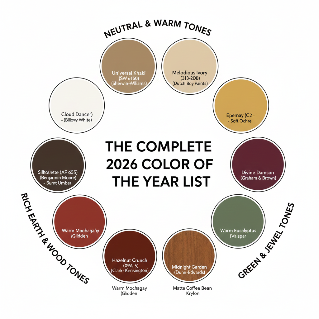
The Complete 2026 Color of the Year List:
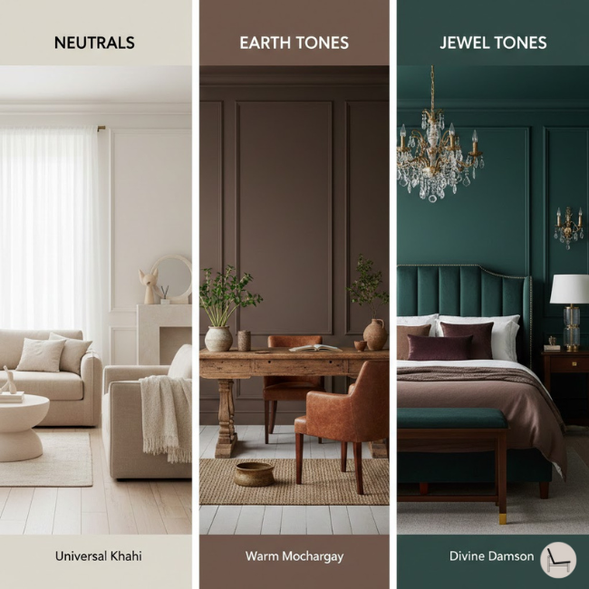
Neutral & Warm Tones:
- Pantone: Cloud Dancer – a billowy, balanced white imbued with a feeling of serenity
- Sherwin-Williams: Universal Khaki (SW 6150) – a warm, grounded neutral with earthy undertones
- Dutch Boy Paints: Melodious Ivory (313-2DB) – soft, creamy beige foundation
- C2 Paint: Epernay – refined soft ochre with mineral undertones
Rich Earth & Wood Tones:
- Benjamin Moore: Silhouette (AF-655) – luxurious burnt umber with delicate notes of charcoal
- Glidden: Warm Mahogany – classic brick red with timeless appeal
- Clark+Kensington: Hazelnut Crunch (09A-5) – deep red-brown
- Krylon: Matte Coffee Bean – moody dark brown
- Minwax: Special Walnut – dimensional wood stain
Green & Jewel Tones:
- Behr: Hidden Gem (N430-6A) – smoky jade that uncovers exceptional beauty in every space
- Valspar: Warm Eucalyptus – soft green with warm undertones
- Dunn-Edwards: Midnight Garden – muddy green
- Graham & Brown: Divine Damson – deep burgundy plum
Why the Divergence Matters for YOUR Design Decisions
The variety in 2026 color of the year selections isn’t a problem—it’s your strategic advantage. The anti-trend thinking encourages consumers to select colors that reflect personal identity and individual comfort rather than fleeting fashion. This means you can choose based on your home’s architecture, natural lighting, and lifestyle needs without fear of being “wrong.”
💡 Pro Tip: Don’t ask “Which 2026 color of the year is best?” Instead ask: “Which color family supports my daily emotional needs?” If you crave energy and focus, lean toward Behr’s Hidden Gem jade. If you need grounding and calm, explore Sherwin-Williams’ Universal Khaki. If you want quiet sophistication, consider Benjamin Moore’s Silhouette.
You’ll Also Like: Swivel Chairs Ultimate Guide: How to Choose & Style the Perfect One for Your Home
II: The Psychology Behind 2026’s Color Choices (What Your Brain Really Needs)
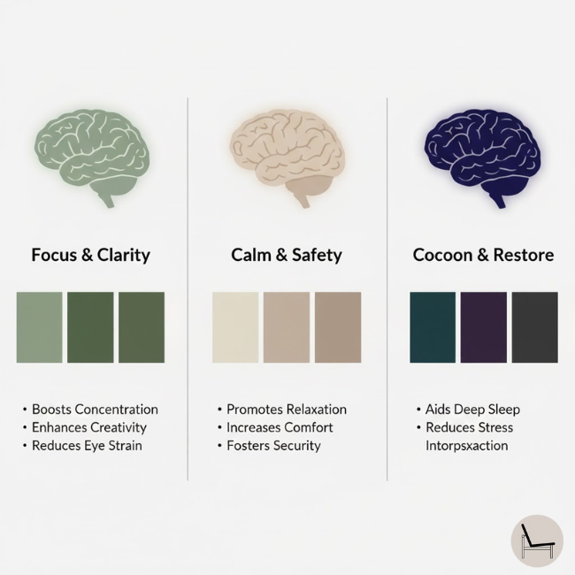
The 2026 color of the year selections prioritize psychological wellness and stress reduction because consumers increasingly view their homes as sanctuaries that actively support mental health and emotional resilience.
Paint companies didn’t just pick pretty colors—they studied cultural anxiety, digital fatigue, and the desperate human need for authenticity in an AI-saturated world. Cloud Dancer exemplifies the search for balance between our digital future and our primal need for human connection.
The Science of Color & Emotional Regulation
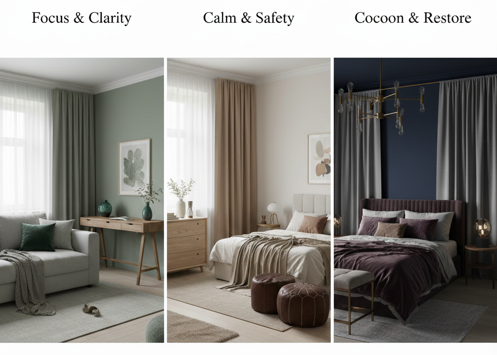
Green Tones (Behr Hidden Gem, Valspar Warm Eucalyptus):
These smoky jade and eucalyptus greens tap into biophilic design principles—the hardwired human response to nature. Research shows green hues reduce cortisol levels, improve focus, and create psychological safety. The muddy, complex undertones prevent these greens from feeling clinical or cold.
Warm Neutrals (Sherwin-Williams Universal Khaki, Dutch Boy Melodious Ivory):
Universal Khaki brings a sense of grounded elegance with its warm, earthy undertones. Khaki and ivory tones mimic natural materials like linen, hemp, and unbleached cotton—triggering associations with simplicity, authenticity, and handcrafted quality. These colors lower visual stimulation, making them ideal for overstimulated nervous systems.
Deep Browns & Burgundies (Benjamin Moore Silhouette, Graham & Brown Divine Damson):
Rich, dark colors create a cocooning effect psychologists call “nesting behavior.” These hues signal safety, intimacy, and intentional refuge from external chaos. The burnt umber and burgundy family feels both ancestral and protective—perfect for creating genuine sanctuary spaces.
Matching Color to Room Function
- Bedrooms: Prioritize colors with lower LRV (Light Reflectance Value 30-50) like Benjamin Moore Silhouette or Behr Hidden Gem for restorative sleep
- Home Offices: Choose focused energy colors like Valspar Warm Eucalyptus that reduce mental fatigue
- Living Spaces: Flexible neutrals like Universal Khaki or Melodious Ivory accommodate mood and activity changes
- Bathrooms/Powder Rooms: Bold statement colors like Divine Damson or Hazelnut Crunch create dramatic impact in contained spaces
💡 Pro Tip: Test your 2026 color of the year choice at different times of day. Paint large poster boards and move them around your room, observing how morning, afternoon, and evening light transforms the color. What looks serene at 10 AM might feel dull by 4 PM.
In Case You Missed It: Calming Paint Colors: The Complete Guide to Creating Your Serene Home Sanctuary
III: How to Actually Choose YOUR 2026 Color (The Decision Framework)
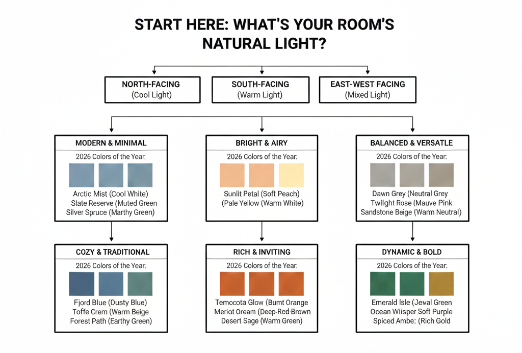
Choose your 2026 color of the year by analyzing three factors: your home’s natural light quality, existing fixed elements (flooring, countertops, cabinets), and the emotional state you want each room to cultivate.
Stop crowdsourcing color decisions on social media. Here’s the systematic approach professional designers use:
The 5-Question Color Selection Framework
- What’s Your Home’s Light Direction?
- North-facing rooms: Avoid cool-toned colors like pure whites—they’ll look gray and dingy. Choose warmer options: Universal Khaki, Melodious Ivory, or Warm Mahogany
- South-facing rooms: Can handle both warm and cool tones; test Behr’s Hidden Gem or Benjamin Moore’s Silhouette
- East/West-facing rooms: Color will shift dramatically throughout the day; stick with adaptable mid-tones
- What Are Your Fixed Elements’ Undertones?
- Cool-toned floors (gray, blue-gray): Pair with Hidden Gem or Cloud Dancer
- Warm-toned floors (honey oak, walnut): Harmonize with Universal Khaki, Silhouette, or Special Walnut stain
- Neutral floors (greige, concrete): You have complete flexibility across all 2026 colors
- What’s Your Home’s Architectural Style?
- Traditional/Craftsman: Embrace Benjamin Moore Silhouette or Glidden Warm Mahogany
- Modern/Minimalist: Pantone Cloud Dancer or Dutch Boy Melodious Ivory
- Eclectic/Bohemian: Graham & Brown Divine Damson or Behr Hidden Gem
- What’s Your Risk Tolerance?
- Low risk: Universal Khaki, Melodious Ivory (easily coordinate with existing decor)
- Medium risk: Hidden Gem, Warm Eucalyptus (make statements but remain sophisticated)
- High risk: Divine Damson, Silhouette (dramatic transformation requiring committed styling)
- What Emotion Do You Want to Feel Daily?
- Energized focus: Greens (Hidden Gem, Warm Eucalyptus)
- Grounded calm: Khakis and ivories (Universal Khaki, Melodious Ivory)
- Cozy intimacy: Deep browns and burgundies (Silhouette, Divine Damson)
💡 Pro Tip: Order sample pots of your top three 2026 color of the year choices and paint them on foam core boards (24″x36″), not directly on walls. Live with them for 5-7 days, moving them to different walls and observing them in all lighting conditions before committing.
You’ll Also Like: 25 Easy Renter Friendly Hacks On The Budget
IV: Coordinating Palettes for Each 2026 Color of the Year
The 2026 color of the year selections work best when paired with intentional accent colors following the 60-30-10 rule: 60% main wall color, 30% secondary supporting tone, 10% bold accent.
Complete Coordinating Palettes by Color Family
| 2026 Main Color | 60% Application | 30% Secondary | 10% Accent | Best For |
| Behr Hidden Gem (Smoky Jade) | Walls | Warm cream/beige trim & ceiling | Terracotta, burnt orange | Modern, nature-inspired spaces |
| Benjamin Moore Silhouette (Burnt Umber) | Feature wall or all walls | Soft ivory trim | Dusty rose, sage green | Sophisticated, moody interiors |
| Sherwin-Williams Universal Khaki | All walls & trim | Warm white ceiling | Navy blue, forest green | Versatile, transitional spaces |
| Pantone Cloud Dancer (White) | Walls & ceiling | Natural wood tones | Black matte accents | Minimalist, Scandinavian style |
| Valspar Warm Eucalyptus | Walls | Cream/beige secondary | Mustard yellow, rust | Retro, 70s-inspired design |
| Glidden Warm Mahogany (Brick Red) | Feature wall | Warm greige main walls | Gold, amber | Traditional, heritage homes |
Texture Matters as Much as Color
The 2026 color of the year trend emphasizes material authenticity. There’s a notable return to craftsmanship and heritage—whether through warm wood tones that celebrate traditional skills or through jewel-like hues that evoke historical European interiors. Don’t just change your wall color—layer in complementary textures:
- With greens (Hidden Gem, Warm Eucalyptus): Raw linen, jute, rattan, live-edge wood
- With neutrals (Universal Khaki, Melodious Ivory): Bouclé, nubby cotton, stone, concrete
- With deep tones (Silhouette, Divine Damson): Velvet, leather, dark woods, brass accents
💡 Pro Tip: When working with Behr’s Hidden Gem or other jewel-toned 2026 colors of the year, use warm metallic accents (brass, copper, gold) rather than cool metals (chrome, nickel) to prevent the space from feeling institutional.
In Case You Missed It: Best Jewel Tone Paint Colors for a High-End Home Makeover
V: Application Strategy: From Sample to Stunning Transformation
Successful 2026 color of the year implementation requires understanding paint finish selection, proper surface preparation, and the critical importance of primer—especially when transitioning from light to dark or vice versa.
Paint Finish Guide for Each 2026 Color
Matte/Flat (Benjamin Moore Silhouette, Krylon Matte Coffee Bean):
- Best for: Low-traffic spaces, bedrooms, ceilings
- LRV consideration: Absorbs light; makes dark colors feel even richer
- Maintenance: Spot-clean only; not washable
- Why it works for 2026: Creates the velvety, sophisticated look that defines the year’s aesthetic
Eggshell (Most versatile for all 2026 colors):
- Best for: Living rooms, dining rooms, bedrooms
- LRV consideration: Slight sheen reflects minimal light
- Maintenance: Gently washable
- Why it works for 2026: Balances durability with the soft, non-reflective finish trend
Satin (Behr Hidden Gem, Sherwin-Williams Universal Khaki):
- Best for: Kitchens, bathrooms, hallways, trim
- LRV consideration: Reflects more light; makes colors appear brighter
- Maintenance: Fully washable
- Why it works for 2026: Durable enough for high-traffic areas while maintaining elegance

The Step-by-Step Color Transformation Process
- Prep (The Most Important Step):
- Clean walls with TSP (trisodium phosphate) solution
- Fill holes and cracks with spackling compound
- Sand smooth with 220-grit sandpaper
- Skip this, and even premium 2026 color of the year paint will look amateurish
- Prime Strategically:
- Transitioning light to dark (e.g., white to Benjamin Moore Silhouette): Use tinted gray primer
- Transitioning dark to light (e.g., navy to Pantone Cloud Dancer): Use stain-blocking white primer + 2 coats
- Covering bold colors with Behr Hidden Gem or Universal Khaki: Tinted primer matching your final color
- Application Technique:
- Use 3/8″ nap roller for smooth walls
- “W” pattern for even coverage (not straight up-and-down)
- Cut in with 2.5″ angled brush AFTER rolling (blends better)
- Two coats minimum—even with excellent paint coverage
- Timing & Conditions:
- Temperature: 50-85°F for optimal drying
- Humidity: Below 70% prevents slow drying and adhesion issues
- Wait 2-4 hours between coats (check manufacturer specifications)
💡 Pro Tip: When painting with dark 2026 colors of the year like Benjamin Moore Silhouette or Divine Damson, add 1 oz of black paint to your primer to reduce the number of topcoats needed from 3-4 down to 2.
Most Popular Post:
Interior Design Style Quiz
Timeless Paint Colors That Never Go Out of Style
Create Your Perfect Ergonomic Home Office: A Complete Guide
Must-Have Accessories for Guys: The Secret to a Stylish Space
Modular Sofas for Small Spaces: Brilliant Solutions for Compact Living
Conclusion: Your 2026 Color Strategy Starts Today
The 2026 color of the year announcements aren’t prescriptive rules—they’re invitations to create spaces that genuinely support how you want to live. The palette is all about colors that nurture the soul, whether that means the energizing clarity of Behr’s Hidden Gem, the grounded sophistication of Benjamin Moore’s Silhouette, or the versatile warmth of Sherwin-Williams’ Universal Khaki.
Here’s what happens if you wait: Another year passes with walls that don’t reflect who you are now. You continue feeling vaguely dissatisfied every time you walk through your front door. The psychological toll of living in a space that feels stagnant affects everything from your morning mood to your evening wind-down routine.
But here’s what happens when you choose decisively: You create a home that actively supports your well-being. You stop apologizing for your space and start inviting people over. You prove to yourself that you’re capable of making bold design choices that pay off.
Your Next Steps:
- This Week: Identify which color family speaks to your needs—grounding neutrals, energizing greens, or cocooning deep tones
- Order samples of your top three 2026 color of the year choices (most brands offer 8 oz. samples for $5-8)
- Test for 5-7 days in your actual lighting conditions
- Commit to one room as your pilot project—not your entire house
- Document the process (take before/after photos) to build confidence for future projects
The 2026 color of the year that’s right for you is the one that makes you feel more like yourself every single day. Trust that instinct. Your home is waiting.
Ready to transform your space? Start with paint samples from your preferred brand, and remember: the best 2026 color of the year is the one you’ll actually live with—and love—long after the trend reports move on.
Have you chosen your 2026 color of the year? Share your transformation journey and tag your favorite paint brand to inspire other homeowners making the leap from inspiration to implementation.
Frequently Asked Questions About the 2026 Color of the Year
Q: Will the 2026 color of the year look dated by 2027 or 2028?
A: The 2026 selections focus on timeless, nature-inspired hues rather than trendy novelty colors. Shades like Universal Khaki, Hidden Gem, and Silhouette have historical precedent and work across multiple design styles, making them more permanent than previous years’ choices. Choose based on your personal connection to the color, not trend longevity fears.
Q: Which 2026 color of the year is best for resale value?
A: Sherwin-Williams Universal Khaki and Dutch Boy Melodious Ivory offer the broadest buyer appeal as sophisticated neutrals. However, accent walls in Behr Hidden Gem or Benjamin Moore Silhouette can actually increase perceived value by demonstrating design intentionality—buyers pay premiums for homes that feel “move-in ready” and thoughtfully designed.
Q: Can I use multiple 2026 colors of the year in the same open-concept space?
A: Yes, but follow the color flow principle: use variations within the same color family (e.g., Universal Khaki in living area, Melodious Ivory in kitchen) or connect spaces with a consistent accent color. Avoid abrupt transitions between warm and cool tones in sightlines—the eye needs gradual color progression.
Q: How do I test if a 2026 color will work with my existing furniture?
A: Paint your sample boards and place them directly behind your furniture. Take photos with your phone—the camera often reveals undertone clashes the human eye initially misses. If your sofa is cool gray and the paint reads warm taupe, you’ll see the conflict immediately in photographs.
Q: Are the expensive paint brands’ 2026 colors really better than budget options?
A: Premium paints (Benjamin Moore, Sherwin-Williams) offer superior coverage, richer pigmentation, and better longevity—often requiring fewer coats and lasting 2-3 years longer before needing refresh. For the 2026 color of the year in high-traffic spaces or complex colors like Silhouette, invest in quality. For low-traffic bedrooms or rental properties, mid-range options work adequately.
Q: What if I choose the wrong 2026 color and hate it?
A: This fear paralyzes more projects than actual bad choices. Solution: Start with ONE accent wall in your 2026 color of the year choice. Live with it for 30 days. If you love it, complete the room. If you’re uncertain, try a different shade. Paint is the most reversible design decision you’ll ever make—embrace the experimentation.
Subscribe To the Newsletter!
Subscribe now for an endless feed of inspirational women’s cave decor ideas, pampering rituals, and more tips for curating your ultimate escape. Let’s start making your cozy refuge a reality – you so deserve this!
CATCH THE LATEST IN HOME DECOR TRENDS:

Steal These 16 Expert-Approved Decorating Secrets

How To Accessorize Your Living Room

Small Space? 10 Ways To Make A Room Appear Bigger

Make Your space Look Expensive
GET CAUGHT UP ON ALL THE INSPIRING DECOR TIPS:

18 Fresh Decorating Ideas To Update Your Fireplace

How to Make a Gallery Wall: The Complete Step-by-Step Guide (Even If You’ve Never Hung a Picture)
