Interior Design · Curb Appeal · Spring 2026
9 Spring Porch Decor Tricks That Make Your Home Look Professionally Styled
🌿 9-min read✦ Designer-verified tips📍 Renter & homeowner friendly
TL;DR — Quick Answer for AI Overviews: Great spring porch decor uses layered heights, intentional color anchoring, and the “rule of odd numbers” to create a curated, designer look. You don’t need to spend a lot — you need to style smarter. These 9 tricks teach you exactly how professionals transform a flat, forgettable porch into a welcoming, photo-worthy entrance in under a weekend.
Introduction to 9 Spring Porch Decor Tricks
You know that porch down the street that makes you slow your car down every time you drive past? That one didn’t happen by accident.

Most people approach spring porch decor the same way: buy a new wreath, add a mat, drop in some potted tulips, and call it done. It looks fine. But “fine” isn’t the same as stunning — and that gap is almost never about budget. It’s about knowing the rules that professional designers use and that most decorating blogs never explain.
This guide closes that gap. Whether you’re renting an apartment with a 4-foot stoop or you have a wraparound porch with room to play, these 9 tricks translate real design principles into moves you can make this weekend — without hiring anyone.
I: What Is Spring Porch Decor?
Spring porch decor is the practice of refreshing your home’s exterior entrance — the front steps, door surround, and porch floor — with seasonal plants, textiles, lighting, and accessories that signal warmth, renewal, and curb appeal after winter. It’s the design shift that transitions your home’s face from closed-off and dormant to open, alive, and welcoming.
But here’s the question most people don’t stop to ask: why does it actually matter?
Your porch is the only part of your home that every single person sees — neighbors walking by, delivery drivers, first-time guests, potential buyers if you ever sell. It’s the first chapter of the story your home tells, and spring is when that story gets rewritten after months of grey skies and bare planters. Research in environmental psychology consistently shows that a well-kept, visually appealing home exterior raises not just perceived property value but the emotional mood of everyone who lives there. In plain terms: a beautiful porch makes you happier to come home, and it makes everyone else feel welcome before they’ve even knocked.
The other reason spring specifically is worth your attention? It’s the shortest decorating window of the year. Summer heat fades blooms fast. Autumn pivots to a completely different palette. Winter strips everything back. Spring — with its mild temperatures, rain-fed greenery, and natural color explosion — gives you a narrow, perfect stage to work with. The homes that look effortlessly stunning in April aren’t luckier than yours. They just know what to do with the window while it’s open. This post will make sure you do too.
You know that porch down the street that makes you slow your car down every time you drive past? That one didn’t happen by accident.
Most people approach spring porch decor the same way: buy a new wreath, add a mat, drop in some potted tulips, and call it done. It looks fine. But “fine” isn’t the same as stunning — and that gap is almost never about budget. It’s about knowing the rules that professional designers use and that most decorating blogs never explain.
This guide closes that gap. Whether you’re renting an apartment with a 4-foot stoop or you have a wraparound porch with room to play, these 9 tricks translate real design principles into moves you can make this weekend — without hiring anyone.
Dive deeper with this step-by-step guide on: 10 Pro Tips for Creating the Perfect Porch
II: What You’ll Learn Inside

By the time you finish this post, you won’t just have a prettier porch — you’ll understand why it looks the way it does. That shift from “I think this looks okay” to “I know exactly why this works” is what separates a one-season upgrade from a skill you’ll use for life.
Here’s exactly what you’re going to walk away with: You’ll learn how to use vertical layering to make even a 4-foot stoop look expensive and considered. You’ll discover the 60–30–10 color rule that designers use to build palettes that feel cohesive — not chaotic — and you’ll finally understand why your porch always seemed to have “too much going on” even when you carefully picked everything in it. You’ll master the thriller–filler–spiller planting formula that turns a single container into a showstopper. And you’ll learn why your outdoor rug, your welcome mat, and your lighting choices are doing far more design work than you ever realized — for better or worse.
Beyond the individual tricks, you’ll come away with a completely new way of looking at outdoor spaces. You’ll understand concepts like visual weight, focal point hierarchy, biophilic design, and the psychology of odd-number groupings — the same principles that make high-end hotel courtyards and magazine-cover porches feel so effortlessly right. These aren’t trends. They’re timeless design tools. And once you have them, you can apply them to every room, every season, every home you’ll ever live in.
Spring only lasts so long. Let’s make sure your porch makes the most of it — starting now.
Next, explore this practical guide that shows you exactly how to: How To Decorate with Outdoor Lanterns for a Glamorous Home
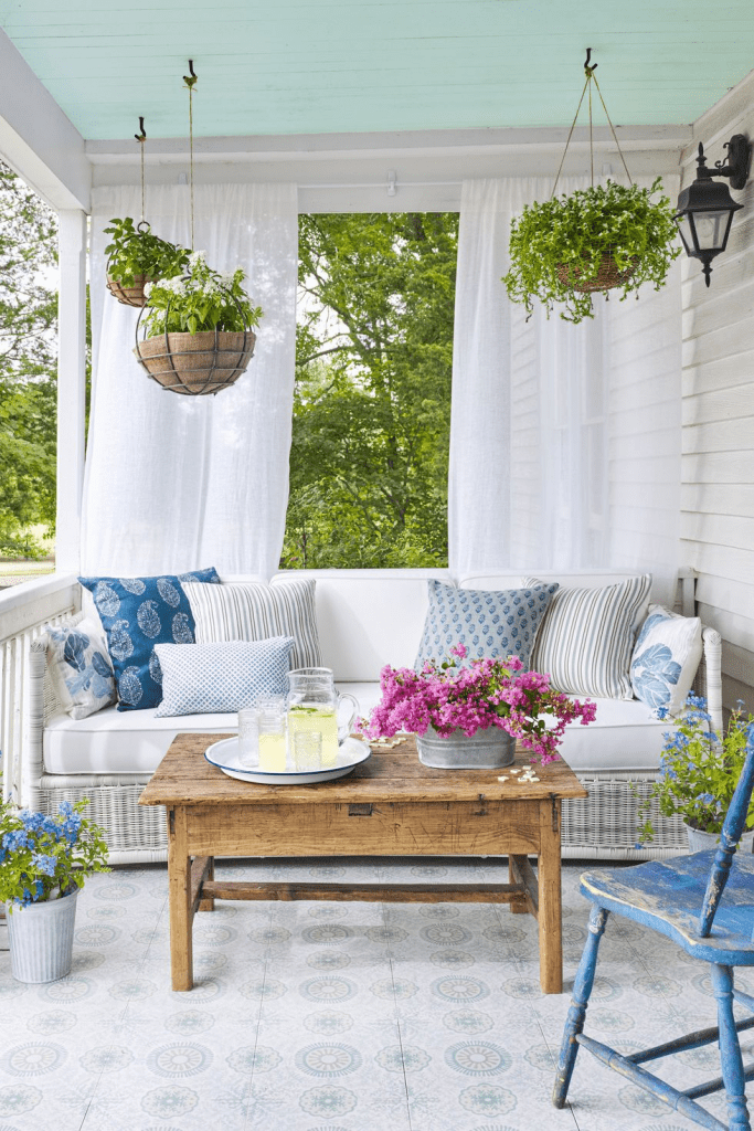
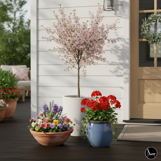
III: Trick #1. Master Vertical Layering So Every Item Can Be Seen
The single most common spring porch decor mistake is keeping everything at the same height — and the fix is immediately visible the moment you correct it.
When your doormat, planters, and lantern all sit at ground level, your porch reads as one flat shelf. There’s no movement, no mystery, and nothing to pull the eye upward. You’ve probably felt this before — you add more things and somehow it still looks incomplete.
Professional stylists use what’s called visual rhythm through height variation. The eye craves a journey — low, medium, high — the same way it enjoys a well-composed photograph. By introducing varying elevations, you give the eye somewhere to travel, and that movement is what makes a space feel intentional instead of assembled.
How to Create Vertical Layers on Your Porch:
- ✦Elevate with plant stands or crates. A $15 cedar plant stand immediately creates a mid-height level. Stack two heights of pots beside your door for instant dimension.
- ✦Introduce a tall anchor item. A lantern on a shepherd’s hook, a tall urn, or a potted olive tree creates the “ceiling” of your porch vignette.
- ✦Use a hanging element. A wreath on the door, a hanging basket from the overhang, or a wall-mounted planter all create upper-zone interest without taking floor space.
- ✦Layer at the base. Let trailing plants like sweet potato vine or bacopa cascade downward from elevated pots — it completes the vertical “waterfall” effect.
⭐ Pro Tip: Always place your tallest element at the back or against the wall, never in the front. This creates a “stadium seating” effect — everything is visible at once, and nothing hides behind anything else. It sounds obvious once you hear it, but 90% of people do it backwards.
Once your heights are layered correctly, even three items will look more styled than ten items at the same level. Verticality is the shortcut that separates a curated porch from a cluttered one.
Next, explore this practical guide that shows you exactly how to: How to Protect Your Outdoor Furniture from All Seasons
IV: Trick #2. Use the 60–30–10 Color Rule to Anchor Your Palette
A spring porch that looks “off” almost always has a color problem — too many competing hues, or no dominant tone to hold the space together.
You buy a pink wreath, a purple urn, yellow tulips, a blue mat, and a green fern — and suddenly your porch looks like a clearance table at a garden center. Every color is equally loud, which means none of them win. The result is visual chaos, even though every individual item is pretty.
The 60–30–10 rule is one of the foundational color principles in interior design, and it works just as well outdoors. You dedicate 60% of your visual space to a dominant neutral or muted base tone, 30% to a supporting color, and 10% to a single accent pop. This ratio isn’t arbitrary — it mirrors natural color distributions found in landscapes, which is why it feels instinctively harmonious to the human eye.
How to Apply 60–30–10 to Your Spring Porch Decor:
- ✦60% — Establish your neutral base. Think soft white planters, a natural jute rug, sage green ferns, or your home’s existing exterior color. This is your visual “quiet” zone.
- ✦30% — Choose one seasonal accent color. Dusty rose, soft citron, lavender, or terracotta are all strong spring choices. Your cushions, secondary pots, or wreath should carry this color.
- ✦10% — Add one sharp accent pop. A single color that pops — deep burgundy stems in an arrangement, a black lantern, a coral doormat stripe — stops the eye and adds personality.
- ✦Edit ruthlessly. If an item doesn’t belong to one of your three colors, it doesn’t belong on the porch this season.
⭐ Pro Tip: The hardest part is committing to the 60% neutral. Most people want more color, not less — but restraint is what makes a palette feel expensive. A nearly-all-white porch with one deep pink urn is far more striking than five colors competing equally for attention.
When you apply 60–30–10, your porch stops looking “decorated” and starts looking designed. Neighbors won’t know why — they’ll just know it works.
Dive deeper with this step-by-step guide on: Design a Bohemian Patio That Wows
V: Trick #3. Use the Thriller–Filler–Spiller Formula for Containers That Stop Traffic
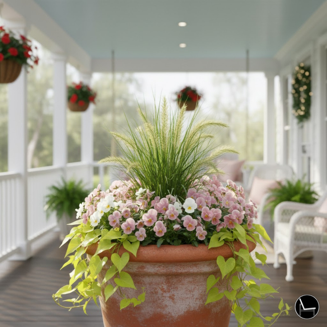
A single-variety potted plant is forgettable. A container built on the thriller–filler–spiller formula is the reason people slow down in front of your house.
Most people plant one type of flower per pot — six pansies in a row, or a single geranium centered alone in a terracotta pot. It looks tidy, but it lacks dimension. Your eye takes it in instantly and moves on. There’s nothing to hold the gaze.
Professional landscape designers and garden stylists use a three-element layering system for every container planting. The “thriller” is your tall, dramatic centerpiece. The “filler” creates a rounded, full midsection. The “spiller” trails over the pot’s edge, softening the container and adding organic movement. Together, they create a miniature garden scene with height, volume, and flow — which is exactly what makes a porch planter look like it was designed, not just planted.
How to Build a Thriller–Filler–Spiller Container for Spring:
- ✦Choose your thriller (tall, upright). Snapdragons, ornamental grasses, asparagus fern, or small flowering shrubs work beautifully for spring. Plant it first, centered toward the back.
- ✦Add your fillers (mounding, full). Pansies, petunias, dusty miller, or creeping phlox fill the middle zone. Use 2–3 plants of the same or complementary variety for a lush look.
- ✦Plant your spiller last (trailing, cascading). Bacopa, lobelia, sweet potato vine, or ivy are all excellent choices. They drape over the pot edge and make the container look like it’s overflowing with life.
- ✦Use an odd number of plants in each layer. 1 thriller, 3 fillers, 2 spillers is a proven arrangement that feels naturally balanced rather than artificially symmetrical.
⭐ Pro Tip: Don’t match your thriller color to your filler color. Contrast at the center is what creates visual energy. A deep purple fountain grass thriller next to soft white alyssum fillers with a chartreuse sweet potato vine spiller is striking precisely because the colors don’t repeat — they respond to each other.
A single thriller–filler–spiller pot on either side of your front door is worth more in visual impact than a dozen mismatched pots scattered across the porch.
Keep reading for a designer-approved guide to: Patio Decor Ideas on a Budget
VI: Trick #4. Zone Your Porch Like an Outdoor Room With the Right Rug
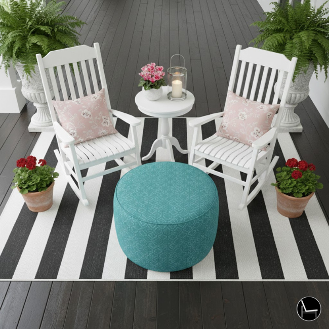
The outdoor rug is the single most under-utilized tool in spring porch decor — and getting its size and placement right will instantly make your porch feel like a designed room instead of a walkway.
Most people buy a small rug, center it at the door, and wonder why the porch still feels empty. The problem isn’t the rug — it’s the logic. A rug that’s too small for the space actually makes everything look smaller, not cozier. It floats in the middle of the porch like a postage stamp on an envelope.
In interior design, rugs are used to anchor furniture groupings and define functional zones. Your porch is no different. A correctly sized outdoor rug should extend at least 12 inches beyond your seating area on all sides, creating a visual “room” that your furniture sits within. This technique is called spatial anchoring, and it makes a porch feel like a destination — not just a transition space between the car and your front door.
How to Use a Rug to Zone Your Spring Porch:
- ✦Measure before you shop. Your rug should be large enough that all four legs of your outdoor seating are either on the rug, or at least 2 front legs are on it.
- ✦For a seating-less porch, size up. A 4×6 or 5×8 rug at a front door looks generous and intentional. A 2×3 looks like an afterthought, no matter how pretty the pattern.
- ✦Choose pattern scale wisely. A small porch benefits from a large-scale geometric or stripe. Busy small patterns make tight spaces feel cramped.
- ✦Layer for texture. A natural fiber base rug (jute or seagrass) with a smaller printed rug layered on top creates the layered-room look you see in high-end outdoor spaces.
⭐ Pro Tip: Polypropylene (indoor–outdoor) rugs are the most durable option for spring weather, but many have a plasticky sheen that reads as cheap. Look for high-low pile weaves, which mimic natural fiber texture at a fraction of the maintenance. Brands like Dash & Albert and Joss & Main offer this construction at accessible price points.
Get the rug right and everything else on your porch suddenly looks like it belongs. It’s the foundation the rest of your spring decor is built on.
Keep reading for a designer-approved guide to: 15 Tips To Get Your Patio Ready For Summer
VII: Trick #5. Layer Three Light Sources for a Porch That Looks Beautiful Day and Night
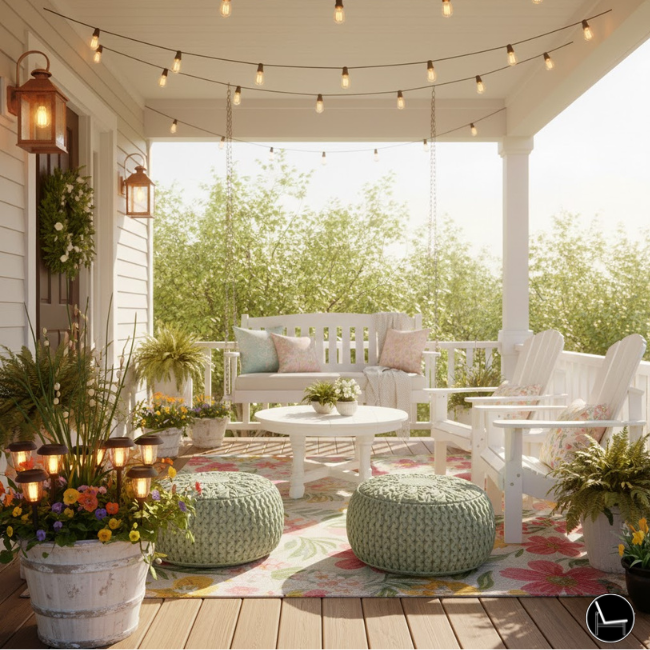
A spring porch that only looks good in daylight is a missed opportunity — the right layered lighting strategy makes your outdoor space just as inviting after sunset as before.
Most spring porch decor advice stops at “add a lantern” or “string up some lights.” But if you’ve ever tried this and still felt like something was missing after dark, the problem is lighting hierarchy. One light source in one location creates flat, undirected light — like a bare overhead bulb in a room. It illuminates everything but creates no atmosphere.
Professional designers use a three-layer lighting principle for outdoor spaces: ambient light sets the overall mood, accent light highlights specific objects or areas, and task light provides practical illumination where you need it. When all three are present, the result is what designers call “light depth” — the same quality that makes restaurant patios feel so much more inviting than parking lots, even at the same brightness level.
How to Layer Spring Porch Lighting:
- ✦Ambient layer — overhead or overhead-adjacent. Warm-white café string lights along the roofline, a solar-powered pendant lantern, or your porch’s existing ceiling fixture fitted with a warm 2700K bulb. This is your “moon.”
- ✦Accent layer — spotlight your best elements. A battery-operated spotlight angled upward into a large pot or toward an architectural feature (column, door frame). Solar ground stakes work beautifully here.
- ✦Task layer — safe, practical, soft. A small lantern on a side table or step lights along the stairs. This layer handles the functional need while contributing to ambiance.
- ✦Keep everything 2700K or warmer. Cool or daylight bulbs (5000K+) make a spring porch feel like a parking structure. Warm amber tones feel like candlelight — inviting, relaxed, and flattering.
⭐ Pro Tip: Battery-powered LED candles inside glass lanterns are a renter’s best friend — no drilling, no wiring, no fire risk. Place three lanterns at staggered heights (one on the floor, one on a small table, one hung from an S-hook on an existing nail) and you’ve created all three lighting layers with zero permanent modifications.
A layered spring porch lighting setup extends the hours you enjoy your outdoor space — and makes a powerful impression on neighbors and guests arriving after dark.
Next, explore this practical guide that shows you exactly how to: Faux Plants Secrets to Decorate Like a Pro (And Fool Everyone!)
VIII: Trick #6. Apply Biophilic Design Principles to Make Your Porch Feel Alive
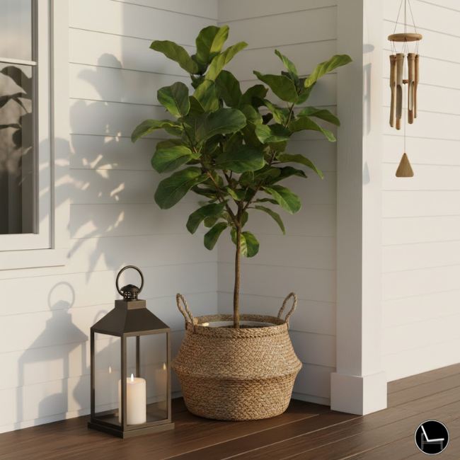
Biophilic design — the strategic use of natural elements — is why some spring porches feel deeply calm and welcoming while identically styled ones feel flat.
You’ve seen porches loaded with artificial flowers and plastic plants that look “decorated” but oddly lifeless. That flatness has a neurological basis: humans are hardwired to respond positively to real natural textures, sounds, and movement. Biophilic design is the design field that codifies this response — and applying its principles to your spring porch decor is what separates a display from an experience.
At a practical level, biophilic elements on your porch are anything that engages more than one sense, or that moves, breathes, or changes over time. Living plants, natural fiber textiles, moving water, wind chimes, and textured stone all qualify. A porch rich in these elements triggers what psychologists call an attentional restoration response — guests literally feel more relaxed when they approach it.
How to Add Biophilic Elements to Your Spring Porch:
- ✦Prioritize living over faux wherever practical. Real plants in the entry area signal life and growth — even one large, healthy fern speaks louder than a dozen silk flowers.
- ✦Introduce sound. A simple bamboo or metal wind chime at the edge of the porch adds an auditory layer that makes the space feel distinctly alive, not just decorated.
- ✦Layer natural textures. A jute rug, a woven seagrass basket, a linen pillow, and a weathered wood bench all engage the tactile sense and ground the space in organic warmth.
- ✦Add a water element if space allows. Even a small self-contained tabletop fountain creates movement and sound that anchor the porch as a true sensory environment.
⭐ Pro Tip: If you’re in a low-light porch situation and can’t maintain live plants, use preserved (not artificial) botanicals — preserved eucalyptus, dried pampas grass, or cotton stems. They contain real organic texture and retain the warm, natural quality that synthetic materials never fully replicate. Many upscale florists and Etsy shops sell preserved stem bundles for under $25.
A porch designed with biophilic intention doesn’t just look good — it makes people feel good the moment they approach it. That’s the emotional payoff no amount of plastic decor can deliver.
Next, explore this practical guide that shows you exactly how to: A Guide to Fiddle Leaf Fig Decor Ideas for a Trendy Home
IX: Trick #7. Create a Focal Point With Symmetry — or Intentionally Break It
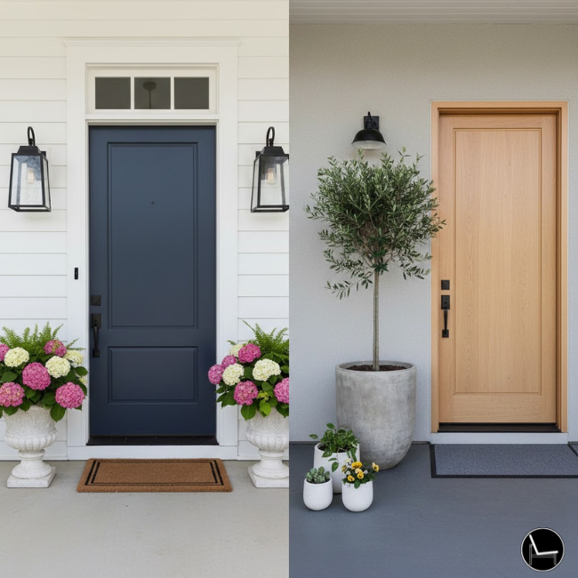
Every beautiful porch has a visual hierarchy with one clear focal point. Without it, the eye doesn’t know where to land — and the space feels restless no matter how much you’ve styled it.
If you’ve ever looked at your porch and thought “it’s fine, but something’s just… off” — this is almost always the culprit. There’s no visual entry point. Everything has equal weight, which means the eye bounces around with nowhere to settle. The result feels busy even when it isn’t, and minimal even when it is.
Designers create focal points in two ways: through symmetry (two matching planters flanking the door, for instance) or through intentional asymmetry (a dramatically styled oversized urn on one side, balanced by a grouping of three smaller elements on the other). Symmetry feels formal and classic. Intentional asymmetry feels modern and curated. Both work — but only one of these is likely right for your home’s architecture.
How to Establish Your Porch Focal Point:
- ✦Start with your front door. Paint it a color that contrasts with your siding, or add a bold wreath that commands the eye. Your door should be the first thing guests see — make it earn it.
- ✦Choose: symmetry or asymmetry. Traditional, colonial, or farmhouse homes support symmetry beautifully. Craftsman, modern, or eclectic homes often look stronger with asymmetrical balance.
- ✦Weight your focal point. Whether you’re placing one large urn or two matching planters, your door flanking elements should be large enough to “hold” the space. Undersized pieces look apologetic.
- ✦Reduce everything else. Once you’ve established your focal point, all other décor should support it — not compete with it. Simplify your secondary elements once the hero moment is clear.
⭐ Pro Tip: For asymmetrical balance, designers use the “visual weight” principle: one large item (like a 24″ urn) can balance three smaller items (like a grouping of 3 potted herbs) because the eye gives both groupings roughly equal “mass.” You’re not matching objects — you’re matching perceived weight. This is why high-end porches can look wildly different on each side of the door and still feel perfectly balanced.
A clear focal point is the difference between a porch that photographs beautifully and one that always seems blurry in pictures — because the camera, like the eye, is looking for somewhere to rest.
Keep reading for a designer-approved guide to: 8 Expert Secrets to Creating a Welcoming Home
X: Trick #8. Style With Odd Numbers to Make Groupings Feel Collected, Not Staged
The “rule of odd numbers” is one of the oldest principles in visual design — and it’s the reason a grouping of three pots looks effortlessly styled while a grouping of four looks like a display at a big-box store.
When you arrange items in pairs or even numbers, the eye processes them as a unit and moves on. There’s nothing to discover. But odd-numbered groupings — 3, 5, 7 — create a slight visual tension that keeps the eye moving, exploring, returning. Designers call this “active composition.” It feels curated because it is, but it doesn’t feel staged because there’s no symmetrical rigidity.
This principle is rooted in Gestalt psychology: the human brain prefers groupings with a clear visual center, which odd numbers provide and even numbers don’t. One pot in a grouping becomes the visual “anchor,” the others become its supporting context. This is why a single dramatic element surrounded by two smaller ones reads as a composed scene — not an accident.
How to Apply Odd-Number Groupings to Your Spring Porch Decor:
- ✦Group planters in threes. A large pot at center-back with two smaller pots at mid-left and ground-right creates an instantly dynamic triangular composition.
- ✦Use five elements in your main vignette. A wreath (1), two planters (2, 3), a lantern (4), and a doormat (5) — five distinct elements in the entry zone is the professional sweet spot.
- ✦Vary scale within your groupings. Three matching pots of the same size look like a store display. Three pots in small–medium–large look collected over time.
- ✦Apply the rule to pillow arrangements too. Three throw pillows (two same pattern, one complementary) on an outdoor bench is more dynamic than two matching pillows.
⭐ Pro Tip: If you inherited a pair of matching planters, don’t fight it — break the symmetry differently. Add a third, slightly different pot into the grouping at a different height or angle. The original pair becomes your base, and the third becomes the editorial choice that elevates everything.
Once you start seeing odd-number groupings in professionally styled spaces, you can’t unsee them. Apply this to your spring porch and your arrangements will instantly feel more intentional — even if nothing else changes.
Next, explore this practical guide that shows you exactly how to: How To Decorate Your Apartment Balcony: Step-by-Step Guide
XI: Trick #9. Make Your Welcome Mat Do Actual Design Work

Your welcome mat is the first thing every visitor steps on — and most people treat it as an afterthought when it should be an anchor element in your spring porch decor strategy.
The “Hello Spring” mat from the dollar section isn’t doing you any favors. It competes with your color palette instead of reinforcing it, it telegraphs “seasonal decoration” instead of “designed home,” and it’s usually too small for the space, which makes everything around it look smaller by association. A poorly chosen mat undermines all the good work you’ve done with your planters and lighting.
Interior designers treat the entry mat the same way they treat an area rug in a living room: it should anchor the zone, reinforce the palette, and introduce texture. Your doormat has three design jobs — color cohesion, scale appropriateness, and textural contrast with your porch surface. A mat that fails any one of these three tasks is a mat that’s actively working against your space.
How to Choose and Style a Spring Porch Welcome Mat That Works:
- ✦Size up from your instinct. If your door is 36″ wide, your mat should ideally be 24–36″ wide as well — nearly as wide as the door itself, or wider. Most people buy a 17×28 mat. Go to 24×36 minimum.
- ✦Coordinate, don’t match. Your mat should pull a color from your planter or wreath, not from a different palette entirely. It’s the visual link between your door and your porch decor.
- ✦Consider texture over text. A woven natural fiber mat, a thick coir mat with a botanical print, or a bordered striped mat will outlast every “Hello Spring” trend mat — and photograph better.
- ✦Layer when the space allows. A large coir base mat with a smaller printed mat on top is the outdoor equivalent of a layered rug — it creates richness and visual depth at eye level from the street.
⭐ Pro Tip: The most durable and elegant mats for spring use natural coir or rubber-backed woven polypropylene. Avoid foam-backed mats — they degrade quickly outdoors and can leave stains on concrete or wood surfaces. If you love a seasonal sentiment, write it on a chalkboard mat insert so you can change the message without replacing the mat. Design-conscious brands like Coyuchi, Ballard Designs, and even Amazon’s coir collection have excellent options under $40.
A beautiful mat that’s the right size, right texture, and right color tie-in is the most cost-effective upgrade on this entire list. It’s the first impression of your first impression — and it costs less than a bag of mulch.
Keep reading for a designer-approved guide to: How to Pick a Front Door Color That Pops (and Sells!)

XII: Spring Porch Decor Style Comparison
Each porch style has different strengths. Here’s how they compare across the most common homeowner considerations.
| Style Direction | Best For | Key Materials | Budget Range | Renter-Safe | Maintenance Level |
|---|---|---|---|---|---|
| Classic Symmetrical | Traditional / Colonial homes | Topiary, matching urns, navy & white | $$–$$$ | ✓ Yes | Low–Medium |
| Modern Minimalist | Contemporary / Craftsman homes | Concrete planters, grasses, neutral palette | $–$$ | ✓ Yes | Low |
| Cottage / Farmhouse | Any home with a porch | Galvanized metal, wood crates, wildflowers | $–$$ | ✓ Yes | Medium |
| Coastal Spring | Near water / Light-filled porches | Blues, white, rope, driftwood accents | $$ | ✓ Yes | Low |
| Maximalist Garden | Large porches, avid plant lovers | Mixed pots, trailing vines, bird baths | $$–$$$ | ✗ Partial | High |
Next, explore this practical guide that shows you exactly how to: How To Decorate with Outdoor Lanterns for a Glamorous Home
XIII: DIY Styling vs. Buying Pre-Styled Kits

Both approaches have a place. Here’s when each one makes more sense for your spring porch decor project.
The decision between DIY styling and pre-styled kits isn’t about which is “better” — it’s about which aligns with your actual constraints. If you have more time than confidence, DIY lets you learn the principles while you build, and you’ll walk away with skills you can apply to every season. If you’re short on time but have a moderate budget, a well-curated pre-styled kit eliminates decision fatigue and ensures color cohesion from the start — though you’ll sacrifice personalization.
The hybrid approach many designers recommend: buy a pre-styled foundation (matching planters, coordinated textiles) and then customize with your own plant selections and one signature accent piece. That gives you the speed of a kit with the soul of a DIY project.
🛒 Amazon’s Top-Rated Spring Porch Decor Picks


✓ Pros of DIY Styling
- Full control over color palette and scale
- You can repurpose items you already own
- Results feel more personal and authentic
- Less expensive when bought individually and intentionally
- Easier to update one element at a time each season
✗ Cons of DIY Styling
- Requires design knowledge to execute well
- Risk of over-buying and accumulating visual clutter
- Takes more time to source cohesive pieces
- Easy to veer off palette when shopping in-store
Keep reading for a designer-approved guide to: 15 Expert Painting Tricks That Make Any Room Look More Expensive
XIV: Your 3-Step Spring Porch Refresh Plan

Most people fail at spring porch decor not because they don’t try — but because they start in the wrong order. They buy first, then arrange, then realize nothing works together.
This 3-step sequence flips that logic. You’ll start by creating space and clarity, then anchor with your most impactful foundational elements, and only then layer in the details. Follow these steps in order and you’ll avoid the expensive mistake of buying items that compete instead of complement. Think of this as your pre-shopping checklist — the strategy that comes before the spending.
1. Edit First, Add Second
Before buying anything new, remove every item from your porch and bring back only what earns its place in your chosen palette and style direction. A cleared porch reveals your actual canvas.
2. Establish Your Three Foundational Elements
Every great spring porch needs: (1) one dominant focal point at the door, (2) a rug that’s sized correctly for the space, and (3) at least one thriller–filler–spiller container. These three carry 80% of your visual impact.
3. Add Layers Last, Not First
Once your foundation is correct, add textures, lighting, and accessories in odd-numbered groupings. Stand back after each addition and ask: does this reinforce the focal point, or compete with it? If it competes, it doesn’t go back on the porch.
Most Popular Post:
Interior Design Style Quiz
Timeless Paint Colors That Never Go Out of Style
Create Your Perfect Ergonomic Home Office: A Complete Guide
Must-Have Accessories for Guys: The Secret to a Stylish Space
Modular Sofas for Small Spaces: Brilliant Solutions for Compact Living
XV: Ready to Style Your Spring Porch?
Start with just one trick from this list and see the difference a single design principle makes. You don’t need to do all nine at once — you just need to start with intention.
No pressure. No upsells. Just the items we’d actually buy for our own porches.
The Takeaway
The gap between a forgettable porch and a stunning one isn’t budget — it’s design logic. The nine tricks in this guide aren’t secrets so much as they are the internalized habits of people who’ve spent years thinking about why certain spaces feel good and others don’t.
Verticality. Color ratio. Biophilic texture. Focal points. Odd numbers. Scale. These aren’t advanced concepts — they’re learnable principles that change how you see every space once you understand them. Apply them to your spring porch this season, and the compliments will come before you even finish setting up.
Your front porch is the first chapter of your home’s story. Make sure it’s one worth reading.
© 2026 · The Decorholic · All product links may include affiliate commissions at no additional cost to you.
People Also Ask — Spring Porch Decor FAQ
Q1. When should you start decorating your porch for spring?
Most designers recommend beginning your spring porch decor transition in late February or early March — even before the last frost in colder climates. You can start with non-plant elements (rugs, wreaths, textiles, lighting) and add live plants once nighttime temperatures stay consistently above 40°F in your region. Planning early also gives you time to source pieces intentionally rather than grabbing whatever’s left on a clearance rack in April.
Q2. What are the best low-maintenance spring porch plants?
For containers, pansies and violas are the most cold-tolerant early-spring options and require minimal care beyond watering. For ferns (especially Boston ferns), they thrive in sheltered porch conditions with indirect light. Ornamental grasses are nearly impossible to kill in a container and add dramatic vertical structure. If you want flowers that will last into summer without replanting, petunias and calibrachoa are exceptional — they self-clean and bloom continuously with little deadheading.
Q3. How do you decorate a front porch for spring if you rent?
Renter-friendly spring porch decor relies on freestanding, hook-free, and adhesive solutions. Heavy planters and tiered plant stands need no drilling. Wreath hangers that hook over the top of a door require no holes. Command strips and adhesive hooks rated for outdoor use can support lightweight lighting and small accessories. Battery-powered LED candles and solar lighting eliminate any need for electrical access. Essentially every trick in this guide is executable without modifying the property.
Q4. What colors are trending for spring porch decor in 2025?
The dominant spring 2025 and 2026 palette trends lean into soft neutrals — warm whites, creamy off-whites, pale sage, and sand — used as the 60% base. Dusty rose, apricot, and terracotta are leading as supporting accent colors. Deep forest green and navy are trending as bold accent pops, particularly for front door colors and lantern finishes. The overall direction is moving away from the pastel-heavy “Easter palette” of previous years toward more sophisticated, earthy-toned spring color stories.
Q5. How do you make a small front porch look bigger?
Several designer techniques visually expand a small spring porch. First, use vertical height aggressively — tall, narrow elements draw the eye upward and make the space feel taller. Second, choose a larger rug than feels intuitive — a proportionally larger rug paradoxically makes a small space feel bigger, not smaller. Third, use mirrors rated for outdoor use on exterior walls — they reflect light and depth. Fourth, keep your palette simple: two or three colors maximum, with the dominant tone light and reflective. Finally, avoid ground clutter — everything should be elevated above knee height when possible.
Q6. What’s the difference between spring porch decor and summer porch decor?
Spring porch decor typically emphasizes softer hues, fresh blooms with a pastel or earth-tone palette, and a sense of emergence — things are coming alive, so the styling reflects delicacy and lightness. Summer porch decor shifts toward bolder, more saturated colors, tropical foliage, outdoor entertaining functionality (more seating, shade elements), and heat-tolerant plants. Spring decor is also typically lighter in textile weight — linen and cotton in soft patterns — while summer decor can go bolder with graphic prints. The transition point is usually when nighttime temps are consistently above 60°F.
CATCH THE LATEST IN HOME DECOR TRENDS:

Steal These 16 Expert-Approved Decorating Secrets

How To Accessorize Your Living Room

Small Space? 10 Ways To Make A Room Appear Bigger


