TL;DR Summary: To pick a front door color, start by identifying your home’s exterior undertones (warm vs. cool), then match or contrast your brick, siding, or stone accordingly. Factor in your architectural style, HOA rules, and the mood you want to project. Finish with a high-gloss exterior paint formulated for UV and weather resistance.
The Front Door Problem Nobody Warns You About
You’ve stared at 47 paint swatches, held them up to your door in six different lighting conditions, and you still have no idea what color to paint it.
I’ve been there. When we bought our first home — a 1960s ranch with faded beige siding — I was so excited to make it feel ours. I bought a sample of a beautiful navy blue, slapped it on the door, and stepped back expecting a magazine moment.

It looked like a bruise.
Not because navy was wrong. Because I hadn’t learned the single most important rule of front door colors: your door doesn’t exist in isolation. It’s in conversation with your siding, your brick, your trim, your landscaping, and even your neighbors’ houses. Once I understood that, everything clicked — and that navy door ended up being the most-complimented thing on our street.
This guide is everything I wish someone had told me before I wasted three weekends and $90 in paint samples. Whether you’re a first-time homeowner, a seasoned renovator, or just tired of your existing door screaming “builder beige,” you’re in the right place.
Understanding the Psychology of Color: How Your Front Door Speaks Before You Open It

Your front door communicates something to every person who walks up to it — before they even ring the bell. Color psychology isn’t abstract theory; it’s the reason a red door feels exciting and a gray one feels calm, and it’s the hidden layer most people skip entirely when choosing a front door color.
Think of your door as the handshake of your home. It sets expectations. It signals personality. Research in environmental psychology consistently shows that color influences mood and social perception within milliseconds — and your front door is the most color-visible, most context-free surface on your entire exterior. It’s not framed by furniture or artwork. It just is. Which means the psychological weight it carries is enormous.
I didn’t fully appreciate this until I visited a client’s home to consult on a refresh. Her house was well-maintained, tastefully neutral — but something felt cold and uninviting. We changed nothing except the door: from a faded taupe to a warm, deep terracotta. When I came back two weeks later, the whole house felt welcoming in a way it hadn’t before. Same siding. Same landscaping. Different story.
A. What Each Front Door Color Says About You (And Your Home)
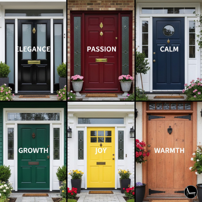
Color isn’t just visual — it’s emotional. Here’s how the most popular front door colors are decoded by visitors, neighbors, and potential buyers:
- Black → Sophisticated, confident, timeless. Signals: “We have taste and we know it.” The most universally respected door color; conveys strength without arrogance.
- Navy Blue → Trustworthy, classic, stable. Signals: “We’re reliable and refined.” Navy reads as educated and intentional — the color equivalent of a firm handshake.
- Forest Green / Sage Green → Grounded, natural, welcoming. Signals: “We value calm and connection.” Green doors test extremely well with buyers because they feel organic and safe.
- Red → Bold, energetic, passionate. In feng shui, a red front door invites good luck and prosperity. In American tradition, a red door on a colonial home signals the mortgage is paid. Both meanings are about abundance.
- Yellow / Mustard → Optimistic, warm, approachable. Signals: “We’re the fun house on the block.” Works beautifully on cottages and Craftsmans; risky on more formal architecture.
- Gray / Charcoal → Calm, neutral, understated. Signals: “We’re composed and unfussy.” A safe choice, but can read as cold without warm hardware and landscaping to balance it.
- White → Clean, fresh, open. Signals: “We keep things simple and bright.” Best used when the rest of the exterior has strong architectural detail to compensate for the low-contrast door.
- Terracotta / Burnt Orange → Warm, creative, earthy. Signals: “We’re interesting and we travel.” Trending strongly for its connection to nature and global design aesthetics.
B. The Mood You’re Creating vs. The Mood You’re Projecting
Here’s a nuance most color guides ignore: there’s a difference between how a color makes you feel and how it makes othersperceive your home.
A bright yellow door might fill you with joy every time you see it — but if your home is on a street of reserved colonials, visitors may unconsciously read it as “different” rather than “charming.” A deep plum might feel dramatic and luxurious to you, while buyers perceive it as polarizing.
The sweet spot is choosing a color that aligns both your personal psychology and your home’s social context. Ask yourself two questions before committing: How do I want to feel every time I come home? And: What do I want my home to say to the world?
💡 Pro Tip: If you’re stuck between two colors, test them on a weekend when neighbors are out and casually ask for reactions. You’ll get real psychological data — not just design opinions — about how your color lands in its actual social context.
Dive deeper with this step-by-step guide on: 9 Spring Porch Decor Tricks That Make Your Home Look Professionally Styled
Step 1: Decode Your Home’s Undertone (This Is the Rule Most People Skip)

The single biggest mistake people make when choosing a front door color is ignoring their home’s undertone — and it’s why a color that looks stunning on Instagram looks wrong on your actual house.
Every exterior surface — brick, siding, stone, stucco — has an undertone. It’s either warm (yellow, orange, red, brown) or cool (blue, gray, green, purple). Your front door color needs to work with that undertone, not fight against it.
How to identify your home’s undertone:
- Stand outside on a cloudy day (direct sun washes out undertones)
- Look at your siding or brick in the shade — does it lean yellow/orange/brown, or blue/gray/green?
- Pull a single brick or siding sample and hold it next to paint chips indoors
Warm undertone homes (tan brick, cream siding, brown stone) pair beautifully with: deep reds, forest greens, warm navy, mustard, terracotta, and black with warm undertones.
Cool undertone homes (gray siding, white with blue tones, gray stone) love: true navy, slate blue, cool greens, charcoal, crisp white, and pure black.
💡 Pro Tip: If you’re unsure, a true black door (like Sherwin-Williams Tricorn Black or Benjamin Moore Onyx) works with almost any undertone because it’s a neutral. It’s the designer cheat code.
Getting the undertone right is the foundation of everything. Skip this step and even the most beautiful color will feel “off” — you just won’t know why.
Keep reading for a designer-approved guide to: Design a Bohemian Patio That Wows
Step 2: Let Your Architectural Style Lead the Way
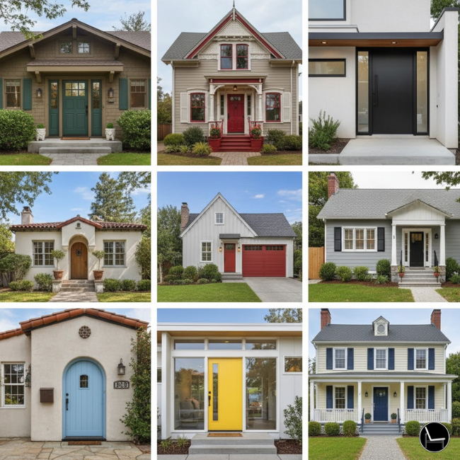
Your home’s architectural style is essentially a dress code for your front door — and the good news is, the rules are surprisingly specific.
A Georgian Colonial practically begs for a glossy black or deep red door. A Craftsman bungalow looks at home with earthy greens, deep blues, or warm burgundy. A mid-century modern demands something bold and graphic — think tangerine, turquoise, or high-gloss white. When the door matches the era of the house, it looks intentional. When it doesn’t, it looks like a mistake.
Front Door Color by Architectural Style: The Cheat Sheet
| Architectural Style | Best Front Door Colors | Colors to Avoid |
| Colonial / Traditional | Black, Navy, Deep Red, Forest Green | Bright orange, lavender, neon |
| Craftsman / Bungalow | Olive, Burgundy, Slate Blue, Warm Brown | Cool gray, ice blue, stark white |
| Mid-Century Modern | Turquoise, Mustard, Tangerine, Chartreuse | Safe beiges, traditional navy |
| Farmhouse | Black, Sage Green, White, Warm Red | Bright jewel tones, purple |
| Tudor / Cottage | Deep Purple, Forest Green, Red, Black | Pastels, bright yellow |
| Mediterranean | Cobalt Blue, Terracotta, Deep Teal | Muted beiges, cold grays |
| Contemporary / Modern | Charcoal, High-Gloss White, Muted Black, Deep Teal | Warm browns, fussy pastels |
| Victorian | Jewel tones (plum, teal, gold), Deep Red | Plain white, builder beige |
| Ranch | Almost anything bold works — this style welcomes personality | Nothing muddy or similar-toned to the siding |
💡 Pro Tip: Google your home’s architectural style + “front door color” and filter to Images. It takes 90 seconds and instantly shows you what works in the real world.
Keep reading for a designer-approved guide to: Patio Decor Ideas on a Budget
The Most Popular Front Door Colors of 2026 (And Why They Work So Well)

If you’re looking for proven starting points, these are the front door colors designers, real estate agents, and homeowners keep returning to — year after year — because they consistently deliver.
Trends come and go, but some front door colors have staying power for a reason. They work across undertones, architectural styles, and neighborhoods. They photograph well, they age gracefully, and — crucially — they hold their value when it’s time to sell. This isn’t a list of what’s momentarily fashionable; it’s a list of what performs.
#1: Black — The Designer’s Default (and For Good Reason)
Black is the #1 most popular front door color in the U.S., and it’s not even close. A 2022 Zillow study found that black front doors correlate with homes selling for up to $6,271 above asking price. It works on almost every architectural style, pairs with every hardware finish, and never looks dated.
The two best blacks for front doors: Sherwin-Williams Tricorn Black (SW 6258) — a true, slightly warm black with no purple or blue undertone — and Benjamin Moore Onyx (2133-10) — a rich, deep black with just a hint of warmth. Both are designer go-tos for a reason.
#2: Navy Blue — Classic Without Being Boring

Navy is the “little black dress” of front door colors — endlessly appropriate, always polished, and universally flattering. It works especially well on white, gray, and cream-colored homes, and it photographs beautifully in real estate listings (which matters more than people realize).
Great navy options: Benjamin Moore Hale Navy (HC-154) — the most-pinned blue on Pinterest for years, a sophisticated blue with just enough depth to feel substantial. Sherwin-Williams Naval (SW 6244) — slightly deeper and more saturated, stunning in high-gloss.
#3: Sage Green — The Trending Color That Actually Has Longevity
Sage green went from trend to classic faster than almost any color in recent memory — because it taps into our deep psychological need for calm, nature, and authenticity. It’s the color equivalent of bringing the outside in. It pairs beautifully with warm wood tones, brick, natural stone, and white trim.
Best sage picks: Benjamin Moore Salamander (2050-10) for a deeper, moodier green. Sherwin-Williams Evergreen Fog (SW 9130) for a softer, more muted sage that works on almost any home.
#4: Deep Red — The Front Door Color With a History

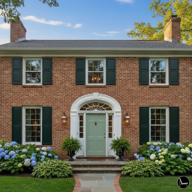
Red front doors have appeared in American and European homes for centuries — and the tradition persists because the color works. Warm, bold, and unmistakably welcoming, a deep red door is especially striking on brick colonials, white farmhouses, and natural wood-sided homes.
Keep it rich and saturated, not orange-leaning. Benjamin Moore Heritage Red (2080-20) and Sherwin-Williams Antique Red (SW 0006) both hit the right balance of depth and warmth.
#5: Forest Green — The Maximalist’s Classic
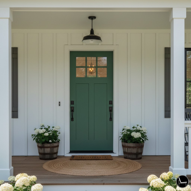
If sage green is the whisper, forest green is the statement. Deep, saturated, rich with personality — forest green doors are having a serious moment, and they show no signs of fading. They work particularly well on Craftsman bungalows, Tudor cottages, and brick homes with warm undertones.
Farrow & Ball Studio Green (No. 93) is the aspirational pick — moody, complex, stunning. For a more accessible alternative, Benjamin Moore Forest Green (HC-180) delivers similar depth at half the price.
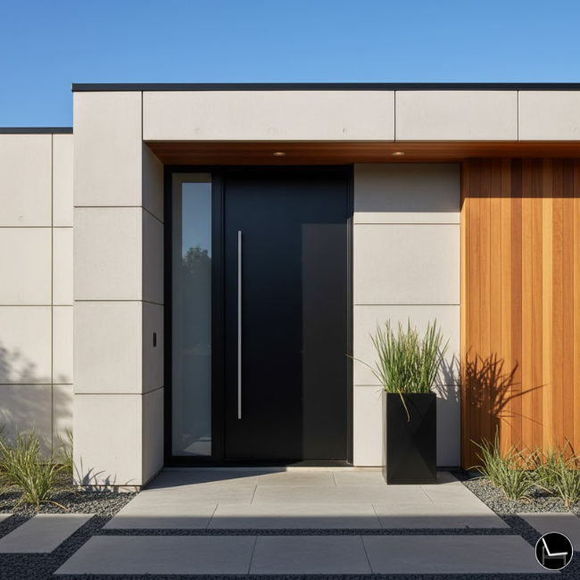
#6: Charcoal Gray — The Sophisticated Middle Ground

Charcoal is what you choose when you want the drama of black but with slightly softer edges. It’s particularly flattering on contemporary and transitional homes with cool-gray siding, and it creates a beautiful tonal look when paired with lighter gray trim.
Sherwin-Williams Iron Ore (SW 7069) is the most popular charcoal for front doors — technically a very dark gray with subtle green undertones, it looks almost black in shade and reveals its complexity in bright light.
Most Popular Front Door Colors: At a Glance
| Color | Best On | Best Paint Pick | Hardware Match |
| Black | Almost anything | SW Tricorn Black | Brass or matte black |
| Navy Blue | White/gray siding | BM Hale Navy | Brushed nickel or brass |
| Sage Green | Brick, wood, stone | SW Evergreen Fog | Matte black or bronze |
| Deep Red | Brick, white siding | BM Heritage Red | Oil-rubbed bronze |
| Forest Green | Craftsman, Tudor, brick | F&B Studio Green | Brass or antique brass |
| Charcoal Gray | Contemporary, transitional | SW Iron Ore | Chrome or matte black |
| Terracotta | Stucco, Mediterranean, Ranch | BM Burnt Sienna area | Bronze or warm brass |
💡 Pro Tip: The most popular color isn’t always the right color for YOUR home. Use this list as a starting point, not a prescription. Go back to Step 1 (your undertone) to filter which of these actually belong on your specific house.
Next, explore this practical guide that shows you exactly how to:
— (How Designers Actually Create Curb Appeal)
Curb appeal isn’t about a single bold color — it’s about proportion. The 60-30-10 rule is the interior designer’s secret for making the whole exterior feel cohesive, and it applies directly to your front door.
Here’s how it works: 60% of your exterior visual weight is your dominant color (siding), 30% is a secondary color (trim, shutters, garage door), and 10% is your accent color — your front door. That 10% is where all the personality lives. It’s small enough to take a risk, large enough to make an impact.
How to apply the 60-30-10 rule to your front door:
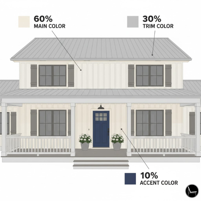
- Write down your siding color and its undertone (this is your 60%)
- Identify your trim color — is it white, cream, gray, or wood? (this is your 30%)
- Your door color should either complement the trim or contrast the siding — not both
- If your trim is bright white (cool), your door should be a cool accent (navy, black, sage)
- If your trim is cream or off-white (warm), your door should be a warm accent (forest green, deep red, cognac)
The One Rule That Prevents Chaos: Your door should never be the same value (lightness/darkness) as your siding. If your siding is light, go dark on the door. If your siding is dark, a lighter or bright door creates beautiful contrast.
💡 Pro Tip: Hold your siding color chip, your trim chip, and your potential door color chip side by side. If all three have different values (light, medium, dark), you’ve got a winning combination.
This proportion rule is why some front doors look “designed” and others just look like someone got brave at the hardware store.
Keep reading for a designer-approved guide to: 15 Tips To Get Your Patio Ready For Summer
Step 4: The Neighborhood Test (The One Constraint No One Talks About)
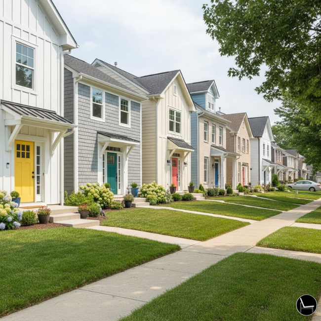
Choosing a front door color in complete isolation — without looking at your street — is like picking an outfit without knowing the dress code.
Your door should feel like you, but it also needs to feel like it belongs on your street. A citron yellow door might be stunning on a row of white farmhouses, but on a block of brick colonials it reads as a mistake. This isn’t about being boring — it’s about context.
Pros and Cons of Going Bold vs. Playing It Safe
Going Bold (highly contrasting or unconventional color):
✅ Memorable and personality-forward
✅ Increases curb appeal when done right
✅ Can actually boost resale interest (stands out in listing photos)
❌ Can feel jarring if neighbors have very conservative palettes
❌ Harder to sell to future buyers with different taste
❌ More expensive to change if you hate it
Playing It Safe (classic black, navy, deep green, or red):
✅ Timeless — won’t look dated in 5 years
✅ Broadly appealing to buyers
✅ Easier to change with seasonal wreaths and hardware
❌ Less personal expression
❌ May blend in on a street where everyone made the same “safe” choice
HOA Note: Before you buy a single sample, check your HOA guidelines. Many associations have an approved color palette or require prior approval. Repainting to comply is an expensive lesson.
💡 Pro Tip: Walk your street on a Saturday morning and take photos of the five houses on either side of yours. Look for the undertones and values those homes share — that’s your “neighborhood palette.” Your door should be distinct from it, but not clash with it.
Next, explore this practical guide that shows you exactly how to: How To Decorate Your Apartment Balcony: Step-by-Step Guide
Step 5: Test Like a Designer — Not Like a Guessing Game

Most people buy a quart of paint, slap it on, and hope for the best. Designers buy three samples, test them in three lighting conditions, and make a data-driven decision. This single habit saves hundreds of dollars and weeks of regret.
Light changes color dramatically. The same navy blue that looks sophisticated at noon can look almost black at dusk and almost purple in the bright morning sun. Your door faces a specific direction — and that matters enormously.
The 3-Lighting Test (Do This Before You Commit)
How to test your front door color like a pro:
- Paint at least a 12×12-inch square of each color directly on the door (not on cardboard — surfaces absorb paint differently)
- Morning light (8–10am): photograph and note any warmth or pink cast
- Midday light (12–2pm): this is the truest, most neutral read of the color
- Golden hour (5–7pm): this is when undertones go crazy — warm colors deepen, cool colors can go gray
- Live with the samples for 48 hours before deciding
The Door Material Factor: Fiberglass and steel doors absorb paint differently than wood. If you have a fiberglass door, look for paints specifically formulated for it — standard exterior latex can peel or fade within a season.
💡 Pro Tip: Take a photo of your door samples against the actual house (not just closeups) and look at it on your phone. We process small-screen images differently — you’ll immediately see which color “belongs” and which one fights the siding.
Dive deeper with this step-by-step guide on: How to Protect Your Outdoor Furniture from All Seasons
Step 6: Choose the Right Paint Finish (This Affects Everything)
The finish you choose for your front door is just as important as the color itself — and high-gloss is almost always the right answer.
Here’s why: your front door takes more abuse than any other painted surface in your home. Fingerprints, UV rays, rain, humidity, temperature swings, and the daily trauma of being slammed by kids with muddy hands. A flat or eggshell finish will show every smudge, fade unevenly, and chip within a year. A high-gloss finish is durable, wipes clean easily, and gives the door that lacquered, “I paid someone to do this” look.
Splurge vs. Save: Front Door Paint Edition
| Item | Save On | Splurge On |
| Interior trim paint | Mid-range is fine | — |
| Front door paint | — | Always splurge. Buy exterior-rated, door-specific paint |
| Paint brushes | Buy decent, not cheap | — |
| Primer | Don’t skip it, but mid-range works | — |
| Door hardware (knob/handle) | — | This is a high-touch, high-visibility item. Buy quality |
| Paint samples | Buy multiple, it’s worth it | — |
Top Performer Picks for Exterior Door Paint:
- Benjamin Moore Advance (Semi-Gloss or High-Gloss) — The designer’s go-to. Self-leveling, incredibly durable, stunning finish.
- Sherwin-Williams Emerald Urethane Trim Enamel — Best-in-class durability, resists moisture and UV.
- Rust-Oleum Door Paint — Budget-friendly option with solid coverage; great for renters doing temporary refreshes. 🛒→ [Find it on Amazon ]
💡 Pro Tip: Two thin coats always beat one thick coat. And always paint in mild temperatures (50–85°F) — paint applied in extreme heat or cold will cure improperly and peel.
Dive deeper with this step-by-step guide on: How To Decorate with Outdoor Lanterns for a Glamorous Home
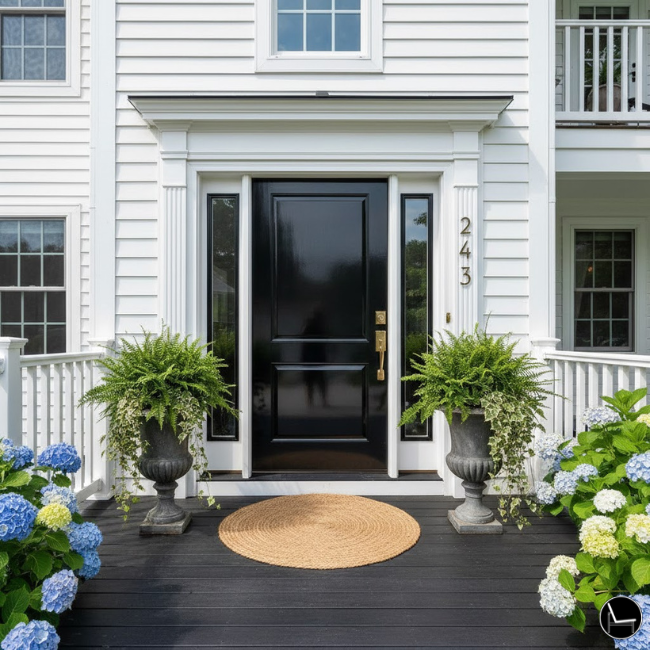
The Black Front Door: Why It’s the #1 Choice and How to Get It Right
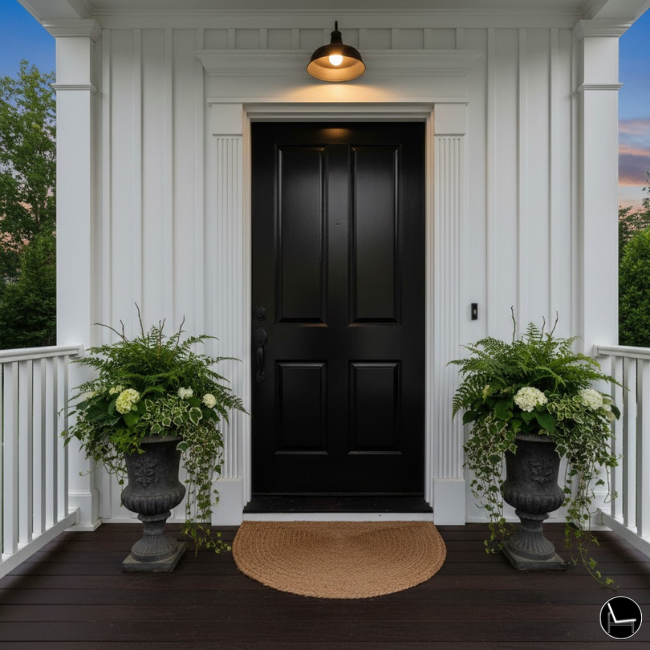
A black front door is the single most universally flattering, design-forward, and resale-boosting choice you can make — and if you’ve been on the fence, this section will push you off it.
Over 100,000 people search “black front door” every month. That’s not a trend. That’s a consensus. And it’s one that designers, real estate agents, and homeowners across every style category have independently arrived at — because black simply works. It works on Victorian cottages and ultra-modern boxes. On red brick and gray fiber cement. On homes with brass hardware and homes with chrome. It is, in the truest sense, a neutral.
When I finally painted my own front door black after years of advising clients to do it, my neighbor stopped me in the driveway to ask what renovation I’d done. I hadn’t touched anything else. That’s the power of a black front door.
Why Black Works on Virtually Every Home
Black succeeds because it functions as a visual anchor. In design, every composition needs something to ground the eye — a dark element that creates contrast and makes everything else look more intentional. Your front door is the perfect place to put that anchor. It frames every other exterior element and makes your trim look crisper, your landscaping look lusher, and your siding look more deliberate.
It also has genuine psychological weight (see the psychology section above): black reads as confident, sophisticated, and timeless — qualities that translate directly to curb appeal and buyer perception.
Black vs. Black: Choosing the Right One
Not all blacks are the same — and choosing the wrong black for your home is one of the most common mistakes designers see. Some blacks lean warm (brown undertones), some lean cool (blue or gray undertones), and some — the rarest — are truly neutral. Your home’s undertone determines which one belongs on your door.
| Black Paint | Undertone | Best On |
| SW Tricorn Black (SW 6258) | Neutral / very slightly warm | The most versatile — works on warm AND cool homes |
| BM Onyx (2133-10) | Warm (slight brown) | Brick, warm siding, tan or cream exteriors |
| BM Black Beauty (2128-10) | Slightly cool | Gray siding, stone, cool-toned homes |
| PPG Black Magic (PPG1010-7) | Neutral | Any exterior; excellent depth in high-gloss |
| Farrow & Ball Off-Black (No. 57) | Warm gray-black | Traditional, classic, and period homes |
💡 Pro Tip: In high-gloss finish, all blacks will look richer and more dramatic. If you want the full effect without committing to maximum contrast, try a very dark charcoal (like SW Iron Ore) as a “soft black” — you get 85% of the drama with a slightly softer edge.
Keep reading for a designer-approved guide to: The Best Performance Fabric Sofas for Real Life (Kids, Pets & Spills Welcome)
The Black Front Door Checklist: Getting Every Detail Right
A black door done halfway looks worse than no black door at all. The contrast is so high that every other detail gets amplified — which means hardware, house numbers, and condition of the door itself all matter more than they would with a lower-contrast color.
How to execute a black front door perfectly:
- Sand and prime before painting — black shows every imperfection. Fill any dents or dings first.
- Use high-gloss finish — the lacquered look is the whole aesthetic; semi-gloss is acceptable but flat black on a door is almost always a mistake
- Apply 3 thin coats — more than other colors, black benefits from full, even coverage to prevent patchiness
- Choose hardware with intention — brushed brass and satin gold are the most elevated pairings; matte black-on-black is dramatic but works; chrome is the only finish to avoid (it reads as cold)
- Update your house numbers — modern numerals in brushed brass or black against a black door are a high-ROI finishing touch
- Mind your welcome mat — a bold, geometric, or natural fiber mat grounds the look; avoid anything too casual or synthetic
Top Product Picks for Your Black Front Door on Amazon:


- Sherwin-Williams Tricorn Black (SW 6258) in Emerald Urethane Trim Enamel — the professional-standard choice for durability and depth
- Kwikset Prava Front Door Lock Handle and Deadbolt Set— the designer’s hardware of choice for black doors 🛒→[Amazon]
- Modern House Numbers in Brushed Gold — the finishing detail that makes the whole look intentional 🛒→[Amazon]
- Jute Door MatX-Large— natural fiber, neutral, and exactly the right texture complement 🛒→ [Amazon]
— — How to Make Your Color Choice Look 10x Better
The most underrated step in the entire front door transformation isn’t the paint — it’s the hardware. New door hardware can make a $40 paint job look like a $2,000 renovation.
Think of door hardware as jewelry for your home. The wrong hardware undermines even a perfect paint color. Old, tarnished brass hardware on a fresh black door? You’ve done 90% of the work and gotten 50% of the result. Updating your door hardware is typically a 20-minute job that costs $40–$150 and has the highest visual ROI of anything on this list.
Hardware-to-Color Pairing Guide
How to match your door hardware to your color:
- Matte black hardware → works with almost any color (black, navy, green, red, white)
- Brushed brass / satin gold → stunning on black, navy, forest green, or deep burgundy doors
- Polished nickel / chrome → pairs best with gray, slate, white, or cool-toned doors
- Oil-rubbed bronze → beautiful on warm-toned colors: red, terracotta, dark brown, olive green
- Antique brass → perfect for Victorian, Tudor, or traditional homes with warm undertones
Top Hardware Picks on Amazon:


- Schlage B60N Deadbolt in Matte Black — the most universally flattering choice, solid brass construction 🛒→ [Amazon]
- Pineapple Brass Door Knocker — adds a high-end, bespoke touch 🛒→ [Amazon]
- HOUSEABLES House Numbers in Brushed Brass — the final detail that ties the whole look together 🛒→ [Amazon]
💡 Pro Tip: Replace your house numbers at the same time as your hardware. Matching metal finishes across your doorbell, handle, knocker, and house numbers is the detail that separates “updated” from “designed.”
Keep reading for a designer-approved guide to: Swivel Chairs Ultimate Guide: How to Choose & Style the Perfect One for Your Home
The Front Door Color Confidence Checklist: Your 3-Step Action Plan
Before you open a single can of paint, run through this:
Step 1 — Gather Your Palette:
- Identify your siding undertone (warm or cool)
- Write down your trim color
- Note your roof color and any brick/stone elements
- Check HOA guidelines if applicable
Step 2 — Test Before You Commit:
- Order 3–5 paint samples (not fan decks — actual painted samples)
- Apply directly to door in at least 12×12-inch patches
- Photograph in morning, noon, and evening light over 48 hours
- Step back 30 feet (curb distance) and evaluate
Step 3 — Execute with the Right Products:
- Prime the door with an exterior bonding primer
- Apply two thin coats of high-gloss or semi-gloss exterior-grade door paint
- Update hardware and house numbers to match your new aesthetic
- Add a seasonal wreath to complete the look
Most Popular Post:
Interior Design Style Quiz
Timeless Paint Colors That Never Go Out of Style
Create Your Perfect Ergonomic Home Office: A Complete Guide
Must-Have Accessories for Guys: The Secret to a Stylish Space
Modular Sofas for Small Spaces: Brilliant Solutions for Compact Living
The Bottom Line: Your Dream Front Door Is One Decision Away
The right front door color doesn’t just look good — it changes how you feel every single time you come home.
It’s the first thing guests see, the first thing buyers remember, and the first detail that tells the world something about the people who live there. And now you have a system to choose it with confidence: decode your undertone, honor your architecture, test in real light, and finish with the right paint and hardware.
You don’t need to be a designer to get this right. You just need to stop guessing and start with a framework.
Start with your undertone. Pull three samples. Do the 3-Lighting Test. Update your hardware.
Your magazine-worthy front door is closer than you think.
Disclaimer: This post may contain affiliate links. I earn a commission on qualifying purchases at no additional cost to you.
FAQ: Front Door Color Questions Designers Get Asked Most
Q: Does front door color affect home resale value?
Yes — significantly. A 2022 Zillow analysis found that homes with bold front door colors (especially black) sell for up to $6,271 more than expected. Navy, dark gray, and forest green also outperformed neutral doors. The key is choosing a color that has broad appeal.
Q: What front door color works with red brick?
Red brick is warm-toned, so you want to either complement or contrast within the warm family. Best options: black (warm undertone, like Tricorn Black), deep forest green, navy with brown undertones, and deep burgundy. Avoid cool grays and pure whites with blue undertones — they’ll clash with the warmth in the brick.
Q: Can I paint a fiberglass door?
Yes, but use a paint specifically rated for fiberglass. Standard latex exterior paint will peel. Look for “fiberglass door paint” or urethane-based formulas like Sherwin-Williams Emerald Urethane Trim Enamel. Lightly sand and prime first.
Q: What’s the most popular front door color right now (2026)?
Black remains the #1 most popular front door color for its versatility and visual impact. Sage green and deep navy are close seconds, driven by the ongoing interest in nature-forward and moody palettes. Muted terracotta and dusty olive are trending for warmer-toned homes.
Q: Should my front door match my shutters?
Not necessarily — and often it looks better when it doesn’t. A safe approach: make your door and shutters the same color family but different values (one lighter, one darker). Or choose a contrasting door color against matching shutters. Identical door and shutter color can flatten the facade.
Q: What color front door is best for a white house?
White houses are the ultimate blank canvas. Almost any color works — black, navy, forest green, red, yellow, teal, even lilac. The key is to pick a color with enough contrast to stand out against the white siding. Avoid very pale versions of any color; they’ll disappear.
Q: Will a black front door fade or show more wear?
In lower-quality paint, yes — black pigment absorbs more UV radiation, which accelerates fading. That’s exactly why product choice matters so much for black doors. Use a high-quality exterior urethane enamel (Sherwin-Williams Emerald Urethane is the gold standard), apply in high-gloss finish, and expect to touch up every 3–5 years depending on sun exposure. A north-facing door in shade will last significantly longer than one baking in afternoon sun.
Q: Is a black front door bad feng shui?
Not at all — in feng shui, a black door on a north-facing home is actually considered ideal, as north is associated with the water element and black is its corresponding color. For other directions, black is generally considered acceptable and protective. Red remains the most auspicious color in feng shui for most door orientations.
CATCH THE LATEST IN HOME DECOR TRENDS:

Steal These 16 Expert-Approved Decorating Secrets

How To Accessorize Your Living Room

Small Space? 10 Ways To Make A Room Appear Bigger


